If you're taking advantage of your employer's 401(k) retirement savings plan at work, how does your balance compare with the median and the average amount that other Americans have saved from their incomes?
Budgets Are Sexy's J. Money recently had a great personal finance article on that topic, featuring the findings of a recent NerdWallet/NBC News poll that presented the average and median 401(k) balance for American workers by age.
But there's a problem with that polled information. 401(k) retirement savings accounts are tied to employers, where when workers change jobs, they often close those accounts and roll over their saved balances into other types of retirement savings vehicles, such as a Rollover Individual Retirement Account, which exist just for that purpose!
That's no small deal. According to the U.S. Bureau of Labor Statistics, the median American can hold an average of 9 jobs from Age 25 until they retire, changing jobs frequently when they're young, but holding jobs for longer periods as they age. Frequent job changes when Americans are young prevent their 401(k) balances from growing very much, which means that the NerdWallet/NBC News figures will skew very much to the low side for those Americans who take advantage of these tax-deferred retirement savings vehicles.
We wondered how the median 401(k) balance might actually be if it were transferred into a Rollover IRA whenever a median American might change employers. The following table shows the results of that math....
| Median and Average 401(k) Balance with Equivalent IRA Rollover Balance by Age | |||||
|---|---|---|---|---|---|
| Age Range | Median 401(k) Balance | Median Years of Tenure with Single Employer | Estimated Number of Employers [and 401(k) Accounts] | Cumulative Rollover IRA Balance* | Average 401(k) Balance |
| 20-29 | $4,000 | 2.8 | 3.6 | $14,286 | $11,600 |
| 30-39 | $16,500 | 4.9 | 2.0 | $47,959 | $43,600 |
| 40-49 | $36,900 | 7.6 | 1.3 | $96,512 | $106,200 |
| 50-59 | $62,700 | 10.1 | 1.0 | $158,591 | $179,100 |
| 60-69 | $63,000 | 10.2 | 1.0 | $220,356 | $198,600 |
| * If Median 401(k) Balance is moved to Rollover IRA After Each Change in Employer | |||||
What we find is that the median 401(k) balance, if accumulated in a traditional Rollover IRA at every job change, and assuming no gaps in employment, is pretty comparable to what NerdWallet/NBC News found to be the average 401(k) balance for each age group in their survey.
On the whole, these median and average 401(k) balances still fall on the low side of what experts recommend people save to either replace their income or to support their anticipated spending in retirement.
Labels: investing, personal finance
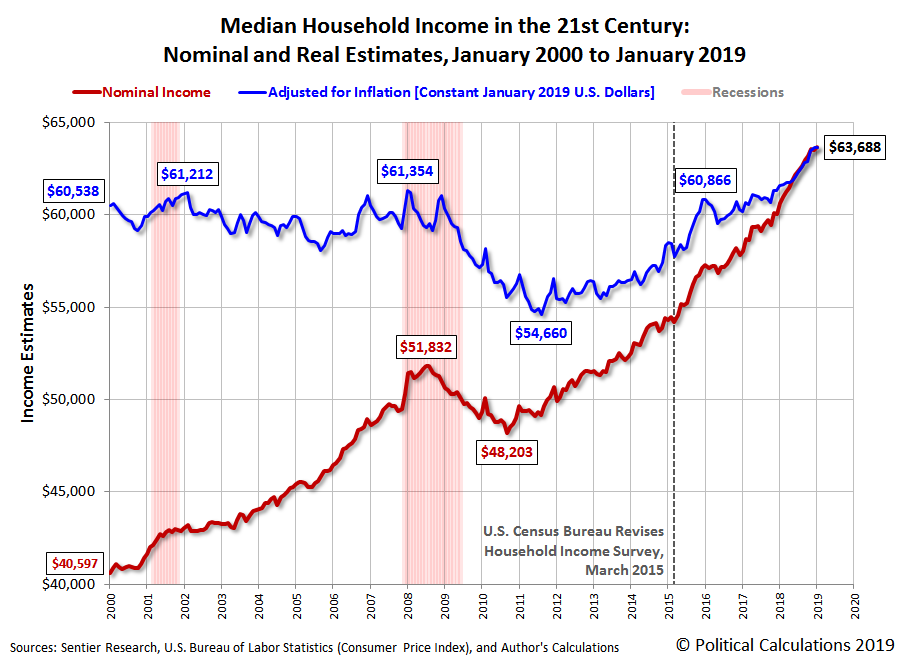
Median household income in the United States rose to $63,688 in January 2019, a 0.3% increase over the Sentier Research's estimate of $63,517 for December 2018. The following chart shows the nominal (red) and inflation-adjusted (blue) trends for median household income in the United States from January 2000 through November 2018. The inflation-adjusted figures are presented in terms of constant January 2019 U.S. dollars.
While the overall trend since December 2016 remains positive for U.S. median household income growth, the rate at which it is growing appears to be starting to slow, which can be seen in the following chart showing the year-over-year growth rate:
Historically speaking, the nominal growth rate is still well elevated near its recent record high, but it's something to watch as the U.S. economy's exposure to well established adverse headwinds from the global economy increases and the chickens come home to roost from the Fed's rate hikes of 2018.
Analyst's Notes
The partial government shutdown earlier in the year has impacted our ability to develop an estimate of median household income using our alternate methodology, where the data we use won't be available until 1 March 2019, assuming the U.S. Bureau of Economic Analysis doesn't change that target date again.
In generating inflation-adjusted portion of the Median Household Income in the 21st Century chart and the corresponding year-over-year growth rate chart above, we've used the Consumer Price Index for All Urban Consumers (CPI-U) to adjust the nominal median household income estimates for inflation, so that they are expressed in terms of the U.S. dollars for the month for which we're reporting the newest income data.
References
Sentier Research. Household Income Trends: January 2000 through January 2019. [Excel Spreadsheet with Nominal Median Household Incomes for January 2000 through January 2013 courtesy of Doug Short]. [PDF Document]. Accessed 21 January 2019. [Note: We've converted all data to be in terms of current (nominal) U.S. dollars.]
U.S. Department of Labor Bureau of Labor Statistics. Consumer Price Index, All Urban Consumers - (CPI-U), U.S. City Average, All Items, 1982-84=100. [Online Database (via Federal Reserve Economic Data)]. Last Updated: 13 February 2019. Accessed: 13 February 2019.
Labels: median household income
During the 2018 partial government shutdown, which affected the timely reporting of housing market data, we began exploring alternative sources for that data that are providing a more detailed picture of recent trends in the residential real estate market at the state level than is possible with the data that U.S. government agencies regularly publish.
We're finding Zillow's data for existing home sales to be especially useful, since it covers 41 states and the District of Columbia, where we can get a pretty good idea of individual state-level trends, which we can quantify by the estimated total valuation of existing home sales within these regions.
Take the west coast of the continental United States for example where the three states of California, Oregon, and Washington all fall within the top 10 for having very expensive housing in the U.S., with California ranking second (after Hawaii), Washington ranks sixth, and Oregon ranks eighth in the nation according to the measure of median home values.
.Normally, the closest you can get to the data that applies for the states of Washington, Oregon, and California comes from monthly data published by the National Association of Realtors, which groups these three states in with 10 others as part of the West region, as defined by the U.S. Census Bureau in reporting home sales. Or you might be able to get home sales data for just California from the California Association of Realtors, but good luck finding similar reports for Oregon or Washington....
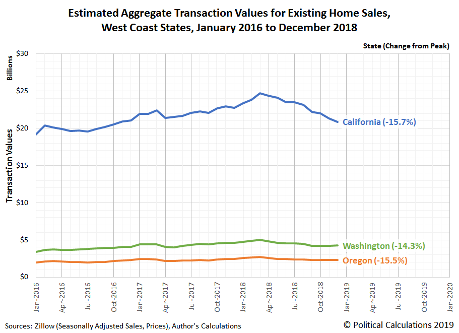
We've used Zillow's data to drill down into the recent history of existing home sales in each of these three states, where we find they share a unique trend that took hold after March 2018. The following chart shows our estimates of the total valuation of existing home sales in California, Oregon, and Washington from January 2016 through December 2018.
All three states saw their seasonally-adjusted total valuation of existing home sales peak in March 2018, where through December 2018, each has experienced a 14-16% decline.
That puts these three states into a unique grouping, where the other states for which we have data range considerably. Some, like North Dakota and Colorado, have seen their total existing home sales valuation drop by more than 20% through December 2018 from their peak values (in March 2017 for North Dakota and in March 2018 for Colorado). Meanwhile, other states had seen no peak as of December 2018, including Michigan, Indiana, Oklahoma, Arkansas, Kansas, and West Virginia.
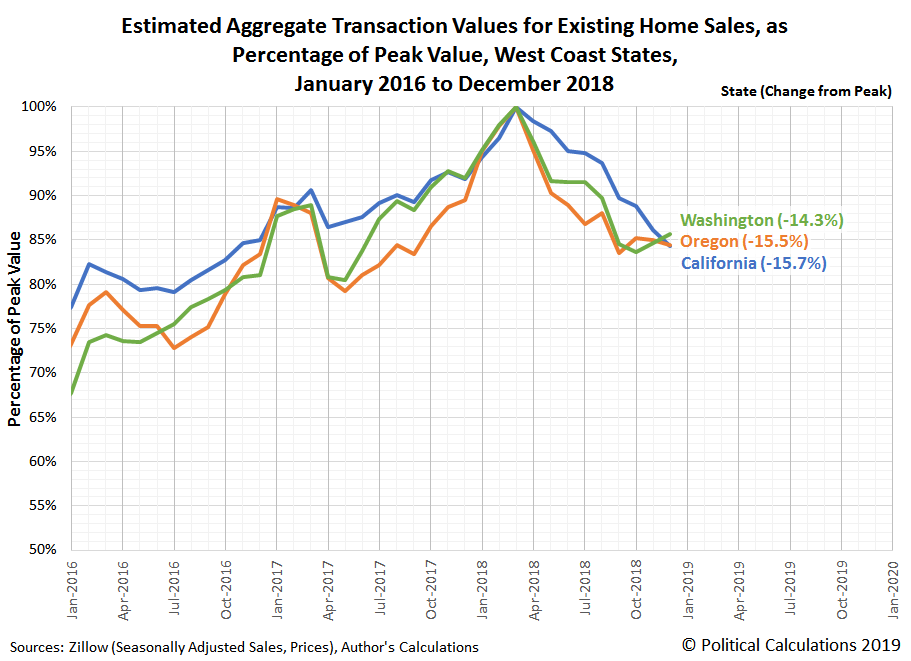
That's a pretty wide range, so to compare how similar the trends have been in Oregon, Washington, and California, we calculated the percentage of the previous peak value of their total existing home sales valuation, which we've presented in the following chart.
Although all three states peaked in March 2018 and have declined by about the same level as of December 2018, we find that the drop-off in existing home sales in Washington and in Oregon have been considerably steeper than what California has experienced. At the same time, both Oregon and Washington are showing potential signs of having reached at least a short term bottom for the declines they have experienced in recent months, while California's trajectory does not yet show such an indication.
There are a lot of potential reasons why that might be, but that's not in the scope for what we're presenting today, where we're demonstrating what's now possible for quantifying and visualizing these state level trends. We'll take on the trends for existing home sales in other states in upcoming months!
Labels: data visualization, real estate
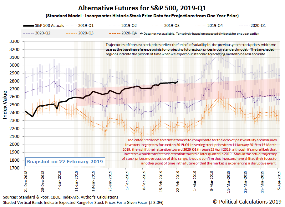
After breaking out above the top end of our redzone forecast range last week, the S&P 500 (Index: SPX) drifted higher through the third week of February 2019, hovering just above it.
As a reminder, the range indicated by the redzone forecast represents where our dividend futures-based model predicts the S&P 500 would go if they were primarily focusing on the current quarter of 2019-Q1 in setting stock prices, which we've added as an adjustment to account for the model's projections being skewed by the past volatility of stock prices that the model uses as the base reference points for its projections into the future. With the S&P 500 having risen above that range, that's an indication that investors have shifted at least part of their forward-looking focus toward another point of time in the future, which our model suggests is 2019-Q2, although it is still much more heavily weighted toward 2019-Q1 at this time. (Although the unadjusted spaghetti forecast chart looks like they are already fully focused on 2019-Q2, if that were really the case, we estimate the S&P 500 would be nearly 150 points higher after accounting for the effect of past volatility on the model's projections!)
As for why they might be shifting their attention toward this particular point of time in the future, we have to turn to the news of the week for context (see below), where the most promising explanation is a potential deal being struck to either end or mitigate the U.S.-China trade war, which if it were made in March 2019, would have benefits start to be recorded during 2019-Q2's earnings season.
- Tuesday, 19 February 2019
- Oil gains as investors grow optimistic over OPEC output deal
- Bigger trouble developing in China: Japan's exports fall most in two years as China shipments weaken
- Bigger stimulus developing in China:
- China unveils plans to develop Greater Bay Area
- China needs tax cuts to relieve pressure on economy: vice premier
- China pledges more support for banks' perpetual bonds to boost lending
- Still in denial: Fed's Mester says higher rates likely needed later this year
- Emerging from denial: Exclusive: Fed's Williams says new economic outlook necessary for rate hikes
- Wall Street rises modestly on Walmart bump
- Wednesday, 20 February 2019
- Oil settles 1 percent higher on hopes of market rebalance, trade deal
- Bigger stimulus developing in China: China to expand agriculture reforms to bolster rural economy
- Fed flags end to balance sheet runoff, patience on rates
- January FOMC minutes: Little risk in pause
- Fed's Daly sees significant economic headwinds, but no recession - but then again, they never do, do they?
- Wall Street ends up slightly as Fed minutes support cautious stance
- Thursday, 21 February 2019
- Bigger stimulus developing in China: Exclusive: China central bank sees benchmark rate cut as last resort, may use other tools - sources
- U.S. existing home sales fall sharply to three-year low
- Exclusive: U.S., China sketch outlines of deal to end trade war - sources
- Wall St. breaks run of gains as economic data disappoints
- Friday, 22 February 2019
- Oil hits 2019 highs on U.S.-China trade hopes, but U.S. output weighs
- Bigger trouble developing in China: China's January home price growth at nine-month low as confidence dips
- Policy changes in the works at the Fed:
- A Fed pivot, born of volatility, missteps, and new economic reality
- Flattening U.S. yield curve in late 2018 'flashing red' on economy: Fed's Williams
- Fed to keep open mind in review of strategy, tools, Clarida says
- Fed eyes end to balance sheet reductions later this year
- Fed's Bullard says not ready to call for another rate cut: Fox Business
- Trade deal getting near?
- Trump says he expects to meet China's Xi soon on trade
- China has agreed to buy up to $1.2 trillion in U.S. goods: CNBC
- S&P 500 posts highest close since November 8 on trade optimism
Barry Ritholtz surveyed the week's markets and economy-related news to identify no fewer than five positives and five negatives for the week that was.
What is wrong with the Oscars?
If we were really going to answer that question, we would need a much bigger blog, but if we were to focus on the televised history of the annual Academy of Motion Picture Arts and Sciences Awards ceremony, we would point to the sheer tediousness of the production.
All the creative talent available to Hollywood, and somehow, when they celebrate themselves and their achievements in the past year, they manage to make it into a boring train wreck. Every year. And they know it.
This year, the writers at the Wall Street Journal forced themselves to watch over 18 hours worth of the Academy Awards ceremony, much of it from last year, where they identified several aspects of the low-rated televised ceremony that just drag on and on for viewers, and found one in particular that stood out.
Last year’s Oscars show was the longest telecast in years, and also the lowest-rated one ever. Coincidence? Doubtful.
Such long nights—last year’s ran nearly four hours—help explain why the length of this year’s show is one of Hollywood’s biggest preoccupations.Amid this awards-season angst, The Wall Street Journal set out to calculate precisely why the Oscars are so long. In the amount of time we spent viewing Oscar shows from 2014 to 2018, logging the number of minutes eaten up by speeches, songs, crowd shots and other staples of the annual broadcast, we could have plowed through the entire “Godfather” trilogy. Twice.
Which activities take up the most time? One of the most surprising revelations: Walking. Viewers watch an average 24 minutes of celebrities and winners walking to and from the stage. The figure is made primarily of victors ambling up to receive awards, as well as the generally quicker strides of presenters strolling to the microphone and guests heading offstage. This year, the academy is trying to curtail the walking shots, which can include cutaways of clapping celebrities, by urging winners to move more quickly.
Short of using a time delay and then speeding through ceremony's many time-filling Roger Corman-esque walking scenes the way the Keystone Kops were featured in films over a hundred years ago, which admittedly would be more entertaining, especially if they brought the Keystone Kops back to accelerate the action, it's not going to work. There's just too much else that's wrong and makes the ceremony unbearably long. Not having a capable host is going to hurt, to name just one new problem the Oscars will have this year.
They really owe an apology to Kevin Hart.
Previously on Political Calculations
- Better Movies Than The Best Picture
- The Dismal Oscars and How China Can Make Hollywood Make Better Movies
- Deadpool Versus the 2015 Best Picture Nominees 2
- Deadpool Versus the 2015 Best Picture Nominees
- The Value of Winning the Oscar for Best Picture Versus Not Winning
- The Difference Between Being Pro-American and Anti-American at the U.S. Box Office
- Copyright Math and the U.S. Entertainment Industry
- The "Hit" Equation for Box Office Gold?
- Can Billy Crystal Sell Movie Tickets?
- Anti-US Fervor in Hollywood
- The Anti-War on Hollywood's Box Office
- Reflections on the Oscars and the Most Manipulative Man in Hollywood
- How Men Are Like Bad Movies, and Why Bad Movies Keep Getting Made
- Do Academy Awards Boost Box Office?
- Does Best Picture Equal Big Box Office?
Labels: academy awards
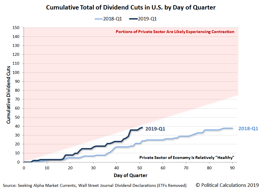
We're only two-thirds of the way through February 2019, but the pace at which distressed U.S. firms are announcing dividend cuts has picked up considerably.
Unlike what we saw in January 2019 however, the near-real time sources that we track for dividend cut announcements suggests that distress is spreading beyond the oil and gas sector of the economy.
Here's the list for the month through 20 February 2019:
- Viper Energy (NASDAQ: VNOM)
- Sabine Royalty Trust (NYSE: SBR)
- Pitney Bowes (NYSE: PBI)
- L Brands (NYSE: LB)
- Arconic (NYSE: ARNC)
- Unique Fabricating (NYSE: UFAB)
- Medley Capital (NYSE: MCC)
- Artisan Partners Asset Management (NYSE: APAM)
- CenturyLink (NYSE: CTL)
- Clearway Energy (NYSE: CWEN)
- AllianceBernstein (NYSE: AB)
- Harvest Capital Credit (NASDAQ: HCAP)
- Tekla Life Sciences Investors (NYSE: HQL)
- Newtek Business (NASDAQ: NEWT)
- Tekla Healthcare Investors (NYSE: HQH)
- Permian Basin Royalty Trust (NYSE: PBT)
- Cross Timbers Royalty Trust (NYSE: CRT)
- Marine Petroleum Trust (NASDAQ: MARPS)
- Owens & Minor (NYSE: OMI)
- PermRock Royalty Trust (NYSE: PRT)
- Fresh Del Monte (NYSE: FDP)
While firms in the oil and gas sector are still well represented, the overall number of these monthly variable dividend payers is so far more consistent with what we expect to see for these firms from month-to-month, which is a good sign following the deluge of dividend cuts announced by oil and gas industry firms in January 2019. What is most different from January 2019 however is the number of firms in the financial sector, where there are a surprising number of asset management firms announcing dividend cuts this month.
At the same time, we're seeing a growing number of industries being represented among dividend reducing firms, including technology, telecommunications, consumer goods, business services, health care, automotive manufacturing, aerospace manufacturing, and utilities. One from the food sector, Fresh Del Monte, isn't cutting its quarterly cash dividend of $0.15 per share, but it is suspending it, which is also an indication of distress.
The following chart illustrates the cumulative number of dividend cuts in 2019-Q1 by day of the quarter, compared with what we recorded back in 2018-Q1.
At this point in time, we can confirm that the number of dividend cuts in our sampling for the first quarter of 2019 has surpassed the total recorded in the first quarter of 2018. The pace at which dividend cuts are being announced is getting close to the threshold that would indicate that some degree of economic contraction is occurring within the U.S. economy, although at present, it hasn't yet crossed into the red.
References
Seeking Alpha Market Currents. Filtered for Dividends. [Online Database]. Accessed 20 February 2019.
Wall Street Journal. Dividend Declarations. [Online Database]. Accessed 20 February 2019.
Labels: data visualization, dividends
Every three months, we take a snapshot of the expectations for future earnings in the S&P 500 at approximately the midpoint of the current quarter, shortly after most U.S. firms have announced their previous quarter's earnings.
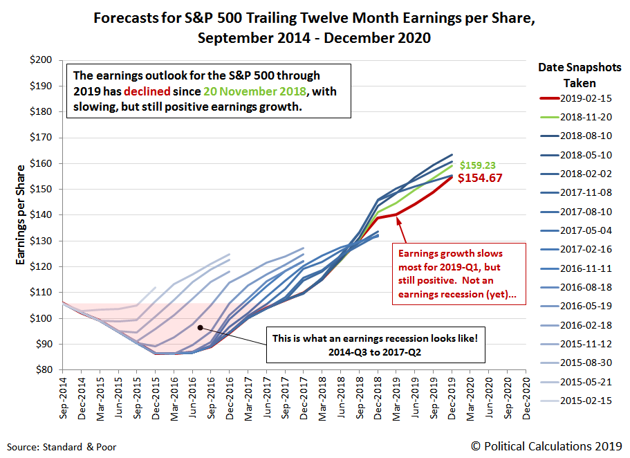
The earnings outlook for the S&P 500 has darkened more since our previous edition, where as of the snapshot available as of 31 January 2019, we find that the projected future for S&P 500 earnings has weakened through the end of 2019, continuing the trend that had been forecast three months earlier.
As of 15 February 2019, S&P projects that trailing year earnings per share through 2019-Q4 will total $154.67, about the same as what they had first forecast for this distant period over a year ago, on 2 February 2018.
Looking at the nearer term future, at present, trailing year earnings per share for 2019-Q1 are still projected to rise above their 2018-Q4 level, so while forecast earnings growth is slowing, it does not yet confirm the arrival of an earnings recession, which occurs when trailing twelve month earnings per share begins to fall after reaching a peak.
In the chart above, we've highlighted the last earnings recession, which began in 2014-Q3 and bottomed in 2016-Q1 before going on to surpass the previous peak in trailing year earnings per share in 2017-Q2. That earnings recession primarily impacted the U.S. oil industry, which was driven by the collapse of global crude oil prices in mid-2014 as Saudi Arabia created a supply glut in the market in an effort to weaken other national competitors, where a recovery didn't begin until those prices finally bottomed in February 2016.
Oil prices have been falling in recent months, although today, that appears to be more the result of a change in the global demand for oil rather than a new surge of supply, where economic growth indicators have been slumping in China and turning negative in the Eurozone.
Boosted by the stimulus of tax cuts, the national U.S. economy appears to have mostly escaped being pulled down toward recession by these global developments in 2018, until perhaps the last months of the year, when the cumulative impact of rising interest rates reversed growth in the U.S. housing sector, followed by the retail sector taking an unexpectedly large hit and auto sales dropping sharply.
With that being the case, many firms in these sectors are now revising their earnings projections downward, which is why the future outlook has darkened for the S&P 500. We expect this process will continue as the higher level of distress in these industries diffuses through other industries over time, slowing the momentum that is so far avoiding the true onset of an earnings recession.
Which is why a number of observers are dreading the official arrival of a new earnings recession, while others are telling investors not to worry yet. We're in a mixed phase right now, where only new information will confirm the direction that earnings per share are headed.
Data Source
Silverblatt, Howard. Standard & Poor. S&P 500 Earnings and Estimates. [Excel Spreadsheet]. 31 January 2019. Accessed 15 February 2019.
Labels: earnings, forecasting, SP 500
After last week's failed breakout attempt, the second week of February 2019 saw the level of the S&P 500 (Index: SPX) broke out above our redzone forecast range on Friday, 15 February 2019, boosted by the speculation of improved prospects for a trade deal being reached between the U.S. and China.
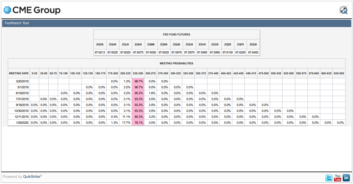
The other big news of the week is that there seems to be a growing consensus at the Fed for no further rate hikes in 2019. In fact, the CME Group's FedWatch Tool is suggesting that investors are giving small, but increased odds of a rate cut in December 2019, though the much greater probability at this point of time is for rates to be held steady at today's Federal Funds Rate target range of 2.25% to 2.50%.
Here's the other headlines of the week that stood apart from the regular noise from the news cycle....
- Monday, 11 February 2019
- Tuesday, 12 February 2019
- Oil gains 1 percent after Saudi Arabia pledges more output cuts
- Bigger trouble developing in China: Debt guarantee tangle: China's private firms hit by default contagion
- Fed to finalize plans to end balance sheet runoff 'at coming meetings': Mester
- Wall Street advances on trade hopes, deal to avert government shutdown
- Wednesday, 13 February 2019
- Oil gains on Saudi output cuts; rally limited by U.S. output
- Despite falling rates, U.S. mortgage applications fall again
- Fed's Mester sees limited inflation risk from rising wages
- Trump: China trade talks going 'very well' before high-level parley
- Wall Street advances on trade hopes, tame inflation data
- Thursday, 14 February 2019
- Friday, 15 February 2019
- Oil rises over 2 percent to 2019 highs on tightening supplies
- Bigger trouble developing in China:
- China's producer prices slow for seventh straight month, raising deflation fears
- Bigger stimulus developing in China: China's banks throw open spigots in January, lend record 3.23 trillion yuan
- Trump says may extend March 1 deadline for China trade deal
- Sputtering auto production sinks U.S. manufacturing output
- Fed policymakers see one U.S. rate hike, or none, as growth slows
- Fed's Bostic: Soft data doesn't change view of above-trend U.S. growth
- Fed's Daly sees no case for rate hike this year: WSJ interview
- Progress in U.S.-China trade talks sparks world stock rally
Elsewhere, Barry Ritholtz scanned the week's markets and economy-related news to identify the positives and negatives, finding six of each, though we wonder if one of the positives (flat inflation) is really a negative....
Two years after it first went into effect, the negative fallout from Philadelphia's controversial soda tax continues to pile up. Here's a short summary of the news that has broken since we last reviewed what has perhaps become the most unpopular tax in the City of Brotherly Love.
A Philadelphia ShopRite convenience store will close, with the owner citing lost business related to the city's soda tax as the primary reason for its closure. The store is located near Philadelphia's city limits, where local residents appear to have taken a good portion of their business across the border to avoid paying the tax. Jeff Brown, the store's owner, whose efforts in bringing supermarkets into impoverished areas of Philadelphia was lauded by President Obama in his 2010 State of the Union address, indicated that reduced sales at all his stores since the soda tax went into effect has cumulatively reduced his total payroll by about 200 jobs, which he has achieved through attrition rather than through layoffs. The store closure is expected to add another 100 jobs to that running total of attrition.
A second independent study has confirmed that net soda consumption among Philadelphia's total population has not meaningfully declined, where "the tax did not improve nutritional intake by encouraging consumers to substitute to healthier beverages". The study's authors, Stephan Seiler, Anna Tuchman, and Song Yao, also found that nearly 100% of the tax is being passed through to Philadelphia consumers, confirmed that many of these shoppers are avoiding the tax by shifting their grocery shopping to stores outside of the city's limits, and that the tax is achieving a disproportionately negative impact by imposing "a relatively larger financial burden on low income/high obesity households that are less likely to engage in cross-shopping at stores outside of the city."
A 116-count federal indictment against International Brotherhood of Electrical Workers president John J. Dougherty (aka "Johnny Doc") and Philadelphia city councilman Robert "Bobby" Henon, among others. In a city like Philadelphia where political corruption scandals are common, that news itself might not stand out, except in this case, because it says quite a lot about the true motivation behind Philadelphia's soda tax.
According to a federal indictment unsealed Wednesday, corrupt Democratic city officials and electricians’ union leaders pushed through the soda tax in 2016 in a revenge feud against the Teamsters union, instead of a motivation to affect public health.
The Justice Department’s indictment reveals how Philadelphia Councilman Robert Henon, who was on the payroll of Mr. Dougherty’s union, introduced the soda-tax proposal as payback against the Teamsters for criticizing Mr. Dougherty in a political advertisement a year earlier.
The Teamsters opposed the soda tax because they believed it would cost them jobs by reducing demand for soft drinks.
When aides to Democratic Mayor Jim Kenney tried to explain to Mr. Dougherty the public health benefits of the soda tax, the indictment alleges, the union leader replied, “You don’t have to explain to me. I don’t give a f–.” He predicted it would “cost the Teamsters 100 jobs in Philly.”
A very predictable negative outcome that Philadelphia Mayor Jim Kenney neither disputed at the time nor sought to diminish in the time since, all while Kenney's claims that positive public health benefits would be achieved from imposing the city's soda tax are proving to be unfounded in practice.
Dougherty's support for the controversial tax was essential because of the IBEW Local 98's money and political influence within the city, where the union's backing often made the difference between candidates winning elections or not. In addition, Johnny Doc's influence extends to appointed positions, including gifts to judges, who might then be counted upon to back the union-supported positions such as on the soda tax when its legality was challenged in court. The full magnitude of the unfurling political scandal as it relates to how the Philadelphia's soda tax was passed and survived legal challenge is not yet known.
Finally, with eleven months of Philadelphia Beverage Tax revenue now counted for 2018 (taxes assessed in December 2018 and collected in January 2019 will be reported either later this month or early in March 2019), we anticipate that the full year's tax collections will fall short of its second year target.
From January through November 2018, Philadelphia's Beverage Tax has accumulated $70,348,376 in the city's coffers, which is nearly $8.5 million short of the city's $78.8 million target. The most the city has ever collected from its soda tax in a single month was $7,567,159 in September 2017, so if it were to collect that much once again, it still would fall about one million dollars short.
Meanwhile, Philadelphia's original revenue target for its controversial tax on the distribution of sweetened beverages for retail sale in the city was $92.4 million, where actual revenues of $77.8 million would be 84% of that figure. In 2017, Wharton Business School Professor of Finance and Public Policy Robert Inman indicated the Philadelphia Beverage Tax could be considered a success if it collected 85% to 90% of the city's original revenue target.
It will almost certainly miss clearing that low bar needed to be considered successful in 2018. The only question now is by how much will it fall short?
Previously on Political Calculations
We've been covering the story of Philadelphia's flawed soda tax on roughly a monthly basis from almost the very beginning, where our coverage began as something of a natural extension from one of the stories we featured as part of our Examples of Junk Science Series. The linked list below will take you through all our in-near-real-time analysis of the impact of the tax, which at this writing, has still to reach its end.
- Examples of Junk Science: Taxing Treats
- Philadelphia Soda Tax Crushes Soft Drink Sales
- The Tax Incidence and Deadweight Loss of Philadelphia's Soda Tax
- Philadelphia's Soda Tax Collections Are Falling Short
- Philly's Soda Tax Collections Continue to Fall Short of Goals
- Jobs Gained and Lost from Philadelphia's Soda Tax
- Philadelphia Soda Sales Volume Down 34% Since Tax
- Philadelphia Soda Tax to Shrink City's Economy by $20 Million
- Big Miss for Philadelphia's Beverage Tax
- Odds and Ends for Philadelphia's Soda Tax
- Legal Jeopardy for Philadelphia's Soda Tax
- Soda Tax Driving Philadelphians To Drink?
- Philadelphia Soda Tax Collections Start Fiscal Year in Deep Hole
- Philadelphia Soda Tax Collections Continues Falling Flat
- A Natural Experiment for Philadelphia's Soda Tax
- Philadelphia Soda Tax $20 Million Short with One Month to Go in First Year
- Philadelphia Soda Tax Falls 15% Short of Target
- Philadelphia Mayor Scales Back Soda Tax Ambitions
- Philadelphia Soda Tax Boosts City's Alcohol Sales
- Philadelphia Soda Tax Collections Falling Further Short in Year 2
- Philadelphia Soda Tax Underperforming Lowered Expectations
- PA Supreme Court Rules Philly Soda Tax Legal
- Philadelphians Sure Drink a Lot More Alcohol Since the City's Soda Tax Was Imposed
- Philly's Soda Tax Impact on City's Calorie Consumption
- Tax Avoidance and the Philadelphia Soda Tax
- Philadelphia Rebuild Paying Price for Soda Tax Shortfalls
- Philadelphia's Soda Tax Isn't Working
- Hits Keep Piling Up Against Philadelphia Soda Tax
Image Credit: Ashkan Forouzani
Happy Valentine's Day to all lovers of math!
We used Microsoft Excel to generate the charts to go along with each equation, where convincing it to draw a proper circle on an x-y scatter plot for the "O" was especially challenging. If you ever want to attempt it yourself, we found Tushar Mehta's instructions to be invaluable!
Meanwhile, if you haven't yet geeked out enough, do check out Hannah Fry's discussion of the Mathematics of Love from 2014....
P.S. If you're accessing this article on a site that republishes our RSS news feed, you might be seeing the charts at the top of the post in reverse order. If you would like to see them in their proper order, please click through to our site!...
Labels: math
Together, Texas and California are home to over one out of five teens between the ages of 16 and 19 in the United States. Of the two states, California's teen population is larger than that of Texas, although its population has been slowly declining in recent years while Texas' teen population has been growing. The following chart shows the population trends for working-age teens in both states from 2003 through 2018, where we find that Texas has grown from having three-fifths of California's teen population to nearly four-fifths.
Since we're focusing on working-age teens in both states, let's next look at teen employment levels in both states from 2003 through 2018.
In this chart, we see that California's working teen population plummeted by 40% from 2007 through 2011, before flattening out through 2014. It went on to rebound somewhat in 2015, but has stagnated at roughly 27% below its 2007 peak in all the years since.
By contrast, Texas saw a 29% decline in working teens from 2006 to 2011, but has since largely recovered. More remarkably, the number of working teens in Texas has periodically surpassed the number in California, in 2014 and again in 2017, despite having a teen population that is considerable smaller than that of California.
That's a pretty remarkable observation, so we've calculated the employment-to-population ratio for working-age teens in California and Texas from 2003 through 2018, showing the results in the next chart.
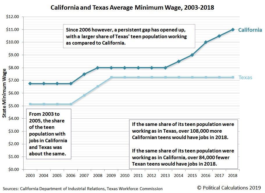
Here, we see that both states start out in a similar place, where from 2003 to 2005, the share of the teen population with jobs in California and Texas was about the same.
Since 2006 however, a persistent gap has opened up, with a larger share of Texas' teen population working as compared to California. In 2018, 28.1% of Texas' working-age teen population were earning paychecks, while only 22.7% of California's Age 16-19 population had jobs.
How big is that difference? If the same share of its teen population were working as in Texas, over 108,000 more Californian teens would have had jobs in 2018. At the same time, if the same share of its teen population were working as in California, over 84,000 fewer Texan teens would have jobs in the same year.
According to the BLS' preliminary data for 2018, California had 457,000 employed teens while Texas had 440,000.
There is, of course, one big difference between the two states that affects whether employers in each state even consider hiring teens to work for them.
That's far from the only difference between the two states however, where things like the composition of the two states' economies and the rates at which different industries in each state are growing also play a role in determining whether there are sufficient jobs that teens can land.
Teen employment is a positive factor that help boost household incomes, help the teens gain experience that will translate into higher incomes later in life, and can even reduce the amount of student loan debt that a college bound teen might otherwise have to take on. Which state's teens do you suppose are coming out ahead?
References
Bureau of Labor Statistics. Local Area Unemployment Statistics: Expanded State Employment Demographic Data. [PDF Documents: 2003, 2004, 2005, 2006, 2007, 2008, 2009, 2010, 2011, 2012, 2013, 2014, 2015, 2016, 2017, 2018 (Preliminary)]. Accessed 8 February 2019. [Note: The BLS has data that goes back to 1999, but it changed its survey methodology in 2003, making it difficult to make valid comparisons with data collected in earlier years.]
Bureau of Labor Statistics Wage and Hour Division. History of Federal Minimum Wage Rates Under the Fair Labor Standards Act, 1938-2009. [Online Article]. Accessed 8 February 2019.
State of California Department of Industrial Relations. History of California Minimum Wage. [Online Articel]. Accessed 8 February 2019.
Texas Workforce Commission. Texas Minimum Wage Law. [Online Article]. Accessed 8 February 2019.
Labels: business, economics, minimum wage
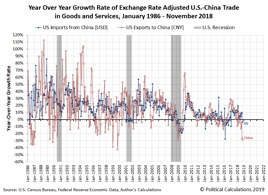
In November 2018, the year-over-year growth rate of the value of goods imported by the U.S. from China dropped into negative territory.
That observation comes from our analysis of the U.S. Census Bureau's report on the U.S.' trade in goods with China, which had been delayed for over a month due to the partial U.S. government shut down. It marks the first month since the U.S.-China trade war began on 22 March 2018 where we can point to a month where the total value of goods that the U.S. imported from China dropped below the value reported a year earlier, where the U.S. had largely been able to avoid following China's fate in that respect. Until November 2018.
The following chart shows that development and also reveals that the year-over-year growth rate of the value of U.S. exports to China became more negative in November 2018. That outcome largely occurred as a consequence of China's retaliatory tariffs on U.S.-produced soybeans, which has prompted China's soybean buyers to effectively boycott the 2018 U.S. crop (until they began making some relatively small buys in December 2018).
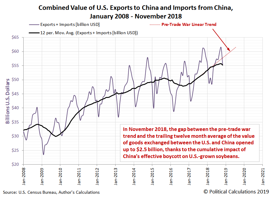
Taking a step back to look at the combined value of goods and services directly traded between the U.S. and China, we find the size of the gap between where that level of trade is today with respect to where it would likely be in the absence of the trade war between the two nations opened up in November 2018, increasing by over 50% from $1.6 billion in the previous month to $2.5 billion.
In percentage terms, November 2018's level of direct trade between the two nations is a little over 4% below where we estimate it might otherwise be based on the pre-trade war trend for this data.
References
Board of Governors of the Federal Reserve System. China / U.S. Foreign Exchange Rate. G.5 Foreign Exchange Rates. Accessed 7 February 2019.
U.S. Census Bureau. Trade in Goods with China. Accessed 7 February 2019.
U.S. Census Bureau. U.S. Trade Online. Accessed 7 February 2019.
Labels: trade
Welcome to the blogosphere's toolchest! Here, unlike other blogs dedicated to analyzing current events, we create easy-to-use, simple tools to do the math related to them so you can get in on the action too! If you would like to learn more about these tools, or if you would like to contribute ideas to develop for this blog, please e-mail us at:
ironman at politicalcalculations
Thanks in advance!
Closing values for previous trading day.
This site is primarily powered by:
CSS Validation
RSS Site Feed
JavaScript
The tools on this site are built using JavaScript. If you would like to learn more, one of the best free resources on the web is available at W3Schools.com.
