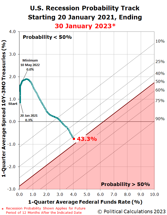
Six weeks ago, an analytical model developed by a analyst at the U.S. Federal Reserve said the odds the NBER will say a recession began sometime betweeen mid-December 2022 and mid-December 2023 was just one in six. As of 30 January 2023, that same model is signaling the probability the NBER will someday say the U.S. went into recession during 2023 is nearing 50%.
The latest update to the Recession Probability Track shows how that probability has evolved since our last update in mid-December.
The chart shows the current probability of a recession being officially determined to have begun between 30 January 2023 and 30 January 2024 is 43.3%. Assuming the Fed follows through on hiking the Federal Funds Rate by another 0.25% tomorrow, the probability of an "official" recession will continue rising. Doing some back-of-the-envelope math using our recession odds reckoning tool, with the 10-Year and 3-Month Treasuries as inverted as they are today, the odds of recession should rise above 50% in the next two weeks. In six weeks, when the Fed's Open Market Committee next meets to discuss implementing another potential quarter point rate hike, the recession probability will have reached nearly 60%.
Keep in mind this model is really trying to forecast what range of months will contain the month the NBER's analysts will say the U.S. business cycle hit its peak of expansion after bottoming during 2020 Coronavirus Pandemic Recession before starting to contract into a new recession. While similar, it's not the same as forecasting when recessionary conditions affecting the economy began. Those already have. It's now a question when those conditions will be determined to have met the NBER's scale, scope, and severity thresholds to qualify as an "official" national recession.
For the latest updates of the U.S. Recession Probability Track, follow this link!
Previously on Political Calculations
We started this new recession watch series on 18 October 2022, coinciding with the inversion of the 10-Year and 3-Month constant maturity U.S. Treasuries. Here are all the posts-to-date on that topic in reverse chronological order, including this one....
Labels: recession forecast
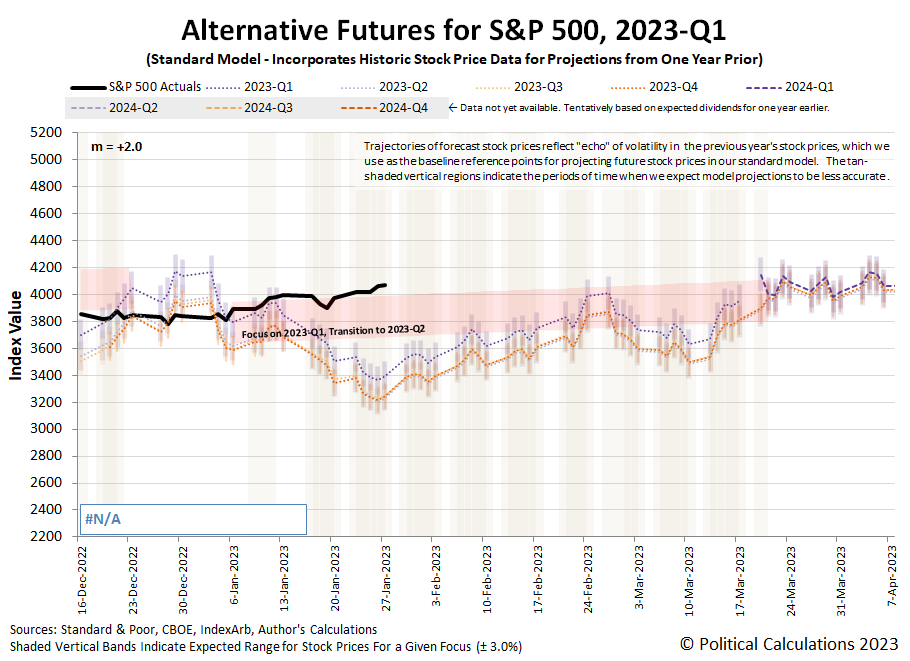
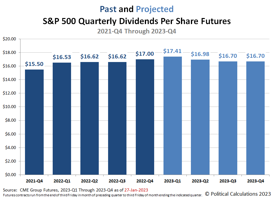
The dividend outlook for the S&P 500 (Index: SPX) in 2023 continued to improve. Combined with recent upward momentum, the index closed at 4,070.56, some 13.5% above its 12 October 2022 bottom, but still 15.1% below its 3 January 2022 record high peak.
Here's the latest update for the alternative futures chart, which indicates stocks running to the high side of the redzone forecast range. That level is consistent with investors focusing on the current quarter of 2023-Q1 in setting stock prices.
The dividend outlook in 2023 has continued to improve over the last two weeks. Here's the latest from the CME Group's S&P 500's quarterly dividend futures:
Meanwhile, the upcoming Federal Reserve's Open Market Committee meeting this week helps account for why investors are so focused on the current quarter of 2023-Q1, where the market-moving headlines point to expectations of a quarter point rate hike. The Federal Funds Rate is also currently projected to top out on or by the conclusion of the Fed's March 2023 meeting. Here are the past week's headlines:
- Monday, 23 January 2023
-
- Signs and portents for the U.S. economy:
- Fed minions want to stop subsidizing mortgage rates:
- JapanGov minions going into crisis management mode while BOJ minions fiddle around:
- ECB minions' messaging a mess with rate hikes on tap:
- European Central Bank to raise deposit rate to 3.25% by mid-year
- ECB policymakers spar on rate outlook beyond Feb hike
- Wall Street extends rally, powered by tech bounce
- Tuesday, 24 January 2023
-
- Signs and portents for the U.S. economy:
- OPEC+ panel unlikely to tweak oil policy at Feb. 1 meeting, sources say
- U.S. business activity still soft in early 2023, but outlook perks up
- Better than expected signs in the Eurozone:
- Bigger trouble developing in Japan:
- Wall Street edges lower as earnings kick into high gear
- Wednesday, 25 January 2023
-
- Signs and portents for the U.S. economy:
- Oil prices steady after smaller-than-expected U.S. crude build
- Analysis-Wall Street heavyweights warn of pain ahead despite market’s recent reprieve
- Central bankers still hiking rates:
- Bank of Canada hikes rates, becomes first major central bank to signal pause
- Thai central bank raises key rate as economy recovers, flags further hikes
- Australia inflation surges further in Q4, more rate hikes loom
- BOJ minions getting ready for new management:
- Japan PM Kishida to pick new BOJ chief while monitoring economy
- Japan cuts economic view as exports to Asia weaken
- ECB minions excited to keep rate hikes going:
- S&P 500 closes slightly red as weak corporate guidance fuels recession fears
- Thursday, 26 January 2023
-
- Signs and portents for the U.S. economy:
- Oil settles up 2% on strong U.S. data, China reopening
- U.S. economy posts strong growth in Q4, but with underlying weakness
- Bigger trouble developing in Asia:
- BOJ minions not sure which direction to turn, but ready to keep never-ending stimulus alive:
- BOJ policymakers divided on wage, inflation outlook, Jan meeting summary shows
- Borrowing to drive Japan's debt over 1,100 trillion yen for first time -draft
- Wall Street closes green as GDP data eases recession worries
- Friday, 27 January 2023
-
- Signs and portents for the U.S. economy:
- Oil prices settle lower on stronger supply outlook
- U.S. consumer spending ends 2022 on weaker footing; inflation slowing
- Fed minions expected to stop hiking rates in March 2023:
- Bigger trouble developing in the Eurozone:
- BOJ minions busy keeping never-ending stimulus alive despite inflation:
- BOJ deploys funds-supply tool again as yields creep up
- Consumer inflation in Japan's capital hits near 42-year high, keeps BOJ under pressure
- Wall Street ends higher, notches weekly gains as Fed meeting looms
The CME Group's FedWatch Tool still projects quarter point rate hikes at both the Fed's upcoming 1 February and 22 March (2023-Q1) meetings, with the latter representing the last for the Fed's series of rate hikes that started back in March 2022. The FedWatch tool then anticipates the Fed will hold the Federal Funds Rate at a target range of 4.75-5.00% through September 2023. After which, developing expectations for a U.S. recession in 2023 have the FedWatch tool projecting a quarter point rate cut in November (2023-Q4).
The Atlanta Fed's GDPNow tool's first projection for real GDP growth in the first quarter of 2023 is +0.7%, which would be a decline from the BEA's first estimate of 2.9% real GDP growth in the fourth quarter of 2022. GDPNow's final projection for real GDP growth in 2022-Q4 was 3.5%. We'll find out in a couple of months how close they got.
Investors have made Apple (NASDAQ: AAPL) worth more than $2 trillion dollars. But how profitable is the company?
That depends on how you measure profit. If you want a raw number, calculating a company's gross income is a good place to start. That's just the difference between its total sales and its total cost of goods sold, ignoring its other costs of doing business. This figure is useful for comparing the basic profitability of a company's core business with that of other companies like it. It's also useful if you track it over time. If you see a company's gross profit swinging wildly from one period to the next, that can be a sign its core business is either highly volatile or, in the worst case, is not well managed. Which if you're going to invest in the company, is probably something you ought to know.
As an investor however, that's not enough information to tell you how profitable the company really is. For that, you need to take its operating costs, how much it pays in interest expenses, how much it pays in taxes, and its other income and expenses into account. Doing that will tell you the company's net income (sometimes called its net earnings), which is the real bottom line. A company with positive net income is making money and a company with negative net earnings is losing money.
For comparing companies, you will find its useful to standardize these measures of profitability by dividing each by the company's total sales revenue and expressing the result as a percentage. For gross income, the result of that math is called the gross profit margin and for net income, the result is called the net profit margin. These percentages will let you directly compare the profitability of companies with very different amounts of profit. And of course, will let you assess trends in a single company's profitability performance if you follow it over time.
All that said, we've built a tool to make it easy for anyone to do this math. All you need is the business' income statement. In the tool below, the default data comes from Apple's December 2022 10-K SEC filing [also available in PDF format], so the tool's results will tell you just how profitable Apple was at the end of 2022. If you're reading this article on a site that republishes our RSS news feed, please click through to our site to access a working version of the tool.
Of course, you're more than welcome to substitute the financial data for other companies in the tool to assess their profitability.
We've made a point of the importance of tracking a company's gross and net profit margins over time, so to that end, we'd like to point you to a very useful resource. Macrotrends features an online application that will chart a company's gross, operating and net profit margins over its recent history using information from its database. Follow this link to see where they've done that for Apple's profit margins going back to December 2009.
Image Credit: Photo by Natasha Hall on Unsplash. The book being read in the photo is Profit First by Mike Michalowicz, which has the enchanting subtitle "Transform Your Business from a Cash-Eating Monster to a Money-Making Machine". At this writing, the book has 7,091 reviews on Amazon, with 85% giving it five stars. Goodreads gives it a 4.27 rating, 51% of which are five star reviews. Most of the critical reviews point out the whole concept of the book could be summarized in five pages or less. Or perhaps just one blog post, but that's a challenge for another day.
Labels: business, investing, personal finance, tool
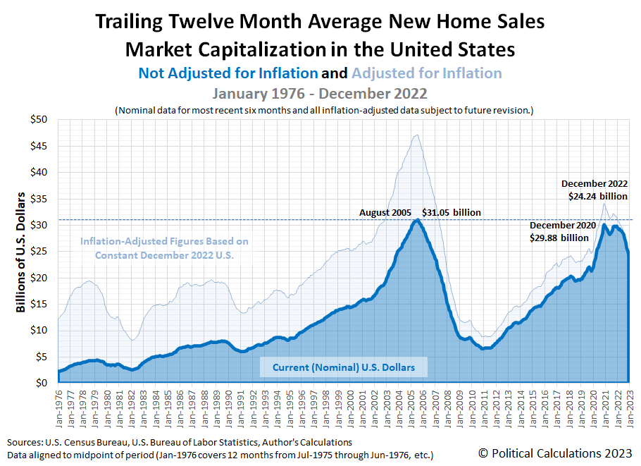
Political Calculations initial estimate of the market capitalization of the U.S. new home market is $24.24 billion in December 2022. That's 18.9% below the revised December 2020 peak of $29.88 billion, and month-over-month, represents a 3% reduction from November 2022's revised estimate of $24.99 billion (November 2022's initial estimate was $25.35 billion).
Here is the latest update to our chart illustrating the market capitalization of the new home market, which now covers 47 full years worth of monthly data from January 1976 through December 2022.
The following two charts show the latest changes in the trends for new home sales and prices:
Reuters misreads what's going on in the new home market:
Sales of new U.S. single-family homes increased for a third straight month in December as mortgage rates continued to decline, offering hope that the struggling housing market was starting to stabilize.
The problem with that assessment is that it only partially takes into account what's happening with how new home sales data from recent months is being revised. Since August 2022, the Census Bureau has been reporting substantial reductions in the number of sales with each revision. Here's is how these numbers have been changing each month, from initial through fourth estimate (these are seasonally adjusted annualized figures, indicating thousands of new homes sold):
- Aug 2022: 685, 677, 661, 646
- Sep 2022: 603, 588, 559, 550
- Oct 2022: 632, 605, 598
- Nov 2022: 640, 602
- Dec 2022: 616
The rightmost figures are either the final or most recent estimate. Based on this recent pattern for revisions, we anticipate December 2022's new sales total will be revised significantly lower than its initial estimate, almost certainly dropping it below the estimate for October 2022 and with a high probability of being reduced below November 2022's estimate.
Here's more from Reuters' report:
The Federal Reserve's fastest interest rate-hiking cycle since the 1980s has driven housing into recession. Falling mortgage rates have, however, raised hope that the housing market could soon stabilize, though at depressed levels.
The 30-year fixed mortgage rate declined to an average 6.15% last week, the lowest level since mid-September, according to data from mortgage finance agency Freddie Mac.
The rate was down form 6.33% in the prior week and has dropped from an average of 7.08% early in the fourth quarter, which was thi highest since 2002. But it remains well above the 3.56% average during the same period last year.
The median new house price in December was $442,100, a 7.8% increase from a year ago.
These figures refer to the raw figures provided in the U.S. Census Bureau's latest monthly report on new residential sales. That report also indicates the average new home sale price for December 2022 was $528,400.
References
U.S. Census Bureau. New Residential Sales Historical Data. Houses Sold. [Excel Spreadsheet]. Accessed 26 January 2023.
U.S. Census Bureau. New Residential Sales Historical Data. Median and Average Sale Price of Houses Sold. [Excel Spreadsheet]. Accessed 26 January 2023.
Labels: real estate
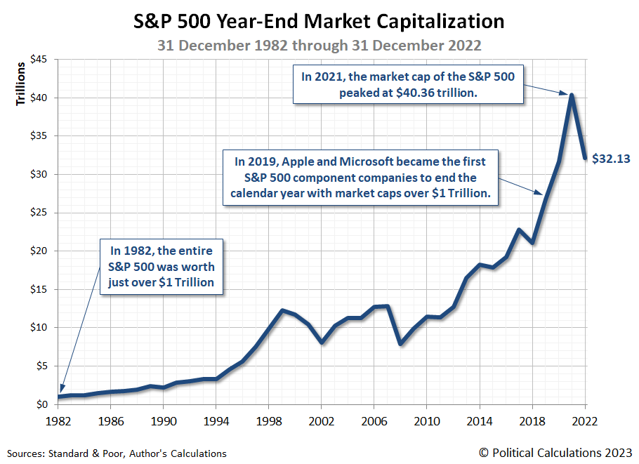
In 1982, the total market capitalization of the S&P 500 (Index: SPX) exceeded $1 trillion for the first time. In 2022, the index closed the year with a total market cap of $32.12 trillion.
The following chart tracks the four decades of the S&P 500's market cap history that constitutes its trillion dollar valuation years:
In 2019, some thirty-seven years after the value of the entire index first grew larger than $1 trillion, two of its component companies saw their market caps grow to exceed that level: Apple (NASDAQ: APPL) and Microsoft (NASDAQ: MSFT). Though the end of the 2022 calendar year, they're the only two companies of the index to sustain market capitalizations in excess of $1 trillion.
At the end of 2021, Apple's valuation was $2.9 trillion while Microsoft's market cap was $2.5 trillion, with the two companies combining for a $5.4 trillion valuation. At the end of 2022, Apple's market cap had faded to just under $2.1 trillion, while Microsoft's shrank below the $1.8 trillion mark. In between 2019 and 2022, Amazon (NASDAQ: AMZN) and Tesla (NASDAQ: TSLA) were brief members of the trillion dollar market cap club.
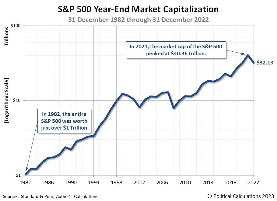
Since the first chart spans more than one order of magnitude, here's another chart presenting the same data using a logarithmic scale:
References
Silverblatt, Howard. S&P 500 Index Earnings. Standard and Poor. [Excel spreadsheet]. 31 December 2022. Accessed 21 January 2023.
Silverblatt, Howard. S&P 500 Top 10 Annual Issues by Market Value. Standard and Poor. [Excel spreadsheet]. 31 December 2022. Accessed 21 January 2023.
Labels: market cap, SP 500
Update 9 March 2023: Econbrowser's Menzie Chinn is, once again, irrationally upset. Here's what he's worked himself up about now as it applies to information that appears in this article:
According to the Treasury Department’s Bureau of the Debt (accessed on 3/8/2023), on January 20, 2023, gross federal debt was $31454980005742.4, and on January 20, 2021, it was $27751896236414.7. Using excel (so as to ensure no mistyping errors), I find the change in the two years to be $3703083769327.70, and not $3,695,343,467,324.62 (as indicated in the PoliticalCalculations blogpost he references). Since the January 20, 2023 number matches my figure, and the figure in the Treasury website, I can only conclude that he made a subtraction mistake. He also made a mistake in calculating the percentage growth rate. I obtain 13.3% (and not 11%) change. My advice – don’t trust the math in Independent Institute pieces.
We would like to thank Chinn for identifying the error. The real error we made traces back to 11 February 2021, when we incorrectly identified the U.S. government's total public debt outstanding for 20 January 2021 as $27.76 trillion. The figure we presented instead represents the total public debt outstanding from 22 January 2021 ($27,759,636,538,417.78). While the math presented in the remaining post is correct when using that figure, by omitting the first two days of President Biden's tenure in office, our analysis understates the full amount by which the nation's public debt outstanding increased by a very small percentage. Meanwhile, what he claims to be a mistake in calculating the percentage growth rate turns out to be something of a misdiagnosis on his part... keep reading to find out more!
But first, if you would like to know more about why Chinn is so irrationally upset at us, please do check out our Examples of Junk Science Series. The series features multiple examples Menzie Chinn unintentionally contributed through his self-destructive antics, including an example when he beclowned himself by failing to correctly diagnose a different error we made.
Back to the correction! Unlike Chinn, we acknowledge our errors and correct them. We've updated the following analysis to show the corrected results in (parentheses and boldface font) where you may hover your cursor over these to see the original figures we presented. We've also updated the chart accordingly (the original version is available here). As you'll see, other than the figure indicating the change in the national debt over two years, the corrections do not meaningfully affect the analysis.
You'll also see the 11% figure he quotes refers to the size of the national debt increase per household that, after the corrections, turns out to be more on the nose than we had previously presented! Chinn seems to be going back into his bag of deceptive junk science tricks in deliberately conflating the percentage change in national debt (13.3%), which we had never presented, with the percentage change in the national debt per household (10.9%, which rounds up to 11%) that we did present.
We wonder how James Hamilton feels about his co-blogger's strange sense of ethics and behavior.
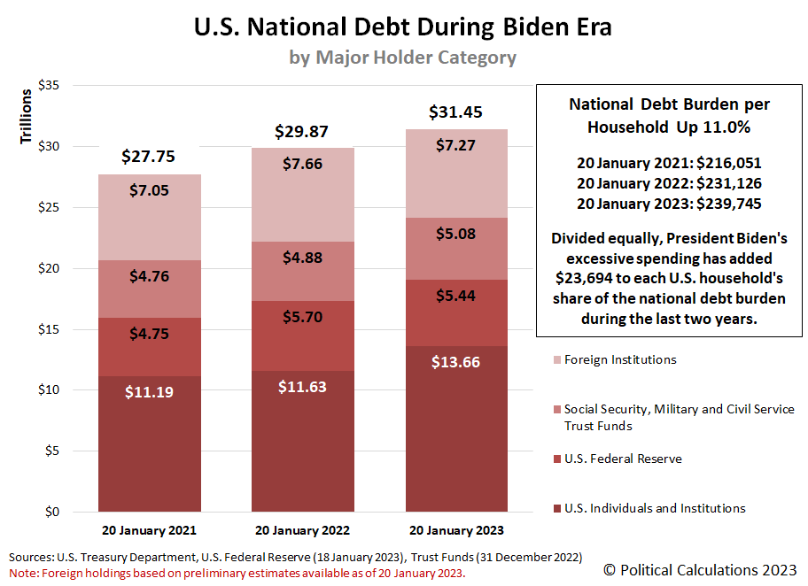
Friday, 20 January 2023 marked the second anniversary of President Biden's tenure in the White House. On that day, the U.S. government's total public debt outstanding reached $31,454,980,005,742.40. The only reason it isn't higher is because the U.S. Treasury Department hit the nation's statutory debt ceiling the day before.
But that's not the real story. The more important story is the growth of the U.S. national debt during the last two years. That debt has increased by ($3,703,083,769,327.63) since 20 January 2021.
Large numbers like that can be difficult to grasp, so let's bring them down to a more human scale. If you divided the U.S. government's total public debt outstanding equally among every household in the U.S. two years ago, each would be responsible for paying the U.S. government's creditors ($216,051). Two years later, the national debt burden per household has grown to $239,745. The increase per household is ($23,694), or (11.0%), which of course, would be on top of whatever other debt each household has.
That increase is the equivalent of buying 131,202,000 American households a brand new 2023 Suburu Impreza! More on that metaphor in a bit....
We've visualized the growth of the U.S. national debt during the Biden era in the following chart. In the chart, we've also identified the U.S. government's creditors by major category:
Here's the big question. Would American households be better off if President Biden actually did buy each a brand new Suburu Impreza instead of what he actually bought with all that newly borrowed money?
Or rather, did Americans get anything of real value to show from President Biden's debt-fueled spending and what it has wrought?
References
U.S. Census Bureau. Historical Households Tables. Table HH-1. Households by Type: 1940 to Present. [Excel Spreadsheet]. 10 November 2022. Accessed 23 January 2023.
U.S. Treasury Department. Debt to the Penny. [Online Database]. 20 January 2023. Accessed 23 January 2023.
U.S. Treasury Department. Major Foreign Holders of Treasury Securities. [Online Data Text File]. 18 January 2023. Accessed 23 January 2023.
U.S. Treasury Department. Monthly Treasury Statement of Receipts and Outlays of the United States Government for Fiscal Year 2022 Through December 31, 2022. [PDF Document]. 12 January 2023. Accessed 23 January 2023.
Labels: inflation, national debt, personal finance
The S&P 500 (Index: SPX) ended the week down 26.48 points from the previous Friday, closing at 3,972.61.
In between the two Fridays, the index dipped and recovered, but otherwise experienced an uneventful week.
We find the level of the S&P 500 is consistent with investors holding their focus on 2023-Q1, which itself is consistent with the expecting timing of the peak of the Federal Reserve's ongoing series of rate hikes. Meanwhile, here are the week's not-so market moving headlines, which reinforce why investors are holding their focus on the current quarter of 2023-Q1:
- Tuesday, 17 January 2023
-
- Signs and portents for the U.S. economy:
- Oil prices hit two-week highs on hopes of China demand rebound
- U.S. household spending gains moderated in December, NY Fed says
- New York state manufacturing plunges in January
- Fed minions suddenly gripped by grasp of the obvious:
- Barkin: Terminal rate for Fed depends on path of inflation -Fox Business
- Fed's Williams: Making economy inclusive has benefits for overall activity
- Bigger trouble developing in China:
- China's 2022 economic growth one of the worst on record, post-pandemic policy faces test
- China's 2022 property investment falls for first time since 1999
- China Dec industrial output up 1.3%, retail sales down 1.8%
- Less trouble than expected developing in the Eurozone:
- German economy expected to contract slightly in 2023 - BDI
- German economy minister: recession threatening Europe manageable
- BOJ minions rethinking never-ending stimulus policies:
- ECB minions thinking about smaller rate hikes:
- Goldman, Travelers drag Dow lower as earnings season picks up
- Wednesday, 18 January 2023
-
- Signs and portents for the U.S. economy:
- U.S. mortgage interest rates fall to lowest levels since September - MBA
- Heavy slate of U.S. oil refinery overhauls to crimp fuel output
- U.S. retail sales post biggest drop in a year; inflation retreating
- U.S. firms pessimistic about economic growth this year, Fed survey shows
- U.S. manufacturing output tumbles in December
- Fed minions say 5% and/or bust, ready for smaller rate hikes, and that Fed has no problems from how its structured:
- Fed policymakers call for target interest rate above 5% to beat inflation
- Fed's Harker says ready to downshift to 25-basis-point rate hikes
- Fed's Bullard urges colleagues not to "stall" on remaining rate increases
- Fed's current structure has boosted public confidence, George says
- BOJ minions have their hands full sustaining never-ending stimulus:
- Bank of Japan keeps yield control policy unchanged
- Yen lower as BOJ sticks to ultra-easy policy, losses trimmed
- Analysis-Japan's yen feels the heat from hard-line BOJ policy
- Quotes: BOJ Governor Kuroda's comments at news conference
- ECB minions long for days of 2% inflation:
- Wall St closes lower after weak data, hawkish Fed comments
- Thursday, 19 January 2023
-
- Signs and portents for the U.S. economy:
- https://www.reuters.com/article/usa-economy-kemp/column-u-s-manufacturing-has-probably-entered-recession-kemp-idUSKBN2TY1J7
- U.S. labor market still tight; housing mired in recession
- U.S. hits debt ceiling amid standoff between Republicans and Democrats
- Oil prices rally to highest close since Dec. 1 on China optimism
- Fed minions, U.S. big bank trying hard to sell higher than 5% interest rates, Fed minions claims they'll deliver 'soft landing' recession:
- Fed 'probing' for right rate level as prospects rise for 'soft landing'
- Fed's Collins sees U.S. interest rate hike peak "just above" 5%
- JPMorgan CEO Dimon sees interest rates going beyond 5% - CNBC
- Fed's Brainard says data may be aligning for 'soft landing' scenario
- Post-Zero-Covid lockdown recovery, more stimulus developing in China:
- Chinese companies set for biggest earnings growth in 5 years in 2023-Refinitiv data
- China seen keeping benchmark lending rates unchanged for fifth month
- Signs of bigger trouble still developing in China:
- Central bank minions signal they're mostly done with rate hikes:
- Indonesia central bank signals end of rate hike cycle as inflation cools
- Taiwan central bank debated larger rate hike, minutes show
- BOJ minions thinking about ending never-ending stimulus:
- BOJ may raise yield cap again by mid-year, says academic Ito
- Analysis-BOJ bullishness on wages suggests days of super-low rates are numbered
- ECB minions thinking more about bigger rate hikes:
- Wall St slips as labor market data fuels Fed worry
- Friday, 20 January 2023
-
- Signs and portents for the U.S. economy:
- Oil settles up more than 1% on China demand outlook, second weekly gain
- U.S. home sales drop to 12-year low; price growth cools
- Fed minions signal smaller rate hike ahead:
- Fed's Waller, citing "good news," backs quarter-point increase at next meeting
- Fed can likely slow runoff as bank reserves near 10% to 11% of GDP
- Bigger trouble developing because of China:
- Central bank rate hikes expected to sputter out:
- Smaller Fed rate hike may augur end to 'ongoing' increases
- BoC to raise rates by 25 bps to peak of 4.50% on Jan. 25: Reuters poll
- BOJ minions determined to keep never-ending stimulus alive despite inflation:
- BOJ's Kuroda vows to keep ultra-loose policy
- BOJ may have crafted new tool for post-YCC era - analyst
- Japan's consumer inflation hits fresh 41-year high, keep BOJ in focus
- ECB minions signal more half point rate hikes ahead:
- Wall Street rallies to end higher on Alphabet, Netflix lift
The CME Group's FedWatch Tool continues to project quarter point rate hikes at both the Fed's upcoming 1 February and 22 March (2023-Q1) meetings, with the latter representing the last for the Fed's series of rate hikes that started in March 2022. The FedWatch tool then anticipates the Fed will hold the Federal Funds Rate at a target range of 4.75-5.00% through September 2023. After which, developing expectations for a U.S. recession in 2023 have the FedWatch tool projecting quarter point rate cuts in both November and December (2023-Q4).
The Atlanta Fed's GDPNow tool's latest projection for real GDP growth in the fourth quarter of 2022 dropped +3.5% from last week's +4.1% estimate. Meanwhile, the so-called "Blue Chip" consensus forecast anticipates a +1.7% growth rate. The BEA will issue its first estimate of 2022-Q4's GDP later this month, on Thursday, 26 January 2023.
How can you train an AI?
By AI, we're referring to "artificial intelligence" systems, which are a special class of machine learning computer programs that are increasing showing up in some pretty amazing applications. Whether its generating an image based on text you enter or nearly instantaneously writing the equivalent of a school report on a particular subject, AI systems are leaving the world of science fiction and becoming today's reality.
But how do their developers train these systems to do these things?
Last year, Matt Parker visited Antartica, where he learned how to apply maths to identify specific humpback whales. The following 22-minute video describes how the mathematical methods developed for advanced image recognition made it possible for him to use an Excel spreadsheet to identify a specific whale he photographed swimming off the north coast of Antartica*.
Clearly, AI can deliver impressive results, but how far can you trust those results?
One area where photo-recognition AI systems could make a real impact is in radiology, where such systems could potentially diagnosis serious health conditions much more quickly at much lower cost than can be done by professional radiologists.
A recent study published in the British Medical Journal (BMJ) asked if AI could pass the Royal College of Radiologists' board examination. Spoiler alert: It couldn't, where why it couldn't tells us something about the limitations of these AI deep maching learning systems. Chuck Dinerstein of the American Council on Science and Health summarizes the study's main findings, in which the performance of AI-trained systems and human radiologists were compared (emphasis ours):
First, the obvious, with two exceptions, humans did better than the AI on diagnosis where both had been trained; when unfamiliar pathology was introduced, AI failed across the board. Second, while the humans fared better, theirs was not a stellar performance. On average, newly minted radiologists passed 4 of the ten examinations.
“The artificial intelligence candidate... outperformed three radiologists who passed only one mock examination (the artificial intelligence candidate passed two). Nevertheless, the artificial intelligence candidate would still need further training to achieve the same level of performance and skill of an average recently FRCR qualified radiologist, particularly in the identification of subtle musculoskeletal abnormalities.”
The abilities of an AI radiology program remain brittle, unable to extend outside their training set, and as evidenced by this testing, not ready for independent work. All of this speaks to a point Dr. Hinton made in a less hyperbolic moment.
“[AI in the future is] going to know a lot about what you’re probably going to want to do and how to do it, and it’s going to be very helpful. But it’s not going to replace you.”
Here's the kicker according to Dinerstein:
We would serve our purposes better by seeing AI diagnostics as a part of our workflow, a second set of eyes on the problem, or in this case, an image. Interestingly, in this study, the researchers asked the radiologists how they thought the AI program would do; they overestimated AI, expecting it to do better than humans in 3 examinations. That suggests a bit of bias, unconscious or not, to trust the AI over themselves. Hopefully, experience and identifying the weakness of AI radiology will hone that expectation.
Like any human expert, AI has limitations. Identifying and knowing what those limitations are will be key to determining how trustworthy they are. In the case of health care, as the example from radiology makes clear, it could be your health that's on the line if you blindly put more trust into a system than it deserves.
Reference
Shelmerdine, S.C.; Martin, H.; Shirodkar, K.; Shamshuddin, S.; Weir-McCall, J.R. "Can artificial intelligence pass the Fellowship of the Royal College of Radiologists examination? Multi-reader diagnostic accuracy study." BMJ 2022; 379. DOI: 10.1136/bmj-2022-072826. (Published 21 December 2022).
* If you know your geography, you already knew every coast of Antartica is the north coast!...
Labels: ethics, health care, ideas, math, technology
Campbell's Condensed Tomato Soup is one of America's most iconic consumer products. First introduced to American consumers by Campbell Soup (NYSE: CPB) in 1898 after having been formulated by John Dorrance the year before, it now ranks as the company's second-most popular soup, selling 85 million cans each year.
That's quite an achievement for a 126 year old product. Campbell Soup sells 440 million cans of soup each year, so its sales of tomato soup represent over 19% of its sales. Only the company's Chicken Noodle soup, introduced in 1934, outsells it with annual sales of more than 250 million cans.
Political Calculations has tracked the price history of Campbell's Condensed Tomato Soup over the past 126 years because of its remarkable consistency as an identifiable product over time. In fact, if you had a time machine and could travel to nearly any point in time from January 1898 to the present, you could likely find a 10.75 ounce size (Number 1) can of Campbell's condensed tomato soup stocked for sale in American grocery stores.
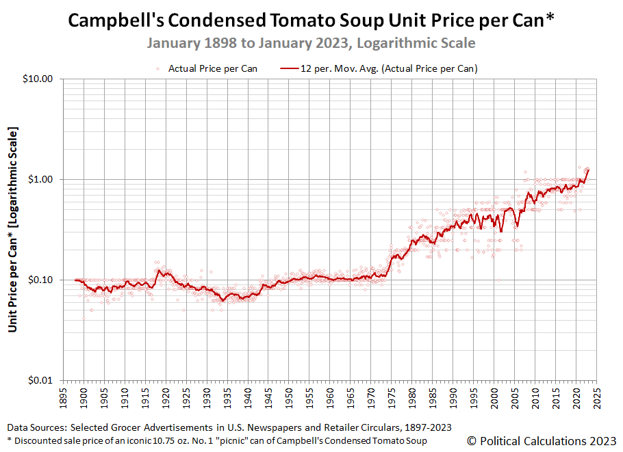
That long-running consistency makes Campbell's Condensed Tomato Soup an ideal product to follow to understand how inflation has affected American consumers through its history. Today, we're updating our chart visualizing that history from January 1898 through January 2023.
For the latest in our coverage of Campbell's Tomato Soup prices, follow this link!
In January 2023, we find the prevailing average sale price for this food product over the past 12 months is $1.23 per can. That figure has risen by over 29% from the trailing 12 month average of $0.95 per can we recorded in January 2022.
We've seen a major change over the past two years with respect to the discounted sale pricing of Campbell's Condensed Tomato Soup by U.S. retailers. Discounting of its sale price has become both smaller and less frequent. Before March 2021, which marks Month 0 for when President Biden's inflation got started, it was rare to see the regular sale price of a can of Campbell's Condensed Tomato Soup above one dollar. In January 2023, that's now the lowest price at which American consumers can buy a can, where it has been temporarily reduced to that level by Kroger-affiliated grocery stores from their regular sale price of $1.29 per can during the week of 10 January through 17 January 2023.
Here's the January 2023 update for our periodic sampling of Campbell's Condensed Tomato Soup sale prices at 10 major U.S. grocery-selling retailers, where we're indicated the change in price since our previous update in October 2022:
- Walmart: $1.26/each, unchanged
- Amazon: $1.59/each, increase of $0.33 (+26.2%)
- Kroger: $1.00/each, decrease of $0.29 (-22.5%)
- Walgreens: $1.99/each, unchanged or $1.50/each when you buy two cans
- Target: $1.39/each, unchanged
- CVS: $2.29/each, increase of $0.50 (+27.9%)
- Albertsons: $1.29/each, unchanged
- Food Lion: $1.25/each, unchanged
- H-E-B: $1.29/each, decrease of $0.01 (-0.8%)
- Meijer: $1.29/each, unchanged
Prices of Campbell's Condensed Tomato Soup are converging toward a level of $1.25-$1.30 per can. We anticipate the trailing 12 month average price will breach the lower end of that range in February 2023.
When it does, it will cost 12.5 times more than the original price American grocery shoppers paid when Campbell's began selling their just-invented condensed soup products in 1898. Because its price history now spans more than a full order of magnitude, showing the price history in logarithmic scale gives a better sense of how much and when inflation has affected the prices American consumers pay for a can of Campbell's Condensed Tomato Soup.
If you're wondering how Campbell Soup is weathering President Biden's inflation, here's an excerpt of Briefing.com's report on the company's most recent quarterly results:
Campbell Soup reports a "soup-er" quarter as higher prices and supply chain fuel results (CPB)
Campbell Soup (CPB +5%) started off FY23 on a "mmm...mmm" good note. The food giant reported strong upside with its Q1 (Oct) results for both EPS and revs. What is notable is that this was CPB's largest EPS beat in the past two years. The company also increased FY23 guidance, although the Q1 upside accounts for much of that. CPB had been dealing with higher inflation for input costs but seems to have finally gotten a handle on it....
In sum, the very strong results were fueled by a combination of inflation-driven pricing and supply chain / productivity improvements. Also, the underlying trend of people cooking more at home seems to be pretty durable. We had concerns that consumers would revert to eating out more but it seems saving money by eating at home is a key trend right now. CPB has been plagued in recent quarters by having to absorb higher food input costs. CPB has announced price increases in the past, but they take time to impact the P&L. However, this Q1 report shows that higher selling prices have finally caught up to offset these costs.
Indeed they have.
Previously on Political Calculations
Political Calculations' analysis of Campbell's Tomato Soup dates back to 2015! Along the way, we've filled in the gaps we had in the historic price data and have explored America's second-most popular soup from a lot of different angles.
- The Price of Campbell's Tomato Soup Since 1897 (2015)
- The Tomato Soup Standard (2015)
- The First Ad Ever for Campbell's Condensed Tomato Soup (2015)
- War and Soup (2015)
- Working Backwards from Retail to Cost (2015)
- Early Advertising Milestones for Campbell's Condensed Soups
- Updated: The Price of Campbell's Tomato Soup Since 1897 (2016)
- Everyday Low Prices (2017)
- Soup and Recession (2017)
- Soup and Steel Tariffs (2018)
- Tomato Soup, Oil and Inflation (2018)
- Celebrating 150 Years of the Campbell's Soup Company (2019)
- The Price History of Campbell's Tomato Soup (2020)
- Campbell's Tomato Soup Sales Soar as Americans prep for Home Quarantines (2020)
- Campbell's Soup Presents "The Magic Shelf" (2020)
- The Price of Campbell's Tomato Soup in the Coronavirus Pandemic (2021)
- The Pandemic Price Escalation of Campbell's Tomato Soup (2021)
- Shrinkflation and a New Tool to Track Price Inflation in Real Time (2021)
- Absence of Discounts Confirms Tomato Soup Inflation (2021)
- The Ship of Theseus and Campbell's Tomato Soup (2021)
- The S&P 500 and Campbell's Tomato Soup (2021)
- Upward Price Pressure at the Start of Soup Season (2021)
- Recent Price Trends for Campbell's Tomato Soup (2021)
- The Price History of Campbell's Tomato Soup (2022)
- Campbell's Tomato Soup Prices Explode Higher (2022)
- Major Grocers Continue Hiking Tomato Soup Prices (2022)
- Campbell's Tomato Soup Prices Keep Escalating (2022)
- Campbell's Soup to See Third Wave of Price Increases (2022)
- Amazon Hikes Campbell's Tomato Soup Prices (2022)
- Cost of Campbell's Tomato Soup Keeps Rising (2022)
- The Price History of Campbell's Tomato Soup (2023)
Welcome to the blogosphere's toolchest! Here, unlike other blogs dedicated to analyzing current events, we create easy-to-use, simple tools to do the math related to them so you can get in on the action too! If you would like to learn more about these tools, or if you would like to contribute ideas to develop for this blog, please e-mail us at:
ironman at politicalcalculations
Thanks in advance!
Closing values for previous trading day.
This site is primarily powered by:
CSS Validation
RSS Site Feed
JavaScript
The tools on this site are built using JavaScript. If you would like to learn more, one of the best free resources on the web is available at W3Schools.com.
