Every now and again, we come across a new (to us) utility on the web that changes how we look at things. Worldmapper does that quite literally with cartograms! The site is dedicated to producing maps of the nations of the world, where the size of each nation is presented to be in proportion to an area of interest, such as population, tourism, etc. (HT: Mahalanobis).
Because we couldn't resist, here's a quick walkthrough of some of the maps available through Worldmapper:
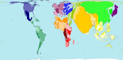
The World as We Best Know It
The most familiar cartogram is one that shows the distribution of land area by nation - in other words, a world map!":

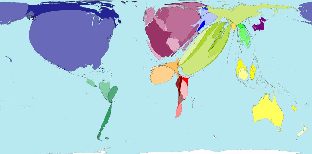
Where the People Are
The total population cartogram emphasizes the nations where the greatest number of people live in the world:
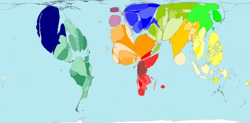
Where People Want to Live
The following cartogram emphasizes the nations having the greatest inflow of immigrants. The United States receives 37.1% of the net total for the world!:
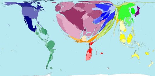
Where People Are Moving From
This cartogram emphasizes the nations that have the greatest net emigration. Current world champion: Mexico:
Where People Only Want to Visit
By far, the nations of Western Europe top the list of the world's preferred tourist destinations:
Where People Are Being Forced Out
The cartogram below illustrates the nations that are producing the greatest number of refugees:
