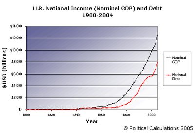
The seeming-to-be-ever-growing size of the U.S. National Debt was in the news just a little over a month ago, as it has been estimated to have just recently passed the $8.0 trillion USD mark (back on October 18, 2005). We here at Political Calculations thought it might be fun to look at the national debt through the last 105 years, so we can compare it to the United States’ national income (as measured by nominal GDP, which has recently crossed the $12.5 trillion USD mark). The following chart shows both figures through the years, with the black line representing U.S. nominal GDP and the red line representing the United States’ national debt:
What’s important in looking at this chart is the vertical spread between national income and national debt. We can see that the spread has widened over time, which is a positive trend – it shows that the growth of national income is outpacing the growth the national debt. The best years for this trend occurred in the late 1990s, as the U.S. ran budget surpluses (keeping the national debt from growing), but an important factor to note is that this trend has continued to the present day as the pace of economic growth has generally been greater than the growth of the nation's debt.
More information:
U.S. National Debt
U.S. Nominal Gross Domestic Product (GDP)
- U.S. Bureau of Economic Analysis, GDP Estimate (9/30/2005)
- Economic History, Nominal GDP 1900-2004
