Following our most recent post looking at the current trends in U.S. median new home sale prices, we were forwarded the following question:
"Can you quickly and easily 'real dollar' this chart?"
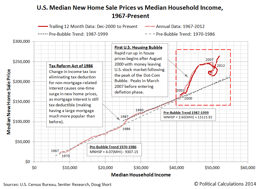
By "this chart", our inquisitor is likely referring to the following chart, showing the overall trend for median new home sale prices with respect to median household income since 1967:
And the answer to their question is: "Why, yes we can!"
It's not as pretty as our nominal value chart, which better describes the world in which people actually live and buy things, but it does clearly show housing prices defying the post-2000 recession as real median incomes fell during the first U.S. housing bubble, and again at present in the second U.S. housing bubble, as median new house prices began rising in 2011, but with no meaningful increase in median incomes to support them.
As for what a non-bubble driven housing market looks like, since we've already demonstrated that household income is *the* primary driver of home prices, we should see a close coupling between median incomes and median sale prices, with both either rising or falling at rates consistent with those observed over extended period of time.
That we're instead seeing nearly vertical movements for prices with respect to household income indicates that other factors have created a situation where housing is becoming increasingly unaffordable.
After all, if the families who earn the median household income are increasingly unable to afford the median price of new homes for sale, something other than the fundamental driver of house prices is seriously skewing the real estate market.
And history tells us that the other factors that can affect home prices do not have any significant "staying power".

