Six. Twelve. Nineteen.
For those who have had COVID-19, those are the median number of days you would need to subtract from the date they...
- experienced symptoms and went to be tested, or
- became sick enough to be admitted to hospital, or
- passed away if they became especially sick,
... in order to determine approximately when they first became infected by the SARS-CoV-2 coronavirus.
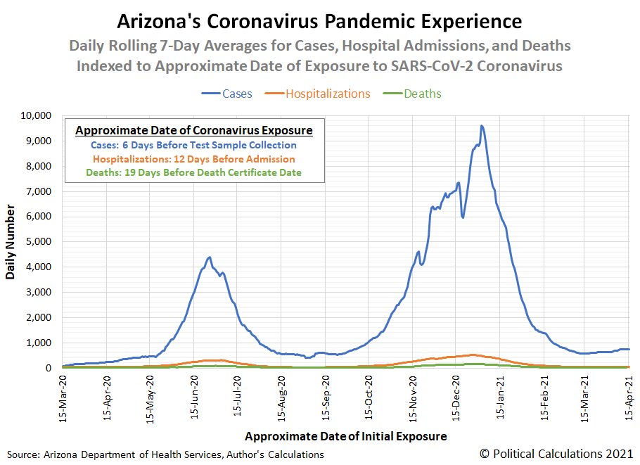
We're going to drive home the significance of those numbers using Arizona's detailed data for COVID cases, hospital admissions, and deaths, where we should see the peaks in the data for each these outcomes synchronize. Here's the graphical result of the math:
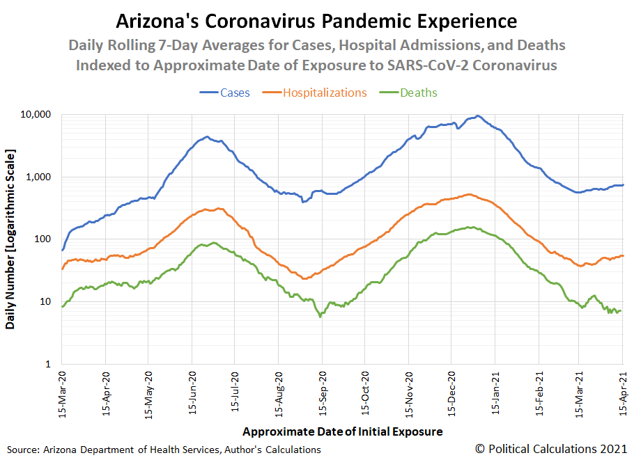
In this visualization, the relative scale of cases, hospitalizations, and deaths make it tough to see the pattern in the data. In the following chart, we're showing the exact same data, but using a logarithmic scale to better illustrate the synchronized pattern.
Using the logarithmic scale lets us compare data that differs by orders of magnitude. For COVID-19, the daily number of those testing positive in Arizona often ranged in the thousands, while the number of those admitted to hospital peaked in the hundreds, and the number of deaths could be counted by tens.
Taking noise in the data into account, the synchronization pattern is fairly strong between all three sets of data when indexed to date of initial viral exposure.
There is an interesting pattern when comparing the timing of troughs for deaths when compared to the other two howver, where the the trend for deaths continue downward for a short period after the trends for cases and hospitalizations have reversed and begun tracking upward. We think this characteristic might be attributable to the age demographics of those being exposed to COVID-19, with older individuals more at risk of dying from COVID lagging in initial exposure behind younger individuals.
We also think the data for deaths is subject to considerably greater noise at low levels than the other datasets, especially when its daily numbers drop down toward single digits. This characteristic can been seen in the short-term trough coinciding with 15 September 2020 and a short-term spike in deaths occurring in late March 2021.
We're featuring this data visualization exercise today because we haven't seen anyone else present COVID data this way anywhere else, and because it will be helpful in answering a different question we have, which we'll feature in upcoming weeks!

