What separates the top teams in the National Basketball Association from the bottom teams in the league?
If you answered "their scores", you're right. But you might be surprised by how seemingly little difference there is between teams.
The offensive performance of NBA teams can be summarized in a figure known as the offensive rating. This statistic combines several different scoring statistics into a single measure that can be used to rank teams. According to the available data at StatMuse, at this point of the NBA's 2023-2024 season, the Boston Celtics have the highest offensive rating of 122.5, while the Detroit Pistons have the lowest at 111.6. If you've been paying attention to the NBA season, that these teams are in their respective positions should sound about right. The Celtics are recognized as a dominant team while the Pistons would be at high risk of being sent down to a lower league if European-style relegation existed for U.S. sports leagues.
But as we're about to show, the two teams have some very similar statistics. The data below shows their offensive output on several different categories of scoring for the 2023-2024 season through Sunday, March 9, 2024.
Boston Celtics:
- Points per game (PPG): 120.8 points per game, most in the NBA.
- Field Goals Made (FGM): 43.8 field goals per game, fifth overall and 48.5% of their attempts.
- Three-Pointers Made (3PM): 16.2 three-pointers per game, 38.5% of their attempts and best in the NBA.
- Free Throws Made (FTM): 17.0 free-throws per game, 80.8% of their attempts, ranking 17th in the NBA.
Detroit Pistons:
- Points per game (PPG): 112.4 points per game, tied for fifth-lowest in the NBA.
- Field Goals Made (FGM): 41.9 field goals per game, 47.1% of their attempts and ninth-lowest in the league.
- Three-Pointers Made (3PM): 11.3 three-pointers per game, 35.6% of their attempts and second-lowest in the NBA.
- Free Throws Made (FTM): 17.3 free-throws per game, 78.4% of free-throws attempted, tenth-lowest among NBA teams.
Only 8.4 points per game separates the two teams' overall averages. They are within two baskets per game of each other when considering field goals and free-throws, where they even have very similar shooting percentages. Where they differ most is three-point shots. On average, the Boston Celtics successfully make five more three-point shots per game than the Detroit Pistons do.
That single statistic goes a long way to explaining why the Celtics have the highest offensive rating in the NBA and why the Pistons have the lowest, despite the two teams scoring on 38.5% and 35.6% of their respective three-point attempts. With such a similar percentage of successful attempts, that means the Celtics higher number of successful three-point shots per game is based on their ability to attempt more of these shots than the Pistons are able to. That ability is the key to the Celtics offensive dominance during the 2023-2024 season.
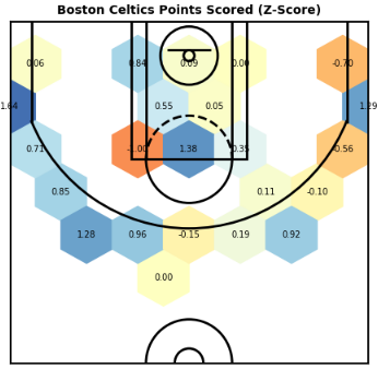
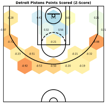
If only there were a great way to visualize that respective dominance. Over at Reddit's r/dataisbeautiful, Solid_Example7519 has put together a fantastic heat map graphic to illustrate how every team in the NBA compares to each other in their ability to score from different parts of the court at about the time of the NBA's All Star Game. We've excerpted the following charts for the Boston Celtics and the Detroit Pistons to show them next to each other:
Here's how Solid_Example7519 describes what the data visualization shows:
Blue is good, red is bad....
I calculated how many points every team got in each position on the court and then normalised it using a Z-score (0 means they got an average number of points, a score of 1 is one standard deviation above meaning top 16%, 2 is two standard deviations and means they are in the top 2.5%)....
I filtered it to be only the coordinates where a team scored at least 5 points, and so if there are no points within a hexagon with more than 5 points then it is blank. This was to make it easier to read and draw meaning from i.e. because these empty spots had teams scoring very few points in them, it meant they got a really really low score, while teams only had to score relatively few points to be seen as disproportionately good there....
It is relative to other teams, so a high z-score on the three-pointer line means that they score more points there relative to other teams.
The individual team charts also emphasize the extent to which the three-point shot affects how professional basketall is played in 2024. The mostly empty hexagonal grids that fall between the key and the three-point line confirm that nearly all teams have bought into the strategy of either going in close to score field goals or shooting from a distance to collect higher points, even though they score less often per attempt.
Comparing Boston to Detroit again, we see the Celtics are highly at the three point line from the left hand side of the court. The Detroit Pistons, on the other hand, are best around the basket itself, but are very weak along the entire arc of the three-point line.
We'll close by pointing again to Solid_Example7519's entire chart, but please do click through to the r/dataisbeautiful post to find out more about how it was generated.
Previously on Political Calculations
Image credits: Brown and Black Basketball photo photo by Kylie Osullivan on Unsplash. NBA 2023-2024 Heat Map by u/Solid_Example7519 on r/dataisbeautiful. Used with permission.


