I realize that I’m treading on the Skeptical Optimist’s turf here, but since I’ve been playing with the U.S. National Debt and National Income data, it was just a matter of time! As the Skeptical Optimist would note, the ratio of a nation's debt to its income (as measured by its nominal Gross Domestic Product) provides a better picture of its overall fiscal health than looking at the level of each on its own. The following chart shows the ratio of the U.S.' Debt-to-Income (DTI) ratio from 1900 to 2005:

The values in this chart differ from those offered by the Skeptical Optimist largely due to the data having been drawn from different sources. Using Political Calculations' data source, we show the U.S.' DTI ratio to be 63%, while the Skeptical Optimist showed a DTI ratio of 65.2% for the most recent data. Regardless of the exact level, the main fact immediately evident from the chart, as it concerns us today, is that U.S.' DTI ratio has been essentially stable in its current range (between 57.3% and 67.2%) since the early 1990s.
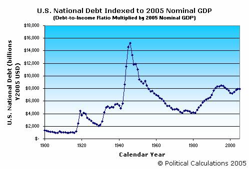
Calculating the Debt-to-Income ratio can be valuable since it provides a quick way to calculate an equivalent level of debt in terms of a given year's nominal GDP for any other year. For example, how much debt, in today’s economy, would the U.S. have to have in order to match its all time high DTI ratio of 121.2% in 1946? We can find out quickly by multiplying the Debt-to-Income ratio by the value of U.S. Nominal GDP in 2005: $15,258 billion USD! The following chart shows this math for every year from 1900 through 2005: