Just when you thought Political Calculations was done milking this whole national income/national debt thing, we're back with a vengeance, and now, we're taking inflation into account!
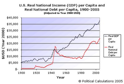
The following chart shows the national income adjusted for inflation (Real National Income) and the national debt adjusted for inflation (Real National Debt), both on a per capita basis and adjusted to Year 2000 U.S. dollars. Why Year 2000 dollars you ask? We originally did this exercise running from 1900 through 2000 – indexing to Year 2000 dollars meant only adjusting 5 additional years worth of figures, rather than having to go back and adjust 104 years worth of figures to Year 2005 dollars!
The cool thing about this chart is that we can easily track some major events in U.S. history. In looking at the upper (except for 1944-1948) black line, showing Real National Income per Capita, we can see the economic history of the United States – every recession, depression, hiccup, turnaround and boom year from 1900 to 2005. In looking at the mostly lower (except for 1944-1948) red line, showing the Real National Debt per Capita, we can track the major priorities of the American people through the years as determined by what the U.S. federal government was willing to take on debt to achieve.
Events Corresponding to Major Changes in Real National Income
Dips in the black line showing the Real National Income per Capita correspond with recessions, with the largest beginning in 1929 and not regaining the level it achieved in this year until 1939. In the post-World War II era, we see dips that correspond to the oil shock of 1973, the stagflation of the late 1970s, with the major recession that began in 1979 and didn't end until the Reagan boom years began in 1982. We can also see the mini-recession of 1991-1992, the boom years of the 1990s, the popping of the economic bubble in 2000, the recession that followed, and finally, the new boom years leading to where we are today.
Events Corresponding to Major Changes in Real National Debt
Looking at the red Real National Debt per Capita line, we can see the first spike that occurred with the United States' entry into World War I beginning in 1917, the massive spike that corresponds with World War II (which also saw the national debt exceed the national income), the large increase in national debt taken on in the 1980s that is directly tied to rebuilding the U.S. military following nearly a decade of under-investment to seriously take on the Soviet Union in the Cold War, the winning of the Cold War with the deceleration and reversal of the national debt in the 1990s, and finally the beginning of the current War on Terror in 2001 with the beginning of a new series of increases in the level of Real National Debt per Capita, once again coinciding with a reversal in a decade of under-investment in the U.S. military.
For more information about where the numbers in the chart came from, see the following posts, which provide links to the original sources:
- Looking at the U.S. National Debt on a Personal Level
- Picturing the National Debt
- Estimating the U.S. Population
The adjustment of nominal values to Year 2000 dollar amounts was done using the method outlined by Robert Sahr of Oregon State University in Consumer Price Index (CPI) Conversion Factors 1800 to estimated 2015 to Convert to Dollars of 2000.
Labels: national debt
Welcome to the blogosphere's toolchest! Here, unlike other blogs dedicated to analyzing current events, we create easy-to-use, simple tools to do the math related to them so you can get in on the action too! If you would like to learn more about these tools, or if you would like to contribute ideas to develop for this blog, please e-mail us at:
ironman at politicalcalculations
Thanks in advance!
Closing values for previous trading day.
This site is primarily powered by:
CSS Validation
RSS Site Feed
JavaScript
The tools on this site are built using JavaScript. If you would like to learn more, one of the best free resources on the web is available at W3Schools.com.
