Welcome to a new series of Inventions in Everything! The IIE team is rested and ready to plunge once again into the amazing world of human ingenuity, featuring some of the most unbelievable inventions that have ever been devised.
Unbelievable may be an understatement for today's featured invention, for which U.S. Patent No. 3,216,423 was issued to inventors George and Charlotte Blonsky on 9 November 1965.
That date is key for understanding the environment in which the inventions was made, coming as America was in the heat of the space race on its way to the first Moon landings. Inventors across America were turning their attention to the technology of space and what it promised for creating a better life. For the Blonskys, that meant introducing the world to their concept of a better way to bring a new life into the world, which required they patent their "apparatus for facilitating the birth of a child by centrifugal force".
We're not making this up! In the 1960s, NASA's astronauts were using large centrifuges in their training to prepare for the forces they would encounter in space travel, much like the two physicists who got to ride in a modern centrifuge did in this 2-1/2 minute video from 2014:
The Blonskys believed those kinds of forces could be applied toward assisting women as they give birth, which would provide several benefits for that process, which they describe in their patent's introduction:
The present invention relates to apparatus which utilizes centrifugal force to facilitate the birth of a child at less stress to the mother.
It is known, that due to natural anatomical conditions, the fetus needs the application of considerably propelling force to enable it to push aside the constricting vaginal walls, to overcome the friction of the uteral and vaginal surfaces and to counteract the atmospheric pressure opposing the emergence of the child. In the case of a woman who has a fully developed muscular system and has had ample physical exertion all through the pregnancy, as is common with all more primitive peoples, nature provides all the necessary equipment and power to have a normal and quick delivery. This is not the case, however, with more civilized women who often do not have the opportunity to develop the muscles needed in confinement.
It is the primary purpose of the present invention to provide an apparatus which will assist the under-equipped woman by creating a gentle, evenly distributed, properly directed, precision-controlled force, that acts in unison with and supplements her own efforts.
In accordance with the invention, there is provided rotatable apparatus capable of subjecting the mother and the fetus to a centrifugal force directed to assist and supplement the efforts of the mother so that such centrifugal force and her efforts act in concert to overcome the action of resisting forces and facilitate delivery of the child.
Did we mention we may have stumbled across one of the most insufficiently informed and misogynistic patents ever filed?
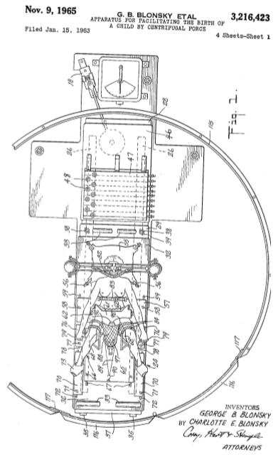
The Blonskys' concept for a birthing centrifuge more resembles a modified playground merry-go-round, with the mother-to-be's head positioned at the center of rotation and her body positioned radially outward, as illustrated in Figure 1 of their patent:
George and Charlotte Blonsky go on to describe how they expected a g-force assisted birth would take place:
During the operation, the operator gradually speeds up the machine to the predetermined force which is expected to produce the birth of the child, and if such force does not accomplish this, he does not exceed it, unless the physician decides to go the higher g's. He cannot, however, go beyond the maximum g's for which the machine has been set without causing the governor (105) to shut down the machine. When in the operation of the machine, the operator reaches a rate of rotation at which the combination of pressures produced both by the created centrifugal force and by the mother exceed the childbirth resisting forces (friction and constriction), the movement of the fetus occurs and the child is delivered into the net (88). While in the net, the child is still subjected to the action of centrifugal force and is caused by such force to firmly press against the elastic bottom of the net (88). As the elastic cables (89) and the net give somewhat to this force which is equal to the weight of the child multiplied by the number of g's it is subjected to, the cotton wad (97) in the net is pressed by the child against the switch lever (93) which is actuated to cut the power from the motor (15) and may be utilized to activate an electric bell, announcing the event. The operator then applies the handbrake (18) to gently bring the machine to a complete stop.
At this point, the Inventions in Everything team would like to point out that spinning at 31.2 revolutions per minute (rpm) would be enough to generate 1 g of centrifugal force. That's quite fast when we're talking about the rotational speed of such a large diameter merry-go-round type contraption, and potentially a safety hazard to the physician and technicians operating the childbirth-assisting centrifuge. Fortunately, the Blonskys took care to address that risk to the birthing team in their patent:
For safety sake, the machine is enclosed in an annular fence (115) capable of excluding all personnel from the reach of the revolving deck (28).
Because the one thing a mother who is most concerned about delivering a healthy baby into a net wants in case there are any complications while she is strapped to a rotating platform is for the physician to be safely on the opposite side of a fence until the birthing centrifuge ride they are on comes to a complete stop. Then again, having all the blood race away from her head during the most critical portion of the procedure would reduce her ability to remain conscious without the need for any anesthesia, so perhaps such concerns wouldn't be on her mind at that point.
Once again, we're not making any of this up! To the best of our knowledge, the Blonskys' apparatus for facilitating the birth of a child by centrifugal force has never been built, nor are we aware of any childbirth that involved spinning the mother on a rotating platform to assist the birth of a baby. But maybe we missed that episode of House, M.D.
Inventions in Everything: The Archives
Ready to sample more of the most creative designs and patents the Inventions in Everything team has explored? Our archives celebrate inventions ranging from the whimsical to the inspired in reverse chronological order!
- Rediscovering Nature: A Biomimetic Clock
- Chairs to Haunt Your Dreams This Hallow's Eve
- Ten Million Inventions In Everything!
- Inventions in Everything: Shoes for Defying the Laws of Physics
- Inventions in Everything: Treadmills Inside Your Shoes
- Inventions in Everything: Makeup Applicator for Cat Eyes
- Inventions in Everything: Optical Illusions to Enhance Safety
- Inventions in Everything: The Future of Ironing
- Inventions in Everything: The Sock Slider
- Inventions in Everything: A Cold, Refreshing, CRISPR Beer
- Inventions in Everything: World's Brightest Flashlight and Glow-in-the-Dark Paint
- Inventions in Everything: On Track for Ten Million Patents!
- Happy Holographic Halloween!
- Elevators that Go Up, Down, Left and Right....
- Inventions in Everything: Ice Cream Pint Lock
- Slow Dance
- Inventions in Everything: Training Device for Beer Pong
- Inventions in Everything: The Flask from the Future
- Inventions in Everything: The Music Playing Bag of Nacho Cheese Flavored Tortilla Chips
- Inventions in Everything: Floating Beer Pong Table
- Inventions in Everything: The Tree Transplanter
- Inventions in Everything: Stopping the Refrig-a-raider
- Inventions in Everything: Popping the Top on National Beer Day
- Inventions in Everything: Fishing for Boats
- Inventions in Everything: Suction Tube for Reverse Axial Withdrawal
- Inventions in Everything: The Unwelcome Mat
- Hubcaps to Replace Snow Chains
- Young AIs in Love
- Inventions in Everything: Rolling on the Vinyl Tracks
- Inventions in Everything: Drilling Square Holes
- The Singing Stones
- Inventions in Everything: The Future of Furniture
- Inventions in Everything: The WiFi Wig
- Inventions in Everything: Keeping Dog Time
- Drying Clothes With Ultrasound
- The Future of Fireworks
- Harvesting Water from the Air
- Inventions in Everything: Automated Window Blinds
- Inventions in Everything: Flying Snoopy!
- Inventions in Everything: Texting Your Dog a Treat
- Houseplants from Avatar
- The Kitchen Unitaskers You Cannot Live Without
- Inventions in Everything: The Baby Cage
- Self-Carving Pumpkins
- Inventions in Everything: The Alarm Clock of Damocles
- Death to Mosquitoes!
- Reinventing the Axe
- Automated Zen
- The Ultimate Swiss Army Knife You Can Buy Today
- Inventions in Everything: The Toilet Snorkel
- There Is No Great Snowplow Stagnation
- The Ultimate in Rust Proofing
- Billionaire Drinks Sewage: Video
- Inventions in Everything: Antiterrorism Barriers
- Wrapping Your Bike Around a Tree... On Purpose
- Inventions in Everything: Geothermal Beer Coolers
- Inventing a Better Snowshoe
- Inventions in Everything: The Salmon Cannon
- Powdered Wine: Just Add Water!
- Fail: The Newest Innovation in Ice Cream
- Unlimited Virtual Legos
- Inventions in Everything: The Ultimate Turkey Blind
- Inventions in Everything: Turning Cans Into Sippy Cups
- Inventions in Everything: Anatomical Lego Figures
- It's Not What You Think....
- Inventions in Everything: Soup Bowl Attraction
- Inventions in Everything: Making Life More Difficult
- Inventions in Everything: The Oreo Separator Machine
- Air Shark!
- Markets in Everything: Stormtrooper Motorcycle Suit
- The Bike That Rides You
- One Inventor's Stick-to-itiveness
- High Five!
- Inventions for Everything
- The Best Mousetrap Ever
- An Invention for the True Wine Connoisseur
- Three of Ten Things You Don't Need on St. Patrick's Day
- The Future Just Got a Lot Cooler Than It Used to Be
- The Worst Piece of Design Ever Done
- The Magic Marker of the Future
- Coming Soon, to a Gym Near You!
Labels: technology
The Federal Reserve's Open Market Committee (FOMC) wrapped up its latest two-day meeting on 29 January 2020, signaling they would hold the Federal Funds Rate within its current target range of 1-1/2 to 1-3/4 percent.
That lack of change combines with a U.S. Treasury yield curve whose rolling one-quarter average has steepened on average during the last six weeks since the FOMC's December 2019 meeting, even though the bond market's reaction to the potential economic impact of China's coronavirus crisis has significantly flattened the yield curve since it hit in the last week. All that together means the probability that a new economic recession will someday be determined to have started in the United States between January 2020 and January 2021 has fallen to 1 in 28, or roughly, a 3-4% probability, where the chart below is rounding down from a more precise estimate of roughly 3.5% in its latest update.
Back on 9 September 2019, those odds had previously peaked at 1 in 9, where if the NBER eventually NBER ever does determine that the national U.S. economy entered into recession in either 2019 or 2020, they will most likely identify a month between September 2019 and September 2020 as its starting point.
These probabilities come from a recession forecasting method developed back in 2006 by Jonathan Wright, which uses the level of the effective Federal Funds Rate and the spread between the yields of the 10-Year and 3-Month Constant Maturity U.S. Treasuries to estimate the probability of recession based on historical data.
While we're now providing this analysis after each of the Federal Open Market Committee' regularly scheduled meetings every six weeks, you don't have to wait for us if you want to get an update on the latest recession odds sooner! Our recession odds reckoning tool is both free and really easy to use. Plug in the most recent data available, or the data that would apply for a future scenario that you would like to consider, and compare the result you get in our tool with what we've shown in the most recent chart we've presented above to get a sense of how the recession odds are changing.
Depending upon how the yield curve behaves over the next several weeks, we may resume presenting updates in this series more frequently. We'll see how that goes.
Previously on Political Calculations
We've been tracking the ebb and flow of heightened recession odds since June 2017 - here are all the posts in our latest recession forecasting series!
- The Return of the Recession Probability Track
- U.S. Recession Probability Low After Fed's July 2017 Meeting
- U.S. Recession Probability Ticks Slightly Up After Fed Does Nothing
- Déjà Vu All Over Again for U.S. Recession Probability
- Recession Probability Ticks Slightly Up as Fed Hikes
- U.S. Recession Risk Minimal (January 2018)
- U.S. Recession Probability Risk Still Minimal
- U.S. Recession Odds Tick Slightly Upward, Remain Very Low
- The Fed Meets, Nothing Happens, Recession Risk Stays Minimal
- Fed Raises Rates, Recession Risk to Rise in Response
- 1 in 91 Chance of U.S. Recession Starting Before August 2019
- 1 in 63 Chance of U.S. Recession Starting Before September 2019
- 1 in 54 Chance of U.S. Recession Starting Before November 2019
- 1 in 42 Chance of U.S. Recession Starting Before December 2019
- 1 in 26 Chance of U.S. Recession Starting Before February 2020
- 1 in 16 Chance of U.S. Recession Starting Before April 2020
- 1 in 14 Chance of U.S. Recession Starting Before April 2020
- 1 in 13 Chance of U.S. Recession Starting Before May 2020
- 1 in 12 Chance of U.S. Recession Starting Before June 2020
- 1 in 11 Chance of U.S. Recession Starting Before July 2020
- Odds of U.S. Recession Before August 2020 Rise to 1 in 10
- 1 in 10 Chance of U.S. Recession Starting Before August 2020
- What The Dickens Is Going On With Recession Indicators?
- 1 in 9 Chance of U.S. Recession Starting Before October 2020
- U.S. Recession Odds Peak, Begin to Recede
- After Peaking at 1-in-9 in September 2019, Odds of U.S. Recession Falls to 1-in-11
- Post Peak, Recession Odds Continue to Recede
- 1 in 18 Chance of U.S. Recession Starting Between Dec-2019 and Dec-2020
- 1 in 29 Chance of U.S. Recession Starting Between Jan-2020 and Jan-2021
Labels: recession forecast
It's soup season, so what better time to update our records of the historic prices Americans have paid for an iconic can of Campbell's Condensed Tomato Soup, which now span January 1898 through January 2020!
For the latest in our coverage of Campbell's Tomato Soup prices, follow this link!
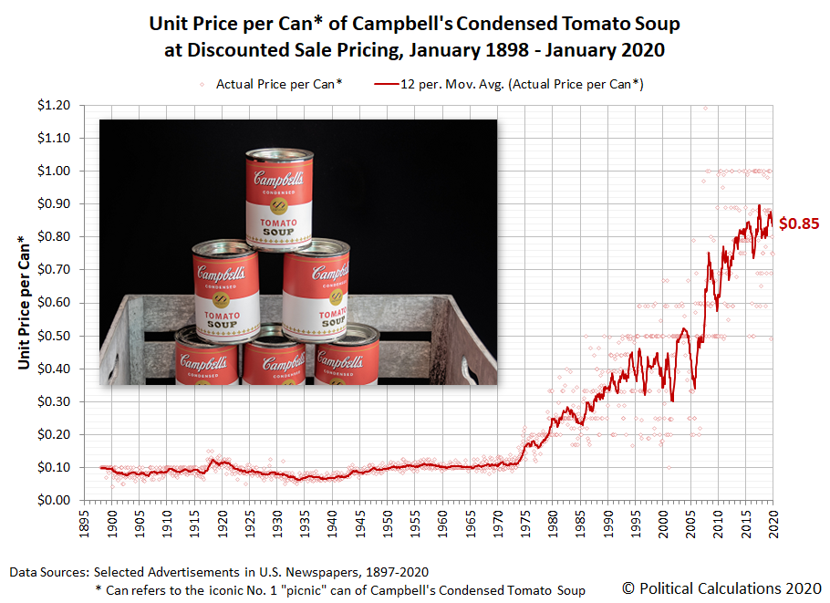
As of January 2020, the average advertised sale price that Americans have paid for a 10.75 fluid ounce can of Campbell's condensed tomato soup is $0.85. Almost all of that price escalation has occurred since 10 April 1974, when the U.S. government lifted its price controls on food, where for the first 76 years of its history, Americans paid somewhere between $0.07 and $0.12 for each Number 1-size can of Campbell's Condensed Tomato Soup they bought.
If you do the math, where the average picnic-size can of Campbell's tomato soup could be bought for just $0.12 on sale as late as October 1973, that works out to an average annual rate of tomato soup inflation of about 4.3% for American consumers during the last 46+ years.
Fifteen years ago, it wasn't uncommon to see a can of Campbell's tomato soup on sale for $0.20. Today, it is becoming rare to see a sale price below $0.50 when the soup is heavily discounted, but still without having to use coupons.
Image Credit: Paweł Czerwiński
Previously on Political Calculations
Our coverage of America's most iconic soup, presented in reverse chronological order!
- Celebrating 150 Years of the Campbell's Soup Company
- Tomato Soup, Oil and Inflation
- Soup and Steel Tariffs
- Soup and Recession
- Everyday Low Prices
- Of Soup and Silver and the Zombie Apocalypse
- Updated: The Price of Campbell's Tomato Soup Since 1897
- Early Advertising Milestones for Campbell's Condensed Soups
- The First Ad Ever for Campbell's Condensed Soups?
- War and Soup
- The Tomato Soup Standard
- The Price of Campbell's Tomato Soup Since 1897
Labels: business, data visualization, economics, inflation, soup
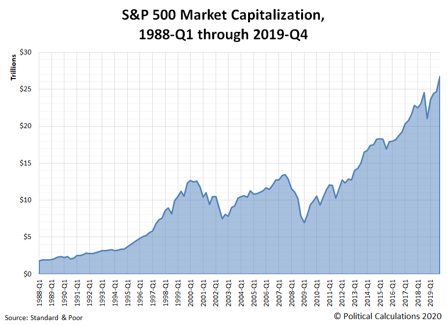
As of the end of 2019, the total market capitalization of the S&P 500 was $26,759,686,786,884. Or if you prefer, approximately $26.76 trillion!
That's 14.8 times the value of the S&P 500's market capitalization at the end of 1988-Q1, when the index' market cap stood at $1.81 trillion. From 1988-Q1 to 2019-Q4, the S&P 500's total market capitalization has doubled three times, completing its first doubling period in 7 years from 1988-Q1 to 1995-Q1, taking another 2.5 years to double again by 1997-Q3, and then another 16 years to double a third time in 2013-Q3.
Measured a little differently, the market cap of the S&P 500 as a percentage of the U.S. Gross Domestic Product at the end of 2019-Q3, the most recent quarter for which we have a somewhat finalized estimate, was 114.7%. That's close to the highest the S&P 500's total market cap has been since the days of the Dot-Com Bubble, when that figure peaked at 126.8% in the first quarter of 2000.
We won't know until the end of March 2020 how the S&P 500's market cap compares to the size of the U.S. economy through the end of 2019, when the estimate for the United States' GDP in 2019-Q4 is somewhat finalized.
References
Silverblatt, Howard. Standard & Poor Index Earnings and Estimates. [Excel Spreadsheet]. 16 January 2020. Accessed 23 January 2020.
U.S. Bureau of Economic Analysis. GDP and Personal Income Interactive Data. National Income and Product Accounts. Table 1.1.5. Gross Domestic Product. [Online Database]. Accessed 23 January 2020.
Labels: market cap, SP 500
The S&P 500 (Index: SPX) completed the Lévy flight event it began last week, with investors fully shifting their forward-looking focus to 2020-Q4 in setting current day stock prices, as expected.
As of the close of trading on Friday, 24 January 2020, the level of the S&P 500 was 3,295.47.
The shift in focus was completed as the outbreak of a new SARS coronavirus in China came to dominate headlines during the week. Here are the market-moving headlines we noted during the holiday-shortened trading week of January 2020:
- Tuesday, 21 January 2020
- Oil market shrugs off Libya crisis amid ample global supply
- Bigger trouble developing in Asia, Eurozone
- Risk assets fall as Chinese virus triggers anxiety
- China's Baoshang Bank to be taken over by local governments, state firms
- South Korea posts slowest annual GDP growth since financial crisis
- Euro zone companies cut loan applications for first time in six years: ECB
- Germany likely to lose the most from trade diverted by U.S.-Sino deal
- Trump says Fed has lowered rates too slowly
- Wall Street falls as China virus reaches the U.S.
- Wednesday, 22 January 2020
- Thursday, 23 January 2020
- Oil falls 2% as specter of China virus threatens fuel demand
- Bigger trouble, stimulus developing in Asia:
- Japan exports shrink for 13th month in further blow to economy
- China central bank to lower funding costs, prevent debt and inflation risks: adviser
- S&P 500 gains, Nasdaq hits new high as investors eye earnings, coronavirus
- Friday, 24 January 2020
- Brent logs worst weekly loss in a year as China virus fears swell
- Early signs of rebound in Eurozone?
- Euro zone economy remains weak but green shoots emerging: PMIs
- ECB's Lagarde says uptick in inflation 'really minor'
- And Japan? Slowing contraction in Japan factory activity eases fears of recession: flash PMI
- The S&P 500 has worst day since October as virus fears mount
Elsewhere, Barry Ritholtz lays out a short list of the positives and negatives he found in the past week's economics and market-related news. Between us and him, did we catch them all during the MLK holiday-shortened trading week?
Artificial intelligence, or AI for short, is creeping into all sorts of real world applications. Want to order cat food from Amazon? Ask Alexa via your smart speaker! Want to take the drudgery out of driving on a long road trip? Have your self-driving car do the driving for you!
Now, if you followed the links in the preceding paragraph, you've not only found stories involving how people are using AI-equipped devices today, you've also found some cautionary tales where machine learning hasn't been as up to the tasks to which it has been put, and certainly not as advertised. Some of these stories are kind of funny. Others have very tragic endings.
That's because many of the most successful AI systems that have been developed to date have limitations that aren't well understood. A recent article in Quanta explores some of those limitations and how researchers are turning toward mathematical physics to address them:
The revolution in artificial intelligence stems in large part from the power of one particular kind of artificial neural network, whose design is inspired by the connected layers of neurons in the mammalian visual cortex. These “convolutional neural networks” (CNNs) have proved surprisingly adept at learning patterns in two-dimensional data — especially in computer vision tasks like recognizing handwritten words and objects in digital images.
But when applied to data sets without a built-in planar geometry — say, models of irregular shapes used in 3D computer animation, or the point clouds generated by self-driving cars to map their surroundings — this powerful machine learning architecture doesn’t work well. Around 2016, a new discipline called geometric deep learning emerged with the goal of lifting CNNs out of flatland.
Now, researchers have delivered, with a new theoretical framework for building neural networks that can learn patterns on any kind of geometric surface. These “gauge-equivariant convolutional neural networks,” or gauge CNNs, developed at the University of Amsterdam and Qualcomm AI Research by Taco Cohen, Maurice Weiler, Berkay Kicanaoglu and Max Welling, can detect patterns not only in 2D arrays of pixels, but also on spheres and asymmetrically curved objects. “This framework is a fairly definitive answer to this problem of deep learning on curved surfaces,” Welling said.
Already, gauge CNNs have greatly outperformed their predecessors in learning patterns in simulated global climate data, which is naturally mapped onto a sphere. The algorithms may also prove useful for improving the vision of drones and autonomous vehicles that see objects in 3D, and for detecting patterns in data gathered from the irregularly curved surfaces of hearts, brains or other organs.
That's pretty cool stuff! If gauge theory sounds vaguely familiar, it may be because mathematician Karen Uhlenbeck made the news last year when she was awarded the Abel prize in mathematics, in part for her work in the field. If you're not already familiar with the concept of gauge invariance, or equivariance as physicists prefer to call it, the following video provides a blissfully short introduction:
If you want to know more about gauge equivariant convolutional networks and how they apply to deep machine learning, Michael Kissner's easy guide is a good place to begin exploring the topic.
Getting back to the main story, the math behind gauge CNNs are showing real promise in the applications to which they have been placed:
A gauge CNN would theoretically work on any curved surface of any dimensionality, but Cohen and his co-authors have tested it on global climate data, which necessarily has an underlying 3D spherical structure. They used their gauge-equivariant framework to construct a CNN trained to detect extreme weather patterns, such as tropical cyclones, from climate simulation data. In 2017, government and academic researchers used a standard convolutional network to detect cyclones in the data with 74% accuracy; last year, the gauge CNN detected the cyclones with 97.9% accuracy. (It also outperformed a less general geometric deep learning approach designed in 2018 specifically for spheres — that system was 94% accurate.)
Beyond weather monitoring, gauge CNNs may find use in advancing how AI-vision systems used in self-driving vehicles see the world, with their capabilities of processing what these systems are seeing in three-dimensions improving their safety performance.
The future is seemingly determined to have self-driving cars and other AI-powered devices in it. Having those things work well enough to be unremarkable is the real challenge.
Image credit: David Anderson
Labels: math, technology
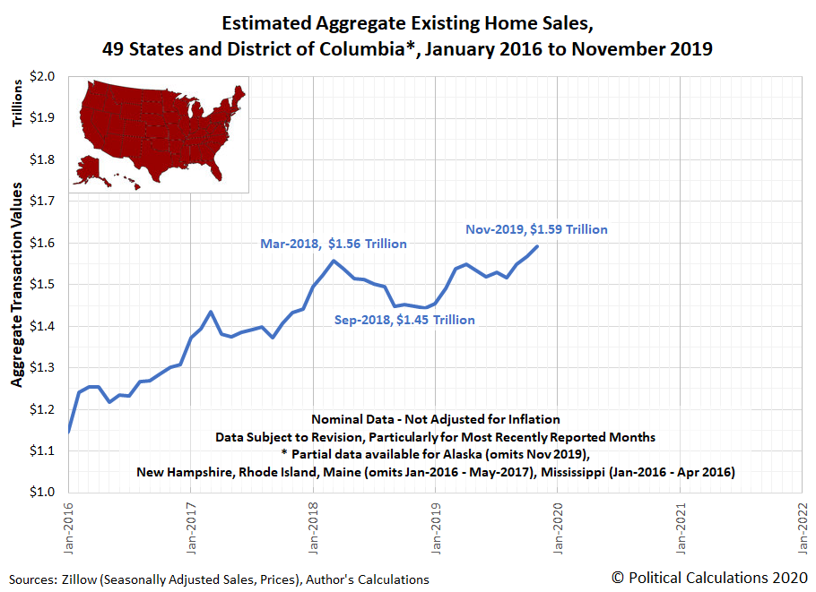
Existing home sales gained strength in the fourth quarter of 2019, with the estimated market capitalization of the existing home market in 49 states for which we have data appearing to have finally surpassed its previous March 2018 peak in November 2019.
State level data for existing homes sales lags the national data, which reports indicate leapt to their highest level in nearly two years in December 2019. Looking at recent trends for the five largest states for existing home sales, we find uptrends in Texas, Florida, New York and New Jersey, which we find has been prompted by increases in both the number of sales and in sale prices.
Given what has been reported for the national level data, we'll be excited to see what the data for these markets will look like through December when that data becomes available next month.
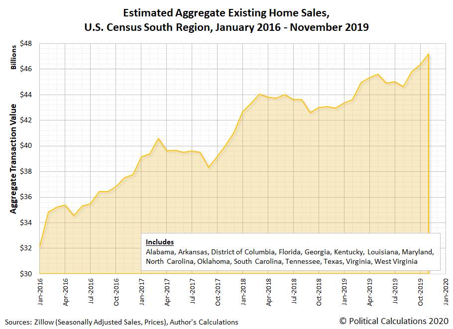
We've taken the available state level data and have built up regional level data from it. The next two charts show the aggregate value of existing home sales for the U.S. Census Bureau's Midwest and Northeast regions from January 2016 through November 2019:
The next two charts show the same data for the for the U.S. Census Bureau's South and West regions from January 2016 through November 2019.
The aggregated state level data confirms growing strength in the Northeast and South regions for the U.S. existing home market. In the Northeast, while New Jersey had the biggest gains, all states but Maine showed month-over-month increases. In the South, South Carolina and Louisiana lagged behind the general growth that took place in all the other states in the region in November 2019, where Maryland and the District of Columbia turned in very strong performances.
Our analysis is based on the existing homes sales and price data published by Zillow's research team, where they also provide data that drills down into the metropolitan level. Check it all out if you get the chance!
Labels: real estate
Two years ago, we announced the end of a relative period of order in the U.S. stock market. Two years later, there are signs that the chaotic period that followed may now be coming to an end. The following chart showing the daily value of the S&P 500 versus the index' trailing year dividends per share points to that possibility:
We're a bit reluctant to start drafting the statistical equilibrium thresholds that apply during relative periods of order in the U.S. stock market, mainly because the new order now taking form has arisen only because the U.S. Federal Reserve began buying large quantities of short-term debt securities issued by the U.S. Treasury in its return to a quantitative easing-like policy in October 2019, which is something it really doesn't want to do, but has to because it badly misjudged the markets' needs for liquidity.
How long that might last remains to be seen. For our part, we'd like to see a more typical level of 'orderly' volatility in stock prices before we overlay any statistical thresholds based on the developing period of relative order in the market.
Labels: chaos, data visualization, SP 500
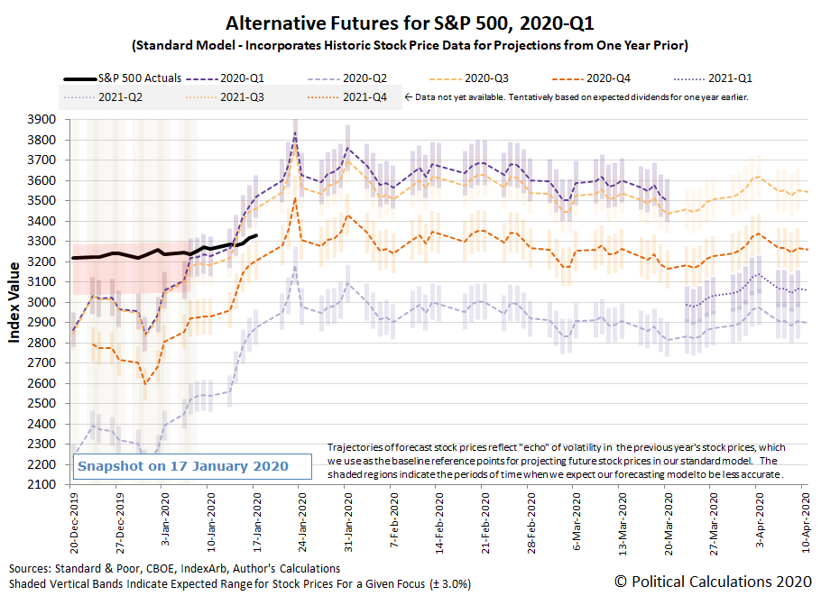
The S&P 500 (Index: SPX) continued its record-setting rally, breaking through the 3,300 level and closing the week at a new record high closing value of 3,329.62. That new record comes as investors appear to be shifting their forward-looking focus, as anticipated, from 2020-Q1 toward 2020-Q4 as indicated on the following chart.
Through the close of trading on Friday, 17 January 2020, the dividend futures-based model that underlies the alternative futures chart above indicates that investors are now dividing their attention between 2020-Q1 and 2020-Q4, with stock prices rising, but not as fast as the model suggests they would have if investors had remained fully focused on 2020-Q1.
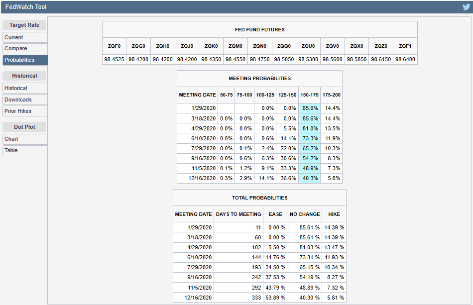
The direction that the S&P 500 will take going forward will depend upon how closely investors might fix their attention on either 2020-Q1 or 2020-Q4 as they make their current day investment decisions, where our thinking is that 2020-Q4 will demand more of their focus given the elevated probability of that more distant future quarter coinciding with the timing of the Federal Reserve's next action for setting short term interest rates in the U.S. The CME Group's FedWatch tool continues to show investors are giving better-than-even odds of a quarter point rate cut taking place during 2020-Q4.
On a side note, we often describe shifts in the forward-looking focus from one point of time in the future to another as the quantum part of the quantum random walk that stock prices periodically follow. Unlike the nearly instantaneous quantum leaps that take place with subatomic particles however, stock prices tend to take somewhat longer to move from one alternative trajectory to another, which we have come to associate with stock prices undergoing a Lévy flight phenomenon. The often outsized changes that take place at these times are what give stock prices their fat-tailed distributions, where large changes in stock prices occur more often than would be predicted by a normal distribution.
This latest shift qualifies as the S&P 500's latest Lévy flight event, although in this case, even though there is a comparatively large gap between the alternative trajectories associated with investor expectations for 2020-Q1 and 2020-Q4, the alternative trajectories the describe the potential paths the S&P 500 might follow are such that the overall change in stock prices will be considerably smaller than it would otherwise have been if the timing of the shift in investor focus had occurred either a week earlier or a week later. In a sense, the S&P 500 is following a path that takes the least amount of energy for it to follow as it transitions from one level to another.
Let's get to the news of the week that was. The following headlines capture the more significant market-moving events that occurred during the second full week of January 2020.
- Monday, 13 January 2020
- Crude exports boom on U.S. Gulf Coast, allaying bottleneck fears
- Fed's Rosengren warns of inflation risks to central bank's 'almost ideal' economic outlook
- Bigger trouble, stimulus developing in China:
- China's economic growth set to slow to 30-year low this year; more government support seen: Reuters poll
- China steel mills cut back on high-grade iron ore as margins slump
- China vehicle sales fall 8.2% in 2019: industry association
- Auto industry cautious as China starts 2020 with forecast of a 2% sales decline
- China disposes of $289 billion of bad loans in 2019: regulator
- Wall Street hits record, boosted by trade and earnings optimism
- Tuesday, 14 January 2020
- Oil edges up after five days of losses ahead of U.S.-China trade pact
- Fed will continue repo offerings into February, reducing term operations
- Fed's George says keeping interest rates on hold 'appropriate' for now
- Signs of previous stimulus gaining traction in China:
- China December copper imports hit highest since March 2016; annual shipments fall
- China posts strong December exports as world awaits Sino-U.S. trade deal signing
- Wall Street dips from record in 'Jason Bourne market'
- Wednesday, 15 January 2020
- OPEC expects lower demand for its oil as U.S. hits new milestone
- With a mixture of fanfare and grievance, Trump signs U.S.-China trade deal
- What's in the U.S.-China Phase 1 trade deal
- 'Phase 2' U.S.-China trade talks have already begun: Pence
- Timeline: Key dates in the U.S.-China trade war
- Bigger trouble developing in the Eurozone: German growth slows sharply in 2019 as trade disputes bite
- Bigger stimulus developing in China: China will increase effective investment: Premier Li
- Fed's minions share opinions on policies, economic outlook:
- Fed's Harker says officials learned lessons from repo turmoil, still mulling standing facility
- Fed's Daly sees inflation reaching 2% goal next year
- Dow closes above 29,000 after China and U.S. sign trade truce
- Fed's Kaplan: Officials should be mindful of financial risk as they increase balance sheet
- Thursday, 16 January 2020
- Oil ends higher, as trade deal progress spurs energy demand hopes
- U.S. Senate approves U.S.-Mexico-Canada trade deal
- Bigger trouble, stimulus developing in China:
- China set to post weakest growth in 29 years as trade war bites, investment sputters
- China's new bank loans hit record in 2019, more stimulus expected
- Limits to bigger stimulus developing in China? Room is limited for further RRR cuts in China: central bank official
- Fed's Bowman: Current interest rate likely appropriate for "this year"
- S&P 500 blasts through 3,300 as tech stocks surge
- Friday, 17 January 2020
- Oil steadies as Chinese economy offsets trade optimism
- U.S. economy looking stronger than expected:
- U.S. housing starts at 13-year high, factory output gains
- U.S. manufacturing output rises unexpectedly
- Bigger stimulus developing in China:
- China will continue to cut taxes on a large scale: Premier Li
- China central bank curbs rates on structured deposits to coax banks to lower lending rates: sources
- Fed minions share opinions on yield curve, Fed policies:
- The yield curve's still weird. Fed's Bullard is okay with that
- Fed's Harker says economy looks 'pretty good,' inflation on track for 2% target
- Fed's Harker says central bank should be backstop for liquidity, not first stop
- Wall Street hits new highs in strongest week since August
But wait, there's more! Barry Ritholtz provides a bigger picture of what's going on in the world by listing the positives and negatives he found in the past week's economics and market-related news!
How long could a Roman emperor expect to survive after taking power?
That's a challenging question to answer because the majority of Roman emperors met violent ends. However, new research suggests such results weren't as unpredictable or as random as you might first think.
In modern engineering, the concept of reliability describes the probability that an item will still be operational at some point of time in the future.
Usually, reliability is applied to things like electrical circuits and mechanical devices, but Joseph Saleh has applied the concept to politics, and more specifically, to mathematically describe the survival function of Roman emperors.
"It's interesting that a seemingly random process as unconventional and perilous as the violent death of a Roman emperor--over a four-century period and across a vastly changed world--appears to have a systematic structure remarkably well captured by a statistical model widely used in engineering. Although they may appear as random events when taken singularly, these results indicate that there may have been underlying processes governing the length of each rule until death."
The following chart from Saleh's paper shows the mixture Weibull survivor function he was able to map to the available empirical data for how long ancient Rome's emperors lived after they assumed the purple.
Looking at the nonparametric estimation of the average remaining lifespans of Roman emperors, shown as the heavy black line in the chart above, Saleh offers several observations:
- Emperors faced a significantly high risk of violent death in the first year of their rule. This risk remained high but progressively dropped over the next 7 years. This is reminiscent of infant mortality in reliability engineering, a phase during which weak components fail early on after they have been put into service, often because of design or manufacturing defects for example. Roman emperors therefore experienced a form of infant mortality;
- The reliability or survivor function stabilizes by the 8th year of rule. The emperors could lower their guard a bit if they made it to 8 years...
- ... but not for long: the risk of violent death picks up again after 12 years of rule. This suggests that new mechanisms or processes drove another round of murder. This is reminiscent of wear-out period in reliability engineering, a phase during which the failure rate of components, especially mechanical items, increases because of fatigue, corrosion, or wear-out. Roman emperors therefore also experienced wear-out mortality.
We've built the following tool to estimate the likely survival potential of a generic Roman emperor from Saleh's math. If you're accessing this article on a site that republishes our RSS news feed, please click through to our site to access a working version.
In the tool, we've arbitrarily capped the maximum number of years a Roman emperor might survive to 45 years, which corresponds to the Emperor Augustus' reign, the longest on record.
Saleh's paper also provides a chart showing the hazard function, or failure rate, for Roman emperors, which reveals a unique pattern.
This pattern is the familiar "bathtub curve" that characterizes how many real world components behave in reliability analysis. Saleh provides an interesting interpretation of how this pattern applies to the lives of Roman emperors:
- The decreasing failure rate early on, the signature of infant mortality, reflects as noted previously a prevalence of weak emperors who were incapable at the onset of their rule to handle the demands of their environment and circumstances. The fact that the failure rate was decreasing though suggests a competition between antagonistic processes, on the one hand those that sought to violently eliminate emperors (elimination), and on the other hand those that reflected the emperors learning curve to better protect themselves and perhaps eliminate their opponents (preservation). Examples abound in Roman history of this competition. Up to the first 12 years of one's rule, the preservation processes steadily improved their performance, and the situation can be casually summarized as "whatever didn't kill them [the Roman emperors] made them stronger" or less likely to meet a violent death;
- The increasing failure rate after 12 years of rule, the signature of wear-out failures, reflects as noted previously an uptake in failures through degradation with time, fatigue, or increased harshness in their circumstances. A growing mismatch between capabilities and demands under changing (geo-)political circumstances. This can be due to a number of reasons discussed previously. The fact that the failure rate was increasing after this 12-year mark suggests again a competition between the same antagonistic processes noted in (i), and this time the preservation ones were on the losing end of this competition. This result can be causally summarized as "whatever didn't kill them made them weaker" after a 12-year rule.
The existence of the pattern means that the probability of how long a Roman emperor might last is the result of both random chance and deterministic factors, rather than just chance alone, as perhaps best imagined by the "roll of the dice" Julius Caesar figuratively cast before crossing the Rubicon on his way to taking power as Rome's age of emperors began.
Part of what makes Saleh's analysis so intriguing is that the same concept can be applied to other nations, or forms of government, that have developed in the centuries since the fall of the Roman empire. It will be interesting to discover what patterns they might share with the Roman emperors.
Image Credit: iam_os
References
Saleh, J.H. Statistical reliability analysis for a most dangerous occupation: Roman emperor. Palgrave Communications 5, 155 (2019). doi: 10.1057/s41599-019-0366-y.
Welcome to the blogosphere's toolchest! Here, unlike other blogs dedicated to analyzing current events, we create easy-to-use, simple tools to do the math related to them so you can get in on the action too! If you would like to learn more about these tools, or if you would like to contribute ideas to develop for this blog, please e-mail us at:
ironman at politicalcalculations
Thanks in advance!
Closing values for previous trading day.
This site is primarily powered by:
CSS Validation
RSS Site Feed
JavaScript
The tools on this site are built using JavaScript. If you would like to learn more, one of the best free resources on the web is available at W3Schools.com.
