We wish we had thought of this, but credit belongs to Business Insider's Joe Weisenthal (HT: Lorenzo), who has worked out how the price of beer correlates with the economic health of various European nations:
Critical to understanding the European crisis is understanding the divergent price levels in the varying countries.
What basically happened over the past several years is: Prices of everything surged in the periphery of Europe, while staying incredibly stable in Germany. This has been a boon to Corporate Deutschland, as it is far more competitive—on a price basis—than all of its peers.
Now the peripheral countries are being asked to devalue and regain competitiveness, but it is a difficult if not impossible task. The problem is that when devaluing an economy the legacy debts remain, and so the sovereign debt of the country stays there, while all of the internal income goes down. And you get a crisis.
So naturally the first thing we did when checking out the new European pricing data is check out the price of beer.
And the chart is a doozy.
What we've done here is charted the price of beer in Greece (blue), Italy (orange), Spain (red), Ireland (green), and Germany (black). Now this is an index chart; essentially the beer component of the CPI. We've set the index to start at 100 in 1996.
The first thing you see is that Greek inflation is WAY above everyone else.
The next thing you see is that Germany has had very little beer inflation since 1996.
Spain and Italy have seen surging prices.
And Ireland (in Green) did once have a huge price bubble, but has now seen significant beer deflation. And not surprisingly, Ireland is seen as having made far and away more progress in its efforts at regaining health.
So really the beer chart says it all: Greece: a wreck. Germany: calm. Spain and Italy: in trouble, and Ireland making a comeback.
The entire European crisis explained by the price of beer.
Genius!
Labels: food, none really
Given recent speculation, Republican vice-presidential candidate Paul Ryan's mention of the company in his acceptance speech last evening and the news that General Motors (NYSE: GM) will shut down production for its troubled Chevy Volt vehicle for the second time this year, that question has become immediately relevant today.
To answer the question, we'll be turning once again to our preferred tool for predicting a company's bankruptcy, the Altman Z-Score.
Here, using data published by the company in its financial reports, we'll measure how distressed GM's situation has become.
This is an exercise we've done with GM's data before. Here, when we first introduced our tool for predicting bankruptcy back in March 2006, we found that GM's Altman Z-score was 0.01.
That value indicates a very financially distressed company, where an Altman Z-score for a manufacturing company like GM would have to be above 2.67 to be considered healthy, and between 1.81 and 2.67 to be considered to be at neutral risk for declaring bankruptcy in the future. Any score below 1.81 indicates that a company is in the danger zone for going through bankruptcy proceedings in the future.
While that Altman Z-score of 0.01 indicated a highly distressed company, it was nothing compared to what we found when we revisited GM's deteriorating financial situation in June 2008, when GM's Altman Z-score fell through the floor and reached -1.35, as its future bankruptcy became inevitable.
From here, we'll pick up the story following what happened after President Obama intervened in what would otherwise have been normal bankruptcy proceedings on the behalf of his political interests and orchestrated the bailout and reorganization of GM using U.S. taxpayer dollars to support them.
Tapping Yahoo! Finance's records of GM's Income and Balance Sheet statements from 2009 through 2011, we calculated GM's Altman-Z score for the bailout year of 2009 and the post-bailout years of 2010 and 2011. Here's what we found:
- In the bailout year of 2009, GM's Altman Z-score jumped to 2.69, with the U.S. government's infusion of more than 100 billion dollars of taxpayer money putting the company immediately into the "healthy" range for manufacturing companies.
- In the following year, without the ongoing infusion of taxpayer cash to keep the company in the healthy zone, GM's Altman Z-score plummeted to 0.54, back into the danger zone, as the reorganized GM failed to generate the sales to needed to support even its greatly reduced size and liabilities.
- In 2011, GM's financial situation improved somewhat as its Altman Z-score rose to 0.66, which still places it deep within the danger zone for risk of future bankruptcy.
We next decided to go the extra mile and update GM's Z-Score through its four most recent quarters, which will indicate the company's relative financial health as of 30 June 2012. We've entered the data in our tool below (click here to visit our site if you're reading this post through sites that access our RSS feed):
Running the numbers through 30 June 2012, we find that GM's Altman-Z score is 0.66. The company's financial situation has not improved since the end of 2011 and it remains well in the danger zone for facing future bankruptcy, as the company's post-bailout reorganization appears to have been inadequate to really restore the company to good health.
While that doesn't suggest that the company will be filing for bankruptcy in the immediate days ahead, it does confirm that more reorganization and cost reduction efforts lie ahead for the company in the short term.
Labels: business
Which modern era President has done the most to materially improve the fortunes of women in the United States? Going back to 1947, when the U.S. Census began collecting data on income earners in the U.S., the choices are:
- Harry Truman (D)
- Dwight Eisenhower (R)
- John Kennedy (D)
- Lyndon Johnson (D)
- Richard Nixon (R)
- Gerald Ford (R)
- James Carter (D)
- Ronald Reagan (R)
- George H.W. Bush (R)
- William Clinton (D)
- George W. Bush (R)
- Barack Obama (D)
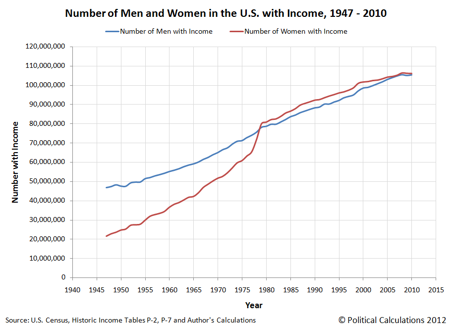
To answer the question, we began with the chart we previously featured showing the change in the number of men and women earning incomes in the United States, we discovered a unique surge in the number of women with incomes occurring from the years spanning 1977 through 1979, as the number of U.S. women counted as earning incomes surged by over 14.5 million:
While occurring during Jimmy Carter's presidency, which ran from 1977 through 1980, the real credit for this achievement belongs to Gerald Ford.
Here's how we know. Digging deeper into the U.S. Census' data, we found that the surge in the number of American women earning incomes occurred entirely within the ranks of those who do not earn wage or salary income:
Digging even deeper into the data, we found an even more impressive increase, as the number of women earning interest income skyrocketed from 15,435,000 in 1977 to 48,702,000 in 1979 - more than tripling in number over a two year period! And though these numbers include a large number of women with wage and salary or other income, it appears to us to have swept up some 14.5 million women who had no other source of income before, which accounts for the tremendous increase we observe in the number of women earning non-wage or salary income in the U.S. during these years.
We found the reason for this dramatic increase in the passage of the Equal Credit Opportunity Act of 1974, which was subsequently amended in 1976. Both measures were signed into law by President Gerald Ford and opened the door to women having direct access to credit.
Here, the original Equal Credit Opportunity Act (ECOA) sought to eliminate discrimination in the ability of women to obtain credit, which charged the Federal Reserve with implementing the new non-discriminatory policy in the nation's financial institutions in 1975.
However, the data for the number of women earning incomes indicates that this measure failed to achieve its purpose in the years immediately following its implementation, because the bill's principal author, Representative Bella Abzug (D-NY), failed to foresee that other means of discrimination, such as for race and other personal attributes, might be used to deny women access to credit.
In response, in November 1975, President Gerald Ford recommended that the law be broadened to include these categories. That action was achieved by the ECOA Amendments of 1976, which President Ford signed into law on 23 March 1976. The provision of those amendments were subsequently encoded into the Federal Reserve's Regulation B on 29 December 1976, which were scheduled to take effect on 23 March 1977.
Since the U.S. Census takes its Current Population Survey in March of each year, the Current Population Report for 1977 nearly perfectly captures the effects of the ECOA Amendments of 1976, as the pre-implementation number of women earning interest income, which came about as they opened bank accounts to gain access to credit, rose from 15,435,000 in 1977 to 30,155,000 in 1978, before more than tripling to reach 48,702,000 in 1979 before stabilizing to grow at a slow and steady rate ever since in 1980.
So not only did President Ford do the most of all modern-era U.S. Presidents to materially improve the fortunes of women in the U.S., he also did the most for minority women.
It's kind of interesting to review the histories published by various feminist organizations such as the National Organization of Women or other timelines that make either no mention or only token mentions of this achievement. It's almost as if they weren't really engaged in what is clearly the most successful program to eliminate discrimination against women in the post World War 2 era in the United States. We wonder if that might have something to do with some pretty notable failures, aside from Bella Abzug's poor legislative foresight, that other leading feminists have had in that area.
References
Board of Governors of the Federal Reserve System. Regulation B; Docket No. R-1008. 1998.
Cubita, Peter N. and Hartmann, Michelle. The ECOA Discrimination Proscription and Disparate Impact - Interpreting the Meaning of the Words That Actually Are There. The Business Lawyer, Vol. 61, No. 2. February 2006. [Ungated version].
Ford, Gerald M. Statement on the Signing of the Equal Credit Opportunity Act Amendments of 1976. 23 March 1976.
Mailliard, Page and Anderson, Ken. Women's Banks and Women's Access to Credit: Competition Between Marketplace and Regulatory Solutions to Gender Discrimination. 20 Loy. L.A. L. Rev. 771 (1987). [PDF document].
U.S. Census. Historical Income Tables: People. Table P-2. Race and Hispanic Origin of People by Median Income and Sex: 1947 to 2010. [Excel Spreadsheet]. September 2011.
U.S. Census. Historical Income Tables: People. Table P-53. Wage or Salary Workers (All) by Median Wage and Salary Income and Sex: 1947 to 2010. [Excel Spreadsheet]. September 2011.
U.S. Census. Money Income in 1977 of Families and Persons, in the United States. Current Population Reports, P-60, No. 118, Table 49. [PDF document]. March 1979.
U.S. Census. Money Income in 1978 of Families and Persons, in the United States. Current Population Reports, P-60, No. 123, Table 53. [PDF document]. March 1979.
U.S. Census. Money Income in 1979 of Families and Persons, in the United States. Current Population Reports, P-60, No. 129, Table 55. [PDF document]. March 1979.
Labels: data visualization, demographics, economics
Picking up on recent comments by Russ Roberts on the changes in the disability rolls over time, we thought we might revisit Social Security's data on the number of disabled workers collecting disability benefits for the years corresponding to the Great Recession. Beginning with the pre-recession baseline year of 2005, our first chart today shows the number of disabled workers counted as receiving Social Security disability insurance benefits for each year through 2011:
Here, we note that most of the change in the number of disabled workers from year to year is concentrated in older individuals, mostly Age 46 or older. We also note the moving peak of the leading edge of the Baby Boom generation from year to year, which we see shift from Age 58 for 2005 up to Age 64 in Age 2011.
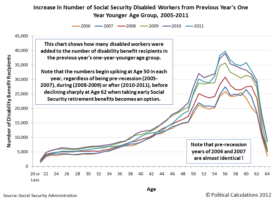
In our next chart, we've extracted the net change in the number of disabled workers receiving Social Security disability insurance benefits from year to year, which we did by subtracting the previous year's number of disabled workers for the one-year-younger age group from the indicated age group:
This chart shows how many disabled workers were added to the number of Social Security disability benefit recipients with respect to the previous year's one-year-younger age group.
Here, we note that there is a distinct spike in disabled workers receiving Social Security disability benefits at Age 50, regardless of each year's economic climate. Here, we earlier found that this corresponds to the Social Security Administration's policy of not seriously challenging the disability claims of workers Age 50 or older.
But perhaps more importantly, in looking at the year-over-year change from 2005 to 2006 (identified as 2006 in the chart) and the year-over-year change from 2006 to 2007 (identified as 2007 in the chart), we find that the year-over-year change for these two pre-recession years are almost identical. This gives us a very good baseline from which we can determine the extent to which the Great Recession has influenced the number of individuals successfully claiming disability benefits in subsequent years.
That result is shown in our third chart, in which we've counted the number of surplus or excess disabled workers added to the number of disability claims in each year from 2007 through 2011 with respect to the net change recorded for each indicated age in 2006:
Adding up the values for each indicated age for each year, we find the number of surplus or excess disabled workers, or rather the number of disabled workers above and beyond what would be considered "normal" and might therefore be attributed to the Great Recession, were added to the disability rolls in the years from 2007 through 2011:
Altogether then, we estimate that some 695,228 individuals, above and beyond the numbers that might be considered to be normal, have filed for and received Social Security disability insurance benefits in response to the Great Recession in the years from 2008 through 2011. We also note that the timing of the increase in the disability rolls would correspond to when many of these individuals would have exhausted their unemployment benefits, suggesting that going on disability became an alternative to seeking gainful employment for these individuals.
And that's a big reason why Social Security's Disability Insurance Trust Fund is now projected to be fully depleted in less than four years time.
Data Sources
Social Security Administration.
Disabled worker beneficiaries in current payment status in December of indicated year, distributed by age and sex. 2005, 2006, 2007, 2008, 2009, 2010 and 2011. Accessed 27 August 2012.
Labels: data visualization, insurance, social security
After showing how only the reduction in the U.S. labor force participation rate has resulted in a lower unemployment rate last week, a number of commenters requested that we follow up and show how the minimum wage might factor into the situation.
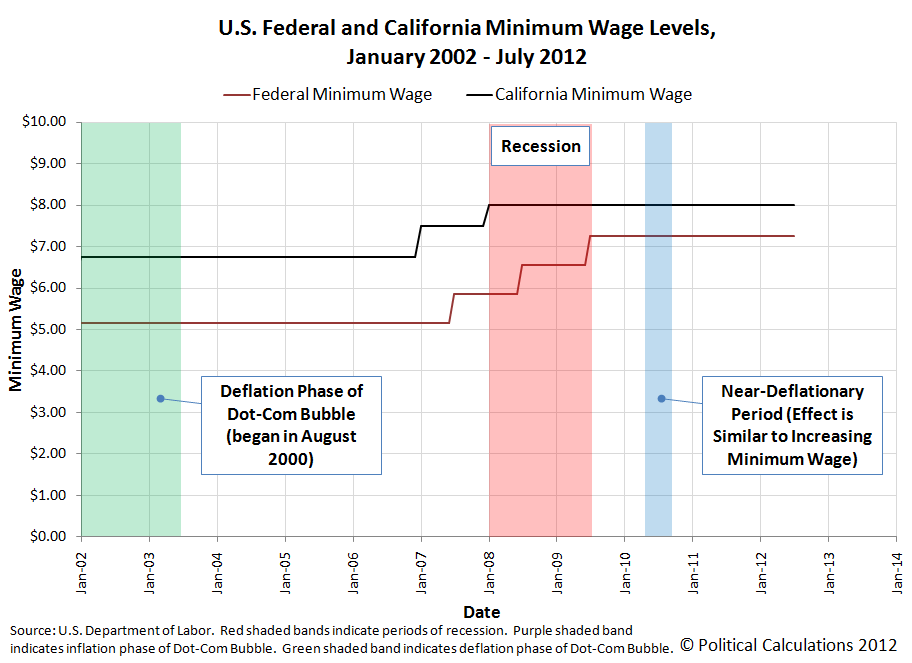
So we whipped up three charts to look at the period from January 2002 through July 2012 [1]. First, here's the level of the minimum wage in both the U.S. and in California [2].
In the charts we're presenting today, we're indicating the deflation phase of the Dot-Com Bubble with the green shaded vertical band on the chart, official recession periods with the red shaded vertical band, and a period of time in which the U.S. was undergoing near-deflationary levels with the blue-shaded bands. Because deflation operates oppositely to inflation, it can result in effectively increasing the minimum wage while it reigns, even though there has been no actual change in the mandated minimum wage level.
Next, we looked at the labor force participation rate for the entire working age population (Age 16+) for the United States:
This data is identical to what we previously posted showing the change in the U.S. labor force participation rate from January 2002 through July 2012. Here, we see that declines in the labor force participation rate largely coincide with recessionary or deflationary periods, however we also note that outside these economic event, increases in the minimum wage (at the federal or state level) tend to also precede declines in the labor force participation rate.
In our next chart, we focused in on the labor force participation data for U.S. teens. This segment of the U.S. work force is the most likely to reveal correlations between the timing of minimum wage increases and changes in their labor force participation rate, because roughly one of ten working teens in the U.S. earn the U.S. federal minimum wage, who in turn, make up nearly one out of four members of the U.S. minimum wage earning work force.
Judge for yourself whether a causal relationship might exist between when a minimum wage increase occurs and when declines in the labor force participation rate take place.
Notes
[1] The choice of dates is arbitrary, and in this case, chosen by the Bureau of Labor Statistics data jocks, who have the default starting and ending years for their online database for the Current Population Survey set at 2002 and 2012 respectively. If you don't like it, well, go to their site and select your own dates to get the data to make your own charts.
[2] We're showing the U.S. federal and California minimum wage levels because California's minimum was so elevated with respect to the U.S. federal minimum wage during this period, and because California is home to one out of every eight Americans. That's a pretty large segment of the population, so what California does will show up in the national level labor force participation rate data. We should also note that a number of smaller population states set their minimum wage at levels similar to those of California during this period of time, with the result being that about one out of five Americans lived and worked in states with higher minimum wage levels than the federal minimum wage. For these reasons, we believe that changes in California's minimum wage level then will work as a fairly good proxy for this portion of the U.S. population.
Labels: jobs, minimum wage
Over the last several months, we've been featuring a number of patents that, well, can only be described as "unusual". Our list so far includes:
- The Best Mousetrap Ever,
- A "Drink Swinging Apparatus",
- One heck of an "ass kicking machine", and of course,
- "An Apparatus for Simulating a High Five"!
What all these patents have in common is that they involve some degree of unique creativity by their inventors. Our unusual patent today however involves just about absolutely no creativity on the part of the individual who filed the patent, except perhaps for their ability to convince the U.S. Patent and Trademark Office to issue them a patent for their "invention" in the first place.
To see why, just consider Figure 1 from U.S. Patent Number 6,360,693, which was issued on 26 March 2002 to Ross Eugene Long III of Oakland, California, for what he titled an "Animal toy":
Yes, someone actually convinced the U.S. Patent Office to issue them a patent for a stick. Really. We're not making this up. Here's the patent's abstract:
An apparatus for use as a toy by an animal, for example a dog, to either fetch carry or chew includes a main section with at least one protrusion extending therefrom that resembles a branch in appearance. The toy is formed of any of a number of materials including rubber, plastic, or wood including wood composites and is solid. It is either rigid or flexible. A flavoring (scent) is added, if desired. The toy is adapted to float by including a material therein that is lighter than water or it is adapted to glow in the dark, as desired, by the addition of a fluorescent material that is either included in the material from which the toy is made or the flourescent [sic] material is applied thereto as a coating. The toy may be segmented (i.e., notched) so as to break off into smaller segments, as is useful for smaller animals or, alternatively, to extend the life of the toy. Various textured surfaces including camouflage colorings are anticipated as are straight or curved main sections. The toy may be formed of any desired material, as described, so as to be edible by the animal.
We really like the part where inventor Ross Eugene Long III allows that the "apparatus" might be made from wood. But really, the genius of the patent lies in describing the field of the invention:
The present invention, in general relates to animal toys and, more particularly, to devices that a dog can chew and carry in its mouth.
Dog chew toys are well known and include a wide variety of devices, some of which rapidly disintegrate--as is well known to most dog owners.
Other dog chew toys are sometimes used in fetching training exercises or simply for play but they may be difficult for the dog to pick up off of the ground. If tossed onto a body of water, they may sink. Furthermore, while a dog may see the toy at night or in dim light, the owner is unable to do so and therefore the toy cannot be used in dim light.
Other variations, such as it being edible or chewable (to relieve the natural tendency dogs have to chew) are also desirable features to incorporate in any dog chew toy design.
It is a natural tendency for dogs to chew and they often make inappropriate selections as to what they will chew. A scented or flavored animal toy that encourages a dog to chew, and possibly to consume it, would be useful.
When training dogs, especially hunting dogs, to fetch or when deciding which dog is especially good for the scent discrimination purpose, it is necessary to asses their ability to detect objects based solely on scent. Therefore an animal toy that is camouflaged would be useful in training and determining a dog's ability to locate hard to find objects based solely on scent.
Accordingly there exists today a need for an animal toy that floats, is easy to pick up off of the ground, can be seen in dim light, is made from a variety of possible materials, and which dogs may chew.
Clearly, such an apparatus would be a useful and desirable device.
Clearly, the U.S. Patent and Trademark Office agreed, and that's what makes inventor Ross Eugene Long III a true patent pioneer!
Unfortunately for our hero, he failed to make his first patent maintenance fee payment and as a result, the patent fell into the public domain on 26 March 2010. Now, anyone can produce a stick and profit from it!
We did say we're not making any of this up, right?
Labels: none really, technology
We're not wrong often, but we're happy when we are.
The reason why is because that means the world has turned out to be a much more interesting place than we had previously supposed.
Today's celebration of wrongness on our part comes from the first public prediction we've offered in a very long time that we missed. Here, on 6 August 2012, we looked at the rising level of the national average price of gasoline in the United States and predicted that we would see an upward shift in the number of new jobless claims filed each week some two to three weeks after they rose above the $3.50 per gallon mark.
Here, we noted that they had risen above that mark on 30 July 2012, which would have our predicted surge in new jobless claims sometime between 11 August 2012 and 18 August 2012 (or as we had described it on 6 August 2012, "either with this week's jobless claim data or with next week's data").
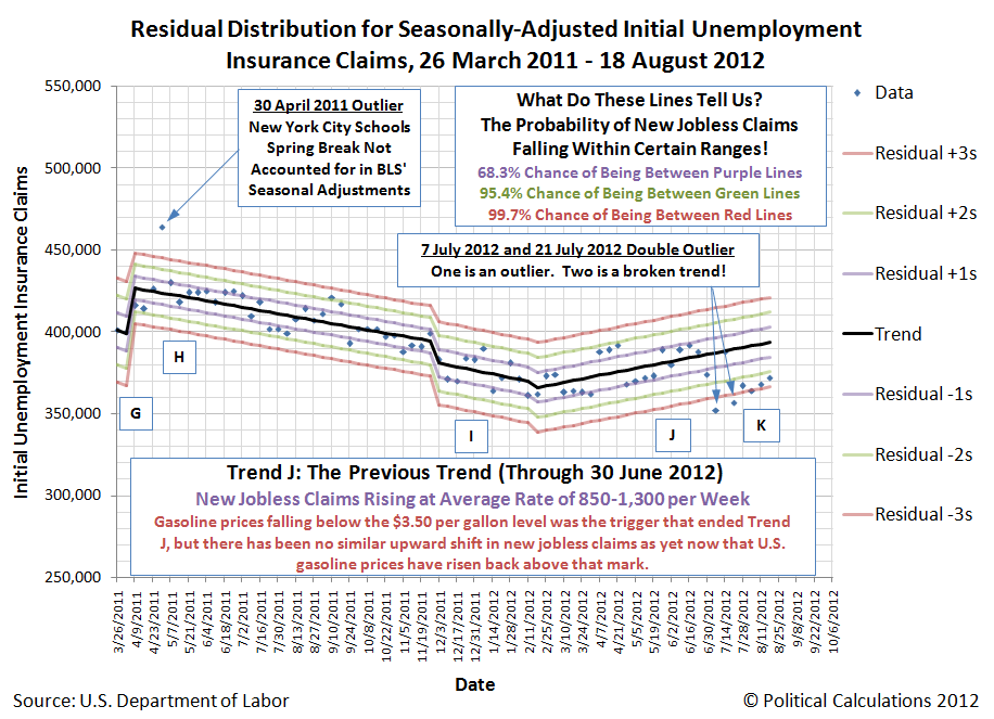
Today's initial data release for the week ending 18 August 2012 from the BLS, although showing an "unexpected" increase, doesn't qualify as the upward shift we had expected. Our chart below shows where the latest data fits with respect to what we've identified as Trend J, which ended on 30 June 2012.
Thanks to volatility in the data related to how the BLS does its seasonal adjustments, which didn't match up with the timing for when a number of U.S. automakers actually took their mid-year plant shutdowns this year, we don't yet have enough data points to indicate the current Trend K (ideally we need at least six to ten weeks of consistent data to model a trend using our methods). Using our statistical control chart-inspired equilibrium limits however, you can see that Trend K so far appears to paralleling Trend J's upward trajectory, which indicates continuing weakness in the U.S. job market.
And that's pretty much where we're at today. We'll be exploring what factors might be behind our missed prediction in our next post on the topic, but here's a short list of what we're weighing today:
- On 30 July 2012, the national average price of gasoline was recorded at $3.508, barely above the bottom level of where we've previously considered the critical threshold to be (between $3.50 and $3.60). One week later, the national average price of gasoline per gallon was $3.645, so perhaps we will see that expected surge in new jobless claims in next week's data.
- After so many months of high gasoline prices for consumers, the sudden break below $3.50 per gallon unleashed pent up consumer demand, which has carried through even though gasoline prices have risen back to a high level. If this is the case, we might see a gradual rise in new jobless claims back to the levels they were previous as the high level of gas prices erodes the purchasing power of consumers and the momentum of pent up demand wanes.
- The price of gasoline in the U.S. is really uneven - perhaps the average gasoline price for the nation was high, but not in the regions showing the greatest economic growth. The comparatively strong growth of those regions then helped keep new jobless claims at their lower level, even though the national average gasoline price rose .
We're psyched for next week's data! And the best part is that we don't know which of these options, or others we've not yet listed, might apply!
Labels: jobs
Suppose, for a minute, that you were in charge of the global organization to preserve endangered species of rhinoceros, of which the two species most at risk of extinction are the Javan rhinoceros and the Sumatran rhinoceros.
Unfortunately, because there is a long list of other species preservation efforts that your fellow environmentalists prefer to support, your organization's resources for preserving these species are limited. So much so that dividing your limited resources between efforts to preserve both species simultaneously will not be sufficient to halt their respective declines in numbers. But, if you threw all your efforts behind preserving one of these species of rhinoceros, you might be able to make a critical difference in its future.
But which one should you choose?
The answer is you should choose to put your limited resources behind the species with the more viable population.
By that, we mean the species whose numbers have not diminished to the point where a random catastrophe, such as a hurricane or tsunami, would be capable of causing their extinction.
Choosing between the species then comes down to the numbers, the math for which has been worked out in a 2011 paper by Gopalasamy Reuben Clements, Corey J.A. Bradshaw, Barry W. Brook and William F. Laurance, describing the SAFE index, which uses a threshold population target to measure how threatened a species may be.
The Species' Ability to Forestall Extinction (SAFE) index measures the relative threat faced by various species, incorporating the best estimates of the species' total population within its known range and its Minimum Viable Population figure - the minimum population needed for it to last over the long term while sustaining its evolutionary potential, which perhaps might better be described as avoiding problems that come from excessive inbreeding within too small a population.
Our tool below is built using the math presented in the researchers' paper. The default data applies for the Sumatran rhinoceros:
Using this math, the researchers found that if a choice needs to be made between preserving the Javan rhinoceros or the Sumatran rhinoceros, the choice should be made in favor of the Sumatran rhinoceros, whose SAFE index score was -1.36 as compared to the Javan rhinoceros' lower score of -2.10.
Then again, to bring other species conservation efforts into the discussion, they find that "donors with limited resources may want to channel their conservation efforts toward the tiger, a species at the "tipping point", with a SAFE index of -0.21.
We found the SAFE index interesting because it appears to provide a better indication of a species' viability than the percentage of range loss measure that is often used to determine the relative threat of extinction to various species.
But what really sets it apart for us is that this method of prioritizing species recovery efforts would seem to also reflect the actual choices made by the combination of individuals, scientists, lawmakers and organizations seeking to preserve various species, which have consistently put more funding to work in support of preserving species that are only "threatened" as compared to those that are "endangered".
Perhaps that's because they implicitly recognize that this approach is the only one that provides any real chance for success. Because if success can be obtained for one threatened or endangered species, it can then free up limited resources to aid the recovery of other species as well as provide the real knowledge for how that goal might be achieved. It's the snowball effect for paying down debt applied to the problem of conservation.
That's something that upsets many environmental activists, who argue that people must sacrifice their interests in ever greater shares to achieve the activist's goals - whether they can reasonably be achieved or not. But then, since so many of these individuals have such different priorities from most people, it's probably better to stick with the current, imperfect system that has evolved over time, as it somehow seems to work.
References
Gopalasamy Reuben Clements, Corey JA Bradshaw, Barry W Brook, and William F Laurance. 2011. The SAFE index: using a threshold population target to measure relative species threat. Frontiers in Ecology and the Environment 9: 521–525. http://dx.doi.org/10.1890/100177. November 2011. [Note: Ungated version available.]
Restani, Marco and Marzluff, John M. Funding Extinction? Biological Needs and Political Realities in the Allocation of Resources to Endangered Species Recovery. Bioscience. Volume 52. No. 2. February 2002.
Labels: economics, environment, tool
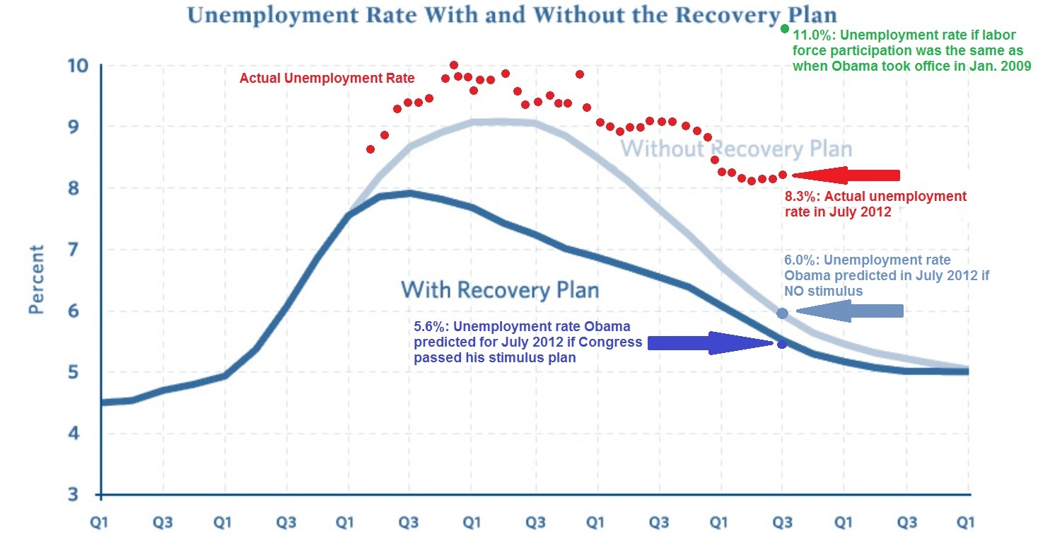
James Pethokoukis has the latest version of the chart originally created by Geoff at Uncommon Misperceptions, to which he's added a new wrinkle in its latest update: the green data point showing what the U.S. unemployment rate would be, if only the labor force participation rate had not fallen so much from where it was in January 2009 when Barack Obama was sworn into the presidency.
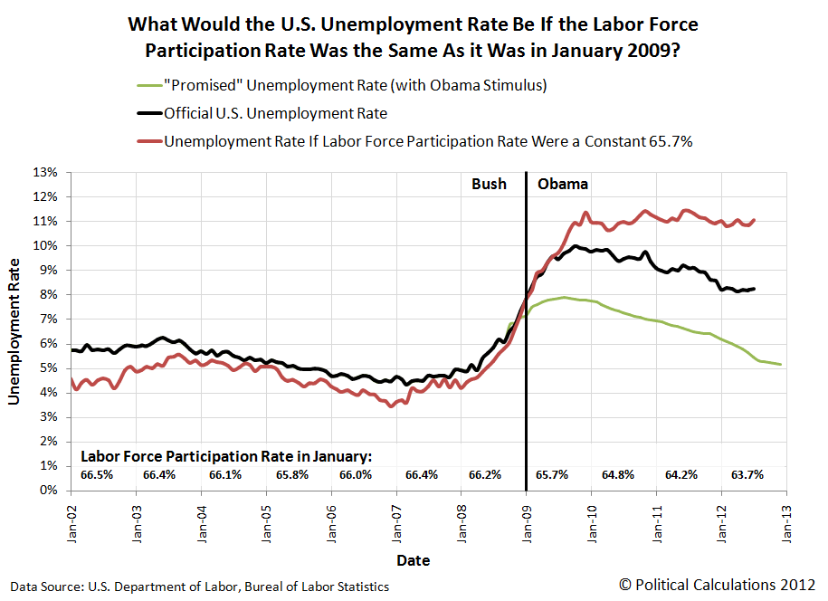
We thought we'd put that data point to the test. But, being us, we'd do the same math covering all the time since January 2002, just over 10 years ago, just to see how we had arrived at that point. Our results, showing the effects of keeping the U.S.' labor force participation rate at a constant 65.7% of the U.S. population, are below:
What we find suggests that there might indeed be something to the President's apparent belief that his economic plan has worked, although only half as well as intended, it seems:
Here, we observe that the actual trajectory for the U.S. unemployment rate largely parallels the one he and his economic planners centered in Washington D.C. desired. Since the actual trajectory for the U.S. unemployment rate requires a significant decline in the United States' labor force participation rate in order for it to have fallen as it has, we must assume that was their intention.
The only problem for President Obama and his economic team is that too few Americans chose to exit the U.S. civilian labor force as they desired. In order to have achieved their goals, they would have needed to remove an additional 2% of the U.S. working age population from the ranks of the nation's civilian labor force.
That would be on top of the 2% of the U.S. working age population that they successfully removed from the U.S. work force since January 2009. With the current civilian labor force participation rate standing at 63.7%, that additional 2% reduction in the number of Americans in the civilian labor force works out to be roughly an additional 4.9 million people.
What can we say? Apparently, the President and his team have decided that culling the U.S. work force is a lot easier for them to do than generating real job-creating economic growth.
Labels: data visualization, jobs
First, the good news! After several months of pacing near recessionary levels, the value of U.S. exports to China kicked up to double digit levels in May and June of 2012. That increase suggests that China's economy is growing more strongly for the first time since that nation effectively entered into recession in December 2011.
The bad news is that the U.S. economy weakened in both May and June 2012, with the value of U.S. imports from China falling back to the single-digit levels that are consistent with near-recessionary conditions, as once again, international trade data confirms the scenario we first forecast more than a year ago.
We continue to anticipate that this will be a short-lived condition as the U.S. economy is likely to grow more strongly in the third quarter of 2012 before falling back toward those near-recessionary levels later in the year. At least, if the expected level of future quarterly cash dividend payments for the S&P 500 is any indication (and yes, they are!)
And now you know what to expect through the rest of this year!
Labels: dividends, SP 500, trade
On 15 August 2008, the total U.S. public debt outstanding was just over $9.6 trillion (or if you're a stickler for accuracy, $9,606,975,957,798.46). Four years later, on 15 August 2012, the total public debt outstanding for the United States had risen to just over $15.9 trillion (or rather, $15,919,488,010,442.70). In four years then, the U.S. national debt rose by more than $6.3 trillion, or by 65.7% of its value in 2008.
To put those numbers on a more human scale, the amount of the U.S. national debt per American household has increased from $81,984 to $131,113 - the latter number being nearly equal to the cost of a 3 bedroom, 1-1/2 bath house in Hartville, Ohio. This represents a 59.9% increase over the last four years, as we estimate that the number of households in the U.S. has increased over the same time from 117,181,000 in 2008 to about 121,418,000 in 2012.
A good question to ask is how much of this increase in the national debt might be attributed to President Barack Obama, who was sworn in as the 44th President of the United States on 20 January 2009?
Typically, an incoming President bears little responsibility for the spending that occurs during their first year in office, since the budget that applies for that fiscal year will usually have been approved by the U.S. Congress in the previous year and signed into law by their predecessor.
How the U.S. government's budget for 2009 became law however was anything but typical.
Here, the Democratic Party-controlled Congress in 2008 only sent three of 12 appropriations bills for the 2009 budget year to President George W. Bush for his signature before he left office, deliberately withholding the remaining nine bills until after President Obama assumed office to avoid likely vetoes given the level of spending proposed in them. In 2009, the incoming Democratic Party-controlled Congress combined those nine bills into one "omnibus" bill, which President Obama signed into law on 11 March 2009.
Congressional Quarterly has a fairly detailed report of the FY2009 budget omnibus' appropriations bill history, but that requires a subscription to access. Here's the key quote from the article:
the omnibus provided a total of $1.05 trillion — $410 billion of it for discretionary programs — and included many of the domestic spending increases Democrats were unable to get enacted while George W. Bush was president.
So that accounts for $1.05 trillion of the U.S. government's spending in its 2009 fiscal year, which works out to be 32.6% of all federal spending in its 2009 fiscal year.
But that doesn't yet account for President Obama's economic stimulus package of 2009, which added some $825 billion to federal spending over its lifespan, above and beyond the U.S. government's annual budget.
Adding those two figures together, we find that Barack Obama, as President of the United States, may be held directly accountable for $1.875 trillion of the U.S. government's spending in 2009, or 53.3% of that year's federal spending. As a result, the federal government's spending during its 2009 fiscal year more closely represents President Obama's spending priorities than it does the previous President Bush's spending priorities.
That fact is especially driven home once we consider the voting record of Barack Obama in the U.S. Senate, where from 2006 through 2008, he supported or approved nearly every appropriations bill the Congress advanced. Or in the case of 2008, where he was often not present to vote for the increases in spending during this period as he ran for President, where he instead signed on to the massive increases in spending he desired after becoming President.
It is therefore reasonable to conclude that the combination of his voting record for government spending while in the U.S. Senate along with his spending record as President makes President Obama uniquely responsible for virtually all the federal government's spending and accumulated debt from Fiscal Year 2007 onward.
And that means that President Obama is uniquely and directly accountable for increasing the national debt burden of American households by $49,129 per household from 2008 through 2012.
References
U.S. Treasury. The Debt to the Penny and Who Holds It. [Online Application]. Accessed 16 August 2012.
U.S. Census. Historical Income Tables: Households. Table H-5. Race and Hispanic Origin of Householder--Households by Median and Mean Income: 1967 to 2010. [Excel Spreadsheet]. September 2011.
Project Vote Smart. President Barack Hussein Obama II's Voting Records. Accessed 16 August 2012.
Notes
Note: We projected the number of U.S. households by adding 1,368,000, the average annual change in the number of U.S. households from 1967 through 2010, to the recorded figure for 2010, twice (once for 2011 and again to estimate the number of households for 2012). The Census' official data for the number of households in 2011 will be published sometime in September 2012.
Labels: national debt
Now that we've tested our median income extraction math upon the U.S. Census' income data for women, we're going to repeat the exercise today for the Census' income data for men.
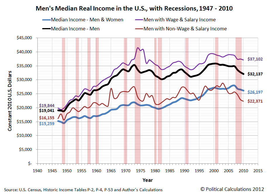
Our chart below shows what we found when we generated the inflation-adjusted median income data for both wage or salary earning men and what we extracted from the data for non-wage or salary earning men from the Census' Current Population Survey results for each year from 1947 through 2010, expressed in terms of constant 2010 U.S. dollars:
The chart is very different from what we observed for women. Starting first with the Census' published data for men with wage and salary income, we see that men just more than doubled their inflation-adjusted wage and salary incomes from 1947 through 1974, rising from $19,844 to just over $41,400, which corresponds to a real annualized growth rate of 2.6%.
But after that, men's median wage and salary income nose-dived in 1977 to a level around $35,000, plus or minus $2,000, about which it stagnated for the next twenty years. In 1997, it jumped up to a level around $38,000, about which it stagnated again in a range within $2,000 of that mark.
We should note at this point that the Census' data only counts money income - it does not include non-monetary compensation, such as health insurance benefits, that individuals earning wage or salary income commonly enjoy.
The more remarkable story though is for men with non-wage and salary income.
Here, we observe that men in this category had a much more slowly rising median income in the years from 1947 through 1965, increasing from an inflation-adjusted level of $16,155 to just $20,654, for a real annualized growth rate of just 1.4%.
In 1965 though, we find that non-wage or salary income earning men had a sudden jump to nearly $27,000 in their median incomes, after which we observe that this value has since settled into a range centered about $25,000, plus or minus $4,000 for all the years since.
That was surprising to us because we had expected that the median income data for this group would follow the same pattern we had observed earlier for women: basically flat up until after 1965, when the launch and growth of the U.S. government's Medicaid and Medicare programs might provide a steadily rising source of income for non-wage or salary earning men.
Instead, we find that other than what might be described as a one-time only benefit, the median income for men with non-wage or salary income has essentially stagnated since 1965.
We also find that non-wage or salary earning men would seem to be much more vulnerable to periods of recession than their wage and salary earning counterparts. Generally speaking, they see much deeper and longer periods of declines in their median incomes, indicating greater levels of economic distress.
We should note here that our non-wage or salary earning men include those who earn income from self-employment or through investments, which might account for much of that apparent greater sensitivity to economic downturns.
Labels: data visualization, demographics, income
Today, we're showing off our newfound ability to extract median income data for a particular sub-population given just what we know for the full population and another sample sub-population within it!
That sounds pretty boring, right? What do you say we liven it up a bit by noting that the full population for our example today represents all women with money income of one kind or another in the U.S. for the years of 1947 through 2010, while the sample sub-population within that group represents the women who earned wage or salary income over that period of time?
From those two bits of officially published data, we can work out the median income of all the women whose income came from everything but wages and salaries! Our results are presented in the inflation-adjusted terms of constant 2010 U.S. dollars in the chart below, where we've shown the median income for the combination of both men and women along with the median incomes of all women, the median incomes earned by women with jobs (or rather, those with wage and salary income) and the median incomes of women without jobs:
Looking at the data for women with wage and salary income, we find that initially, the median income for women was largely flat for the years from 1947 through 1960, hovering around the $9,900 to $10,000 mark in the inflation-adjusted terms of 2010 U.S. dollars.
After 1960 though, we see a steady rise - one that seems to be largely resistant to recessions. As of 2010, the median income for women with wage and salary income has risen by a factor of nearly 2.7 to $26,973, for a real annualized growth rate of 1.9% per year.
Update 23 April 2013: What you're about to read next has turned out to be off target - instead of pacing changes in Medicaid and Medicare, the median income of the non-wage or salary earning women has instead turned out to be largely pacing changes in Social Security benefits paid to women over time, which have often coincided with changes in Medicaid and Medicare. See here for more information....
Looking at the new data we've extracted for the median incomes of women with non-wage or salary income, what we find is really the story of Medicaid and Medicare over time.
Here, we see that after initially dipping in the years from 1948 through 1951 and recovering in 1952, the median incomes for women with non-wage or salary income was essentially flat at a level around $4,500 from then through 1965. Beginning in 1966 however, we find that the median incomes of these non-wage or salary earning women began to rise, reaching $12,924 in 2010, which works out to be a real annualized growth rate of 2.4% since 1965. As it happens, the timing and magnitude of that rise coincides with the launch of both Medicaid and Medicare in the late 1960s.
In fact, we can see much of the growth in the median incomes of non-wage or salary earning women paces the U.S. government's average spending per Medicare beneficiary for each year from 1966 through 2010:
And so, we see that government assistance in the form of Medicaid and Medicare is largely responsible for much of the observed growth of the median income of non-wage or salary earning women over the last 45 years.
Still think what we're doing is boring?
Notes
The published data for women's wage and salary income has a pretty unique anomaly for the years 1974, 1975 and 1976. It appears that the U.S. Census' data jocks were off by 10,000,000 in their estimates of the number of working women in each of those years, or about 25% of the actual figures, which in turn, led the Census to over-estimate the median income for women in those years by a similar percentage.
Labels: data visualization, demographics, income
We're revisiting the average and median incomes of men and women in the U.S. today because we've been using that data behind the scenes to prove out whether or not we could successfully determine these values for a combined population using only that data for the component sub-populations that make up the combined population, or vice versa.
As it happens, we could get pretty close to the actual values. The mean (average) income data was fairly easy to do, which we've shown below in our updated chart, where we've also indicated periods of recession (for the sake of not duplicating the chart we had previously posted and for providing additional context):
The trick here for calculating the average income of the combined population was to calculate the weighted average for the sub-populations - our results nearly matched the actual values recorded by the U.S. Census.
Working with the median income data however was a bit more difficult. Here, we took advantage of the fact that the distribution of income in the U.S. follows a log-normal pattern, which means that if you calculate the natural logarithm of income before graphing the distribution, the data will follow the normal, bell-curve shaped distribution that is pretty common in statistics.
Using the math that applies for log-normal distributions, we took the mean and median income data for the sub-populations and calculated their respective population means and standard deviations. We then took the weighted average of their population means, from which we calculated the median income for the combined population in each year, from which we got results that were really close to the actual values, paralleling them from 1947 through 2010.
When we say "really close", each of our calculated values were within about 2% of the actual values recorded by the U.S. Census in its Current Population Survey results. In the chart above, we multiplied our results by a scale factor of nearly 1.02 to shift our calculated values upward to more closely align with the actual values.
This isn't just an academic exercise. The real reason we've gone through this whole procedure is because we're going to be using the same math to extract information from the Census' annual income distribution data that has never really been examined before and we needed a test case to show that it works. And while we won't have the benefit of being able to check our results against actual data, you can reasonably expect that the trends we'll be presenting in that project will directly parallel the actual ones, and will very likely be within about 2% of them as well.
That's the beauty of the math!
Labels: data visualization, income, math
Three months ago, we took a snapshot of the future investors expected for the S&P 500's earnings per share. At the time, we noted that investors had taken a dimmer view of the future for 2012, but were expecting better things in 2013.
Today, we can report that investors have taken a dimmer view of future stock market earnings across the board. Our chart below shows how much their future expectations have changed since 20 May 2012, as compared to earlier forecasts going back to the gloomiest days for the market in 2009:
The future just isn't as bright as it used to be just three short months ago....
Data Source
Silverblatt, Howard. S&P Indices Market Attribute Series. S&P 500 Monthly Performance Data. S&P 500 Earnings and Estimate Report. [Excel Spreadsheet]. Updated 9 August 2012. Accessed 13 August 2012.
Labels: earnings, forecasting
Via Core77, Dylan (Household Hacker), shares his tips for how to deal with all those pesky little problems of everyday life in this two-part (so far) YouTube video series!
Part 1
What we learned how to do in Part 1:
- Remove a screw with a stripped head.
- Make a stylus for your smart phone.
- Remove spray paint from your hands.
- Unclog calcium buildup from your shower heads.
- Out of window cleaner? Clean your windows with cola instead!
- Better trash bag storage.
- Open and reuse very recently sealed envelopes.
- Make bug repellent from dryer sheets.
- Clean and destink sink pads.
- Easily clean your toilet bowl (plop plop fizz fizz)!
Part 2
- Make a smaller battery work in space for larger battery.
- Destink your sneakers.
- Measure the amount of propane remaining inside a closed tank.
- Easily open blister packaging.
- Pack maximum clothes with minimum wrinkles.
- Watch YouTube videos while doing other things on your computer.
- Convert a lamp into an air freshener.
- Keep writing after running out of ink.
- Open a jar with a stuck lid.
- Fill a pot that won't fit in your sink.
What we learned how to do in Part 2:
Labels: none really, technology
We're continuing our series on men, women and income in the United States today, with our first stop being a look at the number of individual men and women counted as having income in the years from 1947 through 2010:
In this chart, we see that the number of men earning incomes in the U.S. has grown at a fairly steady rate since 1947. But what's remarkable is that the number of women earning incomes in the U.S. has grown much faster, at least for the thirty years from 1947 through 1977. And then, the number of women earning incomes surged by over 14.5 million to surpass the number of men in the next two years, before settling in afterward to grow at a near equivalent rate of growth as that for men in all the years since.
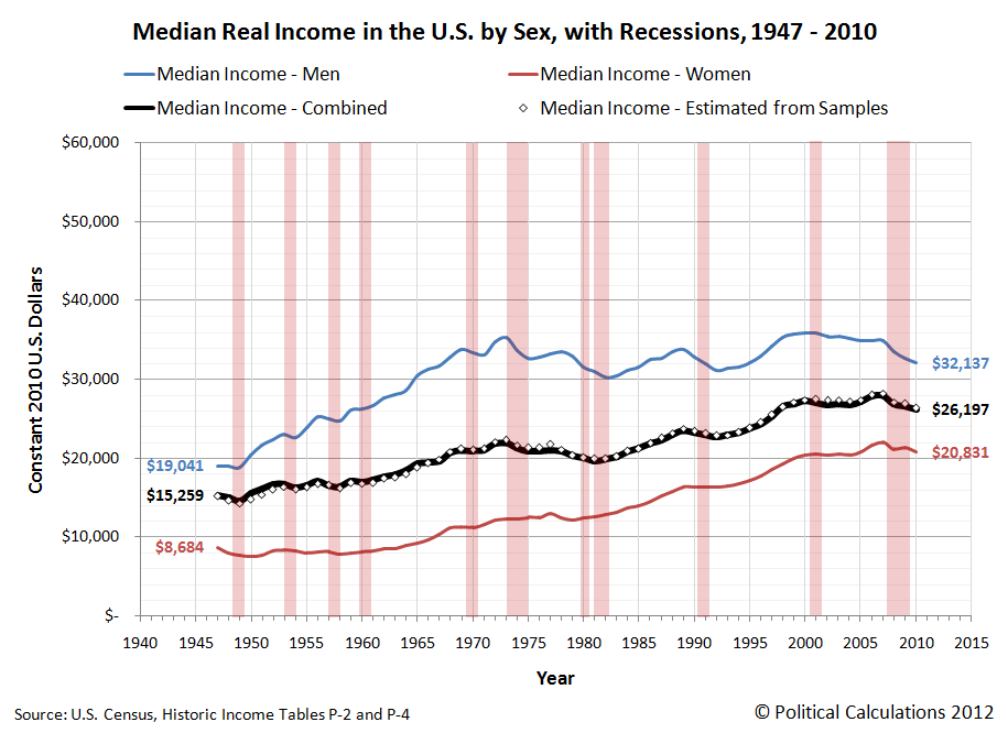
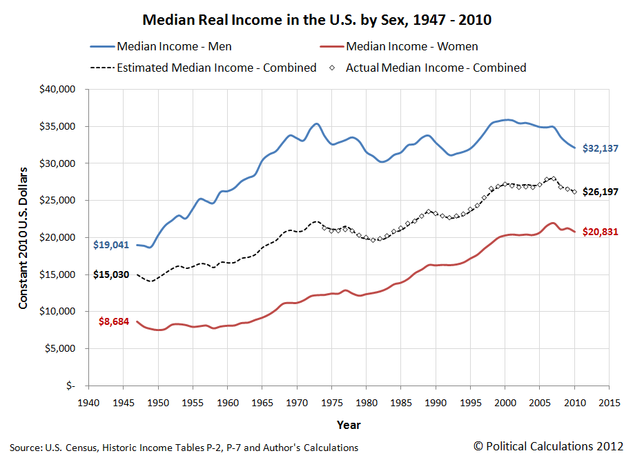
Our next chart features the inflation-adjusted median income for men, women and combined for the years from 1947 through 2010, which we've presented in terms of constant 2010 U.S. dollars. Since the U.S. Census has only published the median income data for all Americans earning income in the years from 1974 onwards, we used the Census' median income data for men and women separately for each year since 1947 to estimate what the the combined median income would be for the years before 1974. Our results are below:
As best as we can tell, the apparent sudden shift in employer hiring preferences for women after 1977, which we observe in both the number of women with incomes with respect to men and the growing median income of women in the years since, combined with the greater sensitivity of men's median income to periods of economic recession, likely accounts for the stalling out of real median income growth for men in the years from 1977 through 1996.
Since 1996, the trend in median income growth for both men and women have been more similar, although it still appears that men's median income is still much more sensitive to economic downturns.
Labels: data visualization, income
Welcome to the blogosphere's toolchest! Here, unlike other blogs dedicated to analyzing current events, we create easy-to-use, simple tools to do the math related to them so you can get in on the action too! If you would like to learn more about these tools, or if you would like to contribute ideas to develop for this blog, please e-mail us at:
ironman at politicalcalculations
Thanks in advance!
Closing values for previous trading day.
This site is primarily powered by:
CSS Validation
RSS Site Feed
JavaScript
The tools on this site are built using JavaScript. If you would like to learn more, one of the best free resources on the web is available at W3Schools.com.


