
The pace at which carbon dioxide accumulates in the Earth's atmosphere has been falling since peaking in January 2025. New data on the changing concentration of CO₂ in the air however suggests that long trend may be ending.
The decline since the January 2025 peak has largely coincided with the negative impact of the U.S.-China tariff war, which has contributed to the slowing of China's economy in the period since. Because China is, by far and away, the world's largest source of carbon dioxide emissions, changes in those emissions can provide a window in the relative health of its economy.
In August 2026, data reported by the remote Mauna Loa Observatory indicates the downward trend in the accumulation rate of CO₂ in the Earth's air has begun to slow. This new data points to a positive change in momentum for China's economy that follows an increase in trade between the U.S. and China, which we've observed in the form of an increase in goods exported from China to the U.S. since April 2026. The combination of this increase in trade with the positive change in momentum for CO₂ emissions indicates China's economic output is picking up.
The following chart shows the downward trend in the pace of carbon dioxide accumulation in the atmosphere is decelerating.

The deceleration in the downward trend is taking place near the levels where reversals in downward economic momentum have been observed during the last twenty years.
On a final note, our featured secondary (inset) chart is taken from the United Nations Environmental Programme's 2025 Emissions Gap Report. We're featuring it because the upper chart shows China's very much larger than every other nation's emissions of greenhouse gases, which is predominantly made up of carbon dioxide emissions.
But there's a surprise in the lower chart of the figure: the U.S. no longer holds the top rank for per capita greenhouse gas (GHG) emissions! The UN's data suggests the Russian Federation's per capita GHG emissions have overtaken the U.S. for the top spot.
References
National Oceanographic and Atmospheric Administration. Earth System Research Laboratory. Mauna Loa Observatory CO2 Data. [Online Data]. Updated 5 September 2026.
United Nations Environment Programme (2025). Emissions Gap Report 2025: Off target – Continued collective inaction puts global temperature goal at risk [Olhoff, A., chief editor; Lamb, W.; Kuramochi, T.; Rogelj, J.; den Elzen, M.; Christensen, J.; Fransen, T.; Pathak, M.; Tong, D. (eds)]. Nairobi. [PDF Document]. DOI: 10.59117/20.500.11822/48854.
Labels: economics, environment


Three months ago, we presented a snapshot of how differently gold prices have come to behave since 16 March 2022, when the Fed finally acted to hike U.S. interest rates after allowing the inflation unleashed by the Biden administration to get out of control. In that update, we noted how the price of gold had effectively decoupled from the yield of 10-year inflation-indexed constant maturity U.S. Treasury. In the years since that date, it had come to rise and fall independently of how the Fed set interest rates.
We even likened it to "High Striker", the carnival game where a player seeking to show off their strength swings a mallet on a see-saw that launches a weight up a vertical rail as high as they can. The rising and falling weight was a metaphor for the escalating and plunging price of gold, which was happening without any change in the inflation-indexed Treasury.
Something other than expectations about inflation was obviously driving the price of gold. Today, we know that something else is the policies of central banks around the world.
We know that because of the plunge in gold prices that took place in March 2026, the cause for which has since been identified. A media report published on 26 March 2026 indicates Turkey's central bank acted to sell over 58 tons of its gold reserves to prop up the nation's currency over a two week period in March 2026. Their fire sale sent the global price of the commodity plunging.
Before that date, several nations' central banks had set out to aggressively buy up gold to stock their reserves, which had become a major contributor to the escalation in its price since March 2022.
But it's not just Turkey who has been a big seller in recent months. Russia's central bank similarly sold off a significant portion of its reserves in April 2026 to "fill a budget hole" to support its government's spending, contributing to the downward plunge in gold prices at that time.
Since mid-May, the price of gold has resumed falling, turning into a steep log flume carnival ride-like plunge in the last several weeks. The following chart updates our previous one.

Since 19 June is a U.S. holiday that doesn't affect trading in gold markets, but does affect whether the U.S. Treasury is open for business, we've set the yield of the 10-year inflation-indexed constant maturity U.S. Treasury to be the same as was recorded for the day before. What we find is that between 27 February 2026, just before the Turkish central bank's gold sale, and 19 June 2026, the price of an ounce of gold has fallen by $1,123 to $4,155, a 21% decline.
Meanwhile, we see the 10-year inflation-indexed Treasury yield has increased by almost half a percent to 2.21%. Although it has increased, it still falls well within the range it has swung since April 2024.
What we don't have yet is an explanation for why gold prices have resumed falling over the last four weeks, and especially since the start of June. That we don't suggests it may be another central bank cashing out their gold because those events are often reported well after they occur.
Or not. Sooner or later, someone will do the accounting that explains why gold prices have fallen so much during this period. All we know for now is that the old wives' tale narrative of higher interest rates acting to rein in inflation doesn't explain it.
Image Credit: Microsoft Copilot Designer. Prompt: "An editorial cartoon of a Wall Street bull and bear on a log flume ride called 'THE GOLD RUSH' that's heading downward where the bear is happy and excited but the bull is scared".

What will used as money in a future space economy?
That question may be too broad, because the space economy already covers a lot of economic activities on Earth, where the money used in transactions is the very familiar currencies that nations have been using for decades, if not centuries. What we're really curious about is what will the people to travel to space use for money.
Space travel presents unique challenges because getting to space is costly. Space travelers have to bring nearly everything they need with them, which imposes limits on what they can use as money. Whatever they might use as money has to be both compact and lightweight, or else it will be difficult to justify the expense of transporting it into space. It would also have to be sufficiently durable because it has to endure in the space traveller's environment. Finally, it will also have to be something on which they place value, otherwise it would not be worth either storing or exchanging in trades with others.
So what will space travelers use as their currency? If we go by the following excerpt from Kelly and Zach Weinersmith's 2023 book A City on Mars telling the story of the first ever space currency, it probably won't be anything like what you might ever have expected:
The environment of space also reportedly makes food taste less flavorful. This may be a result of the fluid shift creating sinus pressure similar to a cold, or it may be that in zero gravity smells don't waft up into your nose, or it may be something about the artificial atmosphere. Whatever the reason, astronauts often lust for piquant condiments, such as salt, pepper, Tabasco, and mayonnaise. And, of course, taco sauce. Salty, zesty taco sauce is so beloved by astronauts that for about a week in 1991 it became the first form of currency specific to outer space. On shuttle flight STS-40, taco sauce went on everything. Pilot Sid Gutierrez recalled, "Although I didn't do it myself, I observed crewmates putting taco sauce on Rice Krispies in the morning." Around day 8, STS-40's Commander Bryan O'Connor realized the crew's rate of taco sauce consumption would soon outstrip the taco sauce supply. According to Gutierrez, the commander "secured all the remaining taco sauce and divided it equally among the crew members. Thereafter taco sauce became the medium of exchange. For example, if it was your turn to clean the latrine, you could pay someone a taco sauce or two to do it for you."
Shopping on Amazon, you can buy a quantity of 200 0.32-ounce single serve packets of taco sauce for $29.99 at this writing, or about six cents per packet. Now, think about how much you would pay someone to clean your bathroom on Earth because that's the equivalent of how valuable a single six-cent packet of taco sauce became in space.
Previously on Political Calculations
- Mars GDP as New Plans in Work to Create Its Export Economy
- The Birth of the Martian Economy
- The Tomato Soup Standard
Image credit: Microsoft Copilot Designer. Prompt: "An image of a banknote featuring an astronaut in space".

"Liberation Day". Otherwise known as 2 April 2025, that was the day U.S. President Donald Trump waited until after the nation's stock markets had closed before announcing the tariffs the United States government would impose on the value of goods produced in other countries to the U.S. that he had campaigned for in the 2024 election.
During his announcement, President Trump displayed several charts indicating the size of the tariffs imposed by foreign governments on U.S.-produced goods and the reciprocal tariff rates the U.S. government would soon impose. The list was stunning, both for the magnitude of tariffs that would be imposed and number of countries and foreign territories that would be affected.
There was just one problem. The numbers didn't make sense, either from a mathematical standpoint or an economic one.
That wouldn't have been a problem if the foreign tariff rates presented on the charts matched the tariff rates those nations and regions impose on U.S. goods. Because they didn't, the reciprocal tariff rates being announced by President Trump also didn't make sense for how the administration described they were arrived at.
The numbers were strange enough that many mathematicians and economists went to the trouble of digging into where they were really coming from. In the following video, Matt Parker, the author of Humble Pi: When Math Goes Wrong in the Real World, presents in the following video explainer:
Since there's no direct connection to actual tariff rates imposed by foreign countries on U.S. goods, the results of this reciprocal tariff math is instead signaling what the Trump administration really cares about. What that is boils down to the following list:
- The size of the trade deficit the United States has with other nations.
- Generating tariff revenue from all nations exporting goods to the U.S.
These things are much more about politics than they are about either maths or economics. The results of the reciprocal tariff math seems it was developed to produce a big, but not too big tariff number to negotiate around for the nations with which the U.S. has its biggest trade deficits, which is almost certainly the point of the exercise. Combined with the scope and scale of the "Liberation Day" tariffs, which even apply to foreign territories mainly inhabited by penguins, the real political message being sent by the Trump administration is there will be no escape for any nation from the newly announced minimum tariff of 10% and nations with whom the U.S. has large trade deficits will pay higher tariffs.
How those higher tariffs might be set however is up for negotiation and likely will be for quite some time.
We debated about whether to present a tool to do President Trump's reciprocal tariff math, but ultimately decided against doing so at this time because it's not a high value-added calculation. If you want to see which countries the U.S. has the biggest trade deficits with, you can get that information from official resources like the U.S. Census Bureau's Excel spreadsheet or sites that visualize that data like Brilliant Maps.
We'll close by presenting the video of President Trump's "Liberation Day" announcement, which we've queued to start from the beginning of his remarks.
The reciprocal tariff charts are brought out at about the 32-minute mark.
Image credit: Microsoft Copilot Designer. Prompts: "An editorial cartoon of a confused mathematician standing with their back to a classroom looking at a blank green chalkboard" and "Change the mathematician to an economist". We grafted the two images together to make the final cartoon.
Labels: economics, math, politics, trade

Yesterday marked the end of an era that has lasted over 232 years. 22 May 2025 is the day the U.S. penny died.
Or rather, it is the day the United States Mint ordered the coin blanks it will use to make pennies for the last time. When that final supply runs out later this year, no more U.S. pennies will be made, per an order issued by President Trump on 9 February 2025.
The cause of the penny's death is inflation. According to the U.S. Mint's 2024 annual report, it cost about 3.69 cents to make and distribute each one-cent penny produced in 2024.
From a cost perspective, the writing has been on the wall for the U.S. one-cent coin for a long time. Just the metal alone in the modern copper-plated, 97.5%-zinc Lincoln pennies minted since 1982 was worth 71% of their one-cent face value on 22 May 2025.
It could be worse. The value of the metal in the 95%-copper pennies minted from 1909 through 1982 is worth 284% more than their face value.
Unlike previous episodes when the cost of the metal needed to make a penny surged, today's labor costs have increased substantially, which add on top of the value of the metal needed to make the penny.
Even so, it would be possible to justify continuing to mint pennies at a loss if the demand for pennies was high enough. The increasing volume of electronic transactions however has put an effective cap on the needed supply of pennies. The combination of factors justifies the decision to stop making U.S. pennies.
There are benefits to be realized in stopping penny production. The U.S. Treasury Department anticipates "an immediate annual savings of $56 million in reduced material costs". And that doesn't include the related labor savings and environmental benefits.
The United States is finally applying something from the lessons of Doc Palmer, the "godfather" of Canada's "Ban-the-Penny" movement. Only about 13 years later than it should have.
Image credit: U.S. Mint. Learn > Coin & Medal Archive > Circulating Coins > Penny. The obverse and reverse images of the 2025 Lincoln Penny are United States Government works and are therefore public domain, which we've animated to show off both sides of the same coin. If you look very closely and are wondering about those very tiny letters tucked in bottom of the designs on the 'heads' and 'tails' sides of the penny, they are the initials of the artists who created them (VDB is Victor D. Brenner, LB is Lyndall Bass, and JM is Joseph Menna).
Labels: economics

Gold is a hedge against inflation. Gold is sensitive to expected long-term real interest rates. Gold is regarded as protective against "bad economic times".
Each of these statements represents a factor that has been cited as a driver of the price of gold. In November 2021, four economists at the Federal Reserve Bank of Chicago tested each of these propositions, publishing their analytical results in a Chicago Fed Letter.
Their analysis found evidence to support all three statements. Here's the conclusion to their essay summarizing their results:
We have investigated several hypotheses about the determinants of gold prices—in annual levels data, quarterly data in innovations form, and daily data in differences. The negative effect of real interest rates on gold prices predicted by theory holds in all three contexts. Two of the three specifications (the quarterly innovations specification being the exception) support the notion that gold is an inflation hedge and that this effect is quantitatively larger than the real interest rate effect. The two specifications that can be used to evaluate the proposition that gold prices also reflect protection against bad economic times are highly supportive of it. In the early part of the sample, variation in inflation or inflationary expectations was the single most important consideration for the real price of gold. From 2001 on, however, long-term real interest rates and pessimism about future economic activity appear as the dominant factors. While disinflation since 2001 might have been expected to result in low gold prices, any effect of low inflation was more than compensated for by unprecedentedly low long-term real interest rates and by pessimism about future economic activity.
That was in 2021. In the years since then, it would seem at least one of the propositions isn't holding the way it used to hold. And it's the big one they found held regardless of how they parsed their data: the negative effect of real interest rates on gold prices.
What's meant by that is they found the price of gold has an inverse relationship with real interest rates. After adjusting for inflation, when interest rates rise, the price of gold falls. And vice versa: the price of gold rises when real interest rates fall.
Since 16 March 2022 however, as the Federal Reserve started increasing interest rates and succeeded in causing real long-term interest rates to rise, the price of gold hasn't behaved they way. Real interest rates are now much higher than they were at that time, but instead of falling, the price of gold has risen and is now at or near record highs. The following chart shows both the pre-March 2022 inverse relationship between gold prices and real long-term interest rates and the new relationship, or rather, the new lack of relationship, between the two in the period since.

We've previously described the behavior of gold prices since 16 March 2022 as representing a paradigm shift. We think that new paradigm is like the old one, but is resetting the relative level of the price of gold at a much higher level than it was previously. It has happened as other factors driving the price of gold have become dominant over the level of real interest rates.
The behavior of gold prices since 1 March 2024 suggests that process has not yet settled. The price of gold is now ratcheting up without any significant change in real interest rates. Which factor do you suppose is more dominant right now? Are people buying gold because they're more worried about inflation and are hedging against it or are they buying gold because they're seeking to protect themselves against bad economic times?
References
Robert B. Barsky, Craig Epstein, Adrian Lafont-Mueller, and Younggeun Yoo. What drives gold prices? Chicago Fed Letter: Essays on Issues. November 2021, No. 464. [Online article]. DOI: 10.21033/cfl-2021-464.
Image Credit: A yellow background with lots of small circles photo by Lucas K on Unsplash

What drives the price of gold?
That's a fascinating question, which is the subject of an article asking that exact question at Investopedia. We're going to cut straight to their bottom line answer:
Today, the demand for gold, the amount of gold in the central bank reserves, the value of the U.S. dollar, and the desire to hold gold as a hedge against inflation and currency devaluation all help drive the price of the precious metal.
We have a unique perspective on this topic because of the fortunate timing of a snapshot we took mapping the recent historic relationship between the spot price of gold and real 10-Year U.S. Treasury yields some two years ago. That snapshot covered the period from 2 January 2007 to 17 March 2022, which is significant because a new paradigm for gold prices took hold starting on that latter date.
Two years later, this new paradigm can be seen in the following update to our chart, in which how the price of gold has changed with respect to the inflation-adjusted yield of the 10-Year Treasury is shown by the red line.
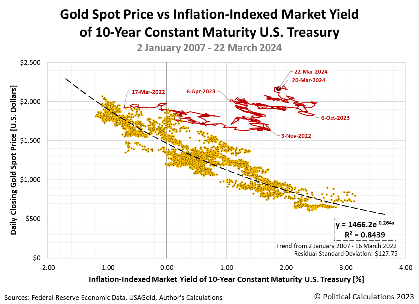
The big thing that stands out in the chart is that the price of gold has been rising even though the inflation-indexed market yield of a 10-Year U.S. Treasury has also risen during this period as the rate of inflation has fallen. This pattern contradicts the previous paradigm, in which gold prices rise as high inflation makes real yields fall or even turn negative in value, while low inflation rate has the opposite effect. In the old paradigm, there is an inverse relationship between the two.
The other thing that stands out are the periodic changes in direction of gold prices with respect to real 10-Year Treasury yields. We've marked the dates of the most significant turning points in the new paradigm on the chart.
We next mined through the market-moving headlines we've been capturing for years as part of our ongoing S&P 500 chaos series. While we seek to record headlines that have the potential to affect stock prices, it turns out we've also captured the events that proved to be major turning points for gold prices in the new paradigm. Here are the notable headlines occurring within a trading day of the indicated date on the chart marking the turning points:
- 16 March 2022: Fed hikes interest rates, signals aggressive battle against inflation
- 2 November 2022: Fed delivers fourth 75 bp hike, signals scale-back coming and Fed's Powell: "Ultimate level of interest rates will be higher than previously expected"
- 6 April 2023: 'Powell's curve' plunges to new lows, flashing US recession warning
- 9 October 2023: Top Fed officials nod to higher bond yields as cause for caution on rates and Marketmind: Fed pivot begins to crystallize
- 20 March 2024: Fed sees three rate cuts in 2024 but a more shallow easing path
For that last headline, gold prices broke through the $2,200 per ounce level to record an all-time high in terms of U.S. dollars. As of the final data point for the snapshot, we find gold prices hovering just a little below that level.
What all these headlines have in common is they herald actions by the U.S. Federal Reserve to alter the course of monetary policy in the United States. In the new paradigm, when the Fed alters its direction, investors alter the trajectory of gold prices.
References
Federal Reserve Economic Data. Market Yield on U.S. Treasury Securities at 10-Year Constant Maturity, Inflation-Indexed. [Online Database (Text File)]. Accessed 24 March 2024.
USAGold. Daily Gold Price History. [Online Database]. Accessed 23 March 2024.
Image credit: American Eagle One-Ounce Gold Coin photo by U.S. Mint. U.S. Government works public domain image.
Labels: data visualization, economics

The pace at which the concentration of carbon dioxide increases in the Earth's atmosphere rose again for the sixth consecutive month in February 2024. Since last bottoming in February 2023, the trailing twelve month average of the year-over-year change in the parts per million of CO₂ being added to the Earth's air has increased by 58%, rising from 1.89 ppm to 2.98 ppm. Only the months of August and September 2023 have seen a small pause in that otherwise upward trend.
That trend continues to be dictated by China's emissions of carbon dioxide, which is primarily produced by its coal-fired power generation plants. China is, by very large margins, the worlds's biggest consumer of coal and the world's biggest producer of carbon dioxide emissions.
China's emissions of CO₂ have generally been on the upswing since the nation ended its zero_COVID lockdowns at the end of 2022. Those emissions have generally reflected the Chinese economy's performance under China's government's ongoing efforts to stimulate the nation's economy during 2023.
The following chart shows the trends for the increasing emissions of excess carbon dioxide into the Earth's atmosphere from January 2000 through February 2024.
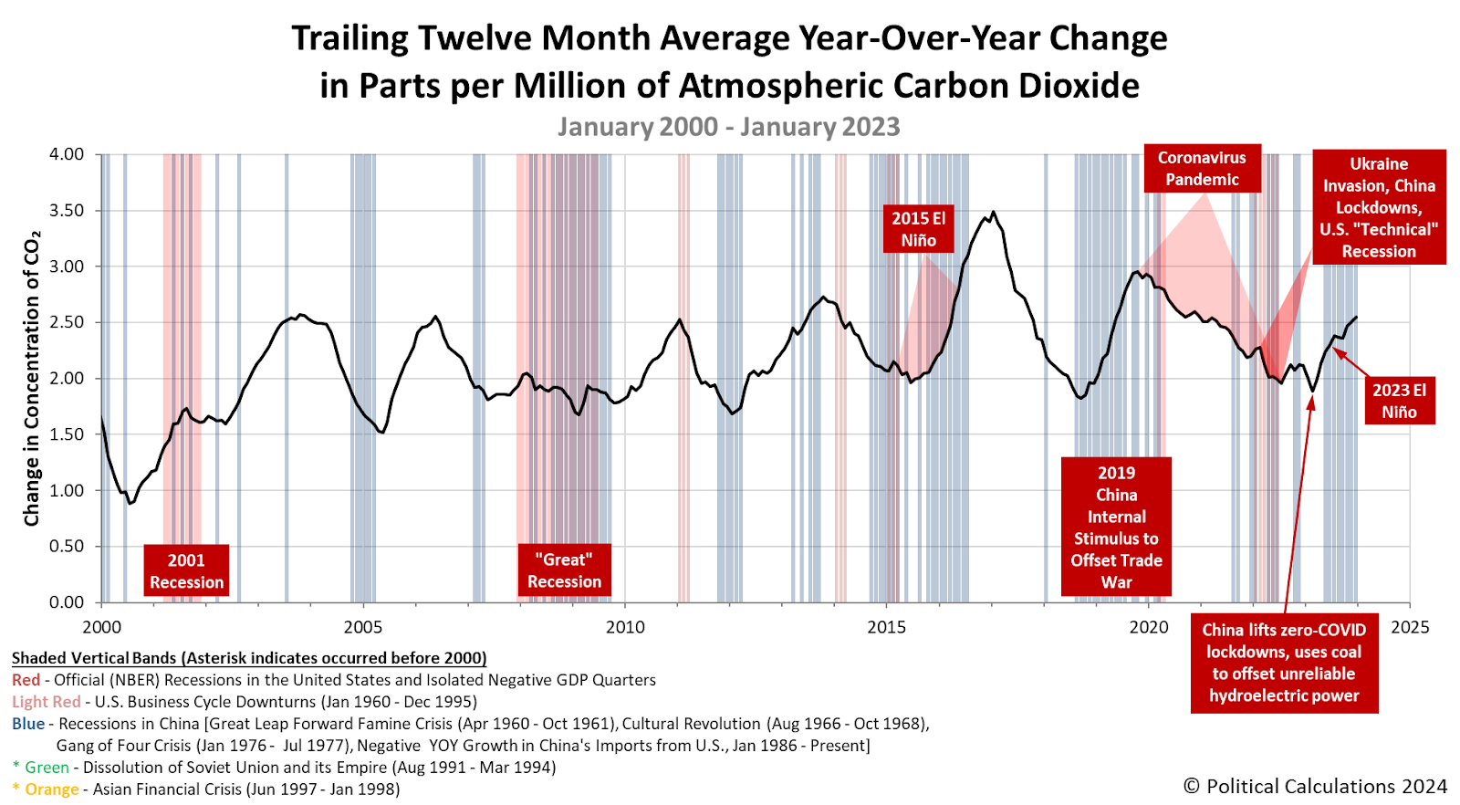
China remains on track to replace the United States as the world's historically largest emission source of excess carbon dioxide in the atmosphere before the end of the 2020s.
That accomplishment is likely given that China's internal coal production hit a new record high in 2023 as the country also boosted its imports of coal to support its growing appetite for electricity.
China continues to rely on coal and coal-fired power generation to meet its growing power demand, and despite being the world's top investor in solar and wind capacity, it also plans a lot of new coal-fired electricity capacity.
During the first half of 2023 alone, China approved more than 50 GW of new coal power, Greenpeace said in a report this year. That's more than it did in all of 2021, the environmental campaign group said.
That continuing expansion has real consequences. Earlier this month, China's government backed off its official five-year target for reducing the carbon intensity of its economy.
“China is effectively admitting its failure to fulfill the five-year target,” Li Shuo, director of the China Climate Hub at the Asia Society think-tank, told Climate Home. “This year’s target is even more modest than the average rate of reduction needed, while they should be playing catch up.”
Lauri Myllyvirta, a senior fellow at the Asia Society and co-founder of CREA, said that China is “basically admitting defeat” with this “very important metric”.
“The [2.5%] target is completely inadequate to get China back on track towards its 2025 goals,” he added. “It is very alarming that the government is not articulating a plan on how they are going to hit an internationally-pledged target.”
China's coal consumption is now projected to peak in 2026. Assuming China's government doesn't continue to back away from its pledges to reduce its use of coal and other carbon-based fuels.
References
National Oceanographic and Atmospheric Administration. Earth System Research Laboratory. Mauna Loa Observatory CO2 Data. [Online Data]. Updated 5 March 2024.
Image Credit: Microsoft Copilot Designer.. Prompt: "A diagram showing a coal power plant emitting carbon dioxide. The power plant has the Chinese characters for 煤 (coal) written on it."
Labels: economics, environment

January 2024 saw the pace at which carbon dioxide accumulates in the Earth's atmosphere increase for the fourth month in a row. The change is consistent with positive economic growth on the planet and China's ongoing efforts to stimulate it's faltering economy in particular.
As the world's large producer of carbon dioxide emissions, largely produced by its growing fleet of coal-fired electricity generation plants, and also the world's largest exporter of consumer goods, the CO₂ emissions produced as China powers its economy tells us a lot about the state of the global economy.
Since the country lifted its zero-COVID restrictions in late December 2022, its economy has expanded, which has increased the rate of carbon dioxide accumulation in the atmosphere. But it has also faltered, pointing to uneven economic growth within the country.
The following chart illustrates that effect using the remote Mauna Loa Observatory's measurements of the concentration of atmospheric carbon dioxide. We trace that impact as the trailing twelve month average of the year-over-year change in CO₂ accumulation presented against the background of major economic and environmental events.
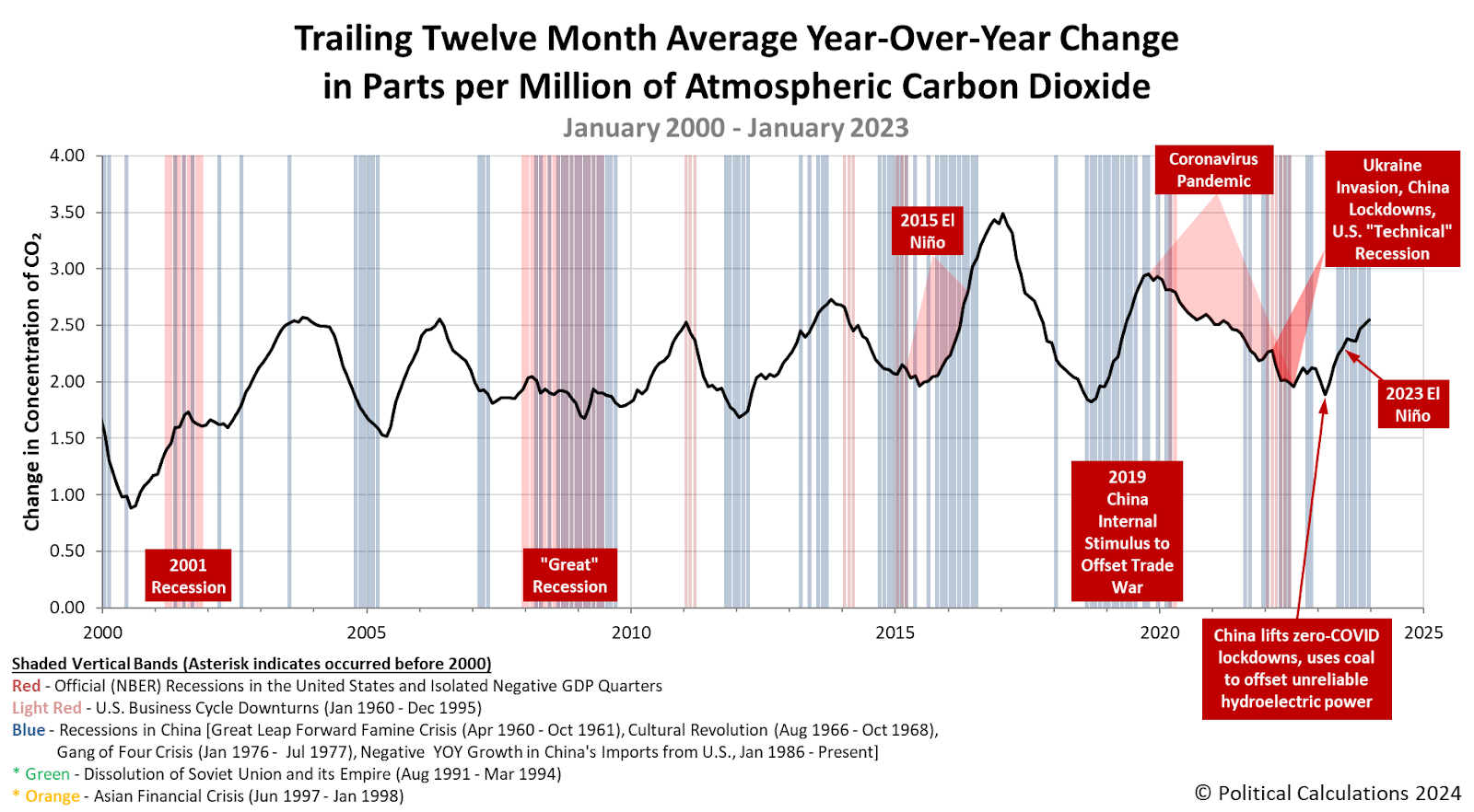
China's economy has increasingly struggled with deflationary pressures in recent months. Without intervention, these pressures would be expected to slow China's economy, the effects of which would also slow the rate at which the carbon dioxide it produces enters into the atmosphere.
But China's government has a history of staging interventions within the nation that have global impact. The implementation of new, larger economic stimulus efforts could soon be on tap.
Beijing responded to past bouts of deflation with forceful monetary easing and big fiscal stimulus measures. China is expected to boost fiscal stimulus again this year, but its plans won’t be clear until a national budget is released in March....
Economists generally see a need to boost demand for goods and services, with the government either directly channeling more money into the economy or encouraging banks to lend more to businesses and households. Calls are growing for the authorities to adopt more aggressive policies than rate cuts and trims to the amount of money banks must hold in reserve with the central bank — steps already taken in 2023, to modest effect. To durably boost consumer confidence and get people spending, the government will need to end the slump in the property market.
How it ultimately does that is something that will almost certainly be able to be measured by how fast the concentration of carbon dioxide in the Earth's air is changing. So goes China's economy, so goes atmospheric carbon dioxide.
References
National Oceanographic and Atmospheric Administration. Earth System Research Laboratory. Mauna Loa Observatory CO2 Data. [Online Data]. Updated 5 January 2024.
Image credit: Stable Diffusion DreamStudio Beta. Prompt: "Digital art concept of carbon dioxide emissions being used to measure economic growth."
Labels: economics, environment
From time to time, we come across data that's interesting in and of itself as we work on various projects. Worldwide coal consumption is one such data series that stands out because coal is a leading source of carbon dioxide in the Earth's atmosphere, which we pay attention to because of its value as an economic indicator.
We've explored worldwide coal consumption before, but only over the last few years worth of available data. So today, we're going to extend the limited picture we've presented all the way back to 1965, which is long enough to capture a number of interesting trends.
As a bonus, we'll tack on the latest estimates for 2023's worldwide coal consumption, which will make the data series as completely current as we can make it. The following chart illustrates the total number of exajoules of energy extracted from coal consumption for the world's top three national consumers of coal and the rest of the world from 1965 through 2023.
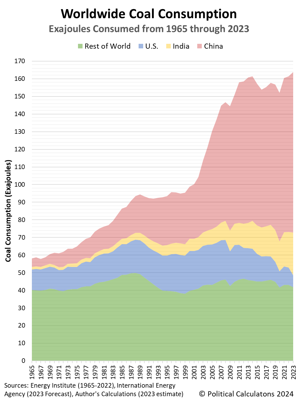
Starting with the big picture, based on current estimates, more exajoules of coal were consumed in 2023 than any other in history. Coal consumption has been rising in each year since the global coronavirus pandemic year of 2020. If its projection holds, 2023's worldwide coal consumption breaks the record set in 2013.
China is, by a very wide margin, the world's largest consumer of coal. China's consumption of coal exploded after 1999 and has more than tripled through 2023.
India has expanded its consumption of coal much more slowly over the decades covered in the data, but has more than quadrupled its consumption since 1996. Although its population has grown to exceed that of China, India recorded a little over 26% of China's total consumption of coal in 2023.
The United States is historically the world's largest consumer of coal, but the nation has greatly reduced its consumption since it peaked in 2005. In 2023, U.S. annual coal consumption has dropped by 70% from that peak.
Meanwhile, the rest of the world looks like its coal consumption has mostly been flat over the past six decades. In truth, that lack of apparent growth hides several major factors that have affected the world's coal consumption. For example, the collapse of the Soviet Union and the dissolution of its empire in 1991 reversed what had been a rising trend before that time. Meanwhile, the nations of the European Union have collectively reduced their coal consumption since it peaked in 1985.
But to make for an apparently flat trend, other nations have increased their consumption of coal over this period. In recent years, Indonesia and Vietnam stand out for the growth of their coal usage.
All these subglobal trends have combined to produce the overall pattern for worldwide coal consumption. The period from 1965 through 1991 saw a rising trend, which flattened out between 1991 and 1999, only to see coal consumption expand rapidly because of China's explosive growth up through 2011. The period since 2011 however has been generally flat with the world ranging between 152 and 164 exajoules worth of annual coal consumption.
2023's estimated worldwide coal consumption is over 2.8 times higher than 1965's coal consumption.
Reference
Energy Institute. Statistical Review of World Energy (2023). [Excel Spreadsheet]. 26 June 2023.
International Energy Agency. Coal 2023. [PDF Document]. 15 December 2023.
Labels: data visualization, economics, environment

The rate at which carbon dioxide accumulates in the Earth's atmosphere is directly affected by human activities. Increasingly, that measure tells us about human activities in China, the world's biggest source of carbon dioxide emissions by a widening margin.
But it's not the only contributor. Environmental events like El Niño can also lead to additional increases in the amount of carbon dioxide measured in the atmosphere.
In December 2023, the trailing twelve month average of the year-over-year change in the concentration of carbon dioxide measured in the Earth's atmosphere rose by 2.55 parts per million, the highest level recorded since December 2020. Not uncoincidentally, China's other exports increased for a second month as the Chinese economy showed signs of recovery following several sluggish months.
The following chart presents the trajectory of CO₂ accumulation in the Earth's air against the context of major economic and environmental events during the 21st Century:

For greater context, let's expand the picture to cover the period since January 1960!
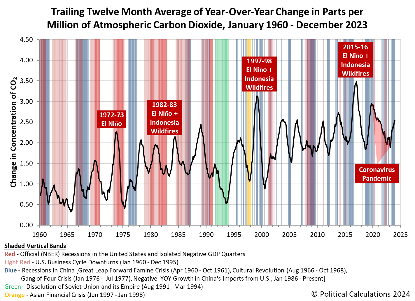
We've made a point of emphasizing El Niño events since we're currently living through one, which took hold in May 2023. Hopefully, the world will escape the surge of CO₂ addition that comes from El Niño drought-worsened wildfire events in Indonesia that produced the biggest spikes recorded in the pace of atmospheric CO₂ accumulation since 1960. At this point, it hasn't contributed much excess CO₂ to the atmosphere, but it is apparently flirting with becoming a "super El Niño" that may have a bigger impact.
References
National Oceanographic and Atmospheric Administration. Earth System Research Laboratory. Mauna Loa Observatory CO2 Data. [Online Data]. Updated 5 January 2024.
Image credit: Microsoft Bing Image Generator. Prompt: "El Niño causing drought in Indonesia leading to wildfires."
Labels: economics, environment

Over the past two months, China's economy has shown signs of greater economic growth. That change coincides with an increase in the rate at which carbon dioxide emissions are accumulating in the Earth's atmosphere. The increase reverses what had been a modest decline that coincided with sluggish economic growth in China.
When we talk about carbon dioxide as an economic indicator, we focus on China because that nation is, by far and away, the world's largest producer of carbon dioxide emissions. Given China's outsize role in global supply chains, these emissions provide can work as an indicator of global economic health in addition to China's.
We can illustrate China's role in producing carbon dioxide emissions by comparing its consumption of coal with the rest of the world. Over two-thirds of China's emissions come from from coal-fired power generation plants, so there's a very direct connection. The following chart summarizes the International Energy Agency's estimates of China, India and the rest of the world's consumption of coal, which is primarily used to generate electricity to support economic activity, for the years from 2020 through 2023.

In 2023, the IEA estimates China's consumption of coal accounted for nearly 56% of the total amount of coal consumed in the world. India, whose consumption of coal ranks second in the world, accounted for a little over 14% of the world's consumption. The entire rest of the world's coal consumption represents a little under 30% of the total.
Examining the chart more closely, both China and India have increased their consumption of coal since 2020, while the rest of the world has seen its consumption of coal decrease over this period (primarily in the U.S. and in the European Union). The increases in China and India however more than offset that reduction, with the result that the world's total coal consumption has increased in each year since 2020.
Unsurprisingly, China is responsible for most of that increase:
Coal power makes up about 70% of emissions in China, which has committed to being carbon neutral by 2060. After 2025, it is unclear whether China will approve new coal plants.
In the third quarter of this year, however, China permitted more new coal plants than in all of 2021, according to Greenpeace, even as most countries have stopped building new coal-fired power and are phasing out plants.
"With energy security becoming a code word for coal in recent years, there is a clear-cut path to receive approval on building more new coal while you still can," Greenpeace project leader Gao Yuhe said.
Xu Mingjun, general manager of Shenhua Energy, China's largest coal company, told investors in September that the company was taking advantage of this window of opportunity to bolster coal development.
More than 95% of the global coal plant capacity that began construction this year was in China, according to U.S. think tank Global Energy Monitor (GEM).
The expansion of China's coal-fired power generation capacity contributes to both economic growth within China, to the extent it does not substitute for other less reliable sources of electricity, and the nation's emissions of carbon dioxide. And by extension, the continuing accumulation of carbon dioxide in the Earth's air, as indicated in the next chart.
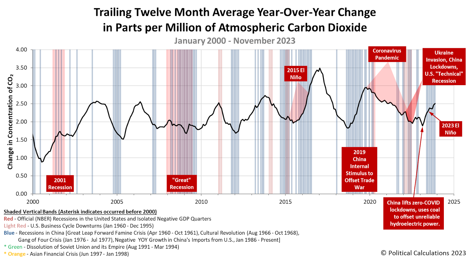
All indications point to China continuing to expand its coal-based power generation capacity through the end of 2025. The big question for these next two years is whether the global economy can support it?
References
International Energy Agency. Global coal consumption, 2020-2023. [Online data]. 28 July 2022.
International Energy Agency. Global coal consumption, 2021-2023. [Online data]. 27 July 2023.
National Oceanographic and Atmospheric Administration. Earth System Research Laboratory. Mauna Loa Observatory CO2 Data. [Online Data]. Updated 5 December 2023. Accessed 8 December 2023.
Image credit: Flickr/Wikimedia Commons. Power Plant (Tianjin, China) by Shubert Ciencia. Creative Commons. CC BY 2.0 DEED Attribution 2.0 Generic.
Labels: economics, environment

China became the world's biggest emitter of carbon dioxide into the Earth's atmosphere in 2006. Since then, its emissions have continued to increase, dwarfing the CO₂ output of every other nation on the planet by a widening margin.
China's emissions have become so large that even if China and every other nation were to freeze their CO₂ emissions at 2021's levels, China would still overtake the United States' historic emissions as the largest single national contributor of carbon dioxide emissions currently in the atmosphere by 2030. And since its emissions have increased substantially since 2021, China will almost certainly claim that top spot before the 2020s have ended.
China's carbon emissions are so large that we can increasingly use atmospheric carbon dioxide measurements to get a sense of how its economy is performing. Which is to say we can see whether its economy is speeding up or slowing by how the pace at which CO₂ accumulates in the air is changing.
The latest data from the remote Mauna Loa Observatory indicates China's economy has been slowing in recent months. Not that such evidence wasn't already apparent through trade data and China's increasing efforts to stimulate its economy over that time, but it's a kind of confirmation all the same. The following chart showing the trailing year average of the year-over-year change in the pace of carbon dioxide accumulation in the atmosphere since January 2000 indicates its recent decline continued into September 2023.

Given China's outsize role in producing global carbon dioxide emissions, the implication that China's economic growth continued slowing through that time logically follows. In reality, because of the lag in time from when emissions enter and begin diffusing in the Earth's atmosphere until they reach the Mauna Loa Observatory and are measured, it's a lagging indicator, telling us what happened anywhere from one to three months earlier.
Speaking of China's economic growth prospects, here's where they stand in early October 2023:
Lackluster growth and rising uncertainty have focused the world’s attention on the state of China’s economy. After a strong start to 2023, Chinese economic activity has sharply fallen short of expectations.
Exports have collapsed. Consumption, production and investment have slowed, while inflation leveled out and the unemployment rate edged up. The Chinese renminbi hit new lows in August and September 2023, driven by worries about the domestic economy....
Economic activity probably suffered its last major drop in July 2023. August data suggests that the economy is bottoming out, albeit very gradually. Casual observation confirms that economic recovery was underway in September.
But not enough to prevent China's government from mulling a new, larger stimulus for the nation's economy.
China is considering raising its budget deficit for 2023 as the government prepares to unleash a new round of stimulus to help the economy meet the official growth target, according to people familiar with the matter.
Policymakers are weighing the issuance of at least 1 trillion yuan ($137 billion) of additional sovereign debt for spending on infrastructure such as water conservancy projects, said the people, asking not be identified discussing a private matter. That could raise this year’s budget deficit to well above the 3% cap set in March, one of the people said. An announcement may come as early as this month, another person said, though deliberations are ongoing and the government’s plans could change.
Ultimately, whatever they decide will have an impact on the pace at which the concentration of carbon dioxide increases in the Earth's atmosphere.
Image credit: XCO₂ anomaly over China by NASA's Orbiting Carbon Observatory-2 (OCO-2), 2014-2016. Public domain image.
Labels: economics, environment

The results of 2022's Consumer Expenditures surveys have been released and it once again falls to us to visualize its historic trends.
Starting in 1984, the U.S. Bureau of Labor Statistics conducts multiple surveys each year to capture the spending of American "consumer units", the affectionate nickname the BLS' data jocks apply to what is pretty close to, but isn't quite, American households. In addition to describing how much and on what they spend money on, the results of the Consumer Expenditures surveys are used to determine the weighting of various consumer spending categories within the Consumer Price Index (CPI), the most commonly cited measure of inflation for the U.S. economy.
Because the data is used this way, it's important to track how the composition of consumer spending changes over time. For example, because the Affordable Care Act of 2010 (ACA) made health insurance much more costly, changes in the cost of health insurance has a bigger effect on consumer price inflation today than they did before the ACA was passed. Meanwhile, the amount that Americans spending on apparel has declined over time, so changes in apparel prices have a smaller effect on the consumer price index than what they had in the 1980s.
Having set that background, our first chart presents the average annual amount of consumer expenditures by American "consumer unit" households for each year from 1984 through 2022.

These figures represent the nominal, or non-inflation adjusted, total average consumer spending in each year. The next chart breaks out that spending into major expenditure categories, such as housing, transportation, food, life insurance & pension savings & Social Security, health insurance & medical expenses, entertainment, charitable contributions, apparel & other products, and education, to put them in order from highest to lowest:

The third chart reveals the trends for these categories, showing how their individual share of total average annual consumer expenditures has been changing since 1984.

The final chart puts all these changing trends together. The major categories of consumer spending that have had a falling share of total consumer spending over time are shown in shades of green, those claiming a rising share over time are shown in shades of purple.

If you want to know specifically how spending on these major categories of consumer spending have changed since last year, we'll close with the following excerpt from the BLS' press release for 2022's consumer expenditures (boldface emphasis ours).
Selected spending patterns, 2022
- Housing expenditures increased 7.4 percent in 2022, after a 5.6-percent increase in 2021. Expenditures on both rented dwellings and owned dwellings increased by 6.5 percent and 8.4 percent, respectively. (For more information on how owned dwellings is defined see the methodology section). The largest housing-related spending increase in all major components of housing was in other lodging, up 30.9 percent, due largely in part to a 38.6-percent increase in lodging on out of town trips.
- Transportation expenditures increased 12.2 percent in 2022, after an increase of 11.6 percent in 2021. This increase was driven by the component category public and other transportation spending (+86.9 percent), followed by a 45.3-percent increase in gasoline, other fuels, and motor oil. Average expenditures for vehicle purchases (net outlay) were down 6.9 percent in 2022, after a 6.7-percent increase in 2021. A net outlay is defined as the household's total payment or purchase amount of a good or service minus any reimbursements. A net outlay is commonly referred to as the total out of pocket spending. Vehicle purchases (net outlay) includes the purchase price minus trade-in value on new and used domestic and imported cars and trucks and other vehicles, such as motorcycles.
- Spending on food increased 12.7 percent in 2022, compared to an increase of 13.4 percent in 2021. The increase was driven by food away from home spending, up 20.1 percent, accompanied by an increase in food at home spending, up 8.4 percent. Expenditures for food away from home in 2022 exceeded 2019 levels, marking the first time since the onset of the COVID-19 pandemic that this has happened.
- Personal insurance and pensions spending increased 11.0 percent in 2022, after increasing 8.7 percent in 2021. This was driven by an 11.1-percent increase in contributions to pensions and Social Security. Within contributions to pensions and Social Security, there was a 28.8-percent increase in expenditures on non-payroll deposits to retirement plans. At the same time, spending on life and other personal insurance increased by 9.7 percent.
- Entertainment expenditures decreased 3.1 percent in 2022, after exhibiting an increase of 22.7 percent in 2021. This decrease was driven by a 24.5-percent decrease in other entertainment supplies, equipment, and services expenditures, which contrasts with the 60.6-percent increase in 2021. Toys, hobbies, and playground equipment also decreased from 2021 to 2022 (-16.1 percent). Although there was a 27.4-percent increase on fees and admissions, this was offset by the previously stated declines.
- Spending on cash contributions increased 14.1 percent in 2022, after a 5.8-percent increase in 2021. This increase in 2022 was driven by a 36.3-percent increase in other cash gifts.(2) Cash contributions includes cash contributed to persons or organizations outside the consumer unit, including alimony and child support payments; care of students away from home; and contributions to religious, educational, charitable, or political organizations.
- Spending on apparel and services increased 10.9 percent in 2022, after an increase of 22.3 percent in 2021. All major components of apparel and services exhibited increases, the largest being an 18.8-percent increase in footwear. With this 10.9-percent growth in apparel and services, spending has surpassed 2019 levels, before the COVID-19 pandemic.
- Personal care products and services increased 12.3 percent in 2022, which follows the large increase of 19.3 percent from 2021. Personal care products increased by 15.5 percent after a 1.0-percent decrease in 2021. Personal care services increased by 9.1 percent, particularly notable since this follows the 50.4-percent rise from 2021.
The data confirms American consumers experienced considerable inflation during both 2021 and 2022.
References
U.S. Bureau of Labor Statistics. Consumer Expenditure Survey. Multiyear Tables. [PDF Documents: 1984-1991, 1992-1999, 2000-2005, 2006-2012, 2013-2020, 2021-2022]. Reference URL: https://www.bls.gov/cex/home.htm. 8 September 2023.
Labels: data visualization, economics
Welcome to the blogosphere's toolchest! Here, unlike other blogs dedicated to analyzing current events, we create easy-to-use, simple tools to do the math related to them so you can get in on the action too! If you would like to learn more about these tools, or if you would like to contribute ideas to develop for this blog, please e-mail us at:
ironman at politicalcalculations
Thanks in advance!
Closing values for previous trading day.
This site is primarily powered by:

CSS Validation

RSS Site Feed

JavaScript
The tools on this site are built using JavaScript. If you would like to learn more, one of the best free resources on the web is available at W3Schools.com.
Other Cool Resources
Blog Roll


