The solution to the New York Times Wordle puzzle on 16 September 2022 left a bad taste in the mouths of the online word game's enthusiasts. Many of these players lost their streaks because the solution, PARER, proved to be the hardest puzzle the game has yet presented.
We'll let Cracking the Cryptic's Mark Goodliffe demonstrate how hard it was by going through his thought process in tackling it:
Goodliffe's method is similar to that of many players. He starts with a test word, one that includes some of the more frequently occurring letters in the English language. He then takes the clues he gets from the game to choose the word he uses on the next line, and the process repeats until the sixth and final line is completed, if needed. Most players can solve the daily puzzle within four lines/guesses.
But a word like parer doesn't make it easy to use that process. There were too many viable options that could legitimately work, without even getting to the duplicate letter option.
So what would be a better approach?
If you recognize that the right way to measure your success at Wordle is not how many lines or guesses it takes you to reach the solution, but rather the amount of time you take to reach it, you can take advantage of a process of elimination. By using a series of test words that include the most frequently used letters in English words that are five letters long, you can extract a lot of information about the correct solution.
Recovering Physicist tapped a Scrabble-legal database of five-letter words to identify the letters most frequently used in them. Here's the list, from most common to least:
SEAOR ILTNU DCPYM HGBKF WVZXJ Q
Using this information, we identified some 277 sets of three five-letter words using the first 15 characters without repeating any characters. We then scored the words in each group according to the rank of their letters, where words using the most frequently used letters would get the lowest scores. For example, the score for a word like Goodliffe's test word of GRIME would be found by adding the ranks of its letters: G(17) + R(5) + I(6) + M(15) + E(2) = 45. Surely there must be a better first choice!
If you just went by the first five most frequently used letters, that word will be AROSE (15), but you won't have any test words to follow it if that guess doesn't provide you with enough clues. To have that option, from our 277 sets of words, the set with the lowest first word score is AISLE (19), MOUND (49), and CRYPT (52).
At that point, it occurred to us that it might be better to stack as many frequently used letters as possible into the first two words, ranking them by their combined score. For AISLE and MOUND for example, the combined score is 67.
Going through our list, we found the lowest combined scores, then filtered for the lowest first word score. Following that process, we think the optimal test words for Wordle are....
ARSON, CITED, and LUMPY
ARSON (or SONAR if you prefer) has a score of 22. CITED (or EDICT) would score 39, with a combined score of 61.
Between ARSON and CITED, you should be able to identify enough clues to solve most easier puzzles. If you need to use all three of these test words to get traction for your solution, you will at least be able to confirm what vowels are being used.
In the case of PARER, you could have used all three of these test words and with a bit of luck, have solved the puzzle in the fourth line. You would have identified A, R, E, and P as used letters, and knowing the location of E, you could set up PARE_ as the solution. You could reasonably identify D, R, or S as the last letter, but because the three test words eliminated D and S, you would select R and be rewarded.
But if you set up PA_ER, which would also be reasonable, you would have to consider the letters C, G, L, P, R, V, and Y as creating valid words, before eliminating C, L, and Y because you've already found they're not used. From here, your optimal choice would be to enter a new test word using letters you haven't previously used (G and V). If you used the word GLOVE, you would be down to just two possible options, P and R, with one line to go.
Your odds of winning at that final line then would have been 1 in 2, coming down to your selection of which letter between P and R to drop into that third space. If a 50% chance of winning seems too low, remember that if you're one of the majority of people who lost their Wordle streak on 16 September 2022, your chance of winning that day's game were never that high. The method we've described would have given you a fighting chance, while also helping you work out the solution faster.
P.S.: According to Recovering Physicist, the most frequently used letters found by those who extracted all the words from Wordle's database are:
EAROL TSINU CYDHP GMBFK WVXZQ J
We'll leave it as an exerise to you to identify your optimal test words based on this information!
Update 9 October 2022 P.P.S.: Matt Parker has identified the five Wordle-legal words you need to know if you're willing to burn five guesses just to identify which letters are used in the solution:
FJORD GUCKS NYMPH VIBEX WALTZ
If you use these words, you're really betting on being able to find the answer in one guess. Considering how many anagrams or words with duplicate letters there are, you'll probably find it's not an optimal way to successfully solve a Wordle game.
Labels: ideas
What does the future hold for the dividends of the S&P 500 (Index: SPX) now that we're reaching the end of the third quarter of 2022?
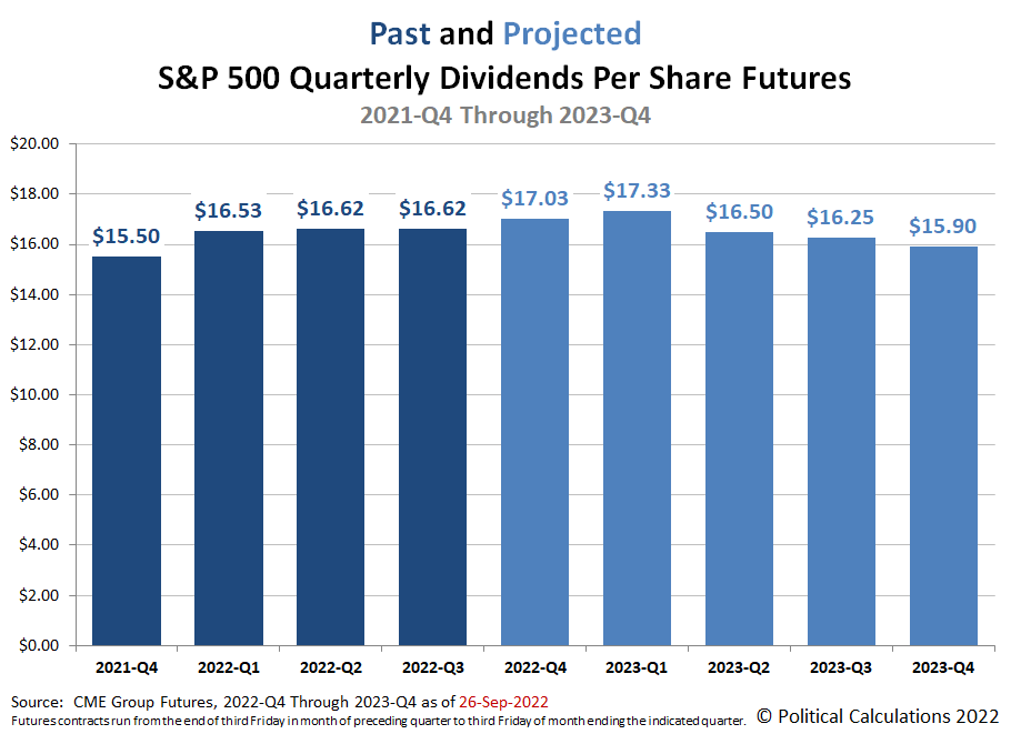
We're now in the gap between when the index' dividend futures contracts for 2022-Q3 have expired and the actual end of the calendar quarter. We find the outlook for the S&P 500's quarterly dividends per share improved since we checked them near the end of 2022-Q2. What's more, we also have a first look for dividend futures data extending through the end of 2023. The following chart reveals those expectations before the start of trading on Monday, 26 September 2022:
Here's how the dividend futures forecast has changed for each quarter for which we presented data at the end of 2022-Q2:
- 2022-Q3: Up $0.29 per share.
- 2022-Q4: Up $0.63 per share.
- 2023-Q1: Up $0.73 per share.
- 2023-Q2: Up $0.40 per share.
As interest rates rise and recessionary pressures increase, we're starting to see firms like Fedex dial back their earnings forecasts, though not yet their dividends. It's an open question of how long that state of affairs can continue.
About Dividend Futures
Dividend futures indicate the amount of dividends per share to be paid out over the period covered by each quarters dividend futures contracts, which start on the day after the preceding quarter's dividend futures contracts expire and end on the third Friday of the month ending the indicated quarter. So for example, as determined by dividend futures contracts, the "current" quarter of 2022-Q3 began on Saturday, 18 March 2022 and will end on Friday, 16 September 2022.
That makes these figures different from the quarterly dividends per share figures reported by Standard and Poor, who reports the amount of dividends per share paid out during regular calendar quarters after the end of each quarter. This term mismatch accounts for the differences in dividends reported by both sources, with the biggest differences between the two typically seen in the first and fourth quarters of each year.
Reference
The past and projected data shown in this chart is from the CME Group's S&P 500 quarterly dividend index futures. The past data reflects the values reported by CME Group on the date the associated dividend futures contract expired, while the projected data reflects the values reported on 27 June 2022.
Labels: dividends, forecasting, SP 500
U.S. new home sales unexpectedly rose in August 2022. Here's how Reuters covered the most important numbers in the story:
New home sales surged 28.8% to a seasonally adjusted annual rate of 685,000 units last month, the Commerce Department said on Tuesday. July's sales pace was revised higher to 532,000 units from the previously reported 511,000 units....
The median new house price in August was $436,800, an 8.04% increase from a year ago.
What Reuters didn't say is that August 2022's new home prices fell $29,500 (-6.3%) from its revised level of $466,300 in July 2022. That previous month's median new home sale price was itself revised 6.1% higher from the $439,400 it was initially reported to be a month earlier.
At the same time, mortgage rates dipped slightly from July to August 2022, falling from 5.41% to 5.22%. The unexpectedly high number of new home sales would appear to be the result of homebuyers recognizing that respite would likely be very short lived, who then scrambled to lock in the month's combination of lower mortgage rates and lower sale prices.
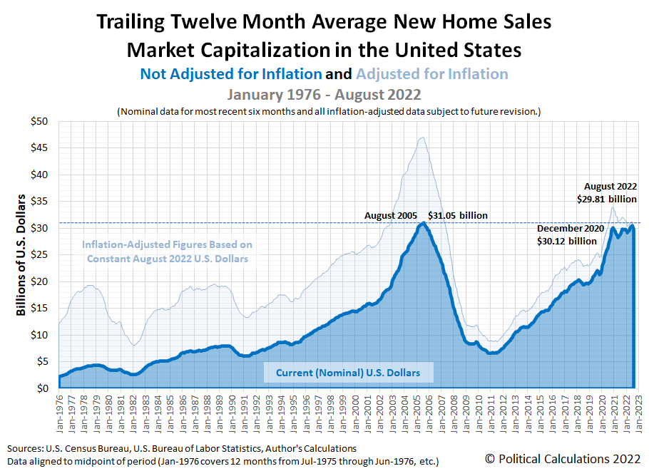
We'll take a closer look at what those changes mean for new home affordability next week, but for now, we'll look at what the combination of revisions and new information involving new home sales means for the U.S. new home market. Political Calculations' initial estimate of the trailing twelve month average market capitalization for new homes in the U.S. in August 2022 is $29.81 billion, down 5.1% from our initial estimate of $31.40 billion for July 2022.
Meanwhile, our revised estimate for July 2022 is $31.47 billion, a 0.2% increase from our initial estimate, confirming this month represents the peak for this measure in 2022. The large, upward revision in new home sale prices almost fully accounts for that outcome. The latest update of our chart shows U.S.' new home market cap's shifted trailing twelve month average.
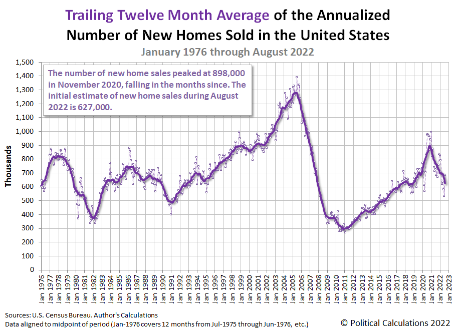
The next two charts show the latest changes in the trends for new home sales and prices:
We've included the raw monthly data for new home sales and their average monthly sale prices in these latter two charts to illustrate the month-to-month noise in the data. The data for new home sales is typically finalized some three months after it is first reported.
Looking forward, we anticipate September 2022 will see both fewer sales and lesser affordability given the spike in mortgage rates during the month. The next data release for new home sales will come on 26 October 2022.
References
U.S. Census Bureau. New Residential Sales Historical Data. Houses Sold. [Excel Spreadsheet]. Accessed 27 September 2022.
U.S. Census Bureau. New Residential Sales Historical Data. Median and Average Sale Price of Houses Sold. [Excel Spreadsheet]. Accessed 27 September 2022.
Labels: market cap, real estate
The U.S. Census Bureau has released its annual estimate of the median income earned by the United States 131,202,000 households in 2021. At $70,784, the annual income earned by a typical American household increased by $2,774 (or 4.1%) from 2020 to 2021. Adjusted for President Biden's inflation however, real median household income fell by $402 year-over-year from 2020 in terms of constant 2021 U.S. dollars.
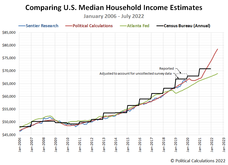
We've added the U.S. Census Bureau's annual data to our chart comparing the various available sources for U.S. median household income data that track this demographic characteristic on a monthly basis. The updated chart compares their nominal, noninflation-adjusted estimates over the period they overlap from January 2006 through July 2022.
In incorporating the U.S. Census Bureau's annual data in this chart, we've annotated the anomaly for 2019's median household estimate. Here, the Census Bureau's median household income estimate for 2019 was greatly impacted by the arrival of the coronavirus pandemic in March 2020, coinciding with the period in which it surveyed U.S. households about the income they earned in 2019. Lockdown measures imposed by several state goverments, including the high population states of California and New York, blocked the Census Bureau from successfully collecting as much data as they intended, particularly from lower-income earning households. In a working paper, Census Bureau analysts confirm the coronavirus pandemic reduced the number of responses to the Annual Social and Economic Survey used to collect household income data, which they believe biased the median household income figure upward by 2.8%. Our chart shows both the Census Bureau's reported figure of $68,703 and indicates the adjusted figure of $66,779 for that year.
Comparing the Census Bureau's annual estimates with the monthly estimates, we find that all these estimates range within a few percent of each other from January 2006 through October 2018. After that point, there's a major divergence between the Atlanta Fed's estimates and the others, where we continue to note the following three differences:
- The Atlanta Fed's estimates understate the rising trend for median household income observed in 2019.
- They also completely miss the impact and recovery from the coronavirus recession in 2020.
- They significantly understate the robust growth in median household income we've observed since March 2021.
That difference, particularly with the U.S. Census Bureau's annual data, is growing much more substantial as time passes.
Political Calculations' estimates of median household income generally tracks with Sentier Research's estimates up through the period where they terminate in December 2019. The analysts who founded Sentier Research after retiring from the U.S. Census Bureau went on to permanently retire in 2020 and Sentier Research is no longer an operating entity.
For the latest in our coverage of median household income in the United States, follow this link!
The Bureau of Economic Analysis will soon be releasing a major revision of its historic income data. Since Political Calculations uses this data in generating its monthly household income estimates, the chart above represents a snapshot of our estimates compared with other sources "before" the revised data becomes available.
References
Federal Reserve Bank of Atlanta. Home Ownership Affordability Monitor (U.S. Census Bureau American Community Survey One-Year Estimates of Median Household Income, Projected to Indicated Month by Atlanta Fed Staff using additional data produced by the Current Population Survey and Decennial Census). [Online Database]. Accessed 23 September 2022.
Sentier Research. Household Income Trends: January 2000 through December 2019. [Excel Spreadsheet with Nominal Median Household Incomes for January 2000 through January 2013 courtesy of Doug Short]. [PDF Document]. Accessed 6 February 2020. [Note: We've converted all data to be in terms of current (nominal) U.S. dollars.] Note: Sentier Research is no longer an operating entity, we've linked to the Internet Archive's copy of this final report.
Political Calculations. Median Household Income in July 2022. [Online Article]. 1 September 2022.
U.S. Census Bureau. Historical Income Tables: Households. Table H-5. Race and Hispanic Origin of Householder -- Households by Median and Mean Income. [Excel Spreadsheet]. 13 September 2022.
Jonathan Rothbaum and Adam Bee. Coronavirus Infects Surveys, Too: Survey Nonresponse Bias and the Coronavirus Pandemic. U.S. Census Bureau Working Paper Number SEHSD WP2020-10. [PDF Document]. 30 March 2021.
Update 2 October 2022
The BEA's annual data revision for 2022 has been released. It's much smaller in scale and scope than it might have been, covering the period from January 2017 through July 2022. We created the following animation to show how the revision changed Political Calculation's median household income estimates over this period.
The effect of the data revision can be divided into two periods. From January 2017 through February 2021, the size of revisions were very small, with data during 2020 seeing the largest changes in the form of upward revisions with a magnitude of +0.2%. Much larger changes are concentrated in the period from March 2021 through July 2022 however, which were revised downward by progressively increasing amounts. The smallest revision in this second period was for March 2021, which was unchanged, the largest revision was for July 2022, which was reduced by $1,000. We'll have more analysis when we present the median household estimate for August 2022 on 4 October 2022.
Update 26 July 2023
Going back over the comparison and looking at how the estimates have progressed since we originally wrote this, we're thinking our estimates started running hot in early 2021. What we're seeing is similar to how our estimates behaved after the relationship between trailing year average earned income per capita and median household income changed as a result of the Census Bureau's March 2015 survey revision, but this time, coinciding with the post-pandemic recovery, which is a pretty exciting development. Unfortunately, we'll need to wait until 2022's annual median household income data becomes available sometime in September 2023 to have enough data to quantify how hot the estimates are running and to find out how the relationship they're based upon may have changed.
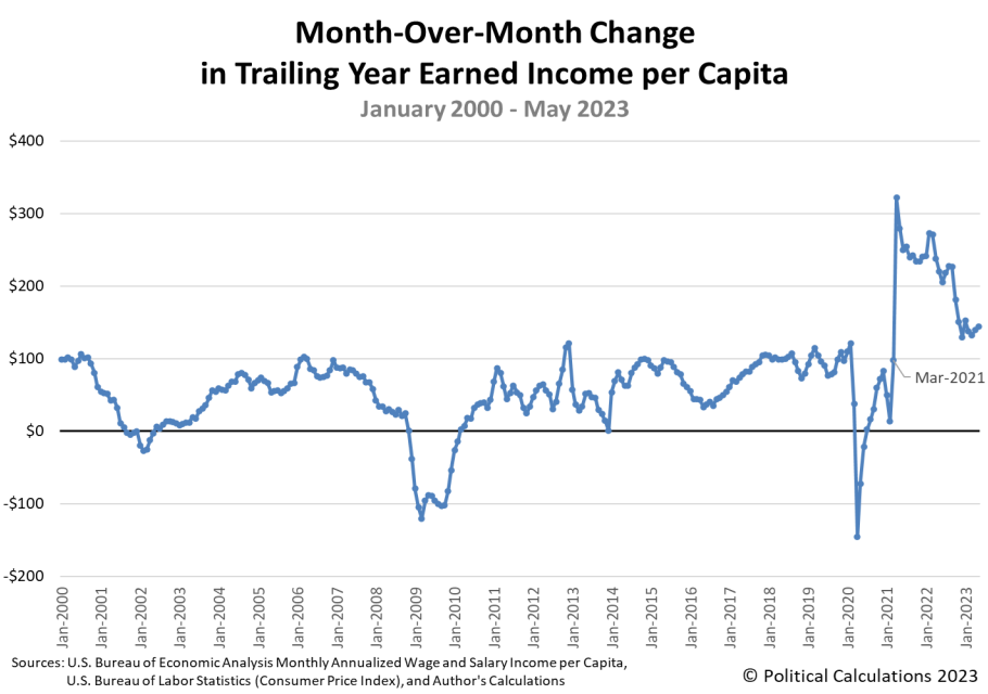
Check this out - the month-over-month change in the trailing year average earned income per capita really took off in early 2021:
What's more, it looks like it's growing faster than what median household income appears to be based on the Census Bureau's annual 2021 estimate, which suggests that relationship has changed. If so, what our monthly estimates are really showing is what median household income would look like if the median household income was keeping up with the increases in average per capita income the way it was up through March 2021!
Labels: data visualization, demographics, income, median household income
The S&P 500 (Index: SPX) continued falling in the third full trading week of September 2022, closing the week down 4.65% from the previous week's close, and a full 23.0% below its 3 January 2022 peak.
This decline is consistent with how the dividend futures-based model would set stock prices if the model's basic multiplier was suddenly reset from the value of -2.5 that has applied since 16 June 2021 to be +2.0 as of 13 September 2022, assuming investors are also focusing their attention on the distant future quarter of 2023-Q2:
We're surprised by how closely the trajectory of the S&P 500 is tracking along with the model's projection of the index' trajectory associated with investors focusing their attention on 2023-Q2. That's because the model has also entered a period when we expect its projections are being affected by the past volatility of the historic stock prices it uses as the base reference points for projecting the index' future potential trajectories based on how far into the future investors are looking. That's something we'll revisit next week, when we'll estimate how much of the decline in stock prices is attributable to noise and how much is signal based on how investors have changed their view of the market.
Speaking of which, we find other analysts are picking up on just how different today's market is from that of just two weeks ago. Here's how Reuters covered that development on Friday, September 23, 2022:
Across Wall Street, banks are scrambling to adjust their forecasts to account for a Federal Reserve that shows no evidence of letting up in its fight against inflation after delivering another market-bruising rate hike this week and signaling more severe monetary policy tightening ahead.
Once-reliable technical indicators are falling by the wayside. The S&P dipped below its mid-June low of 3,666 on Friday afternoon, erasing a sharp summer rebound in U.S. stocks – the first time in history the index breached a new low after erasing more than half of its losses.
A rout in bond markets added to the pressure on stocks — yields on the benchmark 10-year Treasury, which move inversely to prices, recently stood at 3.67%, their highest level since 2010.
“These are uncharted waters,” said Sam Stovall, chief investment strategist at CFRA Research. “The market right now is going through a crisis of confidence.”
Or rather, the market has entered a new regime. Here are the market-moving headlines from the week that was:
- Monday, 19 September 2022
- Signs and portents for the U.S. economy:
- Oil edges up as supply woes outweigh demand and rate hike worries
- U.S. road travel fell 3.3% in July as gas prices remain high
- U.S. home builder sentiment falls for ninth straight month in September
- Bigger stimulus developing in China:
- China to accelerate projects, boost consumption to spur recovery
- China central bank cuts 14-day reverse repo rate, steps up cash injections
- BOJ minions starting to think inflation in Japan may not be temporary:
- ECB minions thinking about looking at data before next rate hikes:
- Wall Street ends higher after choppy trading ahead of Fed
- Tuesday, 20 September 2022
- Signs and portents for the U.S. economy:
- U.S. two-year yield at almost 15-year high before Fed meeting
- Oil prices down, investors expect big Fed rate hike
- Bigger stimulus developing in China:
- Bigger trouble developing in the Eurozone:
- Central bank rate hike global mania!
- Indonesia to raise rates by another 25 bps in Sept, some call for 50 bps: Reuters poll
- Philippines central bank to go for another 50 bps rate hike on Thursday
- Australia's central bank says hikes could slow at some point
- Sweden lifts interest rates by full percentage point with more to come
- ECB's Lagarde raises prospect of rate hikes beyond neutral level
- BOJ minions facing higher-than-target inflation, Japanese government readies more stimulus:
- Japan's inflation hits near 8-year high, stays above BOJ's target
- Japan govt will spend $24 billion in budget reserves to cope with price hikes
- Wall Street falls as Fed, Ford forecasts, give fright
- Wednesday, 21 September 2022
- Signs and portents for the U.S. economy:
- U.S. mortgage interest rates reach 6.25%, highest level since October 2008
- Printing the future: New factory tech reshapes the U.S. industrial economy
- U.S. home sales drop for 7th straight month, house price growth cooling
- Oil prices slide 1% after U.S. Fed raises interest rates
- Gold price jumps as Fed’s Powell talks chance of recession and restrictive rates
- Fed minions hike rates as expected while increasingly expecting face recession:
- Fed delivers big rate hike, sees another large move higher in 2022
- Fed forecasts show fraying faith in soft landing
- The Fed's latest rate hike: five ways Americans may feel the pain
- Fed goes big again with latest rate hike; Powell vows to 'keep at it'
- BOJ minions want leader to continue never-ending stimulus policies, half of economists think BOJ minions won't stop yen drop:
- BOJ's dovish deputy Amamiya top candidate as next head - Reuters poll
- Japan unlikely to intervene to stem weak yen, half of economists say - Reuters poll
- ECB minions says more rate hikes on top of recession needed to reduce Eurozone inflation:
- Wall Street slumps in wake of Fed rate announcement
- Thursday, 22 September 2022
- Signs and portents for the U.S. economy:
- U.S. mortgage rates rise to 6.29%, highest in 14 years
- Big U.S. banks' prime rate soars to highest since 2008 financial crisis
- Oil edges higher on Russian supply concerns in volatile trade
- U.S. leading indicator falls for sixth consecutive month in August
- Bigger stimulus developing in China:
- Central banks continue rate hike mania:
- Central banks unleash 350 basis points more of rate hikes in inflation fight
- ECB must keep raising rates despite downturn, Schnabel says
- Euro zone inflation broadening and will continue to rise, ECB's Schnabel says
- Analysis-Europe says goodbye to negative rates - or just 'au revoir'?
- Indonesia central bank raises rates by 50 bps to head off inflation risks
- Swiss National Bank exits negative rates era with 0.75% hike
- Bank of England hikes rates by 50 bps as economy slows
- Norway lifts rates to 2.25%, expects smaller hikes ahead
- BOJ minions refuse to quit never-ending stimulus, have to prop up yen to stop it from collapsing:
- Bank of Japan keeps ultra-low rates, dovish policy guidance
- Japan intervenes in FX market to stem yen falls after BOJ keeps super-low rates
- Wall Street ends down for third day as growth concerns weigh on tech
- Friday, 23 September 2022
- Signs and portents for the U.S. economy:
- U.S. business activity remains subdued in September - S&P Global survey
- Oil plunges to eight-month low on strong dollar, recession fears
- Bigger trouble developing in the Eurozone, United Kingdom:
- Euro zone likely entering recession as price rises hit demand -PMI
- UK downturn deepens, raising recession risk -flash PMI
- Bigger stimulus developing in the U.K.:
- More central bank rate hikes on tap:
- BoE needs to hike rates next week to calm markets - Deutsche Bank analyst
- Swiss National Bank ready for further steps to combat inflation - Jordan
- Hungary central bank seen hiking rate by 100 bps to 12.75% - Reuters poll
- Wall St tumbles as investors fret on rate hikes and recession
After the Fed hiked the Federal Funds Rate to a target range of 3.00-3.25%, the CME Group's FedWatch Tool projects a three-quarter point rate hike when the FOMC meets in early November (2022-Q4), followed by a half point rate hike in December (2022-Q4). In 2023, investors are expected at least a quarter point rate hike in February (2023-Q1) and another in June (2023-Q2), bringing the FFR to a target range of 4.75-5.00%. After this peak in 2023-Q2, the FedWatch tool indicates the Fed will respond to developing recessionary conditions with quarter point rate cuts projected in July (2023-Q3) and December (2023-Q4).
Meanwhile, the Atlanta Fed's GDPNow tool's projection for real GDP growth in the soon-to-end quarter of 2022-Q3 dropped again for the third consecutive week, from 0.5% to 0.3%. The Bureau of Economic Analysis will provide its first official estimate of real GDP growth in 2022-Q3 at the end of October 2022. The BEA has previously indicated the first two quarters of 2022 experienced negative real growth, but that may change as the BEA's analysts release their annual revisions.
2021 was the year Artificial Intelligence, or AI for short, began making notable achievements in the field of mathematics. 2022 is shaping up as the year AI began doing the same for art.
This year has seen a number of AI art generators take center stage by becoming available to regular people, converting text prompts into images. DALL-E 2, MidJourney and Stable Diffusion are proving to be early leaders, with other AI art generation systems waiting in the wings.
We've already begun incorporating images we've generated using these systems into our articles, where they offer the promise of providing tailored visuals that might otherwise require extensive image searches or paid subscriptions to stock image sites to obtain.
That training means the AI systems are fairly good at producing images in the styles of famous artists. We thought it might make for a fun project to explore art history with these systems, using them to present images of Welsh corgi dogs in the styles of dozens of famous artists, which is something that none of the featured artists ever did in their collective artistic output. We created all the images in the following slideshow using the free Craiyon system, although we could have used Stable Diffusion's Demo (and may if we revisit the art world with corgis!)
The slideshow features the following artists' styles: Banksy, Caravaggio, Leonardo da Vinci, Salvador Dali, Jacques Louis David, Edgar Degas, H.R. Giger, Winslow Homer, Edward Hopper, Gu Kaizhi, Dorothea Lange, Rene Magritte, Michelangelo, Claude Monet, Edvard Munch, Pablo Picasso, Raphael, Pierre-Auguste Renoir, Rembrandt van Rijn, Georges Seurat, Vincent Van Gogh, Johannes Vermeer, Andy Warhol, Grant Wood, Andrew Wyeth, N.C. Wyeth. It also features various traditional and computer-generated artistic modes, including: Abstract Painting, Wireframe Rendering, Low-Poly Rendering, Roman Tile Mosaic, and Egyptian Tomb Painting.
Some of the results are surprising. We found the wireframe and low-poly rendering paired well with an image done in the style of Pablo Picasso, for example. Our favorite images are those done in the styles of Munch, N.C. Wyeth, and Van Gogh.
It's a brave new world. This project was a fun way to explore it!
Postscript: Daniel Eckler has a Twitter thread exploring what Stable Diffusion's AI engine has wrought in its first 30 days online! (HT: Tyler Cowen).
Labels: ideas, technology
How much more electricity generation capacity needs to be added to the U.S. power grid to fuel a complete conversion electric cars?
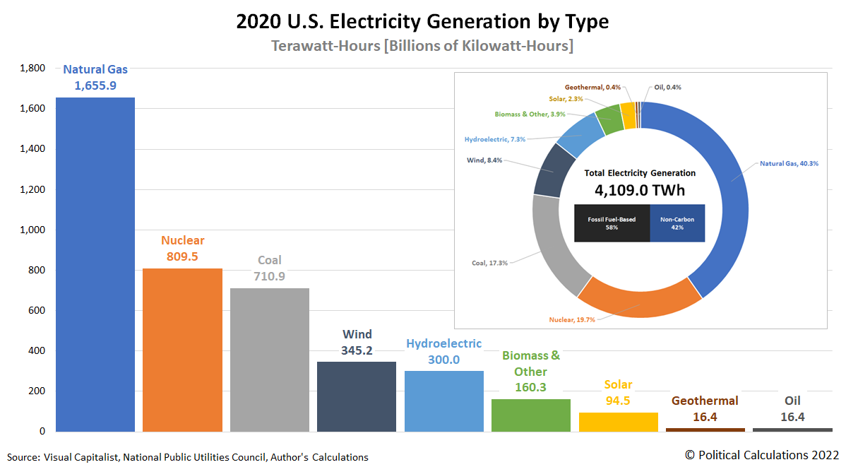
Last week, we took on the personal finance question of whether a petroleum or electric-powered vehicle is the better buy, but we didn't stop to consider where that electricity comes from. The following chart shows the mix of sources that Americans used to power the U.S. economy with 4,109 terawatt-hours (TWh), or 4,109 billion kilowatt-hours (kWh), in 2020.
The most important thing to recognize about this chart is that only an exceptionally small fraction of all that power generated actually goes to charge up electric-powered vehicles. Nearly all of that generated electricity is used instead for other purposes, which means that if Americans are to fully switch over to electric vehicles, the country needs to significantly boost its electric generation capacity to provide the juice they will need to run.
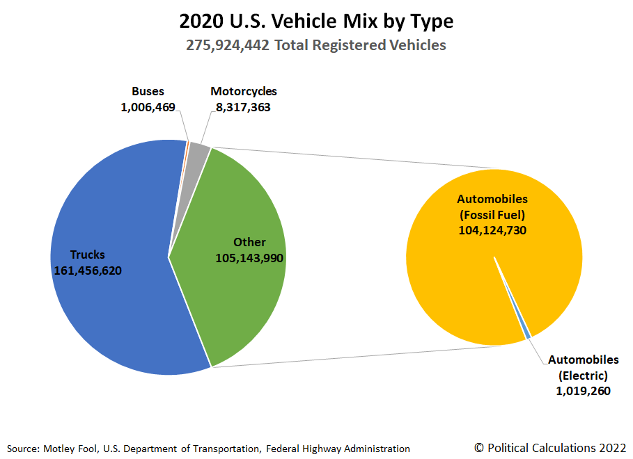
So how many cars are we talking about? For a visual frame of reference, the next chart shows how tiny the share of electric vehicles was in 2020. (For simplicity, we've grouped all electric vehicles into the Automobiles category).
From here, we just need to know that the average electric vehicle consumes 34.6 kilowatt-hours (kWh) of electricity to travel 100 miles, and we can run some back-of-the-envelope numbers to find out how much more electricity generation capacity will be needed to avoid things that would lower the quality of life for Americans or harm the economy, like rolling blackouts.
We built a tool to do the math. If you're accessing this tool on a site that republishes our RSS news feed, please click through to our site to access a working version.
For our default data, we find that the U.S. power grid will need to expand its capacity by 583.0 TWh per year to accommodate the power needs of 104,124,090 electric vehicles. Today, that additional needed electricity generation capacity is missing from the United States' power grid.
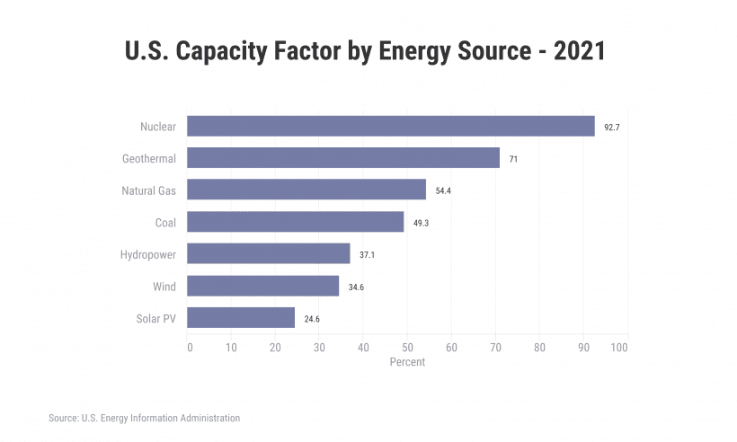
This result assumes the new electricity generation capacity comes from nuclear energy, which according to the U.S. Energy Information Administration, is the most reliable source of electricity. Of course, there are other ways to generate electricity, for which you can substitute the EIA's indicated capacity factors for those other sources in our tool.
As you'll find, your choice of how that electricity is generated has a huge impact on how much more electricity generation capacity will be needed just to power electric vehicles.
References
Daly, Lyle. How Many Cars Are in the U.S.? Car Ownership Statistics 2022. Motley Fool. [Online Article]. 18 May 2022.
International Energy Agency (IEA). Electric Vehicles. [Online Report]. November 2021. Accessed 10 September 2022.
U.S. Department of Energy Office of Nuclear Energy. What Is Generation Capacity? [Online Article]. 1 May 2020.
Wallach, Omri. Road to Decarbonization: The United States Electricity Mix. Visual Capitalist. [Online Article]. 31 August 2021.
Labels: environment, tool
Consumer spending strongly rebounded in 2021 following the lifting of 2020's government-mandated pandemic lockdown measures.
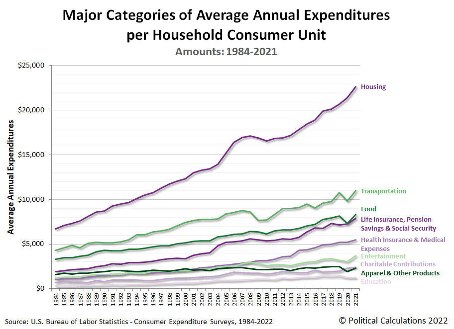
That's the biggest takeaway from the data presented in the 2021 Consumer Expenditure Survey, which saw the average American household consumer unit's expenditures increase by $5,594 over 2020's level to reach $66,928. That's a 9.1% year-over-year increase, the largest ever on record for the available data series that extends back to 1984. The first chart featured shows that full history from 1984 through 2021:
The Consumer Expenditure Survey breaks down the average annual expenditures of U.S. household consumer units into major categories of spending. The next chart shows the amount of spending from 1984 through 2021 for housing; transportation; life insurance, pension savings and Social Security; health expenditures and medical expenses; entertainment; charitable contributions; apparel and other products; and finally education, to rank them from largest to smallest.
With the exception of education, nearly all major categories of spending rose in 2021. Of these, transportation, food (especially in the subcategory of Food Away from Home), and Entertainment had the biggests year over year gains, which is consistent with the lifting of state and local government lockdown measures in 2021.
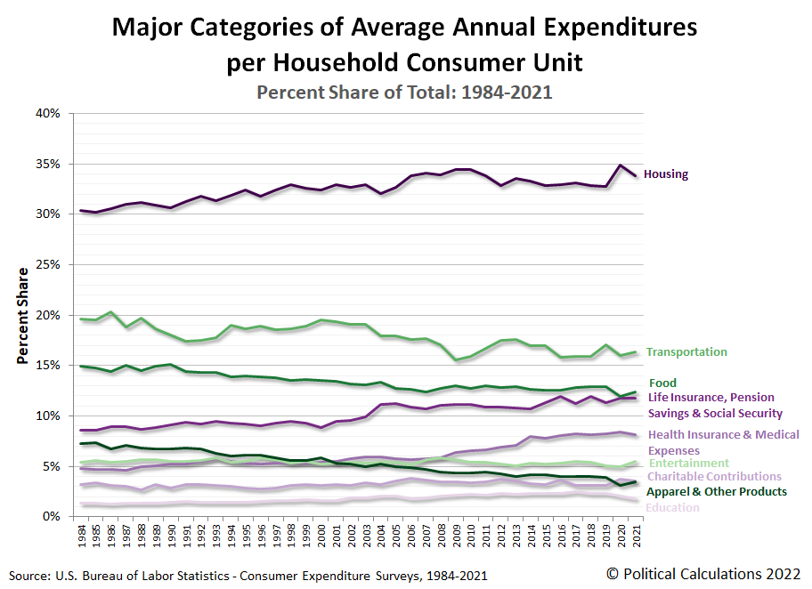
The third chart presents the share of each of the major categories of household spending as a percentage of average annual total expenditures.
As a percentage of total expenditures, the categories of housing, life insurance (including pension savings and Social Security), health insurance (and medical expenses), charitable contributions, and eductation each fell during 2021, while other spending categories increased.
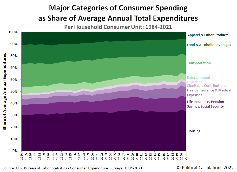
The final chart stacks all these major categories of household spending together to assemble the full picture of how the spending of American consumer unit households has changed each year from 1984 through 2021.
This last chart is our long-running favorite, in part because the colors convey which major categories of spending have generally risen over time (the purple-shaded components) or fallen over time (the green-shaded components).
Although we haven't addressed it, the Consumer Expenditure Survey's expenditure data also captures the early effects of President Biden's inflation. The survey also plays a key role in shaping how inflation itself will be measured because its data is used to set the relative weightings of the various expenditure categories within the Consumer Price Index.
References
U.S. Bureau of Labor Statistics. Consumer Expenditure Survey. Multiyear Tables. [PDF Documents: 1984-1991, 1992-1999, 2000-2005, 2006-2012, 2013-2020, 2021]. Accessed 8 September 2022.
Labels: data visualization, inflation, personal finance
Welcome to the blogosphere's toolchest! Here, unlike other blogs dedicated to analyzing current events, we create easy-to-use, simple tools to do the math related to them so you can get in on the action too! If you would like to learn more about these tools, or if you would like to contribute ideas to develop for this blog, please e-mail us at:
ironman at politicalcalculations
Thanks in advance!
Closing values for previous trading day.
This site is primarily powered by:
CSS Validation
RSS Site Feed
JavaScript
The tools on this site are built using JavaScript. If you would like to learn more, one of the best free resources on the web is available at W3Schools.com.
