In 1985, Caltech's David Goodstein introduced The Mechanical Universe, which stands as one of the best explanatory series on physics ever committed to video. The following 28-minute video telling the story of James Maxwell's mathematical insights linking electricity and magnetism represents one of the highlights of the 52-part series.
Maxwell's equations opened the door to great practical applications, which we find all around us today in the electronic devices that make the world of today so different from how it was when Maxwell first formulated them.
HT: Steven Strogatz, who also points to YouTube's playlist for the entire series.
Labels: math, technology
The price of bread in the U.S. is rising to all-time highs. One of the top contributing factors to its increase is the 2022's rising price of wheat.
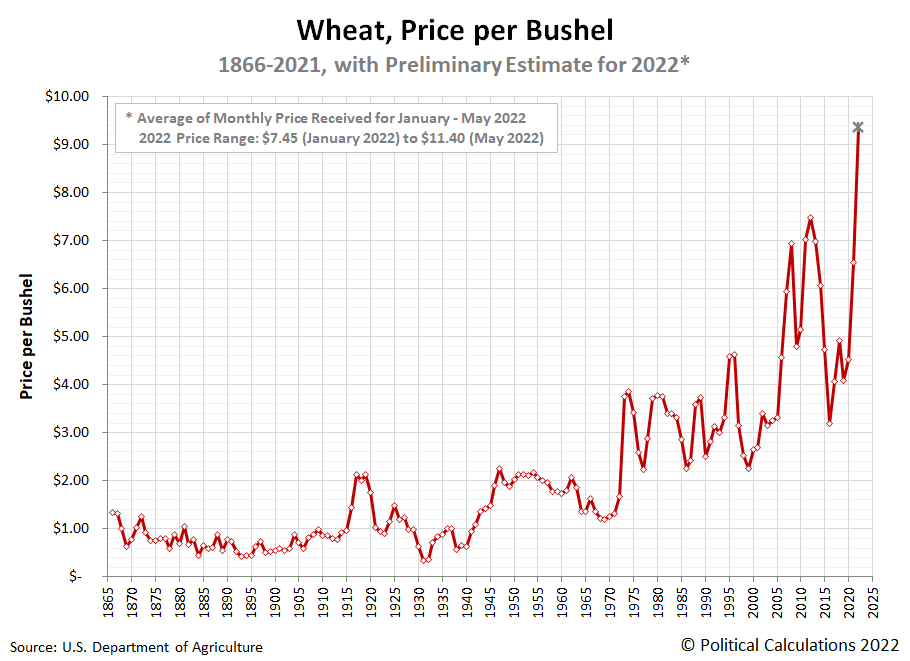
The following chart shows the price per bushel of wheat grown in the U.S. from 1866 through 2021, with a preliminary average for 2022 based on available prices reported from January through May.
During 2022, the average monthly price of a bushel of wheat has ranged from a low of $7.45 in January through a high of $11.40 in May, with an overall average of $9.36 during those months. That's 25% higher than 2012's nominal record peak of $7.48 per bushel. It's also more than double the 2019 pre-pandemic low of $4.08 per bushel.
Adjusting the prices for inflation, the price of a bushel of wheat is returning to levels last seen in the high inflation years of the 1970s and 1980s. The next chart shows the available inflation adjusted history for wheat prices in the U.S.
With inflation factored in, 1917 represents the year with the highest wheat prices thanks to the prolonged impact of World War I and a low wheat harvest in 1917. It wasn't until after World War II when the introduction of widespread irrigation and other improvements in agricultural technologies greatly increased the productivity of American farmers and the amount of wheat they produced. Those improvements led to generally falling prices outside periods of high inflation, and particularly, outside periods with high petroleum prices.
Update 3 August 2022
From Reuters: Analysis: As wheat prices soar, the world's consumers vote with their feet
References
U.S. Department of Agriculture. National Agricultural Statistics Service. Quick Stats: Survey > Crops > Field Crops > Wheat > Price Received > Wheat - Price Received, Measured in $/BU > Total > State > Kansas > 2020-2021 > Annual > Marketing Year. [Online Database]. Accessed 22 July 2022.
Measuring Worth. The Annual Consumer Price Index for the United States, 1774 - Present. [Online Database]. Accessed 22 July 2022.
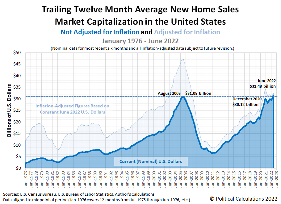
After coming in higher than expected in May 2022, new home sales dropped in June 2022. Combined with lower sale prices, the change sent the market capitalization of the new home market in the U.S. falling in a gloomy portent for the U.S. economy.
Political Calculations initial estimate of the market cap for new homes in the U.S. is $31.48 billion, down 3.8% from our initial May 2022 estimate of $32.73 billion (our revised estimate for May 2022 is $30.91 billion, more on that 5.6% decline in a bit). The latest update of our chart shows the developing trend for the U.S.' new home market cap's shifted trailing twelve month average:
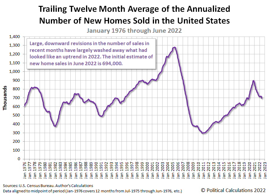
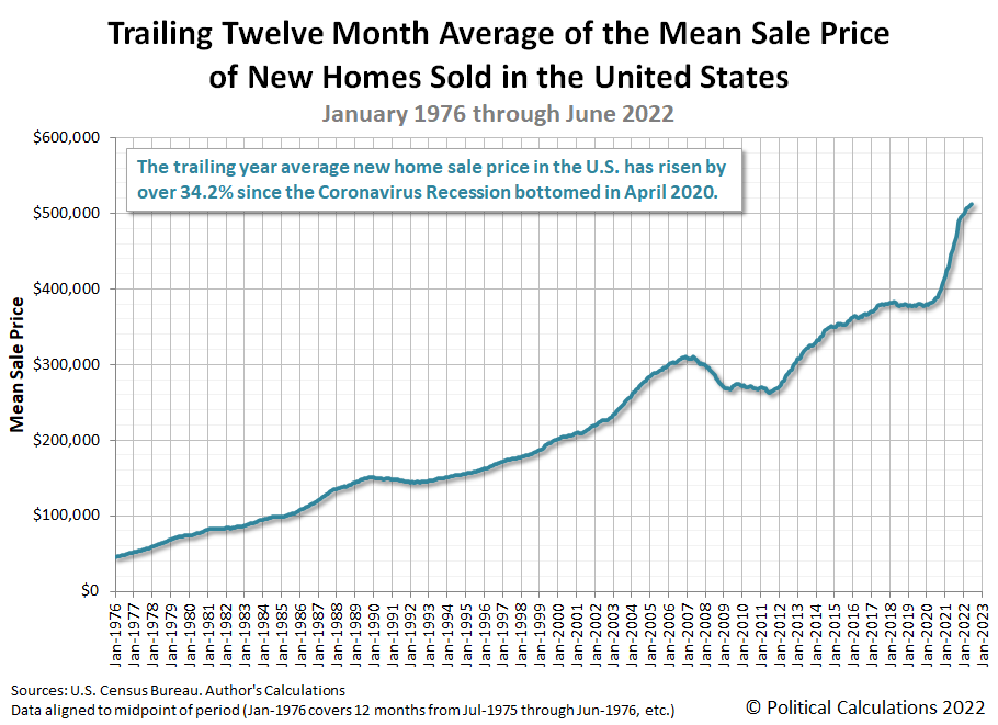
The next two charts show the underlying shifted twelve month averages of sales and price data for the new home market cap:
Downward data revisions for new home sales account for nearly all the changes in the market cap for new homes since April 2020. The latest data for new home sales indicates the uptrend established since November 2021 peaked in April 2020 and has since reversed to become a downtrend. A similar pattern is developing for the shifted trailing twelve month average of new home sale prices, which is still showing an uptrend, but one that is decelerating.
The revisions raise the question of whether new home sales, which contribute anywhere from 3% to 5% of the nation's GDP, will be a plus or minus in 2022-Q2's upcoming GDP report. The latest data suggests it will provide a flat-to-positive contribution, but that's based upon the latest data, which will be revised several more times before being finalized. The large downward revisions in previous months' sales reported in the latest data release suggests the new home market's contribution to GDP has a strong chance of becoming a negative contribution to the U.S. economy's growth in 2022-Q2.
Here is Reuters' coverage of the raw national and regional numbers from the latest new home sales data release:
Sales of new U.S. single-family homes dropped to their lowest level in just over two years in June, the latest sign that rising mortgage rates, combined with higher prices, were dampening demand for housing.
New home sales tumbled 8.1% to a seasonally adjusted annual rate of 590,000 units last month, the lowest level since April 2020, the Commerce Department said on Tuesday. May's sales pace was revised down to 642,000 units from the previously reported 696,000 units. Sales fell in the Northeast, the West and the densely populated South, but surged in the Midwest.
We'll examine the relative affordability of the new homes being sold in the U.S. sometime in the first week of August 2022.
References
U.S. Census Bureau. New Residential Sales Historical Data. Houses Sold. [Excel Spreadsheet]. Accessed 26 July 2022.
U.S. Census Bureau. New Residential Sales Historical Data. Median and Average Sale Price of Houses Sold. [Excel Spreadsheet]. Accessed 26 July 2022.
Labels: market cap, real estate
It's not your imagination. The 2020s are shaping up to become the most volatile period in modern stock market history.
For proof, here's a visual comparison of the standard deviation of the day-to-day percentage change in the S&P 500 by decade.
Believe it or not, stock price volatility has settled down somewhat since last year!
References
Yahoo! Finance. S&P 500 Historical Data. [Online Database]. Accessed 22 July 2022.
Previously on Political Calculations
Labels: SP 500, stock market, stock prices, volatility
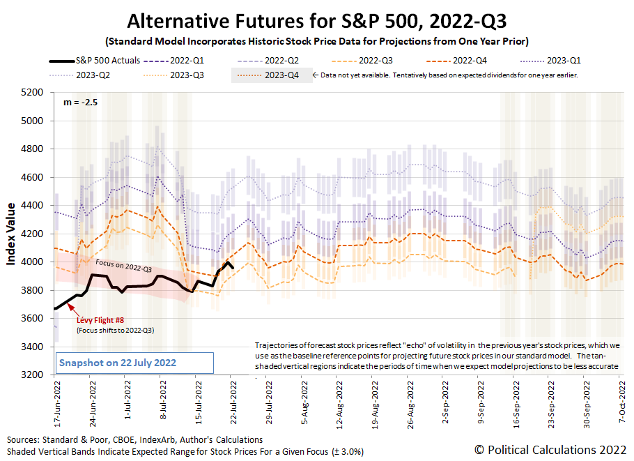
The S&P 500 (Index: SPX) closed at 3,961.63 on Friday, 22 July 2022, rising over 2.5% from the previous week.
It could have risen higher. For much of the week, the trajectory of the S&P 500 tracked with the dividend futures-based model's projection of where the index would go if investors focused their forward-looking attention on 2022-Q4. But on Friday, they shifted their attention back toward 2022-Q3 and the index stayed below the 4,000 threshold we identified in last week's edition. Here's the latest update to the spaghetti forecast chart showing that action.
Looking forward, having the index bounce around that 4,000ish threshold would still indicate investors are paying close attention to how the Fed will set short term interest rates during the current quarter of 2022-Q3. Should stock prices rise significantly above that level would indicate investors have shifted their investment horizon to a more distant future quarter.
With so much attention on the actions the Fed will take following its upcoming meetings, what change in expectations could prompt investors to re-focus their attention so much further out in time? We'll get to that shortly, but first, here are the market moving headlines of the week we've identified to help provide the needed context:
- Monday, 18 July 2022
- Signs and portents for the U.S. economy:
- Big U.S. banks see loan growth slowing as outlook for demand, economy darkens
- Oil gains $5 on weaker dollar, tight supplies
- U.S. home builder sentiment plunges, services activity in New York region stalls
- ECB minions getting excited about hiking rates after thinking about it for so long!
- Wall Street closes down on slide in Apple shares, bank stocks
- Tuesday, 19 July 2022
- Signs and portents for the U.S. economy:
- U.S. housing starts drop to lowest in nine months in June
- Oil settles up 1% at 2-week high on worries about tight supply
- For auto retailers, pandemic-era profit boost in rear-view mirror
- Bigger trouble developing in Japan:
- Expectation grow ECB minions will deliver bigger interest rate hike:
- Euro rallies after report that bigger ECB rate hike is on the cards
- Half of euro zone June inflation came from energy - Eurostat
- Wall Street closes sharply higher on strong corporate earnings
- Wednesday, 20 July 2022
- Signs and portents for the U.S. economy:
- GDP may fall again in Q2. Does it mean recession?
- Consumers shun candles, barbecue kits as budgets tighten
- Oil falls on lackluster U.S. summer gasoline demand
- U.S. existing home sales slide again; prices hit fresh record high
- Fed minions expected to deliver another three-quarter point rate hike:
- Bigger trouble developing in Eurozone, China, Canada:
- EU asks countries to cut gas demand by 15% until spring
- Chinese banks’ half-truths hinder mortgage fix
- Canada's inflation rate hit 8.1% in June as gasoline prices bite
- BOE minions gearing up for big rate hike:
- Wall Street closes higher boosted by tech stocks gains on upbeat earnings
- Thursday, 21 July 2022
- Signs and portents for the U.S. economy:
- U.S. GDP may fall again in Q2. Does it mean recession?
- U.S. jobless benefits rolls grow; key factory output gauge slumps
- Oil slumps $3/bbl on gasoline stockpiles, rate hikes and resuming supply
- Bigger stimulus developing in China, S. Korea:
- China approves projects worth $50 billion after easing environment rules
- S.Korea to cut taxes for companies, workers and retail investors
- Despite higher inflation, BOJ minions won't stop, can't stop never-ending stimulus:
- ECB minions finally acts to combat Eurozone inflation:
- ECB goes big with 50 basis-point hike, ending negative rates era
- ECB raises rates for first time in decade with safety net for debtors
- Analysis: Debt-laden Italy looks no less vulnerable as rates shoot higher
- Analysis-ECB's new tool fails to impress as Italy confronts political paralysis
- Analysis-R.I.P. forward guidance: Inflation forces central banks to ditch messaging tool
- Wall Street closes higher boosted by strong Tesla earnings
- Friday, 22 July 2022
- Signs and portents for the U.S. economy:
- U.S. crude ends below $95/bbl as EU tweaks Russian oil sanctions
- U.S. business activity contracts in July for first time in 2 years, survey shows
- Bigger trouble developing in Japan, S. Korea, Eurozone:
- Japan's July factory activity growth slows to 10-month low - flash PMI
- Japan's inflation stays above BOJ's target for 3rd straight month
- South Korea's economy likely lost some steam in Q2 - Reuters poll
- Euro zone business activity contracted in July as price rises bite - PMI
- ECB minions pledge to keep up rate hikes until inflation (or Eurozone economy) breaks:
- Bigger stimulus developing in China:
- Wall Street ends lower as ad tech, social media stocks drop
Now, here's where we'll get to why investors would have a strong reason to shift their attention to the more distant future: how investors expect the Fed will change interest rates at different points of time in the future. The CME Group's FedWatch Tool still projects a three-quarter point rate hike for July (2022-Q3), followed by half point rate hikes in September (2022-Q3) and November (2022-Q4), with the Federal Funds Rate topping out between 3.25 and 3.50%. In 2023, the tool anticipates the Fed will be forced to begin cutting rates in May 2023 as the U.S. central bank responds to more fully developed recessionary conditions.
Speaking of which, turning our attention back to the recent past, the Atlanta Fed's GDPNow tool's latest projection for real GDP suggests the U.S. economy will have shrunk by 1.6% in the recently ended second quarter of 2022. That's down from last week's projection of -1.5% growth, which we had incorrectly identified as the GDPNow tool's final estimate for 2022-Q2 in the previous edition of our S&P 500 chaos series. Looking forward, the BEA will provide its first official estimate of 2022-Q2's GDP later this week, after which, the Atlanta Fed's GDPNow tool will start giving its estimates of real GDP for the current quarter of 2022-Q3.
When you try to describe how likely something that will happen in the future is to someone, how do they interpret what you mean?
For instance, if you say something will a "slam dunk", will they interpret that as having 100% odds of happening? Or will they assign a lower chance to whatever that is occurring?
What if you're the person on the receiving end of the probabilitistic statement? Would you say something you're told has a "real possibility" of occurring is more or less likely to happen than if the same person told you something had a "serious possibility" of occurring?
Words mean things, and when it comes to describing probabilities, they come with their own probability distributions. That's the finding of Andrew Mauboussin and Michael J. Mauboussin from their 2018 paper, If You Say Something Is “Likely,” How Likely Do People Think It Is?, in which they presented the results of their study into that topic. Better yet, they provided the following chart to illustrate the probability distributions the participants in their study helped them develop for various common words and phrases that American English speakers use in everyday language.
Here's how the Mauboussins describe their findings:
The wide variation of likelihood people attach to certain words immediately jumps out. While some are construed quite narrowly, others are broadly interpreted. Most — but not all — people think “always” means “100% of the time,” for example, but the probability range that most attribute to an event with a “real possibility” of happening spans about 20% to 80%. In general, we found that the word “possible” and its variations have wide ranges and invite confusion.
The cool thing about this chart is that if you are searching for words to describe the likelihood of something that will happen in the future, you now have a useful guide to help you convey the odds you're trying to communicate.
More often than not, with a high probability of getting your intended message across.
When the U.S. economy falls into recession, there's one demographic group that can expect to feel a lot of pain: working teenagers.
That's because unlike every other demographic group, teens have the least education, the fewest skills, and the lowest amount of job experience. That combination makes American teenagers the most marginal of all workers and puts them most at risk of either losing their jobs or of never being hired when the economy goes into recession.
In other words, they're the proverbial canaries in the coal mine of the U.S. economy. And the U.S. economy is at an elevated risk of recession.
That's why we've decided to start regularly tracking teen employment levels. Our first chart shows three sets of seasonally adjusted teen employment levels, for the Age 16-17 population (blue), the Age 18-19 population (orange), and the combined Age 16-19 population (black), from January 2016 through June 2022:
By design, this chart puts the employment impact of the Coronavirus Recession right in the middle, showing both its pre-recession trend and the post-recession recovery to put the current trends for teen employment into context.
We see that employment for the youngest teens, those Age 16-17, peaked at 2,316,000 after rising well above its long term level in April 2022. It has since fallen by 202,000 (or 8.7%) to 2,114,000 through June 2022. This portion of the teen demographic includes the most marginally employed portion of the population.
By contrast, things are still looking up for older teens, which at 3,443,000 in June 2022 is on an uptrend. The Age 18-19 portion of the population has not yet reached the peaks this portion of the U.S. labor force recorded in the pre-Coronavirus Recession period.
For the combined population of working American teens, we find that the employment level peaked at 5,660,000 in March 2022, falling 102,000 (or 1.8%) to 5,558,000 through June 2022. We should note at this point that since all three sets of data have been put through their own seasonal adjustments, the sum of the Age 16-17 and Age 18-19 groups won't add up to the total for the Age 16-19 population. This data however is exactly as the U.S. Bureau of Labor Statistics has reported it - all we've done is visualize it.
Because populations change over time, we're also tracking the U.S. teen employment-to-population ratio, which indicates the percentage of employed teens among their population. Our second chart shows this seasonally adjusted data for each portion of the U.S. teen population.
This data confirms most of the recent trends we described in the raw numbers. For example, employment among the Age 16-17 has trended down since April 2022, falling from a peak of 25.8% to 23.7% in June 2022, coinciding with what we observed in their employment level.
But the data for the older portion of the teen labor force shows something different than what we would have expected from the employment level data. Here, we see that the Age 18-19 employment-to-populaton ratio peaked at 44.1% in November 2021 before trending downward to June 2022's level of 42.2%. By contrast, the employment level rose by 200,000 from 3,243,000 to 3,443,000 during that time.
Finally, we see the pattern for the combined Age 16-19's employment to teen population follows the same pattern we saw in the employment data. It peaked in March 2022 at 33.2% before falling slowly to 32.6% in June 2022.
While we do see developing downtrends in portions of the teen employment data, at this point, they're not yet consistent with the kind of employment declines the teen population has seen in previous recessions. We'll also observe the data is subject to revision, so this information is best considered to be a snapshot in time based on the available data.
Then again, that's exactly why we're tracking the data in a new series.
Labels: demographics
Bloomberg finds another familiar consumer good whose price is rapidly rising and hitting Americans where it hurts in their wallets: bread.
People really begin noticing inflation when it shows up in things that they regularly buy. That’s why gasoline and milk get so much attention. Add bread to a growing list of basics that are rising in price and crushing consumer sentiment.
Amid the highest US inflation in four decades, bread prices have soared this year, pushing more premium options to an unheard-of $10 a loaf and beyond.
“It’s kind of like a punch in the nose,” said Mark Cohen, director of retail studies at Columbia Business School. These are prices “nobody has seen before” and have the same impact as gasoline hitting $5 a gallon, he said.
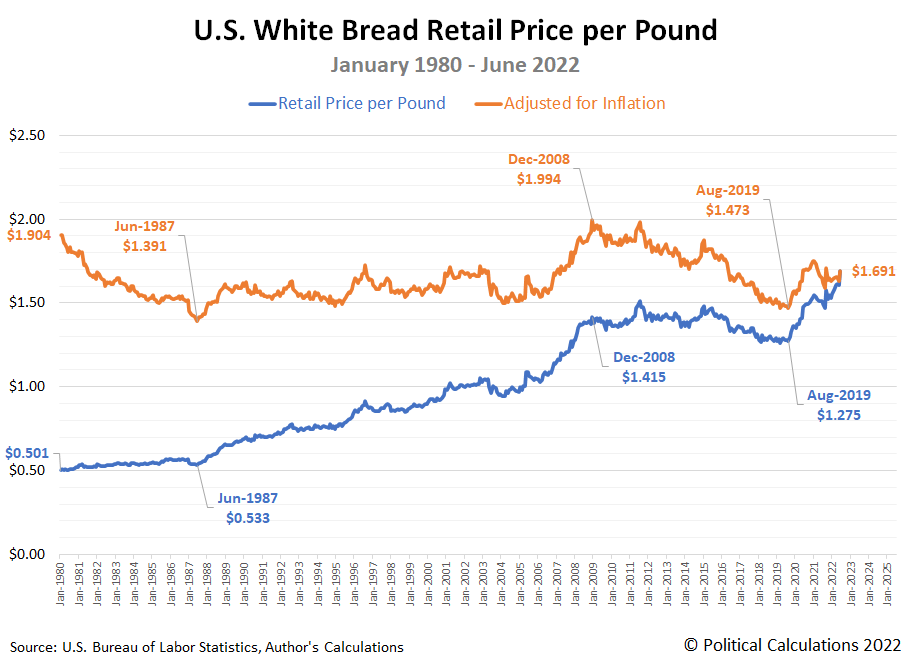
The Bloomberg article features a chart showing the retail price of a pound of white bread over the past 10 years. But since we're talking about the highest inflation in the last 40 years, we wondered how the price of bread has changed since January 1980. In the following chart, we visualize all the Bureau of Labor Statistics' available data at this writing, showing in both nominal (the prices people actually pay) and in terms of constant June 2022 inflation-adjusted dollars.
In nominal terms, we can see the price of a pound of white bread in the U.S. has never been higher. It is nearly 3.4 times what it cost in January 1980.
But we find something different when we account for inflation. Here, we find the average cost of a pound of white bread has ranged from a low of $1.391 in June 1987 to a high of $1.994 in December 2008. At June 2022's average price of $1.691 per pound, the relative cost of bread is in the middle of the range Americans have paid over the last 42+ years. One might reasonably wonder why Bloomberg's writers are choosing to make the big deal out of it that they are.
If you dig deeper into the Bloomberg article, you'll find its three authors are strangely focused on a "premium" bread price of $10 per pound as some kind of talismanic threshold in which they find meaning. As you'll see in the following excerpt, that price applies for a "luxury" two-pound loaf being aimed at consumers with a lot of discretionary income:
In Chicago’s Logan Square neighborhood, husband-and-wife team Taylor and Brian Bruns are trying to stay profitable at their mountain-themed restaurant, Flat & Point. This spring, they ramped up their baking to begin selling loaves of sourdough and whole wheat at farmers markets across the city.
The couple priced their 2-pound loaves at $10, hoping to offset higher flour costs, but also because of surging prices for eggs and butter. While the price tag has turned off some shoppers at the farmers market, it’s fair because they use pricier organic ingredients, according to Taylor Bruns.
“We’ve definitely gotten pushback,” she said.
Comparing apples to apples, the Bruns are asking farmers market customers to pay $5.00 per pound for their gourmet bread product, which is 2.96 times what those same consumers would pay for plain white bread. That's deeper analysis than the three authors have done, so lets consider what it really means by asking some questions.
With money getting tighter because of President Biden's not-so-transitory inflation, which kind of bread do you think these consumers will be more likely to buy when they go shopping six months from now? If you're an investor, would you invest money in the opportunity to expand production of a high-end barbeque restaurant's gourmet bread product in today's economic climate?
Ultimately, it's the answers to the questions we've asked that will determine what the future will be for all those involved. The first question asks you to put yourself into the shoes of a typical consumer. But the second question is the deeper one, because our hypothetical investor might be the small business owner using their own money to expand their business, or perhaps a loan underwriter at a bank, who has to decide if investing in that scheme is worth the risk. Whether it is hinges on how the consumer will answer their question.
They're all being affected by what we'll call "breadflation", even though its a lot more about the "flation" than it is about the "bread". In today's economic climate, all Americans are facing similar questions because of it.
Labels: food, ideas, inflation
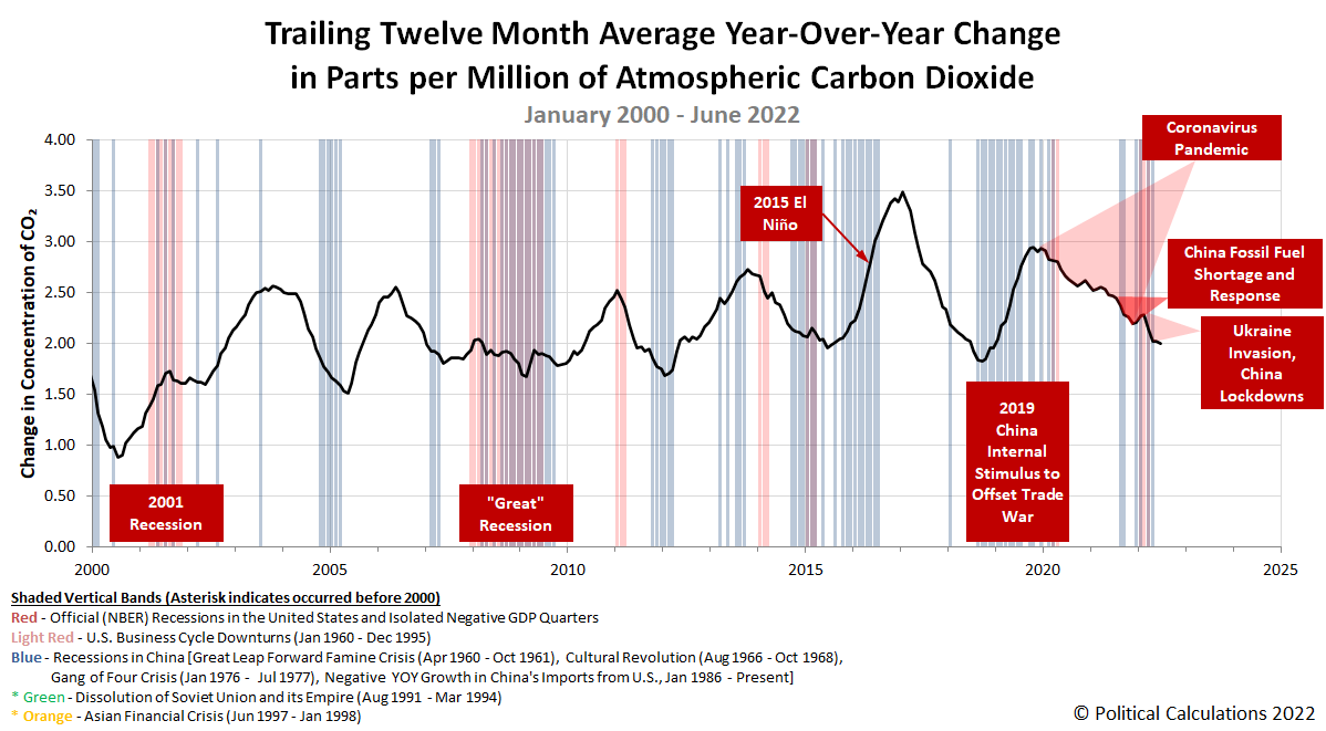
The rate at which carbon dioxide accumulates in the Earth's atmosphere has fallen back to levels that were typical at the beginning of 2008-2009's Great Recession.
You can see that development in the following chart tracking the trailing twelve month average of the year-over-year change recorded in measurements of atmospheric carbon dioxide at the remote Mauna Loa Observatory in the Pacific Ocean.
China's 2022 COVID lockdowns have played an outsize role in creating that outcome, with China's economy slumping in the second quarter of the year to its lowest level since 1991 because of them.
Turning back to the CO₂ data, June 2022's decline occurred despite China lifting most of its COVID lockdowns from the spring, allowing economic activity to resume within the country. That activity is confirmed by increases in roadway congestion and in goods moving through its ports.
We think that June 2022's decline may be explained by decreased economic activity elsewhere in the world. For example, there are strong indications the real U.S. economy shrank in the second quarter of 2022, which would offset positive GDP growth in China's economy during June 2022.
References
National Oceanographic and Atmospheric Administration. Earth System Research Laboratory. Mauna Loa Observatory CO2 Data. [Text File]. Updated 11 July 2022. Accessed 11 July 2022.
Labels: environment, gdp
The biggest market moving news of the week was the unexpected increase in reported inflation in the U.S. on Wednesday, 13 July 2022. Despite the shock, which was followed by related bad news for big banks pointing to developing weakness in the U.S. economy, the value of the S&P 500 (Index: SPX) reacted by mostly shrugging off the news, ending the week down less than one percent from where it closed the previous week.
The latest update to the dividend futures-based model's alternative futures chart helps explain why:
The chart shows that investors were tightly focused on 2022-Q3 throughout most the week and especially so from Wednesday through Thursday, which we see as the actual trajectory of the S&P 500 aligning with the center of the latest redzone forecast range. That makes sense because the Fed's next actions affecting short term interest rates in the U.S. will occur within this quarter. With Fed officials signaling those moves will involve larger than previously expected rate hikes to combat inflation, investors have had good reason to focus on this quarter.
But on Friday, 15 July 2022, stock prices unexpectedly jumped as it absorbed the bad news. We think that may be because investors began looking forward toward the end of 2022. That timing lines up with the new expected timing of the Fed's final rate hikes before the U.S. central bank may be forced to start cutting rates to respond to developing recessionary conditions in the first half of 2023.
We can't quite call it a new Lévy flight event just yet, because of the overlap in the dividend futures-based model's projected ranges for the S&P 500 for both 2022-Q3 and 2022-Q4. But now that we're at the end of the latest redzone forecast range, we have a relatively easy way to find out because of the relative levels of the model's projections based on investors focusing on either of these quarters.
If the level of the S&P 500 remains below the 4,000 threshold, that will be consistent with investors primarily maintaining their forward-looking focus on 2022-Q3. If the index rises above that threshold, that would be consistent with investors shifting their attention forward to 2022-Q4, which we would consider to be a new Lévy flight event.
There's a lot of moving pieces at play right now! Here's our recap of the past week's market moving headlines:
- Monday, 11 July 2022
- Signs and portents for the U.S. economy:
- Fed minions worried about hiking rates too fast and not fast enough:
- Kansas City Fed's George warns "abrupt" rate changes could strain economy
- Bostic: Recent inflation data not as encouraging as hoped
- Bigger trouble developing in China:
- China Doubles Population Under Lockdown, at Risk of BA.5 Shutdown
- China's June factory inflation cools counter to global trends
- Chinese protesters demanding bank deposits tussle with security men
- Bigger trouble developing in the Eurozone:
- Bigger trouble developing in Japan:
- BOJ minions say they can't stop, won't stop never-ending stimulus:
- BOJ's Kuroda warns of high economic uncertainty, repeats easy policy bias
- BOJ upgrades view on most regional Japan areas as pandemic impact fades
- ECB minions thinking about how to bail out most indebted Eurozone countries:
- Wall Street ends lower ahead of economic data, earnings
- Tuesday, 12 July 2022
- Signs and portents for the U.S. economy:
- U.S. small business sentiment drops near 9-1/2-year low in June- NFIB
- Oil slides on strong dollar and weaker demand outlook
- U.S. CPI preview: Past the headline, into the core
- Fed minions paying attention to U.S. economy:
- Bigger trouble developing in the Eurozone as recession fears build:
- BOJ minions racking up problems from never-ending stimulus policies:
- Japan's wholesale prices extend brisk gains as weak yen inflates import costs
- Yellen sees yen's depreciation, says intervention only warranted in 'rare' cases
- Wall Street tumbles at close as worries mount ahead of CPI report
- Wednesday, 13 July 2022
- Signs and portents for the U.S. economy:
- U.S. annual consumer inflation posts largest increase since 1981
- U.S. firms see growing signs of slowdown as inflation persists, Fed survey shows
- Expectations grow that Fed minions next move will involve a full percentage point rate hike:
- Bigger trouble, stimulus, and positive signs developing in China:
- China Q2 GDP growth seen dipping to 1% on COVID hit, 2022 growth at 4% - Reuters poll
- China's central bank to step up policy support for economy, debt level to rise
- China's exports bounce back, but global risks darken trade outlook
- Bank of Canada minions hike interest rates by full percentage:
- South Korea, New Zealand central bank minions hike rates:
- S.Korea's central bank joins peers in historic half-point rate hike
- RBNZ raises cash rate by 50 basis points
- Wall St ends down as hot inflation data raises odds of steep Fed rate hike
- Thursday, 14 July 2022
- Signs and portents for the U.S. economy:
- Oil settles lower ahead of potential large U.S. rate hike
- U.S. weekly jobless claims hit 8-month high; labor market still tight
- U.S. producer prices accelerate in June, but underlying inflation slowing
- Fed minions want three quarter percent rate hike, worry about bond market falling apart without it buying bonds, say "no problem" for Fed officials trading stocks while setting monetary policies:
- Fed hawks say they want 75 basis point rate hike in July
- Fed staff say balance sheet runoff could strain Treasury market
- Trades by Fed's Powell, Clarida violated no rules -watchdog
- Bigger trouble developing in the Eurozone:
- Singapore hikes rates in surprise move:
- S&P 500, Dow close lower after bank earnings, inflation data
- Friday, 15 July 2022
- Signs and portents for the U.S. economy:
- U.S. import prices rise less than expected in June
- U.S. manufacturing production falls for second straight month
- Oil rises 2% as no immediate Saudi output boost expected
- Fed minions want bigger rate hikes, but not too big they can be blamed for causing recession:
- Fed officials still leaning to 75-basis-point rate hike in July
- Fed's Bostic: Should not move rates "too dramatically"
- Bigger trouble developing in China, more post-lockdown recovery signs:
- China GDP data to show sharp slowdown in Q2, tepid recovery in June
- Analysis: China makes tweaks, but tough COVID policy still drags on economy
- Beijing's assurances on mortgage protests fail to convince investors
- China June industrial output rises 3.9%, retail sales up 3.1%
- ECB minions have a huge Italian debt problem:
- Italy spirals into crisis as government teeters on brink of collapse
- Analysis-ECB bond aid plan's fault lines exposed by Italy's political crisis
- Wall St ends tumultuous week with strong rally as rate hike fears wane
After the week's higher than expected consumer inflation data, the CME Group's FedWatch Tool still projects a three-quarter point rate hike for July 2022 (2022-Q3), followed by another one in September (2022-Q3). After that the tool sees two quarter point rate hikes in 2022-Q4, with the Federal Funds Rate topping out between 3.50 and 3.75%. The tool anticipates a quarter point rate cut in June 2023 as the Fed responds to recessionary conditions investors currently expect to have fully developed by then.
Looking backwards, the Atlanta Fed's GDPNow tool's final projection for real GDP suggests the U.S. economy will have shrunk by 1.5% in the recently ended second quarter of 2022. That's down from last week's projection of -1.2% growth. The BEA will provide its first official estimate of 2022-Q2's GDP near the end of the month. The Atlanta Fed's GDPNow tool will start giving its estimates of real GDP for the current quarter of 2022-Q3 next week.
The Webb infrared space telescope made news with the release of its first high quality images. Among those images is a rather spectacular view of a part of the sky that's featured in the opening scenes of the classic 1946 Christmas movie It's a Wonderful Life.
Here's an image that appears in the film, which features Stephan's Quintet, a group of galaxies located near the constellation Pegasus in Earth's night sky.
Since several of these galaxies are in close enough proximity to interact with each other, they have been frequently studied by astronomers since their discovery in 1877. In 2007, NASA published the following image taken of the Quintet using the orbital Hubble Telescope, in which the orientation of the Quintet is rotated nearly 180 degrees from how it was featured in the classic movie!
This image had been the highest quality image taken of these galaxies. Until the orbital Webb telescope focused on the cluster of galaxies as part of its first set of high resolution images. The next image shows much more detail than has ever previously been seen.
Here's how NASA describes the new achievement:
Stephan’s Quintet, a visual grouping of five galaxies, is best known for being prominently featured in the holiday classic film, “It’s a Wonderful Life.” Today, NASA’s James Webb Space Telescope reveals Stephan’s Quintet in a new light. This enormous mosaic is Webb’s largest image to date, covering about one-fifth of the Moon’s diameter. It contains over 150 million pixels and is constructed from almost 1,000 separate image files. The information from Webb provides new insights into how galactic interactions may have driven galaxy evolution in the early universe.
With its powerful, infrared vision and extremely high spatial resolution, Webb shows never-before-seen details in this galaxy group. Sparkling clusters of millions of young stars and starburst regions of fresh star birth grace the image. Sweeping tails of gas, dust and stars are being pulled from several of the galaxies due to gravitational interactions. Most dramatically, Webb captures huge shock waves as one of the galaxies, NGC 7318B, smashes through the cluster.
Together, the five galaxies of Stephan’s Quintet are also known as the Hickson Compact Group 92 (HCG 92). Although called a “quintet,” only four of the galaxies are truly close together and caught up in a cosmic dance. The fifth and leftmost galaxy, called NGC 7320, is well in the foreground compared with the other four. NGC 7320 resides 40 million light-years from Earth, while the other four galaxies (NGC 7317, NGC 7318A, NGC 7318B, and NGC 7319) are about 290 million light-years away. This is still fairly close in cosmic terms, compared with more distant galaxies billions of light-years away. Studying such relatively nearby galaxies like these helps scientists better understand structures seen in a much more distant universe.
This proximity provides astronomers a ringside seat for witnessing the merging and interactions between galaxies that are so crucial to all of galaxy evolution. Rarely do scientists see in so much detail how interacting galaxies trigger star formation in each other, and how the gas in these galaxies is being disturbed. Stephan’s Quintet is a fantastic “laboratory” for studying these processes fundamental to all galaxies.
But wait, that's not all. Ethan Siegel describes the scientific advance the Webb Space Telescope has already made in observing Stephan's Quintet.
Focusing back on the cluster of galaxies itself, however, the various wavelengths of light expose a variety of features inside each of them. In the mid-infrared alone, however, you only see the gas and dust, plus one never-before-seen feature in some of these galaxies: supermassive black holes. The topmost galaxy is active, emitting radiation, as an actively feeding supermassive black hole. The variety of wavelengths over which JWST can observe, even in the mid-infrared, gives us so much information about these objects in mere days that we haven’t been able to uncover with over a century of observations prior to that.
We'll close by pointing to the online tool John D. Christensen created for comparing Hubble and Webb images to show off their relative imaging capabilities. Scroll down the page to see the comparison for Stephan's Quintet - it's remarkable how much more detail, such as much more distant galaxies, appears in the new Webb images. The most stunning difference however is shown for the Southern Ring Nebula, so be sure to check out that comparison while you're on his site!
Labels: technology
Trends in how Americans' incomes are changing can tell us quite a bit about the relative health of the U.S. economy. One of the simplest measures we can follow is the country's average earned wage and salary income per capita. The following chart shows that data from January 2000 through May 2022, covering the 21st century to date:
The chart tracks both nominal and inflation-adjusted income trends. One thing we quickly see is that official periods of recession coincide with significant or sustained declines in average inflation-adjusted earned income (the blue line). Meanwhile, average nominal income, shown in red, either stalls or falls during these periods.
So what does that mean for the state of today's economy? The next chart zooms in the period since December 2020, covering the Biden era:
Here, we see the growth rate of average nominal incomes has notably slowed since December 2021, while inflation-adjusted incomes have sustained declines during this period. What that means is the U.S. economy has definitely slowed during the last two quarters, but the trend for nominal income growth hasn't fully stalled out yet as of the available data for May 2022. Meanwhile, the decline in real earned incomes since December 2021 is consistent with recessionary conditions being present in the U.S. economy during this period.
We should note the underlying income data is subject to revision for many months after it is first reported. The initial estimates for June 2022 will be reported by the U.S. Bureau of Economic Analysis near the end of July. If you want to beat us to the punch in doing that analysis, the References section below provides links to the data you'll need to both replicate and update our results.
References
U.S. Bureau of Economic Analysis. Table 2.6. Personal Income and Its Disposition, Monthly, Personal Income and Outlays, Not Seasonally Adjusted, Monthly, Middle of Month. Population. [Online Database (via Federal Reserve Economic Data)]. Last Updated: 30 June 2022. Accessed: 30 June 2022.
U.S. Bureau of Economic Analysis. Table 2.6. Personal Income and Its Disposition, Monthly, Personal Income and Outlays, Not Seasonally Adjusted, Monthly, Middle of Month. Compensation of Employees, Received: Wage and Salary Disbursements. [Online Database (via Federal Reserve Economic Data)]. Last Updated: 30 June 2022. Accessed: 30 June 2022.
U.S. Department of Labor Bureau of Labor Statistics. Consumer Price Index, All Urban Consumers - (CPI-U), U.S. City Average, All Items, 1982-84=100. [Online Database (via Federal Reserve Economic Data)]. Last Updated: 10 June 2022. Accessed: 10 June 2022.
The middle of summer marks the lowest point in Americans' consumption of Campbell's Condensed Tomato Soup throughout the year. With higher levels of soup sales coming with the arrival of fall and winter ahead, the following portion of Yahoo! Finance's 17 June 2022 interview with Campbell Soup (NYSE: CPB) CEO Mark Clouse shortly after the company reported its third quarter's fiscal results caught our attention.
BRIAN SOZZI: Did I hear this right on the call, you are now looking at a third wave of price increases?
MARK CLOUSE: Yes, it's true. So we're through two waves that are in market already. We announced the third wave in April and have been working closely with our retail partners on that. We want to make sure we're using the full tool bag to try to address costs. So it's not all about pricing. I think it's very important and we remain very mindful of protecting value for consumers.
And so things like productivity are really important. And I think perhaps the thing I'm most excited about in the third quarter was the response of our supply chain and the continued improvement in our execution and performance. Because that gives us a platform to continue to work on productivity and identify ways that we can drive savings so that we're not entirely dependent on pricing. And I think that balance is something that going forward, although we're expecting to see headwinds as far as inflation, I think we'll be able to utilize a variety of different levers to address it.
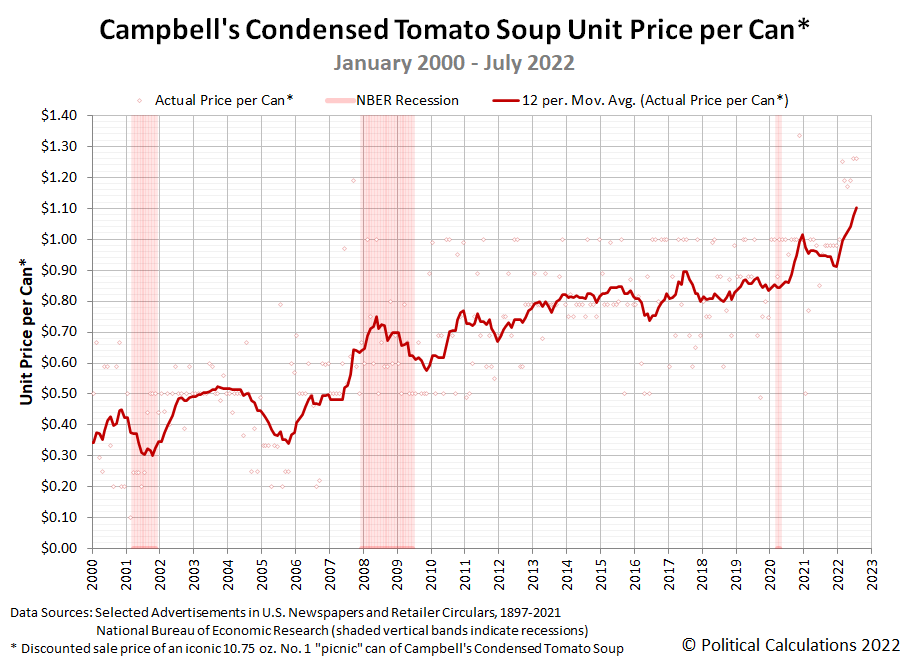
The following chart shows how the price of an iconic No. 1 can of Campbell's Condensed Tomato Soup has evolved from January 2000 through July 2022. It reveals the trailing twelve month average cost per can has recently exceeded the $1.10 per can level. This measure is heading toward the $1.25 level which is where we're recording the typical sale price of a can from Campbell Soup's second wave of price increases.
That second wave of price increases isn't quite over yet. Since our previous snapshot, tomato soup prices have continued to increase:
- Walmart: $1.26/each, increase of $0.07 (+5.9%)
- Amazon: $0.99/each, unchanged (Lowest)
- Kroger: $1.25/each, unchanged
- Walgreens: $1.50/each, unchanged when you buy 2 cans
- Target: $1.29/each, unchanged
- CVS: $2.29/each, increase of $0.10 (+4.9%, Highest)
- Albertsons: $1.69/each, increase of $0.10 (+6.3%)
- Food Lion: $1.25/each, increase of $0.06 (+5.0%)
- H-E-B: $1.21/each, unchanged
- Meijer: $1.19/each, unchanged
Walmart and Food Lion both increased their shelf sale price for a 10.75 ounce can of Campbell's Condensed Tomato Soup up to the $1.25-$1.26 range since our last update, joining Kroger at that level. Only Amazon among the 10 retailers whose sale prices we regularly track has not yet escalated its price from $0.99 per can. How long Amazon might sustain that now deeply discounted sale price remains to be seen.
To put today's inflation in context, before 2022, it was exceptionally rare to ever see prices for Campbell's Condensed Tomato Soup above $1.00 per can. As President Biden's inflation continues, it has become rare to find cans of Campbell's second-best selling soup for sale below that level.
Update 14 July 2022
Campbell Soup's CEO isn't the only one anticipating a third wave of inflation. So is Pimco's Mohamed El-Erian, who tweeted he sees a new wave developing if the Fed doesn't 'get its act together':
“Looking forward, inflation will come down over the next couple of months. That’s the good news,” El-Erian said on Wednesday.
However, the expert noted that a “third wave of inflationary pressures”—the underlying causes of inflation—is building, and “will be unleashed if the Fed doesn’t get its act together quickly.”
“With the first best policy option now long gone due to the first two stages of the ongoing Fed policy mistake, the recession risks are increasing accordingly,” El-Erian said.
El-Erian also thinks much of President Biden's inflation could have been avoided.
Labels: inflation, personal finance, soup
Welcome to the blogosphere's toolchest! Here, unlike other blogs dedicated to analyzing current events, we create easy-to-use, simple tools to do the math related to them so you can get in on the action too! If you would like to learn more about these tools, or if you would like to contribute ideas to develop for this blog, please e-mail us at:
ironman at politicalcalculations
Thanks in advance!
Closing values for previous trading day.
This site is primarily powered by:
CSS Validation
RSS Site Feed
JavaScript
The tools on this site are built using JavaScript. If you would like to learn more, one of the best free resources on the web is available at W3Schools.com.
