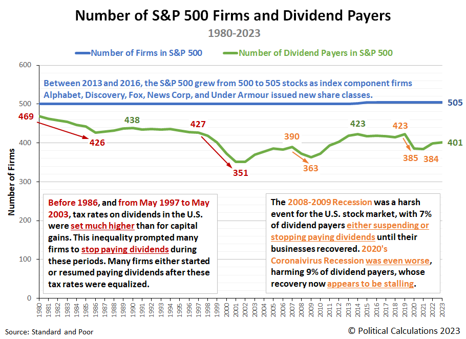
How many companies are in the S&P 500 (Index: SPX)? How many of them pay dividends? What factors affect whether companies pay dividends or not?
The answers to all three of these questions are presented in the following chart!
The data for 2023 is preliminary, reflecting available information as of 31 July 2023.
References
Dai, Zhonglan and Shackelford, Douglas A. and Zhang, Harold Huibing, Capital Gains Taxes and Stock Return Volatility. Available at SSRN: https://ssrn.com/abstract=972349 or DOI: 10.2139/ssrn.972349. 11 August 2010.
De Silva, Matthew. The art and science of stewarding the S&P 500. Quartz [Online Article]. 25 September 2019.
Political Calculations. What Caused the Dot Com Bubble to Begin and What Caused It to End? [Online Article]. 15 December 2010.
Silverblatt, Howard. S&P 500 Indicated Rate Change. Standard and Poor. S&P Dow Jones Indices. [Excel Spreadsheet]. 31 July 2023. Accessed 26 August 2023.
Silverblatt, Howard. S&P 500 Market Attributes Web File. S&P 500 Dividend Payers vs Non-Payers Performance. Standard and Poor. S&P Dow Jones Indices. [Excel Spreadsheet]. 31 July 2023. Accessed 26 August 2023.
Labels: dividends, recession, SP 500, taxes
What month will the National Bureau of Economic Research someday get around to saying marked the beginning of the next recession in the U.S.?
The NBER is notoriously slow in identifying when the business cycle in the U.S. either peaks before going into recession or troughs when coming out of one, often lagging behind these events by many months. That's because they take a number of data series into consideration and will wait until many go through revisions before determining if the national U.S. economy has truly changed direction from growth to contraction or vice versa according to their model of the economy.
Because they're so slow, analysts have built models to try to predict the timing of when the country's business cycle has changed when evidence is building that it has, long before the NBER makes its "official" determination. Some of these models are oriented toward recession forecasting. They have been built to use currently available data to try to anticipate the most likely timing of when the NBER will be likely to say the business cycle changed from boom to bust.
In a sense, they're using models to predict when the NBER's business cycle model will someday find the U.S. economy went into recession! That brings us to a recession forecasting model whose results we've been featuring since October 2022, when a leading recession indicator first flashed a red warning light.
That model was introduced by Jonathan Wright in a 2006 paper while he worked at the Federal Reserve Board. This model uses just three data series to generate the probability the NBER will identify a month sometime between a date of interest and one year into the future. One of those datapoints is the rolling one-quarter average of the Federal Funds Rate. The other two are the rolling one-quarter averages of the yields of two constant maturity U.S. Treasurys, one for the 10-Year UST note, the other for the 3-Month T-bill.
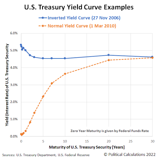
For this data, the red warning light starts flashing when the yield of the 10-Year Treasury drops below the yield of the 3-Month Treasury. This is a clear signal the U.S. Treasury yield curve has inverted, with short term yields paying higher yields than long-term yields. Historically, yield curve inversions have occurred before the U.S. economy entered into recession. Wright's innovation was to also take the level of the Federal Funds Rate into account, recognizing that how the Federal Reserve sets it in accordance with its monetary policies affects the likelihood of recession.
As of the close of trading on 27 April 2023, Wright's recession forecasting model anticipates a 67.0% probability the period between now and the end of April 2024 will contain the month the NBER will someday say marked the beginning of a national recession in the U.S.
The latest update to the Recession Probability Track shows how that probability has evolved since our previous update one month ago.
The chart shows the current probability of a recession being officially determined to have begun between 27 April 2023 and 27 April 2024 is 67.0%. Assuming the Fed follows through on hiking the Federal Funds Rate by another 0.25% next week, the probability of an "official" recession will continue rising. Doing some back-of-the-envelope math using our recession odds reckoning tool, with the 10-Year and 3-Month Treasuries as inverted as they are today, the odds of recession will breach the 70% threshold in about two weeks. Even if the Federal Reserve stops hiking the Federal Funds Rate after its Federal Open Market Committee meets to set its rate next week, the odds of recession will breach the 80% threshold in early July 2023.
Analyst's Notes
Two members of the NBER's Business Cycle Dating committee have a new working paper in which they indicate Americans should expect a recession in 2023 and 2024. The role Federal Reserve officials in changing from expansionary to contractionary monetary policies looms large in their assessment.
For the latest updates of the U.S. Recession Probability Track, follow this link!
Previously on Political Calculations
We started this new recession watch series on 18 October 2022, coinciding with the inversion of the 10-Year and 3-Month constant maturity U.S. Treasuries. Here are all the posts-to-date on that topic in reverse chronological order, including this one....
- U.S. Recession Probability Reaches 67%
- U.S. Recession Probability Shoots Over 50% on Way to 60%
- Recession Probability Nearing 50%
- Recession Probability Ratchets Up to Better Than 1-in-6
- U.S. Recession Odds Rise Above 1-in-10
- The Return of the Recession Probability Track
Image credit: Photo by Annie Spratt on Unsplash.
Labels: recession, recession forecast
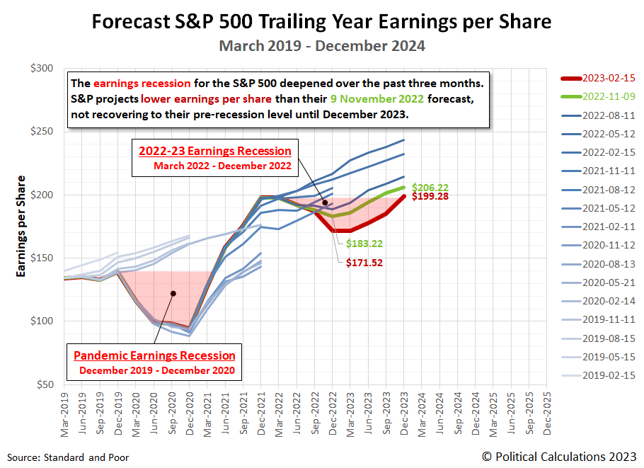
Every three months, we take a snapshot of the expectations for future earnings in the S&P 500 (Index: SPX) at approximately the midpoint of the current quarter, shortly after most U.S. firms have announced their previous quarter's earnings.
Since our last update three months ago, the S&P 500's earnings recession deepened and lengthened again. The bottom dropped to at least $171.52 earnings per share, down from the $183.22 projected during our Fall 2022 snapshot. Looking further forward, to the end of 2023, expectations for the S&P 500's earnings also declined, but by a smaller amount. The S&P 500's earnings at the end of December 2023 are now expected to be $199.28 per share, down from $206.22 per share.
At the same time, Standard and Poor projects the new earnings recession will not recover to its pre-earnings recession level until December 2023. The following chart illustrates how the latest earnings outlook has changed with respect to previous snapshots:
About Earnings Recessions
Depending on who you talk to, an earnings recession has one of two definitions. An earnings recession exists if either earnings decline over at least two consecutive quarters or if there is a year-over-year decline over at least two quarters. The chart identifies the periods in which the quarter-on-quarter decline in earnings definition for an earnings recession is confirmed for both the Pandemic Earnings Recession (December 2020-December 2021) and the new earnings recession (March 2022-December 2022) according to the first definition. The regions of the graph shaded in light-red correspond to the full period in which the S&P 500's earnings per share remained below (or are projected to remain below) its pre-earnings recession levels.
Our next snapshot of the index' expected future earnings will be in three months, where it is quite possible the bottom for the 2022-23 earnings recession will shift to the first quarter of 2023.
Reference
Silverblatt, Howard. Standard & Poor. S&P 500 Earnings and Estimates. [Excel Spreadsheet]. 15 February 2023. Accessed 17 February 2023.
Labels: earnings, recession, SP 500
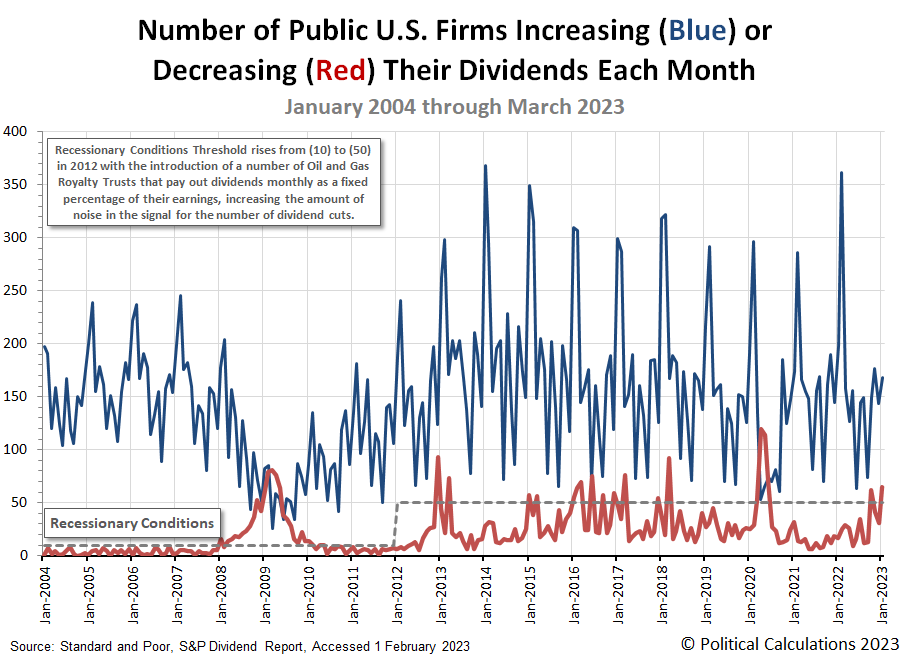
2023 got off to a rocky start for dividend paying stocks in the U.S. stock market. The number of firms announcing dividend reductions jumped back above the threshold indicating recessionary conditions are present in the U.S. economy. Meanwhile, the number of dividend increases announced during January 2023 presents a more mixed picture, up month over month, but down year over year.
These changes are visualized in the following chart.
With the new year, we're revamping how we present the U.S. stock market's monthly dividend metadata. The following table presents the data for the just completed month of January 2023, the preceding month of December 2022, and the year ago month of January 2022. We've also presented the Month-over-Month (MoM) and Year-over-Year (YoY) changes for January 2023's dividend metadata:
| Dividend Changes in January 2023 | |||||
|---|---|---|---|---|---|
| Latest | Previous Month | Previous Year | |||
| Jan-2023 | Dec-2022 | MoM | Jan-2022 | YoY | |
| Total Declarations | 3,127 | 5,528 | 2,401 ↓ | 2,224 | 903 ↑ |
| Favorable | 221 | 281 | 60 ↓ | 264 | 43 ↓ |
| - Increases | 168 | 144 | 24 ↑ | 198 | 30 ↓ |
| - Special/Extra | 48 | 135 | 87 ↓ | 59 | 11 ↓ |
| - Resumed | 5 | 2 | 3 ↑ | 7 | 2 ↓ |
| Unfavorable | 65 | 31 | 34 ↑ | 17 | 48 ↑ |
| - Decreases | 65 | 31 | 34 ↑ | 17 | 48 ↑ |
| - Omitted/Passed | 0 | 0 | 0 ↔ | 0 | 0 ↔ |
Our sampling of dividend decreases only captured 13 of the 65 reported dividend reductions. They are predominantly concentrated in the U.S. oil and gas sector among firms that pay variable dividends to their shareholding owners. These firms have made frequent appearances in recent months, coinciding with the ~35% decline in the price of crude oil from early June through December 2022. Dividend reductions most often represent a mildly lagging indicator for declining business conditions, so their appearance in January 2023 is not unexpected.
Here's the list for our sampling, where we also find industrial representation from the real estate and financial services sectors of the economy.
- MV Oil Trust (NYSE: MVO)
- Sabine Royalty Trust (NYSE: SBR)
- BP Prudhoe Bay Royalty Trust (NYSE: BPT)
- Gladstone Commercial (REIT-Diversified) (NASDAQ: GOOD)
- KNOT Offshore Partners (NYSE: KNOP)
- Permianville Royalty Trust (NYSE: PVL)
- Vornado Realty Trust (REIT-Office) (NYSE: VNO)
- Dorchester Minerals (NASDAQ: DMLP)
- Permian Basin Royalty Trust (NYSE: PBT)
- Hugoton Royalty Trust (OTC: HGTXU)
- VOC Energy Trust (NYSE: VOC)
- Mesa Royalty Trust (NYSE: MTR)
- Artisan Partners Asset Management (NYSE: APAM)
Going back to the dividend metadata, we're surprised we're not seeing more firms being recorded as omitting (or suspending) their dividend payments to shareholders. We suspect Standard and Poor is including them with the number of dividend decreases they report. That makes sense since both dividend cuts and omissions count as unfavorable changes, which we're now tracking in our monthly dividend metadata summary.
Reference
Standard and Poor. S&P Market Attributes Web File. [Excel Spreadsheet]. Accessed 1 February 2023.
Labels: dividends, recession, stock market
U.S. imports of goods produced in China collapsed further in November 2022, continuing the plunge that began in September.
The following chart shows the year-over-year growth rate of the value of goods imported from China to the U.S. has collapsed into negative territory, confirming U.S. imports are shrinking.
We dug into the Census Bureau's detailed data on goods traded between the U.S. and China during November 2022. We found three categories of goods account for the bulk of the year over year reduction in goods imported from China. Here is the list:
- Electric Machinery (primarily Smartphones, Monitors, and Electrical Heating Devices)
- Automatic Data Processing Machines
- Toys (not including Video Game Consoles)
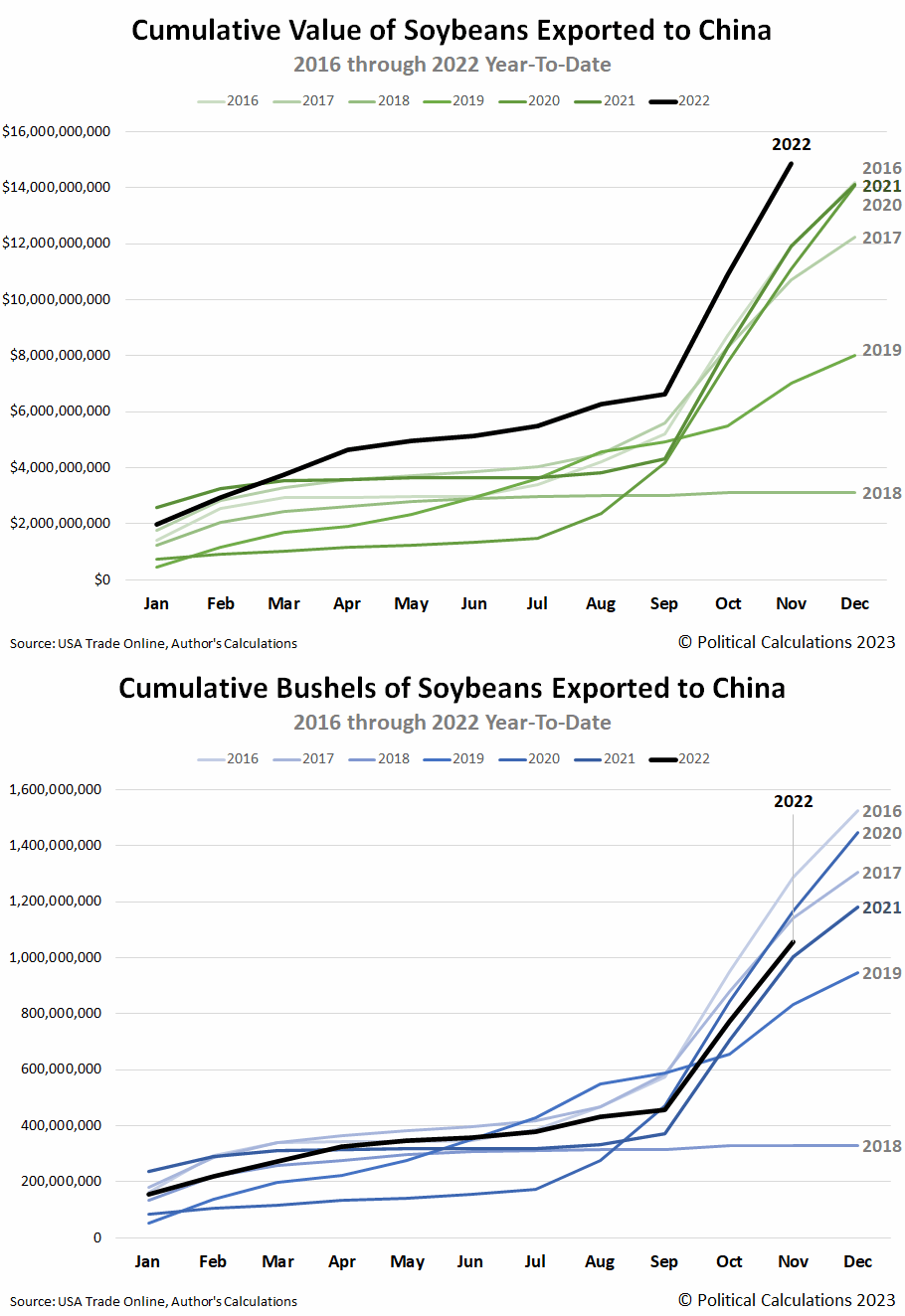
The growth rate chart also shows U.S. exports to China held their single-digit year-over-year growth rate, but even that is misleading. The months of October through December represent the peak season for U.S. exports to China, which is dominated by soybeans. Updating the animated chart we featured last month, we find that while the value of 2022's exports of soybeans is setting new records, in real terms, the volume of soybeans being exported is well below the levels set in 2016, 2017, and 2020.
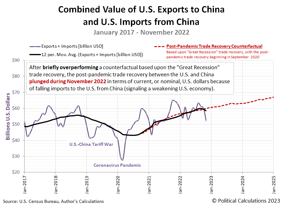
Overall, the continuing collapse of U.S. imports from China has pulled the combined value of goods traded between the U.S. and China below a counterfactual trajectory based on the recovery of trade between the countries after 2008-09 Great Recession. The next chart shows the post-pandemic trade recovery is once again underperforming:
As a general rule, growth trends for imports provide an indication of the relative health of the economy that is importing the goods. In this case, we think it's more an indication that the COVID lockdowns China imposed in October and November severely disrupted its production and export of the goods that saw the biggest year-over-year declines.
China's government was forced to reverse its lockdown policies in December 2022, with most of its restrictions lifted by early January 2023. That timing means we should anticipate at least one more month of negatively impacted imports from China before its government's policy reversal begins to be reflected in the trade data.
On the U.S. side of the trade ledger, we only have December 2022's data to be reported before we can close the books on 2022's soybean export season. After that data is reported in early February 2023, we anticipate U.S. exports to China will plunge since they will no longer be boosted by the inflated value of soybeans. These changes mean that trade between the U.S. and China will transition into a stronger headwind against the U.S. economic growth in 2023.
References
U.S. Census Bureau. Trade in Goods with China. Last updated: 5 January 2023.
U.S. Department of Agriculture. Soybeans - Price Received, Measured in $/bushel. [Online Database]. Accessed 8 January 2023.
U.S. Trade Online. [Online Database]. Accessed: 5 January 2023.
Every three months, we take a snapshot of the expectations for future earnings in the S&P 500 (Index: SPX) at approximately the midpoint of the current quarter, shortly after most U.S. firms have announced their previous quarter's earnings.
The S&P 500's earnings recession has deepened since since our last update three months ago. Standard and Poor continues to project the new earnings recession will last through at least December 2022. The following chart illustrates how the latest earnings outlook has changed with respect to previous snapshots:
Depending on who you talk to, an earnings recession has one of two definitions. An earnings recession exists if either earnings decline over at least two consecutive quarters or if there is a year-over-year decline over at least two quarters. The chart identifies the periods in which the quarter-on-quarter decline in earnings definition for an earnings recession is confirmed for both the Pandemic Earnings Recession (December 2020-December 2021) and the new earnings recession (March 2022-December 2022). The regions of the chart we've shaded in light red indicate the periods where year-over-year declines in earnings per share to qualify as an earnings recession would be satisfied.
Our next snapshot of the index' expected future earnings will be in three months. Whether the S&P 500's current earnings recession extends into 2023 will be determined during that time.
Reference
Silverblatt, Howard. Standard & Poor. S&P 500 Earnings and Estimates. [Excel Spreadsheet]. 9 November 2022. Accessed 11 November 2022.
Labels: earnings, recession, SP 500
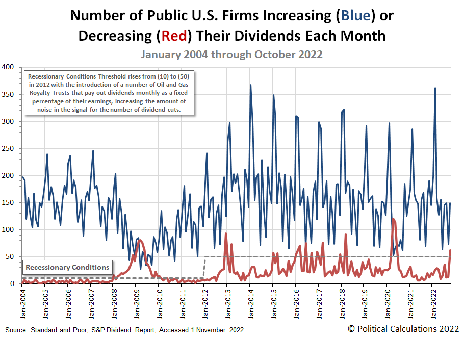
The number of U.S. firms either increasing or decreasing their dividends in any given month can tell us about the developing state of the U.S. economy. In October 2022, the number of announced dividend reductions sent a clear signal the U.S. economy is experiencing recessionary conditions.
Here's the latest update to our chart tracking monthly increases and decreases for dividends as reported by Standard and Poor for each month from January 2004 through October 2022.
The more serious signal is the reported spike in the number of U.S. firms that have announced dividend cuts. In October 2022, that number leapt above the threshold of 50 we've identified on the chart, which coincides with a significant level of distress for businesses within the U.S. economy. The number of dividend increases is also a tell, mainly because it is lower year-over-year, continuing 2022's negative trend for this measure.
Here's our summary of October 2022's dividend metadata:
- There were 3,267 U.S. firms declaring dividends in October 2022. That's a decrease of 815 from September 2022, and a decrease of 1,880 from the number of declarations recorded a year earlier in October 2021.
- A total of 59 U.S. firms declared they would pay a special (or extra) dividend in October 2022, up from September 2022's seasonal low of 33 and the same as did back in October 2021.
- 149 U.S. firms announced they would increase dividends during October 2022, an increase of 475 over September 2022's seasonal low, but a year-over-year decrease of 13 from October 2021's level.
- Standard and Poor reports 62 companies cut their dividends in October 2022. That's 49 more than did in September 2022 and 43 more than did a year earlier in October 2021.
- There were zero U.S. firms suspending (or omitting) their dividends in October 2022, continuing the trend established since June 2021. That trend now stands out as unusual with respect to the surge in announced dividend cuts, because the combination indicates the firms cutting dividends are not anticipating a mild level of distress they might simply weather and simply resume paying dividends at their set levels later.
We found the following fifteen announced dividend reductions in our sampling of October 2022's dividend declarations. This month's list includes six firms from the Oil and Gas sector, four Financial Services firms, three Real Estate Investment Trusts, and one firm each from the Transportation and Materials sectors of the U.S. economy. Meanwhile, over half the listed firms pay variable dividends, which are listed here because they are very sensitive to changing business conditions. If you're someone who becomes irrationally upset when fixed and variable dividend-paying companies are listed together as dividend cutters after they've reduced their dividends, get ready to white-knuckle your armrests.
- Generation Income Properties (REIT-Diversified) (NASDAQ: GIPR)
- Medalist Diversified (REIT-Diversified) (NASDAQ: MDRR)
- MV Oil Trust (NYSE: MVO)
- BP Prudhoe Bay Royalty Trust (NYSE: BPT)
- WhiteHorse Finance (NASDAQ: WHF)
- Blackstone Group (NYSE: BX)
- VOC Energy Trust (NYSE: VOC)
- Southern Copper (NYSE: SCCO)
- Permian Basin Royalty Trust (NYSE: PBT)
- Cross Timbers Royalty Trust (NYSE: CRT)
- Hugoton Royalty Trust (OTC: HGTXU)
- Sachem Capital (REIT-Mortgage) (NYSE: SACH)
- Fortress Transportation (NYSE: FTAI)
- First Business Financial Services (NASDAQ: FBIZ)
- Pioneer Natural Resources (NYSE: PXD)
- AllianceBernstein (NYSE: AB)
Dividend cuts are a near-real time indicator of potential distress for the businesses that declare them, particularly when their numbers begin accumulating above the market's typical noise level. With the exception of monthly dividend payers, the timing of dividend cuts follow about a quarter behind the changes in business conditions that compel them. Which is to say investors need to stay tuned, because the number of dividends cuts is catching up to negative conditions that have already developed within the economy.
References
Standard and Poor. S&P Market Attributes Web File. [Excel Spreadsheet]. Accessed 1 November 2022.
Standard and Poor. S&P Indicated Rate Change. [Excel Spreadsheet]. Accessed 1 November 2022.
Morningstar's Amy Arnott wrote a column exploring whether dividend stocks provide shelter from a recession. It's a good article, and after reading it, we had a question. How would the S&P 500 (Index: SPX) compare with the three categories of dividend funds she discussed?
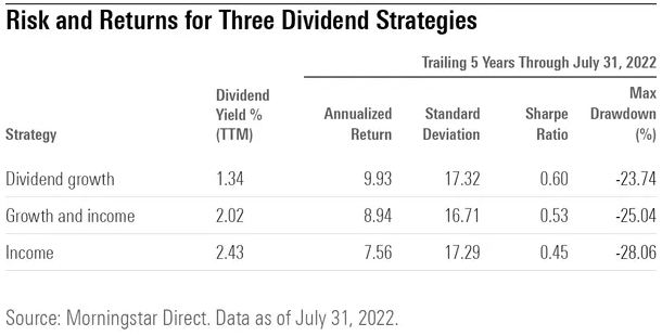
Those dividend stock fund categories include growth, growth and income, and income. In the following table, she gives some useful metrics for comparing how each type has performed during the past five years.
The table presents the trailing twelve month dividend yield for each type of dividend stock fund, and also the five-year performance of each category for their Annualized Return, Standard Deviation (a measure of volatility), Sharpe Ratio (a risk-adjusted measure of investment return), and their Maximum Drawdown (the largest downward trend experienced from peak to trough).
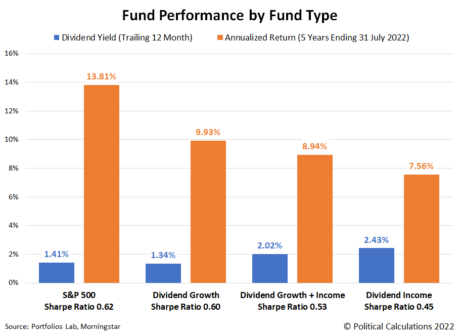
We tracked down the same measures for the S&P 500. In the following chart, we've visually compared the index's dividend yield and 5-year annualized return with that of each of the dividend fund categories. We've also indicated the Sharpe Ratio for each in the column headings.
Although they have the lowest dividend yields, the S&P 500 and Dividend Growth fund categories provided the best total returns. That's also true after considering their Sharpe Ratio values, for which Arnott had indicated for the Dividend Growth category "posted the best combination of risk and return", beating the other two types of dividend funds. Speaking of which, Arnott recognizes that the dividend stock funds might have recorded better returns if not for having higher fees. She found that low-cost funds outperformed high-cost funds for overall returns.
The next chart compares the S&P 500's and the three dividend stock fund categories' standard deviation (volatility) and their worst recorded downward trend over the past five years.
The standard deviation data for the S&P 500, Dividend Growth, and Dividend Income funds were all similar, with the Dividend Growth and Income fund recording the lowest volatility. Meanwhile, the S&P 500 clearly outperformed the other fund types by recording the smallest drawdown during the past five years, with Dividend Growth funds ranking second lowest. Dividend Income funds recorded the most adverse drawdown in the five year period ending on 31 July 2022.
Altogether, the data indicates the S&P 500 had the best overall performance, followed by Dividend Growth funds, then Dividend Growth and Income funds, and finally, Dividend Income funds.
References
Arnott, Amy. Do Dividend Stocks Provide Shelter From Recession? Morningstar. [Online Article]. 8 August 2022.
Morningstar. S&P 500 PR Risk Data. [Online Application]. Accessed 14 August 2022.
PortfoliosLab. S&P 500 Portfolio Trailing Twelve Month Dividend Yield [Online Application]. Accessed 14 August 2022.
Labels: dividends, investing, recession, SP 500
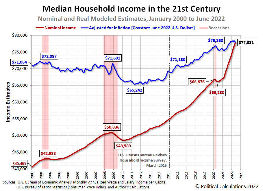
Political Calculations' initial estimate of median household income in June 2022 is $77,881, an increase of $616 (or 0.82%) from the initial estimate of $77,265 in May 2022.
Update 31 October 2023: We have revised our estimate of median household income for this month based on new information from the U.S. Census Bureau for 2022 and revisions to income data by the Bureau of Economic Analysis that were released in September 2023. Please follow this link to see how much. If you're interested, we've provided more information about what has changed and why we think its significant.
The latest update to Political Calculations' chart tracking Median Household Income in the 21st Century shows the nominal (red) and inflation-adjusted (blue) trends for median household income in the United States from January 2000 through June 2022. The inflation-adjusted figures are presented in terms of constant June 2022 U.S. dollars.
Once again, inflation eroded all of the nominal month-over-month gain for American households in June 2022. For the year-to-date, there has virtually been no real growth in median household income.
Developing Recessionary Conditions
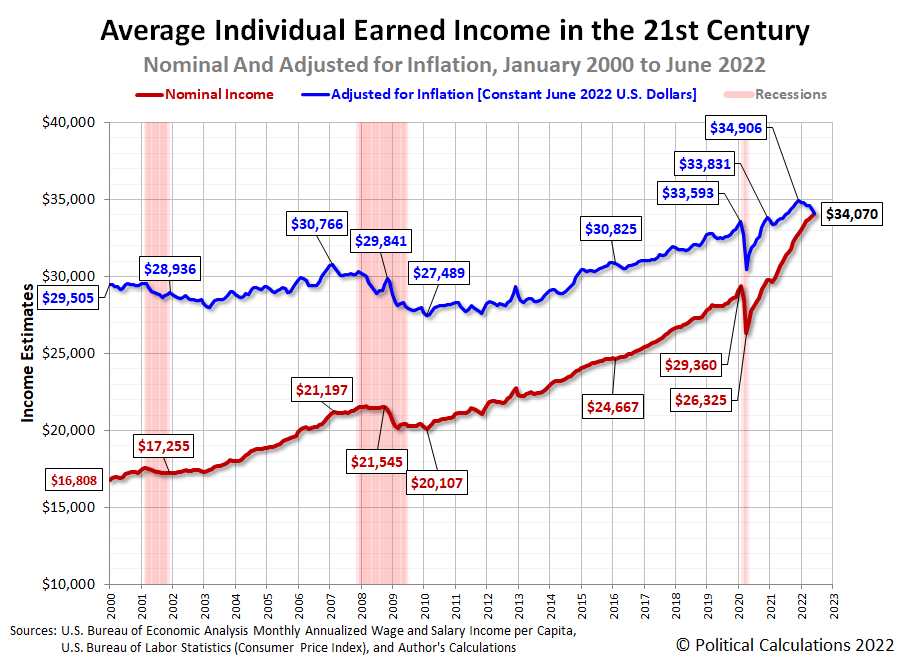
In developing our median household income estimates, we track average earned income per capita as a separate metric. This measure is more sensitive to changing economic conditions, which makes it useful for taking the proverbial temperature of the U.S. economy. Since the Bureau of Economic Analysis has reported the U.S. experience a second consecutive quarter of negative real economic growth in the second quarter of 2022, we thought we'd present it in this edition of our median household income series.
The following chart shows the average earned wage or salary income per capita in the twenty-first century:
This chart covers three officially declared recessions for the U.S. economy. In each, the nominal (or actual) earned income either stagnated or declined during these periods, while the real (or inflation adjusted) earned income experienced sustained or deep declines. For this recent history, the official periods of recession more closely coincide with the sustained or deep declines observed in the inflation-adjusted income data.
Now, let's take a closer look at the most recent data. The third chart shows average individual earned income during the Biden era.
This chart conveys the inflation-adjusted average earned income per capita peaked in December 2021 before a sustained decline that now extends to June 2022, which is consistent with how this measure has behaved during previous recessions. At the same time, the rate at which the nominal average earned income for individual Americans grows has decelerated. This combination is signaling recessionary conditions are building in the U.S. economy.
The way to read this data is that the inflation adjusted data is voting "Yes, the U.S. economy is in recession", while the nominal income data is voting "Maybe". If you want the Magic 8-Ball answer, the average earned income data is saying "Ask again later" while leaning toward "It is certain".
Analyst's Notes
The BEA made minor downward adjustments to its aggregate wage and salary data for April (-0.083%) and May 2022 (-0.062%).
Looking forward, the BEA will be making its large, annual revision to its historic aggregate income data at the end of September 2022. This data, when released, may have a major impact on how we assess whether the U.S. economy went into recession in the first half of 2022.
For the latest in our coverage of median household income in the United States, follow this link!
References
U.S. Bureau of Economic Analysis. Table 2.6. Personal Income and Its Disposition, Monthly, Personal Income and Outlays, Not Seasonally Adjusted, Monthly, Middle of Month. Population. [Online Database (via Federal Reserve Economic Data)]. Last Updated: 29 July 2022. Accessed: 29 July 2022.
U.S. Bureau of Economic Analysis. Table 2.6. Personal Income and Its Disposition, Monthly, Personal Income and Outlays, Not Seasonally Adjusted, Monthly, Middle of Month. Compensation of Employees, Received: Wage and Salary Disbursements. [Online Database (via Federal Reserve Economic Data)]. Last Updated: 29 July 2022. Accessed: 29 July 2022.
U.S. Department of Labor Bureau of Labor Statistics. Consumer Price Index, All Urban Consumers - (CPI-U), U.S. City Average, All Items, 1982-84=100. [Online Database (via Federal Reserve Economic Data)]. Last Updated: 13 July 2022. Accessed: 13 July 2022.
Labels: demographics, median household income, recession
Trends in how Americans' incomes are changing can tell us quite a bit about the relative health of the U.S. economy. One of the simplest measures we can follow is the country's average earned wage and salary income per capita. The following chart shows that data from January 2000 through May 2022, covering the 21st century to date:
The chart tracks both nominal and inflation-adjusted income trends. One thing we quickly see is that official periods of recession coincide with significant or sustained declines in average inflation-adjusted earned income (the blue line). Meanwhile, average nominal income, shown in red, either stalls or falls during these periods.
So what does that mean for the state of today's economy? The next chart zooms in the period since December 2020, covering the Biden era:
Here, we see the growth rate of average nominal incomes has notably slowed since December 2021, while inflation-adjusted incomes have sustained declines during this period. What that means is the U.S. economy has definitely slowed during the last two quarters, but the trend for nominal income growth hasn't fully stalled out yet as of the available data for May 2022. Meanwhile, the decline in real earned incomes since December 2021 is consistent with recessionary conditions being present in the U.S. economy during this period.
We should note the underlying income data is subject to revision for many months after it is first reported. The initial estimates for June 2022 will be reported by the U.S. Bureau of Economic Analysis near the end of July. If you want to beat us to the punch in doing that analysis, the References section below provides links to the data you'll need to both replicate and update our results.
References
U.S. Bureau of Economic Analysis. Table 2.6. Personal Income and Its Disposition, Monthly, Personal Income and Outlays, Not Seasonally Adjusted, Monthly, Middle of Month. Population. [Online Database (via Federal Reserve Economic Data)]. Last Updated: 30 June 2022. Accessed: 30 June 2022.
U.S. Bureau of Economic Analysis. Table 2.6. Personal Income and Its Disposition, Monthly, Personal Income and Outlays, Not Seasonally Adjusted, Monthly, Middle of Month. Compensation of Employees, Received: Wage and Salary Disbursements. [Online Database (via Federal Reserve Economic Data)]. Last Updated: 30 June 2022. Accessed: 30 June 2022.
U.S. Department of Labor Bureau of Labor Statistics. Consumer Price Index, All Urban Consumers - (CPI-U), U.S. City Average, All Items, 1982-84=100. [Online Database (via Federal Reserve Economic Data)]. Last Updated: 10 June 2022. Accessed: 10 June 2022.
The latest view from the volcano points to a higher level of economic gloom for the global economy.
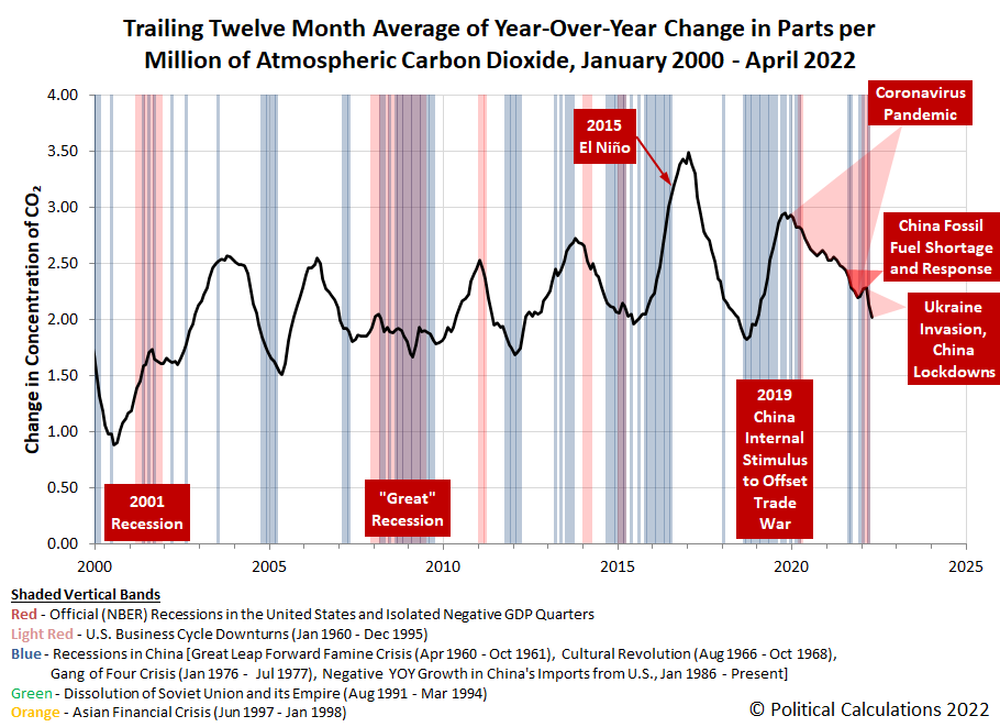
The explanation for that worsening situation is the same as last month: the expanding economic sanctions imposed against Russia following its invasion of Ukraine and, more significantly, China's government's continuing lockdown of Shanghai that threatens to expand to other areas of China.
We're seeing the effects of both situations show up at the remote Mauna Loa Observatory, located atop a volcano on the big island of Hawaii in the middle of the Pacific Ocean, which measures the concentration of carbon dioxide diffused in the Earth's atmosphere. The following chart reveals the sharp, steep decline in the pace at which carbon dioxide is being added to the Earth's atmosphere since February 2022.
The following tool may be used to convert the decline in the rate of CO₂ accumulation into an estimate of the net GDP loss in the global economy associated with it. If you're accessing this article on a site that republishes our RSS news feed, please click through to our site to access a working version of the tool.
Using the default value of a -0.27 parts per million to account for the change in the rate of growth of atmospheric carbon dioxide since February 2022, we find the equivalent net loss to global GDP attributable to the spread of COVID in southeast Asia and to China's fossil fuel shortage is $9.0 trillion. Going back to the beginning of the coronavirus pandemic in December 2019, the reduction of 0.92 part per million in the rate at which carbon dioxide is being added to the Earth's air corresponds to a net loss to global GDP of $30.6 trillion.
Analyst's Notes
We've updated the population data entry in the version of the tool presented above to reflect Earth's estimated 2021 population. Otherwise, the methodology behind the tool is unchanged from when we first introduced it in 2020.
Meanwhile, since we've forayed into planetary level economic analysis, we should note it has been five months since we developed the first-ever estimate of Mars' GDP. We're about a month away from the end of the latest Martian quarter and our next estimate of Mars' GDP, which is coming due because Martian quarters are roughly twice as long as business quarters on Earth.
References
National Oceanographic and Atmospheric Administration. Earth System Research Laboratory. Mauna Loa Observatory CO2 Data. [Text File]. Updated 5 May 2022. Accessed 5 May 2022.
U.S. Central Intelligence Agency. World Factbook. 1 July 2021 Population Estimate (World). [Online Article | Archived Document]. Accessed 8 May 2022.
Labels: environment, gdp, recession, tool
Part of the U.S. Treasury yield curve inverted and all we got was lousy analysis!
That's actually something of an understatement. There has been an explosion of reporting about the inversion of the U.S. treasury yield curve in recent weeks. If you read any of it, you likely found it leaves a lot to be desired. Here's a random selection of recent headlines:
- What The Inverted Yield Curve Means For The Economy
- The Inverted Yield Curve, A Warning, Not An Alarm Bell
- What Does an Inverted Yield Curve Mean for Stocks?
- An Inverted Yield Curve Doesn’t Always Predict a Recession. Why This Time Is Different.
- The Yield Curve May Not Be a Reliable Bellwether for Recession
It's not any better if you read what academic economists have been writing either, much of which has the intellectual consistency of muddled hash. In fact, if all that analysis were laid out end to end, the last thing you'd ever reach from reviewing it all is a conclusion. You'd think achieving some sort of clarity would be both desirable and a priority because the inversion of the Treasury yield curve is believed to portend recession in the future for the economy.
Part of the problem is because the U.S. Treasury yield curve has more than one part to it than can become inverted. A lot of people will focus on some select parts of it, without taking what's going on in the rest of it into account.
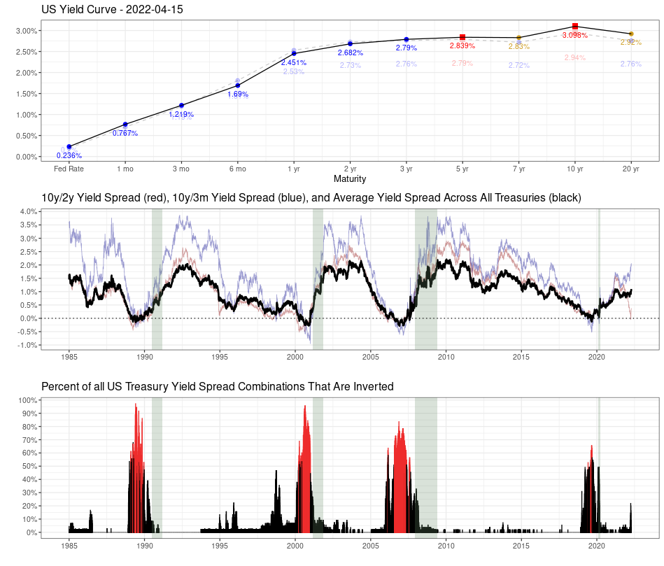
That realization lies behind some more interesting analysis by MetricT at r/dataisbeautiful that offers a path to reach the kind of conclusions you'd want to reach whenever the treasury yield curve becomes inverted. Here's that original analysis from 28 March 2022, which has been updated with charts showing yield curve data through 15 April 2022 (in addition to some other minor tweaks):
Mean Yield Spread across all US Treasury Maturities as a (slightly) better recession gauge than the 10y/2y and 10y/3m yield curve spreads
The US Treasury yield curve spread (most commonly the 10 yr/2 yr and 10 yr/3mo spreads) are popular gauges of incoming recession. But those measures aren't perfect. In particular:
- There is a noticable false positive from Sep 1966 - Feb 1967 where the 10 yr/3 mo yield curve inverted but no recession followed.
- A "is it or isn't it?" event in 1998 where the yield curve almost inverted before returning to normal. This caused a lot of consternation at the time until it was subsequently shown to be another false positive.
- Another "is it or isn't it?" event in 2019 where the yield curve inverted, but pundits wondered if it "inverted enough" to trigger a recession. Narrator: It did...
I've been looking at ways to improve the traditional yield curve measures. A few months ago I posted R code to graph the percent of all yield curve spreads that are inverted, which made it much more obvious that a recession was the likely outcome in 2019.
So the idea occured to me: There are (at present) 55 different yield curve combinations. What would the average of all yield curve combinations look like? That should give us a better measure of how distorted the yield curve is than looking at a single pair of spreads.
As it turns out, the average does perform a bit more accurately than the 10y/2y and 10y/3m yield curves. In particular, it fails to invert in 1998, meaning our "is it or isn't it?" has a much clearer "no" answer. And it did invert during the similar "is it or isn't it?" event in 2019 and correctly predict a recession. So it sends a clearer signal than the better known 10y/2y and 10y/3m curves.
Graph 1:
Top: The US Treasury yield curve as of April 15 2022. A healthy yield curve should be upward sloping. Notice the obvious bear flattening between 3 yr <-> 10 yr Treasuries. There are already inversions between several longer-duration Treasuries (inverted points highlighted in red). There is currently a technical inversion in the 30yr/20yr curve due to a preference for 30 year Treasuries due to the relative newness of 20 yr Treasuries.
Middle: The usual 10y/2y and 10y/3m spread alongside the average yield spread for all maturity combinations. Notice that while the 10y/2y is rapidly nosediving (and getting a lot of press in doing so), the average is still relatively stable, though that may or may not last much longer. So keep an eye on things, but don't overreact just because the 10y/2y curve inverts.
Bottom: Shows the percent of all Treasury combinations that are inverted. It's graphed as a percent because the total number of maturities has changed over time (for instance, the Fed introduced 7 yr Treasuries in 2009), so graphing the percent allows you to do an apples-to-apples comparison. The color scheme is simply "blue if the average yield curve spread is < 0, red if it's > 0".
Graph 2:
Graphs the Federal Funds Rate since 1985 and highlights times when the average yield curve is inverted. As you can see, Fed tightening has come to a screeching halt almost immediately once the average YC is inverted, and quickly starts heading downward. It suggests the Fed is going to have great difficulty raising the Fed rate, as they probably only have a few months before the average inverts.
I'll clean the code up and eventually post it on my Github repo, though it will probably take a few days.
There are two bits of good news. First, MetricT's code is available! Second, through 15 April 2022, the average of all yield curve combinations hasn't changed the low probability of recession signal of MetricT's original analysis from 28 March 2022.
We're not the only ones who recognize there's a lot lacking in current day analysis of the treasury yield curve. For additional discussion, we'll recommend adding Scott Grannis' exploration of better measures of the yield curve to your reading list as well.
Previously on Political Calculations
Labels: data visualization, economics, ideas, recession
Welcome to the blogosphere's toolchest! Here, unlike other blogs dedicated to analyzing current events, we create easy-to-use, simple tools to do the math related to them so you can get in on the action too! If you would like to learn more about these tools, or if you would like to contribute ideas to develop for this blog, please e-mail us at:
ironman at politicalcalculations
Thanks in advance!
Closing values for previous trading day.
This site is primarily powered by:
CSS Validation
RSS Site Feed
JavaScript
The tools on this site are built using JavaScript. If you would like to learn more, one of the best free resources on the web is available at W3Schools.com.
