There are thirty stocks in the Dow Jones Industrial Average (Index: DJI), the U.S. stock market's oldest running index. Unlike the S&P 500 (Index: SPX), the market capitalization-weighted index that's overtaken it as standard for measuring the performance of the U.S. stock market, the component stocks of the DJI are weighted according to their price.
For example, the stock of Goldman Sachs (NYSE: GS) has the heaviest weight within the index, accounting for 11.72% of its value on 27 July 2026 thanks to its highest-in-the-index share price of $1,041.82.
With a share price of $837.24, Caterpillar (NYSE: CAT) ranks second, making up 9.42% of the index. The third largest component stock of the DJI belongs to United Health (NYSE: UNH), whose share price of $427.54 gives it a 4.8% share of the entire Dow Jones Industrial Average.
The following chart visualizes the relative share of each of the DJI's 30 component stocks within the index:

We wondered how this chart would change if the thirty Dow Jones Industrial component stocks were weighted within the index according to their market capitalization. The next chart shows the results of that exercise, keeping the order and coloring of the component stock shares the same as the price-weighted visualization:

The DJI's top three components of Goldman Sachs, Caterpillar, and United Health go from accounting for a combined 25.94% of the index to just 4.23%. In their place, the top three component stocks of become Apple (NASDAQ: AAPL), Nvidia (NASDAQ: NVDA), and Microsoft (NASDAQ: MSFT), which would account for 49.7% of the entire DJI's valuation.
References
Slickcharts. Dow Jones Industrial Average: Price Weighting of Component Stocks and Market Capitalization. 27 July 2026.
Labels: data visualization, market cap, stock market


When we reviewed the carnage among Business Development Companies, or BDCs, when recapping February 2026's dividend decreases, its concentration within this sub-sector of the financial services sector of the U.S. economy really stood out.
BDCs make their money by loaning money they either raise from investors or borrow themselves to small- and medium-sized enterprises that can't raise money by going public and selling stock and also financially distressed businesses. The business models of most established BDCs involve borrowing money, then loaning it back out at higher interest rates, where they pocket the difference.
That makes the profit margins of BDCs vulnerable to rate cuts. Because their loans are tied to the Federal Funds Rate, when the Fed cuts that rate, it negatively impacts BDC profits. In the last three years, BDCs have gone from a rising or high interest rate environment (March 2023 through August 2025), to a falling rate environment (September 2024 through December 2025).
The performance of the VanEck BDC Income Exchange Traded Fund (ETF: BIZD), which includes over 30 BDCs in its market-cap weighted index, gives a good sense of how BDCs performed in these different environments. The following chart shows BDCs rising or flat in the rising rate environment, but then either stalling or falling as the Fed shifted gears into its rate cutting mode.

But that's not the whole story. During the rate cutting period, which initiated the pressure on BDC profits, BDCs have had to cope with the DeepSeek AI shock, peaking just ahead of that event on 19 February 2025. Then they faced the Liberation Day global tariffs shock event of 2 April 2025, plunging with the rest of the market, before going on to recover. That lasted until August 2025, when the return of rate cuts initiated a new downtrend that was followed in January 2026 with a new AI shock event that undermined the business prospects of the Software-As-A-Service (SaaS) firms. Many of which were getting their funding to grow from BDCs.
With AI technologies seemingly set to destroy any potential profitability these firms had, many BDCs were suddenly faced with having to write down large portions of their portfolios. But, not all BDCs are in that boat.
When we looked at the stock performance of individual BDCs, we found a clear characteristic that divided them. That characteristic is their governance and what quickly became evident was that internally-managed BDCs were generally outperforming BDCs whose investments are managed by external parties.
To illustrate that difference, we randomly selected six externally-managed BDCs to compare their performance against an equal number of internally-managed BDCs over the last three years. Here is a list of the BDCs in our performance sample:
Externally Managed BDCs
Let's get to the results. The following chart visualizes the relative performance of the stocks of the two kinds of BDCs:

We've shown the 3-year returns for the benchmarks of the S&P 500 (Index: SPX) at 72.01% and BIZD at -10.79% to show how they compare against the range of the two categories. The externally managed BDCs range from a high of +2.79% to a low of -29.22%, with four of the six BDCs having a negative return.
By contrast, the internally managed BDCs range from a high of +44.22% to a low of -16.96%, with two of the six BDCs having a negative return.
But it's not just recent market events driving that outcome. In the next two charts, we show how the sample of internally managed and externally managed BDCs compare with the performance of the S&P 500 over the last three years. The first chart tracks the internally managed BDCs:

The next chart follows the externally managed BDCs over the same period.

We find the internally-managed BDCs have sustained better performance than the externally-managed BDCs over all portions of this three year period, which can be seen in their relative performance being closer to that of the benchmark S&P 500 index. That better performance occurred both in a period in which rising interest rates provided BDCs with a tailwind and the current period in which falling interest rates are providing fierce headwinds against the BDCs.
When we started this exercise, we thought we'd mainly be discussing the role of how changing interest rates have affected the performance of the BDC sub-sector of the financial services industry, leading so many of these firms to cut their dividends in recent months. We didn't expect to run into a more interesting question: how much does management matter in a publicly traded company? In the case of BDCs, whether the people managing their lending business work directly for the firm or are employed outside of it would appear to have a significant impact affecting the returns of the shareholders who own the companies.
Image credit: Microsoft Copilot Designer. Prompt: "A cartoon illustrating a Business Development Company that is internally managed versus a BDC that is externally managed", the result of would appear to succinctly explain at least one reason why the outperformance of internally-managed BDCs over externally-managed ones exists!
Labels: ideas, investing, management, stock market

Here we are, three months after Thanksgiving 2025. How are the Thanksgiving Leftover Stocks of the S&P 500 (Index: SPX) doing?
The Thanksgiving Leftover Stocks are a group of ten stocks that Seeking Alpha's Jason Capul identified as "Thanksgiving leftovers no one wants". Going into Thanksgiving 2025, these were the worst performing stocks of the index, having lost anywhere from 41.7% to 70.1% of their value up to that point of the year.
We've been tracking the daily ups and downs of these stocks since Thanksgiving 2025, creating two hypothetical stock indices to track them. One is a simple equal-weighted index, consisting of an equal number of shares of each stock. The other is a market capitalization-weighted index, like the S&P 500 itself, which we introduced in the previous edition of this series. We're comparing the performance of both of our Thanksgiving Leftover indices with that of the S&P 500.
The following chart shows where each of these indices stand after one quarter.

There have been dramatic changes since the previous edition. One month ago, both Thanksgiving Leftover Stock indices were handily beating the S&P 500. But now, through the end of trading on 25 February 2026, we find the S&P 500 is outperforming both having reached a value 101.4% of its value on the day after Thanksgiving 2025.
The value of the market cap-weighted version of the Thanksgiving Leftover Stocks has dropped to be 97.7% of its post-Thanksgiving Day value, but the equal-weighted version has lost 11.5% of its value, clocking in at 88.5% of its value on 28 November 2025.
The following spaghetti chart reveals the performance of each of the ten Thanksgiving Leftover Stocks with respect to the S&P 500, each indexed with respect to their closing values on 28 November 2025.

Three of the ten Thanksgiving Leftover stocks have beaten the S&P 500 in the last quarter: Deckers Outdoor (NYSE: DECK), Dow Inc. (NYSE: DOW), and Chipotle Mexican Grill (NYSE: CMG), which have risen to be 135.7%, 125.8%, and 108.6% of their values recorded on 28 November 2025.
Another three, Alexandria Real Estate Equities (NYSE: ARE), Fiserv (NASDAQ: FISV), and Molina Healthcare (NYSE: MOH) are treading water, coming within a few percent but still below the performance of the S&P 500.
The final four Thanksgiving Leftover Stocks however are still being clobbered by bears. Of these, Lululemon Athletica (NASDAQ: LULU) has done the best, dropping to 81.1% of its Thanksgiving Leftover Day value. Gartner (NYSE: IT) and Factset Research Systems (NYSE: FDS) are worth 78.4% and 74.5% what they were on 28 November 2025. But The Trade Desk (NASDAQ: TTD) is by far the worst, having dropped to 63.6% of its Day-After-Turkey-Day price.
Which is really amazing when you consider that to even be on this list, it had already registered the second worst performance of the individual stock components that make up the S&P 500 index. Since the beginning of trading on 2 January 2025, The Trade Desk's share price has fallen 78.8% in value, dropping from $117.73 to $24.94 per share on 25 February 2026.
That's a performance that raises questions of whether TTD will remain within the S&P 500 index. Seeking Alpha reports The Trade Desk's market capitalization is $12.06 billion, but that was before the firm reported better than expected earnings but a disappointing outlook after the closing bell on 25 February 2026.
That's less than the $13.36 billion market cap reported by Seeking Alpha for the Class B shares of News Corp (NWS), which was the smallest company by market cap in the S&P 500. If its bad fortune persists, Standard and Poor's next adjustment to its flagship index could see the Thanksgiving Leftover Stocks of the S&P 500 drop from ten to nine members this year.
Labels: ideas, SP 500, stock market, thanksgiving
On the day after Thanksgiving 2025, we launched a new series in which we'll track the 10 stocks of the S&P 500 (Index: SPX) that Seeking Alpha's Jason Capul headlined as "Thanksgiving leftovers no one wants".
Capul identified the ten worst performing stocks of the S&P 500 in 2025, which raised a question for us. Would a Dogs of the Dow investing strategy work for the year's worst performing component stocks of the S&P 500?
We decided we're going to find out. We'll track how these stocks collectively perform up through Thanksgiving 2026 using two popular methods. The first method is the simplest: we created an index with an equal number of shares of each company's stock in it.
For the second method, we recorded the market capitalization of each company's stock on Friday, 28 November 2025 and added the results together to find their combined market capitalization. Then we calculated the percentage of each company's market cap with respect to that total to determine how much of a hypothetical investment would have to go into buying each stock at their closing prices recorded on 28 November 2025. The following table presents the results of that exercise:
| 2026 Thanksgiving Leftover Stocks | |||
|---|---|---|---|
| Company | Market Capitalization on 28-Nov-2025 |
Weighting | Dividend Payer |
| Fiserv (NASDAQ: FISV) | $32,700,000,000 | 17.0% | No |
| Trade Desk (NASDAQ: TTD) | $18,910,000,000 | 9.9% | No |
| Deckers Outdoor (NYSE: DECK) | $12,710,000,000 | 6.6% | No |
| Lululemon Athletica (NASDAQ: LULU) | $21,580,000,000 | 11.2% | No |
| Gartner (NYSE: IT) | $16,670,000,000 | 8.7% | No |
| Molina Healthcare (NYSE: MOH) | $7,620,000,000 | 4.0% | No |
| Alexandria Real Estate Equities (NYSE: ARE) | $9,260,000,000 | 4.8% | Yes |
| Chipotle Mexican Grill (NYSE: CMG) | $45,000,000,000 | 23.5% | Yes |
| Factset Research Systems (NYSE: FDS) | $10,390,000,000 | 5.4% | No |
| Dow Inc. (NYSE: DOW) | $16,990,000,000 | 8.9% | Yes |
| Total | $191,830,000,000 | 100.0% | 3 of 10 |
We've also indicated which of these ten stocks pay dividends in the table. Here, each of three dividend payers in this collection of stocks paid quarterly dividends in December 2025 and January 2026. For the equal-weighted portfolio, which would have cost $1,143.55 for one share of each of these ten stocks at the end of trading on 28 November 2025, the effective quarterly dividend payout totaled $2.17. That's the equivalent of an annual yield of 0.76%.
Meanwhile, the market capitalization weighting gives a slight boost to the contribution of the dividend-paying members of this group of stocks. Their annual yield is 0.86% thanks mainly to dividend payer Chipotle's largest-in-the-group market cap.
These dividend yields are tiny. So much so they will make very little difference in the total return of our hypothetical investments in the Thanksgiving Leftover stocks during the course of the year we'll be following them. Our plan is to track them behind the scenes while reporting the performance of the two basic portfolios without dividend reinvestment on a monthly basis. When we reach the conclusion of this series on the day after Thanksgiving 2026, we'll report how dividend reinvestment would have affected the total returns for both portfolios.
Now that we've covered how we set up our two hypothetical portfolios, let's see how they were doing through the close of trading on 27 January 2026, two months after Thanksgiving 2025:

Since Thanksgiving 2025, both the equal-weighted and market-cap weighted portfolios of these ten Thanksgiving Leftover stocks have outperformed the S&P 500. In December, the equal-weight portfolio did better than the market cap-weighted portfolio, but that reversed in January 2026 with the market cap-weighted version performing better. Through 27 January 2026, we find the market cap-weighted index of 2025's Thanksgiving Leftover stocks is worth 106.7% of their starting value, while the equal-weight portfolio of the same stocks has grown to be 104.5% of its initial level. The S&P 500 has likewise increased, but to just 101.9% of its value on 28 November 2025.
At two months into this series, it's far too early to say the "Thanksgiving Leftover" investing strategy will beat the S&P 500 by the time Thanksgiving 2026 rolls around. The early indication however is that the Thanksgiving Leftover investing strategy is capable of beating the index by a significant margin.
We'll see if that's still true near the end of February when we have a full quarter of stock price changes to consider!
Image Credit: Microsoft Copilot Designer. Prompt: "A logo to feature 'Thanksgiving Leftover Stocks'".
Labels: ideas, investing, stock market

2025 was a lackluster year for dividend paying firms in the U.S. stock market.
That outcome can be verified with a single number. The net number of favorable dividend actions announced by dividend paying companies was negative in 2025, with 208 more firms announcing unfavorable changes like decreases or omissions in their dividend payouts than firms announcing favorable changes like increases or those that paid extra dividends to shareholders. Ten of the twelve months of 2025 registered a negative net result by this simple metric.
What made the year a lackluster one rather than an outright bad year is that most of the decrease came in the form of fewer firms announcing dividend increases. 2025 continued a now three-year long trend on that count, avoiding the fate of becoming a bad year with the number of firms announcing unfavorable changes holding relatively stable during the year.
The following chart shows the number of dividend increases and decreases announced by dividend-paying firms in each of the last five quarters from 2024-Q4 through 2025-Q4. It reveals most of the bad news for dividend paying firms occurred in the first quarter of 2025, with a less negative performance in the remaining quarters of the year, which agrees with the general pattern we observed in each month's net favorable dividend actions.

Our next chart focuses on the number of dividend increases and decreases announced each month from January 2004 through December 2025. Here's where you can see that the falling number of dividend increases follows a pattern that has become established since the beginning of 2023 even as the number of dividend decreases remains well below a threshold that indicates recessionary conditions are present in the U.S. economy.

Finally, the following table tallies up all the favorable and unfavorable changes recorded by dividend paying firms in the U.S. stock market for the month of December 2025. It also shows the month-over-month (MoM) and year-over-year (YoY) changes for December 2025's dividend metadata.
| Dividend Changes in December 2025 | |||||
|---|---|---|---|---|---|
| Dec-2025 | Nov-2025 | MoM | Dec-2024 | YoY | |
| Total Declarations | 5,207 | 4,948 | 259 ▲ | 5,374 | -167 ▼ |
| Favorable | 244 | 193 | 51 ▲ | 246 | -2 ▼ |
| - Increases | 117 | 134 | -17 ▼ | 128 | -11 ▼ |
| - Special/Extra | 126 | 59 | 67 ▲ | 111 | 15 ▲ |
| - Resumed | 1 | 0 | 1 ▲ | 7 | -6 ▼ |
| Unfavorable | 21 | 10 | 11 ▲ | 10 | 11 ▲ |
| - Decreases | 21 | 10 | 11 ▲ | 10 | 11 ▲ |
| - Omitted/Passed | 0 | 0 | 0 ◀▶ | 0 | 0 ◀▶ |
The number of dividend decreases in December 2025 was notably higher than in the previous month of November 2025 and in December 2024, but remains well below the recessionary condition threshold. The good news, such as it is, is that the year-over-year number of favorable changes was only down by two, which suggests that three-year-long negative trend may be close to ending.
Here's hoping 2026 will become a net positive year for the U.S. stock market's dividend paying companies!
References
Standard and Poor. S&P Market Attributes Web File. [Excel Spreadsheet]. Accessed 2 January 2026.
Image Credit: Microsoft Copilot Designer. Prompt: "An editorial cartoon of a Wall Street bear looking at a chart labeled '2025 NET FAVORABLE DIVIDEND ACTIONS' and shows the value '-208'".
Labels: dividends, stock market
The dividend futures-based model we invented to project the potential future trajectories the S&P 500 (Index: SPX) starts from a very simple observation:
Ap = m * Ad
In this relationship, Ap represents the change in the rate of growth of stock prices and Ad is the change in the rate of growth of dividends per share. The value m is an amplification factor that varies over long periods of time but can be nearly constant for short-to-intermediate periods of time.
Since we first formulated this relationship in April 2009, we've found that short-to-intermediate periods of time can be as long as decades. But eventually, the value of m does change and whenever it does it's a big deal because it means the market regime in which stock prices are set has changed.
The following chart tracks how the value of m has changed from January 2014 through the end of November 2025, which covers the period after we first developed the alternative futures chart we use to visualize the dividend-based model's projections. Our initial observations that set the value of m = 5.0 however go back to March 2010, when dividend futures as we know them today became a reality and made that estimation possible. We should also note that m was almost certainly at that same level for years before that point in time.

So what is m really?
A potential solution to that mystery was advanced by Xavier Gabaix and Ralph S.J. Koijen in their June 2021 working paper In Search of the Origins of Financial Fluctuations: The Inelastic Market Hypothesis. For us, this paper immediate leapt to the front of the pack for its potential explanatory power of what m represents because of a simple example they developed to explore one of their propositions. Here is a screenshot of the proposition:

Here is their example:
To think through the economics of Proposition 3, we found the following simple, undergraduate-level example useful. Suppose that there are just two funds: the pure bond fund and the representative mixed fund, which always holds 80% in equities (the magnitude suggested by Figure 1). Then, theta = .08, kappa = 0, so that zeta = 1 - zeta = 0.2 and and 1/zeta = 5. Then an extra 1% inflow into the stock market increases the total market valuation by 5%.
Or to put it more simply, a multiplier of 5 for this simple example, which puts it in the right ballpark for our observations.
It certainly is an intriguing possibility, especially if it can explain for how the value of m has changed in the period since 19 February 2020, during which the value of m has held at various constant levels for much shorter periods of time.
References
Xavier Gabaix and Ralph S.J. Koijen. In Search of the Origins of Financial Fluctuations: The Inelastic Markets Hypothesis. National Bureau of Economic Research Working Paper 28967. [PDF Document]. June 2021.
Labels: chaos, ideas, stock market

A little over three years ago, Artificial Intelligence (AI) technology took off in the public consciousness with OpenAI's public release of ChatGPT.
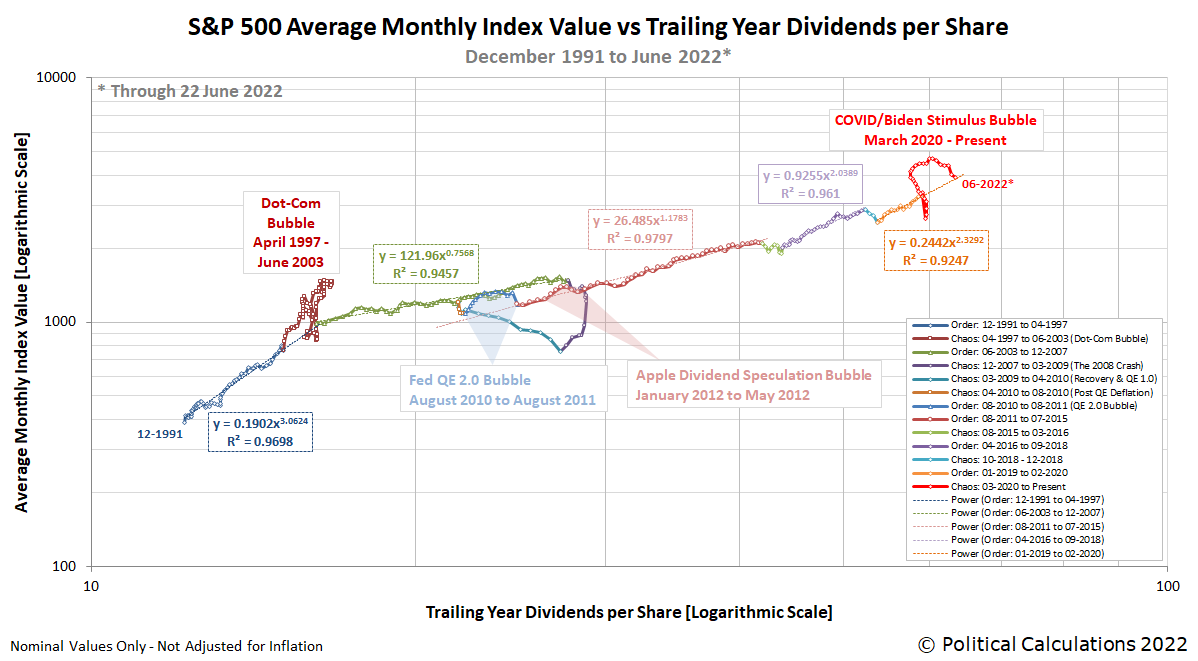
That event took place in a period of relative chaos for the U.S. stock market. That period of chaos started with the S&P 500's plunge after February 2020 with the arrival of 2020's coronavirus pandemic in the U.S., which ended the period of relative order that had established itself in December 2018. The inflation phase of the bubble began after March 2020 with the passage of COVID stimulus funds, which initiated the inflation of the COVID/Biden Stimulus Bubble.
The deflation phase of that bubble began after it peaked in December 2021 and by June 2022, the level of the S&P 500 had returned to levels consistent with where stock prices would have been had the relative order that had been in place starting in December 2018 had simply continued. The following chart, which tracks the average monthly value of the S&P 500 against its underlying trailing year dividends per share shows the scale of that event in the context of the relative periods of order and chaos we've documented since December 1991.
Stock prices continued falling through September 2022 before starting to re-establish some semblance of relative order in the latter part of that year when stock prices began to recover. ChatGPT was rolled out in that environment on 30 November 2022, which helped contribute to the stock market's initial recovery phase that ran through late July 2023, then reversed through late October 2023. It wasn't until 29 December 2023 that what we define as the current period of relative order established itself.
From here, we can track the progress of the current period of relative order in the U.S. stock market on a more refined chart. Here is what that period of order looks like from 29 December 2023 through 2 December 2025:

This chart allows us to quantify what most analysts might identify as the AI bubble, but which we do not because of how we define what a bubble is. Here is our working definition:
An economic bubble exists whenever the price of an asset that may be freely exchanged in a well-established market first soars then plummets over a sustained period of time at rates that are decoupled from the rate of growth of the income that might be realized from owning or holding the asset.
Going back to our chart of the current period of relative order, we find it captures the inflation and deflation phase of the so-called "AI Bubble" that has occurred within it. The inflation phase runs from 29 December 2023 and continues until it peaks in 19 February 2025, just ahead of a market-shaking event for AI stocks. That event came in the form of China's Hangzhou DeepSeek Artificial Intelligence Basic Technology Research company's Friday, 21 February 2025 statement that they would release an open source version of their advanced AI system in the following week, which they followed through and did on Monday, 24 February 2025.
This event popped the proverbial AI bubble. Stock prices plunged until they started to stabilize in late March 2025, but by then, what passed for the AI bubble had all but fully deflated.
Shortly afterward, President Trump's 2 April 2025 "Liberation Day" global tariff announcement sent the S&P 500 plunging much lower, threatening to break the market's current relative period of order. It didn't because less than a week later, President Trump announced a 90-day suspension of the higher tariffs would seek to impose, which prompted a rapid recovery in stock prices that prevented order from fully breaking down.
However, it's not until late June 2025, after Nvidia (NYSE: NVDA) announced blockbuster earnings of its AI-chip systems that we see signs the AI-bubble may have begun a new inflation phase.
From our perspective, the so-called AI bubble doesn't yet deserve that designation. Although it has contributed to making the current relative period of order somewhat chaotic, stock prices remain within the range we identify has established itself during this period, for which we can used the tools of statistical analysis to quantify. The first inflation-deflation phase of the AI-bubble would at best cover 2.5 standard deviations of the variation of stock prices recorded between 29 December 2023 and 2 December 2025, or about 612 points. What passes as its new inflation phase, which we track from 20 June 2025 to the present, is similar in magnitude and is equivalent to about 9% of the current value of the S&P 500.
What would it take for us to officially recognize the AI Bubble as an actual bubble? We would need to see the 20-day moving average of the S&P 500 rise above the upper red dashed line indicated on our refined chart and stay there. For the upcoming milestone of the S&P 500's trailing year dividends reaching $79 per share, that would mean the index sustaining a level above $7,000 for at least 20 trading days to even begin to qualify. Which is to say the earliest that might happen would be early in 2026.
Celebrating Political Calculations' Anniversary
We hope you've enjoyed this analysis because we're celebrating our anniversary a little early this year! Our anniversary posts typically represent the biggest ideas and celebration of the original work we develop here each year, where we've only missed 2024 because we were tied up with other projects. Here are our landmark posts from previous years:
- A Year's Worth of Tools (2005) - we celebrated our first anniversary by listing all the tools we created in our first year. There were just 48 back then. Today, there are over 300....
- The S&P 500 At Your Fingertips (2006) - the most popular tool we've ever created, allowing users to calculate the rate of return for investments in the S&P 500, both with and without the effects of inflation, and with and without the reinvestment of dividends, between any two months since January 1871.
- The Sun, In the Center (2007) - we identify the primary driver of stock prices and describe a whole new way to visualize where they're going (especially in periods of order!)
- Acceleration, Amplification and Shifting Time (2008) - we apply elements of chaos theory to describe and predict how stock prices will change, even in periods of disorder.
- The Trigger Point for Taxes (2009) - we work out both when, and by how much, U.S. politicians are likely to change the top U.S. income tax rate. Sadly, events in recent years have proven us right.
- The Zero Deficit Line (2010) - a whole new way to find out how much federal government spending Americans can really afford and how much Americans cannot really afford!
- Can Increasing the Minimum Wage Boost GDP? (2011) - using data for teens and young adults spanning 1994 and 2010, not only do we demonstrate that increasing the minimum wage fails to increase GDP, we demonstrate that it reduces employment and increases income inequality as well!
- The Discovery of the Unseen (2012) - we go where so-called experts on income inequality fear to tread and reveal that U.S. household income inequality has increased over time mostly because more Americans live alone!
We marked our 2013 anniversary in three parts, since we were telling a story too big to be told in a single blog post! Here they are:
- The Major Trends in U.S. Income Inequality Since 1947 (2013, Part 1) - we revisit the U.S. Census Bureau's income inequality data for American individuals, families and households to see what it really tells us.
- The Widows Peak (2013, Part 2) - we identify when the dramatic increase in the number of Americans living alone really occurred and identify which Americans found themselves in that situation.
- The Men Who Weren't There (2013, Part 3) - our final anniversary post installment explores the lasting impact of the men who died in the service of their country in World War 2 and the hole in society that they left behind, which was felt decades later as the dramatic increase in income inequality for U.S. families and households.
Resuming our list of anniversary posts....
- The Toolmaker's Tool (2014) - we make the code we use for creating online tools available to all!
- Replacing GDP with the National Dividend (2015) - we explore our development of an alternative measure of economic welfare that can replace GDP.
- The Gamblers Who Invented Modern Encryption (2016) - we discover that a group of gamblers seeking to break the law in Missouri back in 1905 put together many of the elements that underlie secure electronic communications and financial transactions!
- The Isolation of El Niño (2017) - in which we advanced the development of a global economic indicator for Earth!
- Telescoping Median Household Income Back in Time (2018) - we find a way to nearly double the available supply of monthly median household income estimates with reasonable accuracy.
- Cashing Out of the S&P 500 (2019) - we develop a tool to answer the question of whether you can survive being retired if you're counting on cashing out your investment in the S&P 500!
- The Deadly Intersection of Anti-Police Protests and COVID-19 (2020) - it was the year of the coronavirus and political protests, so we combined the two in a way that only we could.
- The Birth of the Martian Economy (2021) - we don't mess around when we say we celebrate big ideas, and what's bigger idea to celebrate than the birth of an entire planet's economy?
- The S&P 500 Dividend Engine (2022) - we put the entire history of the S&P 500's cash dividends at your fingertips!
- The Origin of Ancient Alien Theory (2023) - how and when did the idea of aliens visiting Earth to do things like build pyramids get started?
Image credit: Multicolored soap bubble image by Alexa from Pixabay.
Labels: ideas, SP 500, stock market

One of the great truisms in investing is that it is difficult for professional investment managers to beat the Standard and Poor 500 (Index: SP 500) with any regularity over time.
According to S&P Global, the market capitalization-weighted S&P 500 beat over 88% of all Large-Cap stock funds over the last 15 years. The index' relative outperformance over these funds over the decades it has been around has resulted in the S&P 500 becoming the benchmark by which the professionals measure their performance.
In a 2023 paper, Rob Arnott, Chris Brightman, Xi Liu, and Que Nguyen propose a method by which it might be possible to regularly beat the S&P 500 by improving how it selects the component stocks the index adds and removes over time. They note that the index frequently adds overvalued stocks while deleting temporarily undervalued stocks, which lowers the index' returns for investors. They argue there's a practical way to avoid the lower returns that result from this practice.
Here's how they describe their approach:
What if we no longer chase soaring winners and abandon tumbling losers, and instead choose stocks based on a more stable metric, namely, the size of the underlying business? Suppose we select stocks based on their economic scale, their relative size in the macroeconomy, rather than on the market’s expectation of the company’s future success. This strategy will come very close to matching the portfolio held by existing cap-weighted indices. Big businesses are usually large-cap and small businesses are usually small-cap. Thus, if we select stocks based on the economic scale of the underlying business rather than on market-cap, the result is a portfolio with superb liquidity and capacity, fully comparable to popular and commercially available market-cap indices.
We propose the creation of a broad-market capitalization-weighted index by selecting the constituents using fundamental measures of the size of the underlying company, and cap-weighting them. We call this Fundamental-selection Cap-weighted (FS-CW) index. Instead of cap-weighting the largest market-cap stocks, we would be cap-weighting the largest businesses. Additions will be companies that have grown onto the list of the largest businesses, important enough in the macroeconomy to matter, instead of stocks that have soared onto the list of the most popular companies. Deletions will be companies that have diminished in macroeconomic scale, by enough to no longer matter, instead of unloved stocks that have tumbled off the list of the largest market-cap stocks.
How well does that work compared to how the S&P 500 selects its component stocks today? Here's the conclusion to their paper where they summarize how their proposed improvement to an S&P 500 index fund performs in comparison to the benchmark performance set by the current version of the S&P 500 index:
By construction, a cap-weighted index puts more of an investor’s money into overpriced stocks and less into underpriced stocks, but—as indexers will happily point out—How to know which is which. That said, why should we hasten that process by mostly adding stocks based on newly elevated market-cap, when they are priced at “peak froth,” and mostly dropping stocks just after their market-cap has cratered, priced at “peak fear”? We propose a better way to create a cap-weighted index. Using FS-CW, which bases additions and deletions on a company’s fundamental measures and thus de-links index constituents from the stock’s recent price movement, we can create a superior cap-weighted index fund.
With this simple expedient, FS-CW US 500 earns 46 bps of annualized excess return (with less risk!) versus the S&P 500 in a 30-year historical simulation. The live results of the FS-CW model portfolio, since launched in September 2021, have exhibited a stronger outperformance. An additional benefit of this index is that by anchoring index stock selection with fundamentals, we can lower portfolio turnover and potentially markedly reduce trading costs.
Investors can benefit most from the Fundamental-Selection Cap-Weighted index where and when equity markets are less efficient and thus offer more mispricing opportunities. FS-CW’s live portfolio performance, in markets around the world, supports our findings that the index can provide greater outperformance during market turbulence and in higher-volatility markets. After adjusting for relative risk—with FS-CW offering slightly lower turnover in most markets—the result is a superior cap-weighted index, improved by largely eliminating the buy-high/sell-low dynamics inherent in the rebalancing process for most commercially available indexing products.
Given how hard it is for professional investment managers to beat the S&P 500 already, imagine how hard that might become if the method by which the index adds and deletes its component stocks can be easily tweaked to deliver even better returns. It will be interesting to see how well the authors' 'improved' version of the S&P 500 truly performs over time.
References
Rob Arnott, Chris Brightman, Xi Liu, and Que Nguyen. Reimagining Index Funds. Journal of Investment Management, Vol. 21, No. 4. pp 15-31. 2023. DOI: 10.2139/ssrn.4591461. [Ungated PDF document].
Image Credit: Microsoft Copilot Designer. Prompt: "An image of a wall filled with electronic stock ticker data that has the words 'INDEX FUNDS' shown in white letters in one corner".
Labels: ideas, SP 500, stock market

September 2025 was a disappointing month for dividend investors in the U.S. stock market. For the eighth month in a row, the net outcome of favorable and unfavorable changes among dividend paying stocks was negative.
That's what we find after adding up all the favorable year-over-year dividend actions like dividend increases, extra dividends and resumptions during September 2025 and then subtracting all the unfavorable actions, like announced dividend decreases. The result of that math is a single number that summarizes all the dividend changes during the month, which for September 2025, produced a value of -46.
This outcome resulted from two factors. First, there was a year-over-year increase in obviously unfavorable dividend changes with September 2025 having 17 dividend decreases announced during the month, an increase of eight over September 2024's total of 9 firms announcing reduced dividend payments.
The second factor is less obvious but had a bigger impact. The number of firms announcing favorable dividend increases dropped from a total of 136 in September 2024 to just 98 in September 2025. That reduction of 38 dividend increases pulled the number of net dividend changes well into negative territory as bearish factors in the market figuratively intercepted a substantial number of potential dividend hikes.
September 2025's favorable and unfavorable dividend actions are tallied in the following table, which reveals how much they changed since September 2024 (year-over-year) and since August 2025 (month-over-month).
| Dividend Changes in September 2025 | |||||
|---|---|---|---|---|---|
| Sep-2025 | Aug-2025 | MoM | Sep-2024 | YoY | |
| Total Declarations | 4,781 | 4,498 | 283 ▲ | 4,603 | 178 ▲ |
| Favorable | 98 | 174 | -76 ▼ | 136 | -38 ▼ |
| - Increases | 54 | 113 | -59 ▼ | 89 | -35 ▼ |
| - Special/Extra | 44 | 61 | -17 ▼ | 47 | -3 ▼ |
| - Resumed | 0 | 0 | 0 ◀▶ | 0 | 0 ◀▶ |
| Unfavorable | 17 | 13 | 4 ▲ | 9 | 8 ▲ |
| - Decreases | 17 | 13 | 4 ▲ | 9 | 8 ▲ |
| - Omitted/Passed | 0 | 0 | 0 ◀▶ | 0 | 0 ◀▶ |
The following chart tracks the monthly counts of dividend increases and decreases from January 2004 through September 2025:

The good news is the number of dividend decreases remains well below the threshold that indicates outright recessionary conditions are present within the U.S. economy. The bad news is the number of dividend increases has dropped to a level that indicates many publicly-traded companies in the U.S. are facing substantial headwinds. Whether that might turn into recessionary conditions is a reason to keep paying close attention to these near-real time economic indicators.
The next chart visualizes how the dividend increases and decreases reported during 2025-Q3 compare with each of the preceding four quarters:

This chart underscores the curious state of the U.S. stock market's dividends, in which dividend increases have fallen off considerably since the first quarter of 2025, while the number of dividend decreases has been relatively steady, falling within a comparatively narrow range.
Will that pattern continue in the next month and quarter? Stay tuned!
References
Standard and Poor. S&P Market Attributes Web File. [Excel Spreadsheet]. Accessed 1 October 2025.
Image Credit: Microsoft Copilot Designer. Prompt: "An editorial cartoon of a Wall Street bull and a bear who are playing football and the bear intercepts a pass for a ball that says DIVIDEND HIKES".
Labels: dividends, stock market
Welcome to the blogosphere's toolchest! Here, unlike other blogs dedicated to analyzing current events, we create easy-to-use, simple tools to do the math related to them so you can get in on the action too! If you would like to learn more about these tools, or if you would like to contribute ideas to develop for this blog, please e-mail us at:
ironman at politicalcalculations
Thanks in advance!
Closing values for previous trading day.
This site is primarily powered by:

CSS Validation

RSS Site Feed

JavaScript
The tools on this site are built using JavaScript. If you would like to learn more, one of the best free resources on the web is available at W3Schools.com.
Other Cool Resources
Blog Roll


