Think for a moment about the inside of your refrigerator. Have you optimally organized it for maximum cool food storage efficiency?
Don't be silly - of course you haven't! That's why Karl, the Bosch engineer, has created a YouTube video explaining what you need to do to impose order on the chaos that resides within your chillbox!
HT: Core77.
Labels: technology
Previously, we declared that the tipping point for cigarette taxes in Hawaii was on the verge of being reached, where further increases in the state's tobacco taxes would no longer be met with rising tax revenue, but would instead be met with falling tax collections.
Here is how we predicted that scenario would play out, based on our observations of how Hawaiian consumers were adapting their behavior in response to the state's tax hikes on tobacco products, beginning with our description of what we meant when we said the state had reached a tipping point for its cigarette taxes:
By that, we mean that each percentage increase in the inflation-adjusted price of cigarettes above their 2009 level will result in a greater percentage decline in the quantity of cigarettes sold.
That result suggests then that both Hawaii and the federal government have little to gain in terms of their tax collections from Hawaiian smokers by increasing cigarette taxes at a rate faster than inflation. Which means that if these governments are counting on having higher taxes on tobacco products for funding their spending programs, they can instead count on being out of luck.
Instead, elected officials and bureaucrats in Hawaii can count upon ever-greater tax avoidance behavior on the part of cigarette smokers in the island state.
It has been nearly nearly six years since we wrote that prediction. Since, then, Hawaii has increased its taxes on tobacco products twice more, first by 40 cents to $3.00 per pack in July 2010, a month after our observations, and again by 20 cents to $3.20 per pack in July 2011, where it has stood in the time since.
Drawing from Hawaii's monthly tax collection reports going back to 2000, our first chart shows the amount of taxes that Hawaii collected from its increasing excise taxes on tobacco products over the preceding 12 months for each month since January 2000 through the most recent report for February 2016.
In the chart, we see that after Hawaii improved its tobacco tax collection enforcement practices, which were responsible for its increased tax collections that year, the state increased its tax collections each time it hiked its excise taxes on tobacco products all the way up until those taxes peaked at $3.20 per pack on 1 July 2011.
And then, tax collections not only stopped going up, they began to reverse as Hawaiians adapted to avoid the taxes.
That hurt, because Hawaii was counting on having millions more in revenue following its most recent cigarette tax hike in 2011.
At the beginning of FY 2012 Hawaii increased its cigarette excise tax from $3.00 to $3.20 per pack to achieve an $8 million revenue gain. However, it looks like the policy backfired as Hawaii cigarette revenues skidded from $135.6 million in FY 2011 to $131 million in FY 2012. These revenues continued to shrink in FY 2013 to $120.1 million.
In reality, Hawaii's trailing twelve month total of tobacco tax collections peaked in September 2011 at $144.1 million, after which it fell by $23.4 million to bottom at $120.6 million in February 2014, before rebounding somewhat to $129.9 million in June 2015. Since that time, Hawaii's tax collections have fallen slightly thanks to the state's 2015 law to raise the legal age for purchasing tobacco products to 21, which took effect in January 2016. So we find that instead of raking in the $152 million per year in tobacco excise taxes, the state of Hawaii is regularly coming up some $32 million short in revenue it was expecting to collect through its high tobacco taxes.
The next chart shows how the equivalent number of packs of cigarettes per taxes collected in the previous 12 months changed over the period from January 2000 through February 2016.
Since the state last increased its tobacco excise taxes on 1 July 2011, the equivalent number of packs of cigarettes being taxed has fallen by 8.7 million, from an average of 47,565,158 million in the period from July 2010 through June 2011 to an average of 39,861,992 over the last 12 months.
Here's what we find fascinating. In every other one of the United States, people seeking to avoid paying what they believe to be excessive tobacco taxes generally turn to bootlegging, where tobacco products purchased in a low tobacco tax jurisdiction are transported across state lines and sold at an extreme discount to tobacco product consumers compared to what they would pay if they lawfully purchased tobacco products at retailers in their own state.
That's not much of a viable option for Hawaii, given the state's remote location in the Pacific Ocean, where transporting goods to the state from anywhere else in the world, lawfully or not, is costly.
So Hawaiians, and particularly young Hawaiians, have adapted to the state's high tobacco taxes by changing their behavior to consume nicotine through vaping rather than through tobacco products. So much so that the growth of vaping in Hawaii has been described as "out of control" as new consumers of these nicotine-containing goods are clearly favoring vaping-related products over tobacco-related ones.
Since the state imposed its high excise taxes on tobacco in part to cope with the expensive health problems that result from the consumption of traditional tobacco products over a prolonged period of time, whose health hazards are largely caused by other ingredients that are not shared by vaping-related products, the state should benefit from the behavioral adaptation through dramatically lower public health expenses realized through a lowered risk of susceptibility to the kind of ailments that are strongly associated with long-term tobacco product consumption.
In fact, that's the kind of social benefit that is supposed to be provided through the kind of sin taxes first proposed by economist Arthur Pigou, which goes something like this: tax a bad thing, and you'll get less of the bad thing because you make it more costly.
But what happens when a state becomes dependent on the revenue it gets from taxing the bad thing and then it succeeds in getting less of the bad thing being taxed? In fiscally troubled Hawaii, state government officials would seem to believe that the stream of revenue they obtained under the pretense that it was necessary to cover some of the state's portion of the costs for treating the health ailments of poor tobacco consumers is instead absolutely vital for supporting their other priorities. Priorities that include funding their own pension benefits at the top of the list.
That is why the state's legislators are currently looking to impose similarly high taxes on vaping-related products, despite lacking evidence that they are similarly bad. They are simply desperate for the money.
The alternative option of restraining the growth of their promised spending on state government employee pensions so that it can be made permanently sustainable is apparently not being seriously considered by the state's officials. That greed then explains why Hawaii's state officials are seeking to snatch failure from the jaws of their success in motivating the state's consumers of tobacco products to consume far fewer harmful tobacco products.
Labels: taxes
In the first quarter of 2016, the preliminary monthly data for the number and value of new home sales throughout the United States indicates that the growth of the U.S. new home market has stalled out with respect to the previous quarter.
This is true when we look at the trailing twelve month average of the market capitalization of all new homes sold in the U.S. in nominal U.S. dollars.
And it is also true when we adjust the nominal values to account for the effect of inflation to be in terms of constant March 2016 U.S. dollars, as measured by the Consumer Price Index for All Urban Consumers in All Cities.What that means is that the new home market has not grown enough in the first quarter of 2016 to make much of a positive contribution to the nation's GDP, as compared to the level that was recorded at the end of the fourth quarter of 2015.
In terms of constant March 2016 U.S. dollars, the trailing twelve month average of the market capitalization for the U.S. new home market stood at $14.73 billion dollars at the end of December 2015. Three months later, the preliminary data stands at $14.74 billion dollars, suggesting that the entire U.S. new home market grew at annualized rate of just 0.28% during the first quarter of 2016.
By contrast, the inflation-adjusted annualized growth rate of the market capitalization of the U.S. new home market for the four preceding quarters is as follows:
- From December 2014 to March 2015: +31.19%
- From March 2015 to June 2015: +18.93%
- From June 2015 to September 2015: +12.67%
- From September 2015 to December 2015: +5.94%
- From December 2015 to March 2015: +0.28%
That deceleration to near-zero growth is what we mean when we say that the growth of the U.S. housing industry has stalled out. If it slows down any further, the industry may be reasonably considered to be in recession, joining the U.S. oil industry in that state of distress. Based on the preliminary data, it is safe to say that it is teetering on the edge of recession.
The data for the months covering the first quarter of 2016 will be subject to revision during the next several months, so depending upon how those revisions play out, it is quite possible that the industry may already be in recession. We'll be able to make that determination after the third estimates for the quantity of new homes sold and their average value are reported near the end of June 2016.
Data Sources
U.S. Census Bureau. New Residential Sales Historical Data. Houses Sold. [Excel Spreadsheet]. Accessed 25 April 2016.
U.S. Census Bureau. New Residential Sales Historical Data. Median and Average Sale Price of Houses Sold. [Excel Spreadsheet]. Accessed 26 April 2016.
U.S. Department of Labor Bureau of Labor Statistics. Consumer Price Index, All Urban Consumers - (CPI-U), U.S. City Average, All Items, 1982-84=100 [Online Application]. Accessed 25 April 2016.
Labels: real estate, recession
Through the end of Fiscal Year 2015, back on 30 September 2015, we estimate that the ratio of the United States' total public debt outstanding to the nation's median household income is approximately 263%. While down slightly from its peak of 267% in 2014, that figure is up considerably from the 170% of median household income that was recorded at the end of Fiscal Year 2008.
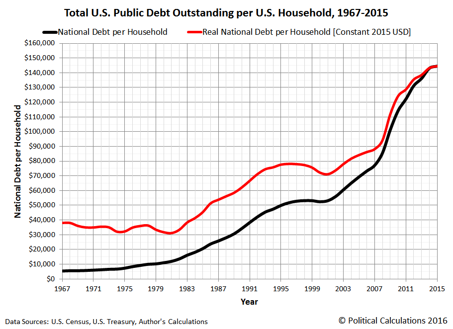
The next chart reveals the evolution of the U.S. national debt per household from 1967 through 2015, presenting it in both nominal current year dollar terms and in terms of inflation-adjusted, constant 2015 U.S. dollars. Measured this way, through the end of the U.S. government's 2015 fiscal year, the amount of the national debt burden per U.S. household was $144,526.
That figure for 2015 is up from a nominal national debt figure of $85,549 per household at the end of Fiscal Year 2008, or from $94,177 per household in terms of constant 2015 U.S. dollars.
Meanwhile, the cause of the dramatic escalation of the national debt burden per U.S. household over time may be identified in the following chart, which graphs the trajectory of the U.S. national debt per household against the U.S. median household income.
The Zero Deficit Line approximates the level of federal government spending per U.S. household that Americans can really afford, which for 2015's estimated median household income of $54,900, is approximately $23,204 per household.
Data Sources
U.S. Census Bureau. Current Population Survey. Annual Social and Economic Supplement. Historical Income Tables. Table H-5. Race and Hispanic Origin of Householder -- Households by Median and Mean Income. [Excel Spreadsheet]. Issued 16 September 2015. Accessed 9 February 2016. [Projection for 2015: 125,587,000 based on author's calculations].
U.S. Treasury Department. The Debt to the Penny and Who Holds It. [Online Database]. Accessed 9 February 2016. [National Debt at End of Fiscal Year 2015: $18.151 trillion].
White House Office of Management and Budget. Historical Tables, Budget of the U.S. Government, Fiscal Year 2017. Table 1.1 - Summary of Receipts, Outlays, and Surpluses or Deficits (-): 1789-2020. [Excel Spreadsheet]. Issued 9 February 2016. Accessed 9 February 2016.
Note: We've projected the estimates of 2015's median household income and number of households from available data. As projections, these figures will be subject to revision when the U.S. Census Bureau officially reports these figures for 2015 in September 2016.
Previously on Political Calculations
Labels: national debt
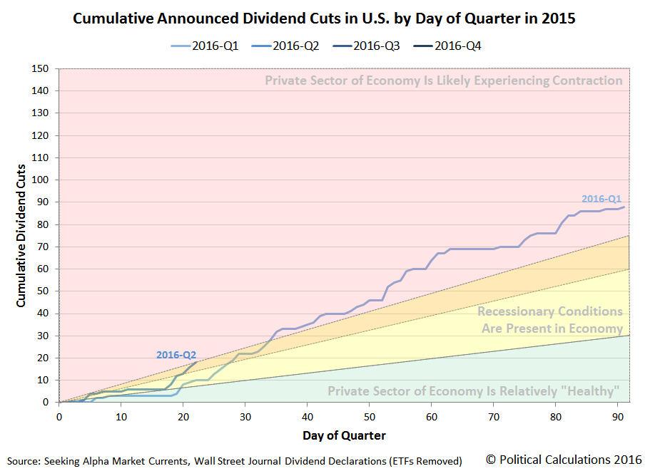
Through Friday, 22 April 2016, the pace at which publicly-traded U.S. companies are cutting their dividends is much higher than what was recorded at the same point of time during the first quarter of 2016.
But compared to a year ago, the rate at which U.S. firms are cutting dividends is about the same, if slightly ahead of schedule on account of the way that weekends and holidays are falling in the current year.
In 2015-Q2, although the quarter started off sluggishly, economic conditions improved as the quarter went on, which was reflected in a slowing rate for newly announced dividend cuts. Which ideally should be the case following the immediately preceding quarters that have been characterized by an elevated number of announced dividend cuts, particularly for firms that set the amounts of their cash dividend payments independently of their earnings. Simply put, if they assess their business' outlook for the future adequately, they shouldn't need to take the painful action of announcing further dividend cuts.
One company that has announced a dividend cut in 2016-Q2 didn't pass that test: Noble Corporation (NYSE: NE), which had previously announced a significant dividend cut in October 2015. The company's owners and management had previously reduced their quarterly dividend by 60% from $0.375 per share to $0.15 per share, which has now been decreased by 87.6% from that lower level to $0.02 per share as the company attempts to improve its fiscal situation.
So far in 2016-Q2, we've acquired a sample of 18 firms announcing dividend cuts, 13 of which are unsurprisingly in the oil and gas industries, 2 in finance, and 1 each in the mining, technology and real estate investment trust sectors of the stock market. Through the same number of days of trading in 2015-Q2, we saw 15 firms announce dividend cuts a year ago, with 12 in the oil industry and 3 in the mining industry. The economic distress in 2016-Q2 is therefore still largely concentrated in the oil sector, but is more broad-based than we observed a year ago.
Meanwhile, as expected, the S&P 500 did little more that largely move sideways during the third week of April 2016.
For reference, here are the week's most influential headlines, which when combined with the expectations that investors have for the future, largely explain why the S&P 500 went mostly nowhere during Week 3 of April 2016.
- 18 April 2016:
- U.S. economy looks good but Fed remains cautious: Dudley - continuing the Fed's new messaging discipline.
- Dollar weakens on risk appetite as Doha meeting impact fades
- Dow reclaims 18,000 as quarterly scorecards start to flow - thus also explaining why the number of dividend cuts was flat up to this point in the quarter!...
- 19 April 2016:
- U.S. housing data adds to signs of weak first-quarter GDP growth
- Oil rises as Kuwaiti strike cuts output for third day
- Wall St. inches closer to record on energy, earnings - rising oil prices should translate into fewer dividend cuts in the oil sector in the weeks ahead, as their revenues stabilize and begin to improve. Note that doesn't mean rising stock prices, which would take a positive change in expectations for future dividends per share.
- 20 April 2016:
- Oil jumps 4 percent after stockpile data; dollar gains
- Wall Street flirts with record high levels as companies report - without a positive change in expectations for dividends per share, or an outburst of speculative noise driven by other factors, we're likely within 3% of the top of the market for the year.
- 21 April 2016:
- Oil slides as dollar rebounds; glut worry grows after rally
- U.S. jobless claims hit 42-1/2-year low as labor market firms
- Wall Street snaps three-day win streak on mixed earnings
- 22 April 2016:
- Dollar rallies against yen on potential for expanded BOJ stimulus
- Wall St. lower as earnings take sheen off oil surge
- Wall Street ends flat; Alphabet and Microsoft tumble - confirming that 2016-Q1 wasn't good in a broad-based kind of way.
Labels: chaos, dividends, SP 500
Otto Dieffenbach has made quite a reputation for himself in developing flying drones that can be modeled after fictional characters and then turned loose in the sky. Or as he might describe it, "developing aerial images for brand enhancement".
Check out a sample of his work that was used to help market The Peanuts Movie, which is maybe his team's most impressive achievement to date:
No word if there's a Red Baron in development for some proper aerial dogfighting!
Other Stuff We Can't Believe Really Exists
- Inventions in Everything: Texting Your Dog a Treat
- Houseplants from Avatar
- The Kitchen Unitaskers You Cannot Live Without
- Democracy, Whisky, and Sexy
- Inventions in Everything: The Baby Cage
- Self-Carving Pumpkins
- Inventions in Everything: The Alarm Clock of Damocles
- Inventions in Everything: The Toilet Snorkel
- Inventions in Everything: Antiterrorism Barriers
- Inventions in Everything: Geothermal Beer Coolers
- Inventions in Everything: The Salmon Cannon
- Powdered Wine: Just Add Water!
- Fail: The Newest Innovation in Ice Cream
- Unlimited Virtual Legos
- Inventions in Everything: The Ultimate Turkey Blind
- Inventions in Everything: Turning Cans Into Sippy Cups
- Inventions in Everything: Anatomical Lego Figures
- It's Not What You Think....
- Inventions in Everything: Soup Bowl Attraction
- Inventions in Everything: Making Life More Difficult
- Inventions in Everything: The Oreo Separator Machine
- Air Shark!
- Markets in Everything: Stormtrooper Motorcycle Suit
- The Bike That Rides You
- One Inventor's Stick-to-itiveness
- High Five!
- Inventions for Everything
- The Best Mousetrap Ever
- An Invention for the True Wine Connoisseur
- Three of Ten Things You Don't Need on St. Patrick's Day
- The Future Just Got a Lot Cooler Than It Used to Be
- The Worst Piece of Design Ever Done
- The Magic Marker of the Future
- Coming Soon, to a Gym Near You!
Labels: technology
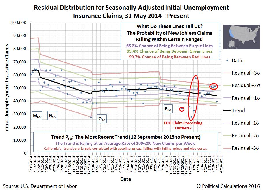
We have been periodically tracking the statistical trends for the number of new jobless claims in the United States, at both the national level and also at the subnational level. Today, we're going to update what we're seeing in the data.
Starting with the national data, we see that overall, the current trend for new jobless claims, which has steadily held since the end of June 2014, coinciding with the widespread fall of oil prices, has generally meant 300 to 400 fewer new jobless claims being filed each week.
But that falling trend hasn't been shared everywhere. Looking at the eight states whose economies include significant, high-cost oil production operations, we see what has been a nearly flat trend, as the economic benefits from lower oil prices, which have reduced the number of layoffs in other industries, have been largely offset by increased layoffs from the oil industry.
Since October 2015, we see that the number of layoffs have skewed above the overall trend line for these eight states (Colorado, North Dakota, Ohio, Oklahoma, Pennsylvania, Texas, West Virginia and Wyoming), but not so much as yet to clearly indicate a break in the overall trend.
By contrast, we did observe a break in trend for the other 42 states from late November 2015 into early January 2016, which appears to have since dissipated, as the overall falling trend of 400-500 fewer new jobless claims being filed each week appears to have resumed.
We previously observed that much of the break in trend took place in states whose economies include significant contributions from the agriculture and finance industries, which have since returned to their overall trend.
Which brings us to the one state where strange things are happening with the data it has been reporting each week: California.
We've revisited our entire analysis for this state, where the data reported since January 2016 suggests that California's Economic Development Department experienced significant difficulty processing initial unemployment insurance claims being filed from the Thanksgiving holiday weekend in November 2015 through early January 2016, which we can confirm by the statistically improbable large swings in the number of claims being processed each week during this time.
California's Economic Development Department has previously had significant issues with processing claims, which made the news over a year ago before the department's staff seemed to overcome its problems, but what we see in the data being reported each week indicates that they had a recurrence, which appears to have continued through 2 April 2016.
And because those newer problems haven't been reported anywhere else in the media that we can find, means that instead of just analyzing information, we're actually breaking news that no other news organization has reported!
What can we say? We scoop the entire mainstream media from time to time!
Labels: data visualization, jobs
From time to time, we like to share unusual patterns that we see in our site traffic. In that sense, Monday, 18 April 2016 was an exceptional day for us, because 58.1% of all the people who found their way to Political Calculations on that day were really seeking to answer one burning question....
Here are the links to those top entry pages on Political Calculations:
- What Is Your Income Percentile Ranking? (2014 - most recently updated with income distribution data reported in September 2015)
- What Is Your U.S. Income Percentile? (2013 - most recently updated with income distribution data reported in September 2015)
- What Is Your Income Percentile? (2012)
Why ask these questions on Tax Day? Simple. That's the one day by which most Americans, and particularly those who reasonably procrastinate in filing their tax returns for as long as possible, will know exactly how much income they had in the previous year!
This information is useful for us, in that it clearly tells us which of these pages should be updated with the latest total income distribution data as it is reported by the U.S. Census Bureau in the future. So when the afternoon of 26 September 2016 rolls around, you'll know where to go!
Update: Speaking of which, if you want a more refined estimate of your income percentile ranking within the U.S., be sure to check out Don't Quit Your Day Job's Income Percentile Calculator. PK uses a more refined version of the U.S. Census Bureau's income data to estimate the distribution of total money income within the United States, which means that compared to our tools, which will put you in the right seating section of the ballpark, his tool can put you in the right row of the seating section.
Labels: none really
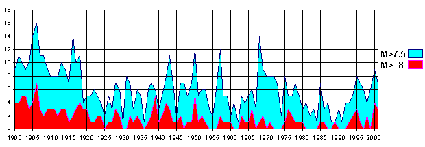
With so many high magnitude earthquakes having taken place during the last week in both Japan and Ecuador, we were curious to track down data that quantifies how frequently such damaging earthquakes occur over a long period of time.
We were surprised however to find that most earthquake data that fits that description only extends back to 1900 The chart below shows data from 1900 through 2001.
And the pattern largely continues to the present, as the U.S. Geological Survey's chart of Magnitude 5 or greater earthquakes from 1990 through September 2013 confirms.
It seems then that we are limited to data that only exists in recent history, coinciding with the invention and deployment of the modern seismograph, which suggests that while the number of large magnitude earthquakes is highly variable from year to year, perhaps as they have occurred in clusters, there is no clear trend to suggest whether they have either increased or decreased in frequency on the whole since 1900.
But that's only since 1900. We cannot tell if they were either more frequent or less frequent in the past because the available data doesn't extend back that farther than that year.
It then occurred to us that the Japanese and Ecuadorean earthquakes occurred along faults associated with the Ring of Fire, which marks the boundary of the major tectonic plates that lie beneath the Pacific Ocean and the continents that border the ocean.
They call it the Ring of Fire for a reason, and that reason is volcanoes. Since volcanic eruptions are often associated with earthquakes[1], and because erupting volcanoes would be easier for people without modern scientific equipment to quantify, we might get a better sense of the changing frequency of geologic events over a much longer period of time by tapping into that stream of data.
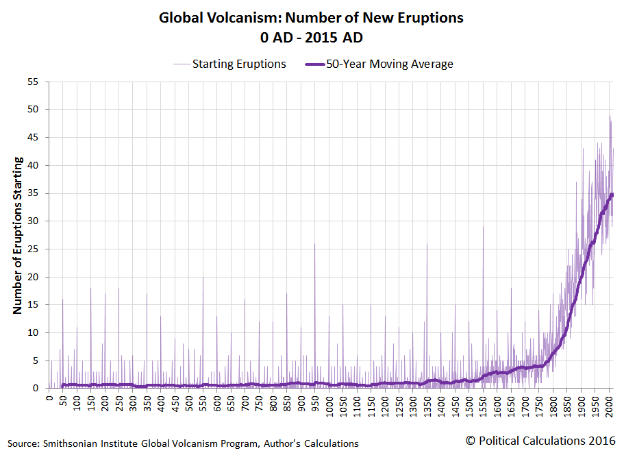
So we did. Specifically, we tapped into the Smithsonian Institute's Global Volcanism Program's Volcanoes of the World database, which offers data going back thousands of years, where we specifically focused on the number of new volcanic eruptions recorded each year.
The chart below reveals what we found when we considered the period from 0 AD through 2015 AD (or 0 CE through 2015 CE, if you prefer):
We have to say that after having seen the large magnitude earthquake frequency data, which shows no trend over time, we weren't expecting to see a proverbial hockey stock chart.
Which begs a question - how come the people who get so worked up over historical temperature charts that show a hockey stick warming of just 1.5-2.0 degrees Fahrenheit in recent centuries aren't absolutely apoplectic over this apparent catastrophic trend?
There is a simple answer that can explain what we observe in the chart above. Most of the history for volcanic eruptions was recorded by Europeans, who didn't frequently travel to the regions of the world where volcanic eruptions most frequently occur until the 1500s, which is why we see the number tick upward after the discovery of the Americas and the voyages of exploration.
The number then grows exponentially as the development of modern science takes off in the late 1700s and 1800s, when advances in trade and transportation combined to lead more people to be in places where they might observe, document and communicate information about new eruptions to others.
Now add in technological innovations, such as the seismograph again from the late 1800s or Earth-observing satellites from the last 50 years, which allow scientists to detect volcanic eruptions from afar, and we find that what has really increased dramatically in recent centuries is our ability to detect erupting volcanoes.
Like large magnitude earthquakes from the 20th century to the present, there is likely no meaningful trend for the observed frequency of volcanic eruptions over centuries - just as there has not been for volcanic eruptions in recent decades. But our improving ability to detect them combined with our discipline for documenting what we observe means that it is our own activities, and specifically these activities, that are behind their apparent increase over time.
Where the frequency of volcanic eruptions is concerned, the bottom line is that the principle of uniformitarianism applies.
Data Sources
Smithsonian Institute. National Museum of Natural History. Global Volcanism Program. Volcanoes of the World. [Online Database]. Accessed 17 April 2016.
Notes
[1] Earthquakes associated with volcanic eruptions are believed to be caused by the movement of magma. This makes them different from the more common variety of earthquakes that are caused by the movement and interaction of tectonic plates along their fault lines. So although Japan's Mount Aso experienced a small scale eruption that coincided with that nation's large magnitude earthquake and aftershocks in the last week, the smaller magnitude earthquakes related to the eruption of Mount Aso are different in nature from the large magnitude earthquakes caused by tectonic plate shifting.
Labels: data visualization, environment
It seems like we just talked about the alternative futures for the S&P 500, which is because we did just last Thursday as we explored the decline in stock price volatility our model projects through the second quarter of 2016.
So what do you say we just get to this week's chart and the news that shaped the trajectory of stock prices in the second week of April 2016!
Here are the main market-moving headlines that stood out to us in the second week of April 2016.
- 11 April 2016:
- Fed's Dudley does not comment on monetary policy, economy - This was before the Fed's short-notice, closed meeting.
- Oil hits four-month high on commodities rally, Doha meeting hopes
- Wall Street ends down after late slide - Reuters original headline for this article was "Wall Street edges higher as investors gird for earnings"
- 12 April 2016:
- Wall Street jumps as oil surges on report of output freeze
- Wall Street up almost 1 percent, boosted by oil rally
- Fed's Williams sees two or three U.S. interest-rate hikes this year - Flashback: Fed's Williams foresees up to five rate hikes this year! Somebody's views are evolving....
- 13 April 2016:
- China's jump in exports soothes growth fears, boosts markets
- U.S. business inventories fall slightly, sales weaken further
- Weak U.S. retail sales reinforce Fed caution on rate hikes - note the not-so-subtle messaging being communicated from the Fed!
- China trade data boost dollar, banks lead stocks up
- Indexes gain at least 1 perent as financial shares lead
- 14 April 2016:
- Tame U.S. inflation supports Fed's cautious rate policy - more not-so-subtle Fed messaging on its desired policies.
- Fed's Lockhart sets high bar for possible June rate hike - Flashback from three weeks earlier: Lockhart: Rate hike could come in April - here's where Janet Yellen likely applied some messaging discipline at the closed Monday meeting!
- Wall Street ends flat after two-day run-up
- 15 April 2016:
- U.S. industrial output falls, signals weak first-quarter GDP growth
- Fed's Evans says bar high for any rate action in April - then again, he's been on board with the Fed's telegraphing for a slow pace of rate hikes.
- Apple, energy shares weigh on Wall Street, but week shows gains
And that was the week that was for the S&P 500!
April 15th. The most dreaded day of the year in the United States because this is the day when federal income tax returns must either be filed or extensions for filing income tax returns must be requested.
Worse, because income taxes have only become more complex over time, U.S. income taxes have become more time consuming and more costly.
It wasn't always that way. The original IRS Income Tax Form 1040 could fit on just one sheet of paper. And to prove it, here's our tool that you can use to calculate your income taxes as if it were 1913 all over again! Just enter the indicated data in the non-shaded rows, and we'll do the math:
Excerpts from the Instructions
3. The normal tax of 1 per cent shall be assessed on the total net income less the specific excemption of $3,000 or $4,000 as the case may be. (For the year 1913, the specific exemption allowable is $2,500, or $3,333.33, as the case may be.) If, however, the normal tax has been deducted and withheld on any part of the income at the source, or if any part of the income is received as dividends upon the stock or from the net earnings of any corporation, etc., which is taxable upon its net income, such income shall be deducted from the individual's total net income for the purpose of calculating the amount of income on which the individual is liable for the normal tax of 1 per cent by virtue of this return.
19. An unmarried individual or a married individual not living with wife or husband shall be allowed an exemption of $3,000. When husband and wife live together they shall be allowed jointly a total exemption of only $4,000 on their aggregate income. They may make a joint return, both subscribing thereto, or if they have separate incomes, they may make separate returns; but in no case shall they jointly claim more than $4,000 exemption on their aggregate income.
On Wednesday, 6 April 2016, St. Louis Federal Reserve President James Bullard said something that, for once, didn't move stock prices.
The market volatility that followed the Federal Reserve's December interest rate hike, its first in nearly a decade, is mostly over and the U.S. central bank can stay focused on economic data to inform its decisions on rates, a top Fed official said on Wednesday.
"We are probably at least as well off, or better off, than we were even at March; it does seem to be fading into the background," St. Louis Federal Reserve President James Bullard told Bloomberg Radio, when asked about market volatility earlier this year. "I think some of it was the reaction to the December rate hike, a kind of delayed reaction, and the notion that (the Fed) ... was not going to be flexible. But that idea has been dashed."
When the Fed held off raising rates further since then, he said, "it became clear the Fed was going to be data dependent and was going to be cautious in raising rates."
Would you like to see what he was talking about? At least, as visualized by our futures-based model of the S&P 500?
That model is based on a very simple premise: changes in the growth rate of stock prices are directly proportional to changes in the expected future rate of growth of their underlying dividends per share.
But here is where it gets complex and chaotic, because as we've long observed, investors focus on specific points of time in the future when they make their current day investing decisions. Stock prices then follow as investors adapt their decisions according to the expectations that apply at whichever point of time in the future they are collectively focusing their forward-looking attention.
Volatility in stock prices arises whenever investors shift their collective attention from one point of time in the future to another. The magnitude of that volatility then depends on the relative expectations for dividends at the future points of time to which they fix their attention.
Investors don't have to all be collectively focused on a single point of time in the future - often, we observe investors splitting their focus between two different points of time in the future, with the result being that stock prices will fall in between the levels that they might otherwise be if investors were fully focused on just one of the alternative future points of time they might focus upon.
That kind of volatility is distinct from the everyday kind of noise that arises from the interaction of millions of traders engaged in millions of transactions, which is best described as simple noise, which falls within a relatively narrow range about the level that is defined by how far forward in the future they are focusing. It is also distinct from speculative noise events, where factors other than expectations for future dividends may cause stock prices to deviate from the trajectory that their fundamental driver would have them follow. Such noise events inevitably come to an end - it is only ever a question of when.
Now, with that in mind, let's show the potential range of volatility that our model indicated that stock prices would fall within during the first quarter of 2016.
Outside of the period from 2 March 2016 through 7 April 2016 where the accuracy of our model was impacted by the echoes of past volatility in stock prices, due to our use of historic stock prices as the base reference points from which we project the future trajectory of future stock prices, we see that the potential range of volatility from the alternative futures associated with investors focusing on 2016-Q1 and 2016-Q4 is the greatest, with as much as 362 points of the S&P 500's projected index value between them, which includes the additional range that would arise from typical levels of noise in the market.
During that period, the actual trajectory maneuvered within a 249 point range, consuming 68.7% of that projected range of potential volatility.
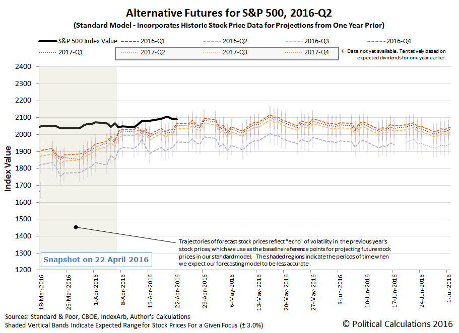
Now, contrast that with our model's forecast for 2016-Q2, as it looked as of the end of trading on 13 April 2016.
You now see what Jim Bullard has seen, although likely using different forecasts: a market where, in the absence of considerable changes to the expectations for future dividends or speculative noise between now and the end of the quarter, the forecast value of the S&P 500 might fit fully within a range of potential volatility of just 154 points - less than half the potential range of volatility that existed during the first quarter of 2016.
Now, if you're up on your modern financial theory, you'll see that our model of how stock prices work largely reconciles the major differences between Robert Shiller's "irrational" investors and Eugene Fama's "rational" ones in explaining the volatility of stock prices. Since both were awarded the Nobel prize for economics in 2013, despite having such theoretical conflicts in the work for which they were recognized, we're happy to have had the opportunity to build upon it to present a more coherent picture of how the world of stock prices really works.
Update 10:30 AM EDT: Remember what we said about changing expectations for future dividends? The potential range of volatility for 2016-Q2 widened this morning as the CBOE's implied dividend futures for 2016-Q2 (CBOE: DVJN) declined from $11.51 per share to $11.24 per share. The result of that change is illustrated in the following chart:
Looking forward, the potential range for volatility in the S&P 500 during 2016-Q2 has expanded to 228 points, which is about 63% of the range recorded in 2016-Q1. Still less volatile than the first quarter of 2016, but not as promising as it looked yesterday.
How much will California's recently passed legislation to raise its minimum wage from its current level of $10.00 per hour to $15.00 per hour by 2021 (or 2022 at the latest) have upon the state's employment levels by age?
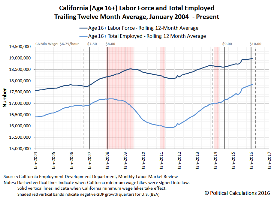
Before you answer, it might help to see what happened the last two times that California acted to hike its statutory minimum wage with respect to the state's labor force and number of employed. Our first chart below shows the period from January 2004 through February 2016 for Californians Age 16 or older.
In the chart above, we've identified the timing of when the state passed legislation to raise its minimum wage (vertical dashed lines) and also the timing of when the state enacted the minimum wage hikes (vertical solid lines) defined by that preceding legislation. Beyond that, we've also indicated the quarters in which the U.S. economy experienced negative real GDP growth (vertical red shaded bands).
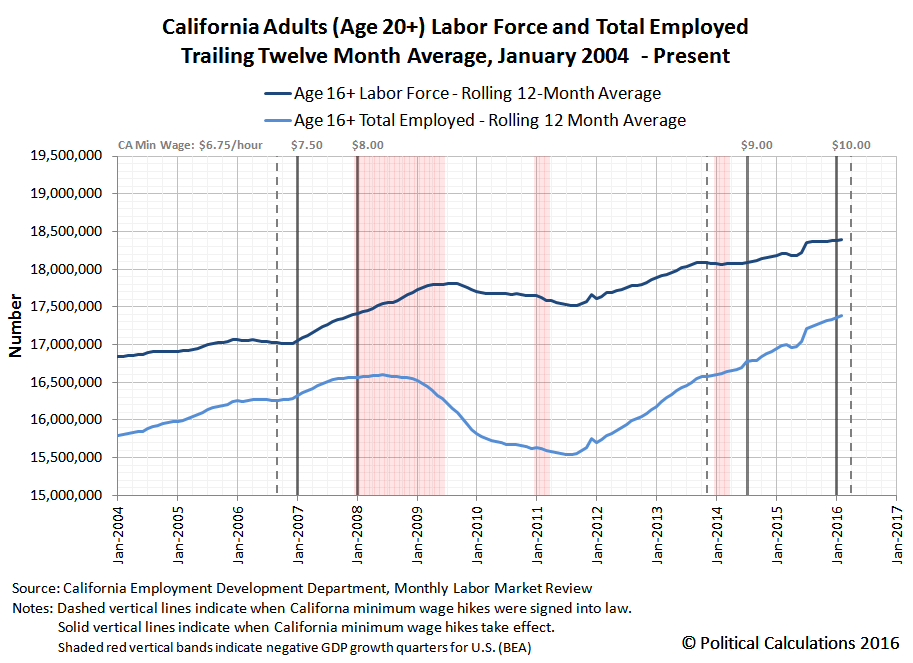
Next, let's look at California's adult labor force and number of employed, which we've defined as individuals Age 20 or older.
Now, compare what you see in this chart with what happened for California's teenage labor force, which we've illustrated in the following chart (please note the change in the scale of the vertical axis, which is different from the preceding two charts):
It's quite a different story for the individuals in California with the least amount of education, training and experience as compared to their better trained, more skilled and greater experienced peers in the labor force, isn't it?
That said, although we can perhaps draw a good hypothesis about what will happen between the present and 2022 from what we observe to have happened in the past, we're really more interested in what will actually influence what happens in the future. What factors might lead to a different outcome that what we've illustrated above? How might the state's politicians react if the state experiences another severe recession? And how will employers in California adapt their hiring practices in response to the state's new arbitrarily-determined minimum wage law?
Because all these things will play out in real time, the labor force and employment data we've visualized for each of these age groups is taken directly from California's Employment Development Department (EDD) monthly Labor Market Review, which directly presents the state's trailing twelve month average of non-seasonally adjusted labor force and employment data for the Age 16+ and Age 16-19 demographic groups (we subtract the Age 16-19 group from the Age 16+ group to get the data for Age 20+). The information you see above for a given month's labor force and employment levels is exactly what would have been known to California's resident labor force and its state legislators and officials within a month or two of the indicated month.
Meanwhile, the only information that reflects later refinements and revisions from the information that was previously reported is that of the negative real GDP growth quarters, which we've presented for the sake of providing some 20-20 economic hindsight for the state whose population makes up one-eighth of the entire population of the United States. This is information that California's residents and officials won't have available for quite some time after it becomes a fact of life.
We'll update these charts periodically over time as events warrant.
Data Sources
California Employment Development Department. Labor Market Review. [Latest edition: PDF Document - for previous editions, contact EDD]. Accessed 10 April 2016.
U.S. Bureau of Economic Analysis. National Income and Product Accounts. Table 1.1.1. Percent Change From Preceding Period in Real Gross Domestic Product. [Online Database]. Accessed 10 April 2016.
Labels: data visualization, demographics, minimum wage
How much do wildfires contribute to the amount of carbon dioxide in the Earth's atmosphere?
That's the question we're tacking today, because a number of massive fires in Indonesia's peat-filled forests in 2015 are reputed to have dumped a considerable amount of CO2 into the air, which we think have been showing up in the Mauna Loa Observatory's measurements of the gas.
But to find out by how many parts per million that the concentration of carbon dioxide in the air may have increased as a result of the fires, we first have to know just how much CO2 is estimated to have been generated as a result of the out-of-control burning that occurred in Indonesia in 2015.
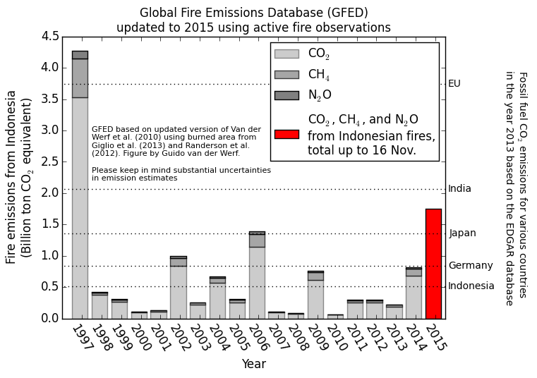
For that information, we turned to Guido van der Werf's Global Fire Data site, where we found that he had provided estimates of the number of gigatonnes of carbon dioxide equivalents for Indonesia's fire through November 2015.
Van der Werf describes the chart's data for 2015:
We expect that the GFED estimate for the 2015 fires will be about 1.75 billion metric ton of CO2 equivalents, with substantial uncertainty.
Above the greenhouse gas emissions from Indonesian fires are plotted according to GFED for 1997-2014 with estimates for 2015 based on active fires. These are converted to emissions based on a relation between the two, established using data from previous years, see the figure and text below for more information. The numbers on the right indicate fossil fuel CO2 emissions for various countries for 2013 derived from the EDGAR database.
In general, fire CO2 emissions are compensated for by regrowing vegetation after a fire and should not be compared to fossil fuel emissions, but that is not the case when forests are burned to make way for other land uses or when peat is burned. That is exactly what happens with the vast majority of the fires in Indonesia and these fires are thus a net source of CO2 as well as other greenhouse gases.
Now that we have that data, we can use it to estimate how much carbon dioxide has actually made its way into the Earth's air as a result of all that burning. We built the following tool to do the math for us - if you're reading this article on a site that republishes our RSS news feed, please click here to access a working version of the tool.
Since the data is preliminary, we expect that the amount of actual carbon dioxide emitted into the atmosphere as a result of Indonesia's 2015 wildfires will ultimately turn out to be different than the 1.75 billion metric tons indicated, but at least we have a starting point from which to do the estimation.
As for what we can do with the estimation, we thought it might be interesting to see how much it affected the year over year change in the amount of carbon dioxide that is measured by the Mauna Loa Observatory in the Earth's atmosphere. The following chart reveals our results, but what's more, we went the extra mile to also visualize just how much Indonesia's 1997 wildfires, the largest recorded in modern world history, contributed to the observed change in atmospheric CO2 levels as it disseminated around the globe.
While both the 1997 and 2006 wildfires occurred during strong El Niño years, which contributed to the dry weather conditions in Indonesia that facilitated the large scale wildfires in those years, the mere onset of even strong El Niño conditions is no guarantee that such wildfires will ignite and spread out of control and pump as much carbon dioxide into the atmosphere as they did in both 1997 and 2015.
Considering our chart above, it's also important to note that the rate of diffusion of carbon dioxide in the Earth's atmosphere from a single geographic region can cause the parts per million of the gas that is measured at the remote, dormant volcano-based observatory to increase for months after the fires came to an end. At this writing, it may have peaked, but we won't know for sure for several months.
On the whole however, the much more controlled means by which carbon dioxide enters the Earth's atmosphere through human activity would appear be a more significant contributor to the changes observed in the rate at which the atmospheric concentration of CO2 changes over time.
Data Sources
National Oceanographic and Atmospheric Administration. Earth System Research Laboratory. Mauna Loa Observatory CO2 Data. [File Transfer Protocol Text File]. Updated 5 April 2016. Accessed 10 April 2016.
Van der Werf, Guido. Global Fire Data. [Online Text]. Accessed 10 April 2016.
Labels: environment, tool
Welcome to the blogosphere's toolchest! Here, unlike other blogs dedicated to analyzing current events, we create easy-to-use, simple tools to do the math related to them so you can get in on the action too! If you would like to learn more about these tools, or if you would like to contribute ideas to develop for this blog, please e-mail us at:
ironman at politicalcalculations
Thanks in advance!
Closing values for previous trading day.
This site is primarily powered by:
CSS Validation
RSS Site Feed
JavaScript
The tools on this site are built using JavaScript. If you would like to learn more, one of the best free resources on the web is available at W3Schools.com.


