Earlier this year, we posted a chart that illustrated the biggest single political issue of 2010, which revealed the near-complete disconnect that has developed since 2007 between the federal government's spending and the median income of American households. Today, we're going to take you deeper into that issue because rectifying that unsustainable situation will affect the lives of every single American.
The Biggest Single Issue of 2010 In One Chart

We'll begin by revisiting a very slightly modified version of our "biggest issue" chart to give you a better idea of why we designed it to look the way it does.
As you can see, we've shown how the U.S. federal government's total spending has changed with respect to the level of the median U.S. household's income in every year from 1967 through 2009.
While the United States' historic federal expenditure data goes back to the nation's founding, the median household income data only goes back to 1967, which limited our ability to show the relationship between the two before that time. And then, the only reason we didn't go past 2009 is because the Census won't report the median household income for 2010 until October 2011! Not that we didn't take a stab at projecting what median household income will turn out to have been for 2010....
So that's why we indicated the future planned spending portion of the chart as horizontal lines - we won't be able to nail down exactly where the trajectory of total federal spending will be in the future until the U.S. Census gets around to releasing the data.
Those notes aside, we should recognize that there's a problem with showing the data this way. The total federal spending data shown in this first chart is way out of scale with respect to the median household income figure, making it somewhat of an apples to oranges comparison. To make it more of an apples-to-apples comparison, we need to re-do the chart so that we're looking at the relationship between total federal government spending per household with respect to household median income.
The Link Between Median Household Income and Federal Deficits

We've shown our results in our second chart, which shows much the same pattern as our first chart, but does it with values that are more in step with the income of the typical American household.
Beyond that, we've mapped a trend line to the historic data of the chart, based upon a simple linear regression for the years from 1967 through 2001, which we then extended forward in time past the data for 2008 and 2009. Here, we recognize that 2001 was really the last year before total federal spending really began to significantly deviate away from what had been a long-established trend.
And that's when noticed something that we didn't expect to see. We recognized that the distance of each data point on the chart with respect to the historic trend line we had just drawn seemed to be almost directly in proportion to the size of the annual budget deficit or surplus for the U.S. federal government for almost every year shown on the chart.
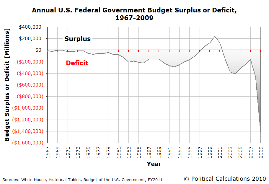
It was almost as if we had taken a chart of the annual U.S. budget deficit, rotated it to align its horizontal axis with respect to the historical trend line we had just drawn, then inverted (or flipped) the deficit chart about that axis.
It was almost, but not quite, perfect! It seemed the historic trend line we had drawn was too high to perfectly correspond to the horizontal axis of the annual U.S. budget surplus/deficit chart.
So we played around with shifting the location of the historic trend line until we got a result that seemed to closely match the deficit chart.

Ultimately, we found that vertically shifting the historic trend line downward by $570.75 seemed to come extremely close to providing a perfect match.
In terms of the context of the chart, this result suggests that if the U.S. Congress had reduced its annual spending by $570.75 per household in the years from 1967 through 2001, the U.S. federal government's budget would have been in balance or nearly so over most of that time.
Taking a closer look at the quality of that match, we find in our fifth chart that we pretty much nailed it.

We confirm that there's a very strong correlation between the deviation from the historic trend between total federal spending per household and median household income and the amount of the annual U.S. budget deficit or surplus.
This strong correlation means that we can effectively replace the enormous numbers that typically characterize the debates surrounding the budget battles of Washington D.C. with the more human-scale household based numbers!
After all, how easy is it to really understand what a trillion dollars really is? Now, multiply that figure by a factor of four, which is how big the federal budget will be in just the next few years.
But then, if we can express that kind of spending in terms of how it directly compares to household income, or better yet, to the median household income in the United States, then we might really be able to redefine the terms in which the debate over federal spending takes place!
Redefining the Terms of the Federal Spending Battle
What we've done works because the amount of money that the federal government collects in taxes in every year is almost perfectly correlated with changes in the median household income in the United States. And because the federal government has proven that it is not capable of collecting significantly more than that amount for any sustained period of time, that means our vertically-shifted trend line really defines what we'll call the Zero Deficit Line.

In a nutshell, when federal spending per household rises above that line, deficits and a growing national debt will be the result. When federal spending per household drops below the Zero Deficit Line, federal budget surpluses will result and the level of the national debt will fall.
Our analysis also confirms that it is the amount of federal spending, and not changes in federal tax rates, that is primarily responsible for the current unsustainable fiscal situation of the United States. This is especially true given how exceptionally stable the level of median household income has been after adjusting for the effect of inflation since 1997, even though federal tax rates have changed significantly over that time.
It's just that now, we can directly communicate how much federal spending per household that the United States can truly afford with respect to the income of the median household.
As an example, if we assume the median household income in 2011 will be $49,000, that means that any federal spending over $20,592.91 per household1 will only add to the national debt and make the nation's fiscal situation worse. How much worse will depend upon how much over that figure the spending figure will work out to be.
Finally, this is a big day for Political Calculations because it's our sixth anniversary. Our long-time readers will hopefully recall that our anniversary tradition is to present the most mind-blowing idea we've discovered during the past year, in the hopes of blowing our readers' minds! Thank you for joining us over the past year, and hopefully, we've returned the favor by sharing how we do some of what we do, and have succeeded in our 2010 attempt to blow the bloody doors off your mind!
1 Update: Corrected from $26,592.91 - our apologies for the typo!
Data Sources
White House Office of Management and Budget. Historical Tables, Budget of the U.S. Government, Fiscal Year 2011. Table 1.1 - Summary of Receipts, Outlays, and Surpluses or Deficits (-): 1789-2015.
White House Office of Management and Budget. Historical Tables, Budget of the U.S. Government, Fiscal Year 2011. Table 3.1 - Outlays by Superfunction and Function: 1940-2015.
U.S. Census. Historical Income Tables. Table H-5. Race and Hispanic Origin of Householder -- Households by Median and Mean Income (1967-2009).
Labels: data visualization, income, income distribution, politics, taxes
Welcome to the blogosphere's toolchest! Here, unlike other blogs dedicated to analyzing current events, we create easy-to-use, simple tools to do the math related to them so you can get in on the action too! If you would like to learn more about these tools, or if you would like to contribute ideas to develop for this blog, please e-mail us at:
ironman at politicalcalculations
Thanks in advance!
Closing values for previous trading day.
This site is primarily powered by:
CSS Validation

RSS Site Feed
JavaScript
The tools on this site are built using JavaScript. If you would like to learn more, one of the best free resources on the web is available at W3Schools.com.
Other Cool Resources
Blog Roll


