
Where do you fall on the distribution of income in the United States?
We can help you answer this question using the data that the U.S. Census Bureau has collected on the total money income earned by individual Americans as well as for the families and households into which Americans gather themselves!
If you're a visual person, we'll first present the U.S. income distribution information with an animated chart, which will cycle through three charts presenting the cumulative distribution of income for U.S. individuals, U.S. households, and U.S. families (follow these links for static versions of the charts).
To use these charts, first find the income that applies for you on the horizontal axis, then move directly upward to the curve that defines the cumulative distribution of income. Once you've found your place on S-shaped curve in each chart, look directly to the vertical scale on the left hand side of the chart to determine your approximate U.S. income percentile ranking. Each of the charts will be displayed for five seconds and will cycle back to the beginning after running through each of the charts. The charts will also indicate the median and average income earned by each category.
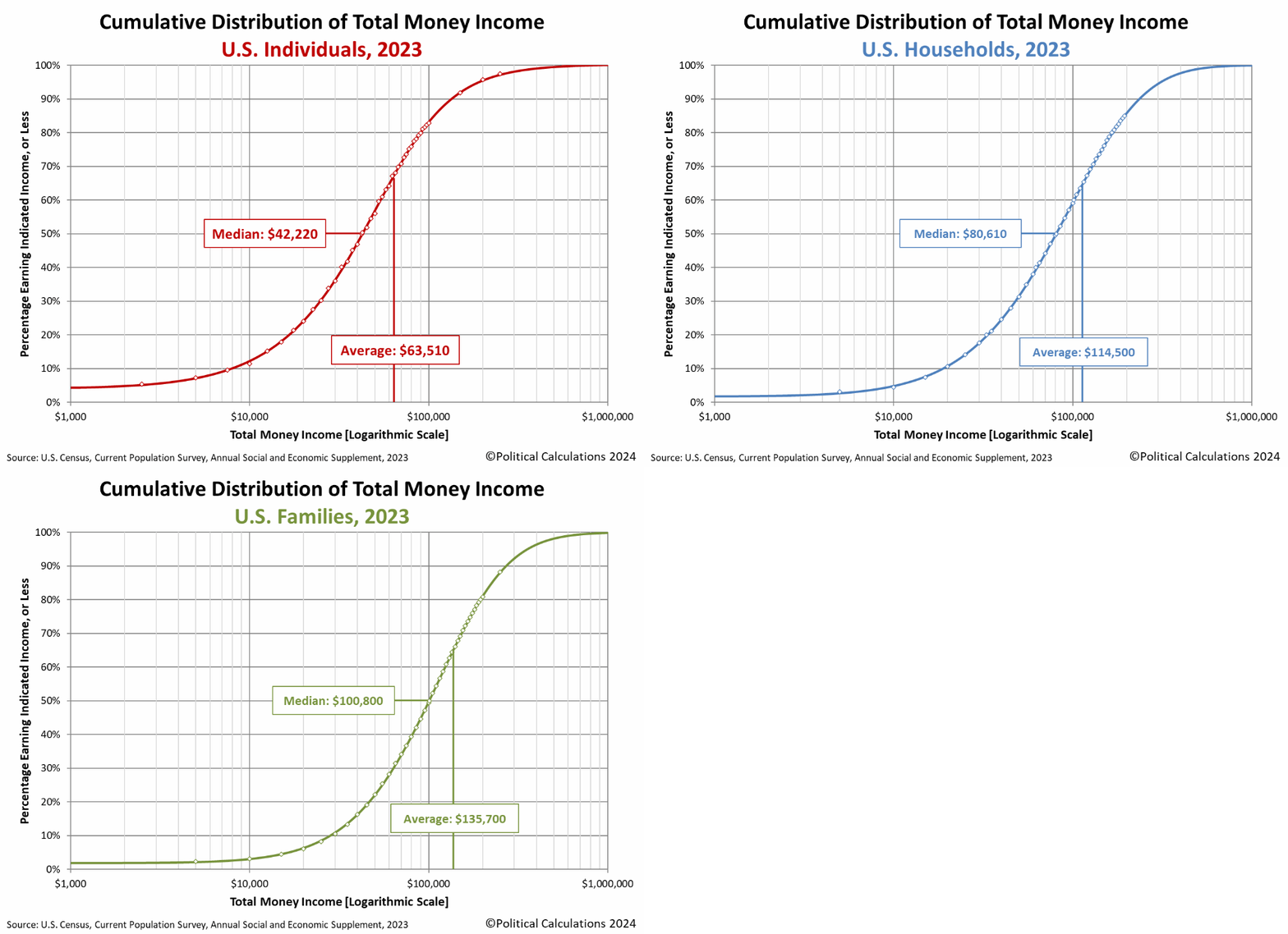
Now, let's find out more precisely where you really fit into the 2023 distribution of income! To find out where you, your family or your household ranks among each of these categories, just enter your personal income, your family's income, which includes the incomes of your spouse and other family members who live with you, and also the combined income of just the people who live within the walls of the same household that you do, into the following tool. We'll do some quick math and provide a more better estimate of the percentage of all American individuals, families and households that you outrank given the incomes you enter than you can get from scanning the animated chart. We'll also break down the numbers for your Individual income to tell you how you compare to your fellow male and female Americans. If you're accessing this article through a site that republishes our RSS news feed, please click through to our site to access a working version of our tool.
Our tool should be able to place most people within half a percentile of their actual income percentile. A percentile of zero indicates that you are at the very bottom end of the U.S. income spectrum, while a percentile ranking of 100 indicates that you are effectively at the very top end. A percentile rank of 50.0 puts you at the median, where 50% of the U.S. population would have a higher income and 50% has a lower income.
For our readers who live outside of the United States, you can still get in on the action if you convert your income from your local currency into U.S. dollars first!
If you want a more precise estimate of your income percentile ranking within the U.S., please check out Don't Quit Your Day Job's Income Percentile Calculator. DQYDJ uses a more refined version of the U.S. Census Bureau's income data to estimate the distribution of total money income within the United States, which means that compared to our tool, which will put you in the right seating section of the ballpark, PK's tool can put you in the right row of that seating section.
Finally, if you're looking for the income data for 2024, please note that the U.S. Census Bureau will report the data it collects for this year sometime in September 2025. The data for 2024 won't even be collected until March 2025, when Americans will be preparing their income tax returns for the 2024 tax year and have all the records needed to do that. The Census Bureau's statisticians will then take the next six months to analyze all the income data they collect before reporting their results.
References
U.S. Census Bureau. Current Population Survey. Annual Social and Economic (ASEC) Supplement. Table PINC-01. Selected Characteristics of People 15 Years and Over, by Total Money Income in 2023, Work Experience in 2023, Race, Hispanic Origin, and Sex. [Excel Spreadsheet]. 10 September 2024.
U.S. Census Bureau. Current Population Survey. Annual Social and Economic (ASEC) Supplement. Table PINC-11. Income Distribution to $250,000 or More for Males and Females: 2023. Male. [Excel Spreadsheet]. 10 September 2024.
U.S. Census Bureau. Current Population Survey. Annual Social and Economic (ASEC) Supplement. Table PINC-11. Income Distribution to $250,000 or More for Males and Females: 2023. Female. [Excel Spreadsheet]. 10 September 2024.
U.S. Census Bureau. Current Population Survey. Annual Social and Economic (ASEC) Supplement. Table FINC-01. Selected Characteristics of Families by Total Money Income in: 2023. [Excel Spreadsheet]. 10 September 2023. Accessed 10 September 2024.
U.S. Census Bureau. Current Population Survey. Annual Social and Economic (ASEC) Supplement. Table FINC-07. Income Distribution to $250,000 or More for Families: 2023. [Excel Spreadsheet]. 10 September 2024.
U.S. Census Bureau. Current Population Survey. Annual Social and Economic (ASEC) Supplement. Table HINC-01. Selected Characteristics of Households by Total Money Income in: 2023. [Excel Spreadsheet]. 10 September 2024.
U.S. Census Bureau. Current Population Survey. Annual Social and Economic (ASEC) Supplement. Table HINC-05. Percent Distribution of Households, by Selected Characteristics Within Income Qunitile and Top 5 Percent in 2023. [Excel Spreadsheet]. 10 September 2024.
U.S. Census Bureau. Current Population Survey. Annual Social and Economic (ASEC) Supplement. Table HINC-06. Income Distribution to $250,000 or More for Households: 2023. [Excel Spreadsheet]. 10 September 2024.
Image credit: Microsoft Copilot Designer. Prompt: "A picture of people climbing stairs with increasing wealth at each step."
Labels: income distribution, tool


Motio Research is now providing monthly U.S. household income estimates by income quartiles!
Previously, the firm had been presenting their monthly index for median household income based on data collected by the U.S. Census Bureau, which represents the 50th percentile in the distribution of total money income earned by U.S. households. But now they've expanded to capture the quartile thresholds of that distribution, introducing indexes for the 25th and 75th percentiles as well. The additional data provides more detail about how the incomes of different households within the U.S. are changing over time.
The following chart presents Motio Research's nominal household income estimates for the U.S. income distribution's quartile thresholds from January 2010 through June 2024:
- 25th percentile, representing the threshold where 25% of households earn less than the amount indicated and 75% earn more.
- 50th percentile, which is better known as the median, where 50% of households earn less than the indicated income and 50% earn more.
- 75th percentile, which represents the threshold where 75% of households earn less than the indicated income and 25% earn more.
Here's the chart:

We've opted to present Motio Research's nominal household income estimates because of their value for economic historians. This data matches up with the real world incomes that real American households at these percentiles would actually have seen as their regular, pre-tax income (not including any welfare payments or income from capital gains) in the months covered by the chart, which will also match up with figures reported in contemporary sources. Since the household income data was collected in each of those months by the U.S. Census Bureau as part of its Current Population Survey, here's a quick summary of what that includes and what it does not include:
Census money income is defined as income received on a regular basis (exclusive of certain money receipts such as capital gains) before payments for personal income taxes, social security, union dues, medicare deductions, etc. Therefore, money income does not reflect the fact that some families receive part of their income in the form of noncash benefits, such as food stamps, health benefits, subsidized housing, and goods produced and consumed on the farm.
If you're interested in inflation-adjusted figures, Motio Research's regular data presentation for these household income quartiles does adjust the figures for inflation and also makes seasonal adjustments. If that's the kind of income information you're after, please follow the various links we've provided in this article.
References
Motio Research. Monthly Series of U.S. Household Income Data: Real Median Household Index (12 July 2024) and Introducing the 25th and 75th Percentiles Household Income (18 July 2024).
Image Credit: A group of coins photo by Allison Saeng on Unsplash.
Labels: data visualization, demographics, income distribution

Where do you fall on the distribution of income in the United States?
We can help you answer this question using the data that the U.S. Census Bureau has collected on the total money income earned by individual Americans as well as for the families and households into which Americans gather themselves!
If you're a visual person, we'll first present the U.S. income distribution information with an animated chart, which will cycle through three charts presenting the cumulative distribution of income for U.S. individuals, U.S. households, and U.S. families (follow these links for static versions of the charts).
To use these charts, first find the income that applies for you on the horizontal axis, then move directly upward to the curve that defines the cumulative distribution of income. Once you've found your place on S-shaped curve in each chart, look directly to the vertical scale on the left hand side of the chart to determine your approximate U.S. income percentile ranking. Each of the charts will be displayed for five seconds and will cycle back to the beginning after running through each of the charts. The charts will also indicate the median and average income earned by each category.

Now, let's find out more precisely where you really fit into the 2022 distribution of income! To find out where you, your family or your household ranks among each of these categories, just enter your personal income, your family's income, which includes the incomes of your spouse and other family members who live with you, and also the combined income of just the people who live within the walls of the same household that you do, into the following tool. We'll do some quick math and provide a more better estimate of the percentage of all American individuals, families and households that you outrank given the incomes you enter than you can get from scanning the animated chart. We'll also break down the numbers for your Individual income to tell you how you compare to your fellow male and female Americans. If you're accessing this article through a site that republishes our RSS news feed, please click through to our site to access a working version of our tool.
Our tool should be able to place most people within half a percentile of their actual income percentile. A percentile of zero indicates that you are at the very bottom end of the U.S. income spectrum, while a percentile ranking of 100 indicates that you are effectively at the very top end. A percentile rank of 50.0 puts you at the median, where 50% of the U.S. population would have a higher income and 50% has a lower income.
For our readers who live outside of the United States, you can still get in on the action if you convert your income from your local currency into U.S. dollars first!
If you want a more precise estimate of your income percentile ranking within the U.S., please check out Don't Quit Your Day Job's Income Percentile Calculator. DQYDJ uses a more refined version of the U.S. Census Bureau's income data to estimate the distribution of total money income within the United States, which means that compared to our tool, which will put you in the right seating section of the ballpark, PK's tool can put you in the right row of that seating section.
Finally, if you're looking for the income data for 2023, please note that the U.S. Census Bureau will report the data it collects for this year sometime in September 2024. The data for 2023 won't even be collected until March 2024, when Americans will be preparing their income tax returns for the 2023 tax year and have all the records needed to do that. The Census Bureau's statisticians will then take the next six months to analyze all the income data they collect before reporting their results.
References
U.S. Census Bureau. Current Population Survey. Annual Social and Economic (ASEC) Supplement.Table PINC-01. Selected Characteristics of People 15 Years and Over, by Total Money Income in 2022, Work Experience in 2022, Race, Hispanic Origin, and Sex. [Excel Spreadsheet]. 8 September 2023.
U.S. Census Bureau. Current Population Survey. Annual Social and Economic (ASEC) Supplement.Table PINC-11. Income Distribution to $250,000 or More for Males and Females: 2022. Male. [Excel Spreadsheet]. 8 September 2023.
U.S. Census Bureau. Current Population Survey. Annual Social and Economic (ASEC) Supplement.Table PINC-11. Income Distribution to $250,000 or More for Males and Females: 2012. Female. [Excel Spreadsheet]. 8 September 2023.
U.S. Census Bureau. Current Population Survey. Annual Social and Economic (ASEC) Supplement.Table FINC-01. Selected Characteristics of Families by Total Money Income in: 2022. [Excel Spreadsheet]. 8 September 2023. Accessed 8 September 2023.
U.S. Census Bureau. Current Population Survey. Annual Social and Economic (ASEC) Supplement.Table FINC-07. Income Distribution to $250,000 or More for Families: 2022. [Excel Spreadsheet]. 8 September 2023.
U.S. Census Bureau. Current Population Survey. Annual Social and Economic (ASEC) Supplement.Table HINC-01. Selected Characteristics of Households by Total Money Income in: 2022. [Excel Spreadsheet]. 8 September 2023.
U.S. Census Bureau. Current Population Survey. Annual Social and Economic (ASEC) Supplement.Table HINC-05. Percent Distribution of Households, by Selected Characteristics Within Income Qunitile and Top 5 Percent in 2022. [Excel Spreadsheet]. 8 September 2023.
U.S. Census Bureau. Current Population Survey. Annual Social and Economic (ASEC) Supplement.Table HINC-06. Income Distribution to $250,000 or More for Households: 2022. [Excel Spreadsheet]. 8 September 2023.
Image credit: Microsoft Bing Image Generator. Prompt: "A picture of the concept of poor, middle class, and rich people."
Labels: income distribution, tool
How has the cumulative distribution of income in the United States changed over the last six years?
Since the U.S. Census Bureau published its income distribution data for American individuals, households, and families for the 2019 calendar year on 15 September 2020, we thought it would be interesting to show how the distributions for each of these subgroups of the nation's population has changed over time. To do that, we've put together several animated charts to show the evolution of the distribution of income in the U.S. from 2014 through 2019.
If you're reading this article on a site that republishes our RSS news feed, you may want to click through to the original version of this article at our site to see the animations in action.
Here is the animated chart showing the shifting distribution of total money income for individual Americans:

Next, let's look at the animated chart for the total money income distribution of American households:

Finally, here is the animated chart showing the ongoing development of total money income for American families:

The U.S. Census Bureau distinguishes families from households by recognizing that families are made up of individuals who live together that are related to each other by birth, marriage, or adoption. Households may consist of people who either are related or that are not related as a family.
Each of the animated charts show the distribution of nominal cumulative total money income for American individuals, households, or families, which have not been adjusted for inflation. For each of these groupings, the animations show the distribution of income in the U.S. shifting toward the right, with Americans' incomes rising over time. The rate of increase has accelerated considerably in the most recent years, although we should note that the data for 2019 was collected in early March 2020, before any negative impacts from the Coronavirus Recession would be observed.
The animations also show the shifting distribution of income in the U.S. resulting in a falling percentage of Americans with the lowest incomes during these years, while the percentage of Americans at the upper end of the nation's income spectrum has been rising.
If you would like to keep track of the latest trends for median household income, we estimate that vital statistic each month. Our next update will come on 1 October 2020, when we'll present the latest updates through August 2020. Until then, our estimate of median household income for July 2020 is the latest entry in the series.
Labels: data visualization, income distribution, median household income
In 1800, 90% of the world's population lived in extreme poverty. In 2019, 10% did. During this 220 year span, 80% of the population of Earth rose out of extreme poverty. Which you can watch happen in the following short video animation of Gapminder's year-by-year global income distribution data.
Regions are grouped by color - red for Asia, blue for Africa, green for the Americas and yellow for Europe (which includes Russia). You can drill down to country-specific data using Gapminder's income mountain data visualization tool, where you can unstack the data to better follow a particular region, or just one country in particular.
We found some surprising results:
- Most of a country's shift out of extreme poverty begins coincides with its industrialization.
- The entire population of the U.S. has been effectively out of extreme poverty since about 1940.
- Most of China's population was stuck in extreme poverty through 1976, after which, the country suddenly began advancing out of it, slowly at first, then much more quickly, as if they had been unnaturally constrained before.
- India's rise out of poverty is also impressive, though it started progressing earlier than China and has maintained a somewhat slower pace.
- The largest country whose population still mostly falls below the extreme poverty line is the Democratic Republic of Congo, which though it has grown significantly in population, has fallen back behind other countries in its region in recent decades.
Of course, watching the short video we threw together is no substitute for playing with the income mountain tool, or any of the other fascinating tools available at Gapminder!
Labels: data visualization, income distribution
As part of its biennial Point-In-Time count of its homeless residents, the city of San Francisco asks roughly one eighth of its homeless population what factors were the primary cause of their homelessness. The city's 2019 report provides their responses to that question from its point in time counts from 2015, 2017, and 2019, which we've visualized in the following chart.

From January 2015 through January 2019, the loss of a job represents the top response, with approximately a quarter of all surveyed homeless residents indicating that single response [1].
During these years, San Francisco's unemployment rate has fallen from 4.1% in January 2015 to 3.4% in January 2017 to 2.6% in January 2019. By itself, the city's falling unemployment rate suggests that job loss should be declining as the primary cause of homelessness because employers would be increasingly reluctant to either fire or lay off employees in such a tightening job market. Logically, since job loss is the number one cause of homelessness identified by San Francisco's homeless residents for their condition, the number of homeless in the city should also be falling.
But it's not. Instead of falling with the city's declining rate of unemployment, homelessness in San Francisco has been rising. San Francisco's 2019 Point In Time homeless count report indicates that homelessness in the city rose from 6,775 in January 2015 to 6,858 in January 2017 to 8,011 in January 2019.
It would be helpful to find out more about what kinds of jobs San Francisco's homeless residents held before they lost them, leading to their becoming homeless. Unfortunately, the survey doesn't provide that specific kind of insight, but it does provide information about the incomes earned by the portion of the city's homeless residents who are employed, who account for about 12% of the surveyed homeless population.
Assuming the jobs of the working homeless provide similar levels of income as the jobs that many homeless San Franciscans held before they lost them and became homeless, this data may tell us about their earning potential. In the following chart, we've constructed the cumulative distribution of income for San Francisco's employed homeless residents, where we find that roughly 85% earn far below the annual income that might be earned by working full time at the city's statutory minimum wage.

The city has been steadily increasing its statutory minimum wage rates, which in January 2015 stood at $11.05 per hour. In January 2017, the city's minimum wage was $13.00 per hour, and in January 2019, was $15.00 per hour [2].
With a falling unemployment rate and a rising minimum wage, we should see the cumulative distribution of income earned by working homeless San Franciscans shift to the right in each year. But we only see that from 2015 to 2017 in the chart above, and only for equivalent annual incomes between $1,200 and $18,000, where we find no meaningful shift for incomes above that level, nor do we see any significant change over all incomes from 2017 to 2019.
Since San Francisco imposes a statutory minimum wage, we can estimate how many hours the city's employed homeless are working at their jobs. The following chart maintains the cumulative distribution of income on the vertical axis, replacing the annual incomes in the horizontal axis with the equivalent hours worked at the city's mandated minimum wage.

This chart is a little more telling. Even at minimum wage, we find that over 85% of the city's employed homeless work less than full time year round, which we define as 40 hours per week, 52 weeks per year, or 2,080 hours per year. Only working part time at minimum wages would severely limit their ability to earn incomes sufficient to avoid being homeless [3].
Below the median 50% mark, we find that hours worked increased for this portion of the working homeless from 2015 to 2017, as unemployment fell and minimum wages rose. But from 2017 to 2019, as unemployment continued to fall and the minimum wage continued to rise, their hours worked fell back to 2015's levels.
Above the median 50% mark, we see hours worked decline from year to year, even though the city's unemployment rate falls and as the city's minimum wage rises. Combined with the income distribution data, this pattern suggests that the rising minimum wage either enables the homeless persons to choose to work less while earning similar levels of income or that their employers are unable to provide as many hours for them to work at the higher minimum wage, limiting any benefit they might obtain from an increased minimum wage.
It would be really interesting to analyze a more detailed breakdown of the earned income data for San Francisco's homeless as well as more information about their employers and employment.
Notes
[1] The survey allows for multiple responses to be recorded for the question. The report lists only the top responses given by the surveyed population.
[2] San Francisco's biennial point-in-time counts of its homeless population took place during January 2015, January 2017, and January 2019. The indicated minimum wages are those that applied in these months.
[3] Among the surveyed population, only 1-2 individuals per year who were counted as homeless earned annual incomes that would place them above the threshold that coincides with working full time, year round at the city's statutory minimum wage rates. That's makes for quite a lot of income inequality among San Francisco's homeless!
Labels: demographics, income distribution, minimum wage
Net wealth is looking like it will be a hot topic in the upcoming 2020 election season in the United States, with several candidates proposing to tax high net worth households to only partially pay for the explosion in federal government spending they are also proposing.
How at risk are you might be to these newly proposed taxes on wealth depends on what your household's net worth is and how your rank in net worth among all Americans. To help answer the first part of that question, we'll direct you to Bankrate's Net Worth Calculator, which will add up the value of your assets and subtract out your liabilities to estimate your household's net worth, assuming you haven't already done that math.
After you have that figure, plug it into the following tool, where we'll estimate your household's percentile ranking among all U.S. households, based on data for 2016 that was recently published by the U.S. Census Bureau. Hopefully, you'll be entering a positive number, but if not, our tool can handle if your household is underwater and you have to enter a negative value. If you're reading this article on a site that republishes our RSS news feed, please click through to our site to access a working version of the tool.
Now you have a fairly good sense of what percentage of all 129,600,000 U.S. households have a net worth that is either less than or equal to yours! The chart below shows our model for the distribution of net worth in the United States and how it compares to the data recorded by the U.S. Census.

Overall, the tool is generally accurate to within about 1.5 percentiles of the reported data, which is pretty good given how we modeled the data, where we spliced two very different regressions to generate our results.
In addition to the Census Bureau's wealth distribution data, the Federal Reserve's Survey of Consumer Finances provides an alternate source of data for household net worth in the U.S. The SCF is conducted every three years, where the data for 2019 will likely become available in late October 2020.
If you want to find out how your household ranks to the nearest half percentile according to the Federal Reserve's survey data, be sure to check out Don't Quit Your Day Job's Net Worth Percentile Calculator. Better still, if you want to find out how your household's net worth ranks among people in your age group, DQYDJ's Net Worth by Age Calculator has you covered!
Finally, we discovered that Microsoft (NYSE: MSFT) chairman Bill Gates had the highest reported net worth in 2016 thanks to the value of the shares he owns in the company he founded, which at $75 billion, would place him just off the top right end of the chart. The second highest net worth for an American belongs to Warren Buffett, whose accumulated net wealth over the last 49 years as the head of Berkshire Hathaway (NYSE: BRK.A, BRK.B) would appear on the chart at $60.8 billion (equivalent to a natural logarithm of 24.8).
References
U.S. Census Bureau. Net Worth and Asset Ownership of Households: 2016. [Excel Spreadsheet]. 25 September 2019. Accessed 19 October 2019.
Forbes. The Full List Of Every American Billionaire 2016. [Online Article]. 1 March 2016.
Clementi, F.; Gallegati, M.; and Kaniadakis, G. A generalized statistical model for the distribution of wealth. Journal of Statistical Mechanics: Theory and Experiment, 2012, P12006. https://doi.org/10.1088/1742-5468/2012/12/P12006. [Ungated PDF Document]. 6 December 2012.
Hozo, Stela Pudar; Djulbegovic, Benjamin; and Hozo, Iztok. Estimating the mean and variance from the median, range, and the size of a sample. BMC Medical Research Methodology, volume 5, Article number: 13 (2005). https://doi.org/10.1186/1471-2288-5-13. 20 April 2005.
Labels: data visualization, income distribution, tool
The U.S. Census Bureau has reported its income distribution data for the United States in 2018. The following animated chart shows what the cumulative distribution of income in the U.S. looks like for individuals, families, and households, looping through each on five second intervals.

Want to find out how you rank among U.S. men, women, individuals, families and households? We have updated our What Is Your Income Percentile Ranking? tool to include the 2018 income distribution data just so you can!
Looking just at the distribution of household income over time, Mark Perry shows a pretty remarkable finding for the middle class contained within the Census Bureau's historic income distribution data since 1967:

If you look at the right hand side of the chart, it's not just middle income earning households that are moving up into higher income echelons - after adjusting for inflation, the lowest income earning households are too!
Labels: income distribution
Welcome to the blogosphere's toolchest! Here, unlike other blogs dedicated to analyzing current events, we create easy-to-use, simple tools to do the math related to them so you can get in on the action too! If you would like to learn more about these tools, or if you would like to contribute ideas to develop for this blog, please e-mail us at:
ironman at politicalcalculations
Thanks in advance!
Closing values for previous trading day.
This site is primarily powered by:

CSS Validation

RSS Site Feed

JavaScript
The tools on this site are built using JavaScript. If you would like to learn more, one of the best free resources on the web is available at W3Schools.com.
Other Cool Resources
Blog Roll


