How much has the average cost of college at a four-year degree-granting institution risen since the 1976-1977 school year?
Our first chart below, drawing on data published in the Digest of Education Statistics: 2010 reveals the answer!

We see that the average cost of tuition and required fees at a four-year institution has risen from $1,218 in the 1976-1977 school year to $12,467 through the 2009-2010 school year.
But how affordable is that? To find out, we calculated the ratio of the average cost of tuition and fees with respect to the median household income for each of these years, which will give us a pretty good idea of just how affordable college has become for the years since 1976:

Here, we've shaded the years where the cost of a college education rose the fastest with respect to median household income. These are the times in which the cost of college really inflated beyond the ability of a typical American household to pay for it.
Next, let's look at the cost of college vs median household income, which will really let us see the inflation of the higher education bubble at work:

In this chart, we've estimated the additional inflation in college tuition and fees that has taken place in the 2010-2011 school year.
But what's really making college so unaffordable for the typical American household? The findings of a recently reported study points to the answer:
Perhaps worse for students than a crowding out effect is the Bennett Effect, named for William Bennett, who 25 years ago as Secretary of Education wrote for the New York Times, "Increases in financial aid in recent years have enabled colleges and universities blithely to raise their tuitions."
[...]
There have been mixed findings on the Bennett Effect in recent decades, with some studies finding a dollar-for-dollar relationship and others, none at all. Determining why college costs are rising is a difficult task, after all. Stephanie Riegg Cellini of George Washington University and Claudia Golden of Harvard take a new approach, focusing on for-profit schools. Some of these are eligible to participate in so-called Title IV aid programs (named for a portion of the aforementioned Act) and some not.
After adjusting for differences among schools, the authors find that Title IV-eligible schools charge tuition that is 75% higher than the others. That's roughly equal to the amount of the aid received by students at these schools.
Without such subsidies, college students would pay the full cost of the tuition and required fees for their education out of their own pockets, or through other financial aid, such as through student loans. With subsidies, the average college student is effectively paying the same amount of their own pockets as they would have without the subsidies, but their universities are also collecting the additional amount of the subsidies.
We see this effect especially during years of recession, where the federal government acted to sharply increase the subsidies for college educations. That's why we see the higher education bubble greatly inflate during these years.
It wasn't always that way. Back in 1982, in the depths of the second biggest recession since World War 2, the federal government didn't jack up its subsidies anywhere near like it did in later recessions. As a result, the cost of college remained closely coupled to the incomes of the typical American household.
But as you can see, the federal government has different ideas today. Perhaps because it has become the dominant student loan provider, as student loans have become nearly the full equivalent of taxes.
Data Sources
Digest of Education Statistics: 2010. Table 345. Average undergraduate tuition and fees and room and board rates charged for full-time students in degree-granting institutions, by type and control of institution: 1964-54 through 2009-10. 5 April 2011.
U.S. Census. Current Population Survey. Annual Social and Economic (ASEC) Supplement. HINC-01. Selected Characteristics of Households by Total Money Income in 2010. 13 September 2011.

At some point during your office-based career, you will be required to run a meeting. And when that happens, it won't just be a large quantity of your time that will get wasted - it will also be the time of all those who attend your meeting.
The Portland Business Journal reports:
A new nationwide survey finds that "runaway" meetings are the biggest time-waster in the workplace. More than 27 percent of workers polled said meetings are the largest culprit for inefficiency and lack of productivity.
The survey was developed by Office Team, a staffing service specializing in skilled administrative professionals. With responses from 613 men and women, all 18 years or older, the findings are part of the "Office Team Career Challenge," a project to help administrative professionals advance their careers.
With today's lean staffing levels, there is increasing pressure for employees to manage their time effectively.
Yet, many employers actually sabotage time management with runaway meetings and interruptions. Industry Week calls meetings "the Great White Collar Crime," estimating they waste $37 billion a year.
So how can you, as someone who will be running a meeting, avoid becoming a white collar criminal?
Fortunately, Dolan Media's David Baugher has developed a list of things that meeting planners can do to avoid wasting too much of the collective time of the people who might attend the meeting, which we've excerpted below (emphasis ours). Although developed for lawyers, whose time might be otherwise used to make money at the rate of $250 per hour or more, the lessons might well be applied for other would-be meeting managers....
- 1. Undershoot the time.
It seems a no-brainer to schedule a meeting with enough time to ensure everything is covered. Yet Tom Polcyn, a partner at Thompson Coburn in St. Louis and chair of the firm's intellectual property group, says conventional wisdom is sometimes a bust. Instead, try scheduling a little less time than needed to encourage participants to cut to the chase. You can always schedule a follow-up meeting if something truly important is skipped. "Meetings have a way of filling up every last minute of the scheduled time, kind of like the way gas expands to fill a container," Polcyn says. "More often than not, I'm finding that if I would have normally scheduled an hour for this and instead we give 30 minutes a try, it's turning out to be enough time. It's like found time."
- 2. Don't do back-to-back meetings.
It's easy to stack and pack meetings one after another. But meetings are more productive if you schedule a few minutes between them to collect your thoughts, Polcyn says. "I've found this to be extremely helpful, because maybe I'll get out of an hourlong meeting and we'll all agree on certain action items — but if I go straight from that meeting into another one, I sometimes can forget what we all decided on or I end up at the end of the day with a mess of notes."
- 3. Ask the key question.
Too many meetings can be as bad as too few. Not every situation calls for a full-scale get-together. Legal management consultant Joan Newman, of St. Louis-based Joan Newman & Associates, says the first question to ask is obvious. "The first tip is deciding whether you need to have the meeting at all," says Newman, whose company is associated with national consultant Altman Weil. "Is there a way to accomplish what you want to accomplish without a meeting, whether it's a phone call, conference call, emails? Make sure you really need this meeting."
- 4. Be punctual.
Meetings are scheduled at a specific time for a reason. Don't dawdle when getting one under way just because a few stragglers haven't yet wandered in or participants are lingering in conversation over yesterday's softball game. "If you have a meeting, start on time and indicate how long the meeting is going to be," Newman says. "End on time. Nobody wants to sit there and have their time wasted because it doesn't start until five minutes late and doesn't end on time."
- 5. Don't settle in.
If a meeting can be brief, ensure that it is. Brent D. Green, a collections, commercial and bankruptcy attorney with Evans & Green in Springfield, says a simple lack of chairs at an impromptu gathering can have a positive effect on meeting length. "I had a meeting in my file room the other day on filing, and everybody stood up," he says. "It was a short meeting."
- 6. Don't let participants ramble.
Dan O'Toole, head of the litigation practice group at Armstrong Teasdale in St. Louis, says he gives meeting attendees a specific timeframe in which to complete their presentations. In a creative twist, he acquired a gong that sits next to the presenter. It's waiting to be struck "The Gong Show"-style if the speaker exceeds his or her allotted time. "I've never had to use it, but it is such a visual reminder to people of the need to stay on topic," O'Toole says. "It works wonders because nobody wants to be the first person to get the gong for having gone over."
- 7. Get out of your office.
For an important one-on-one meeting, playing host isn't always the best idea. "If it's a meeting with subordinates, you go to their office instead of having them come to you," Green says. "If you're in their office, when the meeting is over, you can just leave. It's hard to get a subordinate to leave if you have them come to your office."
- 8. Distribute materials ahead of time.
Handing out lengthy items at a meeting causes delays as participants read the handouts on the fly. Newman says a good organizer disseminates information before the day of the confab. "You don't want to be sitting there at the meeting educating them as to what this case is about," she says. "When you have them read things while at the meeting, they can't make an informed judgment."
- 9. Have an agenda.
Don't just wing it. Efficient meetings aren't organic. They are planned, with participants aware of when they will speak and what they will talk about. "I've been to so many meetings where people just say, ‘Hey, Bob why don't you tell us what's going on with that project?' and Bob has a big chunk of sandwich in his mouth and doesn't even know he was going to be called on," O'Toole says. "He just fumbles through it."
- 10. Keep the guest roster short.
An all-hands-on-deck approach to every meeting wastes time for both the unnecessary participants and the relevant personnel in the room. Think about who really ought to come to the meeting. "I've found that the more people you have at a meeting, the less tends to get done," Polcyn says. Try to make sure the people you invite to a meeting are the people who need to be there.
All we can say is "Amen!"
Previously on Political Calculations
It seems that unlike say a "trained journalist" like the Incredibly Incurious Jonathan Chait, our casual readers are more than capable of asking us questions about our work!
Proof of that today comes straight from our e-mail inbox, which we can attest has still not registered any electronic contact initiated by "trained journalist" Chait, where someone with actual curiosity observed and asked:
Gas prices are about as high as they were in mid 2008 when oil was about 140 per barrel but oil today is about 110. Why the disconnect?
That's a good question - one for which we had no idea what might be the answer before we decided to take it on! Here's our augmented response, where we've expanded upon our original reply to our inquiring reader!...
It's not as disconnected as you might think, given which crude oil and gasoline prices are primarily involved.
Here, the increasing price of Brent crude oil that we've previously discussed...:

Source: livecharts.co.uk - 26 February 2012
... is being pushed upward by geopolitical concerns. That upward price pressure has combined with already falling demand in the U.S....:

... to force the closure of money-losing refineries in the U.S. that refine Brent crude oil, mainly on the East coast.
Matthew Philips of Bloomberg BusinessWeek provides more details from a 23 February 2012 article:
The average price of gas is up more than 10 percent since the start of the year, a point repeatedly made during Wednesday's Republican Presidential debate. Predictably, the four GOP candidates blamed President Barack Obama for the steep increase.
Actually, the President doesn't have that kind of pricing power. The more likely reason behind the price increase, though certainly less compelling as a political argument, is the recent spate of refinery closures in the U.S. Over the past year, refineries have faced a classic margin squeeze. Prices for Brent crude have gone up, but demand for gasoline in the U.S. is at a 15-year low. That means refineries haven't been able to pass on the higher prices to their customers.
As a result, companies have chosen to shut down a handful of large refineries rather than continue to lose money on them. Since December, the U.S. has lost about 4 percent of its refining capacity, says Fadel Gheit, a senior oil and gas analyst for Oppenheimer. That month, two large refineries outside Philadelphia shut down: Sunoco's plant in Marcus Hook, Pa., and a ConocoPhillips plant in nearby Trainer, Pa. Together they accounted for about 20 percent of all gasoline produced in the Northeast.
This week, Hovensa finished shutting down its refinery in St. Croix. The plant processed 350,000 barrels of crude a day, and yet lost about $1.3 billion over the past three years, or roughly $1 million a day. The St. Croix plant got hit with a double whammy of pricing pressure. Not only did it face higher prices for Brent crude, but it also lacked access to cheap natural gas, a crucial raw material for refineries. Without the advantage of low natural gas prices, which are down 50 percent since June 2011, it's likely that more refineries would have had to shut down.
The U.S. refining industry is being split in two. On one hand are the older refineries, mostly on the East Coast, which are set up to handle only the higher quality Brent "sweet" crude–a benchmark of oil that comes from a blend of 15 oil fields in the North Sea. Brent is easier to refine, since it has a low sulfur content, though it's gotten considerably more expensive recently. (Certainly another reason for higher gas prices.)
[Be sure to read the whole article, because it also explains why gasoline prices are so much lower elsewhere in the U.S.]
The combination of rising gasoline prices with reduced quantities being supplied indicate that the relative decrease in supply stemming from the recent refinery closures is currently driving the price of gasoline in the U.S. by more than what would be driven by rising crude oil prices alone:
And that, in a nutshell, is why gasoline prices have risen as high as they did back in 2008, even though crude oil prices haven't risen as high as they did then.
We will note however that actual journalist Matthew Philips is incorrect when he suggests that "the President doesn't have that kind of pricing power". The supply disruptions from the closure of money-losing oil refineries on the East coast and their result effect upon gasoline prices could have been minimized simply by subsidizing their operations - much as the President has been willing to subsidize "green energy" companies that were also certain to fail, like Solyndra.
By our estimate, the $500 million of taxpayer money that the President put on the line and lost on that one company would have been sufficient to keep just one of these recently closed refineries going for another 500 days - thus avoiding the supply disruption and massive run-up in U.S. gasoline prices. (And that doesn't include all the other "green energy" business failures where taxpayer money has been permanently lost that could have gone to create or save real refinery jobs!)
At least then, taxpayers might have something more to show for the money the President was so determined to waste, no matter what!
Labels: economics, gas consumption
If you think about it, the Academy Awards ceremony is really just a three to four (or more!) long televised advertisement for the "Best Picture" winner.

Our question about the Oscars this year: Can host Billy Crystal keep enough of the television audience engaged in the broadcast for long enough to be able to sell more tickets than would otherwise be sold to whatever movie wins that title?
Sure, he'll be dressed in a tux and will look like the guy who sells you movie tickets behind the bullet-proof glass at your local cineplex, but why should Hollywood have to count so much on Billy Crystal to sell their movie tickets?
That question is super-relevant this year because of the unmitigated disaster that was the 83rd Annual Academy Awards ceremony last year! That was when so much of the U.S. audience tuned out during the poorly written and directed live broadcast that the movie's box office plummetted by 15%, as the Best Picture winner took in *LESS* money at movie theaters in the week after the Oscars ceremony than it did in the week before.
It's true! We went back and compared the one-week before and one-week after box office totals for all the Best Picture winners announced since 2000 to see just how each did, using the daily box office data for each as reported by Box Office Mojo, and then calculated the percentage increase or decrease in the week after the Oscars as compared to the week before.
Our data is presented in the table below:
| Box Office Performance of "Best Picture" Academy Award Winners, One Week Before and After Winning | |||||
|---|---|---|---|---|---|
| Academy Award | Ceremony Date | Best Picture Winner | Box Office in Week Before Oscars | Box Office in Week After Oscars | Percentage Change |
| 72 | 26 March 2000 | American Beauty | $5,460,072 | $8,190,112 | 50% |
| 73 | 25 March 2001 | Gladiator | $45,033 | $474,174 | 953% |
| 74 | 24 March 2002 | A Beautiful Mind | $5,499,295 | $6,140,030 | 12% |
| 75 | 23 March 2003 | Chicago | $9,169,194 | $10,637,940 | 16% |
| 76 | 29 February 2004 | The Lord of the Rings: The Return of the King | $2,996,678 | $4,094,558 | 37% |
| 77 | 27 February 2005 | Million Dollar Baby | $10,538,151 | $11,748,270 | 11% |
| 78 | 05 March 2006 | Crash | $70,399 | $342,709 | 387% |
| 79 | 25 February 2007 | The Departed | $367,064 | $336,608 | -8% |
| 80 | 24 February 2008 | No Country for Old Men | $3,365,401 | $5,389,446 | 60% |
| 81 | 22 February 2009 | Slumdog Millionaire | $11,673,672 | $16,669,726 | 43% |
| 82 | 07 March 2010 | The Hurt Locker | Not in theaters. | ||
| 83 | 27 February 2011 | The King's Speech | $10,989,524 | $9,315,074 | -15% |
Since 2000, the box office take of the Academy Awards' Best Picture Winner increases by an average of 22% in the week following the Oscars ceremony as compared to the week before, with the best performance being turned in by Gladiator, which was very near the end of its run in theaters when it won.
The worst however was last year's announced winner The King's Speech, which dropped like a rock after it won. Its only competition for losing money was the Best Picture winner announced in 2007, The Departed, the ceremony for which was also negatively reviewed.
By contrast, the years for which we have data in which Billy Crystal hosted the Oscars (2000 and 2004) saw the box office take for the Best Picture winners jump upward by an above average of 43% - more than double the average post-Oscar bump. It's no accident that Billy Crystal is back....
There just aren't many Oscar hosts who are as gifted at selling movie tickets!
Previously on Political Calculations
- Identity of Political Calculations' "Ironman" Revealed
- Anti-U.S. Fervor in Hollywood
- The Anti-War on Hollywood's Box Office
- Reflections on the Oscars and the Most Manipulative Man in Hollywood
- How Men Are Like Bad Movies, and Why Bad Movies Keep Getting Made
- Do the Academy Awards Boost Box Office?
- Does Best Picture Equal Big Box Office?
Labels: academy awards
John Iacovelli recently ran some "back of the envelope" calculations on the potential impact of Western country sanctions on Iran upon world oil prices. He estimated:
The U.S. Energy Information Administration in its latest tables stated that the Persian Gulf states produced 23,714 thousand barrels per day of crude as of October 2011, which we'll round to 23.7 million.
At the current time, Saudi Arabia is already producing more than usual to make up for the drop in Libya oil production. Let us arbitrarily state, then, that the other Gulf states will make up no more than 20% of the shortfall in Iranian production; thus, the calculation would be as follows:
- 23.7 million, total Gulf production
- minus .8 million (loss of 1 million Iran, plus .2 additional additional from Saudi Arabia and/or others)
- equals 22.9 million as the new production level.
- .8 divided by 23.7 equals a percentage drop of 3 and 1/3 percent. (-0.033)
Taking our PED formula and the Wikipedia coefficient for world oil, then:
- -.4 times -.033 = +1.33 percent change in the price of Persian crude, based upon the drop in supply.
The January 2012 price of Dubai crude (the benchmark for the region) is $110. Adding 1 1/3% puts the new price at $113.63.
I'm neither a mathematician nor an expert in oil pricing, and so would love to hear from anyone who has experience in the subject regarding this exercise. I know enough to know that my calculations could be hysterically off the mark.
But are they hysterically off the mark? To find out, we'll adapt a tool we originally developed in November 2011 to estimate what the impact would be upon world oil prices if the United States increased its production of oil by 25%.
Here though, we'll use the CIA's current estimate for world oil production in 2010 of 89,346,535 barrels per day, the most recent year for which the data is available (even going by the Energy Information Administration's world data, which as of 12 January 2012, only covers 10 months of 2010.)
The CIA's data indicate that Iran, the fourth largest producer of oil in 2010, produced 4,252,000 barrels per day that year. If sanctions imposed by Western nations only affect 25% of Iran's production, then the effect would be to reduce the daily supply of oil to the world by 1,063,000 barrels per day.
Because most of the oil that would be affected by sanctions upon Iran would be shipped to Europe, we'll use the average January 2012 spot price of $110.69 per barrel for Brent crude oil in Europe as our price reference.
The results may be found by clicking the "Calculate" button below!
As always, you're more than welcome to update our tool with more recent data or to consider other assumptions or scenarios!
Using our tool, we would anticipate that the price of Brent crude oil in Europe would rise by $4.39 per barrel, from $110.69 in January 2012 to $115.08 as a result of Iranian oil being embargoed by Western nations, if not offset by increases in the oil production of other nations. Such as the United States, which is experiencing somewhat of a boom in new oil production.
If Iran's oil production were completely shut off from the world, and no other oil producers adjusted their supplies to compensate, the effect upon European oil prices would be to increase the cost of each barrel of Brent crude oil by by $17.39.
So all in all, we find that John Iacovelli's math appears to be largely on target, as the results are consistent with what we find using slightly different assumptions about the elasticity of oil supply and demand.
Labels: gas consumption, tool

Previously, we built a tool to calculate the probability that an individual could keep earning at least $1 million dollars annually after having done it once.
Today, we're headed for the stratosphere of annual income earners to see just how long they can expect to stay on top after they become one of the Top 400 taxpayers in the United States!
Our tool below is based upon data covering the years from 1992 through 2008 about the Top 400 taxpayers published by the IRS. Technically, these individuals aren't necessarily "billionaires", but all have earned anywhere from a low of at least $22,559,000 in 1993 ($20,397,000 in terms of constant 1990 U.S. dollars) to at least $138,815,000 in 2007 ($87,525,000 in constant 1990 U.S. dollars) to be able to be counted among the IRS' "Top 400" in the years from 1992 through 2008!
Running the numbers, compared to just making one million dollars in a year, it's a lot less likely that a U.S. taxpayer will make the Top 400 of all U.S. taxpayers more than once! In fact, after 17 years, the IRS data suggests that only one individual made the list in each of the 17 years for which it has been reporting its data.
The IRS notes the high amount of changeover in the Top 400 U.S. taxpayer from year to year:
Over the 17 tax years a total of 6,800 returns were identified for the table. There were 3,672 different taxpayers representing the top 400 returns of each year. Of these taxpayers, a little more than 27 percent appear more than once and slightly more than 15 percent appear more than twice (see columns 2 and 3). In any given year, on average, about 39 percent of the returns were filed by taxpayers that are not in any of the other 16 years (see columns 4 and 5). In each year, 4 (or 1.0 percent) of the returns are for taxpayers who can be found in all 17 years. Thus, the data shown in the table mostly represent a changing group of taxpayers over time, rather than a fixed group of taxpayers.
You know what they say - it's nice to make it to the top, but good luck staying there!
Data Source
Internal Revenue Service. The 400 Individual Income Tax Returns Reporting the Highest Adjusted Gross Incomes Each Year, 1992-2008. 1 August 2011.
Labels: income, income distribution, taxes, tool
Wouldn't it be nice to win the lottery? And since the multi-state Powerball lottery game has just changed to offer higher jackpots, including one that recently went over $330 million, could it be a good idea to buy a Powerball ticket today?
The answer is "it depends". Specifically, it depends upon the following factors:
- What are the odds of winning the jackpot?
- How much does a ticket cost?
- If you do win, how much of your prize will be taxed away from you?
Together, these three things, combined with the kind of math that an economist might do to calculate the environmental costs of a spill from an oil pipeline, will tell us how big the lottery jackpot needs to be to be worth the cost of the ticket to play!
And that's the math our tool today is here to do for you! Just enter the indicated data for the lottery game of your choice, and we'll calculate just how be the jackpot has to get to be worth the amount of money you might be willing to plunk down on a ticket.
Our default data is that for the new Powerball game, which was revised back on 15 January 2012 to double the price of a single ticket from $1 to $2, and which was also tweaked to increase the odds of winning.
Doing the math, we find that in order to fully justify the cost of a $2 lottery ticket, and to also compensate for the negative effect of having the jackpot get taxed at just the current top federal income tax rate of 35%, the Powerball lottery would have to exceed $539,149,262.
Will the Powerball jackpot ever exceed the more than half billion dollars it at least needs to be to be worth the price of its $2 ticket to play? It's possible, but the odds are such that the average jackpot paid out will be around the $175 million level, which means there's probably something else a lot better you can do with your $2 than play the new Powerball game!
Labels: probability, tool

Although we've stopped offering forecasts for where stock prices will go next, we're still more that happy to occasionally show you where things stand with respect the the stock market, as represented by the S&P 500. We're just not going to tell you what it all means for the future!
With that in mind, take a look at the following chart, in which we observe that investors are currently focused on the change in the growth rate of dividends per share for the third quarter of 2012 in terms of setting today's stock prices:

Our next chart shows the expected level of trailing year dividends per share for the S&P 500 for each quarter through the end of 2012. Pay close attention to the note on the right half of the chart, which is slightly tweaked from the version we posted just a week and a half ago:

Now, take a look back at the first chart we provided in this post, and see what future points in time are available for investors to choose among in setting their forward-looking focus for investing....
Last, let's take a look at exactly where the S&P 500 has been with respect to its underlying dividends per share for each month from December 1991 through the average for February 2012, at least through 17 February 2012:

Given where it is at now, and having now seen what we see, what would you say is next in the cards for the S&P 500?
While it should be pretty blatantly obvious to our smarter readers where stock prices will be heading in the near future, we should note one possible wild card that would alter the course of the future - the potential impact of a new round of quantitative easing being fully launched by the Federal Reserve during this election year.
In which case, our chart here suggests what such a different future might look like for stock prices....
How much power does America's wind industry produce every day?
To find out, we started with the U.S. Department of Energy's current estimate of the total installed wind capacity in the United States, as of 30 September 2011:

Here, we find a total of 43,635 MW of installed wind power capacity across the U.S.
Next, we borrowed the Coyote's back-of-the-envelope math to estimate how much power that installed capacity is generating from the wind, coming up with an estimate of 314,172,000 kiloWatt-hours per day.
Then, we compared the amount of energy that would have been pipelined through the U.S. if President Obama not arbitrarily rejected the Keystone XL pipeline project: 1,530,000,000 kiloWatt-hours per day.
So we see that just this one pipeline project, which would add to the estimated total of 55,000 miles of crude oil trunk lines in the U.S., would outproduce the entire U.S. wind power industry in terms of actual energy production by a factor of nearly 5 to 1. And it's not like major crude oil pipelines don't already criss-cross the entire continent:

You would think with that kind of influence over the White House, that the U.S. wind industry lobby would be able to stop the expiration of the federal government's wind energy tax subsidies, which will help pay for the recently announced payroll tax cut. But apparently, they collectively couldn't generate enough support to keep that particular corporate welfare program running.
Labels: economics
How much has President Barack H. Obama grown the size of the U.S. government's budget since coming into power in January 2009?
If we go by President George W. Bush's final Fiscal Year 2009 budget, in which the average amount of federal government spending for each year through Fiscal Year 2013 was projected to be $2.732 trillion (in terms of inflation-adjusted, constant 2005 U.S. dollars) and compare that value to the average amount of federal spending that President Obama is currently projecting for both 2012 and 2013 of $3.185 trillion (also in terms of constant 2005 U.S. dollars), we find that President Obama has effected a permanent federal government spending increase of at least $452 billion.
Or in other terms, President Obama has permanently grown the size of the U.S. federal government's budget by 16.5% during the four years he will have been in office by the end of his first term in office. The federal government's spending is one-sixth bigger today than it was projected to have been four years ago.

In the chart above, we can see that if President Obama had really had his way, as indicated by the amount of money he proposed to spend in his previous annual budgets, the growth of the federal government's spending would have been even higher.
But that's not the really scary part! We can also see in the chart above that almost all of the increase came in just President Obama's first year in office! When the federal government was doing anything and everything it could to bail out "too big to fail" financial institutions like banks, insurers, and formerly "government-supported enterprises" like Fannie Mae and Freddie Mac, not to mention failing U.S. automakers and President Obama's knowingly wasteful "stimulus" spending.
Since then however, as the crisis that sparked that extremely elevated amount of spending has since receded, we see that President Obama hasn't even tried to let up on any of his spending, as one would think might be fully possible without such a crisis.
Looking beyond the President's Fiscal Year 2013 budget, we see the same dynamic at work. Here, even though military spending is set to drastically decline with the end of the President's "overseas contingency operations" in both Iraq and Afghanistan, there is no real reduction in the overall level of the federal government's spending. Any and all potential savings are being shifted to increase the President's proposed spending on other things.
What a difference from the 1990s, when President William J. Clinton proposed budgets that saw savings from reducing the nation's defense spending at the end of the Cold War following the failure of the former Soviet Union! There's a reason why balanced budgets were achieved in those days....
It's almost as if President Obama cannot bear the thought that a President ought not burden any Americans with the higher debt and taxes needed to sustain his precious spending in support of his grandiose pretentions!
References
White House Office of Management and Budget. Budget of the United States Government, Fiscal Year 2009, Historical Table 1.3—Summary of Receipts, Outlays, and Surpluses or Deficits (-) in Current Dollars, Constant (FY 2005) Dollars, and as Percentages of GDP: 1940–2013. [PDF]. Accessed 15 February 2012.
White House Office of Management and Budget. Budget of the United States Government, Fiscal Year 2010, Historical Table 1.3—Summary of Receipts, Outlays, and Surpluses or Deficits (-) in Current Dollars, Constant (FY 2005) Dollars, and as Percentages of GDP: 1940–2014. [PDF]. Accessed 15 February 2012.
White House Office of Management and Budget. Budget of the United States Government, Fiscal Year 2011, Historical Table 1.3—Summary of Receipts, Outlays, and Surpluses or Deficits (-) in Current Dollars, Constant (FY 2005) Dollars, and as Percentages of GDP: 1940–2015. [PDF]. Accessed 15 February 2012.
White House Office of Management and Budget. Budget of the United States Government, Fiscal Year 2012, Historical Table 1.3—Summary of Receipts, Outlays, and Surpluses or Deficits (-) in Current Dollars, Constant (FY 2005) Dollars, and as Percentages of GDP: 1940–2016. [PDF]. Accessed 15 February 2012.
White House Office of Management and Budget. Budget of the United States Government, Fiscal Year 2013, Historical Table 1.3—Summary of Receipts, Outlays, and Surpluses or Deficits (-) in Current Dollars, Constant (FY 2005) Dollars, and as Percentages of GDP: 1940–2017. [Excel Spreadsheet]. 13 February 2012. Accessed 15 February 2012.
Labels: national debt, politics
We recently tapped the U.S. Department of Transportation's Traffic Volume Trends report to use the data it provides on the total miles accumulated by Americans on the nation's roads as a measure of the health of the U.S. economy, but it occurred to us that we can also use the data to get a sense of how the overall fuel efficiency of the nation's road vehicles is changing over time!
Since the DOT's data only covers the period since January 1986, our first chart shows the number of miles accumulated by all U.S. ground-based vehicles in the 12 months prior to the reported month:

Next, we went into the U.S. Energy Information Administration's data on the amount of motor gasoline, distillate (aka "Diesel") and residual fuel oil distillate to find out how much of these petroleum products were supplied to American vehicles for each month since January 1986:
So now that we have the number of miles driven by Americans each month (which we can approximate by dividing the rolling 12-month figure provided by the U.S. DOT by 12), and also the number of gallons of motor gasoline and distillate products supplied to Americans, which we'll assume all went into the nation's vehicle gas tanks, we can just divide the miles by the gallons to find the nation's average fuel economy for each month since January 1986. Our results are below....

In January 1986, the average mileage of vehicles traveling on U.S. roads was 10.5 miles per gallon. That figure rose then to roughly 13.0 miles per gallon in January 1993.
From there, it took another 15 years to rise just one more mile per gallon, reaching roughly 14.0 miles per gallon in January 2008.
Since then, the apparent fuel economy of the nation's vehicles has increased a bit more rapidly, rising by almost 0.75 miles per gallon between 2008 and 2009, but falling back from 2009 to 2010, but rising to nearly 15.0 miles per gallon from 2010 through November 2011.
Something Doesn't Add Up
We though we'd compare our results with those of the U.S. Environmental Protection Agency.
Here, we found a 2010 report that covers the period of time from 1975 through 2010, which provides specific data for the average fuel economy of all U.S. cars, trucks, vans, etc. for 1975, 1988 and 2010.
Looking at the years of 1988 and 2010, which our data overlaps, we found that the average fuel economy of all U.S. vehicles was 21.9 miles per gallon in 1988, which increased by 2.7% to 22.5 miles per gallon in 2010.
Keeping in mind that our data likely includes petroleum products that go into places other than the fuel tanks of U.S. ground-based vehicles, we see an average increase of nearly 32% in the nation's apparent fuel economy, rising from 11.0 miles per gallon in 1988 to 14.5 miles per gallon in 2010.
If we're right in suspecting that the combination of finished motor gasoline and distillate fuel products is going into much more than just the fuel tanks of America's cars, trucks, vans, and so on, what that apparent difference suggests is that almost all of the apparent gains in the nation's effective fuel efficiency have taken place outside of the nation's ground-based vehicles!
So much for those federal CAFE standards, right?! The more interesting question perhaps then is who's really not consuming anywhere near as much finished motor gasoline and distillate fuel products today as compared to 1988? As best as we can tell from the EPA's data on vehicle fuel economy, it's somebody other than the nation's drivers!
And that's something for which we don't yet know the answer!
Data Sources
U.S. Department of Transportation. November 2011 Traffic Volume Trends. November 2011.
U.S. Energy Information Administration. U.S. Product Supplied, Petroleum and Other Liquids. Accessed 14 February 2012.
U.S. Environmental Protection Agency. Light-Duty Automotive Technology, Carbon Dioxide Emissions, and Fuel Economy Trends: 1975 Through 2010. November 2010.
Labels: gas consumption
Would you like to send your significant other a specially coded transmission for Valentine's Day?
If so, then yes, you're a complete geek. But then, they already knew that about you, didn't they?...
So what about this special Valentine's Day code? Well, first, here it is:
sqrt(cos(x))*cos(300x)+sqrt(abs(x))-0.7)*(4-x*x)^0.01, sqrt(6-x^2), -sqrt(6-x^2) from -4.5 to 4.5
Now, what you have your significant other do is enter it into Google for a special result. (Click here if you want to see it directly for yourself!)
The IBT's Kukil Bora explains how it works:
The series, including square roots, absolute values and cosine functions, will form the shape of a heart in deep blue. Twitter user @Huckberry shared the trick by posting it on his Twitter page.
Because of the absolute value function flipping the sign of the x-coordinate, the plotted lines change direction and form a mirror image diagonally the y-axis.
The "cos(300x)" part in the formula makes the line go up and down quickly. If the number "300" in the equation is changed to "100," it will show how the blue line traces out the interior of the heart - higher the number, higher the rate of frequency of the blue line, filling up the heart.
Previously on Political Calculations
- Math Formula Explains Geek's Dating Drought
- Picking the Right Date for Valentine's Day
- Should You Become Intimate with a Co-Worker?
- The Indisputable Inter-Age Rule for Dating
- Men: What's Your Sex Appeal?
- Men: Are You Old Enough to Propose Yet?
- Are You Whipped?
- Should You Get Married?
- What Are the Chances that Your Marriage Will Last?
Labels: geek logik
China entered into recession in December 2011.
We base that observation upon our analysis of international trade data collected by the U.S. Census Bureau, where we have calculated the year-over-year growth rate in the value of goods and services that the United States has both exported to China and which the U.S. has imported from China.
Here, we observe that the year-over-year growth rate of U.S. exports to China has fallen into negative territory. Since a growing economy is one that draws an increasing level of exports from other nations, while a contracting economy is one that draws a falling level of exports, the year-over-year decline of U.S. exports to China in December 2011 indicates that China has indeed fallen into recession.
To help put that observation in context, the chart below reveals the annual growth rates of both U.S. exports to China (shown in blue) and U.S. imports from China (shown in red) since January 1985:

Meanwhile, we observe that the U.S. economy, as measured by the growth rate of China's exports to the United States, shows signs of very slow growth, indicating that it is near recession.
Our doubling rate charts present the value of U.S. exports to China and the value of U.S. imports from China. First, for the value of U.S. exports to China:

Here, we directly observe that U.S. exports to China have followed a seasonal pattern in recent years, topping out in December of both 2010 and 2011. However, in 2011, the value of those exports topped out at a lower level than they did in 2010.
Since the U.S. dollar has fallen in value with respect to China's currency over that time, effectively increasing the "dollar value" of U.S.-produced goods and services, that outcome indicates a falling quantity of exports being sent from the U.S. to China.
By contrast, the U.S. economy appears to be growing a bit more strongly than the Chinese economy:

Still, that growth in 2011 appears to be fairly anemic, as it is up only slightly from 2010 levels, indicating continued sluggish economic growth.
Labels: recession forecast, trade
They're easily the most coordinated band in music history, whose amazingly complex choreography have set the bar for real-time, live-action music videos. Speaking of which, here are four examples of what that means, beginning with their car-based performance of Needing/Getting:
Their tribute to Rube Goldberg's inventions: This Too Shall Pass:
White Knuckles, showing they can work with dogs and not get upstaged:
And finally, the all-time classic that introduced the world to what they do, Here It Goes Again:
What can we say? It's Friday!
Labels: none really
Can we use the odometers in the vehicles driven by millions of Americans to tell if the United States is experiencing an economic recession?
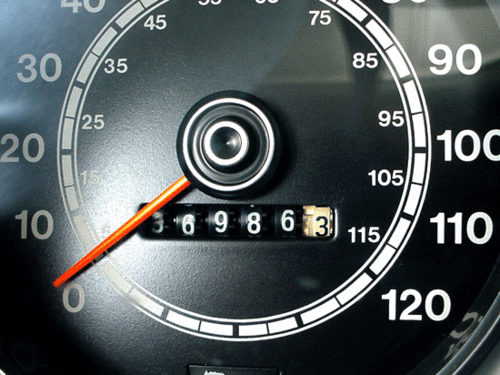
Let's find out! Each month, the U.S. Department of Transportation publishes a report on Traffic Volume Trends in the United States, where it adds up all the billions of miles that have been traveled on the nations roads over the preceding twelve months. The most recent report extends through November 2011.
But how can we use that report to tell if Americans are experiencing an economic recession?
Recessions are periods where economic activity is either greatly reduced or even turns negative. Since traveling is an economic activity, we should expect to see the distance that Americans collectively travel in a recession to follow a similar pattern, which we would observe in the form of a slower rate of growth or even a negative rate of growth.
Since the U.S. Department of Transportation has been publishing its Traffic Volume Trends report, there have been three recessions, as determined by the National Bureau of Economic Research: July 1990 through March 1991, March 2001 through November 2001 and December 2007 through June 2009.
We've created three graphs from the DoT's data, each spanning an eight year period, which show each of these recessions. The first covers the period of time from November 1989 through November 1996:

Already we're off to a good start! Here, for the period of recession from July 1990 through March 1991, we observe that the slope of the line showing the billions of miles traveled by Americans in the previous 12 months went flat during the period of recession, indicating a period of low economic growth. Outside of the recession however, we see that the number of miles accumulated by vehicles on America's roads generally rose, which is what we would expect during periods of economic growth.
Our next chart examines the eight year period from November 1996 through November 2003:

Once again, we observe that most of the periods of time where the U.S. economy was growing coincides with periods of increasing miles being driven on U.S. roads. And we see that the rate at which that increased slowed dramatically during the period of economic recession that officially ran from March 2001 through November 2001, at least as compared to what we typically observe in periods of growth.
We also see that the volume of traffic in the United States slowed significantly in advance of the official recession, beginning in September 2000. That's significant in that this month has been advanced by some economists as being the actual beginning of the 2001 recession, although not by the NBER, which uses a number of measures to make its official recession call.
Our final chart brings us up to to the most recently published data:

Here, we can see that the most recent official recession, running from December 2007 through June 2009, was especially severe compared to the previous two recessions, in that the number of vehicle miles accumulated on U.S. roads fell dramatically.
We can also see that an economic recovery has taken place in the months following June 2009, as the number of vehicle miles has generally risen following that period, although with some significant dips indicating an uneven pace of recovery.
But then we run into a real obstacle: we find that the total number of miles that American drivers have put onto America's roads over the previous 12 months has been falling steadily since March 2011.
If the number of miles driven by Americans is a contemporary indicator of the relative economic health of the nation, that falling number of miles driven suggests that the U.S. economy has been effectively in recession during that time, although the NBER has not yet made any such determination.
At the very least however, it does indicate a high degree of economic distress during that time.
Labels: data visualization, recession forecast
Welcome to the blogosphere's toolchest! Here, unlike other blogs dedicated to analyzing current events, we create easy-to-use, simple tools to do the math related to them so you can get in on the action too! If you would like to learn more about these tools, or if you would like to contribute ideas to develop for this blog, please e-mail us at:
ironman at politicalcalculations
Thanks in advance!
Closing values for previous trading day.
This site is primarily powered by:
CSS Validation

RSS Site Feed
JavaScript
The tools on this site are built using JavaScript. If you would like to learn more, one of the best free resources on the web is available at W3Schools.com.
Other Cool Resources
Blog Roll


