
Christmas will soon be here, you still need to shop for gifts, and your time is running out.
Millions of people face this situation every year. It most often arises because of a classic knowledge problem. You don't know what to get for the people for whom you are shopping. If you did, you would probably already be done with all your shopping at this point of time.
You could perhaps solve this problem a very traditional way, say by giving a classic fruitcake to all the people you have left to shop for on your Christmas shopping list. And depending upon how they feel about receiving a fruitcake, that may help you with the problem of shopping for them next year, especially if they don't like your gift of fruitcake and that leads to them falling out with you.
But odds are that if you're shopping for gifts for them, it's probably because you like them, so why would you even risk that? You need a better solution. So let's turn to statistics.
Or more precisely, let's turn to the results of a poll of Americans run by Statista on what kinds of items are most frequently found on people's wish lists for the gifts they will receive at Christmas. The following interactive chart shows the percentage of Americans whose gift lists included items that fell into the indicated categories.
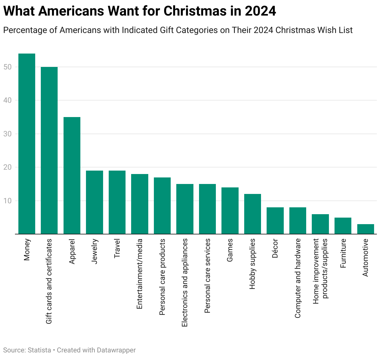
Knowing the probability the people on your Xmas shopping list will want something that falls in the most popular categories can help you finish up your shopping this year now that there's so little time left. And to help get you over the finish line for this year's gift shopping, we've asked the Inventions in Everything team to supply suggestions of gifts that go along with many of these categories.
Last Minute Xmas Gift Ideas
When the IIE team goes shopping, its normally to find out if its even possible to buy a product based on wild or wacky patented invention we've featured. Or, in the case of the "Outside the Box Thinking" category, we review unusual innovations that do exist and that you can buy. The six items on the IIE team's last minute Xmas list for 2024 falls somewhere between these two categories. Here they are.
Bilz Money Puzzle for Cash, Gift Cards and Tickets
Money and gift cards top the list for gifts Americans say they would prefer to receive in 2024 with more than half of those surveyed saying they want to get these things for Christmas. These are really easy things to get, so giving them as gifts is more about how you package them. That's where the Bilz Money Puzzle for Cash, Gift Cards and Tickets comes into play.

Put the cash or gift card into the puzzle box and your gift recipient can enjoy the challenge of extracting your gift from it. Or should we say that your gift recipient can "enjoy" the challenge of extracting your gift from it. We trust that since you know them, you know what you can get away with. As a plus, because the money puzzle can also hold things like movie or concert tickets, you can also tick the box for the Entertainment/media category with this item.
Moipejo LED Flashlight Gloves
Over a third of Americans say they would like to receive some kind of apparel for Christmas this year, so why not light up their faces by giving them gloves with built in LED lights?

It occurs to us this product might also tick the boxes for Jewelry, which nearly one out of five Americans would like to receive at Christmas. It also ticks the box for Electronics and appliances, which 15% of Americans hope to get in 2024.
The Flying Orb Ball Hover Toy
Speaking of electronics and appliances, which 18% of Americans say they'd like to receive, why not get them a flying ball they can play catch with themselves with?
This is a unique product the IIE team covered earlier this year. It's fundamentally a lightweight miniature drone mounted inside a ball-shaped frame that allows air to pass through so the drone's rotors can work, making it possible for the 'ball' to fly on its own.
Combined with a bit of programming magic, it becomes a ball that lets you play catch with yourself. The concept of Flying Orb Ball Hover Toy, a.k.a. "the boomerang ball" is demonstrated in the following short video:
Versions of this technological wonder are available at retailers like Amazon and Walmart. And like many modern tech-based toys, it has a rechargeable battery.
Funboy Winter Fun Inflatable Toboggan
As long as we're talking about products that are fun, we have to include the inflatable toboggan. Unlike the Flying Orb, it's low tech and it checks the box for Games.

For obvious reasons, this gift is best given to those who live in areas that get snow and that ideally also has hills. Otherwise, you may need to pair this item with Travel, which nearly 19% of Americans say they would like to get for Christmas this year. If you don't, there's nothing stopping your gift recipient from blowing it up anyway and using it as a cushion or pillow, which means it might work for them as Décor. Or not.
Original SipCaddy Shower Wine Holder
We think this item falls into the Personal care products category, but really, it's for that person you know who likes to drink adult beverages and who also likes to bathe or shower.

In truth, this gift is for that special someone who likes these activities so much they want to do them both at the same time. Again, you know who you would give this gift. If you didn't, you might be better off giving them that fruitcake.
Pulidicki Car Cleaning Gel
This last minute gift idea is a total stretch on our part. We looked at the remaining categories we hadn't already covered and tried to identify one product that could tick the boxes on as many of those as we could. This miracle product was the winner.

Pulidicki Car Cleaning Gel is a sticky gel that you can use to remove dirt from the nooks and crannies of your car while you detail it, which clearly falls in the Automotive category. You can also use the gel to clean the gunk off the keyboard for your Computer and hardware, and also your electronics and appliances. Or for that matter, around your light switch plates and baseboards of your home, which makes it a Home improvement product. If their hobby is cleaning, it would count as Hobby supplies.
There you have it. Six last minute gift ideas, links to where you can buy them, and just enough time to order them to get them before December 25 arrives. What can possibly go wrong? Happy Xmas!
Image credit: Cake Decorator Displaying Deluxe Fruitcake on Baking Line photo by JmanningCSB on Wikimedia Commons. Creative Commons CC BY-SA 4.0 Attribution Share-Alike 4.0 International Deed.
Labels: data visualization, geek logik, technology
It's St. Valentine's Day! Quite possibly the most annoying day of the year, what with all those loving lovers looking for love gushing about it.
Some, we're sad to say, are finding attraction in a very strange place. In what some physicists describe as one of the most elegant and beautiful equations ever written.
(i∂̸ – m) ψ = 0
If you're up on your physics, you'll immediately recognize this formula as the work of Paul Dirac. It combines Einstein's theory of relativity with quantum theory to describe how microscopic particles like electrons act when they travel at speeds near the speed of light. It's that connection with quantum theory is apparently all that's needed to hook the lovelorn on Dirac's math as an expression of love.
If you have seen this equation tattooed on someone’s body, it’s because it not only describes the phenomenon of quantum entanglement, but has also been called the formula for love. Why? Because the equation implies that if two particles are connected for a time and then separate, what happens to one will continue to affect the other despite the separation.
Popular culture has somehow taken a mathematical equation to be the formula for love. It’s a strange turn of events for the ascetic physicist, part genius and part madman, who devised such a beautiful equation. It has now transcended the scientific world and has become a tattoo on young people who seal their love with padlocks on bridge railings.
Here's a screenshot of the infamous tattooed expression of love as shared on social media:

What could possibly go wrong with such a metaphorical expression of love in a formula involving quantum entanglement?
If you ask quantum physicists, plenty. Mainly because they know the equation doesn't say anything like what the people tattooing it on themselves seem to think it says.
Thomas Pashby, an assistant professor in the Department of Philosophy at the University of Chicago, whose research concerns the interpretation of quantum mechanics, told AAP FactCheck the Dirac equation described a single electron: “It is notable for providing an elementary description of the electron in a hydrogen atom which gets the energy levels almost exactly right (apart from some small corrections from quantum field theory).”
Asst Prof Pashby confirmed the photo of the tattoo in the post was the Dirac equation, but that the equation was incorrectly written in the post itself ((∂ + m) ps = 0), since it was missing the “Feynman slash notation”.
He said the interpretative part of the text was “essentially nonsense” and entanglement was not a phenomenon the Dirac equation describes “since it applies to a single electron”.
Whoops! Don't you hate it when your permanently applied ink doesn't really say what you thought it did?
Here's the bottom line. While it may indeed be among the most elegant of equations, the Dirac equation is a formula that only a physicist who understands it can truly love.
Labels: geek logik, math, whoops

Writing is a skill you never stop learning. If you care about effectively communicating with your audience, at some point, you will need to come to terms with the readability of what you write.
Readability is defined as "the quality of being easy and enjoyable to read". Which is really not very helpful, because the definition doesn't tell you what's either easy or enjoyable to read.
Of those two things, what's enjoyable for you to read is completely subjective. You might, for instance, enjoy reading works of postmodern literary criticism, although that's very unlikely because these works are not easy to read. That's because the writers of these works don't care about effective communication with their audience. Their writing is mostly an exercise in vanity.
What makes something readable then comes down to how easy it is to read. Fortunately, that is something that can be quantified. Because it can be quantified, it can be measured. And once you know how ease of reading is measured, you can make your writing more readable.
Or rather, once you know how to score how readable your writing is, you can game the system to get a better readability score for your writing.
The most common measure of how easy a passage of text is to read is the Flesch Reading Score. Here's the math that goes into how it is calculated:
Flesch Reading Score = 206.835 - 1.015 × (Total Words ÷ Total Sentences) - 84.6 × (Total Syllables ÷ Total Words)
To get the highest score possible, your writing should use:
- a low number of words, using
- a lot of sentences, and
- words that have few syllables.
If you go back and read the first paragraph of this article, it consists of 34 total words with 51 syllables in 2 sentences. It has a Flesch Reading Score of 62.7, which puts it at an 8th-to-9th grade reading level. That qualifies as "plain English", which most English speakers would say falls in the sweet spot between being easy and difficult to read.
Now, since we know how to game the reading score, we made some very minor tweaks to produce the following paragraph:
Writing is a skill you never stop learning. If you're a writer, at some point, you're going to need to come to terms with the readability of what you write. At least you will if you care about communicating with your audience.
This version of the opening paragraph has 42 words, 3 sentences, and 57 syllables earn a Flesch Reading Score of 77.8. The minor changes we made dropped its difficulty level to the 7th grade level, even though we added words. The changes make it fairly easy for a larger audience to read.
Here's some additional math you can use to get the Flesch-Kincaid Reading Level, which is mapped to the U.S. school grade level:
Flesch-Kincaid Reading Level = 0.39 × (Total words ÷ Total sentences) + 11.8 × (Total Syllables ÷ Total Words) - 15.59
Here's the reading score-to-grade summary:
| Flesch-Kincaid Reading Scale Summary | ||
|---|---|---|
| Reading Score | Grade Level | How Easy Is the Text to Read? |
| 90 - 100 | 5th grade | Very easy to read |
| 80 - 90 | 6th grade | Easy to read |
| 70 - 80 | 7th grade | Fairly easy to read |
| 60 - 70 | 8th & 9th grade | Plain English |
| 50 - 60 | 10th to 12th grade | Fairly difficult to read. |
| 30 - 50 | College | Difficult to read. |
| 10 - 30 | College graduate | Very difficult to read |
| 0 - 10 | Professional | Extremely difficult to read |
A lot of writers at the "professional" end of the grade scale make the mistake of not appreciating who the audience for their writing is. The worst writing we see is often that of "educators". The worst offenders in this group would appear to care more about showing off how smart they are than being effective at teaching. Somehow, they just don't get that teaching involves communicating with a much broader audience than themselves.
Image Credit: Photo by Fa Barboza on Unsplash.
Labels: geek logik, ideas, math
Did you wake up on the right side of the bed this morning?
By that, we're really asking whether you got up early enough after having enough sleep before you go off to accomplish all the stuff you intend to today. Getting up on the "right side" of the bed means you did, while getting up on the "wrong side" of the bed means you did not.
We're asking that question today because British mathematician Dr. Anne-Marie Imafidon has constructed a mathematical relationship to determine which of those sides of the bed you woke up on. You can imagine our palpable excitement when we discovered the following video in which she discusses her formula:
After watching the video to decipher her math, we have to agree with Ralphie from Christmas Story:
And yet, we wondered if she might be onto something. So we built a tool to do her math. If you're accessing this article on a site that republishes our RSS news feed, please click through to our site to access a working version of the tool.
The default data in the tool was provided by WFXB's Carolina AM's Greg and Audra, where the tool's results differs from Audra's because she went off into the weeds in doing her calculations.
Then again, that might be expected for someone who woke up on the wrong side of the bed! (For the record, we find she woke up on the right side!) Regardless, change the values as you need to represent your own personal scenario, and the tool will determine which side of the bed you got up on!
Labels: geek logik, tool

The solution is 37%. But before we get too far ahead of ourselves, we should reveal the question we're answering. That question is "when should you get serious about finding that special someone to settle down with?"
Right now, that answer doesn't make sense, but it soon will. That solution is arrived at through the math of optimal stopping theory, which deals with the problem of finding the right match, whether that be for a new hire, an apartment, a parking spot, the love of your life, or for whatever you have to devote time and effort to learning about what you like most about the supply of available options. What you do is investigate the first 37% of those options without making any commitments, after which, you get serious. As soon as you find the first option that's as good as or better than the best option you previously passed on, you go all in on commitment.
Sounds pretty romantic, right? But how does that work for dating when you have no idea how many people you'll ever date in your lifetime?
Mathematician Hannah Fry suggests using time instead:
Say you start dating when you are 15 years old and would ideally like to settle down by the time you're 40. In the first 37 percent of your dating window (until just after your 24th birthday), you should reject everyone -- use this time to get a feel for the market and a realistic expectation of what you can expect in a life partner. Once the rejection phase has passed, pick the next person who comes along who is better than everyone who you have met before. Following this strategy will definitely give you the best possible chance of finding the number one partner on your imaginary list.
The assumption behind this suggestion is that you expect the first 37% of your prospective maximum dating life before settling down will be similar to what the remaining portion of it would be like. If you dated an average of X people per year in that first portion, you could reasonably expect you'll do the same until you finally find that special someone.
The following tool works out how long that might be for you, based on the ages you enter for when you start dating and the maximum age you intend to reach before meeting your optimal match according to this scheme. If you're reading this article on a site that republishes our RSS news feed, please click through to our site to access a working version of the tool!
The tool's default scenario replicates the math for Dr. Fry's example, but you can set the ages to whatever applies for you. That said, you might be surprised at how soon the tool will suggest you need to get serious about finding your potential mate if you set a really low maximum age.
As a bonus, you can also use the tool for those other kinds of examples, such as finding a house, if you set 0 as the starting age and a value like 91 to represent three months worth of house hunting. In that case, you would have 34 days to sort out what your optimal housing solution looks like, but unlike real life dating, you would have the option of going back to one of your "exes". Assuming that optimal solution is still on the market....
Image credit: Photo by Fernanda Nuso on Unsplash.
Previously on Political Calculations
Labels: geek logik, math, tool
Should you, as an investor, let a groundhog decide when to buy stocks in the U.S. stock market?
To many rational investors, that sounds completely crazy. But if you believe investors are irrational, and you happened to have seen a recent paper presented in Finance Research Letters, you might just consider it. Here's the conclusion from the paper by Savva Shanaev, Arina Shuraeva, and Svetlana Federova:
This study has discovered a new calendar anomaly on the United States stock market associated with the prognostications of Punxsutawney Phil on the Groundhog Day. Across 1928–2021, the S&P 500 substantially appreciated subsequent to Phil’s “prediction” of an early spring, while the returns were moderately negative after he “predicted” a long winter. The difference in buy-and-hold abnormal returns two weeks after the Groundhog Day is a statistically and economically significant 1.85%, establishing the importance of the Groundhog Day superstition to investor sentiment and market performance. There is a seemingly puzzling positive anticipation effect to an early spring prognostication equalling 1.14% over the two weeks prior to the announcement that implies either informed trading or, more likely, rational investors exploiting their awareness of the superstition and weather forecasts. The results are robust in subsamples, when controlled for a wide range of other calendar anomalies, as well as to time-varying risk premia and conditional heteroskedasticity.
The findings have implications for academics and stock market participants. For individual and institutional investors, this study has identified an exotic yet moderately profitable trading strategy. For empirical finance researchers, it has highlighted the nuanced idiosyncratic nature and persistence of calendar anomalies, showing that country-specific superstitions can have notable market specific effects. While some anomalies can have no explanations consistent with the efficient market hypothesis – like Friday the 13th effect or, indeed, the Groundhog Day effect established in this paper – they seem to exist, hence the market truly is that irrational.
In the study, the authors reviewed daily U.S. stock market data extended back to 1928, which includes 18 years in which Punxatawney Phil did not see his shadow, signaling both an early end to winter and an opportune time to invest in the U.S. stock market. That opportune time is defined as the period covering the 11 trading days preceding Groundhog Day (2 February) each year, through the 10 trading days following it.
We wanted to confirm their results for ourselves, so we tapped Yahoo! Finance's historical data for the S&P 500 (Index: SPX). This database contains daily trading data for the index beginning in January 1950, where the period since contains 17 of the 18 Groundhog Days where Punxatawney Phil did not see his shadow to predict an early spring. The following chart suggests Shanaev, Shuraeva, and Federova may be onto something....

For all years since 1950 where Punxatawny Phil saw his shadow, forecasting a long winter, the average value of the S&P 500 ten trading days after Groundhog Day was barely changed from its value eleven trading days before it. But in the 17 years where Punxatawny Phil did not see his shadow, predicting an early end to winter, the value of the S&P 500 rose an average 3.0% above its pre-Groundhog Day anomaly value.
So are you ready to start taking investing advice from the world's most famous groundhog? Before you do, you may want to consider the following video:
As with any scientific hypothesis, it takes only one bit of contrary evidence to debunk it. In this case, all we need to do is show that instead of being irrationally influenced by the weather prognostications of a burrowing rodent, investors in any one of the years in which Punxatawney Phil saw no shadow were instead motivated by rational considerations to bid up stock prices.
We chose 2020. The year the coronavirus pandemic would negatively impact the world's economy. The year that saw billions of people deal with the irrational fear of a deadly spreading virus amplified by responses of public officials that were often even more irrational. A year in which irrationality would seem to have abounded like no other in recent history!
The next chart shows how the S&P 500 evolved during 2020's Groundhog Day anomaly window, which covers the trading days from 16 January 2020 through 18 February 2020:

So far, it seems to check the boxes for irrational behavior the Groundhog Day anomaly. We see Groundhog Day fell on a Sunday, so we set our Day 0 as Monday, 3 February 2020. We visually confirm that the preceding trading day of Friday, 1 February 2020 saw the S&P 500 bottom at 97.2% of its pre-anomaly window value. It began rising on 3 February 2020, proceeding to end the anomaly window period at 101.6% of its pre-anomaly period value after peaking at 101.9% on the seventh day after Groundhog Day.
But that doesn't consider what other information investors were considering during this period, much less what parts of that information were driving the stock market. For that, we tapped our own archives, where the clues to indicate investors were actually behaving very rationally were built into the headlines of our weekly recaps of the S&P 500's activity:
- S&P 500 in First Lévy Flight Event of 2020
- S&P 500 Completes First Lévy Flight Event of 2020
- Coronavirus Fears Weigh S&P 500 Down
- S&P 500 U-Turns to Reach Record Highs on China Liquidity Injections
- Fed Love-Hate Relationship With Liquidity Injections Pushes S&P 500 To New Record High on Valentine's Day
What we describe as a Lévy flight event corresponds to the decline of the index' value during the early part of the Groundhog Day anomaly window, which then combined with the realization that China's response to the epidemic would negatively affect the outlook for U.S. businesses. On 3 February 2020, U.S. stock prices rebounded slightly from that low based on strong U.S. manufacturing data with a small boost from tech stocks.
But what really caused stock prices to surge came on Tuesday, 4 February 2020, when China's central bank signaled they would initiate major stimulus programs to offset the negative economic impact of the spreading pandemic. The U.S. Federal Reserve also acted to boost liquidity in U.S. money markets at this time, but that was a much smaller act than the stimulus rolling out in China. U.S. stock prices remained elevated through the end of this period as Fed officials sought to boost confidence in the U.S. economy.
Most of that positive response would dissipate as the seriousness of the coronavirus pandemic became more apparent by the end of February 2020, but if you follow the links above to see the contemporary news headlines, there was nothing pointing to the prospects of an early spring that would affect the trajectory of the S&P 500 during the Groundhog Day anomaly window. Unless, of course, the Bank of China's officials took their policy direction from Punxatawney Phil. Whose 2020 weather prediction for an early spring also turned out to be wrong, as indicated by this late April 2020 photo....
. by Ralph Katieb via Unsplash")
The following video clip provides better advice for those irrational enough to follow the life advice of groundhogs:
Update: According to Punxatawny Phil, there will be no Groundhog Day-related stock market rally in 2022!
References
Savva Shanaev, Arina Shuraeva, Svetlana Federova. The Groundhog Day stock market anomaly. Finance Research Letters. DOI: 10.1016/j.frl/2021.102641. 22 December 2021.
Yahoo! Finance. S&P 500 Historial Prices. [Online Database]. Accessed 1 February 2022.
Image credit: Photo by Ralph Katieb on Unsplash
Labels: forecasting, geek logik, ideas, SP 500, stock market
A year ago, the world went crazy with the onset of the coronavirus pandemic and the concept of a lockdown.

Originally pitched as a 15-day solution to "slow the spread" of SARS-CoV-2 coronavirus infections by "flattening" the epidemic curve, government-imposed lockdowns became an ongoing fact of life for many around the world. Worse, they became the go-to policy for many public officials who used them to cover their inability to adapt to the pandemic's demands, week after week after week. At this writing, parts of the world are still going into COVID lockdowns, some for the third or fourth time since the start of the pandemic.
For couples, these lockdowns has meant spending a lot more time together than would have otherwise happened in a world without the coronavirus pandemic. Having their places of work closed by lockdowns forced many couples to work from home if they could. At the same time, the lockdown stay-at-home orders prevented them from visiting others or having guests. The end result is much more "together time" than anyone would have imagined before the pandemic.
But how much more time is that? And how does that compare to a year of time couples would have spent together in the pre-COVID world?
Questions like these led BBC presenter and Cambridge doctoral maths candidate Bobby Seagull to develop a formula to quantify how much more perceived together time couples have accumulated as a result of the lockdowns.
We've taken the math and built the tool below to do it, using data collected from a survey of 2,000 couples conducted by Groupon earlier this year as the default data. Substitute your own numbers as you might like to see how your relationship has relatively aged!
If you're accessing this tool on a site that republishes our RSS news feed, please click through to our site to access a working version. We'll have more comments below the tool....
Most of the data input items are very straightforward, but one represents a subjective judgement. The "Boredom Factor" represents how the lack of options for entertainment or away-from-home social gathering contributes to making time spent with your partner seem like more time is passing than is really the case. Which is to say that often being bored 'ages' your relationship.
In the tool, we've opted to make that factor a "Yes" or "No" proposition, where if you feel you've experienced the boredom factor, selecting "Yes" will double the amount of additional time you have spent together outside of what would have been the case before being locked down.
If you select this factor, the final answer then is the 'perceived' amount of time your relationship has aged, as a multiple of the time you would have had together without the pandemic. Not selecting it will give you an estimate of the actual number of equivalent pre-pandemic years the additional time spent together you have accumulated in lockdown.
All in all, the result is a number that, for most, will be the equivalent of multiple years of time together as a couple. A result of one, on the other hand, would mean that your time in lockdown went about the same as it would have in a pre-lockdown world.
Either way, it's an interesting way to approach the question, which is why we took on the project!
Image credit: Photo by Chris Greene on Unsplash
Labels: coronavirus, geek logik
If you've ever had to deal with a pair of earphones after they've become tangled, you know exactly what kind of mess they can make and what kind of pain they can be to untangle. Is there anything you can do about it?
Before we go any further, let's draw some lessons from science for how cords can almost spontaneously become tangled from the following video:
Now, let's get to the practical matter of finding out how likely your cords will become tangled. In the following tool, we've adapted the math developed by Dorian M. Raymer and Douglas E. Smith in their 2007 paper to calculate the probability that your cord/string/rope will become tangled, assuming that it is made of a medium-stiffness material, based upon its length. If you're reading this article on a site that republishes our RSS news feed, click here to access a working version of this tool!
If your cord has a relatively low probability of becoming knotted or tangled, say below 5 or 10%, you might not need to worry much about taking any special measures to keep it that way.
But, if you want to avoid the hassles that come from your cords becoming tangled, you might consider the suggestions from the video, using shorter, stiffer cords (if feasible) or getting smaller containers to store your longer cords (if not).
Meanwhile, if you're looking to learn more about knot theory, and yes, there is such a thing in maths, here's a quick introduction:
References
Raymer, Dorian M. and Smith, Douglas E. Spontaneous knotting of an agitated string. PNAS. October 16, 2007 104 (42) 16432-16437; https://doi.org/10.1073/pnas.0611320104. Note: For our tool, we corrected the L₀ parameter to be 1.025 after replicating the other parts of the authors' logistic function regression using the data presented in Figure 2, where our L₀ correction allowed us to replicate their reported probabilities for various cord lengths.
Labels: geek logik, math, physics, tool

From time to time, Political Calculations takes on the challenge of answering questions that other blogs avoid. Whether that's due to fear on their part, where a sensitive topic may be too far out of their comfort zone, or just because they cannot, we see such challenges as an opportunity.
So let's talk about how much underwear you need to pack while you're traveling away from home. Not long ago, Ashley McIntosh of Brisbane, Australia's 97.3 FM radio posted the solution to a problem that we ourselves never appreciated existed. We'll let her explain....
Are you guilty of packing three times as many pairs of underwear as you could possibly need when travelling.
*Raises hand*
Or even worse... Not packing enough!?
Well never fear, this nifty new math equation is here to the rescue ladies.
And it seems pretty thorough.
Karina Judd recently shared on Facebook group Meme Queens her saving grace.
Not just that, but she has also created a public Google doc excel spreadsheet so the math is all done for you!

That's all well and good, but what if you're packing in a rush right before leaving on your trip because you've procrastinated too long and you can no longer afford to take the time to fire up your personal computer to run Karina Judd's spreadsheet to calculate how many pairs of underwear you should pack?
That's the kind of niche market that we seek to serve here at Political Calculations, where we've brought Karina Judd's undie math into the world of online ready reckoners you can run on your mobile! Just enter the indicated data below, and we'll sort out how much underwear you should pack for your travel. [If you're accessing this article on a site that republishes our RSS news feed, please click through to our site to access a working version.]
For the sake of simplicity, we've limited the tool to consider no more than a week-long vacation, where we've assumed you will not have access to clean underwear outside of what you pack (if you're traveling for longer than that, or have limited packing space, you might consider taking advantage of local options for doing laundry during your trip).
We've also generalized the math a bit, to make it more universally applicable. The original math in Karina Judd's spreadsheet was developed by Jess Evans, who considered a number of additional factors that could affect your underwear packing needs, such as the temperature of your destination, whether the drinking water is "dodgy", and whether you will be able to do laundry while traveling, where the spreadsheet can handle a much longer trip.
Previously on Political Calculations
Underwear math is far from the strangest problem we've built tools to solve! Here's a sampling of some of the other quirky problems we've tackled over time....
- What Are the Chances Your Marriage Will Last?
- Picking the Right Date for Valentine's Day
- The Indisputable Inter-Age Rule for Dating
- Men: What's Your Sex Appeal?
- Men: Are You Old Enough to Propose Yet?
- Should You Become Intimate with a Coworker?
- Is Your Personal Grooming Adequate?
- How Much Should You Spend on Gifts this Christmas?
- Should You Keep Your New Year's Resolution?
- Should You Call in Sick?
- Five More Minutes?
- Are You Too Good for Your Job?
- Should You Buy Something (or Not)?
- How Many Cups of Coffee Should You Drink This Morning?
- How Many Beers Should You Have at the Company Picnic?
- Earth Live: Walk, Bike or Drive?
- Should You Say It on the Grapevine?
- Should You Start or Stop Procrastinating?
- Should You Apologize?
- Should You Lie?
- Should You Quit Your Job?
- Should You Go Out with the Guys?...
- Are You Whipped?
- Do You Dare Run for Public Office?
- How Many Hours of Sports Can You Watch (Without Her Getting Angry)?
- Should You Stop to Put Gas in the Car?
- How Many Kids Should You Have?
- How Big Should Your Kids' Halloween Bucket Be?
- When Will You Become Obsolete?
- The Robin Hood Morality Quiz
- The Ultimate Mobile App
- Math Formula Explains Geek's Dating Drought
- Happy Valentine's Day!
Labels: geek logik, tool
Are you not anywhere near as capable as you make yourself out to be? If so, you might have a problem, and potentially a really big problem.
How big a problem that may be depends upon several factors:
- What are the consequences if you continue? Do you face impending doom?
- How competent do the people you work with think you are?
- How competent do you really need to be to do what you do?
- How competent are you really?
- How good are you at faking being competent?
- How long have you been faking being competent?
Geek Logik author Garth Sundem has considered these questions, and describes how they might come into play in a work setting:
On your resumé it states "expert in protein-structure analysis," a phrase you heard once on the Discovery Channel. Originally, you though it did a good job of filling the white space under "other skills" and never thought your knowledge of crystallography would be tested while you were working at Blockbuster. But now your manager wants you to categorize this month's new movies based on their homologous superfamily and/or CATH designation and you're thinking "online gaming" would have been a beter choice as resumé filler. However, you're pretty sure your manager can't tell an orthogonal prism from an alpha solenoid, so you might get away with faking it. On the other hand, someone likely had this same thought just before the Chernobyl nuclear disaster.
Clearly, this is the kind of situation that would only arise if you lacked the integrity to be honest about your capabilities in the first place. But since you already have problems with your integrity, you now have a choice: should you continue your bluff or should you finally come clean and admit your incompetence before things spiral out of control for you?
Fortunately for you, Garth Sundem has put those ethical questions into algebraic form, which we've turned into a tool to do the math for you! All you need to do is to rank yourself on each of the following questions, which Garth has expressed by incorporating a more serious surgical scenario, and we'll help you determine how you'll deal with the problem that is entirely of your own making.
If you're reading this article on a site that republishes our RSS news feed, click here to access a working version of this tool!
At this point, we can't help but think of Dave Foley's classic comedic performance in "The Doctor" sketch from the Kids in the Hall:
While these scenarios may seem far fetched, the truth is they are all too common, as the lack of meaningful consequences encourages the unethical behavior. Just consider the case of the less than capable econometrician who effectively made themselves into the economics equivalent of a climate change denier just so they could both avoid losing face and sustain their error-laden, invalid, pseudoscientific analyses, or the more serious cases of the Environmental Protection Administration's top climate expert who claimed to be a spy for the CIA for a decade, or the phony records that allowed the staff of the Department of Veterans Affairs to claim big bonuses for providing care they never delivered.
This tool is for them!
Guest post contributed by Alec Chìnn.
Labels: geek logik, tool
Welcome to the blogosphere's toolchest! Here, unlike other blogs dedicated to analyzing current events, we create easy-to-use, simple tools to do the math related to them so you can get in on the action too! If you would like to learn more about these tools, or if you would like to contribute ideas to develop for this blog, please e-mail us at:
ironman at politicalcalculations
Thanks in advance!
Closing values for previous trading day.
This site is primarily powered by:
CSS Validation

RSS Site Feed
JavaScript
The tools on this site are built using JavaScript. If you would like to learn more, one of the best free resources on the web is available at W3Schools.com.
Other Cool Resources
Blog Roll


