
As the pioneer (okay, if somebody started doing it before us, we don't know about it!) in bringing web-based calculation tools to the blogosphere, we here at Political Calculations always keep an eye out for other tools developed in other places. Today, we'll drop in on some tools brought to life at other blogs! First up, MyMoneyBlog, which featured the following tools in recent months:
- 28 Day Treasury Bill APY Calculator
This is a neat tool that estimates your annual percentage yield (APY) from the U.S. 28-day T-bill, taking into account how they actually work (you can't roll-over the entire value of a T-bill after it comes due into a new 28-day T-bill, but you can direct the excess proceeds to an interest-bearing bank account.) It's a very specialized type of investing math that only applies in a unique situation - and it's exactly the kind of application that makes more sense to post in the context of a blog than it does anywhere else.
- Rate Chaser Calculator
The only tool I've ever seen that considers how long your investing money is out of action when moving it from an account earning a lower rate of return to a higher one!
Meanwhile, Nathan Whitehead's Paranoid Brain has been at work in developing some pretty interesting tools (or "toys" in paranoid parlance!) Here's a quick sampling of tools posted since we previously noted Nathan's work:
- Geometric Arithmetic Mean Converter Calculator
Great fun for statistics fans! The only tool I've encountered that points to the difference between geometric and arithmetic mean, then approximates it!
- Funding Your Emergency Fund
The first step to weathering a potential financial crisis is planning for it - Nathan's tool for determining how long it will take to set aside a certain number of months of your income is an essential part of that exercise and is therefore one of the better personal finance tools I've come across.
- Kelly Formula Calculator
Are you a gambler? Want to determine the optimal size for your bets? This tool is for you!
- Investing is Less Risky Than I Thought
Want to see the likely range of your investment return in a diversified portfolio over various time intervals, given the average rate of return you have plus its standard deviation? A Political Calculations' Gold Standard tool for its combination of simple user-interface and high information return! (And, we might add, only the second tool to which we've ever awarded the designation!)
- Investing is More Risky Than You Think
Just in case you thought "Paranoid Brain" was just a catch-phrase! This tool was posted on the same day as Nathan's "Less Risky" calculator, but much earlier! This tool uses a different statistical distribution which applies to the returns of a single stock rather than those of a diversified portfolio of stocks. Be sure to read through Nathan's discussion where he catches his initial error!

We begin this week's edition of Political Calculations' weekly wrapup of all the major business, capitalist, debt-reducing, investing, marketing, personal finance and frugal-living blog carnivals, On the Moneyed Midways with a rant on how *not* to present the posts submitted in a blog carnival.
We can summarize our position in one word: Haiku. While we greatly appreciate the creativity needed to master this exquisite form of Japanese poetry, it should not, ever, be used to describe the posts that have been contributed for a blog carnival. Not ever. Never. Ever. And in case we haven't made our point clear, you may discover the many reasons why for yourself by scrolling down and visiting the Carnival of Debt Reduction for this week....
And since you're scrolling down anyway, be sure to read each of the best posts we've found in all the money-related blog carnivals for the week ending on May 26, 2006, including a hands-down winner forThe Best Post of the Week, Anywhere!(TM)
| On the Moneyed Midways: May 26, 2006 | |||
|---|---|---|---|
| Carnival | Contributor | Post | Comment |
| Carnival of Business | Do You Dare to Dream the Impossible Dream? | Aridni | "Can you create solutions when there are seemingly impossible problems?" Aridni's Todd reveals how creativity can solve problems that at first glance, seem unsolvable! |
| Carnival of the Capitalists | Stagflation | Econbrowser | James Hamilton examines the challenges before the Fed in setting interest rates, as inflation and economic performance data are moving in not good directions. |
| Carnival of the Capitalists | Multi-Channel Myth | MineThatData | Kevin Hillstrom finds the direct marketing industry to be in the middle of a 'strategic' collapse - where significant in-fighting is happening over choosing the tools and techniques that will lead the industry in the future. |
| Carnival of Debt Reduction | Why Buy Now, Pay Later Deals Are Bad | Get Rich Project | The best laid plans for paying off debt can go off track when emergencies arise. The author of the Get Rich Project shows that taking on debt can be a gamble. |
| Carnival of Entrepreneurship | Innovation 101 | Seeds of Growth | Dave Free shows off the process of innovation in a home drywalling project he took on with his son. The engineer, economist and entrepreneur in me all agree that this is, hands down, The Best Post of the Week, Anywhere! |
| Carnival of Investing | Beat the Market Consistently | The Dividend Blog | Investing in stocks that pay dividends is key to getting more-than-market performance (where market performance is defined simply as price appreciation). |
| Carnival of Marketing | A Great Example of Direct Response Marketing in Action | JimLogan | Jim Logan points out what works for direct mail solicitation with an example he received from a local auto repair company. |
| Carnival of Personal Finance | This Personal Finance Tip Saved Me $29,871.63 | In Cash Flow We Trust | Steve Mertz kept his Social Security annual statements, and was able to use them to claim $29,871.63 from his old employer's defined benefit pension plan. |
| Festival of Frugality | Frugal Vacations | Money and Values | Penny Nickel offers 7 tips for traveling on the cheap! |
| Festival of Job Hunting | Job Interview: 3 Questions for Your Prospective Boss | Jack Yoest | Jack Yoest suggests three key questions that you might use to either qualify or disqualify your current or potential future employer. |
Previous Editions
- On the Moneyed Midways – May 19, 2006
- On the Moneyed Midways – May 12, 2006
- On the Moneyed Midways – May 5, 2006
- On the Moneyed Midways – April 28, 2006
- On the Moneyed Midways – April 21, 2006
- On the Moneyed Midways – April 14, 2006
- On the Moneyed Midways – April 7, 2006
- On the Moneyed Midways – March 31, 2006
- On the Moneyed Midways – March 24, 2006
- On the Moneyed Midways – March 31, 2006
- On the Moneyed Midways – St. Patrick's Day 2006 Edition
- On the Moneyed Midways – March 10, 2006
- On the Moneyed Midways - The inaugural edition from March 3, 2006!
 The problem with corruption in government, any government, is that the people who can actually do something about it are the same people who stand to benefit from corruption. The answer for fixing corruption is almost always the same: create and enforce an open and transparent system where the interaction between public officials and those seeking their favor is easily and instantly accessible by individual members of the public. The requirement of full, instant public disclosure provides the basic sunlight needed to reduce the back-room deals sought by blood-sucking vampirical special-interests, that can't stand up to the light of day otherwise, to dust.
The main problem with setting up a system like this is one of enactment. How, for instance, do you get a vote in support of such an open system from a legislator or group of legislators who benefit, either personally or professionally, from the closed system they've established for themselves? Throw in a sense of institutional entitlement, and suddenly all you have is a proposal that isn't going to go very far, with a lot of lip service and no action, absent the compelling leadership needed to bring it about.
Without that leadership, the Congress will simply keep plodding along its current corruption-tolerant path. Consider the Cunningham (R-CA) case. Here, one of the things that surprised me is that he offered a volume discount for his bribes. Want a $16 million contract? Pay $140,000! Want a $20 million contract? Pay an additional $50,000 for each million over the first $16 million. $25 million? Sure, just pay an additional $25,000 for each million over the $20 million bracket!
This is the kind of pricing strategy that only evolves in a competitive market - one where the "client" has the option of taking their "business" elsewhere. What we know so far about the Jefferson (D-LA) and Mollohan (D-WV) cases would seem to confirm that there is a healthy marketplace for this kind of activity. And the recent joint statement of party leaders Denny Hastert (R-IL) and Nancy Pelosi (D-CA), would seem to indicate they want to sustain the status quo by circumventing the public's right of discovery. And they will, up until new leadership makes their position in support of the status quo untenable.
Fixing corruption takes compelling leadership. 2008 Presidential aspirants should be taking note. This is a "hygiene" issue. Either you have it, or you don't.
Note: This post was expanded from a comment left behind at Captain's Quarters!

On March 3, 2006, U.S. Congressman Randy "Duke" Cunningham (R-CA) was sentenced to eight years and four months in federal prison months after pleading guilty to charges that he had accepted bribes from defense contractors Brent Wilkes of ADCS Inc. and Mitchell Wade of MzM Inc. Cunningham had previously resigned from Congress on November 28, 2005 after pleading guilty to the crimes.
What makes the case really interesting is that Cunningham created a price sheet that outlined what benefits could be obtained for bribes of certain values (see image). The San Diego Union-Tribune outlines the details:
The prosecutors' papers listed previously untold details of Cunningham's crimes, including a “bribe menu” found on Cunningham's boat that detailed in his own writing how much it would cost Pentagon contractors for each million dollars in business steered their way.
The menu offered a $16 million contract in exchange for a $140,000 yacht. The bribes then grew by $50,000 for every $1 million in additional funding, according to the list, which included a volume discount as the contracts grew.
UC-San Diego economist James Hamilton comments on Cunningham's volume discount:
For example, going from $17 million to $18 million would cost you an extra $50,000 in bribes, but once you get past $20 million, we offer a special deal of an extra $1 million in contracts for only $25,000 in additional bribes.
The volume discount aspect of the bribery scandal is what I find most fascinating - what on earth could explain why Cunningham was willing to reduce his take in return for providing millions and millions more in contracts with his co-conspirators? So far, I've been able to come up with the following hypotheses:
- Declining Marginal Risk. In this hypothesis, the greatest risk for a Congressman accepting a bribe lies in providing the first service on behalf of the one doing the bribing. For example, it could be a sting operation being run by a law enforcement agency. Because of this risk, the initial price for which a Congressman might sell out is set fairly high. Once it's been established that the briber will pay the first bribe however, the marginal risk of providing additional services on behalf of the briber is much less, which is reflected in the declining level of bribes to the Congressman as the benefits for the individuals doing the bribing increases.
- Increased Risk of Discovery. Here, the theory is that the chance that the bribery will be discovered increases with the size of the bribes being offered. So, our unintrepid Congressman reduces this risk by accepting smaller bribes as the benefits to the briber increases. I strongly suspect that this is the kind of problem that only criminals really have.
- Competition. In business, a company may, in seeking to establish a long-term relationship with a good customer, provide them with a volume discount for its products and services. This has two benefits: First, it reduces the risk of losing a customer to a competitor by keeping them happy. Second, it provides a competitive edge since the cost to the customer of seeking another business to provide the same product or service is higher. Why would the business of bribery work any differently in a competitive environment?
Recent events suggest that the third hypothesis of Competition provides the best explanation, as the circumstances surrounding the alleged corruption of Representative William Jefferson, D-LA, and Representative Alan Mollohan, D-WV are just now coming to light. Who knows what other "bribe menus" there might be floating around the halls of Congress?
For no other reason than I have all this data and because I can, I thought it might be fun to take a look at the distribution of losing streaks for the S&P 500 index since 1871!
By counting up the number of periods where the S&P 500 index produced a negative annualized nominal rate of return for a given number of years of duration, I was able to create the following chart, which shows the number of periods between January 1871 and December 2005 where the S&P 500 was "under water":
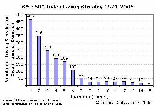
The data behind the chart above assumes full dividend re-investment, but does not take inflation, taxes or fees into account, all of which would increase the number of periods indicated since these factors eat away at the market's rate of return.
The following table shows the number of periods taken into account for each number of years of losing streak duration. A period consists of a full-year increment of time beginning in any month following January 1871. (Note: there were no losing streaks, in nominal terms, after 15 years!)
| Number of Periods for Given Years of Duration | |||||
|---|---|---|---|---|---|
| Duration (Years) | Number of Periods | Duration (Years) | Number of Periods | Duration (Years) | Number of Periods |
| 1 | 1,608 | 6 | 1,548 | 11 | 1,488 |
| 2 | 1,596 | 7 | 1,536 | 12 | 1,476 |
| 3 | 1,584 | 8 | 1,524 | 13 | 1,464 |
| 4 | 1,572 | 9 | 1,512 | 14 | 1,452 |
| 5 | 1,560 | 10 | 1,500 | 15 | 1,440 |
The Longest Losing Streaks
The longest losing streak of 15 years, which has only occurred once in the time since 1871, coincides with the Great Stock Market Crash of October 1929, where an investor who began investing in the preceding month of September, when the market reached its pre-depression era peak, was truly in for a rough ride.
Likewise, all the periods where market losses extended for 10 years or more are clustered between March 1928 and April 1931.
 Did you ever look at leasing a car from a dealer? And if you did, were you confused when they quoted you a money factor instead of an interest rate when determining your monthly payment (assuming they did)?
As it happens, the money factor is a percentage that represents the cost of the money required to lease a vehicle and is similar to (but not the same as!) the interest rate paid on a loan. By law, it will not appear in the terms of your lease agreement - even though it's used in establishing the finance fee portion of your monthly payment.
For you as a consumer, being able to determine the money factor can help you determine whether or not you're overpaying for a lease. That's why we've created the following tool, which you may use to extract the lease money factor from the lease agreement you're considering. The tool below will also approximate the Annual Percent Rate of interest, which will allow you to compare your cost of money in leasing with the cost of borrowing (via a conventional loan) for owning instead:
The math underlying the tool above is presented by LeaseGuide.com. Also, the single best discussion of lease money factor, and how it may be calculated, is presented by efunda, a very cool resource for engineers.
Labels: business, personal finance, real estate, tool
Two brand-spanking-new Carnivals join this week's edition of Political Calculations' On the Moneyed Midways (OMM for short!) As luck would have it, both new carnivals focus on careers, suggesting that Rob May's observation that the proliferation of "second-movers" will lead to fewer and fewer readers for each individual carnival, as the market fractures into smaller and smaller pieces, is dead-on.
Then again, that kind of proliferation is why OMM is slowly gaining readers, since someone needs to sort the wheat from the chaff. That, and where else can you easily keep track of everything going on in the sphere of money-related blog carnivals?
But enough justifying OMM's existence - you're here to catch up with the best business, investing, debt-reduction, frugal-living, personal finance and now career-related posts from the week's money-related blog carnivals! Here they are in all their glory, including The Best Post of the Week, Anywhere!(TM)
Update: All links now working!
| On the Moneyed Midways: May 19, 2006 | |||
|---|---|---|---|
| Carnival | Contributor | Post | Comment |
| Carnival of Business | Is SOX draggin down the US economy? | Professor Bainbridge | Professor Stephen Bainbridge finds evidence that the Sarbanes-Oxley (SOX) legislation went too far in regulating publicly traded U.S. companies, putting them at a real disadvantage in the global marketplace. |
| Carnival of Career Intensity | How to Change Your Career with a Blog | Career Change and Executive Coaching | Margaret Stead provides interesting advice on what blogging might provide for those seeking a change in career. |
| Carnival of the Capitalists | Gresham's Law and Leadership | Slow Leadership | Carmine Coyote explores how bad management becomes the norm when meeting ""the numbers"" becomes more important than sound business practices. Runner up for being the Best Post of the Week, Anywhere!(TM) |
| Carnival of Debt Reduction | Lessons to Live By? | No Credit Needed | No Credit Needed provides the lessons they learned in becoming debt free. |
| Carnival of Entrepreneurship | VC Cliché of the Week | A VC | BusinessPundit's Rob May called this the best post the week for the Entrepreneur's Carnival, and we'll go a step further by calling it the Best Post of the Week, Anywhere!(TM), as it deals with the intricacies of the best ways to get both money or advice (by asking for the other!) |
| Carnival of Investing | Investing with Leverage for Wealth | Personal Development Blog | Alex Scheel Meyer unlocks the power of leverage (via Physics) for increasing wealth. |
| Carnival of Marketing | Starbucks = Coffee | Multiple Mentality | Josh Cohen finds that Starbucks is positioning itself to become *the* brand name people associate with coffee (ala Xerox for copies or Kleenex for tissue paper). |
| Carnival of Personal Finance | Americans Are NOT in Bad Shape with Credit, Sort Of | Consumerism Commentary | We always hear that soaring credit card debt is about to wreck the average U.S. consumer, but Flexo finds data that suggests otherwise. |
| Festival of Frugality | Saving on Groceries | MotherLoad: The Mom Advice Blog | Amy reveals the secrets of frugal grocery shopping - everything you need to know to cut your food bill! |
| Festival of Job Hunting | What the 4% Salary Increase Means | Find a New Job | Jose Anes explains exactly what it means if you received a raise equal to or less than 4% in 2005. |
Previous Editions
- On the Moneyed Midways – May 12, 2006
- On the Moneyed Midways – May 5, 2006
- On the Moneyed Midways – April 28, 2006
- On the Moneyed Midways – April 21, 2006
- On the Moneyed Midways – April 14, 2006
- On the Moneyed Midways – April 7, 2006
- On the Moneyed Midways – March 31, 2006
- On the Moneyed Midways – March 24, 2006
- On the Moneyed Midways – March 31, 2006
- On the Moneyed Midways – St. Patrick's Day 2006 Edition
- On the Moneyed Midways – March 10, 2006
- On the Moneyed Midways - The inaugural edition from March 3, 2006!
 Here at Political Calculations(TM), we do tools. Lots of them! Our unique expertise, in fact, lies in bringing web-based computation tools into the context that blogs provide, which makes the tools much more than just stand-alone web pages. As such, we have a high appreciation for other, more traditional sites that make extensive use of applications similar to what we've developed, and especially those that do so in ways that increase the user's knowledge about how they can use these tools in ways that help them make better decisions.
That's why we're pointing to one of the better investor education sites we've come across: Moneychimp. The site takes its name from the dart-throwing simians who do about as well as professional analysts do in picking stocks, and the site's authors have done a remarkable job in integrating tools throughout their financial education lessons. Here's a quick sample of what you'll find:
- Compound Annual Growth Rate
Moneychimp's CAGR calculator works out the performance of the S&P 500 index, for the years between 1975 and 2005. The only limitation is that you can only select full calendar year performance - in other words, you can only find the CAGR of the S&P 500 for an investment beginning on January 1 of one year and ending on December 31 of the same or later year. We have a similar tool that models the best and worst recorded CAGRs for the S&P 500 index for full-year increments between 1900 and 2005 - the main difference is that Moneychimp's tool finds the specific CAGR for the time period you enter.
- Federal Tax Brackets
A great tool, updated for 2006, that lets you determine your marginal tax bracket. Why is this important? If you're choosing between a taxable or tax-free investment vehicle, it matters!
- Rule of 72
Why is 72 the most important number for investors? Moneychimp explains why and offers two tools to run your numbers!
- Monte Carlo Retirement Calculator
Want to find the odds of whether you'll achieve your investment goals for retirement? The calculator is off to the right hand side of the page for this application, so don't mistake it for an advertisement - the open space in the middle of the page is for a graph the tool generates!
Try them out! The greenback-loving great apes have put together a really cool site!
Building on our previous post, here is the tool we promised for estimating the best, worst and average annualized nominal rates of return for investments made in the S&P 500 since 1871! The tool below will approximate these rates for any holding period you enter between 1 month and 130 years:
Note: Given the difficulties in fitting curves around sharp corners, the error between actual and modeled rates of return are greatest for the shortest investment holding periods.
For example, the actual best case one-year rate of return is nearly 140% (recorded between July 1932 and July 1933), while this tool conservatively estimates it to be less than half that value at 60.5%. A similar error occurs in the short time period portion of the worst-case modeled curve, where the calculator will return values far lower than the actual worst case return for these shorter periods of time. The errors may be seen in the vertical spread between the actual data and the modeled curves in the graph presenting the basic data and formulation.
The error comes about as a trade-off for getting accurate estimates of the rates of return for longer investment horizons while limiting the number of very short-holding period calculations that would have to be done to capture the corresponding rates of return for these periods. It can be done, and I leave it as an exercise for an enterprising analyst with more time than myself....
Previously on Political Calculations
Labels: best case, investing, SP 500, tool, worst case
Update 16 June 2009: We've updated our chart, model and tool presenting the best, worst and average non-inflation adjusted rates of return for the S&P 500 since 1871!
In the world of investing, the performance of the S&P 500 index is the benchmark by which all other investments are measured. Representing roughly 70% of the market capitalization of the entire U.S. stock market, the S&P 500 provides an excellent window into the overall performance of the U.S. equity market.
Previously, Political Calculations has looked at the historical returns of this index, but has limited its study to its calendar-year performance. In other words, we looked at the performance of an investment made in January of a given year, then compared it its value in January of a later year. Plus, we only went back as far as 1900.
While doing so provides a good picture of the index's performance over time, that doesn't necessarily reflect the performance that an investor might see, particularly if they initiate their investment in any of the other 11 months of the year!
Going to the Data Mine
So, we went back to the data mine. More specifically, we went to Yale Professor Robert J. Shiller's data mine! Shiller maintains an online database of historic S&P 500 performance in an Excel spreadsheet that he's made available to the public. The data presents the average of the S&P 500 index for each month beginning in January 1871. At the time we began this project, the data for the latter half of 2005 was incomplete, so we supplemented it with Yahoo! Finance's Historical Prices for S&P 500 (from June 2005-December 2005), Standard & Poor's Estimates and PE Excel spreadsheet (for Dividend Yields from September 2004-December 2005 and Price/Earnings ratios from June 2005-December 2005).
We took all this data and found the nominal annualized rates of return for investments made in the S&P 500 (assuming full re-investment of dividends, and not considering the effects of commissions, fees, taxes or inflation) for initial investments made in each month beginning with, and since, January 1871. We did this for full-year increment holding periods ranging from one year to 130 years.
Doing so gave us, for example, 1,608 rates of return for the one-year holding period, while we only found 61 rates of return for the 130-year long holding period. And of course, we found each of the full-year increment holding periods in between!
Update: Would you like to find the rate of return of an investment made in the S&P 500 between any two months since January 1871? With or without inflation? How about with or without the reinvestment of dividends? We've put all our data online, which puts The S&P 500 at Your Fingertips! Plus, we update our signature tool in the third week of every month after the Bureau of Labor Statistics releases the inflation data for the previous month!
What We Found
We then sorted through these thousands of points of data to find the best, worst and average annualized rates of return for each of the various holding periods. For example, the single best one-year holding period rate of return is 139.8%, and represents an investment made in July 1932 and sold in July 1933! Meanwhile, the worst one-year holding period rate of return is -63.8%, which represents an investment made in June 1931 and sold in June 1932. The average of all 1,601 one-year holding period investments initiated in each month from January 1871 through December 2004 in the S&P 500 is 10.8%.
Update (21 May 2006): An informed reader makes a very good point regarding the best and worst one-year rate of return data noted above - an individual who had invested in the S&P 500 in June 1931 at the beginning of the worst one-year span (-63.8%), who then sold their holdings in July 1933 at the end of the best one-year span (+139.8%) which begins the month after the worst one-year span, would have lost money on their initial investment overall! Assuming full reinvestment of dividends, their compounded annualized rate of return over this 25 month period would be -1.9%!
The average annualized rate of return for all holding periods from 1 to 130 years beginning in January 1871 and ending in December 2005 is 9.4%. Going from other points of reference, we find the average rate of return for all holding periods beginning in 1926 (the year the S&P 500 was actually founded) is 11.0%. The average rate of return for all holding periods beginning in January 1945 is 11.6%, and since January 1980, the average rate of return for all full-year increment holding periods is 13.9%.
The chart below presents our summary of the best, worst and average rate of return for each full-year increment holding period from 1 to 130 years. The points represent the actual best, worst and average rates of return, while the curves represent our mathematical model of the actual points:
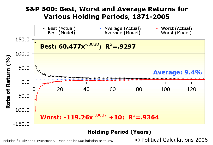
The rates of return presented above are annualized, and include full dividend re-investment that does not include commissions, fees, taxes or inflation. The points graphed are culled from the nominal returns for investments made in the S&P 500 index from 1871 through the end of 2005.
We find that in the historical data, the worst case nominal rate of return becomes positive for a 17-year holding period. Likewise, the worst case investment exceeds a 3.0% rate of return after 25 years and 5.0% after 36 years. These figures demonstrate the power of investing in a diversified pool of equities, as represented by the S&P 500 index, over long periods of time.
Where's the Tool?
Yes, we've developed a tool to do the math, but this post was long enough already! Look for it in days ahead here!...
Labels: best case, investing, SP 500, worst case
This week, the Carnival of Entrepreneurs makes a trimphant return to Political Calculations' On the Moneyed Midways, and we're happy to welcome the new Carnival of Business to the ranks of blog carnivals we scan for each week's edition!
Below, you'll find the top business, economics, personal finance, investing, marketing and frugal living posts for the week ending on Friday, May 12. For those visiting for the first time, On the Moneyed Midways is the best way to catch up with the best posts from each of the biggest money-related blog carnivals on the web, and is the only place you can find the blog post that has earned the title of being the Best Post of the Week, Anywhere!(TM)!
But enough about us - here are the best posts of the week:
| On the Moneyed Midways: May 12, 2006 | |||
|---|---|---|---|
| Carnival | Contributor | Post | Comment |
| Carnival of Business | Business Opportunities Blog | The Art of Sales | Making a customer happy, according to Marcus Markou, is the key to making a successful sale. |
| Carnival of the Capitalists | View from a Height | The USPS - Timely As Ever | Joshua Sharf's measures the pros and cons of the U.S. Post Office's recent proposal to issue "Forever" stamps |
| Carnival of the Capitalists | SOXfirst | Enron's Code of Ethics | Leon Gettler is back with an insightful take on Enron's code of ethics. |
| Carnival of Debt Reduction | Becoming and Staying Debt Free | Why Everyone Should Pay Off Their Mortgage Early | Kevin Surbaugh runs the numbers and frames the issue this way: "Paying off your mortgage early is always better, because 72 cents will always be more than 28 cents." |
| Carnival of Entrepreneurship | Awareness and Consciousness | Leadership | Kavit Haria shares his view on leadership and what defines a good leader. Simply The Best Post of the Week, Anywhere!(TM) |
| Carnival of Investing | Stock Market Beat | Starbucks vs. McDonalds | So, will you be ordering coffee or hamburgers for your investment portfolio? Trent compares the two businesses. |
| Carnival of Personal Finance | Paul's Tips | How to Get a Job Paying Over $100,000 a Year | Looking for a six-figure annual income? Paul provides a map for how to get there. |
| Festival of Frugality | Blueprint for Financial Prosperity | Brewing Your Own Good Beer on the Cheap | We couldn't find a better post to wrap up this week's OMM and kick off the weekend, as Jim finds the economy in home-brewing. |
Previous Editions
- On the Moneyed Midways – May 5, 2006
- On the Moneyed Midways – April 28, 2006
- On the Moneyed Midways – April 21, 2006
- On the Moneyed Midways – April 14, 2006
- On the Moneyed Midways – April 7, 2006
- On the Moneyed Midways – March 31, 2006
- On the Moneyed Midways – March 24, 2006
- On the Moneyed Midways – March 31, 2006
- On the Moneyed Midways – St. Patrick's Day 2006 Edition
- On the Moneyed Midways – March 10, 2006
- On the Moneyed Midways - The inaugural edition from March 3, 2006!
Time again for another edition of real medical notes augmented by real snarky comments! Let's go straight to the charts:
I saw your patient today, who is still under our car for physical therapy.
Well, okay they're changing our oil. You know how much I hate filling out the paperwork to bill the insurance company.
Patient was alert and unresponsive.
No doubt in a state of shock after seeing the bill.
Coming from Detroit, this man has no children.
[Insert Detroit joke here. Any Detroit joke.]
Exam of genitalia was completely negative except for the right foot.
At least now we know why the man's childless. Freaking mutants from Detroit....
The patient lives at home with his mother, father, and pet turtle, who is presently enrolled in day care three times a week.
Living in Detroit, the turtle is also registered to vote.
While in the emergency room, she was examined, x-rated and sent home.
What! You sent her home without calling me in for a consultation? What were you thinking?!!!
Between you and me, we ought to be able to get this lady pregnant.
Ah yes. Now you're thinking! But why are you taking off your right shoe?
The patient was prepped and raped in the usual manner.
Okay, now I'm thinking you'll be doing 15 to 20 in the big house.
When she fainted, her eyes rolled around the room.
Happens all the time. Just watch your step.
The patient suffers from occasional, constant, infrequent headaches.
It's the loose eyeballs. They're rattling around, I tell you!
She stated that she had been constipated for most of her life until 1989 when she got a divorce.
You know, in the old days, they would just "wash that man right out of their hair." Today, it's so different.
Bleeding started in the rectal area and continued all the way to Los Angeles.
The patient was married a pretty long time, huh?
Labels: health care, none really
Once again, you can find the best business, economics, personal finance, investing, marketing and frugal living posts from this week's major blog carnivals right here at Political Calculations' roundup On the Moneyed Midways. And once again, you can find the Best Post of the Week, Anywhere!(TM) here as well.
But what you can't find this week is a post from the Carnival of Entrepreneurs, who didn't have a host blog lined up! Hopefully they'll be back in action next week. In the meantime, here are the top posts of the week that was in Blog Carnival Land....
| On the Moneyed Midways: Cinco de Mayo 2006 Edition | |||
|---|---|---|---|
| Carnival | Contributor | Post | Comment |
| Carnival of the Capitalists | ExecuPundit | Lessons from Jerks | Michael Wade finds virtues where you would least expect them: the jerks with whom you work! The Best Post of the Week, Anywhere! |
| Carnival of the Capitalists | Gongol.com | The Gasoline Rebate | Brian Gongol examines whether the bad effects of a proposed gasoline tax rebate outweigh the good. |
| Carnival of the Capitalists | The Entrepreneurial Mind | The Highway to Success | Professor Jeff Cornwall reveals that even the most successful entrepreneurs skirt the edge of failure. |
| Carnival of Debt Reduction | Canadian Financial Stuff | Guilty as Charged: Fifteen Free Coffees | The Big Cajun Man has a Big Tim Horton's Coffee Addiction - which could be a good source for freeing up cash to pay off debt! |
| Carnival of Investing | It's Just Money | Top Ten Mistakes that Investors Make | lamoneyguy offers a countdown of the most common mistakes made by investors, whether novices or experienced. |
| Carnival of Marketing | Neuroscience Marketing | Decision Making and the Brain | Neuroguy reports that scientists have found the part of the brain that encodes economic values - can better marketing be far behind? |
| Carnival of Personal Finance | Firevalt | Cash Flows vs. Account Balances | Firevalt answers the question of which is more important - having a large account balance or a positive cash flow? |
| Festival of Frugality | It's Just Money | How Much Does Your Commute Cost? | We here at Political Calculations love it when people find useful tools on the web! lamoneyguy qualifies for a second slot in the OMM by finding a neat tool for determining how much you're spending on your commute - and here's the shocker: the recent run-up in gas prices doesn't have that big an effect! |
Previous Editions
- On the Moneyed Midways – April 28, 2006
- On the Moneyed Midways – April 21, 2006
- On the Moneyed Midways – April 14, 2006
- On the Moneyed Midways – April 7, 2006
- On the Moneyed Midways – March 31, 2006
- On the Moneyed Midways – March 24, 2006
- On the Moneyed Midways – March 31, 2006
- On the Moneyed Midways – St. Patrick's Day 2006 Edition
- On the Moneyed Midways – March 10, 2006
- On the Moneyed Midways - The inaugural edition from March 3, 2006!
Just in case the point that Betsy Newmark made yesterday about how increasing the taxes on things results in decreasing the supply of the things being taxed wasn't clear, here is Political Calculations' official supply and demand diagram showing the impact of increasing taxes on the supply of the item being taxed:

For those who missed Econ 101, note that in the diagram above, the consumer's demand didn't change. This is very true for products like oil and gasoline in the short-to-medium run (in the long run, people have time to adapt and find substitutes or become more efficient.) What did happen is that as the tax increase was imposed, it immediately reduced the ability of consumers to purchase the same quantity of the item being supplied as before. As a result, the available supply of the item will decrease to meet the artificially reduced demand.
Alternatively, the consumer could continue to purchase the same quantity as before, but must purchase lesser quantities of other items. That has negative consequences for other economic activity.
In the case of the windfall profit taxes discussed in Betsy's post, the effect is that the supply of oil in the market not only decreases, but also that the money that could otherwise have been used by the oil companies to expand production or to create incentives for future investment in the companies' productive capacity is instead routed to fund projects supported by a handful of special interest groups with strong political connections.
For that matter, we're talking about the same special interest groups who cannot convince enough consumers that their projects are worth investing in directly - projects like building large stadiums, installing art on public property, passenger railroad service or constructing highways and bridges to nowhere.
At worse, increased taxes not only reduce the supply of the item being taxed, but also results in less productive economic activity that results in less tax revenue which hinders the politicians' ability to reward their supportive special interest groups. Because the politicians are not looking out for consumers (read: everybody), they hike the taxes again to replace what they see as their "lost" revenue. And the cycle repeats ad nauseum (see Zimbabwe for a current example of what happens when taken to the full extreme.)
Labels: taxes
So, which industries siphoned the most jet fuel from the forward thrust of the U.S. economy in 2005?
Or rather, which industrial sectors of the Fortune 500 were the least profitable? Political Calculations has extracted the least profitable industries, as measured by their ratio of earnings-to-revenue from the Fortune 500 for 2005. The bottom 10 industries are ranked in the dynamic table below (which you may sort from low to high or high to low by clicking the column headings!).
As for the worst performing industry in 2005? Well, we gave that answer away already....
| Fortune 500: Least Profitable Industries in 2005 |
|---|
| Sectors | Revenues (millions $USD) | Profits (millions $USD) | Profits/ Revenue (%) |
|---|---|---|---|
| All U.S. Sectors | 4,851,909 | 551,908 | 06.7 |
| Entertainment | 0,143,056 | 002,709 | 01.9 |
| Advertising & Marketing | 0,018,366 | 000,328 | 01.8 |
| Food and Drug Stores | 0,295,410 | 005,207 | 01.8 |
| Auto Retail & Services | 0,060,781 | 001,030 | 01.7 |
| Wholesalers: Electronics & Office Equipment | 0,088,917 | 000,890 | 01.0 |
| Wholesalers: Health Care | 0,223,526 | 001,597 | 00.7 |
| Packaging, Containers | 0,065,606 | 000,024 | 00.0 |
| Motor Vehicles & Parts | 0,589,195 | -014,305 | -02.4 |
| Building Materials, Glass | 0,022,242 | -004,717 | -21.2 |
| Airlines | 0,100,091 | -028,259 | -28.2 |
Previously on Political Calculations
Welcome to the blogosphere's toolchest! Here, unlike other blogs dedicated to analyzing current events, we create easy-to-use, simple tools to do the math related to them so you can get in on the action too! If you would like to learn more about these tools, or if you would like to contribute ideas to develop for this blog, please e-mail us at:
ironman at politicalcalculations
Thanks in advance!
Closing values for previous trading day.
This site is primarily powered by:
CSS Validation

RSS Site Feed
JavaScript
The tools on this site are built using JavaScript. If you would like to learn more, one of the best free resources on the web is available at W3Schools.com.
Other Cool Resources
Blog Roll


