I recently came across stock market return data tracked and published by Crestmont Research. What makes Crestmont Research's presentation of data remarkable is the depth of information presented in the charts they've developed. Using their charts, you can quickly determine what the rate of return is for an investment made for any given full calendar year period, as well as whether or not the Price-to-Earnings (P/E) ratio ended higher or lower for the period. The charts available at Crestmont Research's web site cover the performance of the S&P 500 index from 1900 through 2004, including nominal, real (adjusted for inflation) as well as the impact of taxes upon investment returns.
The chart presented below, which you may select to link to the original 47KB PDF document, provides nominal rates of return for the S&P 500 index (including full reinvestment of dividends) for each full calendar year period from the beginning of 1900 through the end of 2004:
All in all, a very effective way of presenting 105 years worth of stock market performance data, including what rate of return could have been obtained on an investment made at the beginning of a calendar year for any given holding period of interest. But, that's not all - the folks at Crestmont Research have provided more data than they realize!
If you follow the diagonals in the chart, which run from the upper left to the lower right, you can see what the S&P 500 rates of return are for given holding periods. If you follow the left-most diagonal, you will have 105 points of data showing what the S&P has historically returned for a one-year holding period. If you follow the black diagonal line on the chart, you can quickly see the 20-year long rates of return for the S&P 500. And if you take this pattern to the extreme, at the upper right corner of the chart, you will have one point of data showing the S&P 500 rate of return for the 105 year investment holding period!
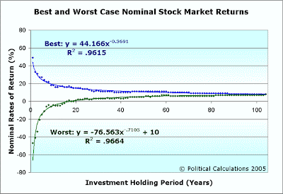
Why is this important? If you want to map the historical extremes of best and worst stock market performance, reading the diagonals on Crestmont Research's chart is one way you can go about doing it! Political Calculations has been reading the chart's diagonals and has found that the best and worst rates of return for any given holding period from one to 105 years may be mapped as follows:

Click the image for a larger version.
Update 10 October 2009: Better yet, click here for the latest version of this chart and tool!
The chart and formulas above map the extremes of the S&P 500 index's raw performance from 1900 through 2004, neglecting the effect of inflation and taxes upon investor returns, and also assuming that dividends have been fully invested. The corresponding rates of return approximated by the formulas in the chart above may be found by using the following tool:
Anyone wishing to see the effect of having the historical best or worst case rate of return of the S&P 500 for a given holding period may use the values generated by the calculator above in projecting the future value of their investment.
Update (10 October 2005): But what about mapping average rates of return for an investment in the S&P 500 Index?
Welcome to the blogosphere's toolchest! Here, unlike other blogs dedicated to analyzing current events, we create easy-to-use, simple tools to do the math related to them so you can get in on the action too! If you would like to learn more about these tools, or if you would like to contribute ideas to develop for this blog, please e-mail us at:
ironman at politicalcalculations
Thanks in advance!
Closing values for previous trading day.
This site is primarily powered by:
CSS Validation
RSS Site Feed
JavaScript
The tools on this site are built using JavaScript. If you would like to learn more, one of the best free resources on the web is available at W3Schools.com.
