While we were drafting yesterday's post on Australia's economy, we came across the following maps, which we've combined into one image. The top portion shows the geographic population density of Australia as of 30 June 2012, while the lower portion shows a habitability map that was drawn up about 90 years earlier.

It's surprising to see what has changed, and also what hasn't.
Labels: none really
Last week, economist Steve Keen went on record to predict that Australia's economy would fall into recession in 2017.
In doing that, Keen made a back-of-the-envelope calculation linking changes in the rate of private sector debt growth available with real economic growth available via an Excel spreadsheet.
We were intrigued by the math, so we've converted the spreadsheet math into the simple tool below, in which anyone can play with the numbers to predict how a nation's economic growth might change over the next year based on just a handful of factors.
The default numbers apply for the years 2016 and 2017 for Keen's Australia example, but you're more than welcome to substitute the numbers that apply for other nations or years of interest. If you're reading this article on a site that republishes our RSS news feed, please click here to access a working version of this tool!
In the tool above, "Current Nominal Credit Growth Rate" is the rate at which private sector debt increased from the previous period to reach its current value. The "Projected Nominal Credit Growth Rate" is the rate that would apply in the future period under consideration.
The reason why changes in the rate at which private sector debt grows would have predictive power for future economic performance comes down to why people in the private sector of the economy take on debt in the first place. It is because they reasonably expect to have sufficient income in the future where they will be able to make payments without significant problems.
As such, the forward-looking expectations that influence decisions to take on debt in the private sector, and consequently economic growth as a result, serve a similar role to what the expectations for earning dividends in the future do for setting the current and projecting the future value of stock prices. The math involved is certainly very similar.
As for Steve Keen's recession call for Australia, we should caution that he has been famously wrong before, particularly with respect to Australian housing prices, yet at the time he made that ill-fated prediction, the impact of China's massive economic stimulus on the strength of Australia's resource-exporting economy was an unknown factor. China's stimulus worked to significantly boost Australia's economy in 2009 and 2010, helping the nation to avoid falling into recession at that time, which in turn, also helped sustain housing prices.
The rapid deceleration of China's economy today as the remnants of that previous stimulus effort evaporate provides a good argument in support of why a recession in Australia's future has become increasingly likely at this time.
It will be interesting to see what factors might intervene to either forestall or accelerate that scenario. Having gone 25 years without an official period of recession, Australia certainly has lived up to its reputation as the "Lucky Country" through this point in time.
Update 30 March 2016 9:46 PM EDT: Steve Keen e-mails a clarification - the output variables in the tool above have been reidentified as nominal and real aggregate demand growth rates rather than as GDP growth rates. It's a subtle difference, but a distinct one that better describes the tool's output!
Previously on Political Calculations
- The Position, Velocity and Acceleration of Private Debt in the U.S.
- The Correlation Between Decelerating Debt and Falling GDP
- QE and the Acceleration of Private Debt in the U.S.
- Private Debt Decelerates in 2015Q3, Real U.S. GDP Follows
- Slowing Private Sector Debt and the Slowing Economy

Labels: debt, gdp, gdp forecast, recession, recession forecast, tool
The following chart shows the recent past and the expected future for the S&P 500's dividends per share, spanning 2015-Q1 through 2017-Q1.

Typically, the greatest mismatch between the expected future for the S&P 500's dividends per share and the actual dividends per share recorded by Standard and Poor occur in the first and fourth quarter of each year.
While these quarters are the ones in which firms are the most likely to announce changes to their dividend policies, the disparity between the available futures for a given quarter and its actual reading is also affected by the mismatch in the terms of calendar quarters, which S&P follows, and the terms of dividend futures contracts, which end on the third Friday of the month ending a given calendar quarter.
And in the case of IndexArb's dividend futures data, that's complicated by the data's "countdown" reporting format, where each future quarter's data represents the expected total amount of dividends that will be paid out by the end of the dividend futures contract associated with it.
Here, the value of a given quarter's expected dividends per share must be determined by the difference between the dividends for that quarter and the quarter immediately preceding it, which isn't possible to calculate for the current quarter. As a result, the last reading we are able to find using this data source represents the future that was predicted some 14 to 15 weeks before the end of a given quarter.
For more information, as well as links to sources for all data, see our previous posts on the topic.
Labels: dividends, forecasting
Before we begin, let's recall, as we did last week and the week before, what it was that we said three weeks ago in comparing what our S&P 500 forecasting model was projecting would be the apparent trajectory of stock prices for March 2016 versus what we predicted that they actually would follow:
That's also true for the projections for the remainder of March 2016, which suggest that stock prices are in for a rough ride before recovering. However, that apparent trajectory is really an artifact of the historic stock prices we use in our model to project their future trajectory, and as such, it is an echo of past volatility, which means that our model will be less accurate until that echo subsides....
So can we predict where stock prices are likely to go next?
Of course we can!... Provided investors keep their forward-looking focus on 2016-Q4 in making their current day investing decisions, we can expect that the S&P 500 will continue to track largely sideways (plus or minus 3% of their current value of just under 2000), through the end of March 2016.
Our override forecast, that the S&P 500 would be most likely to trade in range between 1940 and 2060 (or rather, 2000 plus or minus 3%) over nearly the whole month of March 2016 is still holding!

With just four days left to go in March 2016, we're content to let that predictive bet for the future of the S&P 500 continue to ride in Wall Street's casino as the clock for the month runs down.
That said, let's review the major market moving news from the Good Friday holiday-shortened fourth week of March 2016, starting with a recap of the news we previously covered for Monday, 21 March 2016 in our previous edition.
- 21 March 2016:
- Fed's Lacker says he is confident inflation will return to 2 percent - And now, the jawboning begins. The Fed is trying to reign in some of the impact of its previous announcement.
- Fed's Williams downplays soft U.S. market inflation measures: MNI
- Dollar rises as market moves past dovish Fed rate views - Reality check: Sooner or later, other nations adapt to minimize the relative advantage of a currency manipulation.
- Fed's Lockhart says rate hike possible at April meeting
- Stocks dip, dollar advances in wake of Fed comments
- Wall St. ends flat as recent rally spurs caution - Technically, stock prices ended up on the day, although by a small amount.
- 22 March 2016:
- Fed's Evans says he sees two rate hikes this year
- As Fed eyes two rate hikes, dovish Evans is no longer fringe
- Wall St. down but pares losses after Brussels blasts - Someone is already likely checking up on this hypothesis, be we think that incidents of terrorism are having less and less of an impact on markets - not that they ever had much of an impact to begin with.
- 23 March 2016:
- Bullard Says Jobless Decline May Warrant Faster Rate Hikes Later - the relative impotence of terrorists quickly becomes clear when compared to the market moving power of the St. Louis Fed president.
- Wall Street rally fizzles out as oil, materials fall - Or, as Bullard intended with his comments, stock prices fall. This is how Fed officials use forward guidance to move markets - they focus investors on a particular point of time in the future, and stock prices adapt accordingly, or rather, their values change to be in tune with the expectations for dividends that will be earned at that particular point of time. Although Robert Shiller would call these kinds of changes in stock prices "irrational", it really does reflect an underlying order in the chaos of how stock prices behave, with investors rationally responding to new information as prescribed by Eugene Fama's theories, with the magnitude of the movements corresponding to the relative distance between where stock prices are with where the expectations associated with the alternative future point of time would place them. So far as we know, we're the only ones to ever develop a coherent theory of how stock prices work that successfully reconciles the otherwise conflicting Nobel-prize winning theories of both Fama and Shiller.
- 24 March 2016:
- Another U.S. rate hike may be around corner: Fed's Bullard
- Wall St. closes flat, five-week rally ends - but not as low as you would think. That suggests that investors aren't completely buying what Fed officials are selling. Certainly not another rate hike in April or June 2016 as yet, which we would see in the form of stock prices being driven considerably lower. We think that investors are looking at 2016-Q3 as being more likely for the timing of the Fed's next rate hike, but we don't yet have clear signal to differentiate it from 2016-Q4.
As for getting a clearer signal with our futures-based model of the S&P 500's stock prices, we should have that by the second week of April 2016.
Update 30 March 2016: Dammit, Janet! It looks like Janet Yellen's dollar weakening and new QE-hinting statement yesterday, which completely contradicted the scenario that other Fed officials had been trying to sell, prompted stock prices to rise to where the S&P 500 might poke above the 2060 mark as early as today as her statement succeeded in fully focusing investors on 2016-Q4. Now, simple noise would be enough to push stock prices over that mark, which would break our nearly month-long prediction streak. Just how seriously did you screw up the whole rate hike thing, U.S. Federal Reserve?!
It is looking more and more like the market for new homes in the U.S. is did indeed reached a top in the fourth quarter of 2015.
We base that observation on our calculation of the market capitalization of new homes sold in the U.S., where we've multiplied the average prices of new homes sold by the number of new homes sold, then adjusting the results to account for the effects of inflation as measured by the Consumer Price Index for All Urban Consumers in All Cities. The results of our math are shown in the following chart.

The data for both the price and quantity of new home sales for the most recent three months (December 2015 through February 2016) will continue to be revised over the next several months as more information about the sales of new homes that occurred during these months becomes available.
With data through November 2015 however, we think we can make the call that the growth of the market for new homes in the U.S. has flattened out in real terms.
In nominal terms however, if we don't consider the most recent months that are still subject to revision, the growth of the market capitalization of new homes in the U.S. decelerated in mid-2015, but has not stalled out.

Which chart between real and nominal data do you suppose is telling a more accurate story about the relative health of the U.S. new home market?
Data Sources
U.S. Census Bureau. New Residential Sales Historical Data. Houses Sold. [Excel Spreadsheet]. Accessed 23 March 2016.
U.S. Census Bureau. New Residential Sales Historical Data. Median and Average Sale Price of Houses Sold. [Excel Spreadsheet]. Accessed 23 March 2016.
U.S. Department of Labor Bureau of Labor Statistics. Consumer Price Index, All Urban Consumers - (CPI-U), U.S. City Average, All Items, 1982-84=100. [Online Application]. Accessed 23 March 2016.
Labels: real estate
Did you know that there was no open-market price for silver in the United States in the period from 2 April 1792 until 12 February 1873?
It's true! From 2 April 1792 to 27 June 1834, the price of silver was set by the U.S. government so that it would take 15 ounces of silver to be equal to one ounce of gold. Then, in the two and a half years from 28 June 1834 to 17 January 1837, it was reset so that it took 16.002 ounces of silver to equal 1 ounce of gold. And then, from 18 January 1837 through 12 February 1873, it was tweaked slightly so that 15.988 ounces of silver would be equivalent in value to a single ounce of gold.
But after that point in time, except for a dark period that ran from 9 August 1934 until 18 May 1967 when the U.S. acted to nationalize and to artificially set the price of silver in the market, the price of silver has largely been determined through open trading in a worldwide market. Not uncoincidentally, it stopped setting the price of silver almost a year after the U.S. Mint coined its last dimes, quarters and half dollars with the metal.
As an interesting side note, the dimes, quarters and half dollars minted from silver in 1965 and 1966 were made using the same dies created to produce these coins in 1964, so they are marked with that year.
We thought it might make for a fun project to track the average monthly nominal price of silver in terms of U.S. dollars for the period in which it was traded in the open-market. Unfortunately, we were only able to find monthly data back to July 1878, so there is a gap in the historical records that we're still looking to fill (yes, we have the annual data, but it's just not the same). In the meantime, we've begun visualizing the data - our first chart below shows the evolution of silver prices in the period from January 1880 through December 2015 in linear scale, against which we've also shown the periods in which the National Bureau of Economic Research determined the U.S. economy was in recession. In case you're wondering about why 1880 through 2015, it's because graphing a whole 135 years worth of prices is easier than graphing all the 136 years and 8 months worth of prices we were able to collect!
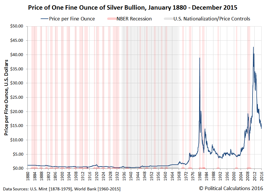
The linear scale in the chart above really doesn't do justice to the changes in silver prices over those 135 years, particularly in the years before 1968, so to get a better sense of the percentage swings that took place over all this time, only a logarithmic scale can properly visualize the story.

And there you have it. Believe it or not, this post is actually part of our Tomato Soup project, where we'll be comparing the nominal prices of the two over their shared history, which should help anyone who doesn't have a firm grasp of why such nominal data is important better understand the kinds of insights that can be gained from both having and presenting it!
Speaking of which, if you would like to use our historic silver price data to support your own projects, just click the link for our Excel spreadsheet. As long as you follow the terms of our copyright in the spreadsheet, we grant you permission to use or reprint both the data in the spreadsheet and charts in this post that are derived from that data as you like! And as a bonus, you'll also find direct links to all the original sources we accessed to obtain the detailed price data.
Update 24 March 2016: For more market history of the price of silver, at least with respect to the price of gold, check out Nathan Lewis' 2013 article The Silver:Gold Ratio, 1687-2011.
In the article, Lewis cites the historic value of silver to gold as being typically between a ratio of 15 or 16 to 1. If we were just looking at the relative abundance of silver and gold in the Earth's crust, the Geological Society of America's Geoscience Handbook estimates the ratio of silver to gold to be 17.5 to 1. While the current edition is available on Amazon, the fifth edition of the handbook is expected to be published in May 2016.
Reference
Political Calculations. Average Monthly Silver Prices. [Excel Spreadsheet]. 22 March 2016. Available data as of 22 March 2016 spans July 1878 through February 2016.
Labels: data visualization, economics, inflation
As we did last week, we'll begin by reminding you of what we said back in the first week of March 2016 before you look at our updated chart showing the actual trajectory of the S&P 500 against the alternative trajectories of what our futures-based model forecast:
That's also true for the projections for the remainder of March 2016, which suggest that stock prices are in for a rough ride before recovering. However, that apparent trajectory is really an artifact of the historic stock prices we use in our model to project their future trajectory, and as such, it is an echo of past volatility, which means that our model will be less accurate until that echo subsides....
So can we predict where stock prices are likely to go next?
Of course we can!... Provided investors keep their forward-looking focus on 2016-Q4 in making their current day investing decisions, we can expect that the S&P 500 will continue to track largely sideways (plus or minus 3% of their current value of just under 2000), through the end of March 2016.
It looks like we're going to skate the upper edge of our impromptu prediction this week, and its quite possible that the S&P 500 will poke above that range before the end of the month.

The big change in this chart from the previous version is that it now reflects the expected dividends that will be paid in 2017-Q1, which the implied forward dividend futures (CBOE: DVMR) for that distant quarter have initially pegged at 11.95 per share.
In terms of the acceleration of dividends, that future quarter is approximately on par with 2016-Q4.
As a result, the potential volatility of stock prices through the upcoming quarter will be much less than what took place during the first half of 2016-Q1, since the spread between the alternative future trajectories of the S&P 500 is narrower.
Because we're nearing the end of the quarter, let's look past it to see what lies ahead:

We anticipate that the echo of past volatility affecting the unadjusted accuracy of our model will subside in the second week of April 2016. In the meantime, if you connect the dots for the trajectory for 2016-Q4 on both sides of the echo, and factor in the typical daily volatility range of plus or minus 3%, you pretty much have what our model would forecast for the S&P 500 in the absence of the echo event.
The major market driving headlines for the week are listed below, along with our notes for the week.
- 14 March 2016:
- In a relief for Fed, U.S. inflation survey rebounds
- Crude drops; dollar gains with eyes on central banks - The value of the dollar is the story to pay attention to this week. Mind what happens on Wednesday after the Fed meets….
- Wall St. ends flat as Fed meeting looms
- 15 March 2016:
- U.S. business inventories rise as sales remain weak
- Wall St. dips as healthcare lags before Fed statement
- 16 March 2016:
- Fed seen holding U.S. rates for now, leaving door open for June hike - This is the expectation that investors had going into the FOMC's March meeting.
- Traders see fewer U.S. rate hikes after Fed forecast - This is the expectation that changed after the FOMC's post-meeting announcement.
- Dollar slides, stocks rise after dovish Fed statement - This is the outcome of the Fed's decision. In effect, the Fed acted to devalue the U.S. dollar, which is what sent stock prices up.
- 17 March 2016:
- Fed signals send dollar lower as Europe returns - More fallout….
- Yellen steers Fed with cautious hand, despite hints of inflation
- Dow closes positive for year as commodities rally, dollar dives - Reality check: It's good for commodities like oil and metals, and a falling dollar is good for U.S. manufacturers….
- 18 March 2016:
- Dollar bounces but down for third straight week - … but that's only true if other currencies don't fall as much.
- Struggling U.S. oil and gas companies eye rare financing deals - Reality check: Exotic financing schemes are an indication of distress for a firm, not strength….
- 21 March 2016:
- Fed's Lacker says he is confident inflation will return to 2 percent - And now, the jawboning begins. The Fed is trying to reign in some of the impact of its previous announcement.
- Fed's Williams downplays soft U.S. market inflation measures: MNI
- Dollar rises as market moves past dovish Fed rate views - Reality check: Sooner or later, other nations adapt to minimize the relative advantage of a currency manipulation.
- Fed's Lockhart says rate hike possible at April meeting
- Stocks dip, dollar advances in wake of Fed comments
- Wall St. ends flat as recent rally spurs caution - Technically, stock prices ended up on the day, although by a small amount.
It occurs to us that if investors were to suddenly focus on 2016-Q2, now the worst of the alternative trajectories for the future of stock prices, the S&P 500 could drop by 200 points on very short notice. Which is something could happen if Fed officials were to regain enough credibility to have the possibility of a rate hike in 2016-Q2 taken seriously. (Despite their comments from Monday, 21 March 2016, they're not there yet....)
Because all the other trajectories are more positive than that one, one trading strategy that an investor might consider to take advantage of such a situation, without playing around with options or shorting the market, would be to place a limit order to buy long near that level, and then sell when investors shift their attention to a more distant future quarter.
That would assume little risk from changes in expectations for future dividends or a noise event that would send stock prices on a different trajectory, so paying attention to what stock prices are doing with respect to their alternative future trajectories would be required.
We're delaying our weekly look at the S&P 500's performance in the previous week by a day because sometime later today, we'll get our first look at what the expectations for dividends are for the first quarter of 2017.
So as we're stalling for time, we thought it might be interesting to update our chart showing the cumulative number of U.S. firms that have announced ordinary dividend cuts during the current quarter of 2016-Q1 through Friday, 18 March 2016, which we'll compare to the year ago quarter of 2015-Q1.
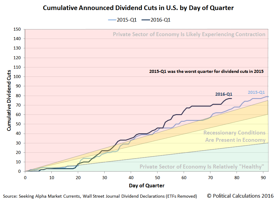
Since the last time we updated this chart at the beginning of March 2016, we see that U.S. firms in 2016-Q1 continue to be following a more distressful path than did U.S. firms in 2015-Q1, which itself was the worst quarter for dividend cuts in all of 2015.
Moreover, we see that the main difference between the quarters has set in since Day 50 (19 February 2016) of the current quarter. We thought it might be interesting to see which firms have announced dividend cuts in the past month - our results are presented in the table below.
| Publicly Traded U.S. Companies Cutting Dividends Since 19 February 2016 | |||||
|---|---|---|---|---|---|
| Date | Company | Symbol | Old Dividends per Share | New Dividends per Share | Percent Change |
| 19-Feb-2016 | Yamana Gold | AUY | $0.01500 | $0.00500 | -66.7% |
| 19-Feb-2016 | GAMCO Investors CL A | GBL | $0.07000 | $0.02000 | -71.4% |
| 22-Feb-2016 | Cross Timbers Royalty Trust | CRT | $0.16870 | $0.07202 | -57.3% |
| 22-Feb-2016 | Enduro Royalty Trust | NDRO | $0.02984 | $0.02431 | -18.5% |
| 22-Feb-2016 | Magic Software | MGIC | $0.09500 | $0.09000 | -5.3% |
| 22-Feb-2016 | Enerplus Corp | ERF | $0.03000 | $0.01000 | -66.7% |
| 22-Feb-2016 | First Potomac Realty Trust | FPO | $0.60000 | $0.40000 | -33.3% |
| 22-Feb-2016 | Mesa Royalty Trust | MTR | $0.04607 | $0.02375 | -48.4% |
| 23-Feb-2016 | Cimarex Energy | XEC | $0.10600 | $0.08000 | -24.5% |
| 23-Feb-2016 | Extended Stay America | STAY | $0.19000 | $0.17000 | -10.5% |
| 24-Feb-2016 | Tronox | TROX | $0.25000 | $0.04500 | -82.0% |
| 25-Feb-2016 | Newtek Business Services | NEWT | $0.40000 | $0.35000 | -12.5% |
| 25-Feb-2016 | Northstar Realty Finance Corp | NRF | $0.75000 | $0.40000 | -46.7% |
| 25-Feb-2016 | Gulf Island Fabrication | GIFI | $0.10000 | $0.01000 | -90.0% |
| 25-Feb-2016 | PHX Energy Services | PHXHF | $0.00700 | $0.00000 | -100.0% |
| 26-Feb-2016 | Acacia Research | ACTG | $0.12500 | $0.00000 | -100.0% |
| 29-Feb-2016 | Gramercy Property Trust | GPT | $0.12850 | $0.11000 | -13.7% |
| 29-Feb-2016 | NRG Energy | NRG | $0.14500 | $0.03000 | -79.3% |
| 29-Feb-2016 | Range Resources | RRC | $0.04000 | $0.02000 | -50.0% |
| 29-Feb-2016 | Golar LNG | GLNG | $0.45000 | $0.05000 | -88.9% |
| 1-Mar-2016 | Tesco | TESO | $0.05800 | $0.00000 | -100.0% |
| 1-Mar-2016 | Global Ship Lease | GSL | $0.10000 | $0.00000 | -100.0% |
| 1-Mar-2016 | CONSOL Energy | CNX | $0.01000 | $0.00000 | -100.0% |
| 3-Mar-2016 | BAB | BABB | $0.03000 | $0.01000 | -66.7% |
| 3-Mar-2016 | Ampco-Pittsburgh | AP | $0.18000 | $0.09000 | -50.0% |
| 11-Mar-2016 | Equity Residential | EQR | $0.55250 | $0.50375 | -8.8% |
| 11-Mar-2016 | Federal Agricultural Mortgage Corporation | AGM-A | $0.36720 | $0.26000 | -29.2% |
| 15-Mar-2016 | Elmer Bancorp | ELMA | $0.33000 | $0.30000 | -9.1% |
| 15-Mar-2016 | Two Harbors Investment | TWO | $0.26000 | $0.23000 | -11.5% |
| 15-Mar-2016 | OHA Investment | OHAI | $0.12000 | $0.06000 | -50.0% |
| 16-Mar-2016 | Conrad Industries | CNRD | $0.25000 | $0.10000 | -60.0% |
| 16-Mar-2016 | OCI Partners | OCIP | $0.41000 | $0.32000 | -22.0% |
| 17-Mar-2016 | Dynex Capital | DX | $0.24000 | $0.21000 | -12.5% |
Sharp eyed readers comparing this listing to our previous version will note that we have adjusted the size of the dividend cut shown for Gramercy Property Trust (NYSE: GPT), as we later found that the amount of the firm's previously reported dividend cut was really an artifact of its reverse merger with Chamber Street Properties (NYSE: CSG), which affected the number of outstanding shares.
Looking over the list of 33 dividend cutting firms, we find that 9 are in the oil industry (27.3%), 6 are Real Estate Investment Trusts (18.2%) and 5 are in the finance sector (15.2%), which together account for nearly 61% of all dividend cuts that we have been able to identify from our news sources in the month since 19 February 2016. Of the remainder, 3 are mining firms (9.1%), there are 2 each for technology, shipping, and manufacturing firms (18.3%) and 1 each for the hotel, chemical, utility, and restaurant industries.
By comparison, our news sources identify 22 firms that announced they would reduce their dividends between 19 February 2015 and 18 March 2015. Of these dividend cutting firms from a year ago, 10 were in the oil and gas industry (45.5%), 4 were in the finance sector (18.2) and 3 were REITs (13.6%). There were 1 each for firms representing the technology, shipping, mining, aerospace, and materials industries.
It's quite a different, and longer, list.
Data Sources
Seeking Alpha Market Currents Dividend News. [Online Database]. Accessed 18 March 2016.
Wall Street Journal. Dividend Declarations. [Online Database]. Accessed 18 March 2016.
Notes
Some readers have remarked that our previous listings of firms that have announced dividend cuts include firms that pay variable distributions rather than set dividends. To be honest, that's a distinction without much of a meaningful difference where dividend cut announcements are involved. When times are good, such firms automatically distribute increasing dividend payments to their shareholders and when times are bad, they automatically reduce those payments. They are simply more responsive to the economic conditions that exist in their markets.
As such, since dividends are the primary fundamental driver of stock prices, the stock prices of these firms will tend to be more volatile than firms that more firmly fix the expectations for their future dividend payments.
That factor is a big reason for the relative stability of U.S. stock prices as compared to Chinese stock prices. Chinese firms tend to set their dividend payments as a simple percentage of their earnings, while U.S. firms tend to set them independently of their earnings.
Which is why U.S. stock market earnings can crash without necessarily taking stock prices down with them as would seem to be predicted by such metrics as Shiller's CAPE Ratio. China's government-directed financial institutions could have spent a heck of a lot less money to prop up that nation's stock markets by simply having Chinese firms set their dividends independently of their earnings and underwriting those payments to investors instead of the outright stock purchases they chose to make instead.
Several weeks ago, we compared the box office performance of the movie Deadpool against its eight 2015 Best Picture Academy Award-nominated peers. Back then, we found that the scrappy Deadpool beat all eight films through its first week of release.
Today, we're producing the sequel to that original story, where this time, we find that the eight Best Picture nominees of 2015 have struck back, taking the cumulative box office crown away from 2016's Deadpool.

It really shouldn't be a surprise, but you should always expect that eight movies, even 2015's Best Picture nominees, will combine to make more money at the box office than just one movie.
The real story here is how the eight 2015 Best Picture nominees did it. Basically, they added another 8,400 theaters in their third week of release to their previous week's total of 10,487, dwarfing the peak of 3,836 for Deadpool by nearly a factor of 5.
And then, in their fourth week of release, they added another 566.
It was like one of those cliché fight scenes in a superhero movie where the evil league of supervillains start fighting really dirty by ordering their henchmen to "sic 'em" in the hopes of overwhelming their greatly outnumbered foe.
But what if the odds were equalized? What if we calculated the average gross per theater for each day of release for all these movies, and then compared their box office prowess, mano a mano?
Here's the chart showing the results of that daily calculation for the first four weeks of release for Deadpool and the eight 2015 Best Picture nominees.

And here's how it looks when we add up the cumulative average box office per theater take.
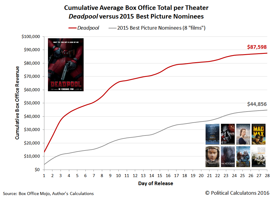
In this last chart, we confirm that Deadpool is nearly twice the movie that the eight Best Picture nominees of 2015 are where performance in Hollywood matters most. At the box office.
But here's the best part - the winner of the Academy Award for Best Picture and Pretentiousness in 2015, Spotlight, is going to have a sequel. So at some point in the future, we're going to get a rematch. Alas, without The Revenant 2.
Just like in the movies!
Labels: academy awards, business, movies
According to CBS MarketWatch, approximately 40% of bonds issued by European governments "sport negative yields", which is to say for the people who lend money to these governments, they are guaranteed to lose money on their investments rather than to make money.
The BBC's Andrew Walker considers it to be something like Alice's adventures in Financial Wonderland:Think about what interest is. The lender gets paid interest for allowing someone else to use their money. But when the rate goes below zero the relationship is turned on its head. The lender is now paying the borrower. Why would anyone do that?
Indeed. Why would anyone do that? Why not just burn cash instead?

Walker explores two potential reasons that would apply to those lending money to governments at negative rates of interest:
- Investors are banking on the central bank buying them up as part of their next Quantitative Easing (QE) program.
- Foreign investors are buying them up because they're really engaged in currency speculation, where they count on the issuing government's currency to rise enough to compensate for the negative yield.
But that can't possibly be all there is! We thought we'd consider some other possibilities.
A third reason might be that all the other things they might do with their funds would provide an even worse rate of return. Which is to say that they are so extremely pessimistic about the opportunities available to them that they are rejecting them completely. But if this reason were the case, why not just sit on cash or some other asset that can be expected to hold its value?
A fourth reason would be to deliberately earn a guaranteed negative income to offset other, more positive income and reduce their potential tax liabilities, where they are in effect sheltering the income they earn from other, better investment opportunities from being subjected to unreasonably high tax rates. The key here would be to get their income below the threshold that would define a particular marginal tax rate level or perhaps even a threshold that defines whether they would be eligible for some subsidy benefit.
A fifth reason takes inflation into account. Or rather, deflation. Here an investor who chooses to buy government bonds with negative yields could come out ahead, in real terms, if they reasonably expect that the rate of inflation over the term of the bond's life will be even more negative.
That's what we could come up with as we were writing up this post. We're sure there are other reasons why an individual or firm would actually choose to lend money to a government for a negative rate of return.
But perhaps a better question to ask is what does a government gain by borrowing money at a negative interest rate? Isn't that the same as saying that the government is going to default on its debt and won't even try to pay back the amount that it has borrowed, but promises that it will absolutely, positively pay back "this much"?
We suppose that's one way to get the growth of the national debt under some semblance of control....
Update 18 April 2016: One of our sharp readers added some additional insight into why an investor might choose to buy a negative-yielding investment:
If you are holding a near zero interest rate bond, when the government issues negative rate bonds, the par value goes up on your low interest bond. A tidy profit on the capital gain. You might buy a negative rate bond betting on the rate going lower and pay the monthly interest as a fee to participate in gaming the system.
They also took an a bigger question: "What is the real reason to have negative interest rates?"
The real reason for negative interest rates: The Treasury sells the bond on the open market via the auction. Who buys? The banks and brokerage houses who in turn sell it to the Fed on the secondary market to mask via a wash sale who is really buying the bonds. With what does the Fed buy this bond? Electronic ones and zeros they pull out of the ether in the form of a wire transfer. Hence, no excess physical printing of money which is why hyper-inflation has not shown it's ugly face. This is how the Fed feeds/lends money to a deficit spending government.
Additionally, the Fed paying negative interest rates then gets to magically reduce its balance sheets by paying this money to the government as well to help magically pay down the Treasury's own debt pile or just waste it on more spending.
Imagine this scheme if you will: The US Treasury charges a 5% negative rate, the Fed buys the bond to give the Treasury the principal. In how many years will the Fed pay off the bond with the Treasury *IF* the Treasury applies this interest to the principal of other bonds? The rule of 72 says, (72/5) 14.4 years, a doubling, which means both the negative rate bond and another bond will be paid off in full merely using the interest rate payments.
Taken that way, negative interest rates might best be considered to be really severe form of financial repression, intended to benefit overindebted governments and the banks that control them at the expense of ordinary people.
It would seem that the obvious alternative of stopping doing stupid things and cleaning up their acts is just too much to ask of some government/bank industrial complexes.
Labels: debt, investing, national debt, risk
The U.S. Federal Reserve released its latest Flow of Funds report for the U.S. economy on 10 March 2016. Let's run through a short checklist to see what it tells us of the relative health of the U.S. economy....
Falling or negative acceleration of private sector debt?
Check.
Falling real GDP growth rate?
Check.
Let's go to the chart....

If you look closely at the latest data in the chart above, there is reason for optimism. The rate at which the acceleration of private sector debt in the U.S. is falling is itself decelerating, or at least it was through the final quarter of 2015. That positive jerk (or impulse), if sustained, points to a higher real GDP growth rate for the U.S. economy in the near future.
Previously on Political Calculations
- The Position, Velocity and Acceleration of Private Debt in the U.S.
- The Correlation Between Decelerating Debt and Falling GDP
- QE and the Acceleration of Private Debt in the U.S.
- Private Debt Decelerates in 2015Q3, Real U.S. GDP Follows
Data Sources
U.S. Federal Reserve. Data Download Program. Z.1 Statistical Release (Total Liabilities for All Sectors, Rest of the World, State and Local Governments Excluding Employee Retirement Funds, Federal Government). 1951Q4 - 2015Q4. [Online Database]. 10 March 2016. Accessed 10 March 2016.
U.S. Bureau of Economic Analysis. Table 1.1.1. Percent Change from Preceding Period in Real Gross Domestic Product. 1947Q1 through 2015Q4 (second estimate). [Online Database]. Accessed 10 March 2016.
Welcome to the blogosphere's toolchest! Here, unlike other blogs dedicated to analyzing current events, we create easy-to-use, simple tools to do the math related to them so you can get in on the action too! If you would like to learn more about these tools, or if you would like to contribute ideas to develop for this blog, please e-mail us at:
ironman at politicalcalculations
Thanks in advance!
Closing values for previous trading day.
This site is primarily powered by:
CSS Validation

RSS Site Feed
JavaScript
The tools on this site are built using JavaScript. If you would like to learn more, one of the best free resources on the web is available at W3Schools.com.
Other Cool Resources
Blog Roll


