While we were drafting yesterday's post on Australia's economy, we came across the following maps, which we've combined into one image. The top portion shows the geographic population density of Australia as of 30 June 2012, while the lower portion shows a habitability map that was drawn up about 90 years earlier.
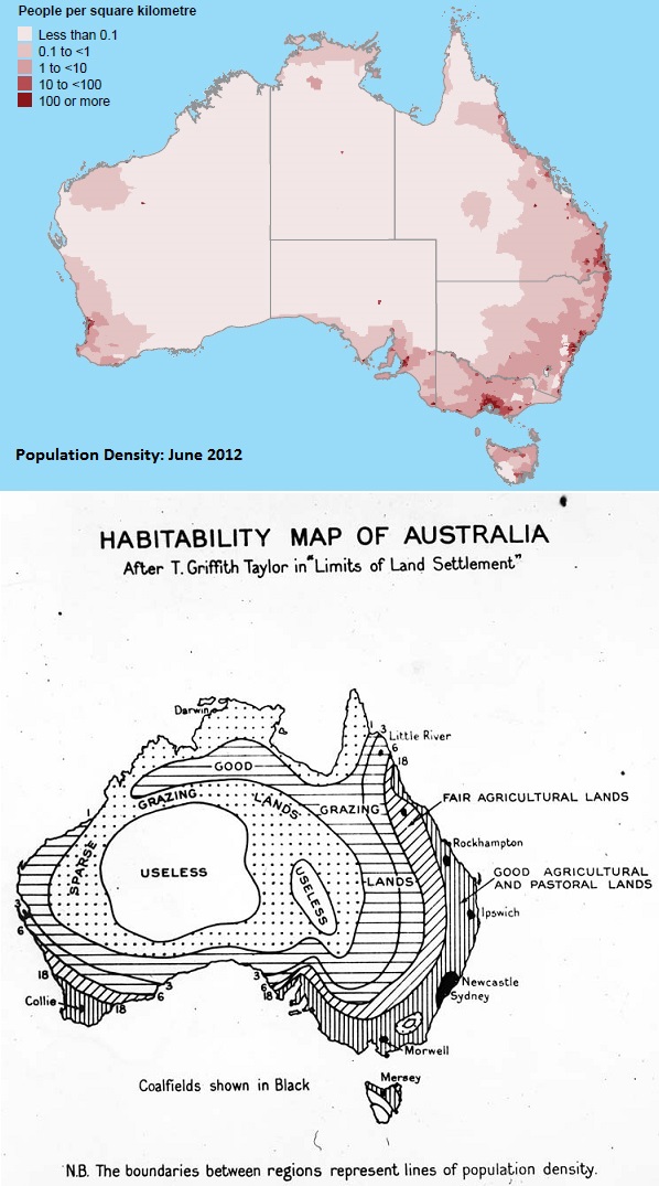
It's surprising to see what has changed, and also what hasn't.
Labels: none really
Welcome to the blogosphere's toolchest! Here, unlike other blogs dedicated to analyzing current events, we create easy-to-use, simple tools to do the math related to them so you can get in on the action too! If you would like to learn more about these tools, or if you would like to contribute ideas to develop for this blog, please e-mail us at:
ironman at politicalcalculations
Thanks in advance!
Closing values for previous trading day.
This site is primarily powered by:
CSS Validation

RSS Site Feed
JavaScript
The tools on this site are built using JavaScript. If you would like to learn more, one of the best free resources on the web is available at W3Schools.com.
Other Cool Resources
Blog Roll


