With 2021 just about over, it's time to celebrate the year's biggest stories in math!
Because we're of a practical bent, we seek out maths stories that involve doing math to do things, whether that's making progress toward resolving long-standing questions, developing practical applications, or otherwise impacting the real world. We've provided deeper information about the topics covered in our summary of 2021's biggest math stories where we can, so be sure to follow the links if you want to learn more.
We'll also identify what we think qualifies as the biggest math story of the year. Buckle up, it's time to get started!...
Making Connections with Sheaves
What better way to start than with the biggest pure mathematics story of 2021? Mathematicians Laurent Fargues and Peter Scholze made significant progress toward achieving one of the goals of the Langlands Program, which seeks to develop a grand unified theory of mathematics by connecting seemingly separate branches of math. Their achievement provides a means of translating the math of p-adic groups to Galois groups using sheaves, which are special tools that can connect local and global properties within a geometric or topological space.
The featured video lecture in this section will provide a basic introduction to them, but you'll have to make it through to the 51-minute mark before they're even introduced because of having to go through the foundational material it takes to get there. And then, there are at least four more video lectures that follow it to build on the concept!
Fargues and Scholze's achievement represents something of a halfway point in the Langlands Program's quest, because the challenge of starting with the math of Galois groups and going in the opposite direction to translate it into p-adic groups remains. But the tool they used to pull off their accomplishment has turned up in a more practical application as well.
Robert Ghrist and Jakob Hansen utilized sheaves to develop a new mathematical model for more realistically model how opinions are disseminated over social networks, where they also deployed the math of Laplacian operators and diffusion dynamics.
To do this, Ghrist and Hansen used topological tools called sheaves, previously used in their group. Sheaves are algebraic data structures, or collections of vector spaces, that are tethered to a network and link information to individual nodes or edges. Using a transportation network as an illustrative example, where train stations are nodes and the tracks are the edges, sheaves are used to carry information about the network, such as passenger counts or the number of on-time departures, not only for specific stations but also on the connections between stations.
"These vector spaces can have different features and dimensions, and they can encode different quantities and types of information," says Ghrist. "So the sheave consists of collections of vectors over top of each node and each edge with matrices that connect them all together. Collectively, this is a big data structure floating over top of your network."...
By incorporating Laplacians into their "discourse sheaves," the researchers were able to create an opinion dynamics model that was incredibly flexible and able to incorporate a wide variety of scenarios, parameters, and features. This includes the ability to have agents who can lie about their feelings on a specific topic or tell different opinions to others depending on how they are connected, all within a rigorous and testable mathematical framework.
Ghrist and Hansen's new approach to modeling how information spreads in a network has the potential to greatly improve the understanding of how information diffuses in societies. That in turn has the potential to improve not just polling, but also fields like public health, where it can be used to more effectively develop things like vaccination strategies or to direct scarce resources.
Or to improve pandemic modeling, which became the biggest math story of 2020 because of its failures.
Building Better Models
The failures of pandemic modeling in 2020 pointed to the need to develop better mathematical models of how things work in the real world. 2021 saw developments toward developing more effective models that are improving our understanding of reality.
One example of that happening lies in the work of Cambridge University researchers Eugene Terentjev and Neil Ibata to more accurately model how exercise builds muscles in a new paper. You might think this would be a very well-studied and established science, but until 2021, there was very little understanding for how that actually works. Here's how they built up their biophysical model that focused on the role of titin proteins in building muscle into something that could explain real world observations:
Terentjev and Ibata set out to constrict a mathematical model that could give quantitative predictions on muscle growth. They started with a simple model that kept track of titin molecules opening under force and starting the signaling cascade. They used microscopy data to determine the force-dependent probability that a titin kinase unit would open or close under force and activate a signaling molecule.
They then made the model more complex by including additional information, such as metabolic energy exchange, as well as repetition length and recovery. The model was validated using past long-term studies on muscle hypertrophy.
"Our model offers a physiological basis for the idea that muscle growth mainly occurs at 70% of the maximum load, which is the idea behind resistance training," said Terentjev. "Below that, the opening rate of titin kinase drops precipitously and precludes mechanosensitive signaling from taking place. Above that, rapid exhaustion prevents a good outcome, which our model has quantitatively predicted."
This story provides a good example of why we focus on practical applications for math. Mathematical models can do many things, but unless their results are continually compared with observations to validate them, even the most seemingly impressive math will fall far short of its potential.
That brings us to another example where better modeling is finally resolving a challenge that has existed for over a century: how to more accurately represent turbulent flow in a fluid.
It's no accident that the math of fluid dynamics makes repeated appearances when we cover the biggest math stories of a year, due to the immense practical value advancements in computational fluid dynamics can deliver. This year, it's because a team of researchers from the University of California at Santa Barbara and the University of Oslo led by Björn Birnir and Luiza Angheluta have published a paper providing a mathematical equation describing how fluids behave when they transition from laminar to turbulent flow in a boundary layer where the fluid is moving past a solid surface.
That's a challenge that some of the biggest names in physics and mathematics have been working toward for a very long time. The following excerpt introduces that history to put Birnir's and Angheluta's achievement into context:
This phenomenon was first described around 1920 by Hungarian physicist Theodore von Kármán and German physicist Ludwig Prandtl, two luminaries in fluid dynamics. "They were honing in on what's called boundary layer turbulence," said Birnir, director of the Center for Complex and Nonlinear Science. This is turbulence caused when a flow interacts with a boundary, such as the fluid's surface, a pipe wall, the surface of the Earth and so forth.
Prandtl figured out experimentally that he could divide the boundary layer into four distinct regions based on proximity to the boundary. The viscous layer forms right next to the boundary, where turbulence is damped by the thickness of the flow. Next comes a transitional buffer region, followed by the inertial region, where turbulence is most fully developed. Finally, there is the wake, where the boundary layer flow is least affected by the boundary, according to a formula by von Kármán.
The fluid flows quicker farther from the boundary, but its velocity changes in a very specific manner. Its average velocity increases in the viscous and buffer layers and then transitions to a logarithmic function in the inertial layer. This "log law," found by Prandtl and von Kármán, has perplexed researchers, who worked to understand where it came from and how to describe it...
In the 1970s, Australian mechanical engineer Albert Alan Townsend suggested that the shape of the mean velocity curve was influenced by eddies attached to the boundary. If true, it could explain the odd shape the curve takes through the different layers, as well as the physics behind the log law, Birnir said.
Fast forward to 2010, and mathematicians at the University of Illinois released a formal description of these attached eddies, including formulas. The study also described how these eddies could transfer energy away from the boundary toward the rest of the fluid. "There's a whole hierarchy of eddies," Birnir said. The smaller eddies give energy to the larger ones that reach all the way into the inertial layer, which helps explain the log law.
However, there are also detached eddies, which can travel within the fluid, and these also play an important role in boundary layer turbulence. Birnir and his co-authors focused on deriving a formal description of these. "What we showed in this paper is that you need to include these detached eddies in the theory as well in order to get the exact shape of the mean velocity curve," he said.
Their team combined all these insights to derive the mathematical formulation of the mean velocity and variation that Prandtl and von Kármán first wrote about some 100 years earlier. They then compared their formulas to computer simulations and experimental data, validating their results.
"Finally, there was a complete analytical model that explained the system," Birnir said.
Having a mathematical formula, fluid dynamicists and physicists can now more accurately model the physical flow of fluids, whether they be air over an airplane's wing, liquid mixtures passing through a pipe at a chemical plant, or weather systems passing over the Earth.
That's a big deal, but it's not the biggest math story of the year. That's coming up next....
The Year AI Made Its Mark on Maths
There wasn't one big math story in 2021 so much as there were multiple, independent math stories pointed to what the biggest math story of the year would prove to be. And that story is about the rise of Artificial Intelligence (AI) as a tool for making serious advances in multiple fields of maths.
That's on top of the stories where either "machine learning" or "neural nets" appeared as a player behind an accomplishment. What changed in 2021 was the development of AI systems to first generate and then prove mathematical conjectures.
That goes beyond the capabilities of previous knowledge-based tools, such as proof assistants, which also made a big leap in 2021.
What AI promises is a serious boost to the productivity of mathematicians. 2021 is the first year in which that promise became something more than a potential future event, making the rise of AI the biggest math story of 2021.
Previously on Political Calculations
The Biggest Math Story of the Year is how we've traditionally marked the end of our posting year since 2014. Here are links to our previous editions, along with our coverage of other math stories during 2021:
- The Biggest Math Story of the Year (2014)
- The Biggest Math Story of 2015
- The Biggest Math Story of 2016
- The Biggest Math Story of 2017
- The Biggest Math Story of 2018
- The Biggest Math Story of 2019
- The Biggest Math Story of 2020
- The Biggest Math Story of 2021
- A Simple Introduction to Quantum Tunneling
- How Different Were Neanderthals?
- The Most Romantic Shape in Mathematics
- How Much SARS-CoV-2 Coronavirus Is There in the World?
- Inventions in Everything: Better 2D Maps of a 3D World
- A Computational Mystery for Pi Day
- Solving for Three
- The Magic of the Pigeonhole Principle
- How Lucky Is Too Lucky in Minecraft?
- COVID and the Magnitude of the Border Migration Crisis in Arizona
- The Hole at the Bottom of Math
- Counting in Cuneiform
- Say, What's this Bitcoin Thing We Keep Hearing About in the News?
- The Logistic Map and the Emergence of Complexity
- Gambling on the Martingale Strategy
- The Mathematically Defined Egg
- Inventions in Everything: Artificial Intelligence-Generated Patents
- Guessing to Reach Solutions and Newton's Fractal
- Spooky Maths
- Applied Geometry in Babylon
- Heavy Tails and Taylor's Law
- Ramanujan Machines: AI and the Future of Mathematics
This is Political Calculations final post for 2021. Thank you for passing time with us this year and have a Merry Christmas and a wonderful holiday season. We'll see you again in the New Year, which we'll kick off with another annual tradition by presenting a tool to help you find out what your paycheck will look like in 2021 after the U.S. government takes its cut from it....
Before we go, we're not the only ones paying attention to the biggest stories in maths. Quanta Magazine has put together a video with their take on the year's top math stories:
We'll see you in the new year!
Labels: math
The year was 1978. Americans were suffering under the weak leadership of an ineffective president. Inflation was running hot and about to get much worse. And then, as if to put an exclamation point on just how bad things were getting, one of the three broadcast television networks that existed at the time aired The Star Wars Holiday Special.
It's difficult to describe just how crushingly bad this entertainment event was. The year before, the movie Star Wars (as it was popularly known at the time, today it goes by "Star Wars: Epsiode IV - A New Hope") had been a spectacular success, providing a beacon of light in the gathering gloom of the era's popular entertainment. By contrast, The Star Wars Holiday Special has been described as a "cosmic catastrophe" and "infamously terrible". No wonder Star Wars producer George Lucas and the stars of the movies worked hard to bury the memory of the special in the decades since.
But some Star Wars fans, being who they are, couldn't let it go. Not only did they remember it existed, some have worked to improve it in a campaign to bring it back. One fan has even gone so far as to create a two minute 4K video trailer for The Star Wars Holiday Special, employing AI and machine learning to improve a portion of the viewing experience.
The trailer only hints at the badness to which Americans were subjected in 1978. To get the full experience, we need to turn another effort to improve the watchability of The Star Wars Holiday Special, put together by Rifftrax.
If you don't think the jokes in the added soundtrack are an improvement, try watching the special without them. You'll soon see why President Jimmy Carter was sermonizing about malaise to Americans just a matter of months later.
We'll agree with CNet's Gael Fashingbauer Cooper that the best part of the improved viewing experience are the vintage ads.
Previously on Political Calculations
Since we're on the verge of the holiday season, here's a sampling of how we've celebrated the time of year in years past.
- The New Physics of Santa and His Reindeer
- How Much Should You Spend on Gifts this Christmas?
- Air Shark!
- Why There Are Only 12 Days of Christmas
- The Quantum Santa and the Solutions to Other Christmas Conundrums
- Inventions in Everything: The Santa Claus Detector
- 2020's Xmas Bill
- Reworking Overworked Christmas Carols
And for Star Wars fans, do have a happy Life Day!
Labels: none really, technology
In December 2021, the typical discounted sale price Americans paid for an iconic can of Campbell's Condensed Tomato Soup was $0.98. Meanwhile, the rolling twelve month average for a 10.75 oz can dropped to $0.91 per can as the soup's November 2020 price spike dropped out of the trailing average math. The following chart tracks the recent price trends for Campbell's Tomato Soup from January 2000 through December 2021.
For the latest in our coverage of Campbell's Tomato Soup prices, follow this link!

We should note the current dip in the trailing twelve month average of Campbell's Tomato Soup prices will dissipate over the next few months. That's because the unusually low discounting prompted by supply imbalances that peaked with the coronavirus pandemic in January 2021 will soon roll off the trailing twelve month average math as well. When it does, that average will quickly rise to at least $0.97 per can in the absence of deep discounting.
Or the average will rise higher, because we anticipate rising prices in 2022. On 8 December 2021, Campbell Soup (NYSE: CPB) CEO Mark Clouse confirmed the company would increase prices in response to their inflating costs.
The firm, which announced some price increases at the end of its last fiscal year, “recently communicated additional inflation-justified pricing actions,” Clouse said.
The latest increases, to take effect in January, are needed to offset higher costs for ingredients, packaging, shipping and labor, said Clouse.
Meanwhile, here's the summary of prices we surveyed at several retailers in December 2021 ranked from highest to lowest, along with the change in price at each since our previous snapshot:
- Safeway: $1.49, unchanged
- Walgreens: $1.49, up $0.24
- Meijer: $1.29, up $0.20
- Acme: $1.29, up $0.31
- Albertsons: $1.00, unchanged
- Kroger: $1.00, unchanged
- Target: $0.99, unchanged
- Walmart: $0.98, unchanged
- Amazon: $0.89, down $0.78

Of all these retailers, we've found Amazon's pricing to be the most volatile. The second chart provides an indication of just how volatile, based on snapshots at several points of time between 27 November 2021 and 19 December 2021.
While the latest snapshot puts Amazon's price at $0.89 per can, that pricing has ranged from a low of $0.79 per can to a high of $1.49 per can in this chart. Microsoft Edge's price history tracking feature calls the price stable because the current price is within 2% of the median price over this time, which coincidentally happens to be $0.89 per can. Amazon's average price for Campbell's Tomato Soup during this period was $0.96 per can according to this data.
We think Amazon represents a very small share of Campbell's Condensed Tomato Soup sales overall, where we give a higher weighting to more traditional retailers operating large numbers of stores in tracking the product's price trend.
Labels: inflation, personal finance, soup
Investors expectations that the U.S. Federal Reserve will start hiking short term interest rates beginning in 2022-Q2 spiked upward during the past week, fueled by the outcome of the FOMC's December 2021 meetings.
According to the CME Group's FedWatch tool, investors are now giving greater than 60% odds of that first hike happening as early as early May 2022, and a nearly 85% probability of a quarter point rate hike in the Federal Funds Rate by mid-June 2022 as the Fed begins belatedly addressing the outbreak of inflation its "run-the-economy-hot" policy combined with excessive spending fueled by the Biden administration's March 2021 stimulus package caused.

Consequently, the S&P 500 changed during the week to align with the trajectory of associated with investors focusing nearly all their forward-looking attention on 2022-Q2. Given the record high level at which it ended the previous week, that meant a downward movement in the value of the index.
 - Snapshot on 17 Dec 2021")
The market-moving news headlines of the week that was point to how much central bank action there was during the week that was.
- Monday, 13 December 2021
- Signs and portents for the U.S. economy:
- Oil settles lower on oversupply concerns, strong dollar
- U.S. producer prices soar as supply bottlenecks persist
- U.S. Senate debt limit bill would cover federal borrowing into 2023 - Schumer
- Bigger trouble developing in China, mixed signs in Eurozone:
- COVID-19 rattles major Chinese manufacturing province
- Euro zone production rises in Oct on capital, consumer goods
- Wall Street ends down, investors eye inflation and Omicron
- Tuesday, 14 December 2021
- Signs and portents for the U.S. economy:
- Shortages, inflation curb U.S. retail sales in November
- U.S. business inventories increase strongly in October
- Fed minions set expectation for faster taper of stimulus bond buys and three rate hikes in 2022:
- Fed signals three rate hikes for 2022 as inflation fight begins
- FOMC speeds up taper and opens door to rate lift off in 2022
- Bigger trouble, stimulus developing in COVID-stricken countries:
- New Zealand GDP shrinks 3.7% in Q3 due to Delta lockdowns
- Japan lower house passes record extra budget to prop COVID-hit economy
- China's factories speed up but new COVID pain hits retailers
- Central bank minions hinting they will hike rates:
- In rate hike signal, Bank of Canada says economic slack has substantially diminished
- UK inflation jumps above 5% as BoE considers rate rise
- Wall Street ends higher; Fed to end bond purchases in March
- Wednesday, 15 December 2021
- Signs and portents for the U.S. economy:
- Shortages, inflation curb U.S. retail sales in November
- U.S. business inventories increase strongly in October
- Fed minions set expectation for faster taper of stimulus bond buys and three rate hikes in 2022:
- Fed signals three rate hikes for 2022 as inflation fight begins
- FOMC speeds up taper and opens door to rate lift off in 2022
- Bigger trouble, stimulus developing in COVID-stricken countries:
- New Zealand GDP shrinks 3.7% in Q3 due to Delta lockdowns
- Japan lower house passes record extra budget to prop COVID-hit economy
- China's factories speed up but new COVID pain hits retailers
- Central bank minions hinting they will hike rates:
- In rate hike signal, Bank of Canada says economic slack has substantially diminished
- UK inflation jumps above 5% as BoE considers rate rise
- Wall Street ends higher; Fed to end bond purchases in March
- Thursday, 16 December 2021
- Signs and portents for the U.S. economy:
- Oil rises around 2% on strong U.S. demand, upbeat Fed outlook
- U.S. manufacturing production near three-year high in November
- Fed minions discover data that says inflation isn't transitory:
- Bigger trouble developing in the Eurozone:
- Central bank minions start taking away COVID stimulus punch bowls:
- Bank of England raises interest rate to 0.25%
- Norway hikes interest rates, with more expected
- BOJ may scale back emergency funding as pandemic strains ease
- ECB minions buck desire to keep stimulus flowing to synchronize policies with other central banks:
- ECB dials back stimulus in tense meeting
- TEXT-Statement from the ECB following policy meeting
- ECB hawks disagreed with bond largesse, inflation outlook
- ECB dials back some stimulus, ups inflation forecast
- Lagarde comments at ECB press conference
- Nasdaq ends sharply lower as investors dump growth stocks
- Friday, 17 December 2021
- Fed minion seems to think stimulus bond buy taper has to happen before rate hikes, bond markets think Fed minions will chicken out on rate hikes, another Fed minion wants rate hikes to start in 2022-Q1:
- Analysis-Fed's hawkish pivot includes historically bullish view of U.S. job market
- NY Fed's Williams says faster taper creates possibility of rate increases next year
- Waller: Rate hikes likely warranted at March meeting, balance sheet drawdown should follow on fast
- Bond markets don't buy hawkish Fed's view on how high U.S. rates can go
- Bigger trouble developing in China, Eurozone:
- China govt land sales down for fifth month amid cash crunch
- Ifo economist says virus, bottlenecks hit German economy
- Bigger inflation developing in Japan, Eurozone:
- Japan core consumer inflation seen hitting 20-month high as price pass-through spread: Reuters poll
- Euro zone inflation confirmed at record high in November
- Central banks responding to inflation they helped create:
- Central banks step up pace of their great stimulus retreat
- Despite Omicron, Bank of Canada likely to signal earlier rate hikes possible
- BOJ dials back pandemic funding as global central banks eye post-COVID era
- ECB 'increasingly likely' to hit 2% inflation goal, Kazaks says
- Wall Street ends down after mostly negative week
This is the final edition of the S&P 500 chaos series in 2021. We’ll be back with a two-week catchup edition to close out 2021 on 4 January 2022.

SETI, the Search for Extraterrestial Intelligence, has its roots in late 1959 and early 1960, when astronomer Frank Drake began reviewing data from radio telescopes to see if he could locate intelligent alien life by detecting their transmissions.
Over sixty years later, a privately funded SETI project, Breakthrough Listen, promises to spend some $10 million per year for the next 10 years, or $100 million altogether. The project aims to buy time on radio telescopes in West Virginia and in Australia to survey the one million stars nearest Earth as well as 100 nearby galaxies for signs of life.
But according to game theory, virtually all of that time and money will be wasted. Here's why:
If advanced alien civilisations exist in our galaxy and are trying to communicate with us, what's the best way to find them? This is the grand challenge for astronomers engaged in the Search for Extraterrestrial Intelligence (SETI). A new paper published in The Astronomical Journal by Jodrell Bank astrophysicist, Dr. Eamonn Kerins, proposes a new strategy based on game theory that could tip the odds of finding them more in our favor.
SETI programs tend to use one of two approaches. One is to conduct a survey that sweeps large areas of sky in the hope of seeing a signal from somewhere. This survey approach can quickly generate huge volumes of data that can be very hard to search through comprehensively. An alternative approach is targeted SETI, where the search focuses more intensively on specific star systems where life might exist. This provides more comprehensive data on those systems, but maybe there's nobody there?
Dr. Kerins proposes the use game theory: "In game theory there are a class of games known as coordination games involving two players who have to cooperate to win but who cannot communicate with each other. When we engage in SETI we, and any civilisation out there trying to find us, are playing exactly this kind of game. So, if both we and they want to make contact, both of us can look to game theory to develop the best strategy."
Dr. Kerins dubs his idea "Mutual Detectability." It states that the best places to look for signals are planets from which we would be capable of determining that Earth itself may be inhabited.
Kerins describes which of those systems would be the best for SETI searches to concentrate their resources in his paper's abstract:
Surveys of the Earth Transit Zone for Earth-analog transiting planets around subsolar luminosity hosts would facilitate targeted SETI programs for civilizations who have game-theory incentive to transmit signals to us.
Translating from Astronomerese to English, Kerins recommends focusing on places where Earth-like planets could be found orbiting stars that are dimmer than the Sun. In focusing on this subset of the millions of stars that would otherwise be searched, the probability that we could successfully detect alien scientists seeking to contact other intelligent life in the universe would be greatly increased over that resulting from the approach planned for the Breakthrough Listen project.
Whether seeking intelligent extraterrestrial life might carry high risks remains to be determined. In any case, we think that anyone going out looking for extraterrestrials ought to do it with the least amount of wasted effort and money.
References
Eamonn Kerins. Mutual Detectability: A Targeted SETI Strategy That Avoids the SETI Paradox, The Astronomical Journal (2020). DOI: 10.3847/1538-3881/abcc5f.
Image Credit: Photo by Lamna The Shark on Unsplash.
Labels: ideas, technology
When we last checked up on Arizona's experience with the coronavirus pandemic a month ago, we confirmed a new uptrend in cases had begun. We had tracked the timing of the origins of that new upswing to the weekend of 8 October through 11 October 2021, coinciding with multiple high attendance sporting events in the state.
A month later, that upswing is showing signs of peaking. The following chart shows the latest trends for the number of COVID cases, hospital admissions, and deaths indexed to the approximate date of when those infected were initially exposed to the variants of the SARS-CoV-2 coronavirus being transmitted within the state.

The state's detailed data for both hospital admissions and deaths has followed the pattern for the uptrend in cases. However, with compared with the pre-COVID vaccine era for the pandemic, we confirm lower rates of new hospital admissions and deaths with respect to the number of recorded cases in the period with the vaccines widely available and improved treatments.
Arizona however is facing a new challenge: a dwindling supply of Intensive Care Unit beds. The next chart shows the situation that has developed over the past month:

Unlike in 2020, Arizona's hospitals have sought to avoid clearing their ICU units to dedicate space exclusively for COVID patients in 2021. However, the rising number of cases in the latest upswing has led to several ICUs in the state nearing their capacities.
For the first time this entire pandemic, Arizona hospitals have less than 80 total ICU beds available. At Valleywise Health, a spokesperson confirmed there are currently three available. But some medical professionals are worried that things will only get worse the deeper we head into winter. "If we can feel the heat already, then we're already at a level where people should be mindful and doing what they can," Valleywise district medical group vice-chair of surgery Dr. Ross Goldberg said.
With only three ICU beds available, Goldberg and the rest of his staff are preparing for a scenario where that number gets even lower. But he's holding out hope that never happens. "We are constantly watching our situation," Goldberg said. "We are allocating resources as needed to make sure we're getting people taken care of. But again, we don't want to find what those breaking points are. We don't really want to stress the system to that level."
Across Arizona hospitals, ICU bed availability is either at zero or approaching that number. At Flagstaff Medical Center, the only Level I trauma center north of Maricopa County, they are currently at ICU capacity with a waiting list. But if someone shows up needing an ICU bed, a hospital spokesperson confirmed to Arizona's Family that they will be provided with one.
In December 2020, media reports that Arizona's hospital ICU capacity was becoming scarce helped contribute to a positive development in the state's COVID trends. With signs the latest uptrend in cases is already peaking, we may see a similar development in the weeks ahead.
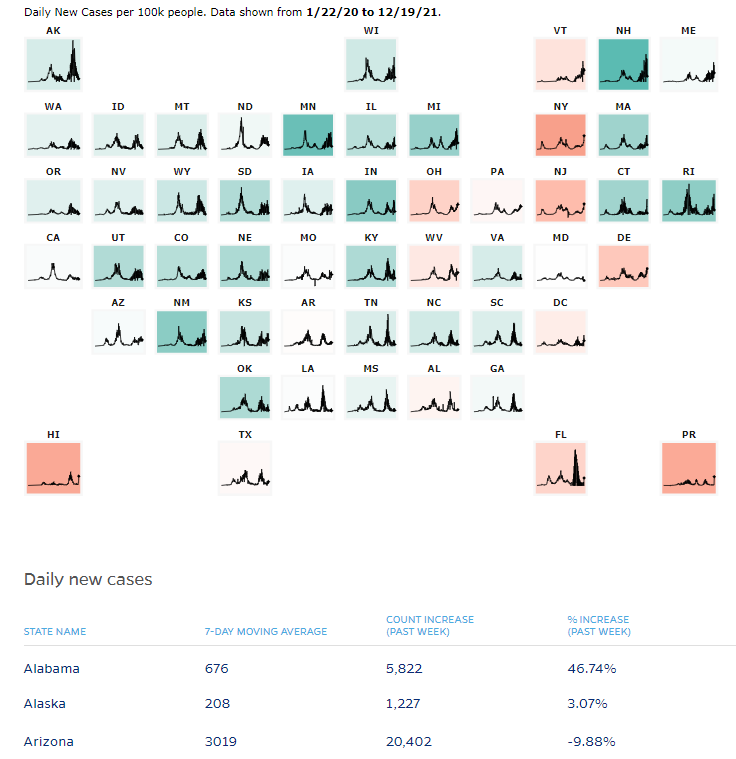
Update 21 December 2021: Data tracking from Johns Hopkins confirms Arizona's new cases have peaked. Here's their chart showing state-by-state trends as of 19 December 2021, where Arizona's new case count has dropped by almost 10% during the previous seven days:
On the plus side, major sport leagues in the U.S. are now postponing games in the recognition their large attendance events are contributing to adverse trends for COVID, as our analysis indicates they did starting from early-October 2021 to cause Arizona's most recent upswing in cases. We may also have been the first analysts to directly make that connection in the new wave of cases in the U.S.
Previously on Political Calculations
Here is our previous coverage of Arizona's experience with the coronavirus pandemic, presented in reverse chronological order.
- Upswing in Arizona COVID Cases Shows Signs of Peaking, Crowded ICUs
- COVID-19 Cases on Upswing in Arizona
- Arizona's COVID Hospital Admissions Unexpectedly Plunge
- All Indicators Confirm COVID Third Wave Receding in Arizona
- Arizona's Third COVID Wave Peaks and Begins to Recede
- Arizona COVID Cases Rising in Third Wave
- Arizona COVID Cases on Slow Uptrend in Summer 2021
- Increase in Arizona COVID Cases from Border Migration Crisis Stabilizing
- COVID-19 and the 2021 Border Migration Crisis in Arizona
- Improving COVID Trends Bottom and Flatline in Arizona
- Surge of Migrants, Lifting of Business Capacity Limits Change Arizona COVID Trends
- COVID-19 in Retreat in Arizona With Vaccines Gaining Traction
- The Ebb and Flow of COVID-19 in Arizona's ICUs
- Arizona's Plunging COVID-19 Caseloads and the Vaccines
- Arizona Enters Downward Trend for COVID-19 After Second Peak
- Arizona Passes Second COVID-19 Peak
- A Tale of Two States and the Coronavirus
- COVID-19 Questions, Answers, and Lessons Learned from Arizona
- The Deadly Intersection of Anti-Police Protests and COVID-19
- 2020 Campaign Events Drive Surge in Arizona COVID Cases
- Arizona Arrives at Critical Junction for Coronavirus Cases
- Arizona To Soon Reach A Critical Junction For COVID-19
- Getting More Than Care from Arizona's COVID ICU Beds
- Arizona's Decentralized Approach to Beating COVID
- Going Back to School with COVID-19
- Arizona Turns Second Corner Toward Crushing Coronavirus
- Arizona's Coronavirus Crest in Rear View Mirror
- The Coronavirus Turns a Corner in Arizona
- A Delayed First Wave Crests in the U.S. and a Second COVID-19 Wave Arrives
- The Coronavirus in Arizona
- A Closer Look at COVID-19 Deaths in Arizona
- The New Epicenter of COVID-19 in the U.S.
- How Long Does a Serious COVID Infection Typically Last?
- How Deadly is the COVID-19 Coronavirus?
- Governor Cuomo and the Coronavirus Models
- How Do False Test Outcomes Affect Estimates of the True Incidence of Coronavirus Infections?
- How Fast Could China's Coronavirus Spread?
References
Political Calculations has been following Arizona's experience with the coronavirus experience from almost the beginning, because the state makes its high quality data publicly available. Specifically, the state's Departent of Health Services reports the number of cases by date of test sample collection, the number of hospitalizations by date of hospital admission, and the number of deaths by date recorded on death certificates.
This data, combined with what we know of the typical time it takes to progress to each of these milestones, makes it possible to track the state's daily rate of incidence of initial exposure to the variants of the SARS-CoV-2 coronavirus using back calculation methods. Links to that data and information about how the back calculation method works are presented below:
Arizona Department of Health Services. COVID-19 Data Dashboard: Vaccine Administration. [Online Database]. Accessed 12 December 2021.
Stephen A. Lauer, Kyra H. Grantz, Qifang Bi, Forrest K. Jones, Qulu Zheng, Hannah R. Meredith, Andrew S. Azman, Nicholas G. Reich, Justin Lessler. The Incubation Period of Coronavirus Disease 2019 (COVID-19) From Publicly Reported Confirmed Cases: Estimation and Application. Annals of Internal Medicine, 5 May 2020. https://doi.org/10.7326/M20-0504.
U.S. Centers for Disease Control and Prevention. COVID-19 Pandemic Planning Scenarios. [PDF Document]. 10 September 2020.
More or Less: Behind the Stats. Ethnic minority deaths, climate change and lockdown. Interview with Kit Yates discussing back calculation. BBC Radio 4. [Podcast: 8:18 to 14:07]. 29 April 2020.
Labels: coronavirus, data visualization
Going by the reduction in the rate at which carbon dioxide is accumulating in the Earth's atmosphere, November 2021 saw a net reduction in economic activity on the planet.
Since July 2021, much of that decline is associated with COVID-related disruptions of manufacturing production in southeast Asia, and also a shortage of fossil fuels that developed in China, which forced the Chinese government to shutter energy-intensive manufacturing. While both situations have somewhat abated, their disruptions still negatively affect the world's economy given the region's relatively "early" position in global supply chains.
A good example of that impact can be seen in the global market for new steel and aluminum production, where Chinese foundries provide the materials used within the country and elsewhere in the world for higher value production. China's production of steel and aluminum has fallen significantly in the last several months. That reduction has created shortages of materials for other countries like Germany, whose economic output has been greatly reduced as a result.
Here's a chart showing the continued decline in the rate at which human economic activities are adding carbon dioxide to the Earth's atmosphere.

Since December 2019, a net reduction of 0.74 parts per million of atmospheric carbon dioxide has been recorded in the trailing twelve month average of the year over year rate of change in atmospheric carbon dioxide levels measured at the remote Mauna Loa Observatory. We estimate this change represents a net loss of $24.6 trillion to the world economy since the coronavirus pandemic originated in China at this time. Approximately a third of that decline has taken place since July 2021.
Meanwhile, on Mars, economic output has hit an all time high, but that's mainly because the red planet's GDP is now greater than zero. More on that story here from your sole source of planetary scale economic reporting!
References
National Oceanographic and Atmospheric Administration. Earth System Research Laboratory. Mauna Loa Observatory CO2 Data. [Text File]. Updated 6 December 2021. Accessed 6 December 2021.
Previously on Political Calculations
Here is our series quantifying the negative impact of the coronavirus pandemic on the Earth's economy, presented in reverse chronological order.
- Earth's Economy Continued Cooling in November 2021
- World GDP Shrinks at Slower Rate in October 2021
- Fossil Fuel Shortages Shrink World GDP
- Global GDP Falls as COVID Hits Southeast Asia
- World GDP Still Shrinking from Coronavirus Pandemic
- Estimated Net Global GDP Lost to Coronavirus Pandemic Exceeds $15.6 Trillion
- Coronavirus Pandemic Sends Global Economy Into Triple Dip Recession
- Double Dip Global Coronavirus Recession Sees Second Bottom
- Net Global GDP Lost to Coronavirus Pandemic Tops $13.6 Trillion
- Global Double Dip Coronavirus Recession Deepens
- Global Economy Enters Double Dip Coronavirus Recession
- Global Economy Teeters on Double Dip Recession
- World GDP Lost Due to Coronavirus Reaches $12 Trillion
- Cumulative World GDP Loss From Coronavirus Pandemic Tops $11 Trillion
- Estimates of World GDP Lost to the Global Coronavirus Recession
- Finding Human Fingerprints in Atmospheric CO2
- The Coronavirus and Atmospheric CO2 in April 2020
- The Coronavirus, Atmospheric CO2, and GDP
Labels: economics, environment, gdp
The combined value of goods traded between the U.S. and China jumped to its highest level since before the 2019 tariff war between the two countries in October 2021.
That's mainly on the strength of U.S. soybean exports to China, which typically peak from October through December each year. Meanwhile, U.S. imports of goods from China also rose, but could have been much higher if not for the growing backlog of container ships at the U.S.' west coast ports, where the Biden administration has dealt with the problem by ordering the ships to sail further from shore so they are not included in the official count of ships waiting to be unloaded.
The following chart shows the jump in the level of trade between the U.S. and China:

The values on the chart do not take the effect of inflation into account, which has risen considerably during 2021. In real terms, the quantity of goods traded between the U.S. and China is lower than indicated by their value.
References
Board of Governors of the Federal Reserve System. China / U.S. Foreign Exchange Rate. G.5 Foreign Exchange Rates. Accessed 7 December 2021.
U.S. Census Bureau. Trade in Goods with China. Accessed 7 December 2021.
Labels: trade
The S&P 500 (Index: SPX) continued following its volatile path, ending the second week of December 2021 by bouncing up to a new record high of 4,712.02.
That volatility continues to fit with the market experiencing Lévy flight events, in which investors are shifting their forward-looking focus back and forth between different two points of time in the future. In this past week, between 2022-Q2 and 2022-Q3, depending on the timing for when the Federal Reserve might start hiking short term interest rates in the U.S.
The alternative futures chart shows investors are splitting their attention between these two future quarters, but are putting a heavier weight on the Fed's rate hiking beginning in 2022-Q3.
 - Snapshot on 10 Dec 2021")
That outcome is consistent with this report from the past week, which also appears in our summary of the week's market moving headlines below. However, that reported focus doesn't match the timing of the Fed's projected rate hikes from the CME Group's FedWatch tool, which gives greater than 50% probabilities of the Fed's first quarter point rate hike in 2022 taking place in the second quarter, with another two taking place before the end of 2022, in the third and fourth quarters of the year.

For more context, here are the market-moving headlines we noted during the week that was:
- Monday, 6 December 2021
- Signs and portents for the U.S. economy:
- Bigger trouble developing in China, Eurozone, Japan:
- Chinese govt thinktank proposes growth target of above 5% for 2022
- Weaker foreign demand sinks German industrial orders in October
- Japan's Oct household spending extends declines on COVID-19 drag
- Bigger stimulus developing in China:
- Wall Street regains some ground with help from easing virus fears
- Tuesday, 7 December 2021
- Signs and portents for the U.S. economy:
- China's Nov. soybean imports up on month, boosted by U.S. cargoes
- U.S. third-quarter labor costs revised sharply higher
- Bigger stimulus developing in China:
- ECB minions think Eurozone banks aren't taking risks seriously, don't want to make long commitments, want to keep stimulus bond buys where they're at:
- Euro zone banks complacent to rising risks: ECB's Enria
- ECB should keep policy commitment short, focus on APP - Kazimir
- No need now for ECB to boost legacy bond purchase scheme: Muller
- Wall Street closes higher with Nasdaq boosted by tech rally
- Wednesday, 8 December 2021
- Signs and portents for the U.S. economy:
- Bigger inflation developing in Eastern Europe:
- Bigger stimulus developing in Japan:
- ECB minions think they should keep on keeping on, are okay with higher inflation sticking around:
- ECB should maintain sequence of future policy moves: Schnabel
- Euro zone inflation will take longer to fall back to 2%, says ECB
- Wall St closes higher as vaccine update feeds optimism
- Thursday, 9 December 2021
- Signs and portents for the U.S. economy:
- U.S. weekly jobless claims at lowest level since 1969 as labor market tightens
- Biden administration signals Friday's inflation data could be high
- Some investors betting Fed minions will wait until 2022-Q3 to hike rates:
- Bigger inflation originating in China:
- Better news from Eurozone:
- ECB minions ready to play games to keep stimulus bond buys going:
- Wall St closes lower ahead of inflation data, Fed meeting
- Friday, 10 December 2021
- Signs and portents for the U.S. economy:
- Fed minions betting on "soft landing":
- Bigger trouble developing in UK, China:
- UK economy almost flatlined in October, adding to rate hike doubts
- China vehicle sales fall for seventh month in prolonged chip shortage
- Wall Street gains, S&P hits record closing high as CPI meets expectations
With the Federal Reserve gearing up for significant changes in monetary policy, we wonder if we’ll soon need to account for a change in the value of m, the amplification factor in the dividend futures-based model for projecting the future for the S&P 500. We last adjusted it to -2.5 on 16 June 2021.
Welcome to the blogosphere's toolchest! Here, unlike other blogs dedicated to analyzing current events, we create easy-to-use, simple tools to do the math related to them so you can get in on the action too! If you would like to learn more about these tools, or if you would like to contribute ideas to develop for this blog, please e-mail us at:
ironman at politicalcalculations
Thanks in advance!
Closing values for previous trading day.
This site is primarily powered by:
CSS Validation

RSS Site Feed
JavaScript
The tools on this site are built using JavaScript. If you would like to learn more, one of the best free resources on the web is available at W3Schools.com.
Other Cool Resources
Blog Roll


