The fourth month of the coronavirus pandemic in the U.S. has carried a lot of bad news with it, but some good news as well. The bad news is that several states are experiencing a delayed first wave of infections, after exiting their lockdowns in May, which was followed by widespread political protests in early June that contributed to the surge in new infections.
But that's not all the bad news. A few states that had already experienced first wave coronavirus infections are showing signs of experiencing a second wave, indicating their residents failed to achieve the kind of herd immunity that appears to now be present in the locations that have been the most hard hit.
The good news however is that there are far fewer deaths occurring with the delayed first wave and new second wave than did in the states that were hardest hit in the first wave. Let's visualize the time series trends for individual states in the COVID Tracking Project's data to see what we mean.
Here is an interactive chart showing the rolling 7-day average of newly confirmed COVID-19 cases per 100,000 residents by state from 17 March 2020 through 7 July 2020. Hover your device's cursor over a point or line on the chart to highlight it (alternatively, if you want to see the day-by-day reported data for a single state, or a particular group of states, the COVID Time Series application is a good resource to bookmark):
Through 7 July 2020, Arizona continues to lead the nation in the number of new cases per 100,000 residents, exceeding the rate achieved by New York did in early April 2020, though that's partly because coronavirus testing back in March and April 2020 was very limited in comparison, failing to capture the full extent of the spread of the SARS-CoV-2 coronavirus in New York at the time.
Florida and South Carolina have risen to take the second and third positions respectively, as both states, like Arizona, are experiencing a delayed first wave of COVID-19 infections.
Three states appear to have begun to experience a second wave of coronavirus infections. Louisiana, Delaware, and Washington each had an early wave in March, which went on to subside, but now are each experiencing rising levels of infection.
If there is good news, it is that the rate of deaths attributed to COVID-19 in states experience both a delayed first wave and in the three states now experiencing a second wave is far lower than what was seen in previous epicenters for COVID-19 in the U.S. Here is an interactive chart showing the rolling 7-day average daily reported COVID-19 deaths per 100,000 residents by state from 17 March 2020 through 7 July 2020:
The chart shows anomalies for three states. The large spike for New Jersey in June 2020 is the result of delayed reporting of deaths that occurred over several months. Meanwhile, the rolling 7-day average deaths for both North Dakota and Colorado turned negative when both states corrected their cumulative COVID-19 death totals during May, as both had previously reported higher figures before these negative adjustments.
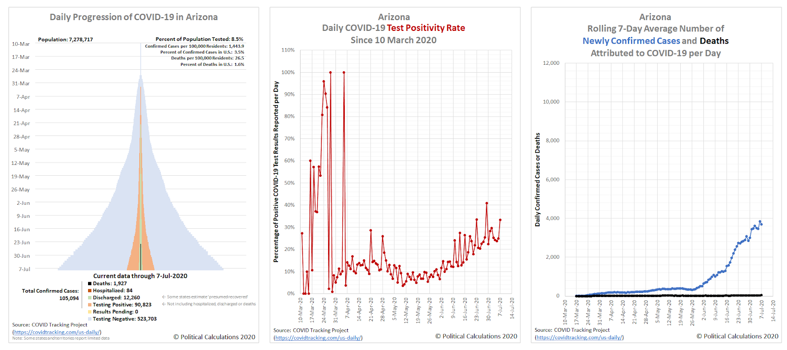
Looking at the most current data, Arizona now leads the nation for deaths per 100,000 residents attributed to COVID-19, although considering its number of cases per 100,000 residents, the state so far appears to be better managing its surge of coronavirus cases than did other states that experienced similar rates of viral infection, such as New York.
That apparent better performance can be seen by comparing Arizona's current populaton adjusted data for deaths with the state of New York's data from when it reported a similar rate of incidence of cases back on 25 April 2020.
Back then, New York had accumulated some 1,450.3 cases per 100,000 residents, which is directly comparable to Arizona's cumulative 1,443.9 cases per 100,000 residents as of 7 July 2020. But with that level of reported cases, New York's rate of COVID-19 deaths was 3.2 times higher than what Arizona is experiencing today, with 85.3 deaths per 100,000 residents versus Arizona's 26.5 deaths per 100,000 residents.
One key difference that helps explain a large portion of Arizona's significantly lower COVID-19 death rate to date is that Arizona's top state officials haven't panicked and tried to open up hospital bed space by transferring coronavirus-infected patients to the state's nursing homes, as occurred in New York and other states that stupidly copied its policies.
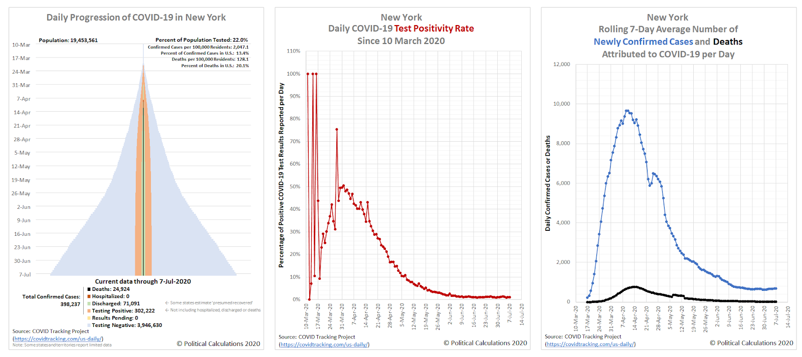
The skyline charts for each state show the dynamics of how things have changed in the four months from 10 March 2020 through 7 July 2020. Each tower chart within the presentation shows the relative number of confirmed cases, hospitalizations, recoveries (or discharges), and deaths for the 56 individual U.S. states or territories, all indexed to the same 2% of the state or territories population, making it easy to see which have been most affected and where coronavirus are now either spreading the fastest or the slowest.
New York continues to lead the country in having experienced the most coronavirus cases, with just over 2% of its population having been confirmed with the infection. The spread of infections is slowing however, as the sides of its tower chart are becoming more vertical. The following chart group shows New York's full tower chart (including negative tests), its daily test positivity rate, and its rolling 7-day average of newly confirmed coronavirus cases and deaths.
Here's the same chart group for Arizona, covering the same period of time for comparison.
We've been covering Arizona's situation since we determined it became the new epicenter for coronavirus cases in the U.S. several weeks ago. We'll continue to do so in upcoming weeks.
Finally, we'll close on a potentially hopeful note. The U.S. Centers for Disease Control and Prevention reported on 27 June 2020 that "mortality attributed to COVID-19 decreased compared to last week and is currently at the epidemic threshold", which is to say that if COVID-19 deaths continue to fall in the U.S., the nation will no longer be considered to be undergoing a national epidemic. While the CDC cautions that late reporting of deaths may prevent it from changing classification in the near future, that the U.S. is nearing this threshold is a positive development.
Previously on Political Calculations
While this is the last planned article for this particular series, here are all of the articles featuring the data visualization we've developed to track the spread and severity of the coronavirus epidemic at the state level, which we've listed in reverse chronological order, starting with this very article!
- Three Months of the COVID-19 Pandemic In The U.S.
- Twelve Weeks of the Progression of COVID-19 in the United States
- United States Continues Trending Downward for Coronavirus
- U.S. Sees Widespread Improvements in Coronavirus Epidemic But Develops a New Regional Hotspot
- A Shifting Geography for Coronavirus Cases in the U.S.
- Most States Show Slowing Progression of Coronavirus in Week 8 of Epidemic
- Seven Weeks and One Million Coronavirus Cases Later...
- A Mixed Picture Emerges For Progression of COVID-19 in U.S.
- Signs Of Slowing COVID-19 Spread Among U.S. States
- Visualizing The First Four Weeks Of The Coronavirus Epidemic In The U.S.
- Visualizing the Progression of COVID-19 in the United States
- Introducing Skyline Charts for Tracking Coronavirus Cases in the U.S.
Labels: coronavirus
Welcome to the blogosphere's toolchest! Here, unlike other blogs dedicated to analyzing current events, we create easy-to-use, simple tools to do the math related to them so you can get in on the action too! If you would like to learn more about these tools, or if you would like to contribute ideas to develop for this blog, please e-mail us at:
ironman at politicalcalculations
Thanks in advance!
Closing values for previous trading day.
This site is primarily powered by:
CSS Validation
RSS Site Feed
JavaScript
The tools on this site are built using JavaScript. If you would like to learn more, one of the best free resources on the web is available at W3Schools.com.


