We have reached the sixth week of the global coronavirus epidemic in the U.S., where we're seeing both clear signs of improvement among some of the most impacted states and territories, but also signs that other states and territories have a long way to go.
Here's what the daily progression of cumulative COVID-19 testing, confirmations, hospitalizations, and deaths look like when tracked at the national level in a tower chart over the six weeks from 10 March 2020 through 21 April 2020.
With the increased volume of testing, perhaps the most important bit of information this chart is communicating is that the rate at which Americans are testing positive for COVID-19 has stopped increasing exponentially during the last two and a half weeks, but is instead increasing at a steady rate. That change is a bit easier to see in our next chart, where we've simply presented the number of newly reported positive coronavirus test results reported on each day since 10 March 2020.
A sudden transition from exponential to steady growth appears to have taken place on 4 April 2020, with the number of new cases showing noisy day-to-day volatility, with the peak in the daily number of new cases occurring on 10 April 2020.
The changes affecting the national pattern are actually taking place at the state and local level, where a more mixed picture is emerging in the pandemic's sixth week in the U.S. Those changes may be seen in the following skyline tower charts, where you can start to see some of the improvements that have begun to take place. Each of these charts span the same period of time and the width of each corresponds to 2.0% of each state or territory's population, making it very easy to see which states and territories have been most impacted and which have been the least impacted through the first six weeks of the coronavirus epidemic in the U.S., especially since we've ranked them from the highest percentage of infection within the state's population to the least as you read from left-to-right, top-to-bottom.
If you look at the top row of the chart, you can see the growth in cases in the state of New York is now clearly slowing, though they are still at a level that puts New York at the top of the list for states and territories most impacted by the coronavirus. The other state we highlighted last week, Louisiana, is considerably further along in showing a trend of improvement, which is allowing it to drop down to fifth place in our skyline chart rankings.
But that's not the case for the #2, #3, and #4 states of New Jersey, Massachusetts, and Connecticut, which are each continuing to steady growth in new coronavirus cases, nor is it true for the #6, #7, #8 ranked states or territories of Rhode Island, Washington D.C., and Michigan.
We should also note that the quality of data reported by individual states and territories varies considerably from one to another. For example, the District of Columbia doesn't report hospitalizations, but does report hospital discharges, which means hospitalizations are being underreported. At the same time, the District revised its count of confirmed cases a little over a week ago, which is why its skyline tower of coronavirus cases looks a bit like an orange Christmas tree. If you scan further down the chart, Vermont's chart is similarly creative, where a sudden large jump in the reported number of discharged patients on 21 April 2020 by the COVID data project is almost certainly in error.
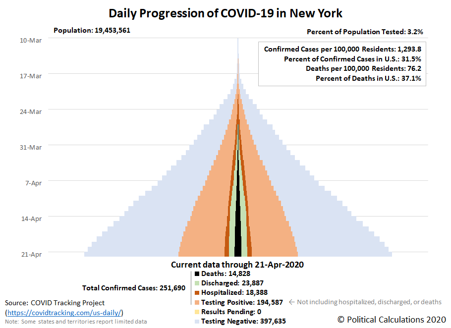
Of all the regions that have been hardest hit within the U.S., the state of New York continues to stand apart as having experienced the greatest incidence of coronavirus infections. Here's the latest update to the state of New York's full tower chart:
The daily growth of New York's confirmed cases is still growing, but with clear signs of deceleration. The state's confirmed cases are now accounting for a little under one-third of the total positive test results in the United States.
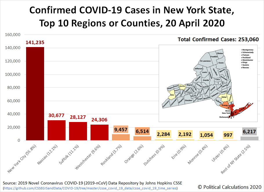
Here's a little more detail on the geographical distribution of confirmed cases in the state, where the following chart identifies the top 10 regions or counties, through 20 April 2020:
The region of New York City includes Bronx, Kings, New York, Richmond, and Queens counties. The most affected counties are adjacent to New York City.
Why is New York's situation with the coronavirus so bad? The New York Times points to the poor judgment of government officials, including Governor Andrew Cuomo and particularly New York City Mayor Bill De Blasio. Their grave mistakes greatly amplified the poor judgment and sluggishness of bureaucrats in the Centers for Disease Control and the Food and Drug Administration, who the New York Post reports failed to treat the rapidly developing crisis like a rapidly developing crisis.
But wait, there's more! A new study is pointing to the city's public transportation system, particularly its subways and buses, as major contributors in exposing New Yorkers to the coronavirus. The failure to regularly decontaminate the city's trains and buses while keeping them running on a reduced schedule that resulted in packing more New Yorkers into highly contaminated spaces ensured they would be at much higher risk of being exposed to the SARS-CoV-2 coronavirus (shades of what happened on the Diamond Princess cruise ship). Here's a map from the paper showing the incidence of coronavirus cases within New York City overlaid with the access points to the city's subway system:
Are New York's subways really a big player in the spread of coronavirus infections? The key phrase to remember here is that "correlation is not causation", where the apparent results have been challenged.
As for ending the business closures and stay-at-home orders they've imposed, on 16 April 2020, Governor Cuomo indicated he will extend his statewide order through 15 May 2020, while Mayor De Blasio will keep New York City locked down well into July or August 2020.
Much of the rest of the nation will be ready to reopen closed businesses and end their stay-at-home orders much earlier, though states and territories like New Jersey, Massachusetts, Connecticut, Rhode Island, Michigan, and the District of Columbia may not based on their current trends.
Previously on Political Calculations
Here's a very short guide to some of the data visualization we've featured for tracking the spread of the coronavirus epidemic in the United States in this series:
- Introducing Skyline Charts for Tracking Coronavirus Cases in the U.S.
- Visualizing the Progression of COVID-19 in the United States (Updated daily)
- Visualizing The First Four Weeks Of The Coronavirus Epidemic In The U.S.
- Signs Of Slowing COVID-19 Spread Among U.S. States
- COVID-19 In New York (Updated daily)
Meanwhile, if you prefer your data in the form of tables presenting numbers and percentages, we also have you covered!
- COVID-19 Coronavirus Cases in the U.S. (Updated daily)
- Ranking the World for COVID-19 Coronavirus Cases (Updated daily)
Labels: coronavirus, data visualization
Welcome to the blogosphere's toolchest! Here, unlike other blogs dedicated to analyzing current events, we create easy-to-use, simple tools to do the math related to them so you can get in on the action too! If you would like to learn more about these tools, or if you would like to contribute ideas to develop for this blog, please e-mail us at:
ironman at politicalcalculations
Thanks in advance!
Closing values for previous trading day.
This site is primarily powered by:
CSS Validation
RSS Site Feed
JavaScript
The tools on this site are built using JavaScript. If you would like to learn more, one of the best free resources on the web is available at W3Schools.com.


