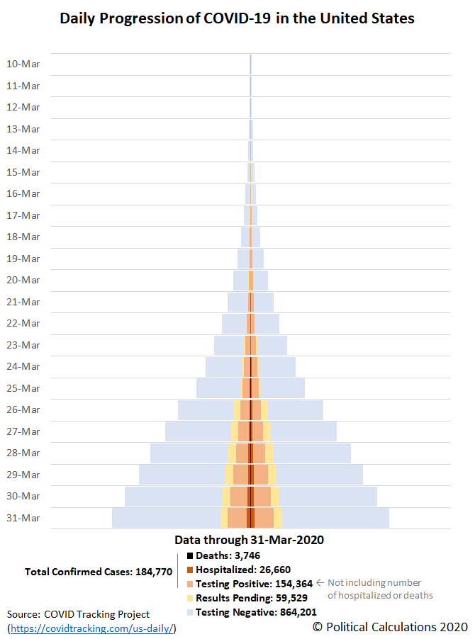
Through 31 March 2020, the United States has tested over 1.1 million Americans for COVID-19 infections in all 50 states and the territories of Puerto Rico and the District of Columbia. The known results of that testing, including the number of positive, negative and pending test results for the SARS-CoV-2 coronavirus, the number of deaths, and also the reported cases severe enough to require hospitalization, are visualized below in the tower chart showing the daily progression of COVID-19 infections in the U.S. since 10 March 2020.
In the following chart, we've combined the skyline tower charts illustrating the daily progression of positive COVID-19 infections, hospitalizations, and deaths for each of the 50 states and the territories of Puerto Rico and the District of Columbia, ranking each from worst to best as you read from left to right, top to bottom. All charts are presented covering the same period of time from 10 March 2020 through 31 March 2020 and use the same scale, with the width of the charts representing 0.5% of the state or territory's population, making is easy to quickly visualize in which states the coronavirus infections are concentrated and are spreading the fastest.
It appears from the available data that a number of states are not reporting their number of coronavirus-related hospitalizations, with New Jersey, Michigan, the District of Columbia, and Illinois standing out in that category among the top 10 states ranked by share of their population having been infected.
We're also well past the point where it is worthwhile to track the daily progression of COVID-19 in states whose governors have mandated business closures or stay-at-home orders for their residents. Also as of 31 March 2020, three out of four Americans are affected by these restrictions, which have spread far faster than the coronavirus.
Previously on Political Calculations
- Visualizing the Progression of COVID-19 in the United States (through 24 March 2020)
- COVID-19 Coronavirus Cases in the U.S. (state and territory-level data updated daily!)
Update 31 March 2020: Thank you for scrolling all the way down to the bottom of this article! If you're viewing the original version of this article, we will periodically post updates to the original national tower chart (presented above), or will link to newer posts in the series where you can find updates for all the charts, just below the following line....
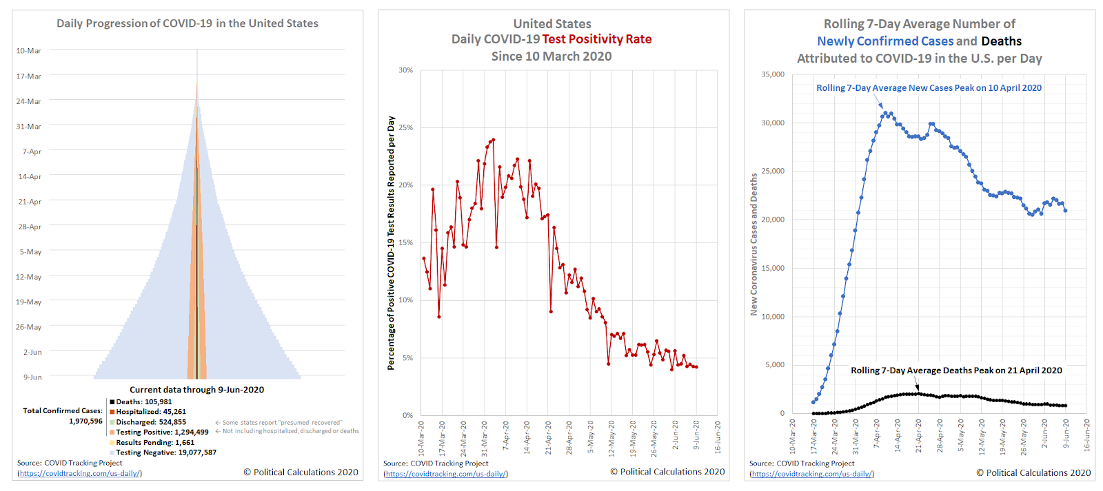
Here's the latest update to the United States' full tower chart through 9 June 2020, along with the nation's daily test positivity rate (the percentage of positive test results among all tests reported), and also the nation's rolling 7-day average of newly confirmed cases and deaths per day. Click on the image below to access a much larger version of the three charts together:
Starting back on 22 April 2020, the amount of COVID-19 testing in the U.S. has expanded considerably, which you can see in the widening base of the outer 'blue' pyramid in the chart. Meanwhile, the number of confirmed cases indicated by the 'light orange' inner pyramid in the chart is still rising at a steadily declining rate. In addition to hospital discharges, some states are beginning to report their estimates of "presumed recovered" (shown in 'light green'), where this measure is greatly underreported through the end of April 2020. The numbers of current hospitalizations ('dark orange') and deaths ('black') are growing more slowly.
New York continues to have the largest number of confirmed cases, accounting for about one-fifth of all confirmed cases in the U.S. but a larger percentage of reported deaths, with New York City and the surrounding counties that make up its greater metropolitan area having the largest share. Counties in New Jersey adjacent to New York City have been similarly hard hit, with that state ranking second in the nation, though the rate of increase of confirmed cases in the northeastern U.S. is decelerating. A secondary hotspot is developing in the regions adjacent to Washington D.C., which is currently seeing faster rates of growth in the number of confirmed cases.
If you would like to see a state-by-state breakdown of the coronavirus epidemic data, an updated version of the skyline tower chart we created for individual states and U.S. territories is available here, with data through 9 June 2020.
Update 9 June 2020: This article was near the beginning of a series that is nearing its end. With that being the case, we're discontinuing daily updates for this article, where you can catch up with the latest entry in the series here.
Labels: coronavirus, data visualization
Welcome to the blogosphere's toolchest! Here, unlike other blogs dedicated to analyzing current events, we create easy-to-use, simple tools to do the math related to them so you can get in on the action too! If you would like to learn more about these tools, or if you would like to contribute ideas to develop for this blog, please e-mail us at:
ironman at politicalcalculations
Thanks in advance!
Closing values for previous trading day.
This site is primarily powered by:
CSS Validation
RSS Site Feed
JavaScript
The tools on this site are built using JavaScript. If you would like to learn more, one of the best free resources on the web is available at W3Schools.com.


