There's a trick for multiplying numbers that goes back hundreds, if not thousands, of years. Here are the steps to do it:
- Take the first number you're multiplying and cut it in half, writing it on the line below the original math and ignoring any fraction left over. Then take the other number, double it, and write it down on the same line.
- Keep adding rows by repeating the first step until you reach the number 1 and complete the final line.
- For any row whose first value is an even number, cross out the entire row.
- Add up the second numbers, the ones you've been doubling, for all the remaining rows. The resulting sum is the product of multiplication!
Different variations of this trick have been done since ancient Egyptians first came up with what might be the original version of it. In the following Numberphile video, Johnny Ball reveals the magic behind how the trick works, which involves secretly converting the first number you're multiplying into its binary code.
Nobody tell Dan Brown about the Egyptian code!
Labels: math
Statistically speaking, day-to-day changes in the S&P 500 (Index: SPX) don't start to be interesting until the index changes by more than two percent from its previous day's closing value. But those day-to-day changes get really interesting when the S&P 500 changes by more than three percent from its previous day's closing value.
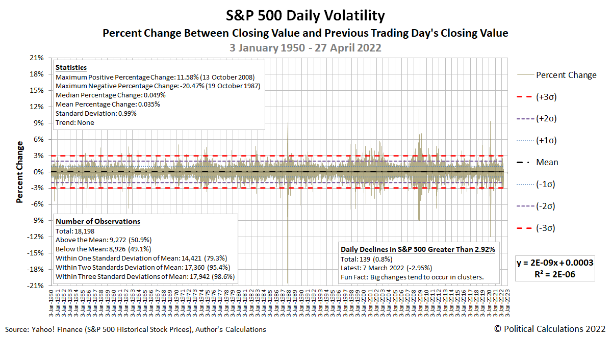
That's because big changes like that don't happen very often. Going back to 3 January 1950, for the 18,198 days through 27 April 2022 where we have the data to tell how much the index gained or lost from where it ended on the previous day's trading, just 239 involved the index gaining or losing more than 3.00%. That's 1.3% of all the trading days in the index' modern era.
The following chart updates our visualization of that day to day volatility, where the dashed red lines roughly coincide with when the S&P 500's volatility has gotten really interesting.
The index has experienced two trading days in the past week where it has gotten close to becoming really interesting. Friday, 22 April 2022 saw the index fall by 2.77%, while Tuesday, 26 April 2022 saw the S&P drop by 2.81%. We're pointing these recent changes out because when the S&P 500 experiences big changes like these, they tend to be clustered together in time. Which is to say that once they show up, they tend to keep showing up until the market's volatility dies down.
They also tend to be roughly balanced between gains and losses, with the number of big daily gains being nearly equal to the number of big daily losses. Today, the market's big gain/loss ratio is 118/121.
Here's the question to answer: How long might it be until what looks like a developing volatility cluster for the S&P 500 causes the index to cross the line and become really interesting by our standards?
Labels: SP 500, volatility
A combination of record high new home sale prices and an upward trend in the number of new homes sold as buyers raced to beat rising mortgage rates caused the market capitalization of the U.S. new homes market to surge in March 2022.
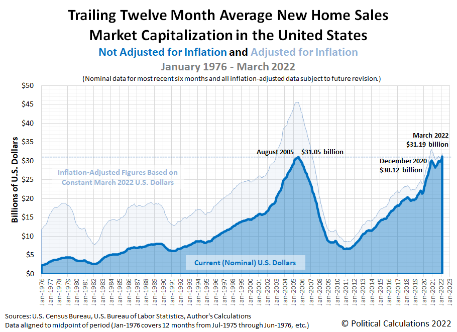
In doing that, the market cap of new homes in the U.S. surpassed its previous nominal, non-inflation adjusted record. Political Calculations' initial estimate of the U.S. new homes market cap is $31.19 billion. That figure is 0.45% higher than the previous record of $31.05 billion set in August 2005 during the peak of the first U.S. housing bubble.
The following chart shows what that new record looks like in the context of the new home market cap history since January 1976:
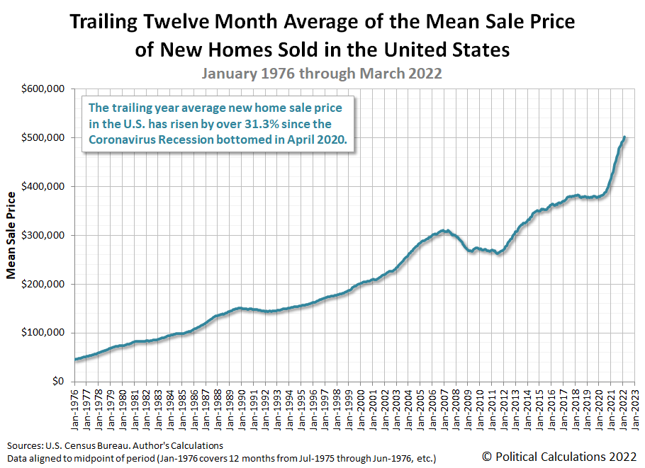
March 2022 also saw significant upward revisions for the number of new homes sold in January and February 2022, which were coupled with small adjustments in the average new home sale prices during these months. Overall, the trailing twelve month averages for both new homes sales and average new home sale prices continued their recent upward trends.
The trailing twelve month average for new home sales removes the effects of annual seasonality from this data, while the math helps smooth the month-to-month noise in new home sale prices, making it easier to identify trends for both data series. Note the number of new home sales is still well below its recent November 2021 peak. The market capitalization of new homes sold in the U.S. has broken its nominal housing bubble era record mainly because of the contribution of rapidly inflating new home sale prices.
Since new home sales are counted toward GDP when their sales contracts are signed, a rising trend in the market cap for new homes represents an economic plus for the U.S. economy. The National Association of Home Builders estimates new homes sales represent 3% to 5% of the nation's Gross Domestic Product.
Labels: real estate
It's not often we can use math to definitively shut down a claim being made to pitch an investment, but here we are.
The pitch involves the cryptocurrency Bitcoin (BTC). The claim, most famously made by the Winklevoss brothers in 2017, is that "Bitcoin is Gold 2.0". Here's a more recent clip of the brothers repeating their pitch on CNBC on 10 July 2019:
While they may be among the most prominent pitchmen for Bitcoin, they're far from alone in claiming Bitcoin has gold-like investing properties. Here's a selection of articles we turned up from 2013 through 2022 where analysts have made similar claims:
- 29 April 2013: BitCoin Is Gold 2.0: Venture Capitalist
- 11 April 2016: Can Bitcoin Be Gold 2.0?
- 10 December 2020: Why Bitcoin is Gold 2.0
- 1 January 2021: Billionaire bitcoin proponents make play for gold 2.0
- 24 December 2021: Bitcoin is Gold 2.0. It Fixes Inflation And Good ROI Too
- 3 January 2022: Bitcoin is ‘gold 2.0’ and will hit ‘$100k’ this year’, Nexo founder reiterates
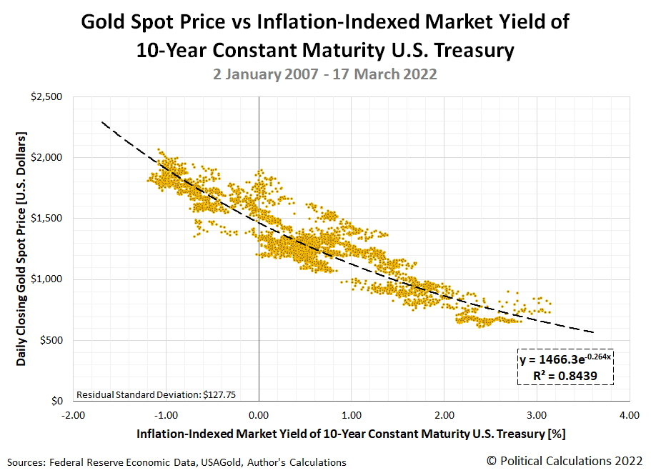
Let's address the elephant in the room. For Bitcoin to be Gold 2.0, it needs to share gold's top investing characteristic: it needs to provide an effective hedge against inflation by rising in value as inflation reduces real yields. Gold, or as BTC enthusiasts would describe it, Gold 1.0, does exactly that when real interest rates fall and become negative as the rate of inflation grows to exceed nominal interest rates. Here's the chart we featured in previous analysis showing the price of gold doing just that, rising in value as real interest rates decline in value and vice versa.
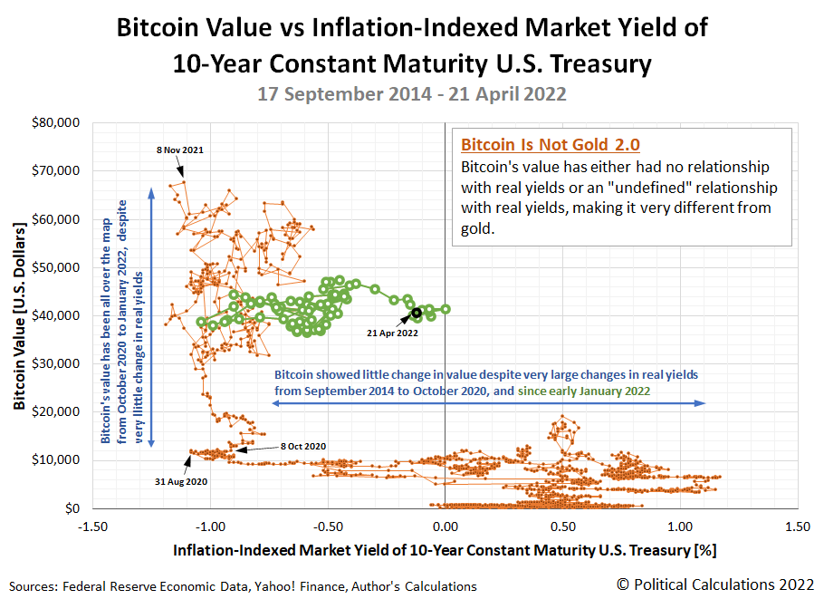
Now, here's a chart that presents the value of Bitcoin with respect to the same data for the inflation-adjusted yields of 10-year Constant Maturity U.S. Treasuries over the period from 17 September 2014 through 21 April 2022, covering nearly the entire period where we can identify that the claim that "Bitcoin is Gold 2.0" has been prominently made. Spoiler alert: Bitcoin is not Gold 2.0!
The chart of Bitcoin's "relationship" with real yields looks like something that could have been created on an Etch-a-Sketch. The value of BTC either moves sideways or up-and-down.
That observation aside, we see three main periods for Bitcoin's valuation history in this chart:
- 17 September 2014 to 7 October 2020. The price of Bitcoin in U.S. dollars has virtually no relationship with real interest rates, despite substantial changes in their value during this period. In math terms, the slope of the trendlines whenever real interest rates are changing in value is nearly equal to zero, because the value of Bitcoin isn't changing with them.
- 8 October 2020 - 6 January 2022. This is the period when the biggest changes in the valuation of Bitcoin has occurred, and we find that while Bitcoin's value has ranged all over the map from nearly $11,000 to a peak of $67,567 during this second period, it's matched against very little change in real interest rates. In math terms, the effectively vertical movement in Bitcoin's valuation is not defined with respect to changes in real interest rates. In practical terms, whatever moved Bitcoin prices during this time was unconnected to how inflation affected interest rates.
- 7 January 2022 - 21 April 2022. Shown as the green circles on the chart, we find once again there is little change in the value of Bitcoin even though real interest rates have substantially changed. Just like in the first period, the value of Bitcoin shows little to no, or dare we say, zero connection to changes in real interest rates.
For the record, we're just the latest to conclude that Bitcoin is not Gold 2.0, though perhaps the first to show it using tools available to middle and high school algebra students. Here is other analysis that finds Bitcoin lacks gold's most attractive investing properties for extra credit reading:
- 1 October 2018: Bitcoin is not the New Gold - A comparison of volatility, correlation, and portfolio performance
- 15 May 2019: Why Bitcoin Isn’t Gold 2.0
- 16 March 2020: Bitcoin Is Not Like Gold
- 15 April 2021: Ten Years And $1 Trillion Later, Bitcoin’s Still Nothing Like Gold
With respect to changes in inflation-adjusted interest rates, we've demonstrated the value of Bitcoin either moves sideways or up-and-down with little rhyme or reason, making it very different from how gold has performed during the period of their shared existence. Bitcoin is not Gold 2.0.
Previously on Political Calculations
References
Federal Reserve Economic Data. Market Yield on U.S. Treasury Securities at 10-Year Constant Maturity, Inflation-Indexed. [Online Database (Text File)]. Accessed 22 April 2022.
Yahoo! Finance. Bitcoin USD (BTC-USD), 14 September 2014 through 21 April 2022. [Online Database]. Accessed 22 April 2022.
Labels: data visualization, inflation, investing
The S&P 500 (Index: SPX) has fallen off the edge we described it was on, entering into 2022's third Lévy flight event.
What's happening with stock prices now is the "short and brutal path to sobriety" alternative we explained would come about if "investors have a reason to refocus a significant portion of their attention on 2022-Q2" in setting current day stock prices in our discussion demystifying the recent moves of the S&P 500. You cannot say you were not warned what would happen if that occurred, though we doubt anyone could predict the specific circumstances that succeeded in pushing the S&P 500 off the edge.
As for what triggered the new Lévy flight by prompting investors to shift their forward looking attention from 2022-Q3 inward toward what they expected will happen during 2022-Q2, we can thank ZeroHedge's Tyler Durden for providing a succinct summary:
Ultra-hawkish FedSpeak (from them all) sent rate-hike expectations this week (with 50bps fully priced-in for May, and a 35% chance of a 75bps hike in June now)...
Here's how that change looks on the alternative futures spaghetti forecast chart where, for the first time ever, we've added a second, 'redder' forecast range to track where stock prices are most likely to head as investors focus upon 2022-Q2.
The key triggering event involving Fed Chair Jerome Powell's comments took place on Thursday, 21 April 2022, which went on to build downward momentum for investor expectations on Friday, 22 April 2022. Read all about it by following the appropriate links in our recap of the week's market moving headlines:
- Monday, 18 April 2022
- Signs and portents for the U.S. economy:
- Oil rises over 1% as Libya outages add to Russia supply fears
- U.S. homebuilder sentiment drops to seven-month low amid surging mortgage rates
- Fed minion wants higher interest rates to address inflation than all the others:
- Bigger stimulus developing in China:
- China to step up financial support for industries hit by COVID outbreaks
- China's supply chains must be stabilised, vice premier says
- BOJ minion concerned about value of currency:
- Wall St ends lower as investors await further earnings cues
- Tuesday, 19 April 2022
- Signs and portents for the U.S. economy:
- Oil prices fall 5% after IMF cuts growth outlook
- U.S. single-family starts tumble; construction backlog at record high
- Fed minions set lower expectations for rate hikes:
- Fed's Evans sees year-end rates at 2.25%-2.5%, and then likely higher
- Fed's Bostic says slowing global growth a reason for Fed to be "cautious" - CNBC
- A jumbo 75-basis-point rate hike? Fed's Bullard isn't ruling is out
- Bigger trouble, stimulus developing in China:
- China to keep 2022 crude steel output lower than last year's level
- China likely to lower benchmark lending rates after RRR cut - Reuters poll
- China urges policies to support catering, retail sectors
- Japanese finance minion getting really worried about falling yen:
- Wall Street advances on earnings optimism, dovish rate rise remarks
- Wednesday, 20 April 2022
- Signs and portents for the U.S. economy:
- U.S. firms beset by worker shortages and high inflation, Fed survey shows
- U.S. mortgage interest rates reach a 12 year high, demand falters
- Oil slips nearly 1% on broader demand concerns
- Fed minions lock in expectations for half point rate hike, claim inflation will fall to 2% in five years:
- Fed's Daly: Case for half-percentage-point hike in May is 'complete'
- Fed's Daly sees U.S. inflation at 2% goal in five years
- Raising Fed's policy rate to 2.5% by end of 2022 is 'prudent,' Daly says
- Fed's Evans repeats view he sees interest rates at neutral rate by year end
- Bigger trouble, stimulus developing in China:
- China imports 13% less crude oil from Saudi in March, 14% less from Russia -customs
- Analysis-Wealth shock: property bust in small Chinese cities rattles households
- IMF's Georgieva says China should stimulate consumption as lockdowns mount
- China to accelerate VAT credit rebates for small firms - finance ministry
- Bigger inflation developing in Canada, Eurozone, Japan:
- Canada inflation surges more than expected in March, hitting 31-year high
- German producer prices at record high amid Ukraine war
- Japan raises gasoline subsidy to maximum of 25 yen per litre
- Wall Street mixed as Nasdaq drags, bond yields dip after recent surge
- Thursday, 21 April 2022
- Signs and portents for the U.S. economy:
- Oil edges higher on concerns over Russia, Libya supply disruption
- U.S. weekly jobless claims fall; unemployment rolls smallest in 52 years
- Fed minions signal willingness for bigger rate hikes:
- Fed's Powell, half-point hike in view, completes hawkish pivot
- Hiking Fed policy rate beyond 2.5% is 'open question,' says Daly
- Bigger trouble developing in China, Eurozone:
- A prolonged China slowdown raises risks for global economy, IMF chief says
- German exports to Russia slump by 57.5% in March
- ECB minions thinking they may need to stop stimulating Eurozone economy:
- Wall St ends down as Powell plops 50 bps rate hike on table
- Friday, 22 April 2022
- Signs and portents for the U.S. economy:
- Oil extends losses on growth concerns and Shanghai lockdown
- U.S. services sector activity eases in April - survey
- Yellen says U.S. economy being 'resilient', no recession in sight
- Fed minions shift investor focus to near term with prospect of bigger rate hikes:
- Bigger trouble developing in South Korea, Eurozone, Brazil, Canada, UK:
- S.Korea first-quarter growth likely slowed sharply by COVID curbs
- Two-speed euro zone economy as services shine, factories struggle -PMI
- French Finance Minister: we are entering "new era" of higher inflation
- Exclusive-Germany cuts 2022 economic growth forecast to 2.2% - source
- Brazil's economy stagnant, growth freeze to continue in 2023
- Canada March producer prices up 4.0%, biggest monthly gain in 66 years
- Slowdown warnings flash for UK economy as inflation surges
- Bigger stimulus developing in China:
- BOJ minions getting into deeper trouble with yen:
- BOJ's Kuroda vows to 'persistently' continue aggressive monetary easing
- BOJ should revise policy if key bond yield keeps rising, economists say
- Japan March consumer prices rise at fastest pace in over 2 years
- Japan, U.S. likely discussed joint yen-buying intervention - media
- ECB minions told to toe the party line:
- Wall St tumbles as investors fret on weak earnings, rate hikes
The CME Group's FedWatch Tool projects the Fed will hike rates by a half point in May (2022-Q2) and by another three-quarter point hike in June (2022-Q2). That would be followed by a half point rate hike in July (2022-Q3) and a quarter point rate hike in September (2022-Q3). 2022-Q4 would see a half point rate hike in November, and a quarter point rate hike in December 2022.
Looking at the Atlanta Fed's GDPNow tool, we find it anticipates the first quarter of 2022 saw 1.3% of real GDP growth. The BEA's first estimate of 2022-Q1 GDP will be reported later this week, so the GDPNow tool will soon refocus on 2022-Q2's GDP growth rate.
Later this week, we'll update our ongoing series on the day-to-day volatility of S&P 500 stock prices. Because it may become highly relevant in the near future.
A good book can be a very good thing. Turning the pages of an engaging story filled with entertaining characters is always time well spent.
That's why we were pleasantly surprised to find the following chart out on the Datawrapper River, which visually ranks the character density of fifteen books known for having lots of characters. Most are considered literary classics, some are not. More on that in a bit, here's the chart:
Perhaps the least surprising book in the list is War and Peace. Tolstoy's work is notorious not just for being really long, but also for having a ton of characters. We would have predicted it would rank at or near the top, and at second, it does.
The most surprising title, but perhaps less so when we think more about it, is Harry Potter and the Philosopher's Stone, sold in the U.S. with the title Harry Potter and the Sorcerer's Stone. The first book of the Harry Potter series introduces a lot of characters in establishing its world in a comparatively short 352 pages, but not quite as many per 100 pages as Tolstoy did in War and Peace.
And then there's Antigua: The Land of Fairies, Wizards and Heroes, which is only available in an electronic Kindle version and blows Tolstoy's War and Peace out of the water, nearly doubling its character density.
It also seems as far from a classic work of literature as you can get. The titles we didn't recognize were contributed by the 372 Pages We'll Never Get Back podcast, whose hosts are reading books they're pretty sure they're going to hate. Which sounds like the book club we badly needed back in school just to make it through some of the 'masterpieces' being pushed by overly enthusiastic literature teachers. Going by the titles they've covered, they're having a lot of fun.
Labels: data visualization
The story of how Gamestop (NYSE: GME) went from a value of $11.01 per share on 13 November 2020 to reach $325.00 per share on 29 January 2021 has become a stock market legend.
It has also become the subject of a fascinating academic study, where a new paper by Lorenzo Lucchini, Luca Maria Aiello, Laura Alessandretti, Gianmarco De Francisci Morales, Michele Starnini and Andrea Baronchelli investigated how social media contributed to the short squeeze that made GME into *the* prototype meme stock.
If you're not familiar with the story, here's the paper's summary of how the GME short squeeze was made, in which Reddit's r/wallstreetbets (WSB) plays a prominent role (we've added the bullet list formatting to make it easier to follow):
GameStop (GME) is a US video game retailer which was at the centre of the short squeeze in January 2021. The timeline of the events around the squeeze is summarized in table 1, and it unfolded as follows.
- In 2019, Reddit user u/DeepFuckingValue entered a long position on GME, i.e. he bought shares of the GME stock, and started sharing regular updates in WSB.
- On 27 October 2020, Reddit user u/Stonksflyingup shared a video explaining how a short position held by Melvin Capital, a hedge fund, could be used to trigger a short squeeze.
- On 11 January 2021, GME announced a renewed Board of Directors, which included experts in e-commerce. This move was widely regarded as positive for the company, and sparked some initial chatter on WSB.
- On 19 January, Citron Research (an investment website focused on shorting stocks) released a prediction that GME’s stock price would decrease rapidly.
- On 22 January, users of WSB initiated the short squeeze.
- By 26 January, the stock price increased more than 600%, and its trading was halted several times due to its high volatility. On that same date, business magnate Elon Musk tweeted ‘Gamestonk!!’ along with a link to WSB.
- On 28 January, GME reached its all-time intra-day highest price, and more than 1 million of its shares were deemed failed-to-deliver, which sealed the success of the squeeze. A failure to deliver is the inability of a party to deliver a tradable asset, or meet a contractual obligation; a typical example is the failure to deliver shares as part of a short transaction.
- On 28 January, the financial service company Robinhood, whose trading application was popular among WSB users, halted all the purchases of GME stocks.
- On 1 and 2 February, the stock price declined substantially.
By the end of January 2021, Melvin Capital, which had heavily shorted GameStop, declared to have covered its short position (i.e. closed it by buying the underlying stock). As a result, it lost 30% of its value since the start of 2021, and suffered a loss of 53% of its investments, i.e. more than 4 billion USD.
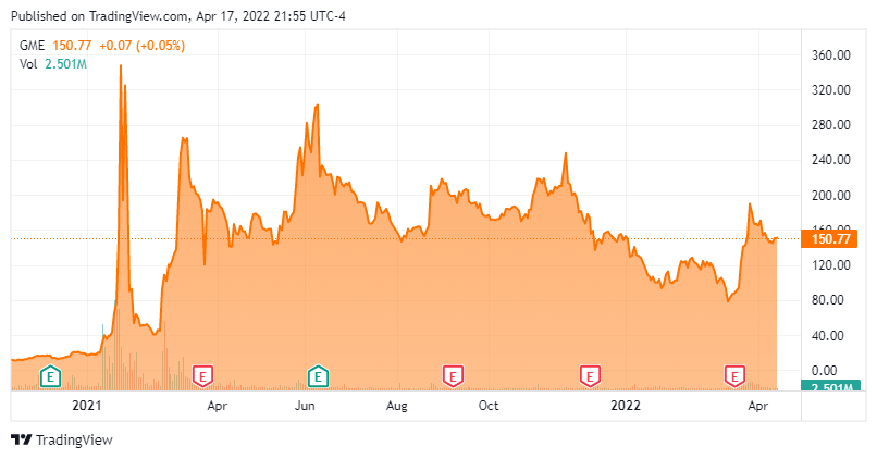
While the paper's summary indicates a substantial decline in value, we'll point out that since it peaked at $325 per share, GME bottomed at $40.69 per share on 18 February 2022 before climbing back up to $300 per share on 8 June 2021, before dropping back toward the middle of that range. The following chart shows its stock price history:
That's all the "what happened", but it's the "why it happened" we find fascinating. The authors identify one key element in the postings of the WSB redditors that established their credibility, separating their postings from the ordinary run of the mill comments that dominate discussions on many other stock investing discussion sites, which they describe in the paper's introduction:
In this paper, we analyse discussions on WSB from 27 November 2020 to 3 February 2021 (table 1) and investigate how they translated into collective action before and during the squeeze that was initiated on 22 January and lasted until 2 February. Motivated by recent theoretical [10,11] and experimental [12] evidence that minorities of committed individuals may mobilize large fractions of a population [10,13–15] even when they are extremely small [16], we investigate whether committed users on WSB had a role in triggering the collective action. To this aim, we operationalize the commitment of a user as an exhibited proof that the user has financial stakes in the asset.
We won't keep you in suspense. Here's the summary of what they found:
We show that a sustained commitment activity systematically pre-dates the increase of GameStop share returns, while simple measures of public attention towards the phenomenon cannot predict the share increase. Additionally, we also show that the success of the squeeze operation determines a growth of the social identity of WSB participants, despite the continuous flow of new users into the group. Finally, we find that users who committed early occupy a central position in the discussion network, as reconstructed by WSB posts and comments, during the weeks preceding the stock price surge, while more peripheral users show commitment only in the last phases of the saga.
The last part is to say that the early influencers who effectively established their credibility continued to be influential within the network. We think that continued influence is attibutable to their success, which had the short squeeze of GME's stock not occurred, would have led other WSB participants to discount the information value of their postings. People with opinions about a company's investment worthiness are a dime a dozen on a stock discussion board, but people who back up their talk with hard evidence of their bets that go on to pay off were granted credibility.
Much of the authors' study focuses on the dynamics between this "core" group of GME redditors and others who were on the periphery of the investing activity, which they describe as a "behavioural cascade" event. The core group attained a critical point of credibility, sweeping up peripheral redditors who transitioned from observers to participants as the short squeeze cascaded into a legendary event.
Update
As for the hedge fund that lost billions on its attempted short of GME, the firm is considering returning what's left of the capital it controls to its remaining investors as its future with its current structure is in doubt. The fund lost 39% of its capital in 2021, with another 21% of losses to date in 2022. It's management would launch a new fund to replace it.
Reference
Lorenzo Lucchini, Luca Maria Aiello, Laura Alessandretti, Gianmarco De Francisci Morales, Michele Starnini and Andrea Baronchelli. From Reddit to Wall Street: the role of committed minorities in financial collective action. Royal Society Open Science. Volume 9, Number 4. 6 April 2022. DOI: 10.1098/rsos.211488.
Labels: chaos, ideas, investing, stock market
Part of the U.S. Treasury yield curve inverted and all we got was lousy analysis!
That's actually something of an understatement. There has been an explosion of reporting about the inversion of the U.S. treasury yield curve in recent weeks. If you read any of it, you likely found it leaves a lot to be desired. Here's a random selection of recent headlines:
- What The Inverted Yield Curve Means For The Economy
- The Inverted Yield Curve, A Warning, Not An Alarm Bell
- What Does an Inverted Yield Curve Mean for Stocks?
- An Inverted Yield Curve Doesn’t Always Predict a Recession. Why This Time Is Different.
- The Yield Curve May Not Be a Reliable Bellwether for Recession
It's not any better if you read what academic economists have been writing either, much of which has the intellectual consistency of muddled hash. In fact, if all that analysis were laid out end to end, the last thing you'd ever reach from reviewing it all is a conclusion. You'd think achieving some sort of clarity would be both desirable and a priority because the inversion of the Treasury yield curve is believed to portend recession in the future for the economy.
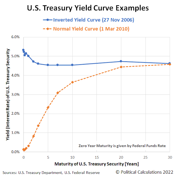
Part of the problem is because the U.S. Treasury yield curve has more than one part to it than can become inverted. A lot of people will focus on some select parts of it, without taking what's going on in the rest of it into account.
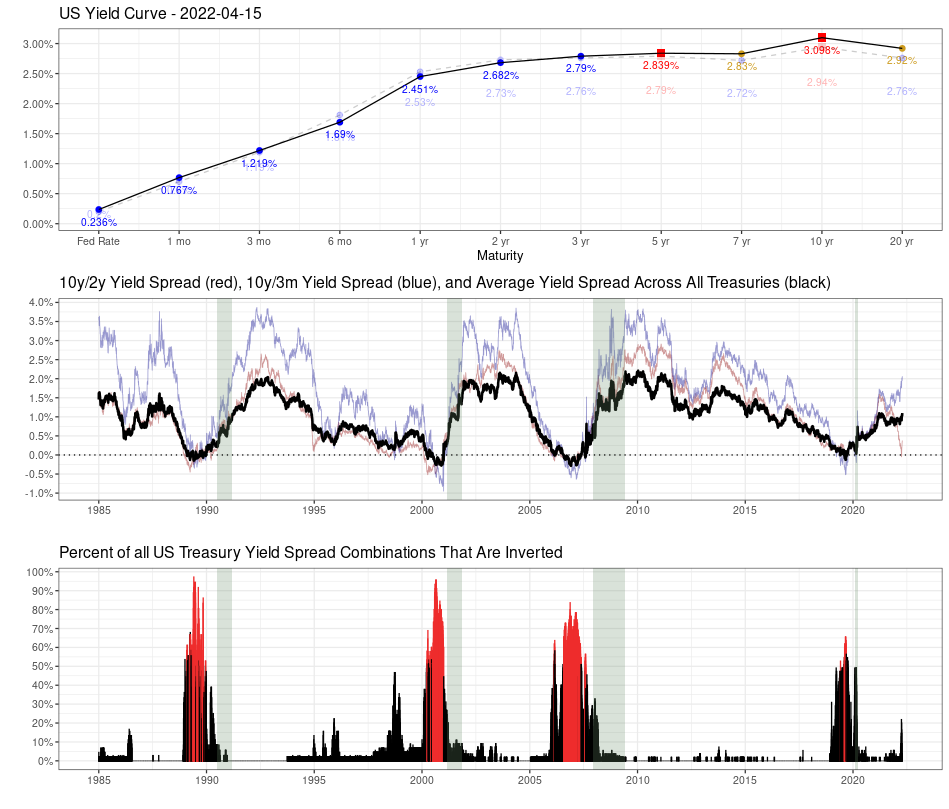
That realization lies behind some more interesting analysis by MetricT at r/dataisbeautiful that offers a path to reach the kind of conclusions you'd want to reach whenever the treasury yield curve becomes inverted. Here's that original analysis from 28 March 2022, which has been updated with charts showing yield curve data through 15 April 2022 (in addition to some other minor tweaks):
Mean Yield Spread across all US Treasury Maturities as a (slightly) better recession gauge than the 10y/2y and 10y/3m yield curve spreads
The US Treasury yield curve spread (most commonly the 10 yr/2 yr and 10 yr/3mo spreads) are popular gauges of incoming recession. But those measures aren't perfect. In particular:
- There is a noticable false positive from Sep 1966 - Feb 1967 where the 10 yr/3 mo yield curve inverted but no recession followed.
- A "is it or isn't it?" event in 1998 where the yield curve almost inverted before returning to normal. This caused a lot of consternation at the time until it was subsequently shown to be another false positive.
- Another "is it or isn't it?" event in 2019 where the yield curve inverted, but pundits wondered if it "inverted enough" to trigger a recession. Narrator: It did...
I've been looking at ways to improve the traditional yield curve measures. A few months ago I posted R code to graph the percent of all yield curve spreads that are inverted, which made it much more obvious that a recession was the likely outcome in 2019.
So the idea occured to me: There are (at present) 55 different yield curve combinations. What would the average of all yield curve combinations look like? That should give us a better measure of how distorted the yield curve is than looking at a single pair of spreads.
As it turns out, the average does perform a bit more accurately than the 10y/2y and 10y/3m yield curves. In particular, it fails to invert in 1998, meaning our "is it or isn't it?" has a much clearer "no" answer. And it did invert during the similar "is it or isn't it?" event in 2019 and correctly predict a recession. So it sends a clearer signal than the better known 10y/2y and 10y/3m curves.
Graph 1:
Top: The US Treasury yield curve as of April 15 2022. A healthy yield curve should be upward sloping. Notice the obvious bear flattening between 3 yr <-> 10 yr Treasuries. There are already inversions between several longer-duration Treasuries (inverted points highlighted in red). There is currently a technical inversion in the 30yr/20yr curve due to a preference for 30 year Treasuries due to the relative newness of 20 yr Treasuries.
Middle: The usual 10y/2y and 10y/3m spread alongside the average yield spread for all maturity combinations. Notice that while the 10y/2y is rapidly nosediving (and getting a lot of press in doing so), the average is still relatively stable, though that may or may not last much longer. So keep an eye on things, but don't overreact just because the 10y/2y curve inverts.
Bottom: Shows the percent of all Treasury combinations that are inverted. It's graphed as a percent because the total number of maturities has changed over time (for instance, the Fed introduced 7 yr Treasuries in 2009), so graphing the percent allows you to do an apples-to-apples comparison. The color scheme is simply "blue if the average yield curve spread is < 0, red if it's > 0".
Graph 2:
Graphs the Federal Funds Rate since 1985 and highlights times when the average yield curve is inverted. As you can see, Fed tightening has come to a screeching halt almost immediately once the average YC is inverted, and quickly starts heading downward. It suggests the Fed is going to have great difficulty raising the Fed rate, as they probably only have a few months before the average inverts.
I'll clean the code up and eventually post it on my Github repo, though it will probably take a few days.
There are two bits of good news. First, MetricT's code is available! Second, through 15 April 2022, the average of all yield curve combinations hasn't changed the low probability of recession signal of MetricT's original analysis from 28 March 2022.
We're not the only ones who recognize there's a lot lacking in current day analysis of the treasury yield curve. For additional discussion, we'll recommend adding Scott Grannis' exploration of better measures of the yield curve to your reading list as well.
Previously on Political Calculations
Labels: data visualization, economics, ideas, recession
In just a month, the global economy has gone from showing signs of stalling growth to providing strong evidence the Earth's economy has resumed shrinking.
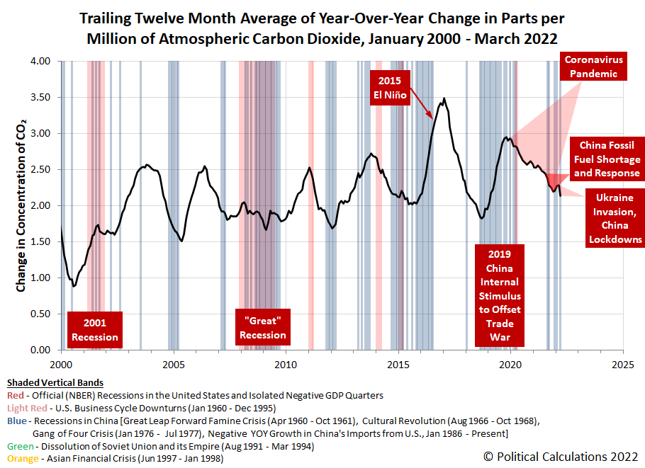
That's evident from the sharp drop in the pace at which carbon dioxide is increasing in the Earth's atmosphere recorded at the remote Mauna Loa observatory during the last month. The following chart confirms that outcome as measured by the trailing twelve month average of year-over-year change in the atmospheric concentration of carbon dioxide:
There are two driving factors behind this development. First, Russia's 24 February 2022 invasion of Ukraine has disrupted coal, oil and especially natural gas flows from Russia to the European Union, as many EU nations are boycotting or have implemented economic sanctions against Russian firms.
The second major factor is China's increasing use of lockdowns as the government struggles to prevent the spread of COVID-19 within the country, which is also the world's largest emitter of carbon dioxide. The lockdowns have shut down the country's largest economic center and are now spreading to more regions along with coronavirus infections.
In terms of overall impact for the global economy, we view Russia's invasion of Ukraine as a secondary event, while China's ongoing use of lockdowns clearly represents a continuation of the global coronavirus pandemic recession that originated within the country in 2019.
Update 20 April 2022
Welcome MarketWatch readers! For those interested, we have created a tool to estimate how the change in atmospheric carbon dioxide translates into lost GDP for the planet. Here are the earliest and most recent posts from that series where we've put a number on that impact:
A quick back of the envelope calculation with a net reduction of -0.80 parts per million in the rate at which carbon dioxide is being added to the Earth's atmosphere from December 2019 through March 2022 puts the estimated net global GDP loss at $26.6 trillion. This estimate is likely on the high side of what the IMF and World Bank would estimate.
Reference
National Oceanographic and Atmospheric Administration. Earth System Research Laboratory. Mauna Loa Observatory CO2 Data. [Text File]. Updated 8 April 2022. Accessed 8 April 2022.
Labels: coronavirus, environment, recession
The S&P 500 (Index: SPX) showed it was close to the edge during the Good Friday holiday-shortened trading week. In fact, the latest weekly update to the alternative futures spaghetti forecast chart reveals it still is on the edge of the redzone forecast range:
The current redzone forecast range is based on the assumption investors would be focusing on 2022-Q3 during the weeks it runs, indicating where we expect the actual trajectory of the S&P 500 will range while the accuracy of the dividend futures-based model's forecasts are affected by the echo of the past volatility of historic stock prices it uses as the base reference points to project the future for the index. As you can see, it's running right along the lower edge of that range.
That's because investors had a reason to draw in their forward-looking focus toward the current quarter of 2022-Q2 during the past week. That's because speculation the Fed's next rate hike in May 2022 could be as large as 0.75% took hold early in the week ahead of the latest report on the Consumer Price Index.
As the week played out, the level of inflation proved to be a bit lower than investors were speculating, which meant they continued focusing their attention on 2022-Q3. But the level of the S&P 500 remains at the edge of the lower end of the range we would expect the index to be in that situation.
What would be the risk if investors fully shifted their attention to 2022-Q2 in setting current day stock prices? The dividend futures-based model indicates such a shift would be accompanied by significant drop in stock prices, around 3-7% below their current depressed level. And that drop could happen without any change in the expectations for the S&P 500's dividends and earnings.
And that brings us to 2022-Q2's earnings season, which is just getting underway. Now that we're past the March 2022 inflation report and still ahead of when the Federal Reserve's Open Market Committee will meet in May 2022, the random onset of new information about the business outlook for S&P 500 firms has the most potential for prompting investors to shift their attention back into the second quarter of 2022. At their current level, it wouldn't take much to make that happen, which is why we're describing the S&P 500 as being on the edge.
Speaking of the random onset of new information, here's our sumary of market-moving news headlines that investors absorbed during the past week.
- Monday, 11 April 2022
- Signs and portents for the U.S. economy:
- U.S. consumers up view of inflation, spending in coming year, NY Fed survey finds
- Oil dives 4%, below $100 on reserves release, China lockdowns
- Gasoline seen boosting U.S. consumer prices in March
- OPEC tells EU not possible to replace potential Russian oil supply loss
- Early signs of cooling housing market seen in some U.S. cities, Redfin says
- Fed minions say inflation will be high through 2023, getting on board with bigger rate hikes:
- Cleveland Fed's Mester says inflation elevated through 2023 but trajectory will fall - CBS
- Fed's Evans: half-point hike "worthy" of consideration
- Bigger trouble developing in China:
- China's inflation tops forecasts as supply pressures worsen
- China developer Zhenro defaults on interest payments for two offshore bonds
- BOJ minions getting gloomy:
- Wall Street stumbles as surging Treasury yields slam growth stocks
- Tuesday, 12 April 2022
- Signs and portents for the U.S. economy:
- Oil rises on OPEC warning and easing of Shanghai COVID curbs
- Surging gasoline price boosts March US CPI
- Fed minion confirms 2022-Q2 date for starting QT:
- Bigger trouble developing in China, Eurozone, Russia, Sri Lanka:
- China's March trade growth likely slowed due to virus curbs, Ukraine war- Reuters poll
- Euro zone banks to tighten corporate credit access on war fears: ECB
- Russia's economy set for biggest contraction since 1994, Kudrin says
- Sri Lanka unilaterally suspends external debt payments, says it needs money for essentials
- Bigger inflation in Australia, Japan:
- Australia business conditions surge in March, inflation runs hot
- Japan's wholesale inflation stays near record on Ukraine war, weak yen
- ECB minions have questions to answer:
- Wall St reverses gains, closes lower as aggressive Fed actions loom
- Wednesday, 13 April 2022
- Signs and portents for the U.S. economy:
- Broad increase in U.S. producer prices underscores tough inflation battle for Fed
- U.S. mortgage interest rates top 5%, buyers look to lock in rates
- U.S. crude stocks surge on strategic reserve release
- Fed minions thinking about stagnating economy to stall inflation:
- Fed's Bullard says central bank must put brakes on economic activity -FT
- Fed's Waller: need fast rate hikes, but not a Volcker moment
- Bigger stimulus developing in Japan, China:
- Japan's Feb machinery orders fall for second month, adding to growth fears
- China's imports unexpectedly fall as COVID curbs convulse trade outlook
- Bigger stimulus developing in China:
- BOJ minions really want to keep stimulus going, Bank of Canada minions hike rates:
- BOJ's Kuroda vows easy policy, warns of economic hit from rising import costs
- Bank of Canada lifts rates, promises more hikes to fight inflation
- Wall Street surges in growth stocks rally; earnings season opens
- Thursday, 14 April 2022
- Signs and portents for the U.S. economy:
- Oil rises on news EU may phase in a ban on Russian oil imports
- Bird flu, Ukraine war push egg prices higher worldwide
- U.S. companies load up on costly inventories as new supply snarls loom in China
- Higher gasoline prices flatter U.S. retail sales; consumers remain resilient
- Fed minions locking in half point rate hike expectation:
- Fed's Williams: 50 basis point hike is a 'very reasonable option' for May
- Fed aims to bring elevated inflation under control: Mester
- Bigger trouble, stimulus developing in China:
- China's GDP growth seen slowing to 5.0% in 2022 on COVID hit - Reuters poll
- China seen holding medium-term rate steady Friday, RRR cut seen more likely- Reuters poll
- China set to loosen credit but economic woes may be too deep for quick turnaround
- Central banks ramping up rate hikes in attempts to slow, reverse inflation:
- The game is afoot: central banks ramp up inflation fight
- South Korea steps up inflation fight with surprise rate hike
- Singapore tightens monetary policy to fight inflation, growth slows in Q1
- BOJ minions happy to see inflation stop chronic deflation, ECB minions stand by to watch inflation, may do something about it someday:
- BOJ's Wakatabe says Japan no longer suffering from sustained price falls
- ECB closely monitoring inflation expectations, Lagarde says
- U.S. stocks slide as rising bond yields hit growth stocks
- Flashback: Investors buy tech stocks to hedge inflation, Fed rate hike, Jim Cramer says
- The hedging strategy doesn't work like Jim Cramer thought it did in this article. It's still a hedge, but a longer term one where investors cash out the tech stocks they bought when the inflation they expected back when they bought them fully arrives and forces fast and furious rate hikes.
The CME Group's FedWatch Tool is still projecting Fed's next moves will be three consecutive half point rate hikes in May, June, and July (the first two in 2022-Q2, the third in 2022-Q3), two quarter point rate hike in September (2022-Q3) and November (2022-Q4), followed by a half point rate to close out 2022 in December (2022-Q4).
Meanwhile, the so-called "Blue Chip Consensus" forecast for 2022-Q1's GDP has converged with the Atlanta Fed's GDPNow tool's latest estimate of real GDP growth, which is unchanged from last week's 1.1%.
Once again, American taxpayers are being asked to perform a grim annual ritual. Or else you'll be paid a visit by the dreaded tax man.
The grim ritual is the annual filing of federal income tax returns. And in all but nine states, they'll also have to file state income tax returns.
But that's nowhere near all the taxes that Americans have to pay. As an American, did you ever wonder how much of your income goes to pay all the taxes you pay? It's not just federal and state income taxes. That can include local income taxes, Social Security and Medicare (FICA) taxes, property taxes, utility taxes, sales taxes, excise taxes, etc.
What percentage of your income is going to pay all those taxes?
Answering that question is why we've built the following tool. It identifies the major taxes most Americans will encounter during the course of a year and can be used to estimate how much of your annual income is really sucked up by governments at every level you might encounter. If you're reading this article on a site that republishes our RSS news feed, please click here to access a working version of the tool! And if you're already here, you can get started by entering any numbers of interest into the tool or running the default scenario we've entered. Let's get to it!
For the default example, we've set the annual income to be a little under the median household income for the United States as of December 2021, so it represents an income that half of American households make more than, and half of American households make less than.
For fun, we set our hypothetical median income earning household in Philadelphia, Pennsylvania, where residents are subjet to federal, state, and local income taxes. Since the city and county for Philadelphia is one and the same, we've only entered taxes paid at the county level.
We also set our median household up in a home that cost $304,000 in 2021, which happens to be the median sales price of a single family home in Philadelphia, adjusting the property taxes accordingly, including the city's school district taxes.
But wait, there's more! Our median income-earning household will pay water/sewer/stormwater, electricity, natural gas, telephone/mobile, cable/internet, solid waste/trash, and other utility taxes!.
Think that's all? Guess again! There are sales taxes to be paid too, for the state, county and/or city. There's also excise taxes like those for gasoline and others, which are paid by those who pay for alcohol, cigarettes, soda, parking, etc. There are so many we can't easily incorporate them into our tool and keep its user interface manageable, which is why we've had to add categories for "other" in a couple of spots!
Just for the record, we've omitted things like sales taxes for real estate and vehicles, mainly because they're usually not regular annual events for most households.
So how much of a median income earning household's income would be consumed by taxes if they lived in Philadelphia? Our tool conservatively estimates 37.3%.
How does your household compare to that? Would living somewhere else make a big difference? These are questions our tool can help you discover. Go ahead. Take it for a test drive. The Tax Man already has.
Image credit: Photo by Jon Tyson on Unsplash.
Welcome to the blogosphere's toolchest! Here, unlike other blogs dedicated to analyzing current events, we create easy-to-use, simple tools to do the math related to them so you can get in on the action too! If you would like to learn more about these tools, or if you would like to contribute ideas to develop for this blog, please e-mail us at:
ironman at politicalcalculations
Thanks in advance!
Closing values for previous trading day.
This site is primarily powered by:
CSS Validation
RSS Site Feed
JavaScript
The tools on this site are built using JavaScript. If you would like to learn more, one of the best free resources on the web is available at W3Schools.com.
