New York has become the epicenter of COVID-19 infections in the United States. That description applies to both New York City, whose number of confirmed coronavirus cases total 17,896 with 192 deaths, and the state of New York, whose total positive cases reached 30,811 with 285 deaths as of 25 March 2020.
The following tower chart shows the progression of COVID-19 in the state of New York from 10 March 2020 through 25 March 2020.
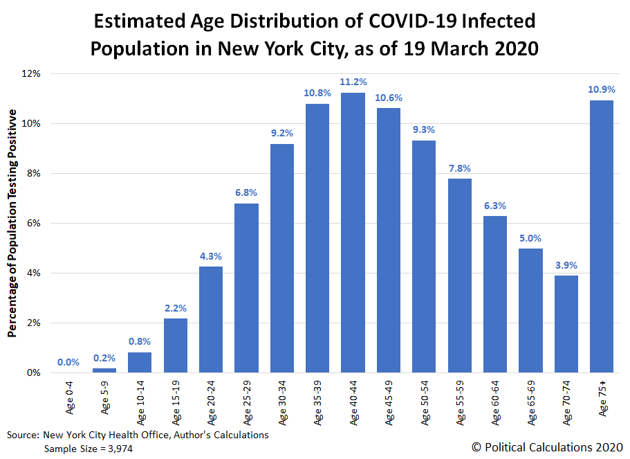
New York City accounts for 58% of the cases reported in the state, where the city's Department of Health has provided some limited demographic data about who has tested positive for COVID-19 in the city. The data is from 19 March 2020, but provided enough information for us to construct a cumulative distribution of the ages of the 3,954 who had tested positive for COVID-19 nearly a week ago, which allows us to generate a more detailed distribution of that sampled population. The following chart shows those estimated results.
The median age of New York City's population of those testing positive for the coronavirus infection is 46, which means half of confirmed cases are in people above that age, and half are in people below that age. Of those confirmed to have coronavirus infections, 40 to 44 year old New Yorkers have the highest incidence, with 51% of the city's infected population would appear to fall between the ages of 30 and 54.
How good are these estimates? As of 25 March 2020, New York City's age demographic data for COVID-19 infections has been expanded to cover over five times as many cases, and the percentages of the smaller sample from our analysis fall within 1% of the larger sample's data for Ages 0 through 64, and within 3% up to Age 74.
Overall, the state of New York has recorded over three times the rate of incidence of residents testing positive for COVID-19, when measured as a percentage of its population, than second ranked New Jersey.
As for COVID-19 related deaths in New York City, 95% are reported to have occurred in individuals with underlying illnesses, including diabetes, lung disease, cancer immunodeficiency, heart disease, hypertension, asthma, kidney disease, and gastrointestinal/liver disease. The best statistical analysis we've seen for the mortality risk associated with COVID-19 is from David Spiegelhalter, who describes the effect of the disease as being "like packing a year's worth of risk into a week or two".
Why has New York City become the epicenter for coronavirus cases in the United States? While that's a question that will be studied by epidemiologists for years, significant parts of the answer might be found here.
What's The Latest?
Here's the latest update to the state of New York's full tower chart through 9 June 2020, along with the state's daily test positivity rate (the percentage of positive test results among all tests reported), and also the state's rolling 7-day average of newly confirmed cases and deaths per day. Click on the image below to access a much larger version of the three charts together:
The daily growth of New York's confirmed cases is now growing much more slowly, with the incidence of new cases approaching a stable level as the 'curve' is flattening, which can be seen in the orange-shaded portion of the tower chart above, whose sides are becoming more and more vertical - like a tower. The state's confirmed cases accounting for just over one-fifth of the total positive test results observed in the United States, but nearly a quarter of all deaths.
At the same time, with the amount of testing increasing steadily, as indicated by the blue-shaded section of the tower chart, the state's test positivity rate is declining as the spread of coronavirus infections within the state is slowing, as shown in the middle chart above. That can be confirmed in the rightmost chart, which shows the number of newly confirmed cases stabilizing around 14,360 per week, which is well within the available capacity of the state's hospitals and medical facilities.
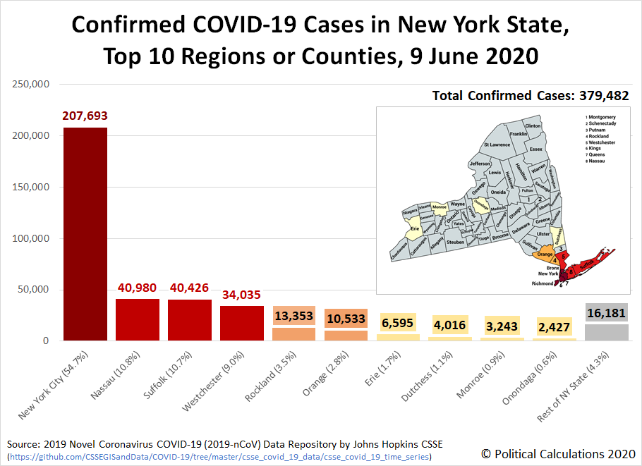
Here's a little more detail on the geographical distribution of confirmed cases in the state, where the following chart identifies the top 10 regions or counties:
The region of New York City includes Bronx, Kings, New York, Richmond, and Queens counties. While the most affected counties in the state are adjacent to New York City, believe it or not, there are several counties in the state (such as Hamilton, Lewis, and Schuyler) that are reporting exceptionally low numbers of confirmed cases, with little to no change in their very low levels of reported cases for weeks. Although their data points to exceptionally low levels of risk, their residents have been subject to the same stay-at-home orders and business closures that were put into place because of the runaway situation in New York City, which points to an inability of the Cuomo administration to manage any kind of flexible response to the epidemic that could have reduced the economic harm their blanket one-size-fits-all policies have created.
Why has New York's situation with the coronavirus been so bad? The New York Times points to the poor judgment of government officials, including Governor Andrew Cuomo and particularly New York City Mayor Bill De Blasio. Their grave mistakes greatly amplified the poor judgment and sluggishness of bureaucrats in the Centers for Disease Control and the Food and Drug Administration, who the New York Post reports failed to treat the rapidly developing crisis like a rapidly developing crisis.
In addition, a new study is pointing to the city's public transportation system, particularly its subways and buses, as major contributors in exposing New Yorkers to the coronavirus. The failure to regularly decontaminate the city's trains and buses while keeping them running on a reduced schedule that resulted in packing more New Yorkers into highly contaminated spaces ensured they would be at much higher risk of being exposed to the SARS-CoV-2 coronavirus (shades of what happened on the Diamond Princess cruise ship). It took until 30 April 2020 for Governor Cuomo to order New York City's subway trains be sanitized nightly following weeks of inaction by New York City Mayor Bill De Blasio.
As for ending the business closures and stay-at-home orders they've imposed, on 16 April 2020, Governor Cuomo indicated he will extend his statewide order through 15 May 2020, while Mayor De Blasio will keep New York City locked down well into July or August 2020. On 7 May 2020, Governor Cuomo revealed data indicating that two-thirds of new hospital admissions were individuals who had adhered to the state's stay-at-home order, raising questions of its effectiveness.
On 14 May 2020, Governor Cuomo announced the "phased reopening" of many of the comparatively less affected regions of New York would begin on 15 May 2020, but excluded the westernmost region of the state as well as the southeastern region of the state, including New York City. On 15 May 2020, Governor Cuomo once again extended New York's stay-at-home order, this time until 13 June 2020, which would fully apply in those areas until they met Governor Cuomo's criteria for lifting his restrictions.
The unmitigated spread of coronavirus infections within New York City is also a primary source of coronavirus inflection elsewhere in the U.S., with subsequent outbreaks elsewhere in the U.S. linked to individuals who traveled from New York City.
Although President Trump proposed a quarantine on travel from New York City and the counties that make up its surrounding greater metropolitan area, Governor Cuomo actively opposed the action for weeks, which he claimed could only have be implemented in New York under his authority. The proposed quarantine was never implemented.
Governor Cuomo and Mayor Bill De Blasio have also been engaged in political squabbling with deadly repercussions that needlessly delayed any effective response in New York, as you can see from the reporting of how Governor Cuomo responded to Mayor De Blasio's attempt to order New York City business closures and residents to stay-at-home following San Francisco Mayor London Breed's example:
In an interview, California Health and Human Services Secretary Dr. Mark Ghaly said it was critical to allow Northern California counties to rely on their own experts, act with a degree of autonomy and thus perhaps pave the way for the state to expand on what they had done. And three days after San Francisco and its neighboring counties were closed, Newsom, on March 19, imposed the same restrictions on the rest of California.
Breed, it turns out, had sent de Blasio a copy of her detailed shelter-in-place order. She thought New York might benefit from it.
New York Gov. Andrew Cuomo, however, reacted to de Blasio’s idea for closing down New York City with derision. It was dangerous, he said, and served only to scare people. Language mattered, Cuomo said, and “shelter-in-place” sounded like it was a response to a nuclear apocalypse.
Moreover, Cuomo said, he alone had the power to order such a measure.
For years, Cuomo and de Blasio, each of whom has harbored national political ambitions, had engaged in a kind of intrastate cold war, a rivalry that to many often felt childish and counterproductive. When de Blasio finally decided to close the city’s schools, it was Cuomo who rushed to make the public announcement, claiming it as his decision.
“No city in the state can quarantine itself without state approval,” Cuomo said of de Blasio’s call for a shelter-in-place order. “I have no plan whatsoever to quarantine any city.”
Cuomo’s conviction didn’t last. On March 22, he, too, shuttered his state. The action came six days after San Francisco had shut down, five days after de Blasio suggested doing similarly and three days after all of California had been closed by Newsom. By then, New York faced a raging epidemic, with the number of confirmed cases at 15,000 doubling every three or four days.
That's some monstrously bad decision making.
But that poor decision making pales in comparison to the matter of Governor Cuomo's coronavirus nursing home scandal, for which we've developed two timelines to present in a separate post (one of the timelines had been appended to the bottom of this post, but it made more sense to move it to the newer article, where we are continuing to cover the deadly scandal.
Finally, as a testament to how deadly the coronavirus epidemic has been within the nursing homes and long term care facilities that cater to sick, elderly New Yorkers, here's an update to the share of deaths by age group within New York, through the first two months of the state's lockdown:
Update 29 May 2020: Over two months later, some post mortems have begun to be written about why the five counties that make up New York City were hit so hard by the coronavirus epidemic, even though the city still has a very long way to go before its can be considered over.
Update 9 June 2020: We've reached the end for providing weekly updates for New York's coronavirus cases - we are continuing to follow the state's situation, but will no longer be updating information in this article.
Labels: coronavirus, data visualization
Welcome to the blogosphere's toolchest! Here, unlike other blogs dedicated to analyzing current events, we create easy-to-use, simple tools to do the math related to them so you can get in on the action too! If you would like to learn more about these tools, or if you would like to contribute ideas to develop for this blog, please e-mail us at:
ironman at politicalcalculations
Thanks in advance!
Closing values for previous trading day.
This site is primarily powered by:
CSS Validation
RSS Site Feed
JavaScript
The tools on this site are built using JavaScript. If you would like to learn more, one of the best free resources on the web is available at W3Schools.com.


