The coronavirus epidemic in the U.S. is again trending downward in its eleventh week. As the volume of testing has continued to expand, averaging 386,000 tests per day during the last week, the rate at which Americans are testing positive for coronavirus infections is reaching new lows. Meanwhile, the incidence of both newly confirmed cases and deaths across the nation has continued to fall since peaking on 10 April 2020 and 21 April 2020 respectively as the spread of infections slows at the national level.
You can see these trends in the latest update to the United States' full tower chart through 26 May 2020, along with the nation's daily test positivity rate (the percentage of positive test results among all tests reported), and also the nation's rolling 7-day average of newly confirmed cases and deaths per day. Click on the image below to access a much larger version of the three charts together:
Most states and territories within the U.S. have seen improving trends during the past week, with two big exceptions. The following skyline tower chart illustrates the progression of COVID-19 cases for U.S. states and territories from 10 March 2020 through 26 May 2020, where we can see the slowing rate of growth of confirmed cases in the individual state or territory tower charts, and for the states and territories that report the number of recovered patients, in the transition from orange to lighter green shading in their tower charts.
Each of these charts span the same period of time and the width of each corresponds to 2.0% of each state or territory's population, making it very easy to see which states and territories have been most impacted and which have been the least impacted through the first eleven weeks of the coronavirus epidemic in the U.S., especially since we've ranked them from the highest percentage of infection within the state's population to the least as you read from left-to-right, top-to-bottom.
This is the fifth week in a row we haven't needed to adjust the horizontal scale of the charts to accommodate larger percentages of confirmed cases within the populations of the most affected states and territories, which is another very positive indication.
Two Big Exceptions at the State Level
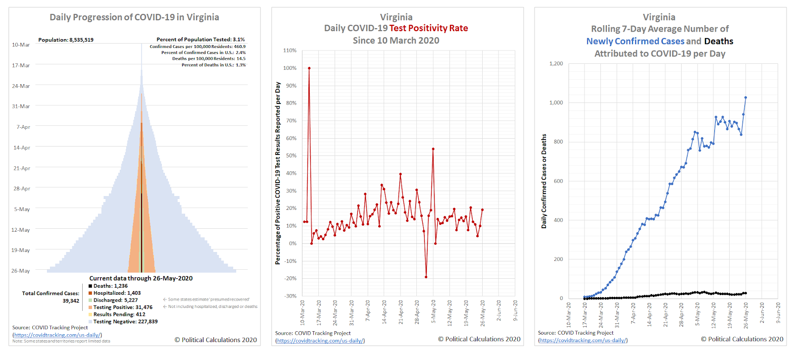
While most states and territories are reporting falling levels of newly confirmed coronavirus cases, there are two big exceptions: Virginia, which we spotlighted last week as part of a regional hotspot in the U.S., and California.
Let's look at Virginia's data, where you would never know from looking at the trends in its data that the state has been on a lockdown ordered by its governor, a medical doctor, since 30 March 2020.
One contributing factor may be recent example set by the state's governor, who just mandated Virginia residents wear face masks indoors while in public venues, after ignoring his own recommendations for the public while going to the beach over the weekend.
The other problem state is the most populous: California. Here are the charts showing its trends:
California was the first state to impose a statewide lockdown order, with its governor acting to do so back on 19 March 2020, with the action extending those of local governments who locked down their jurisdictions following the detection of one of the nation's earliest known outbreaks of SARS-CoV-2 coronavirus infections.
That early action contrasts with the very delayed response of New York's governor, whose actions through March 2020 all but ensured the exponential spread of the virus in the northeastern United States, which is reflected in the states that rank at the top of the skyline tower chart.
That's also what makes California's now rising trend of newly confirmed coronavirus cases somewhat surprising in the epidemic's eleventh week. California's neighboring states are each seeing falling numbers of new infections, while California's continues to rise. A recent report attributes the rising trend of new cases in Orange County to the virus' penetration into state-run or regulated institutions, such as jails and nursing homes, which are characterized by people living in close proximity to one another, making infections more likely to spread among the resident populations once they are established. California's early actions may have slowed that penetration, but now that the virus is establishing itself in these places, it is spreading rapidly.
But it's not just Orange County seeing an increasing trend within California. Los Angeles County is experiencing a far larger increase, but with less explanation for why that might be. It's an area that certainly bears watching.
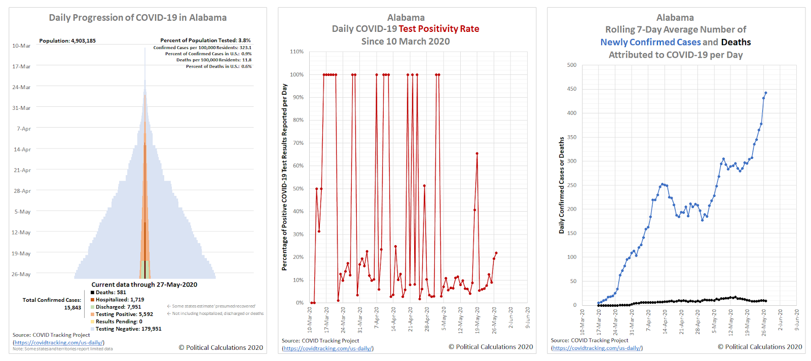
Update 27 May 2020: Let's add Alabama to the list of states now seeing a surge in cases:
Compared to California and Virginia, its overall numbers are much lower, but that's still an adverse trend.
Previously on Political Calculations
Here's our series of articles featuring the data visualization we've developed to track the spread and severity of the coronavirus epidemic at the state level, which we've listed in reverse chronological order:
- U.S. Sees Widespread Improvements in Coronavirus Epidemic But Develops a New Regional Hotspot
- A Shifting Geography for Coronavirus Cases in the U.S.
- Most States Show Slowing Progression of Coronavirus in Week 8 of Epidemic
- Seven Weeks and One Million Coronavirus Cases Later...
- A Mixed Picture Emerges For Progression of COVID-19 in U.S.
- Signs Of Slowing COVID-19 Spread Among U.S. States
- Visualizing The First Four Weeks Of The Coronavirus Epidemic In The U.S.
- Visualizing the Progression of COVID-19 in the United States
- Introducing Skyline Charts for Tracking Coronavirus Cases in the U.S.
We're also covering the worst-in-the-U.S. situation in the state of New York and why it has been so bad in that state:
- Governor Cuomo and the Coronavirus Models - Recently updated
- COVID-19 In New York - Recently updated
Meanwhile, if you prefer your data in the form of tables presenting numbers and percentages, we also have you covered!
- COVID-19 Coronavirus Cases in the U.S. - Recently updated
- Ranking the World for COVID-19 Coronavirus Cases - Recently updated
Labels: coronavirus, data visualization
Welcome to the blogosphere's toolchest! Here, unlike other blogs dedicated to analyzing current events, we create easy-to-use, simple tools to do the math related to them so you can get in on the action too! If you would like to learn more about these tools, or if you would like to contribute ideas to develop for this blog, please e-mail us at:
ironman at politicalcalculations
Thanks in advance!
Closing values for previous trading day.
This site is primarily powered by:
CSS Validation
RSS Site Feed
JavaScript
The tools on this site are built using JavaScript. If you would like to learn more, one of the best free resources on the web is available at W3Schools.com.


