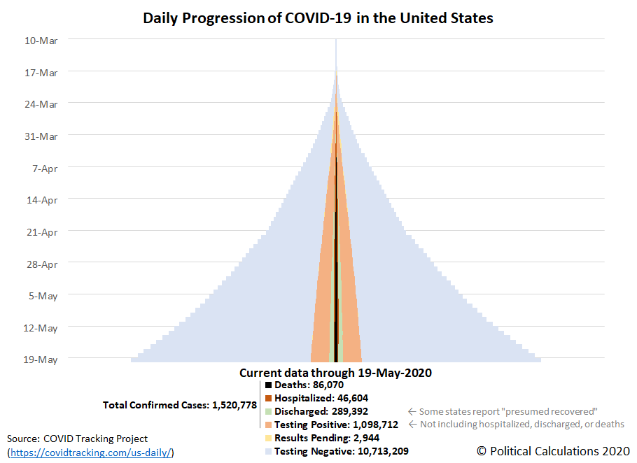
The progression of the coronavirus epidemic in the United States continues to slow, with most states having successfully 'flattened the curve' for the spread of the potentially deadly infection in the last several weeks, with the number of both hospitalizations and deaths attributed to the coronavirus stabilizing. At the same time, testing for the SARS-CoV-2 coronavirus has been growing exponentially.
All of these trends can be seen in the following tower chart, where the expanding light-blue pyramid for negative test results confirms the expansionary growth in the amount of testing since 22 April 2020, the light-orange tower within the light-blue pyramid indicates a slowing rate of growth for positive test results, the growing light-green zone within the light-orange tower indicating the growing number of Americans 'recovering' from the infection, and the dark-orange and black towers at the center of the tower indicating much slower growth in the rate of new hospitalizations and deaths from the viral infection.
That's quite a lot of information to unpack, so let's dig down into the underlying state and territory level data. The following skyline tower chart illustrates the progression of COVID-19 cases for U.S. states and territories from 10 March 2020 through 19 May 2020, where we can see the slowing rate of growth of confirmed cases in the individual state or territory tower charts, and for the states and territories that report the number of recovered patients, in the transition from orange to lighter green shading in their tower charts.
Each of these charts span the same period of time and the width of each corresponds to 2.0% of each state or territory's population, making it very easy to see which states and territories have been most impacted and which have been the least impacted through the first ten weeks of the coronavirus epidemic in the U.S., especially since we've ranked them from the highest percentage of infection within the state's population to the least as you read from left-to-right, top-to-bottom.
Another sign of improvement is that for the fourth week in a row, we haven't needed to adjust the horizontal scale of the charts to accommodate larger percentages of confirmed cases within the populations of the most affected states and territories.
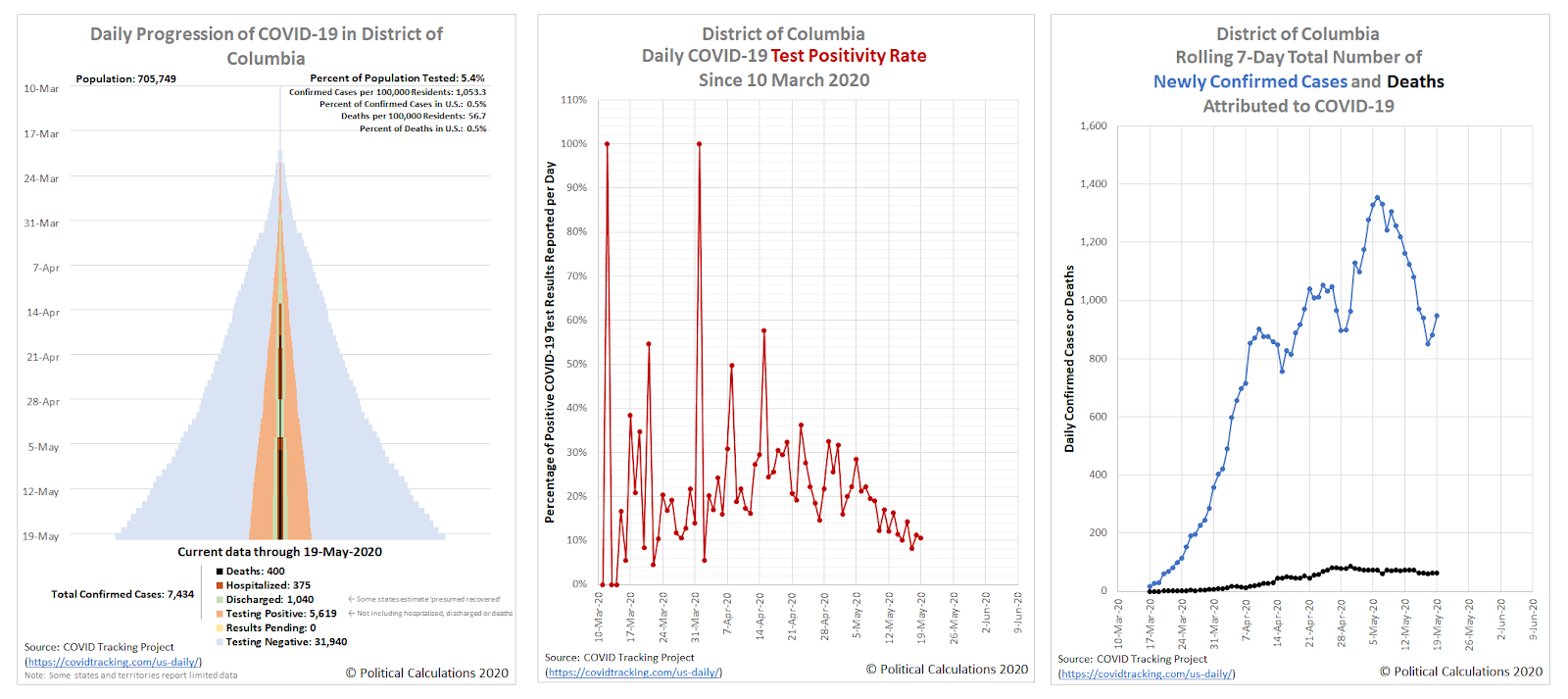
As promised last week, we'll take a closer look at the new regional hotspot for COVID-19 infection that has developed around the nation's capital. Let's start with the District of Columbia, where we'll show its full tower chart, its daily test positivity rate (the percentage of positive tests among all its newly reported test results, and its 7-day rolling total of newly confirmed cases and deaths. Each chart covers the period from 10 March 2020 through 19 May 2020.
Starting with the rightmost chart, the number of newly confirmed cases appears to have peaked in the District of Columbia on 6 May 2020, at 1,355 cases per week. That has since declined to range between 850 and 950 new cases per week during the last several days. The district's test postivity rate has likewise been trending downward in the last two weeks, partly because fewer new cases are being confirmed but also because the amount of coronavirus testing has been increasing, as confirmed in the district's tower chart.
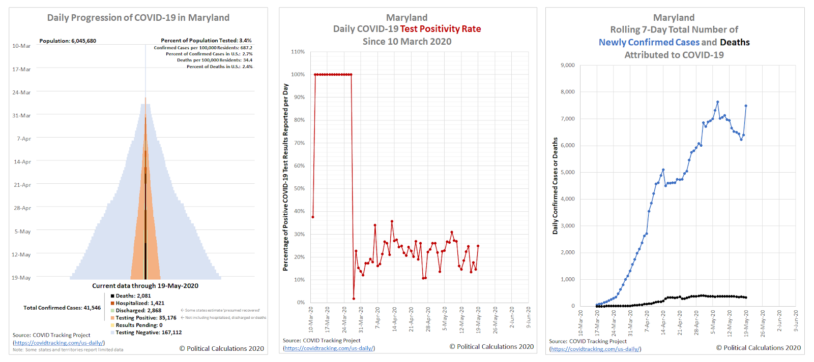
Let's next look at the data for the state of Maryland:
Here, starting again with the rightmost chart, we find a state that is experiencing an increasing rate of coronavirus infections, recording 7,485 per week as of 19 May 2020. The middle chart shows an elevated test positivity rate, ranging between 10% and 31% during the past two weeks, which is the result of two factors: spreading infection and insufficient testing.
Both factors are evident on the tower chart which, though not scaled to population as in the skyline tower charts, is relatively 'skinnier' than the District of Columbia's tower chart.
But as we're about to see, Virginia isn't far behind in becoming a coronavirus hotspot:
Virginia shares all the problems and adverse trends that we described for Maryland, confirming the greater Washington D.C. area as a regional hotspot for coronavirus infections within the U.S.
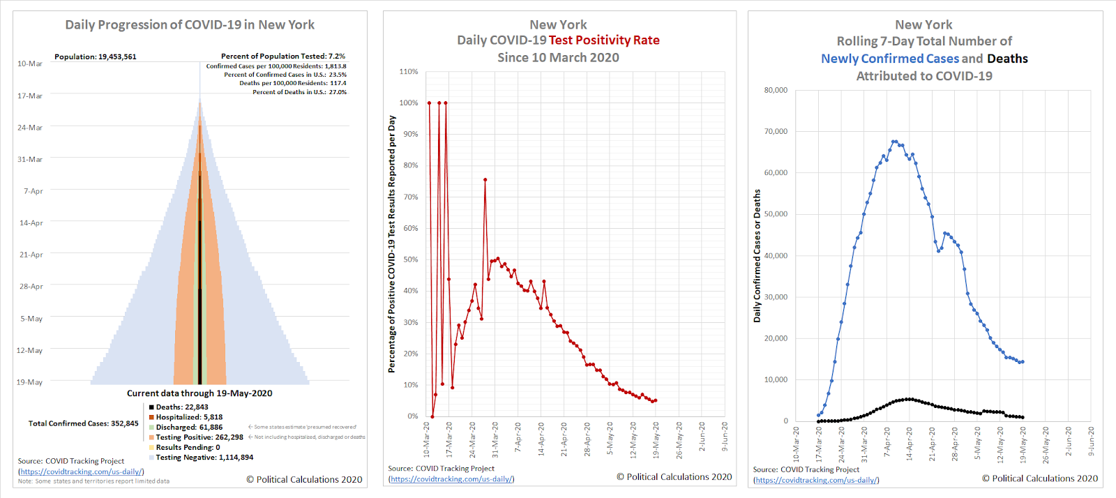
As for the original regional hotspot of New York, here's what its data looks like:
The state appears to be past its peak for both coronavirus infections and deaths attributed to them, but note the vertical scale on its chart for the 7-day rolling totals - it is still recording nearly the same number of new cases as the region of the District of Columbia, Maryland, and Virginia is combined. We've been covering New York's situation separately, where you can find links to our ongoing analysis below.
Previously on Political Calculations
Here's our series of articles featuring the data visualization we've developed to track the spread and severity of the coronavirus epidemic at the state level, which we've listed in reverse chronological order:
- A Shifting Geography for Coronavirus Cases in the U.S.
- Most States Show Slowing Progression of Coronavirus in Week 8 of Epidemic
- Seven Weeks and One Million Coronavirus Cases Later...
- A Mixed Picture Emerges For Progression of COVID-19 in U.S.
- Signs Of Slowing COVID-19 Spread Among U.S. States
- Visualizing The First Four Weeks Of The Coronavirus Epidemic In The U.S.
- Visualizing the Progression of COVID-19 in the United States
- Introducing Skyline Charts for Tracking Coronavirus Cases in the U.S.
We're also covering the worst-in-the-U.S. situation in the state of New York and why it has been so bad in that state:
- Governor Cuomo and the Coronavirus Models - Recently updated
- COVID-19 In New York - Recently updated
Meanwhile, if you prefer your data in the form of tables presenting numbers and percentages, we also have you covered!
- COVID-19 Coronavirus Cases in the U.S. - Recently updated
- Ranking the World for COVID-19 Coronavirus Cases - Recently updated
Labels: coronavirus, data visualization
Welcome to the blogosphere's toolchest! Here, unlike other blogs dedicated to analyzing current events, we create easy-to-use, simple tools to do the math related to them so you can get in on the action too! If you would like to learn more about these tools, or if you would like to contribute ideas to develop for this blog, please e-mail us at:
ironman at politicalcalculations
Thanks in advance!
Closing values for previous trading day.
This site is primarily powered by:
CSS Validation
RSS Site Feed
JavaScript
The tools on this site are built using JavaScript. If you would like to learn more, one of the best free resources on the web is available at W3Schools.com.


