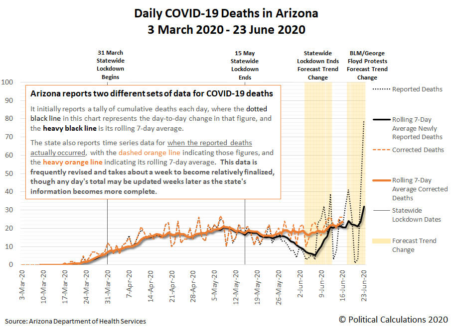
Following our reporting that Arizona has become the new epicenter for coronavirus cases in the U.S., we've been paying close attention to the number of deaths attributed to COVID-19 infections in the state. We've found the state is reporting two sets of data for those deaths.
The first is a cumulative daily tally of reported deaths that many news outlets use in their reporting, from which a day-to-day change in the number of these newly reported cumulative deaths may be calculated.
But the day-to-day changes in the cumulative total doesn't communicate when these deaths actually occurred. For that data, Arizona's Department of Health Services is reporting time series data on its COVID-19 dashboard, in the Deaths section, as a bar chart that is updated and revised daily. From what we have observed, it takes about a week for a given day's death tally to be relatively finalized, after which it may still be subject to revision as the state's information about their actual timing becomes more complete.
In the following chart, we've taken data from both series to see how they compare to each other, where we've discovered that the day-to-day changes in the cumulative tally may be providing an unreliable picture of the timing of COVID-19 deaths in Arizona.
The biggest deviation occurs within the timeframe we've previously projected would show a change in trend following the lifting of Arizona's statewide lockdown order, where instead of declining then rising sharply in the predicted range, COVID-19 deaths instead occurred at a relatively steady pace before ticking upward in the predicted range.
Based on what we're seeing in the more accurate time series data, the reopening of Arizona's economy had a small effect on the number of COVID-19 deaths taking place 20 to 28 days later, with the state experiencing a slow uptrend in deaths, as might be expected. This situation is far better than what occurred in states like New York or other states that copied its policies, which saw COVID-19 deaths skyrocket as their number of cases raced past the population-adjusted levels Arizona is now reaching, which is attributable to the different policy choices made by each state's government officials.
We're still short of when we can see what impact the George Floyd protests in the state may have had upon the trend for COVID-19 deaths, where the state's more accurate time series data for these deaths is still very incomplete. We should have a much better picture of the impact of that event within the next one to two weeks.
Labels: coronavirus, data visualization
Welcome to the blogosphere's toolchest! Here, unlike other blogs dedicated to analyzing current events, we create easy-to-use, simple tools to do the math related to them so you can get in on the action too! If you would like to learn more about these tools, or if you would like to contribute ideas to develop for this blog, please e-mail us at:
ironman at politicalcalculations
Thanks in advance!
Closing values for previous trading day.
This site is primarily powered by:
CSS Validation
RSS Site Feed
JavaScript
The tools on this site are built using JavaScript. If you would like to learn more, one of the best free resources on the web is available at W3Schools.com.
