
Through August 2024, the cost of eating out at establishments that provide full service meals and snacks has risen 23% since January 2021.
In fact, when you go out to a restaurant today, it's not uncommon to see things like $16 dollar BLT sandwiches on the menu. How is it possible that two slices of toasted bread, a couple strips of bacon, several leaves of lettuce, and one or two tomato slices and some mayonnaise possibly cost so much?
The short answer is because of the inflation unleashed in early 2021. That inflation has driven up the costs of everything it takes to provide you as a customer with a BLT sandwich, including rents, utilities, and labor - it's not just the cost of food itself that has gone up.
Brian Will is a restaurant owner in the north Atlanta metropolitan area. In the following TikTok video, he lays out the percentages and costs of doing business that dictate why he has to charge for a BLT sandwich:
@dropoutmm Restaurant food is expensive #restaurantlife #foodcost #restaurantindustry #restaurant #businessowner #businesscoach ♬ original sound - The Dropout Multimillionaire
We thought the numbers he provided, including the average number of BLT sandwiches that his restaurant must sell per day just to break even, made for some interesting math. We've built the following tool to convert the numbers he throws out into the math behind them, but you're more than welcome to change the numbers to consider a multitude of other scenarios. If you're accessing this article on a site that republishes our RSS news feed, you may need to click through to our site to access a working version.
The default values are mostly those given by Will for his restaurant, which almost certainly involve some rounding. We tweaked the value of the unit cost of the food to roughly match what it would take for the restaurant to break even, assuming an average of 257 BLT sandwiches at $16 each per day. Of course, the restaurant's net income represents the income that Will and his partners earn through their ownership and management of the business. If they're just breaking even, with a net income of $0, they can't afford to be in business and the restaurant will shut down.
If they do have a positive net income, say from selling an average of 300 BLT sandwiches per day instead of just 257 to break even, they're going to have to pay income taxes on it, which is why we added that additional element to the tool.
There's one other aspect to consider as well. Today's inflated prices for BLT sandwiches and every other menu item on American restaurant menus are changing the way people eat, with fewer people willing to eat out because of the higher prices they would have to pay. The effect of inflation on supply and demand has a negative effect on the restaurant industry. If they could count on selling more sandwiches every day, they could sell them for a lower price, but the higher costs for everything that goes into making a sandwich to be served at a restaurant have made that marketing strategy much more risky.
If the risk of making the wrong decision in this real world scenario means going out of business, especially if you expect inflation to continue making everything more costly, could you as a business owner even afford to try?
Image credit: Photo by David Trinks on Unsplash.
Labels: business, food, inflation, investing, personal finance, tool


One of the most interesting characteristics of many companies in the oil and gas sector is they pay variable dividends.
That makes them unlike the companies in many other industrial sectors of the U.S. economy. Because so many of these firms pay variable dividends, dividend payouts by firms in the oil and gas sector are especially sensitive to changes in their business conditions. Given the nature of the oil and gas sector's business, that means they are very sensitive to changes in the price of crude oil. That in turn makes the number of dividend reductions being recorded by these firms very useful for gauging the relative health of the entire oil and gas industry.
That's a big deal for investors, because as we're about to show, how the price of crude oil is trending has an impact on how many firms within the industrial sector adjust their dividends. In the case of firms that pay variable dividends, that adjustment happens automatically without any action by the firms' board of directors. The following chart presents the average monthly spot price of West Texas Intermediate crude oil along with the sampling of dividend reductions we've tracked since January 2015.

Throughout much of this period, domestically produced crude oil at $60 per barrel appears to be a significant threshold. When the price of crude oil rises above this level, the number of firms reducing their dividend payouts each month generally declines. When crude oil prices rise well above this level, the number of dividend reductions falls to very low levels.
We see an opposite pattern when the price of a barrel of crude oil drops below $60 per barrel. When that happens, we often see a rising number of firms whose dividend payouts decrease along with the decline in oil prices. The further the price falls below this threshold, the more the number of dividend reductions within the oil and gas sector increase. You can see that pattern in 2015 and early 2016, which marked a time of distress for these firms. You can especially see it during the coronavirus pandemic recession, which saw oil prices plunge below $20 per barrel.
Taking these patterns into account, the chart also reveals a potentially useful threshold to identify when dividend reductions are out of the ordinary. As a general rule of thumb, whenever the number of dividend decreases rises above ten per month, it generally coincides with some level of distress for the industry.
At the same time, we very rarely ever see the number of dividend reductions ever decline to zero. Since January 2015, that has only ever occurred once, in June 2021. This characteristic is attributable to the "noise" generated by variable dividend payers, where we recognize dividend decreases don't always signal a widespread level of distress, but are instead indicating typical month-to-month or quarter-to-quarter variations in an otherwise relatively healthy market for the industrial sector. As another general rule of thumb, we view anything between a range of zero and ten dividend decreases reported in any given month as typical for the oil and gas industry when its experiencing relatively good business conditions.
That brings us to May 2023, which saw 14 dividend reductions in the oil and gas sector while the average price of crude oil during the month was $71.58 per barrel. We should recognize that most of the historic data on the chart occurred when inflation was at historically low levels in the U.S. economy. Since March 2021, the nation has experienced much higher rates of inflation. That much higher inflation may have reset the dollar-per-barrel threshold that may be used to identify when the oil and gas industry is experiencing distress. Doing the inflation-adjustment math, the $60 per barrel "distress" threshold from March 2020 (during the coronavirus pandemic recession) is the equivalent of about $71 per barrel in terms of constant May 2023 U.S. dollars.
Since we have just one data point to suggest that threshold is significant, it will be interesting to follow this sector to see if that hypothesis holds.
References
U.S. Energy Information Administration. Cushing, OK WTI Spot Price (FOB) - Monthly. [Online Database]. Accessed 9 June 2023.
MarketBeat. Recent Dividend Cuts. [Online Database]. Accessed 29 May 2023.
Seeking Alpha. Dividend-Stocks News. [Online Database]. Accessed 29 May 2023.
Wall Street Journal. Dividend Declarations. [Online Database]. Accessed 29 May 2023.
Image credit: Photo by Zbynek Burival on Unsplash.
Labels: business, dividends, stock market

Bankruptcies are on the rise in the U.S., which is driving a surge of interest in the news media. Here's a series of recent headlines:
- Corporate bankruptcies climb year-to-date, tracking toward more normal levels
- Corporate bankruptcies are on the rise — and the pain won’t end for a while
- Corporate bankruptcies are creeping up as pressures in the economy grow
- The credit crunch is driving more bankruptcies and could spark a domino effect of defaults at larger firms, investment manager says
- FirstFT: Corporate bankruptcies rise as US credit squeeze tightens
Most of the reports either don't do much to communicate what kind of numbers are being talked about, or in the case of the FT article, focus on a subset of commercial bankruptcy data so it presents an incomplete picutre. We threw together the following chart using data from Epiq Global/Epiq Bankruptcy to track the monthly number of commercial Chapter 11 bankruptcy filings over the past 10 years to provide some longer term context.
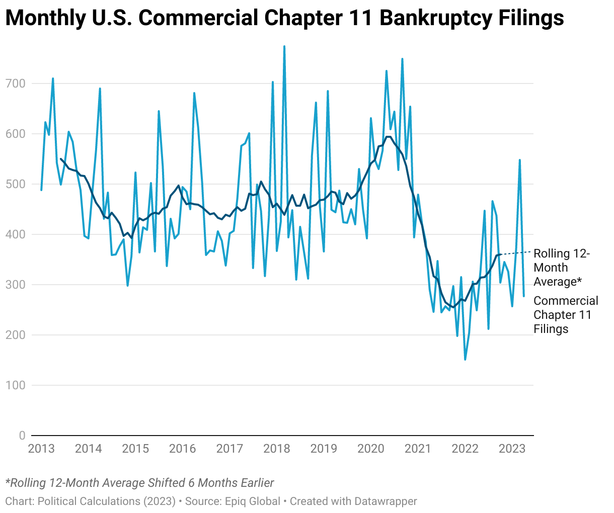
Based on what we see in the chart, the first headline provides the best description of where things stand today. The rest are looking forward to a future that's still developing. The big, unanswered questions are when will the current rising tide of commercial Chapter 11 bankruptcies peak before beginning to recede, and how high will the number of filings get before it does?
Image credit: Photo by Melinda Gimpel on Unsplash.
Labels: business, data visualization
FIFO has become the most popular accounting method U.S. businesses use to determine both the cost of the goods they sell and the value of the goods they have in their inventories. With about 53% of firms in the S&P 500 (Index: SPX) using the accounting method, which plays a big role in determining how profitable they are on paper, it's high past time we took a closer look at how the First In, First Out (FIFO) accounting method works!
For a really good introduction, here's Excel spreadsheet guru Leila Gharani's eight-and-a-half minute video explaining how the First-In-First-Out (FIFO) accounting method is used to calculate the Cost of Goods Sold (COGS) for a business.
While her examples reflect how a modest amount of inflation can affect a business' cost of goods sold, how might a surge of inflation like what the U.S. has experienced during the past two years affect how profitable it appears to be on paper?
For the answer to that question, let's turn to Breaking Bad Accounting's shorter video from September 2020, which compares how the different the net earnings (or profit) results are for firms using the different accounting methods. Given what happened after inflation was unleashed in 2021, it's somewhat prophetic (although their example is more fun to talk about!):
Under FIFO accounting rules, reported profits soar in an inflationary environment because the calculated Cost of Goods Sold lags behind the rising cost of replenishing their inventories with higher cost goods.
About 16% of the firms making up the S&P 500 use the Last In, First Out (LIFO) accounting method. The remaining firms utilize variations of the Average Cost method. Firms that use the LIFO method see much lower profits than FIFO firms report, while Average Cost firms come out somewhere in between these extremes.
During periods of deflation, the opposite pattern develops. LIFO firms will report the highest profits, FIFO firms will report the lowest, and Average Cost firms come out in the middle again. If prices were stable however, all three methods would produce identical results.
The United States is somewhat unique in allowing firms to utilize any of these methods, and the LIFO method in particular, which is banned under International Financial Reporting Standards. Despite that prohibition, major accounting firms like Price Waterhouse Coopers have recommended private U.S. firms adopt the practice because of the high inflation environment established during the past two years.
Labels: business, ideas, inflation, SP 500

Investors have made Apple (NASDAQ: AAPL) worth more than $2 trillion dollars. But how profitable is the company?
That depends on how you measure profit. If you want a raw number, calculating a company's gross income is a good place to start. That's just the difference between its total sales and its total cost of goods sold, ignoring its other costs of doing business. This figure is useful for comparing the basic profitability of a company's core business with that of other companies like it. It's also useful if you track it over time. If you see a company's gross profit swinging wildly from one period to the next, that can be a sign its core business is either highly volatile or, in the worst case, is not well managed. Which if you're going to invest in the company, is probably something you ought to know.
As an investor however, that's not enough information to tell you how profitable the company really is. For that, you need to take its operating costs, how much it pays in interest expenses, how much it pays in taxes, and its other income and expenses into account. Doing that will tell you the company's net income (sometimes called its net earnings), which is the real bottom line. A company with positive net income is making money and a company with negative net earnings is losing money.
For comparing companies, you will find its useful to standardize these measures of profitability by dividing each by the company's total sales revenue and expressing the result as a percentage. For gross income, the result of that math is called the gross profit margin and for net income, the result is called the net profit margin. These percentages will let you directly compare the profitability of companies with very different amounts of profit. And of course, will let you assess trends in a single company's profitability performance if you follow it over time.
All that said, we've built a tool to make it easy for anyone to do this math. All you need is the business' income statement. In the tool below, the default data comes from Apple's December 2022 10-K SEC filing [also available in PDF format], so the tool's results will tell you just how profitable Apple was at the end of 2022. If you're reading this article on a site that republishes our RSS news feed, please click through to our site to access a working version of the tool.
Of course, you're more than welcome to substitute the financial data for other companies in the tool to assess their profitability.
We've made a point of the importance of tracking a company's gross and net profit margins over time, so to that end, we'd like to point you to a very useful resource. Macrotrends features an online application that will chart a company's gross, operating and net profit margins over its recent history using information from its database. Follow this link to see where they've done that for Apple's profit margins going back to December 2009.
Image Credit: Photo by Natasha Hall on Unsplash. The book being read in the photo is Profit First by Mike Michalowicz, which has the enchanting subtitle "Transform Your Business from a Cash-Eating Monster to a Money-Making Machine". At this writing, the book has 7,091 reviews on Amazon, with 85% giving it five stars. Goodreads gives it a 4.27 rating, 51% of which are five star reviews. Most of the critical reviews point out the whole concept of the book could be summarized in five pages or less. Or perhaps just one blog post, but that's a challenge for another day.
Labels: business, investing, personal finance, tool
Costco (NYSE: COST) recently made the news because of something the company didn't do. The wholesaler refused to raise the price of hot dogs sold at its food court:
Costco CFO Richard Galanti revealed last Thursday that its famous hot dog-and-soda combo deal of $1.50 will remain in place despite record-high inflation.
At an earnings call, Galanti said the profit margins the company is seeing in the gas and travel sectors allow Costco to make up for losses at the food court.
That's not necessarily news. Back in 2018, Costco's CEO Craig Jelinek approached company founder Jim Sinegal about raising the price of the company's hot dog and soda combo above the $1.50 price it has been held at since 1985. Here's what happened next:
“I came to (Jim Sinegal) once and I said, ‘Jim, we can’t sell this hot dog for a buck fifty. We are losing our rear ends.’ And he said, ‘If you raise the effing hot dog, I will kill you. Figure it out.’ That’s all I really needed. By the way, if you raised (the price) to $1.75, it would not be that big of a deal. People would still buy (it). But it’s the mindset that when you think of Costco, you think of the $1.50 hot dog (and soda).
“What we figured out we could do is build our own hot dog-manufacturing plant (in Los Angeles) and make our own Kirkland Signature hot dogs. Now we are doing so much hot dog business that we’ve opened up another plant in Chicago.
“By having the discipline to say, ‘You are not going to be able to raise your price. You have to figure it out,’ we took it over and started manufacturing our hot dogs. We keep it at $1.50 and make enough money to get a fair return.”
It's amazing what a CEO can do when properly motivated!...
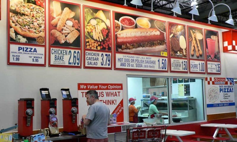
But we wondered how other items on Costco's food court's menu have fared during the last several years, which includes both 2020's coronavirus pandemic that forced the company to shut down its food courts before being allowed to reopen them in 2021 when they were impacted by President Biden's inflation. To find out, we tracked down the following photo of a Costco food court menu with prices, which we think is from 2018 because it still shows the option of a Polish sausage along with the hot dog - they were eliminated from the menu in 2018:
Here's a more recent version of Costco's food court menu with prices from 17 October 2022:

We quickly find that prices for the twisted churros, mocha freezes, smoothies, ice cream, sodas, and chicken bakes have all increased. But if you look closer at the two menus, you'll find other changes as well.
In 2018, for example, you could get four different kinds of pizzas at Costco's food court: cheese, pepperoni, sausage, or a combo (featuring pepperoni, sausage, onions, and green peppers). In 2022, the available options have dwindled to just cheese and pepperoni.
You could also get a Chicken Caesar Salad in 2018. That choice is gone in 2022.
Let's take a closer look at Costco's hot dogs. In 2018, you weren't limited to ordering a hot dog - you could substitute a Polish sausage. You can't do that in 2022. Also notice the condiment selection shown on the 2018 menu photo - you could add pickle relish, onions, ketchup, mustard, or deli mustard to your order. The 2022 menu photo shows no condiments, but we can verify you can still put ketchup or mustard (but not deli mustard, pickle relish, or onions) on your Costco hot dog.
But wait, there's more! Several reports suggest the quality of Costco's continuing food court menu items have also declined over the last several years.
So let's review what Costco's CEO has figured out for the wholesaler's food court menu between 2018 and 2022:
- To keep hot dog prices the same, Costco built two factories to make its own hot dogs. [Side note: the company used a similar strategy to hold down the cost for its popular rotisserie chickens.]
- Costco raised prices for six other food and drink items it sells at its food court. Most of those price increases have taken place since 2020.
- Costco has eliminated options it previously offered for pizzas and condiments.
- Costco has degraded the customer-perceived quality of the food items it sells at its food courts. This can be considered a type of "shrinkflation".
Sounds like the CEO needs to figure it out some more.
Labels: business, inflation, personal finance
As part of our usual day-to-day analysis, we sometimes come across fascinating information that deserves attention all to itself. That's the case with today's data visualization featuring the 20 biggest grocery store chains in the United States by number of store locations.
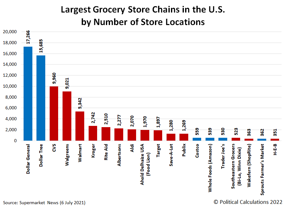
For the visualization, we've omitted several convenience store operators who operate large numbers of stores that are better known as places to refuel motor vehicles than they are as places to buy food and pantry items. We have however included drug store operators because they make a point to regularly advertise these kinds of grocery items in their weekly ads.
By far, the most numerous chains are represented by Dollar General with 17,266 locations and Dollar Tree with 15,685 outlets, which are followed by drug stores CVS with 9,960 outlets and Walgreens with 9,021 stores. Walmart ranks fifth by number of outlets, with 5,342, but ranks first in food sales.
But the largest supermarket operator (which omits Walmart under that classification) is the Kroger family of stores, with 2,742 locations across the U.S.
In the chart, we've highlighted the grocery store chains where you can regularly buy an iconic No. 1 "picnic" (or 10.75 oz) can of Campbell's Condensed Tomato Soup in red. That omits warehouse wholesaler Costco, which often carries Campbell's Chicken Noodle Soup (but not Tomato!). It also omits German-owned discount grocers Aldi and Trader Joes, as well as U.S.-based organic grocers like Amazon's Whole Foods and Sprouts Farmers Market, none of which carry Campbell's Soups (though you can buy it through Amazon's web site).
The biggest surprise for us was to find that Dollar General and Dollar Tree did not sell Campbell's condensed tomato soup in its most iconic packaging either. While these value-oriented grocery stores do in fact sell Campbell's Condensed Tomato Soup, they do so in larger volume cans. As a final personal finance tip, if you're looking for the most tomato soup for your money, you'll get the best value in buying the 15.2 and 14.3 oz cans of Campbell's Condensed Tomato Soup that these discount grocers carry in place of the 10.75 oz can.
Update 29 January 2022: We're happy to report that discount grocer Aldi is indeed a purveyor of Campbell's Condensed Tomato Soup's 10.75 oz. cans! We've updated the chart above to indicate that status (here is the original version of the chart that showed Aldi's bar as blue rather than red).
Reference
Supermarket News. Top 50 food and grocery retailers by sales. [Online Article]. 6 July 2021.
Labels: business, data visualization, food, personal finance
In 2020, the average live weight of a turkey raised on a U.S. farm was nearly unchanged from 2019's final recorded average of 32.7 pounds per bird. That stagnation ended what had been a 40 year long trend of growth in the average size of turkeys produced on U.S. farms.

In the chart above, we've shown that new trend of stagnation continuing based on early signs that production factors such as the rising costs of feed, fuel, and labor for producing turkeys in the U.S. will affect the growth of the average turkey much the same as it did during the inflationary 1970s. Should the finalized data for 2021 confirm that's the case when it is released next year, it will indicate U.S. turkey producers are dealing with today's inflation similarly to how they did during that period of relative stagnation for the U.S. economy.
References
U.S. Department of Agriculture National Agricultural Statistics Service. Livestock Historic Data. [Online Database: Survey - Animals & Products - Poultry - Turkeys - Production - Turkeys Production Measured in Head - Total - National - US Total - 1929-2021 - Annual - Year]. Accessed 14 November 2021.
U.S. Department of Agriculture National Agricultural Statistics Service. Livestock Historic Data. [Online Database: Survey - Animals & Products - Poultry - Turkeys - Production - Turkeys Production Measured in LB - Total - National - US Total - 1929-2021 - Annual - Year]. Accessed 14 November 2021.
Labels: business, food, inflation, thanksgiving, turkey
An estimated 214 million turkeys were raised on U.S. farms in 2021, down 4.5% from 2020's 224 million. That decline continues an ongoing downward trend that has now lasted for 25 years.

2021 saw the fewest number of turkeys produced on U.S. farms since 1986. Turkey production had soared during the late 1980s and early 1990s thanks to that era's low-fat diet craze, which saw a sharp increase in demand for lean turkey meat.
On a side note, we now have turkey production data going back to 1929!
References
U.S. Department of Agriculture National Agricultural Statistics Service. Livestock Historic Data. [Online Database: Survey - Animals & Products - Poultry - Turkeys - Production - Turkeys Production Measured in Head - Total - National - US Total - 1929-2021 - Annual - Year]. Accessed 14 November 2021.
Labels: business, food, thanksgiving, turkey
When you buy gold jewelry, how much are you paying for the gold in it and how much are you paying for everything else it takes to make and bring it to where you can buy it?
For the sake of simplicity, we're going to call that everything else for the jewelry you're buying the "markup". That makes sense in the event that you ever try to sell the jewelry, where you'll quickly find that the amount of gold in it is what gives it most of the value you can recover from it.
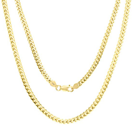
We selected the Nuragold 14k Yellow Gold 3.5mm Solid Miami Cuban Link Chain Pendant Necklace that can be purchased at Amazon to use for our example since it is made from solid 14-karat gold. That means it has much more gold in it than jewelry that has been gold-plated, making its gold content representing a significant portion of its price.
Meanwhile, because pure, or 24-karat gold is a notoriously soft metal, solid gold is often alloyed with alloyed with other, less costly metals such as copper, silver, zinc, and/or nickel to make it stronger. In the case of 14K gold, 58.3% of the content is pure gold.
Meanwhile, if you want to know how much gold is worth today, here is its latest spot price from Kitco, along with a few other precious metals, where the price is given in U.S. dollars per ounce!
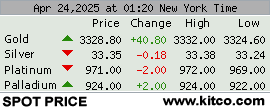
From here, we just need to know the weight of the metal in the jewelry to estimate how much of its value is due to its gold content. For the 20-inch long version of our example necklace, that's 16.6 grams, which on the day we sampled the data, costs $1,003.99. We built the tool below to handle the various weight unit conversions and to calculate the value of gold in it and the resulting markup. If you're reading this article on a site that republishes our RSS news feed, please click through to our site to access a working version of the tool.
For this default example, we find out the jewelry's gold content represents 55.4% of its purchase price, or $556.34. The markup makes up the remaining 44.6%, or $447.64.
If you find yourself in the situation where you're a seller of an article of gold jewelry, you may find the best price you can obtain from a precious metals dealer will be less than the value of the gold content. That's because they have their own markups, which in addition to the transaction costs of doing business, may also include the expense of melting down the jewelry to extract the gold content from it. But that's the subject for a different tool on another day!
Labels: business, personal finance, tool
When we talk about Campbell's Tomato Soup, we often refer to it as a product that hasn't much changed since it was first introduced to American consumers in 1897. But like the metaphorical Ship of Theseus, just about every aspect of the iconic product has been changed over the decades the product has existed. The recipe. The tomatoes. The can. The can's lining.
And also its iconic label, which has just been in the news because its basic design is being changed for the first time in 50 years. Campbell Soup (NYSE: CPB) posted the video announcement of the change on Twitter:
New label, same M'm! M'm! Good!® taste you know and love.❤️Look for our new design on shelves & online!#NewLook #Campbells #MmMmGood pic.twitter.com/h1tb6FRJrJ
— Campbell's (@Campbells) July 27, 2021
The company described the changes to its label in a press release:
Maintaining the famed red and white color blocking loved by generations, the redesigned Campbell’s label features several new elements to contemporize the brand while respecting its heritage — including a modernized logo scripture, which was based on founder Joseph Campbell’s original signature. Campbell’s fans will be able to spot more hidden elements, including the Campbell’s ‘C’ in the fleur de lis and slanted ‘O’ in soup that pays tribute to the letters from the first red and white label in 1898.
“We’ve been on a journey to reimagine this iconic brand and appeal to new generations of consumers who are cooking at home more than ever, while still honoring our rich history,” says Linda Lee, Chief Marketing Officer, Meals & Beverages, Campbell Soup Company.
What Lee doesn't mention is the 2021 changes in the label will help Campbell Soup save money on printing labels, reducing the complexity of the printing process it has been using during the past five decades. It's a seemingly small change that when multiplied by millions of cans produced per year, will produce significant savings, partially offsetting the inflation in other production and transportation costs Campbell Soup is coping with in 2021.
But only partially, since those other rising costs are larger. What the change means is that the price for consumers will rise more slowly than it otherwise would have had Campbell's not adapted the design of its labels.
Speaking of producing millions of cans of soup per year, we'll close with a 2019 video of Campbell Soup's labelling and palletizing line #3 at its Toronto facility in action.
Producing soup has changed too. At the time the video was posted, Campbell Soup was seeking to sell the featured production equipment.
Labels: business, ideas, inflation, soup
Back on 18 November 2020, we described the stock of document storage giant Iron Mountain (NYSE: IRM) as a "COVID-19 play, or rather, a bet on the future for the coronavirus pandemic's real world impact on business activities".
By that, we recognized that the future for IRM's stock price would very much depend on the extent to which the global economy recovered from the coronavirus pandemic and Europe's economy in particular, since Iron Mountain was actively expanding its business in that region. We're following up that observation today, comparing how the stock price of IRM compares with the benchmark of the S&P 500 (Index: SPX). The following chart shows that comparison over the seven months from 18 November 2020 to 18 June 2021:

Nice to see the bet played out well. As for our coverage, unless we find Iron Mountain back in the kind of circumstances that originally drew our attention to it, we're closing out our short series on future prospects of the company's stock price today.
Previously on Political Calculations
Here are the two previous posts where we've discussed the prospects for Iron Mountain's stock price, presented below in chronological order:
Labels: business, coronavirus, stock prices
Homebase is a cloud-based application that provides scheduling and time-tracking services for over 100,000 small businesses in the U.S. As such, the firm has a unique window into the impact the coronavirus recession is having upon hourly workers at U.S. small businesses.
They have produced an interactive chart reveals what their national level data has tracked since 4 March 2020, which is complete through the pay periods ending two weeks ago. If you're accessing this article on a site that republishes our RSS news feed, you may want to click through to our site to see the chart in its full-scale, big screen glory.
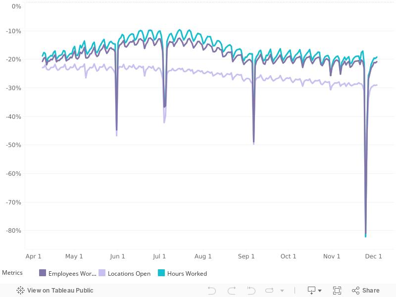
They also visualize their data for major cities, states and various small business types, so you can compare regions and also find out which kinds of small businesses are bouncing back the fastest and which are still well below their pre-coronavirus recession levels.
The national level data indicates the bottom of the coronavirus recession for hourly workers at Homebase's client businesses came on 12 April 2020, with over 50% of locations closed nationwide and over 60% reductions from pre-coronavirus epidemic levels for both number of employees working and number of hours worked. That decline occurred rapidly over a month long period.
Since then, a recovery has been taking place more slowly, with the metrics of hourly employees working, business locations open, and hours worked now about 20% below their pre-coronavirus recession levels through the beginning of July 2020. The trend has been flattening out in recent weeks, coinciding with the increased spread of coronavirus infections in states experiencing a delayed first wave of cases.
HT: Greg Mankiw.
Labels: business, data visualization, recession

The coronavirus pandemic has created a lot of economic challenges, but the latest one is not one anybody could have predicted. Because if it could have been predicted, it wouldn't have ever become a challenge in the first place.
We're talking about the national coin shortage, where pennies, nickels, dimes, and quarters have fallen into short supply across the United States. It turns out the coronavirus is responsible for that problem, because to fight off the coronavirus, many Americans are apparently tossing lots of coin to their witchers.
Oh, if only that were true! The Federal Reserve confirmed what the real story is in an official statement back on 11 June 2020.
The COVID‐19 pandemic has significantly disrupted the supply chain and normal circulation patterns for U.S. coin. In the past few months, coin deposits from depository institutions to the Federal Reserve have declined significantly and the U.S. Mint’s production of coin also decreased due to measures put in place to protect its employees.
Nearly a month later, the problem has become severe enough that many retailers are being forced to cope with the resultig shortage of coins in circulation. One solution for many retailers has been to limit cash transactions by only processing transactions using credit or debit cards or checks for payment.
But at least one retailer is considering a different strategy, for which they solicited advice on Reddit's math subreddit:
I work at a shop where we have a multitude of items with wildly different prices. Due to the national coin shortage, my boss wants me to change the thousands of prices of our items so that we won't have to use change, or get the change to come out on the lower end so we can round down without too much loss. My question is if this is even possible. Is there a magic amount of change to charge on each very differently priced item so that it will come out even? Is this undertaking a waste of time?
r/math was the wrong forum for the question, but it's an interesting question none-the-less. In effect, the boss in this question wants to transform the shop into what we'll call "The Whole Dollar Store". No change needed! Ever!
So how would you do that? Well, in mathematical terms, what you need is for the transaction price at the register to ring up as a whole dollar amount. To set prices to make that work, what you need then is to divide a series of integers (1, 2, 3, ...) by the quantity (1 plus the Sales Tax Rate) to get back to each item's ideal shelf price.
So if the store is located in a place that has a sales tax rate of 8.5%, you would divide each integer sale price by (1 + 0.085), or 1.085. Or you could multiply by 0.9217, its reciprocal rounded to 4 decimal places.
Then, to get a final transaction of $1.00 even, you would set the shelf price for the item to $0.92. For a $5.00 transaction, you would set the shelf price to $4.61. And so on, for the range of item prices for everything the store sells.
But that will leave a roughly 92 cent gap between shelf price levels, which the store can make work for them in one of two ways:
- Set each item shelf prices whose regular price is within 46 cents (half the gap between shelf price increments) of these levels to these amounts.
- Package multiple units of items together to get their combined regular shelf price close to these levels, then set the price to these levels. So if you have an item that regularly sells for $0.33, package 3 together and then set the bundle's shelf price at $0.92 (or 3 for $0.92).
The store would really only need to do that with the lowest regular price items, where customers might be put off if the unit price is too far off from the regular shelf price. For items with much larger unit prices, the potential difference won't be as significant.
In any case, whether that's a waste of time depends on how much time will have to be invested in changing all the prices to make "The Whole Dollar Store"-concept a reality!
Which if it happens, will mean Americans can toss even more coin their witcher.
The stock prices of Boeing (NYSE: BA) and Spirit AeroSystems (NYSE: SPR) tend to be strangely synchronized. Which makes sense because Spirit AeroSystems is a major supplier to Boeing, but the last few months have seen the trajectories of the two companies' stock prices take significantly diverging paths, only to recouple once more.
Let's start by reviewing the path that each company's stock price has taken since mid-October 2018, shortly before the first crash of Boeing's 737-MAX commercial transport aircraft on 29 October 2018:

Both firms' stock prices peaked on 1 March 2019, with Boeing at $440.62 per share and Spirit AeroSystems at $99.35 per share. Alas, while you can get a sense that both companies' stock prices have generally risen and fallen together, the linear scale of the chart doesn't do justice to describing how closely synchronized both stock prices have been with respect to one another, while showing the data using a logarithmic scale wouldn't improve that situation.
But when we present show each company's stock price as a percentage of their 1 March 2019 peak values however, the synchronization between the two leaps out:

Here, we find that in percentage terms, both companies stock prices have generally held with within several percentage points of one another in the period from 15 October 2018 through 31 October 2019, but there have diverged significantly in the period since. The following list of news headlines corresponds with the boxed letters indicated on the chart and describes the reasons for the divergences:
| Chart Item | Headlines | Comments |
|---|---|---|
| A | Spirit AeroSystems profit falls short due to 787 Dreamliner charge | Marking the end of the a period where BA and SPR stock prices were closely synchronized. |
| B | Spirit AeroSystems to Acquire Select Assets of Bombardier Aerostructures and Aftermarket Services Business How Spirit AeroSystems Stock Has Benefited From The Deal To Buy Bombardier's Aerostructures Business | Because SPR's acquisition will diversify the sources of its production revenue, insulating it from Boeing's continuing 737 MAX-related problems, SPR's stock price rose considerably higher than BA's during November 2019. |
| C | Max Crisis Leads to Layoffs at Spirit AeroSystems | But that new revenue source isn't going to be enough, because most of SPR's revenue and net earnings still tied to Boeing production, which isn't looking like it's going to recover quickly, which is why BA and SPR stock prices had recoupled prior to this point. SPR began to break lower after this point, because looming 737 MAX production cuts would hit it harder than BA. |
| D | Boeing secures more than $12 billion in financing to help weather 737 Max crisis | The loans boost both BA and SPR because they will provide some insulation from the loss of revenue from their stalled production lines. |
| E | Spirit AeroSystems slashes quarterly dividend on 737 MAX troubles Boeing's fraying 737 MAX suppliers see capacity crunch | The loans are too little, too late for SPR, which has no choice but to slash its dividend from 12 cents per share to 1 cent per share as the projected end of the 737 MAX production line stoppage slides further out to the right with no clear relief yet in sight. |
The halt of 737 MAX component production at Spirit AeroSystems has caused SPR's stock price to fall several percentage points below BA's stock price, which is a new divergence. Since SPR has cut its dividend, the question now becomes "Will Boeing be following suit?"
Since the company has taken on billions of new debt, and has not yet determined when it might be able to finally resume new 737 MAX deliveries, pressure will build for Boeing to cut its dividend to preserve its operating cash flows. We suspect that reality may soon lead investors to bid down Boeing's stock price in anticipation of that change, which would re-synchronize BA's stock with SPR's.
On the other hand, if Boeing finally gets its operations in order and gets the FAA to buy into its recovery plans, the stock prices of both companies would benefit. It's all a question of timing for which of these scenarios might play out first.
Meanwhile, all of that is separate from the effect of China's coronavirus epidemic on both companies' supply chains and customer demand, which will also affect their potential recovery paths. Given the importance of aerospace production to the U.S. economy, Boeing's continuing 737 MAX problems look like they will be a source of drag for some time.
Labels: business, stock market
Welcome to the blogosphere's toolchest! Here, unlike other blogs dedicated to analyzing current events, we create easy-to-use, simple tools to do the math related to them so you can get in on the action too! If you would like to learn more about these tools, or if you would like to contribute ideas to develop for this blog, please e-mail us at:
ironman at politicalcalculations
Thanks in advance!
Closing values for previous trading day.
This site is primarily powered by:

CSS Validation

RSS Site Feed

JavaScript
The tools on this site are built using JavaScript. If you would like to learn more, one of the best free resources on the web is available at W3Schools.com.
Other Cool Resources
Blog Roll


