
August 2026 was a good month overall for the Thanksgiving Leftover Stocks of 2025.
Compared to their July 2026 snapshot, both our hypothetical indices of the ten worst stocks within the S&P 500 (Index: SPX) during 2025 saw month-over-month gains. The market cap-weighted index of these stocks increased from 87.4% to 91.4% of its value on the day after Thanksgiving 2025, while the equal-weighted index grew more, rising from 88.5% to 94.7%.
Both these indices are still lagging behind the overall S&P 500 index. The benchmark index increased from 108.2% to 112.1% of its day-after-Thanksgiving Day 2025 value in the month from the July to August snapshots.
The following chart shows the performance of all three sets of stocks, with the two Thanksgiving Leftover stock indices continuing to lag behind the S&P 500 index by a wide margin.

It's worth noting why the equal-weighted version of the ten stock index is performing better than the market cap-weighted version. The largest component of the market-cap weighted index is Chipotle Mexican Grill (NYSE: CMG), which accounts for 23.5% of its value. Shortly after the July 2026 snapshot, Chipotle's stock plunged when jalapeno peppers served at the chain's restaurants in Minnesota were linked to an outbreak of salmonella.
Although Chipotle acted quickly to pull all potentially affected jalapenos from its restaurants, investors sent its stock down sharply, losing nearly 16% of its value in a week. Since then, Chipotle's stock has largely recovered to its pre-jalapeno recall level.
That recovery however lagged behind the improvement of several other Thanksgiving Leftover stocks, which gave the edge to the equal-weighted version of the index. The stock of Gartner (NYSE: IT) led the month, rising from 63.4% to 82.5% of its value on 28 November 2026 as investors shook off some of the AI disruption discounting they had earlier imposed on it. the stock price of Factset Research Systems (NYSE: FDS) also saw outsized gains for the same reason, rising from 95.6% to 106.6% of its post-Thanksgiving Day 2025 level.
Two of the individual Thanksgiving Leftover stocks lost notable value over the past month. Deckers Outdoor (NYSE: DECK) declined from 111.0% to 101.6% of its 28 November 2025 value, while the stock price of Trade Desk (NASDAQ: TTD) continued to fall through its continually lowering floor.
The spaghetti chart tracks the relative movements of 2025's ten Thanksgiving Leftover stocks during the last nine months with respect to their value on the day after 2025's Thanksgiving holiday.

Nine months after Thanksgiving 2025, five of the S&P 500's Thanksgiving Leftover stocks have risen above their 28 November 2025 level, while the other five have dropped below it.
In cased you missed it, our extended discussion of The Trade Desk's woes as the worst of the 2025's Thanksgiving Leftover Stocks is available here. We'll check back in with the Leftover Stocks near the end of September 2026.
Labels: ideas, stock prices


When we launched the S&P 500's Thanksgiving Leftover project the day after Thanksgiving 2025, we knew we were going to spend the next year following the stock prices of companies that weren't doing very well. After all, to even make the list, the ten companies whose stocks we would track ranked as the S&P 500's worst performing stocks of 2025.
In the nine months since then, a few of those stocks have outperformed the index, while the rest have lagged behind. Most of those stocks have fallen below their post-2025 Thanksgiving Day level, but not by anywhere near as much as they had fallen to qualify as one of the S&P 500's worst performing stocks in 2025.
But one stock in particular has gone on to plumb new depths. It has continued to fall so much more that it is on track to qualify as one of the S&P 500's worst performing stocks of 2026.
That stock is The Trade Desk (NASDAQ: TTD), the digital advertising firm analyst David Desjardins believes is facing an "existential crisis". Here's how he describes the company's now nearly two year long fall from grace:
After reporting highly disappointing financial results for the second quarter of 2026, shares of The Trade Desk, Inc. (TTD) declined by a whopping 21.9% last Friday, which came on top of a 6.8% decline on the prior day. Since the publication of my initiating coverage in early February 2026, TTD's stock price has basically been cut in half, from ~$27.00 per share at the time of publication to around $13.39 as of today's market close.
Relative to its all-time high of $141.53 reached in December 2024, The Trade Desk has now declined by a massive ~90%. As David Einhorn famously said, a stock down 90% is just a stock that was down 80% before being cut in half again, and this is exactly what happened to TTD since last February. The depth of TTD's sell-off is quite something, but what is even more impressive to me is its speed....
At this point, The Trade Desk has become one of the most hated stocks that I am aware of, and this is on top of being the worst-performing constituent in the S&P 500 (SPX) on a year-to-date basis. Pretty much everything said or written about the company is negative, and it is precisely why I decided to write an update today. In less than two years, TTD went from a market darling that could do no wrong at over 26.0x forward sales to being viewed as a melting ice cube changing hands at 2.3x forward sales today.
The following chart compares The Trade Desk's stock performance with the S&P 500, from 29 November 2024 (aka "the day after Thanksgiving Day 2024) through 18 August 2026:

Believe it or not, despite the company's continued misfortune, Desjardins views the company's low stock price as a speculative strong buy opportunity, where he makes the argument that the company has some potential for a turnaround based on its available cash balance, lack of debt, and cash flow.
We disagree, because we think The Trade Desk has further to fall before it might reach that point.
Here's why. According to SlickCharts, The Trade Desk's market cap has fallen to where the company now ranks 502 out of the 503 stocks that make up the S&P 500 index. Because it has, and because its fall is continuing, the company's stock is verging on the point where S&P will act to remove it from the index. If and when that happens, as increasingly seems likely, its stock price will experience the opposite of what happens when a company's stock is included in the index, which is to say its stock price will fall even further.
A deeper decline is almost ensured given the negative outlook CEO Jeffrey Green communicated during the company's 2026-Q2 earnings call. Gytis Zizys, who formerly held a buy rating for the company on the hope it will see a turnaround, reacted to that development:
The Trade Desk, Inc. (TTD) provided one of the worst guidances I’ve seen in recent months, which put the last nail in the coffin for many shareholders who were still clinging to the idea of a turnaround. It seems I was prematurely too bullish on the turnaround as well, and this report is forcing me to downgrade it to a hold. I don’t think there’s a point in selling at these low prices, unless you want to harvest some tax losses. If it gets to under $10 per share, I will be jumping in to see what happens over the next couple of years. It’ll either recover, or my investment will go to zero.
The only problem with this investing strategy is we can argue that the bar for being able to beat TTD's stock performance is very low. It's so low that investing almost anywhere else or just parking the money in a cash savings account would be more advantageous.
This article is a standalone feature in our ongoing Thanksgiving Leftover series, which will continue with its regular monthly installment later this month. The ongoing tragedy of the performance of The Trade Desk's stock demanded a special edition.
Labels: ideas, SP 500, stock prices, thanksgiving
July 2026 saw positive changes overall for the Thanksgiving Leftover portfolio made up of the ten worst-performing stocks in the S&P 500 (Index: SPX) as of Thanksgiving 2025. At least, as compared to how they fared in June 2025.
The equal-weighted weighted version of the portfolio overtook the market cap-weighted version over the past month. Through the close of trading on 27 July 2026, the equal-weighted group of Thanksgiving Leftover stocks rise to 88.5% of their value recorded on 28 November 2025. That compares with the 87.4% valuation of the market-cap weighted version of the ten stock portfolio.
That's a change from most of the preceding seven months that had the market-cap weighted version of the 2025 Thanksgiving Leftover stock portfolio outperforming the equal-weighted version. It's also developed as the S&P 500 index itself has largely moved sideways, rising from 107.4% to 108.2% of its post-2025 Thanksgiving holiday valuation.
The following chart shows the performance of all three sets of stocks, with the two Thanksgiving Leftover stock indices continuing to lag behind the S&P 500 index by a wide margin.

Much of the gain of the equal-weighted version of the Thanksgiving Leftover stock index has come about because the three worst performing individual stocks in the portfolio, Lululemon Athletica (NASDAQ: LULU), Gartner (NYSE: IT), and The Trade Desk (NASDAQ: TTD) stopped falling and even rebounded a bit in the past month.
More significantly for the equal-weighted Leftover stocks, Factset Research Systems (NYSE: FDS) rose 23% over its level a month earlier.
At the same time, three stocks that account for 45% of the makeup of the market-cap version of the Thanksgiving Leftover stock portfolio, Chipotle Mexican Grill (NYSE: CMG), Fiserv (NASDAQ: FISV), and Alexandria Real Estate Equities (NYSE: ARE), saw positive but smaller gains over the preceding month while the Leftover stocks' highest flyers, Molina Healthcare (NYSE: MOH), Deckers Outdoor (NYSE: DECK), and Dow Inc. (NYSE: DOW) were little changed from where they were a month earlier, though they changed quite a bit in between!
The spaghetti chart tracks the relative movements of 2025's ten Thanksgiving Leftover stocks with respect to their value on the day after 2025's Thanksgiving holiday.

Will the equal-weighted continue pulling ahead of the market-cap weighted version of the Thanksgiving Leftover portfolio? Or will the market-cap weighting win out? We'll next see where things stand near the end of August 2026.
Labels: ideas, stock prices
The Thanksgiving Leftover stocks of 2025 turned in a bad showing during June 2026. The ten worst performing stocks of the S&P 500 (Index: SPX) in 2025 collectively dropped by both measures we use to track their performance.
Our market capitalization-based weighted index of the ten stocks went from holding 92.2% of their value on the day after Thanksgiving 2025 as of 26 May 2026 to 84.6% of that value through the close of trading on 24 June 2026. But that wasn't low as the equal-weighted index, which went from 87.2% to 82.7% of their post-Thanksgiving Day 2025 value as determined by that method.
The S&P 500 was also down month over month, dipping from 109.8% to 107.4%. However, as these values are both over 100%, the index is holding gains, putting its performance on a much better position than that of its ten laggards. The following chart shows how the performance of both the market cap-weighted and equal-weighted Thanksgiving Leftover indices compare with the entire S&P 500 index.

Not all is dismal among the worst performing S&P 500 stocks of 2025. Three, Molina Healthcare (NYSE: MOH), Dow Inc. (NYSE: DOW), and Deckers Outdoor (NYSE: DECK), are outperforming the S&P 500 index, but in the case of Dow, not as strongly as it had been.
The remaining seven Thanksgiving Leftover stocks of 2025 however are doing worse, which can be seen in the next chart:

From here, we'll focus on the stocks of the three firms to see the biggest month-over-month declines:
Dow Inc. (NYSE: DOW). The chemical giant's stock price has risen and fallen in recent months in conjunction with the disruptive impact of the geopolitical event of the Iran war. The firm, which announced a restructuring in January 2026, benefited from the event's effect upon its international competition, sharply boosting its profits while trade from the region was affected by the conflict. But that benefit has increasingly dissipated as the ceasefire reached in late March 2026 has held, which benefits Dow's biggest international competitors as they recover from the disruption. The company is now facing a delayed market evaluation of the effectiveness of its restructuring.
The Trade Desk (NASDAQ: TTD) continues to find new ways to disappoint investors with its prospects for a turnaround still in doubt. The outlook of the company's core digital advertising business continues to be hammered as the disruption from AI technologies makes it increasingly vulnerable to competition. At the same time, The Trade Desk has also endured management turmoil and in June 2026, welcomed its third CFO since the beginning of the year.
Keep in mind that The Trade Desk's stock has been doing badly since the end of 2024. Its stock price fell by 66.3% by Thanksgiving 2025 to earn its place on the list of 2025's Thanksgiving Leftover stocks. Since Thanksgiving 2025, The Trade Desk's stock price has gone on to lose 55.3% of that already much reduced value.
Lululemon Athletica (NASDAQ: LULU) is another Thanksgiving Leftover stock facing stronger competition while undergoing extreme management turmoil. Here, the battle between the company's board of directors and its founder Chip Wilson have reached a truce, with the now-outsider Wilson successfully getting his two candidates on the board, which he can use to change the company's direction. Unfortunately, there's a lot of opportunity for improvement as the company's product lines failed to generate either positive sales growth or earnings in its North American markets.
Running struggling businesses like these is not easy. Turning around a struggling business is likewise hard, but there is a lot of potential value that can be realized if it can be successfully done. The trick for investors considering these stocks as potential turnaround stories is to sort the proverbial wheat from the chaff. Our sense from sampling of companies we highlighted in this edition is that that some 2025's Thanksgiving Leftover stocks might qualify as positive turnaround stories, but are taking an excessive amount of time to get themselves properly sorted out. It's no wonder those companies have continued losing substantial value in 2026, dragging down the market-cap and equal-weighted groups as a whole.
Labels: ideas, investing, stock prices
Six months and two earnings seasons have come and gone since Thanksgiving 2025 when we were introduced to the worst performing stocks of the S&P 500 (Index: INX). How many of those 10 stocks have seen their fortunes improve and how many are proving to be an even bigger investment turkey than they appeared on the day after last Thanksgiving?
Let's cut to the chase! Here are the relative winners as measured by the percentage of their stock price recorded value on 28 November 2025:
- Dow Inc. (NYSE: DOW) - 148.1%.
- Deckers Outdoor (NYSE: DECK) - 126.6%.
- Molina Healthcare (NYSE: MOH) - 118.9%.
The stock price of these S&P 500 component companies are all higher than they were on 28 November 2026 and are also beating the S&P 500's growth, which has risen to 109.8% of its day-after-Thanksgiving-Day-2025 level. What each of these companies have in common is improved business performance combined with an improved outlook for their earnings.
Meanwhile, all seven of the other Thanksgiving Leftover stocks have experienced continuing declines in their stock prices. Here they are, ranked from best-to-worst performing over the past six months:
- Chipotle Mexican Grill (NYSE: CMG) - 93.6%
- Fiserv (NASDAQ: FISV) - 90.5%
- Alexandria Real Estate Equities (NYSE: ARE) - 90.3%
- Factset Research Systems (NYSE: FDS) - 83.3%
- Lululemon Athletica (NASDAQ: LULU) - 69.1%
- Gartner (NYSE: IT) - 67.8%
- Trade Desk (NASDAQ: TTD) - 56.1%
The following spaghetti chart shows how each performed throughout the last six months:

Since our last update, Lululemon Athletica (NASDAQ: LULU) has taken the most negative turn for the worse. The athletic apparel company is struggling to sell its mostly foreign-made clothing line in the U.S. after hiking prices to cover the cost of new tariffs. But higher costs are not the "athleisure" clothing company's biggest problem. Its latest products have been on the wrong side of fashion trends as it faces increased competition.
If that weren't enough, the company's top management is involved in war of words with Chip Wilson, the company's founder, who criticized them for losing the company's "cool" factor.
TLDR: Poorly managed Lululemon has become costly and unfashionable with few indications that will change anytime soon, sending its stock price even lower.
Breaking away from the ongoing drama of a failing business, the next chart reveals how the performance of the Thanksgiving 2025 Leftover stocks compares as a group with the S&P 500 index, both as a market-cap weighted index and as an equal-weighted index.

By both grouping methods, the Thanksgiving Leftover stocks are substantially underperforming the S&P 500 index.
Compared to a month ago, the equal-weighted group is close to the same, but the market-cap weighted group is worse off. If you went double-or-nothing in betting whether the Thanksgiving Leftover stocks were going to be doing better or worse than they were a month ago, we'd have to give the edge to worse this month.
Labels: SP 500, stock prices
April 2026 saw positive changes for the ten worst performing stocks the S&P 500 (Index: INX) served up for Thanksgiving 2025.
Since 28 November 2025, the 503 stocks that make up the market-capitalization weighted S&P 500 index have collectively risen to 104.2% of their value on the day after Thanksgiving Day in 2025.
But when similarly weighted by their market caps into their own index, the ten worst performing stocks of the S&P 500 in 2025, a.k.a. the Thanksgiving Leftover stocks, have collectively fallen to 95.5% of their value on the day after Thanksgiving 2025. Still, that's quite an improvement over where there were almost a month ago when they bottomed at 90.3% of their post-Thanksgiving Day level, even though it would have been outperformed by the entire S&P 500 index.
It could even be much worse. Over the same five month interval, an equal-weighted index of the same ten Thanksgiving Leftover stocks have fallen to be worth just 89.1% of their recorded value at the close of trading on 29 April 2026. Together, they had plunged as low as 80.5% of their day after Thanksgiving Day level on 27 March 2026 before proceeding to stage a recovery through April 2026.
The following chart shows how each of these groupings of stocks, the S&P 500 index and the ten Thanksgiving Leftover stocks, both market cap-weighted and equal-weighted, have fared since 28 November 2025.

As a group, the Thanksgiving Leftover stocks are clearly still losers with respect to the whole S&P 500 index. But individually, three of these ten stocks have outperformed the entire index in the five months since 28 November 2025.
The next chart tracks how each of the ten Thanksgiving Leftover stocks have performed over this period, showing their value on 29 April 2026 as a percentage of their value on 28 November 2025:

In previous editions of this series, we've focused on the worst of 2025's ten worst S&P 500 stocks. But the gains of three stocks are clearly putting the whole index' performance to shame.
Dow Inc. (NYSE: DOW) has done the best of the bunch through 29 April 2026, increasing to 165.8% of its value on 28 November 2025. The chemical company's stock has benefited from the restructuring of its business to focus on growth opportunities, which led its stock to rise from $23.85 on 28 November 2025 to $32.65 on 13 February 2026. Since then however, the company has seen its forecast earnings soar along with other publicly-traded chemical companies as a result of the Iran war because the geopolitical event has disrupted the operations of their largest international competitors in the Middle East.
The second-best performing Thanksgiving Leftover stock is Molina Healthcare (NYSE: MOH). The health insurer has seen quite a lot of volatility in 2026, but in the last few weeks, its stock has sharply risen because it beat its earnings expectations for the first quarter of 2026 by a wide margin. Molina Healthcare accomplished this result by focusing on controlling its costs, while the company has benefited from the escalation of Medicare reimbursement rates that were announced earlier in the month.
The third Leftover stock doing better than the S&P 500 is Deckers Outdoor (NYSE: DECK). On 29 April 2026, the shoe company's stock was 115.1% of its 28 November 2025 level. Deckers Outdoor has fallen since peaking after it announced strong earnings near the end of January 2026, but still remains above the S&P 500's level.
In any case, we now have an answer to the question we raised at the end of our previous edition of this series: If you were going to place a bet on the outcome, would you take the over or the under for the Thanksgiving Leftover Stocks given where they were at a month ago? Readers who took the over would be winners.
But what about now? If you were offered a new chance to place a bet for where the Thanksgiving Leftover stocks will be at the end of May 2026, compared to their level at the close of trading on 29 April 2026, would you take the over or the under?
Not that it's much help, but there's a reason why so many commercials for trading firms carry the disclaimer: "Past performance is not indicative of future results". With that in mind, if you won the last time around, would you go for double or nothing?
Labels: SP 500, stock prices, thanksgiving

The Dow Jones Industrial Average (Index: DJI) ranks among the world's oldest stock market indices. Created by Charles Dow in 1884, the price-weighted index originally included just 11 stocks, which was later expanded to 20 firms in 1916 and finally to 30 companies in 1928.
Over the years, the membership of the DJI has changed, with companies being periodically removed and replaced. Today, the S&P 500 (Index: SPX) has largely replaced the Dow Jones Industrials as the major index that's most representative of the most of the U.S. stock market, but the much longer history of the DJI has given it a popular staying power. For decades, it was *the* index that summarized the state of the U.S. stock market.
We're tapping a large part of that history today in a project exploring winning and losing streaks for the Dow Jones Industrial Average. We pulled the index' price data through Measuring Worth's DJI database, which documents the daily closing value of the index for each trading day from 2 May 1885 onward. We tallied up the number of up days and down days for the index, then grouped them into winning and losing streaks based on how many days they lasted.
The following chart summarizes our results, presenting the number of times a winning or losing streak of the indicated number of days was recorded. The inset chart shows the frequency of winning and losing streaks as a percentage of the 38,131 trading days of the available DJI price data, which runs through 21 February 2025.

Some quick observations. Winning streaks are more common than losing streaks in the Dow Jones Industrial Average. The longest streaks lasted 14 trading days, for which there is one example of each.
"Single day" streaks are the most common, representing a little over 48% of the total, with nearly an equal number of up and down days. Two day long streaks account for more than 25% of the total, with two-day long winning streaks covering 13.4% of the index' total number of trading days and two-day long losing streaks covering nearly 12%. Longer streaks rapidly become less and less common.
The DJI data includes 209 days in which the level of the index did not change from its previous day's closing value, which is not covered in the chart. That makes an unchanged day for the DJI almost as likely as a seven-day long winning streak for the index!
The longest streak in which the DJI was unchanged is three trading days, which has happened three times in the index' history. The most recent occurrence of that phenomenon ran from 27 January 1912 through 30 January 1912.
References
Samuel H. Williamson, 'Daily Closing Value of the Dow Jones Average, 1885 to Present,' [Online database]. MeasuringWorth, 2025.
Image Credit: Microsoft Copilot Designer. Prompt: "An editorial cartoon of a Wall Street bull and a bear running in a race."
Labels: data visualization, stock prices

We're in the midst of one of the great stock market stories of all time. The soaring stock price of Nvidia (NASDAQ: NVDA) to become the most valuable company on Earth in the middle of 2024, as measured by its market capitalization, is one that market historians will study for ages.
In terms of recent market history, the rise of NVDA is most similar to the Apple (NASDAQ: AAPL) dividend speculation bubble of early 2012. During that event, the stock price of Apple soared in the early months of 2012 as speculation built Apple would soon re-initiate a regular dividend for its shareholders, powering the rise of the S&P 500 (Index: SPX) as the component weighting of Apple stock within the index inflated as investors piled into the stock, peaking in March 2012.
That speculative bubble went on to dissipate during the next several months, through a phenomenon we call the conveyance effect. After Apple announced its plans to resume paying dividends to its shareholding owners, many stockholders sold their shares while Apple's stock prices was still buoyed by the speculation that caused it to rise. But instead of pocketing their profits, they reinvested them in other companies that make up the S&P 500 index.
In doing so, much of those gains were conveyed to the rest of the S&P 500, even though Apple's stock price and component weighting within the index fell during the deflation phase of that bubble event.
In 2024, the rationale behind the speculative investing in NVDA's stock is different, as speculation in the stock has been fueled by the potential of artificial intelligence technology to reshape the information sector of the economy. The resulting rise in NVDA's market capitalization can be seen in the following interactive chart. [If you're accessing this article on a site that republishes our RSS news feed, you may need to click through to our site or to access a working version of the chart.
Since NVDA's market cap peaked on 20 June 2024, we've seen signs the conveyance effect is kicking in. Here's Capital Spectator's James Picerno arguing now is the time for investors to "rebalance" their portfolios, though he doesn't specifically cite the run-up in NVDA's market valuation:
By nearly any measure you cite, US equities are enjoying a stellar run. Despite numerous global risks, investor sentiment for American shares is resilient. The question, as always, is when is it timely to take some of the winnings and redeploy to other assets classes?
There are countless ways to engage in opportunistic portfolio rebalancing analytics, but a good way to start is by profiling performance. For US equities, the case for tamping down expectations looks persuasive. To the extent that expected return evolves inversely with trailing performance, recent history provides a baseline for thinking about risk.
Meanwhile, the view that the bear-market for bonds is over is attracting more attention. The future’s uncertain as always, of course, but one can argue that the foundation is in place for a round of portfolio rebalancing.
Then again, at least one Wall Street trading desk did specifically cite the run-up in technology stocks like NVDA as a reason to take profits and reinvest elsewhere:
Goldman's trading desk summed up the market theme perfectly today: "sell tech and buy everything else"...
Then again, they've already been doing that for at least a couple of months. The question now is how many more investors will adopt the strategy now that NVDA has achieved its lofty valuation?
About the Chart
We calculated NVDA's approximate market cap by multiplying the index's market cap as of 30 June for each year from 2015 through 2023 as reported by Ycharts by the stock's component weight within the S&P as reported by SlickCharts and captured by the Wayback Machine at the following dates:
- 28 June 2015
- 4 July 2016
- 16 June 2017
- 20 June 2018
- 19 July 2019
- 22 June 2020
- 23 June 2021
- 27 June 2022
- 7 July 2023
This method should closely approximate NVDA's market capitalization at the mid-point of each year from 2015 through 2023, though the results are subject to error because of stock price changes between these dates and 30 June of these years. For 2024, we multiplied Slickchart's estimated market cap of $45.851 trillion by Slickchart's reported peak component weight for NVDA of 7.25% on 20 June 2024 to obtain the result presented in the chart.
Since that date, Nvidia's stock price has experienced considerable volatility, so the approximate value we've shown for 2024 may be quite different from where it will settle at the end of the month.
Disclaimer: Aside from long positions in funds that track the S&P 500 index, we don't hold any position of any kind in either NVDA or AAPL, which we find to be interesting because of their influence on the index.
Image credit: Microsoft Bing Image Creator. Prompt: "An artificial intelligence computer chip with the letters NVDA in the middle." We originally featured this image on 26 February 2024.
Labels: ideas, investing, market cap, stock prices
Oliver Elfenbaum explains how the stock market started, what it is and how it works in the following four-and-a-half-minute long video.
Obviously, there's a lot more to it, but Elfenbaum provides a marvelously brief introduction that highlights the basics.
Previously on Political Calculations
Labels: dividends, ideas, stock market, stock prices
From time to time, Political Calculations will follow a single stock. To qualify as a stock we follow, we look for one major characteristic: the stock must be on the verge of a major potential change involving its dividend, when the question of whether the company will change its dividend is still up in the air.

In 2018, that stock belonged to General Electric (NYSE: GE), which followed through on our prediction that it would cut its dividend by a large amount. In 2020, we identified Iron Mountain (NYSE: IRM) as a promising investment based on the hypothesis it would not cut its dividend despite its depressed stock price.
Last Thursday, 15 September 2022, FedEx (NYSE: FDX) came roaring onto our radar screen when, after the market had closed, the firm tossed out the earnings guidance it presented to investors just three months earlier, because of the deterioration of the U.S. and global economy's outlook over the summer.
The company's stock price was hammered in the next day's trading, falling over 21% from the previous day's close, its "biggest plunge ever". But although the firm withdrew its previous earnings guidance and announced plans to shutter retail stores, park its cargo transport aircraft, freeze its hiring and cut back labor hours of its staff, it left one big cash-preserving option unaddressed. FedEx' leaders haven't announced what they might do about the company's quarterly dividend.
The following chart illustrates how we see FedEx' options potentially playing out:

Superficially, FedEx' current situation is similar to what we found for Iron Mountain back in 2020. The company's current stock price is well depressed, where a handsome reward awaits if its outlook improves and no dividend cut is needed, or a major dividend cut needs to be on the table because its outlook remains grim.
The chart shows FDX lived through a very similar experience back in June 2020 as faces the company today. Then, the company's executives were presented with similar options. If the company's prospects improved, leaving the dividend alone would see its stock price soar back to the level the long term relationship between it and the company's trailing year dividends per share would place it. If they didn't, a dividend cut of 61% would make sense given the level of its stock price.
Ultimately, the prospects for the global economy and FedEx rapidly improved in the following months, and investors who might have bought into the company at that time were well rewarded. But what would happen today?
If the "outlook gets better" scenario holds, given where its stock closed on Friday, 16 September 2022, our simple analysis suggest FDX could double in value. But if the "things stay grim" scenario is the right one, FedEx' board of directors could cut the dividend by as much as 64%.
We have one more bit of information to consider that may tell us which way FedEx' board will go. In June 2022, they boosted FedEx' quarterly dividend from $0.75 to $1.15 per share, a 53.3% increase. When they implemented that dividend, it was based on the company's earnings outlook from that time. The one they just trashed. Since they've thrown out that forecast, we think FDX' dividend is now also on the cutting board, with at least a 50% reduction up for consideration. That's despite the company's history in avoiding cuts to its dividends for its shareholding owners.
The only question is now is how long it will be before the board acts. In ordinary circumstances, the company could wait to announce a cut when it will next declare dividends in early November. In an economy with deteriorating prospects, it would be to their advantage to act much sooner than that.
References
NASDAQ. FDX Dividend History. [Online Database]. Accessed 17 September 2022.
Yahoo! Finance. FedEx Corporation (FDX) Historical Data. [Online Database]. Accessed 17 September 2022.
Labels: dividends, investing, stock market, stock prices
It's not your imagination. The 2020s are shaping up to become the most volatile period in modern stock market history.
For proof, here's a visual comparison of the standard deviation of the day-to-day percentage change in the S&P 500 by decade.

Believe it or not, stock price volatility has settled down somewhat since last year!
References
Yahoo! Finance. S&P 500 Historical Data. [Online Database]. Accessed 22 July 2022.
Previously on Political Calculations
Labels: SP 500, stock market, stock prices, volatility

What is the best way to think about what Bitcoin (BTC-USD) is as an investment?
We've already demonstrated what it isn't. Bitcoin isn't "Gold 2.0". We know that's true because Bitcoin doesn't act like gold (KITCO: Live Gold Price), which rises in value whenever inflation forces real interest rates to fall. If anything, we found changes in the value of Bitcoin is almost completely independent of inflation-adjusted interest rates. If gold were a duck, Bitcoin wouldn't look, walk or quack anything like it.
Which then raises the question: what does Bitcoin look, walk and quack like?
We think Bitcoin looks, walks, and quacks like a non-dividend paying stock.
The thing that put us onto that line of thought was a recent headline: Bitcoin’s correlation with the Nasdaq 100 index reaches a new all-time high.
To be highly correlated with something is akin to looking, walking and quacking like it. So we put that proposition to the test, tracking the relationship between Bitcoin and the Nasdaq Composite Index (NASDAQ: COMP.IND), which is a broader measure of the stocks that trade on the NASDAQ stock exchange. The following chart shows what we found after we mapped the available data we have for the historic value of Bitcoin against the value of the Nasdaq Composite Index over the same period of time, from 17 September 2014 through 20 May 2022.
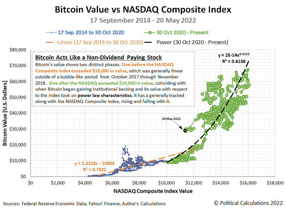
In the chart, we see that Bitcoin's value has two distinct phases. One before the NASDAQ Composite index exceeded $10,000 in value, which was generally linear outside of a bubble-like period from October 2017 through November 2018. One after the NASDAQ exceeded $10,000 in value, coinciding with when Bitcoin began gaining institutional backing and its value with respect to the index took on power law characteristics. In both cases though, outside short periods where changes in its valuation decoupled from changes in the value of the stock index, Bitcoin has a generally tracked along with the NASDAQ, rising and falling with it in a positive relationship.
That makes it very much like a non-dividend paying stock, especially during the period after it began gaining significant institutional backing. We know that from the exponent of the power law relationship that exists between Bitcoin and the Nasdaq Composite Index during this period, which represents the ratio of the exponential growth rates of Bitcoin and that of the Nasdaq index, which includes dividend-paying stocks.
In doing that, Bitcoin is very much looking, walking, and quacking like a volatile non-dividend paying stock, which shares those characteristics. Unless and until it starts acting differently, that's perhaps the best way for investors to think about Bitcoin's qualities as an investment.
Update 26 May 2022
We're not the only ones looking at a cryptocurrency and wondering what it looks, walks, and quacks like! Elsewhere on the interwebs, Mitchell Zuckoff argues many cryptocurrencies are passing the Ponzi duck test.
References
Federal Reserve Economic Data. NASDAQ Composite Index. [Online Database (Text File)]. Accessed 20 May 2022.
Yahoo! Finance. Bitcoin USD (BTC-USD), 14 September 2014 through 21 April 2022. [Online Database]. Accessed 20 May 2022.
Previously on Political Calculations
- The Sun, in the Center
- Deriving the Price Dividend Growth Ratio
- Say, What's This Bitcoin Thing We Keep Hearing About in the News?
- The Definition of a Bubble
- Real Yields and the Price of Gold
- Bitcoin Is Not Gold 2.0
Image credit: Photo by Ross Sokolovski on Unsplash.
Labels: data visualization, stock market, stock prices
When we say the bottom dropped out of the S&P 500 (Index: SPX) last week, what does that really mean?
It seems obvious that we're referring to the decline in stock prices, but there's much more to it than that. After all, the stock market has weeks when its value rises and has weeks when its value falls from the previous week, but we don't claim the bottom has dropped out of the index every time the latter situation happens. What makes the trading week ending 21 January 2022 different?
It wasn't the rate at which stock prices declined. On no single day of the holiday-shortened trading week did the S&P 500 drop by more than 2% of their previous day's closing value, the volatility threshold we use for any given day's trading to qualify as being interesting.
Nor did the overall 8.3% decline of the index since its 3 January 2022 record high qualify as interesting, falling less than the 10% threshold that it would take to qualify as a correction in stock prices according to professional traders. By both these definitions, what happened in the Nasdaq composite index (Index: COMP) during the past three weeks qualifies as interesting, but not so much for the more diverse S&P 500.
Instead, our observation has a lot to do with how stock prices were behaving in recent months. Here, let's start with the latest update to our chart showing the S&P 500's periods of relative order and chaos, which now covers the full 30-year period from December 1991 through December 2021.

According to a long-standing set of technical definitions we developed, here's how we define when a period of order exists in the market:
Order exists in a market whenever the change in the price of assets in the market are closely coupled with the change in the income that might be realized from owning or holding the assets, within a band of approximately normal variation about a central tendency.
In the case of the stock market, the assets are stocks, the price of which is given by the value of the S&P 500 index. The income that might be realized from owning or holding the assets are dividends, represented in the chart by the index' trailing year dividends per share.
When we refer to these two things being closely coupled, we mean when both the value of the S&P 500 and the index' trailing year dividends per share are either rising or falling together in a general trend. When that coupling exists, the variation of stock prices about a mean trend line can be approximately described by a normal distribution.
Looking at the most recent period of our 30-year chart, we see the period from March 2021 through December 2021 could reasonably qualify as a period of order according to our definition. Both stock prices and dividends per share have both been rising during these months.
Our next chart zeroes in on this period with daily data, where we confirm a close coupling exists in the period from 30 June 2021 through the end of 2021 and into January 2022.
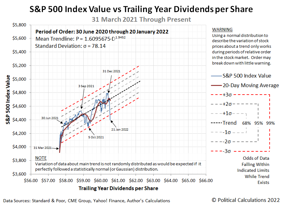
We've added statistical control chart-style thresholds to the chart to visualize a statistical hypothesis test. Here, when stock prices fall within three standard deviations of the mean trend, order can be said to exist for the S&P 500. Once stock prices fall outside that range indicated by the red dashed lines, we reject the hypothesis that order exists in the market.
On 21 January 2022, we see the level of stock prices drop below that key statistical threshold. We confirm order has broken down for the S&P 500 in this analytical approach and has done so by breaking through the lower limit of the range we would expect to find stock prices had the short established period of relative order in the U.S. stock market not broken down. This backward-looking approach confirms the similar assessment we arrived at using a forward-looking model.
To put it more colorfully, the bottom has dropped out of the S&P 500.
And now you know why we can say that! Now the question has become "is what happened on 21 January 2022 an outlier event and the trend still holds, or has it truly broken down?" We'll learn the answer to that question as early as this week.
Previously on Political Calculations
Labels: chaos, data visualization, dividends, SP 500, stock market, stock prices
Some months ago, Joakim Book put his finger on a problem that has bedeviled financial professionals and Nobel prize-winning economists for a much longer period of time.
A seemingly simple question has bothered the discipline of finance for decades: what is a bubble? In a theoretical sense it's a banal question: if the price of an asset is trading much higher than what it's actually worth, it's a bubble; if not, then it isn't.
That begs the question of how the great professors of finance and economics have attempted to define what a bubble is for their discipline. Here's what Book found when he surveyed the field:
The financial historians William Quinn and John Turner published a book on bubbles last year – Boom and Bust: A Global History of Financial Bubbles – that I reviewed for CapX. They acknowledge this definitional problem of finance's vast bubble literature – and sidestep the issue by offering a practical definition of their own: an asset's price has to increase by 100% and then fall by at least 50%. While completely arbitrary numbers (why, a 99% increase or a 49% collapse is not a bubble...?), it at least allows them to investigate the rich history of our financial past. And it's a lot more useful than entirely empty ones we may get from Nobel Laureates Robert Shiller or Joseph Stiglitz (where "'fundamental' factors do not seem to justify such a price").
It seems far from right for the distinguished professors from Yale University and from Columbia University to give their opinions on bubbles in the stock and housing markets without having ever established how they ought to be defined, especially as they possessed the building blocks for a proper and useful definition. To their credit, the financial historians from Queen's University, Belfast have a practical rule of thumb, if not a definition, though a limited one that can only be seen in a rear view mirror.
This state of affairs is all the more aggravating because there is a suitably workable definition that's been around now for more than a decade. Here it is:
An economic bubble exists whenever the price of an asset that may be freely exchanged in a well-established market first soars then plummets over a sustained period of time at rates that are decoupled from the rate of growth of the income that might be realized from owning or holding the asset.
Let's put this definition to practical use. Let's go back to turn of the millennium to consider the Dot Com Bubble. The assets involved here are shares of stocks so in addition to working with stock prices, we'll be considering dividends as well, which represents the income that might be realized from owning or holding shares of stock.
The following chart shows the trajectory of the S&P 500 index with respect to its underlying trailing year dividends per share. It shows the periods of relative order preceding and following the Dot Com Bubble, during which stock prices and dividends were generally coupled with both following rising trends while they lasted. In between is the chaotic event of the Dot Com Bubble, when they became decoupled, which is a very visibly different period.

During relative periods of order in the stock market, we can borrow some basic techniques from statistical analysis to help determine when these periods begin and end. We've done that in the following two charts, one for the period of relative order that ran from 17 December 1991 until the seminal event of 7 May 1997, the other for the period from 30 June 2003 through 31 December 2007, which ended with the onset of the "Great Recession" in January 2008.


In these charts, we've mapped the main trend curve using a power law relationship between stock prices and their trailing year dividends per share. The standard deviation for each is based upon the residual variation of the data points with respect to the main trend curve. We've overlaid a statistical control chart-style thresholds to visualize where we expect to find the data assuming a normal distribution and to set up a statistical hypothesis test.
In that test, we can say that stock prices and dividends are coupled in a relatively stable period of order while their trajectory stays within three significant deviations of the mean trend curve. If it moves outside that range and stays outside of it, the odds are that relatively stable relationship no longer applies. In these two charts, you can easily see how quickly those relative periods of order broke down after the dates marking the end of each.

What this means is that we have effective tools for determining when the inflation phase of a bubble in stock prices has begun. It can only occur when stock prices become decoupled from their underlying trailing year dividends per share and begin to soar. We still have the problem of knowing whether a true bubble has formed until it might enter into its deflation phase, but we're on fairly safe ground in assuming a bubble is inflating until a new relative period of order develops to confirm otherwise.
The power law relationship between stock prices and trailing year dividends per share for an index like the S&P 500 during periods of order gives us some insight into how bubbles form. The exponent is a ratio, with the exponential growth rate of stock prices in the numerator and the exponential growth rate of dividends per share in the denominator. That means when the growth rate for dividends becomes small, the potential for decoupled growth in stock prices becomes large.
Structurally, the power law relationship exists because the index is composed of two different kinds of companies: those that pay dividends to their shareholding owners and those that do not. If the index were only made up of dividend paying firms, the relationship between stock prices and dividends per share would be linear. The power law math most often kicks in when companies that do not pay dividends either see rapid growth or become heavily weighted within the index, which contributes stock price movements that are not coupled with changes in dividends.
While non-dividend paying firms are always present in the index, it is only when market conditions develop that favor share price gains in these firms without proportionate gains in dividend paying firms that bubbles develop by the definition. For example, the inflation phase of the Dot Com Bubble took hold in the S&P 500 index shortly after the tax rate for capital gains was set lower than the tax rate for dividends on 7 May 1997, giving investors a very strong incentive to start weighting these firms much more heavily in their investing portfolios and causing them to be relatively bid up in value as a result. Order did not return to the U.S. stock market until after the end of the quarter in which the tax rates for dividends and capital gains were reunified on 21 May 2003.
We've done the most work in developing or applying these definitions and tools for stock prices, but the logic holds in the prices of other assets where investors can earn dividend-like income from simply owning or holding the asset. That includes assets like housing, where we can assess the value of housing prices with respect to the income that can be earned from owning a house: rent.
The following chart tracks the median asking sale prices of vacant homes against the median asking annualized rent for vacant homes. In it, we find our definition of a bubble works once again, even though we didn't have sufficient data to confirm the deflation portion of the U.S. housing bubble at the time we drafted it:

Unlike stock prices and dividends, we see the relationship between home sale prices and rents is linear. For this basic example, we treated the pre- (1988-Q1 through 2005-Q1) and post-bubble (2009-Q4 through 2019-Q4) periods as if they share the same general trajectory, which appears to be an okay initial assumption. We've also omitted data since 2019 from the analysis because of the impact of the coronavirus pandemic on data collection during 2020 and early 2021 and also because of what initially appears to be the formation of a new bubble with respect to the main trendline in 2021. The latter is a topic for a different day.
As for the U.S. housing bubble of the early 2000s, though we're omitting the statistical control-chart lines to provide a statistical hypothesis test, we find its inflation phase clearly took hold after 2005-Q1 and peaked in 2007-Q2. Its deflation phase then endured through 2009-Q4, after which asking sale prices and asking rents for vacant units in the U.S. recoupled in a new period of relative order.
That assessment generally agrees with the findings of an August 2021 NBER working paper by Gabriel Chodorow-Reich, Adam M. Guren, and Timothy J. McQuade, which Tyler Cowen commented upon shortly after its publication.
We reevaluate the 2000s housing cycle from the perspective of 2020. National real house prices grew steadily between 2012 and 2019, with the largest price growth in the same areas that had the largest booms between 1997 and 2006 and busts between 2006 and 2012. As a result, the areas that had the largest booms also had higher long-run price growth over the entire 1997-2019 period. With “2020 hindsight,” the 2000s housing cycle is not a boom-bust but rather a boom-bust-rebound.
We argue that this pattern reflects a larger role for fundamentals than previously thought.
As I see it, there was a “negative bubble” circa 2008-2009, based on panic about the shadow banking system that was at the time reasonable but also turned out to be wrong. You can argue however that there was a small bubble at the time (see Figure 1 in the paper, and compare that say to the Japanese stock market), or a bubble in a few particular regions. And do you know who got this right at the time? Our own Alex T., perhaps he will tell you the story in more detail.
The authors continue:
A few papers ascribe a role to fundamental factors in the 2000s cycle as we do. Writing near the peak of the boom, Himmelberg et al. (2005) found “little evidence of a housing bubble” because of fundamental growth, undervaluation in the 1990s, and low interest rates. Ferreira and Gyourko (2018) estimate the timing of the boom across cities and show that the beginning of the boom was “fundamentally based to a significant extent” but that fundamentals revert in roughly three years. We similarly conclude that fundamentals played a significant role in the boom, but based on different methods that focus on long-term fundamentals rather than short-term income growth. More recently, Howard and Liebersohn (2021) propose an explanation for housing cycles based on divergence in regional income growth, in which fluctuations in fundamentals fully explain the cycle, and Schubert (2021) identifies spillovers of fundamentals across cities via migration networks.
We excerpted all this text because it illustrates how economists have been stumbling without an effective definition of what a bubble is. Even though we've had at least two very noticeable bubble events in the 21st century, analysts continue to struggle to determine when they began to inflate, how big they became and even when they ended. All of which stop being problems after an appropriate framework is established for evaluating whether a bubble exists.
That's true even of Chodorow-Reich, Guren, and McQuade, who though more than a decade removed from the housing bubble, haven't fully accounted for its dynamics in their excellent work updating the building general consensus for the event.
We've gone on in this discussion long enough, but before we conclude, let's talk about where our own definition is incomplete. We still don't have good proxies to use as the equivalent of stock share dividends or shelter rents in dealing with the prices of commodities like oil. Or copper. Or lumber. Or Bitcoin. All of which have been proposed to be in bubbles at one time or another, including the present. What do you suppose those equivalents might be for each of these things?
References
Joakim Book. The Bubble That Never Was: Finance’s Definition Problem. American Institute of Economic Research. [Online Article]. 22 June 2021.
Gabriel Chodorow-Reich, Adam M. Guren, and Timothy J. McQuade. The 2000s Housing Cycle with 2020 Hindsight: A Neo-Kindlebergerian View. National Bureau of Economic Research. NBER Working Paper 29140. [PDF Document]. August 2021.
Jack Ewing. Shiller's List: How to Diagnose the Next Bubble. New York Times (DealBook). [Online Article]. 27 January 2010.
Howard Silverblatt. Standard and Poor S&P 500 Earnings and Estimates [Excel Spreadsheet]. Accessed 29 November 2021.
Joseph Stiglitz. Symposium on Bubbles. Journal of Economic Perspectives, Vol. 4, No. 2. Spring 1990. pp. 13-18. DOI: 10.1257.jep.4.2.13. [PDF Document].
Mark Twain. Fenimore Cooper's Literary Offenses. Project Gutenberg. [EBook version of original 1895 publication]. Release Date: 20 August 2006. Last Updated 24 February 2018.
U.S. Census Bureau. Housing Vacancies and Homeownership (CPS/HVS). Table 11A/B. Quarterly Median Asking Rent and Sales Price of the U.S. and Regions: 1988 to Present. [Excel Spreadsheet]. Accessed 29 November 2021.
Yahoo! Finance. S&P 500 Historical Prices. [Online Database]. Accessed 29 November 2021.
Image credit: Photo by Raspopova Marina on Unsplash.
Labels: data visualization, economics, ideas, real estate, stock prices
Welcome to the blogosphere's toolchest! Here, unlike other blogs dedicated to analyzing current events, we create easy-to-use, simple tools to do the math related to them so you can get in on the action too! If you would like to learn more about these tools, or if you would like to contribute ideas to develop for this blog, please e-mail us at:
ironman at politicalcalculations
Thanks in advance!
Closing values for previous trading day.
This site is primarily powered by:

CSS Validation

RSS Site Feed

JavaScript
The tools on this site are built using JavaScript. If you would like to learn more, one of the best free resources on the web is available at W3Schools.com.
Other Cool Resources
Blog Roll


