Occasionally, our readers keep us on our toes by asking really good questions. Today, we're going to share part of an e-mail exchange we recently had, in which we get into the nature of when, where, why and how the analytical methods we've developed to anticipate what stock prices will or should be will work. We reckon its a good time to fit that discussion into a regular post since we doubled up on our ongoing series of weekly observations on how the S&P 500 is behaving last week, and because its always a great time to identify and describe a phenomenon that many professional investors may not even know exists.
Here's the e-mail that kicked off the discussion, followed by our response, which we've enhanced by adding links and charts, as well as some text for clarification in boldface font. Enjoy!
I have really been enjoying the S&P 500 posts lately concerning index value vs. trailing year dividends.
Not to make things more complicated than they need to be, but have you ever considered breaking it down into sectors? Would that help to explain even further what is going on in the market?
I ask this question because I think of things like the 2007-2009 market decline. If you just look at the S&P500 index value, you may not have realized the market was in a major decline until early to mid 2008. If you looked at the sectors (e.g., XLB, XLE, XLF, XLI, XLK, XLP, XLU, XLV, XLY) you would have seen that most of the market sectors were in decline since 2006 or 2007, except for energy and basic materials. They were keeping the index afloat. It would only be a matter of time before they collapsed, too.
I realize that looking at your index vs. trailing year dividends, it's much more obvious that something was up with the market, going from order, to disorder. I just wonder if it would be even more clear if it was broken down on a sector by sector basis.
Thanks for your comments and question!
The main challenge for what you describe is the available data. While it's easy to get the market-cap weighted values for each sector's stock prices, getting market-cap weighted dividend data for the various sectors is a little more difficult (we would have to take each component stock's projected future dividends per share for each sector and weight them according to their market cap within the sector, which would be pretty time consuming.)
Aside from that, we would also see greater volatility in the price portion of the data, since we would be looking at a smaller section of the market.
Apple provides a pretty good example of what we mean here. Individual stock prices, like Apple's, are really volatile over time, as there is often a lot of speculation (or noise) affecting them in addition to the more fundamental driver of their dividends (or signal). If you recall last year, Apple's stock price ran up considerably in the months and weeks leading up to their announcement that they would initiate a cash dividend on the speculation that they would do so.

After they announced it, Apple's stock price began to fall. But the S&P 500, of which it became the largest component, did not, even though it had been rising with it.

The reason why is because of an effect that we'll call "conveyance". Here, Apple's stock price rose on the speculation of investors who on having bought on the rumor, after their dividend announcement, sold on the news.
Much of that money stayed in the stock market, going to buy other stocks as investors sold off their shares of Apple as they rebalanced their portfolios. That rebalancing, in turn, allowed the S&P to keep rising (and sustain its value), keeping in tune with the index' increased level of dividends. In effect, Apple's dividend was conveyed throughout the entire index, supporting its (the index') valuation, even though Apple's stock price itself fell in the weeks and months that followed.
We capture that effect in looking at the entire index, but can lose the strong correlation when looking at sectors or individual stocks, where the conveyance effect can be affected by investors rotating into or out of particular sectors or stocks, making them much more volatile than the index as a whole.
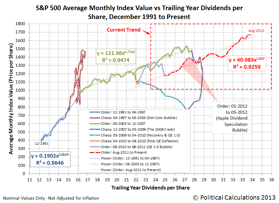
Quick history: The starting and ending dates we selected for our charts above coincide with the date at which dividend futures contracts for 2011-Q4 and 2012-Q2 expired. The serious speculation that Apple would initiate a dividend began after the expiration of the 2011-Q4 futures contracts. Apple made the announcement that it would begin paying a dividend on Monday, 19 March 2013.
Its stock price was buoyed up for another three weeks as the speculative bubble inflated (see our third chart in this post), peaking on 9 April 2012 as investors finally began to realize that the company's stock price was getting too disconnected from where its own fundamentals would place it, after which the conveyance effect really kicked in.
You can see that in the second chart that we've added to our original exchange above, where most of the conveyance effect took place between 9 April 2012 and 30 April 2012, after which Apple's stock price and the rest of the S&P 500 resumed following mostly matching trajectories, which is what we should expect for the new 800-pound gorilla of the S&P 500.
Since the end of the Apple speculative bubble in May 2012, the S&P 500 has mostly followed a stable trajectory, as the market has largely continued in the period of relative order that began in August 2011.
Labels: dividends, SP 500, stock market
Welcome to the blogosphere's toolchest! Here, unlike other blogs dedicated to analyzing current events, we create easy-to-use, simple tools to do the math related to them so you can get in on the action too! If you would like to learn more about these tools, or if you would like to contribute ideas to develop for this blog, please e-mail us at:
ironman at politicalcalculations
Thanks in advance!
Closing values for previous trading day.
This site is primarily powered by:
CSS Validation

RSS Site Feed
JavaScript
The tools on this site are built using JavaScript. If you would like to learn more, one of the best free resources on the web is available at W3Schools.com.
Other Cool Resources
Blog Roll


