![Woman posed with stack of packages of $1 silver certificates at the Bureau of Engraving and Printing, Washington, D.C. [between ca. 1950 and ca. 1969] Source - loc.gov/rr/business/money/paper.html](https://blogger.googleusercontent.com/img/b/R29vZ2xl/AVvXsEhrVZsRdezoSYB-Bm08VZ-UZLb1rzZuCCjFvmd7ly7TK5HN2eQze48DW809qisWe2bMMVSfzm2Bep_50mm8RSFofnhefZr5oeBRgTNjOCYKKnAVbfxA7K5FkXKOuyvsxTeLHt44/s1600/a-money2_3b38767r-source-loc-gov.jpg)
Where do you stack up in the distribution of income within the United States?
We can help you answer this question using the data that the U.S. Census Bureau has collected on the total money income earned by individual Americans, as well as for the families and households into which Americans gather themselves!
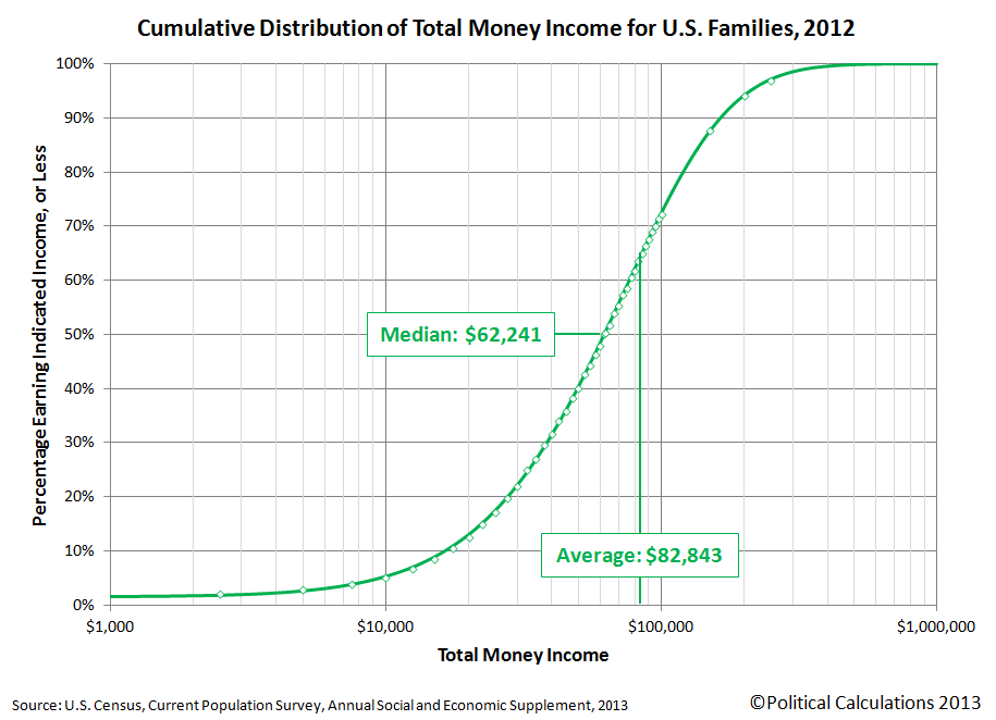
If you're a visual person, we'll first present the information graphically in chart form and then we'll present a tool where you can get a more precise estimate of what your percentile ranking is within each of these groups. In the charts below, first find the income that applies for you on the horizontal axis, then move directly upward to the curve that defines the cumulative distribution of income. Once you've found your place on S-shaped curve in each chart, look directly to the vertical scale on the left hand side of the chart to determine your approximate U.S. income percentile ranking.
The first chart applies for individual Americans, which includes all people Age 15 or older who received some kind of money income on a regular basis, say from full-time jobs or Social Security benefits, but not for things like food stamps, health benefits, housing assistance, capital gains, etc.. With that being the case, the Census Bureau's data tends to understate the amount of effective income that Americans have, especially at the lower end of the income spectrum:

Our second chart shows how the distribution of income changes when individual Americans are grouped into families, which the Census Bureau defines as being a "group of two people or more (one of whom is the householder) related by birth, marriage, or adoption and residing together":
Our third chart is similar to the families chart, but here, individual Americans have been grouped into households. Households are different from families in that they consist of "all the people who occupy a housing unit", regardless of whether they are related to each other by birth, marriage or adoption, or not, and even a single individual who lives alone is considered to be a distinct household.

So much for the pictures - let's see where you really fit in! To find out where you, your family or your household ranks among each of these categories, just enter your personal income, your family's income, which includes the incomes of your spouse and other family members who live with yout, and also the combined income of just the people who live within the walls of the same household that you do. We'll do some quick math and provide a more precise estimate of the percentage of all American individuals, families and households that you outrank given the incomes you enter.
And as a bonus, we'll also break down the numbers for your Individual income to tell you how you compare to your fellow male and female Americans.
It all starts below! (Unless you're accessing this article through a site that simply republishes our RSS news feed, in which case, you should click through to our site to access a working version of our tool....)
Update 13 September 2017: We have a more up-to-date tool available here!
Update 16 September 2014: You can now find your income percentile ranking for 2013 in our tool below - just change the year! And if you want to see the latest cumulative income distribution charts, click here!
For our readers who live outside of the United States, you can still get in on the action if you convert your income from your local currency into U.S. dollars first!
Notes
The default data we've presented in the tool above represents the average total money income of U.S. individuals, families and households for the year you select. Oh, and as a bonus, you can also see where you would have fit in the U.S. income distributions we've modeled going back to 2011 by selecting your year of interest (other years may appear in the future!...)
In the tool above, your percentile ranking indicates the percentage of Americans who either share your income or earn less than you do. As such, it tells you what percentage of the population you're above in the income-earning food chain.
For example, a percentile ranking of zero would indicate that you are at the very bottom end of the American income spectrum, while a percentile ranking of 100 indicates that you are effectively at the very top end. A percentile rank of 50.0 would indicate that you're within spitting range of being the middle of all Americans, as our tool should be able to place most people within 0.2% of their actual percentile ranking.
Finally, if you're looking for the income data for this year, please note that the U.S. Census Bureau will report the data it collects for this year sometime in September of next year. The delay isn't all bureaucratic - they send out the surveys for income in March of each year, just as or after most Americans fill out their income taxes for the previous year so their income figures are still fresh in their memories, and then it can take the Census Bureau's statisticians up to six months to sort it all out and make some kind of coherent sense of it all!
References for 2012 Incomes
U.S. Census Bureau. Current Population Survey. Annual Social and Economic (ASEC) Supplement.Table PINC-01. Selected Characteristics of People 15 Years and Over, by Total Money Income in 2012, Work Experience in 2012, Race, Hispanic Origin, and Sex. [Excel Spreadsheet]. 17 September 2013. Accessed 17 September 2013.
U.S. Census Bureau. Current Population Survey. Annual Social and Economic (ASEC) Supplement.Table PINC-11. Income Distribution to $250,000 or More for Males and Females: 2012. Male. [Excel Spreadsheet]. 17 September 2013. Accessed 17 September 2013.
U.S. Census Bureau. Current Population Survey. Annual Social and Economic (ASEC) Supplement.Table PINC-11. Income Distribution to $250,000 or More for Males and Females: 2012. Female. [Excel Spreadsheet]. 17 September 2013. Accessed 17 September 2013.
U.S. Census Bureau. Current Population Survey. Annual Social and Economic (ASEC) Supplement.Table FINC-07. Income Distribution to $250,000 or More for Families: 2012. [Excel Spreadsheet]. 17 September 2013. Accessed 17 September 2013.
U.S. Census Bureau. Current Population Survey. Annual Social and Economic (ASEC) Supplement.Table FINC-01. Selected Characteristics of Families by Total Money Income in: 2012. [Excel Spreadsheet]. 17 September 2013. Accessed 17 September 2013.
U.S. Census Bureau. Current Population Survey. Annual Social and Economic (ASEC) Supplement.Table HINC-06. Income Distribution to $250,000 or More for Households: 2012. [Excel Spreadsheet]. 17 September 2013. Accessed 17 September 2013.
U.S. Census Bureau. Current Population Survey. Annual Social and Economic (ASEC) Supplement.Table HINC-01. Selected Characteristics of Households by Total Money Income in: 2012. [Excel Spreadsheet]. 17 September 2013. Accessed 17 September 2013.
Labels: income, income distribution, tool
Welcome to the blogosphere's toolchest! Here, unlike other blogs dedicated to analyzing current events, we create easy-to-use, simple tools to do the math related to them so you can get in on the action too! If you would like to learn more about these tools, or if you would like to contribute ideas to develop for this blog, please e-mail us at:
ironman at politicalcalculations
Thanks in advance!
Closing values for previous trading day.
This site is primarily powered by:
CSS Validation

RSS Site Feed
JavaScript
The tools on this site are built using JavaScript. If you would like to learn more, one of the best free resources on the web is available at W3Schools.com.
Other Cool Resources
Blog Roll


