 One of our most popular posts ever maps the best, worst and average rates of return for investments placed in the S&P 500, or its predecessor indices and companies, since 1871. Today, we're updating that post as well as our model of those returns!
To do that, we calculated every non-inflation adjusted rate of return for various holding periods of time ranging from 1 to 130 years in duration, beginning with January 1871 and ending in May 2009, the last full month for which we have this data, on a rolling basis. We then determined the best and worst compound annual rates of return for all of these periods, as well as the average rate of return for all of the holding periods we considered. Our source data is available here.
But wait, that's not all! We went the extra mile and rebuilt our mathematical models of the best and worst nominal rates of return for all holding periods running between 1 and 130 years in length using ZunZun, significantly improving their accuracy!
But we weren't finished yet.... For us, a new mathematical model means a new tool to create, so we whipped one up:
Labels: best case, SP 500, stock market, tool, worst case


 Not long ago, we mined our S&P 500 data to find the five worst month-long periods ever for investors in the stock market. And now, for the sake of balance, we're extracting the five best month-long periods ever for the S&P 500.
As we noted previously, we can't precisely answer which calendar month since January 1871 was the worst given our S&P 500 data, since the value we have for each month is the average of the closing value of the S&P 500 index on every trading day during the course of that month. Consequently, our data doesn't include what value it started out at in the beginning of the month of interest, what highs or lows it may have hit during the course of that month, how long it was at any given level, or where it ended up on the last trading day of the month.
But, what we do have in the average value of the S&P 500 index for each month over its entire history since 1871 allows us to measure its general performance between any two months, even if just one month apart.
So, we scanned our average monthly data to find the five best average month-long investing periods captured by our data, which we've summarized in the table below. As before, we're looking purely at the value of the index itself, without considering factors that would influence an investor's actual returns, such as inflation, reinvestment of dividends, taxes, commissions or other transaction fees:
| The Five Best Months for the S&P 500 Index Value | ||||
|---|---|---|---|---|
| Starting Month | Ending Month | Starting Index Value | Ending Index Value | Percentage Gain |
| July 1932 | August 1932 | 5.01 | 7.53 | +50.3% |
| April 1933 | May 1933 | 6.23 | 6.89 | +28.7% |
| June 1938 | July 1938 | 10.21 | 12.24 | +19.9% |
| May 1933 | June 1933 | 8.87 | 10.39 | +17.1% |
| August 1982 | September 1982 | 109.70 | 122.40 | +11.6% |
As we've noted elsewhere in looking at the best and worst case returns on investments in the S&P 500 for periods of time ranging from 1 through 50 years long, the only consistent factor that shared by the best returns in the stock market index is that these periods tend to coincide with the end of the worst periods of time for investing in the stock market!
Previously on Political Calculations
- The Worst Returns of the S&P 500 vs The Safest Investments on Earth
- The S&P 500's Golden Years - Did you ever wonder what the best bull years the stock market ever had? We find the best 1 through 50 year periods ever!
- The Worst Returns Ever for the S&P 500 - We identify the dates that go along with the worst returns ever (after inflation) for the S&P 500!
- The S&P 500 at Your Fingertips - Our signature tool provides historical market data for the S&P 500 going all the way back to January 1871, and finds the rates of return between any two months both before and after inflation and with or without dividend reinvestment!
- Lemony Snicket and the S&P 500 - Our tool that takes the best, worst and most average investment returns ever from the S&P 500, and asks what if your investments had these returns?
- Mapping S&P 500 Performance, Since 1871 - our analysis that led to our model of the best and worst case performance ever for the S&P 500.
- S&P 500: Best, Average and Worst Returns - our tool approximates the best, worst and average returns for investments of any length in the S&P 500 stock market index.
Labels: best case, investing, SP 500
 When were the best years to have ever invested in the S&P 500 stock market index? Last week, we introduced our chart showing the best inflation-adjusted rates of return ever obtained from the stock market index, but today, it's time to introduce our dynamic table!
We returned to our database of the S&P 500's performance since January 1871, and scanned month-by-month through every period ranging from 1 year to 50 years in length to sort out what the highest ever real returns were for our hypothetical investments and when they began.
In our analysis, we assumed full reinvestment of dividends, adjusted for inflation, and did not consider the effects of taxes or commissions and fees, which vary considerably over time. Our results for our hypothetical investment's holding periods between 1 and 50 years are summarized in the dynamic table below. You may sort the data by clicking the column headings - clicking the column heading once will sort by the selected category from low to high values, and clicking a second time will re-sort the table's data from high to low values.
| Best Case Inflation-Adjusted S&P 500 Rates of Return for Investment Holding Periods of 1 to 50 Years |
|---|
| Holding Period (Years) | Starting Date (Year-Month) | Ending Date (Year-Month) | Nominal Return (%) | Inflation Rate (%) | Real Return (%) |
|---|---|---|---|---|---|
| 1 | 1932-07 | 1933-07 | 139.8 | -03.7 | 143.5 |
| 2 | 1932-06 | 1934-06 | 53.1 | -00.7 | 053.8 |
| 3 | 1926-09 | 1929-09 | 38.7 | -00.4 | 039.1 |
| 4 | 1932-06 | 1936-06 | 39.4 | 00.4 | 039.0 |
| 5 | 1924-09 | 1929-09 | 33.6 | 00.2 | 033.4 |
| 6 | 1923-09 | 1929-09 | 31.4 | 00.1 | 031.3 |
| 7 | 1922-01 | 1929-01 | 25.6 | 00.2 | 025.4 |
| 8 | 1921-09 | 1929-09 | 27.9 | -00.1 | 028.0 |
| 9 | 1920-08 | 1929-08 | 23.0 | -01.8 | 024.8 |
| 10 | 1919-09 | 1929-09 | 19.6 | -00.3 | 019.9 |
| 11 | 1918-09 | 1929-09 | 20.3 | 00.9 | 019.4 |
| 12 | 1949-06 | 1961-06 | 19.4 | 01.9 | 017.5 |
| 13 | 1948-12 | 1961-12 | 18.2 | 01.7 | 016.5 |
| 14 | 1942-04 | 1956-04 | 20.1 | 03.7 | 016.4 |
| 15 | 1954-07 | 1969-07 | 18.2 | 02.1 | 016.1 |
| 16 | 1982-07 | 1998-07 | 19.7 | 03.3 | 016.4 |
| 17 | 1982-07 | 1999-07 | 19.7 | 03.2 | 016.5 |
| 18 | 1982-08 | 2000-08 | 19.0 | 03.2 | 015.8 |
| 19 | 1980-04 | 1999-04 | 18.4 | 03.9 | 014.5 |
| 20 | 1980-04 | 2000-04 | 17.9 | 03.8 | 014.1 |
| 21 | 1942-05 | 1963-05 | 16.3 | 03.0 | 013.3 |
| 22 | 1942-05 | 1964-05 | 16.4 | 02.9 | 013.5 |
| 23 | 1942-05 | 1965-05 | 16.3 | 02.9 | 013.4 |
| 24 | 1932-06 | 1956-06 | 16.0 | 02.9 | 013.1 |
| 25 | 1932-06 | 1957-06 | 15.6 | 02.9 | 012.7 |
| 26 | 1942-05 | 1968-05 | 15.1 | 02.9 | 012.2 |
| 27 | 1932-06 | 1959-06 | 15.6 | 02.9 | 012.7 |
| 28 | 1932-06 | 1960-06 | 15.1 | 02.8 | 012.3 |
| 29 | 1932-06 | 1961-06 | 15.2 | 02.7 | 012.5 |
| 30 | 1932-06 | 1962-06 | 14.2 | 02.7 | 011.5 |
| 31 | 1932-06 | 1963-06 | 14.7 | 02.7 | 012.0 |
| 32 | 1932-06 | 1964-06 | 14.7 | 02.6 | 012.1 |
| 33 | 1932-06 | 1965-06 | 14.6 | 02.6 | 012.0 |
| 34 | 1932-06 | 1966-06 | 14.3 | 02.6 | 011.7 |
| 35 | 1932-06 | 1967-06 | 14.1 | 02.6 | 011.5 |
| 36 | 1932-06 | 1968-06 | 14.1 | 02.6 | 011.5 |
| 37 | 1932-06 | 1969-06 | 13.7 | 02.7 | 011.0 |
| 38 | 1921-08 | 1959-08 | 11.8 | 01.3 | 010.5 |
| 39 | 1920-12 | 1959-12 | 11.5 | 01.1 | 010.4 |
| 40 | 1921-08 | 1961-08 | 11.7 | 01.3 | 010.4 |
| 41 | 1920-12 | 1961-12 | 11.6 | 01.1 | 010.5 |
| 42 | 1921-08 | 1963-08 | 11.4 | 01.3 | 010.1 |
| 43 | 1921-07 | 1964-07 | 11.6 | 01.3 | 010.3 |
| 44 | 1920-12 | 1964-12 | 11.4 | 01.1 | 010.3 |
| 45 | 1920-12 | 1965-12 | 11.4 | 01.1 | 010.3 |
| 46 | 1921-08 | 1967-08 | 11.4 | 01.4 | 010.0 |
| 47 | 1920-12 | 1967-12 | 11.2 | 01.2 | 010.0 |
| 48 | 1920-12 | 1968-12 | 11.3 | 01.3 | 010.0 |
| 49 | 1949-06 | 1998-06 | 13.6 | 04.0 | 009.6 |
| 50 | 1949-06 | 1999-06 | 13.8 | 04.0 | 009.8 |
The End of the Worst Marks the Beginning of the Best
Unlike our previous findings that found that the worst periods for having made an investment in the S&P 500 were defined by when the given holding period ended, when looking at the best ever real returns for the index, we find here that they're largely determined by when they began. More remarkably, they largely began at the end of the worst-ever recorded rates of return for the holding periods in question!
Here's what we mean. The worst ever month to have ended an investment in the S&P 500 is June 1932, which marks the end of 23 of the 50 worst holding periods for investments in the index that we previously recorded. June 1932 also marks the beginning of 15 of the 50 best holding periods for having launched an investment in the S&P 500.
We also see this pattern for the worst investing holding periods ending in 1920 and 1921, which accounts for 14 of the 50 worst 1-to-50 year holding periods, but also marks the beginning of 13 of the 50 best 1-to-50 year holding periods! And we see this same pattern for investments ending and beginning in 1980-1982 and 1942.
The Bubble Years
When we turn our attention to the years ending the best inflation-adjusted performance of investments ranging from 1 to 50 years in length, we find two timeframes that stand out above all others: 1929 and 1999-2000. Both are significant in that each of these years marks the pinnacles of the stock market bubbles of their day!
Together, these periods account for 13 of the 50 best recorded performances for investments made in the S&P 500. 1929 alone accounts for 8 of these top inflation-adjusted rates of return, with 1999-2000 accounting for the remaining 5.
Labels: best case, investing, performance, SP 500, stock market
Last week, we introduced our findings of the worst case performance of the S&P 500 adjusted for inflation for investments made in the index ranging from 1 to 50 years in length. This week, we're looking at the brighter side of the U.S. stock market in looking at the best case performance for the index for investments of the same lengths of time! Here's the chart (click to enlarge):

Best Case Real Rates of Return
The chart above shows our basic findings of the best-case inflation-adjusted performance of the S&P 500 for all holding periods of 1 to 50 years, defining each unique period as beginning in each month starting from January 1871 and going all the way through to December 2006. The annualized rates of return shown in the chart have been adjusted for inflation and assume that dividends are fully reinvested. No taxes or trading commissions and fees are taken into account for these results.
A key point of interest is the investing holding period of 45 years, which spans the typical length of an individual's career (assuming starting at age 20 and working until age 65). Here, the best case annualized rate of return for an investment of this length is 10.3% after adjusting for inflation. By contrast, the worst case historical performance of the S&P 500 for a holding period of 45 years is 3.6% after inflation.
Although we don't show it in the chart above, as more time passes, the best-case performance for an investment in the index continues to gradually decrease, eventually reaching a range between 7.4% and 7.8% for holding periods running between 100 and 130 years in length.
The Best Years Ever for Beginning an Investment in the S&P 500
Unlike our previous look at the worst case real returns for the S&P 500, the best case performance for investments made in the index are largely defined by the year in which they begin, instead of when they end.
For this analysis, we found that five periods account for 84% of the best periods in which to have made an investment. The best, by far, is for investments made in 1932, and more specifically, in or around June 1932, which accounts for 32% of the best case holding periods for investments made in the index of 1 to 50 years in length. The other periods that are defined by the years in which they began include 1920-1921 (26%), 1942 (10%), 1980-1982 (10%) and 1949 (6%).
More interestingly, the periods in which the best real returns were obtained seem to be largely correlated with the end of the periods in which the worst real returns were achieved for investments made in the index!
If nothing else, this observation does suggest a unique stock investing strategy. Should the market ever break its records for worst case real return performance, that may be a really good signal that it's a really good time to go "all-in"!
Labels: best case, investing, performance, SP 500
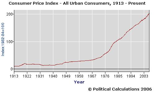 When we created our "Lemony Snicket and the S&P 500" tool, we included a feature that would allow our tool's users to account for inflation during the terms of their hypothetical "absolute" best and worst case investing scenarios.
But, that left us with a hard question for us to answer: what rate(s) of inflation should investors use in making their investment decisions?
There are two main factors that make answering this question tough. The first factor is that inflation can be pretty volatile. We've had periods of double-digit inflation here in the U.S., as well as periods of negative inflation (or deflation). The second factor is time. The range of inflation data that an investor should consider should correspond to the length of the time period they expect to hold their investments.
In our "Lemony Snicket" tool, the best information we had available to provide our readers came from Bryan Taylor of Global Financial Data (via this 43.0KB Word document), which showed the range of inflation data for selected 30-year periods beginning in 1871.
But, what if you wanted to consider the extremes of inflation for all thirty-year periods since inflation data began being collected? And what if you wanted to consider something other than a 30-year period?
Those are the kinds of questions we answer here at Political Calculations! And to do this job, we went straight to the source: the U.S. Bureau of Labor Statistics' record of the Consumer Price Index for All Urban Consumers (CPI-U) averaged across U.S. cities for each month since January 1913. This inflation data has been collected continuously since 1919 and represents the oldest measure of inflation in the U.S. (the index was estimated back to 1913 to provide a reference for comparison in the data's early years. While others have estimated CPI-U for earlier years, 1913 represents the base year for the BLS' officially tabulated data.)
Using this data, we generated the following chart to map the extremes of inflation for periods ranging from one-month to 90 years. We utilized rolling periods of time in generating the chart to find our extremes to map. For instance, the first one-year period we considered began in January 1913 and ended in December 1913, while the second one-year period began in February 1913 and ended in January 1914, and so on until we ran out of months in September 2006 (and we did this for every fixed period of time from one-month to 90 years!):
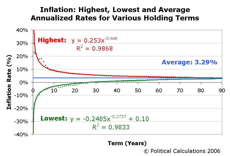
Our first surprise was to see that the average rate of inflation in the U.S. for every period of time we measured since January 1913 is 3.29%, instead of the 2.5% we had set as our original default data in our "Lemony Snicket and the S&P 500" tool. (Depending upon the time period, this figure fluctuates within a range between 3.1 and 3.4%. The average rate of inflation for of all CPI-U data is 3.29%.)
Our next step was to generate the formulas you see in the chart above that effectively approximate the historical bounds of inflation in the U.S. These formulas are utilized in our tool below, which will provide you with the approximations of inflation you should consider when selecting potential investments:
In looking at the chart again, we're intrigued by the "bump" for the highest limits of inflation (where the actual historic inflation is significantly above our mathematical model), which occurs for periods of time ranging from 2 years through 6 years, while all the other actual data points fit well on our curve. We'll be taking a closer look at the underlying data in days ahead.
Labels: best case, economics, inflation, tool, worst case
Craig Newmark cited our humble blog yesterday, remarking that:
One tool that I think I'll use the next time I preach to high schools about saving money is "Best and Worst Case Stock Market Investing".
Our tool for mapping the inflation-adjusted extremes of the performance of the total U.S. stock market is definitely one of our favorites, and our Lemony Snicket vs. King Midas tool is based upon it - but it does leave an open question that we often have to answer: How does the performance of the total stock market compare to the S&P 500?
We understand why. The S&P 500 is, after all, *the* benchmark against which all stock market investing performance is measured.
 To date, we've only answered half the question in mapping the historical performance extremes of the S&P 500 index, and building a tool to estimate the best, worst and average performance of the S&P 500 for investments of any holding period.
Today, we'll answer the rest of the question by taking our mathematical model of the S&P 500's performance extremes and using it in the behind-the-scenes math of our Lemony Snicket tool! Now, you can find out what your actual returns would be if you make a fixed, once-a-year investment in the S&P 500 (like a lot of people do with their IRAs!), and you consistently get the best, average or worst case historical performance ever achieved by the index!
What's more, you can even play with the effects of inflation on your hypothetical absolute best, average and worst case performance! Our default value of 2.5% is the median average inflation rate (as measured by CPI-U) for all 30-year periods between 1871 and 2000, and we'll note for your reference that the worst 30-year period of inflation recorded in that period is 5.41%. You can see a small sample of this data in this Word document from Global Financial Data.
What value for inflation should you use for your investing horizon? The median average inflation rate will be the best representative of inflation for any holding period, but you should adjust this figure to consider a range of values above and below this quantity. As a general rule of thumb, the longer your investing horizon, the smaller the range around the 2.5% value you should consider.
Update (30 December 2006): Don't say we don't learn anything! We went and found the highest, lowest and average rates of inflation for the U.S. since 1913 and changed the default value in the tool below to match what we actually found. Plus, the tool we created in the link above will provide you with the range of historical values you need to consider!
As an added bonus, we've also expanded the range for the possible investing holding periods all the way out to 100 years! And why not? We've got the data to back it up....
The Total Amount Invested "Unadjusted for Inflation" is the amount that you actually contributed to your investment over the entire investing period. The "Adjusted for Inflation" amount shows how much this money would be worth at the end of the investing period if you used it to stuff your mattress instead (which we note for short periods of time can be a valid investment strategy....)
And to finally answer the question of how the performance of the total stock market compares to the S&P 500, well, all you need to do is to compare the results above with those in the original Lemony Snicket tool!
Labels: best case, investing, tool, worst case
Building on our previous post, here is the tool we promised for estimating the best, worst and average annualized nominal rates of return for investments made in the S&P 500 since 1871! The tool below will approximate these rates for any holding period you enter between 1 month and 130 years:
Note: Given the difficulties in fitting curves around sharp corners, the error between actual and modeled rates of return are greatest for the shortest investment holding periods.
For example, the actual best case one-year rate of return is nearly 140% (recorded between July 1932 and July 1933), while this tool conservatively estimates it to be less than half that value at 60.5%. A similar error occurs in the short time period portion of the worst-case modeled curve, where the calculator will return values far lower than the actual worst case return for these shorter periods of time. The errors may be seen in the vertical spread between the actual data and the modeled curves in the graph presenting the basic data and formulation.
The error comes about as a trade-off for getting accurate estimates of the rates of return for longer investment horizons while limiting the number of very short-holding period calculations that would have to be done to capture the corresponding rates of return for these periods. It can be done, and I leave it as an exercise for an enterprising analyst with more time than myself....
Previously on Political Calculations
Labels: best case, investing, SP 500, tool, worst case
Update 16 June 2009: We've updated our chart, model and tool presenting the best, worst and average non-inflation adjusted rates of return for the S&P 500 since 1871!
In the world of investing, the performance of the S&P 500 index is the benchmark by which all other investments are measured. Representing roughly 70% of the market capitalization of the entire U.S. stock market, the S&P 500 provides an excellent window into the overall performance of the U.S. equity market.
Previously, Political Calculations has looked at the historical returns of this index, but has limited its study to its calendar-year performance. In other words, we looked at the performance of an investment made in January of a given year, then compared it its value in January of a later year. Plus, we only went back as far as 1900.
While doing so provides a good picture of the index's performance over time, that doesn't necessarily reflect the performance that an investor might see, particularly if they initiate their investment in any of the other 11 months of the year!
Going to the Data Mine
So, we went back to the data mine. More specifically, we went to Yale Professor Robert J. Shiller's data mine! Shiller maintains an online database of historic S&P 500 performance in an Excel spreadsheet that he's made available to the public. The data presents the average of the S&P 500 index for each month beginning in January 1871. At the time we began this project, the data for the latter half of 2005 was incomplete, so we supplemented it with Yahoo! Finance's Historical Prices for S&P 500 (from June 2005-December 2005), Standard & Poor's Estimates and PE Excel spreadsheet (for Dividend Yields from September 2004-December 2005 and Price/Earnings ratios from June 2005-December 2005).
We took all this data and found the nominal annualized rates of return for investments made in the S&P 500 (assuming full re-investment of dividends, and not considering the effects of commissions, fees, taxes or inflation) for initial investments made in each month beginning with, and since, January 1871. We did this for full-year increment holding periods ranging from one year to 130 years.
Doing so gave us, for example, 1,608 rates of return for the one-year holding period, while we only found 61 rates of return for the 130-year long holding period. And of course, we found each of the full-year increment holding periods in between!
Update: Would you like to find the rate of return of an investment made in the S&P 500 between any two months since January 1871? With or without inflation? How about with or without the reinvestment of dividends? We've put all our data online, which puts The S&P 500 at Your Fingertips! Plus, we update our signature tool in the third week of every month after the Bureau of Labor Statistics releases the inflation data for the previous month!
What We Found
We then sorted through these thousands of points of data to find the best, worst and average annualized rates of return for each of the various holding periods. For example, the single best one-year holding period rate of return is 139.8%, and represents an investment made in July 1932 and sold in July 1933! Meanwhile, the worst one-year holding period rate of return is -63.8%, which represents an investment made in June 1931 and sold in June 1932. The average of all 1,601 one-year holding period investments initiated in each month from January 1871 through December 2004 in the S&P 500 is 10.8%.
Update (21 May 2006): An informed reader makes a very good point regarding the best and worst one-year rate of return data noted above - an individual who had invested in the S&P 500 in June 1931 at the beginning of the worst one-year span (-63.8%), who then sold their holdings in July 1933 at the end of the best one-year span (+139.8%) which begins the month after the worst one-year span, would have lost money on their initial investment overall! Assuming full reinvestment of dividends, their compounded annualized rate of return over this 25 month period would be -1.9%!
The average annualized rate of return for all holding periods from 1 to 130 years beginning in January 1871 and ending in December 2005 is 9.4%. Going from other points of reference, we find the average rate of return for all holding periods beginning in 1926 (the year the S&P 500 was actually founded) is 11.0%. The average rate of return for all holding periods beginning in January 1945 is 11.6%, and since January 1980, the average rate of return for all full-year increment holding periods is 13.9%.
The chart below presents our summary of the best, worst and average rate of return for each full-year increment holding period from 1 to 130 years. The points represent the actual best, worst and average rates of return, while the curves represent our mathematical model of the actual points:
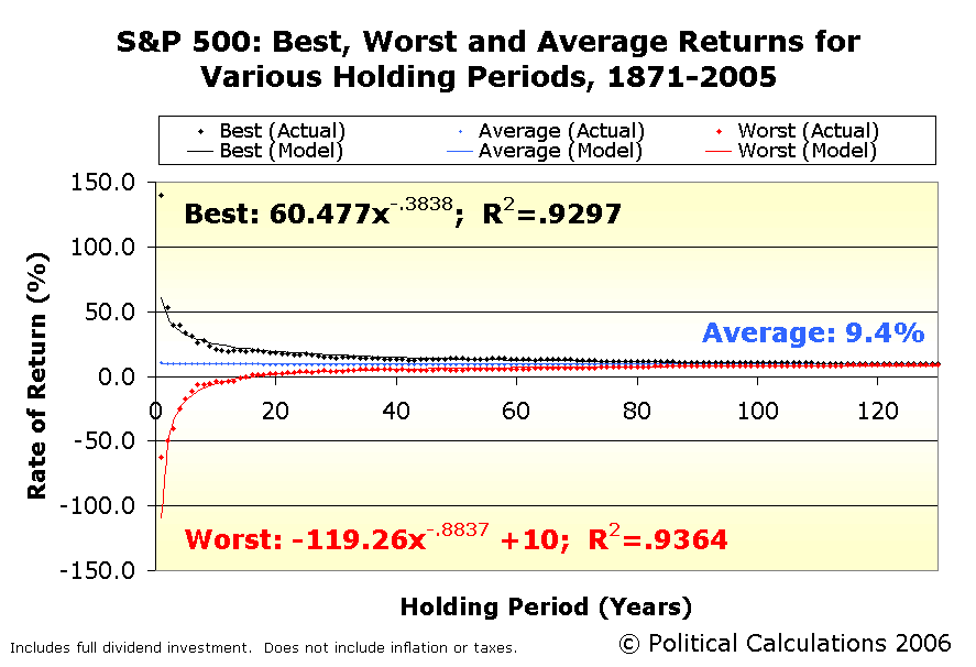
The rates of return presented above are annualized, and include full dividend re-investment that does not include commissions, fees, taxes or inflation. The points graphed are culled from the nominal returns for investments made in the S&P 500 index from 1871 through the end of 2005.
We find that in the historical data, the worst case nominal rate of return becomes positive for a 17-year holding period. Likewise, the worst case investment exceeds a 3.0% rate of return after 25 years and 5.0% after 36 years. These figures demonstrate the power of investing in a diversified pool of equities, as represented by the S&P 500 index, over long periods of time.
Where's the Tool?
Yes, we've developed a tool to do the math, but this post was long enough already! Look for it in days ahead here!...
Labels: best case, investing, SP 500, worst case
When it comes to investing, are you more prone to suffer Lemony Snicket's Series of Unfortunate Events
Today, in honor of the DVD release
The calculator below allows you to enter a fixed amount that you would invest each year for the number of years you specify. You will be invested in the entire U.S. stock market, which may be fairly represented by today's Wilshire 5000 index. For each year a deposit is made in your investment account, the amount of money you place in the hands of either King Midas or Count Olaf will, for the length of time that the money is invested, have either the corresponding best or worst case inflation-adjusted rate of return as outlined by Political Calculations' post Best and Worst Case Stock Market Investing.
For example, the money that would be deposited for a period of one year will have two future values calculated, one based upon the best historical rate of return for a one year period and the other based upon the worst historical rate of return for a one year period. This process would be repeated for the money placed with these "advisors" for two years, five years, twenty years and so on, until the entire term of your investment period is covered (up to fifty years.) The respective future values for each investment term are added together and provided in the calculator's results below:
Using the calculator, we can find some surprising results, particularly in the Lemony Snicket scenario (of course, we expected good results from King Midas!)
Even with the worst historical inflation-adjusted rates of return, after 29 years of investing, an investor will at least break even (an effective rate of return of 0.0% for that investing period.) In 38 years, the investor would have an effective rate of return of at least 2.0% for their investment, outperforming such "safe" investments as government bonds. After 46 years, the investment account would be worth more than twice what had initially been invested, with an effective rate of return over the entire period of roughly 2.9%. In fifty years, the maximum for the calculator, your effective rate of return on your entire investment in the Lemony Snicket scenario would be slightly over 3.4%. And also notice that at no point in this exercise did the investment lose its entire value.
More than anything else, the Lemony Snicket scenario shows the power of investment diversification and compounding interest over time when it comes to investing. Even with Count Olaf's horrible timing encompassing the worst stock market performances in history, provided the investment is suitably diversified and combined with the compound nature of long term investment growth, even Count Olaf could come out ahead!
Update 26 September 2005: Want to see the best and worst case rates of return over the past 105 years for various investment periods for the S&P 500 index? A graph and calculator for determining those rates of return is available here!
Labels: best case, investing, tool, worst case
Update: Political Calculations has mapped the extremes in market performance for the S&P 500 too!
Compared to determining the effective return that an average "investor" can expect to earn from their "investment" in Social Security, working out the best and worst case investment returns from investing in the stock market turned out to be a breeze!
It turns out that there are whole bodies of scholarly work that have been done in this area with results that have been posted on the Internet. There are two sources I recommend. The first is an excerpt from mutual fund pioneer John Bogle's book, Bogle on Mutual Funds that shows the general trend between investment holding period and the best and worst case performance of the stock market between 1926 and 1992.
The second source, an interactive example provided by the Foundation for Investor Education, takes inflation-adjusted stock market performance data for a variety of holding periods from work done by Wharton School professor Jeremy Siegel, whose book, Stocks for the Long Run covers his research into the history of U.S. stock market returns since 1802. The following table shows Siegel's best and worst case historical stock market returns, which have been adjusted for inflation:
| Inflation Adjusted Stock Market Annual Rates of Return | ||
|---|---|---|
| Holding Period (years) | Worst Case (%) | Best Case (%) |
| 1 | -38.6 | +66.6 |
| 5 | -11.0 | +26.7 |
| 10 | - 4.1 | +16.9 |
| 20 | + 1.0 | +12.6 |
| 30 | + 2.6 | +10.6 |
I used Siegel's data to create the best and worst case, inflation-adjusted, stock market performance formulas below, using various regression techniques available in Microsoft Excel (and some other mathematical manipulation) to come up with the equations:
In these equations, "Holding Period" represents the number of years that the stock market investment is held. Investors should note that Siegel's work is based on the performance of the entire U.S. stock market, which today may be best be tracked through the performance of the diversified Wilshire 5000 stock index. I've provided a simple calculator that performs this math below for reference:
Additional Note: Since the formulas are based on a limited number of data points, the results calculated will only approximate historical inflation-adjusted rates of return over time, with greater differences between historical and calculated results at very short holding periods, a result of the regression method. For long term results, the formulas also deviate from what would be expected due to the limited number of data points used to create the formulas (after 93 years, the worst case calculated return is higher than the best case calculated return!) As a result of this long term conflict with reality, I arbitrarily placed the effective long-term useful limit of the formulas at a holding period of 75 years for the Social Security versus Private Retirement Accounts comparison calculator, which should provide reasonably good approximations of returns without too great a discrepancy with what would actually occur in real market performance.
Update: Want to see what the future value of a fully diversified stock market investment might look like if you consecutively kept having the best or worst market performance over time? Take the Lemony Snicket vs. King Midas challenge today!
Update 30 July 2007: We've gone way beyond this tool! For the most recent analysis we've done, see our following posts:
- The Worst Returns of the S&P 500 vs The Safest Investments on Earth
- The S&P 500's Golden Years - Did you ever wonder about the best bull years the stock market ever had? We find the best 1 through 50 year periods ever!
- The Worst Returns Ever for the S&P 500 - We identify the dates that go along with the worst returns ever (after inflation) for the S&P 500!
- The S&P 500 at Your Fingertips - Our signature tool provides historical market data for the S&P 500 going all the way back to January 1871, and finds the rates of return between any two months both before and after inflation and with or without dividend reinvestment!
- Lemony Snicket and the S&P 500 - Our tool that takes the best, worst and most average investment returns ever from the S&P 500, and asks what if your investments had these returns?
- Mapping S&P 500 Performance, Since 1871 - our analysis that lead to our model of the best and worst case performance ever for the S&P 500.
- S&P 500: Best, Average and Worst Returns - our tool approximates the best, worst and average returns for investments of any length in the S&P 500 stock market index.
Labels: best case, investing, stock market, worst case
Welcome to the blogosphere's toolchest! Here, unlike other blogs dedicated to analyzing current events, we create easy-to-use, simple tools to do the math related to them so you can get in on the action too! If you would like to learn more about these tools, or if you would like to contribute ideas to develop for this blog, please e-mail us at:
ironman at politicalcalculations
Thanks in advance!
Closing values for previous trading day.
This site is primarily powered by:

CSS Validation

RSS Site Feed

JavaScript
The tools on this site are built using JavaScript. If you would like to learn more, one of the best free resources on the web is available at W3Schools.com.
Other Cool Resources
Blog Roll


