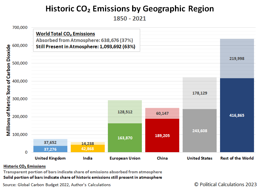
The Global Carbon Budget offers a wealth of data on carbon dioxide emissions. That includes estimates of how CO₂ each nation has emitted into the Earth's atmosphere in each year since 1850. At least, for the period for which records are available for the various nations.
When that historical data is presented, it's almost always given in terms of the total emissions emitted over that time for a given territory. Which is misleading, because not all that previously emitted carbon dioxide is still in the Earth's air. A significant fraction of it [has been taken out of the atmosphere, absorbed by various carbon sinks on land and sea.
We wondered how much of the carbon dioxide in the air today originating from fossil fuels could be attributed to various nations or territories. To find out, we tapped the Global Carbon Budget's territorial data to find out how much has been emitted by several nations or regions of interest and how much has been removed from the air over the years from 1850 through 2021. The following chart illustrates our results:
The next chart gives the percentages of each nation's or region's fossil fuel-based carbon dioxide emissions that are still present in the atmosphere.
Perhaps the most surprising result is for the United Kingdom. The portion of the U.K.'s CO₂ emissions that are still present in the air is less than half it's total emissions since 1850. This outcome owes a lot to the United Kingdom's leading role in the industrial revolution. The U.K. initially dominated global carbon dioxide emissions, but its relative contribution has declined over time as other nations and regions industrialized. As time has passed, most of the U.K.'s historic carbon dioxide emissions from consuming fossil fuels have been absorbed from the atmosphere.
A similar pattern is playing out with the regions of the European Union and the United States, which also industrialized early. Meanwhile, nations like China and India that are among today's sources for increasing CO₂ emissions industrialized much later, which is why a larger share of their historic emissions are still in the atmosphere.
What does that mean for the Earth's atmosphere of today? More or less, it means the share of carbon dioxide in the air today from our nations and regions of interest looks like what we've illustrated in the following treemap chart:
This chart shows the largest share for any single nation is that for the United States, to which a little over one-fifth of the CO₂ is attributed. China ranks second by that measure at over 17% and the combined nations of the European Union come in third at 15%. We also find India's 3.9% share outranks the United Kingdom's 3.4%. The "Rest of the World" combines for nearly two-fifth's of the excess fossil-fuel based carbon dioxide emissions present in the atmosphere through 2021.
But these relative shares are not going to stay that way. We also asked "what if each of these nations or regions had the same carbon dioxide output they did in 2021 for the next ten years through 2031?" to see how this last chart might change. We found that in 2031, China will replace the United States as the largest single national contributor of carbon dioxide in the air.
In reality, that outcome will occur before the end of the 2020s. China's carbon dioxide emissions have soared since 2021 so our assumption of level CO₂ emissions for the "what if" scenario we ran does not hold.
References
Friedlingstein et al. Global Carbon Budget 2022, Earth System Science Data, 11 November 2022. DOI: 10.5194/essd-14-4811-2022.
Political Calculations. How Long Does Carbon Dioxide Stay in the Atmosphere? [Online Article, Tool]. 19 July 2023.
Political Calculations. How Much Fossil Fuel CO2 Is in the Air? [Online Article]. 15 August 2023.
Labels: data visualization, environment
Welcome to the blogosphere's toolchest! Here, unlike other blogs dedicated to analyzing current events, we create easy-to-use, simple tools to do the math related to them so you can get in on the action too! If you would like to learn more about these tools, or if you would like to contribute ideas to develop for this blog, please e-mail us at:
ironman at politicalcalculations
Thanks in advance!
Closing values for previous trading day.
This site is primarily powered by:
CSS Validation
RSS Site Feed
JavaScript
The tools on this site are built using JavaScript. If you would like to learn more, one of the best free resources on the web is available at W3Schools.com.


