
Since the Affordable Care Act's health insurance "marketplaces" first went online back in October 2013, we've been proud to offer a unique tool that subsidy-eligible American consumers can use to make the right choice for themselves in shopping for health insurance with respect to their personal financial situation and their health.
That tool will tell you whether it makes more financial sense to buy health insurance through the Obamacare exchanges or to opt out and pay higher income taxes instead, depending upon whichever of these options is less costly for you.
According to recently released IRS statistics, that is a choice that million of Americans have been making since 2014, where after performing similar calculations on their own and finding out how actually "affordable" the Affordable Care Act's health insurance policies are with respect to whatever additional tax they might otherwise have to pay after considering the state of their health. The IRS confirms that in 2014, the first for which Americans had to either demonstrate that they had health insurance coverage or else be subject to a "shared responsibility" tax penalty, some 8,061,604 Americans chose the penalty over paying any health insurance premiums.
The Obamacare tax collectively cost them $1.694 billion, which works out to an average tax paid of $210.14 per income tax return for those who were subject to the tax. By contrast, the average monthly unsubsidized premium for a health insurance plan through the Affordable Care Act exchanges for 2014 was $328, which corresponds to a total cost of $3,926 per year for health insurance coverage.
It would have taken annual tax subsidies of at least $3,716 to have made signing up for health insurance through the Obamacare exchanges a slam dunk choice from a personal finance perspective that year, and though the penalty income tax has since increased to its now maximum rate, which changes where that threshold now lies, similar personal finance math still applies today!
Our tool below will help you decide which option may be more affordable for you in 2017. Beginning on 1 November 2016, you can obtain the relevant health insurance policy cost information you need from either the Healthcare.gov web site, or more reliably, from the independent and far more transparent Health Sherpa site. The default data in the tool below applies for 2017 premium data that has already been published for Pueblo, Colorado.
Also, if you're accessing this tool on a site that republishes our RSS news feed, please click here to access a working version of our tool.
About This Tool
In building this tool, we've made a handful of assumptions. Here they are, along with links to our references for data:
- The federal government's poverty income thresholds for 2013 will initially apply in 2014.
- The Kaiser Family Foundation's description of how ObamaCare's subsides will be calculated is accurate.
- The map of states we used to identify which are expanding their eligibility for their Medicaid programs up to 138% of the federal poverty income threshold and which are not is largely accurate. For states that had not made their determination as 1 September 2013, we've assumed that they are not expanding their Medicaid program's eligibility. We will update this periodically as new information becomes available.
- CNNMoney's description of how the penalty tax will work is accurate. We also thank Sean Parnell of The Self-Pay Patient blog, who identifies an exemption from the tax that we originally missed - it turns out that people who live in regions where the lowest-cost Bronze plan is more than 8% of their household income even after the subsidy will be fully exempt from the tax! (Of course, you realize that means that skipping out on not paying health insurance too until they might actually need it just became an even more attractive option for those who will be fully exempt from the tax!)
- The default values associated with selecting the "United States" are those that will apply for a majority of the nation's population.
- People will mostly act rationally where their financial incentives and the assessment of their health care needs are involved.
Beyond this, we've assumed that for some people there may be a "gray area", who would only have a small incentive to not purchase health insurance, where any benefit in doing so is not very large with respect to their household income, and where the decision to buy or not buy should instead be based upon an assessment of what the buyer's actual health care needs for their household will be in the near term, rather than purely upon its cost with respect to the ObamaCare income tax.
Mathematically, we've defined that gray area as being equal to the difference between the penalty tax they might choose to pay or an amount equal to 4.2% of their income before taxes, which closely corresponds to the average expenditure of U.S. households for health insurance in 2015 according to the most recent Consumer Expenditure Survey. This figure has increased from the 3.1% of income before taxes that was indicated by data in the Consumer Expenditure Survey report for 2012, which is a direct consequence of how the Affordable Care Act has sharply escalated the cost of health insurance in the United States since it became law.
Updates
Here at Political Calculations, our policy is for our tools to always improve over time. This section of this indicates all the significant changes we have made to the text of this article and the code for this tool.
- 20 September 2013: Modified programming to consider the tax exemption that might apply if the out-of-pocket cost of the least-expensive "Bronze" plan, even after the subsidy tax credit is considered, is still greater than 8% of their household income. Modified text in Assumptions section to indicate change was incorporated.
- 25 September 2013: Modified text in fourth paragraph to better clarify when an individual opting to pay the tax instead of a premium could acquire insurance if they determine they will need it. Added the Updates section to communicate all significant changes in this post and tool.
- 27 October 2013: Updated the data for Ohio, which will be expanding its Medicaid program, and also for Pennsylvania, which appears set to expand its Medicaid program to some degree.
- Updated 7 November 2015: Montana is now listed among the states expanding their Medicaid programs. We should also note that seven of the now 30 states that have adopted the Medicaid expansion are also imposing measures that will limit costs to the states, such as Montana's decision to require Medicaid beneficiaries earning above 100% of the federal poverty level to pay premiums equal to up to 2% of their annual income. Other states that have adopted cost control measures that have been approved by the federal government include Arkansas, Indiana, Iowa, Michigan, New Hampshire, and Pennsylvania.
- Updated 16 October 2016: Louisiana has expanded their Medicaid coverage under the federal plan, and both Indiana and New Hampshire have expanded their Medicaid coverage under an alternative plan with the adoption of cost control measures that have been approved by the federal government. We've also updated this version of the tool with 2016's poverty thresholds that hold for the 48 contiguous states, Alaska and Hawaii.
Legal Disclaimer
Materials on this website are published by Political Calculations to provide visitors with free information and insights regarding the incentives created by the laws and policies described. However, this website is not designed for the purpose of providing legal, medical or financial advice to individuals. Visitors should not rely upon information on this website as a substitute for personal legal, medical or financial advice. While we make every effort to provide accurate website information, laws can change and inaccuracies happen despite our best efforts. If you have an individual problem, you should seek advice from a licensed professional in your state, i.e., by a competent authority with specialized knowledge who can apply it to the particular circumstances of your case.
Labels: health, insurance, personal finance, risk, tool


Ten years ago, in 2006, the average combined cost of health insurance premiums and deductibles for a single individual in the United States was $1,211. In 2016, that figure has risen to $2,607, representing an average increase of 8% per year.
By contrast, if the combination of health insurance premiums and deductibles for a single American had increased at the overall rate of inflation of 1.8% per year in the U.S. between 2006 and 2016, that $1,211 in 2006 would have increased to just $1,446 in 2016.
The chart below indicates the average premiums and deductibles that Americans paid for single coverage health insurance in each year from 2006 through 2016.

Similar math involving larger numbers applies for Americans with family health insurance coverage. In 2006, the average annual combined cost of health insurance premiums and deductibles totaled $4,044, which in 2016, had risen to $8,243 thanks to the an average rate of escalation of 7.4% per year. If they had risen at the average rate of inflation in the U.S., they would only have totaled $4,831.
The second chart shows the average cost of premiums and deductibles that Americans paid for family coverage health insurance in each year from 2006 through 2016.

The important thing to recognize here is that these are the average costs that Americans would have had to pay out of their own pockets for their health insurance before they might receive the full benefits for that coverage, without any contribution from their employers or from government subsidies. In the case of employer provided health insurance coverage, these costs represent anywhere from 33% to 39% of the total cost of health insurance for U.S. individuals or families.
Reference
Kaiser Family Foundation and Health Research & Educational Trust. 2016 Employer Health Benefits Survey. [Online Document]. 14 September 2016.
The Kaiser Family Foundation and the Health Research & Educational Trust have released the results of their 2016 Employer Health Benefits Survey, which gives an idea of how much the health insurance coverage provided by U.S. employers costs.
Those costs are divided between employers and their workers. In the case of health insurance premiums, the cost is shared between U.S. employers and workers. For 2016, U.S. employers will pick up an average of 82% ($5,309) of the full cost of the premiums ($6,438) for workers who select single coverage and an average of 71% ($12,865) of the full cost of health insurance ($18,142) for workers who select family coverage.
U.S. employees however are fully responsible for paying the deductible portion of their health insurance coverage, which is the actual cost of the health care they might actually consume before they would realize the full benefits of having health insurance coverage. For 2016, the average deductible for any type of health insurance is $1,478 for single coverage and we estimate an average deductible of $2,966 applies for family coverage.
Combined together, these costs represent the amount of money that the average American employee can expect to pay before their health insurer would begin paying the majority of costs for the actual health care they consume. The following chart indicates the average annual costs for employers and employees for health insurance premiums and deductibles in 2016.

Most of these values are directly provided in the 2016 Employer Health Benefits Survey, however we've estimated the average cost of the deductibles for employees selecting family health insurance coverage by calculating the weighted average deductible that applies for each major category of health insurance coverage according to the percentage enrollment for each plan type in 2016, whether conventional, Health Maintenance Organization (HMO), Preferred Provider Organization (PPO), Point of Service (POS) or High Deductible Health Plan (HDHP).
For 2016, U.S. workers with single health insurance coverage will pay 33% of the combined total cost of health insurance premiums and deductibles before reaching the threshold where the health insurer is responsible for paying the majority of their health care expenses. U.S. workers with family health coverage can expect to pay up to 39% of the combined total cost of health insurance premiums and deductibles before they reach that threshold.
U.S. workers pay no income taxes on the amount of money their employers contribute to paying their health insurance premiums on their behalf. That exemption has existed since World War 2, when the U.S. government passed legislation to allow U.S. firms to provide these alternative compensation benefits in order to attract and retain skilled employees at a time when the wage and price controls of that era prevented them from being able to directly pay them more.
Data Source
Kaiser Family Foundation and Health Research & Educational Trust. 2016 Employer Health Benefits Survey. Exhibits 5.1, 6.3, 6.4, 7.7 and 7.20. 14 September 2016.
The Consumer Expenditure Survey is a joint project of the U.S. Bureau of Labor Statistics and the U.S. Census Bureau, which documents the amount of money that Americans spend each year on everything from Shelter, which is the biggest annual expenditure for most Americans, to Floor Coverings, which represents the smallest annual expenditure tracked and reported by the survey's data collectors.
The chart below shows the average annual expenditures for the major categories per "consumer unit" (which is similar to a "household"), as reported in the Consumer Expenditure Survey for the years from 1984 through the just reported data for 2015.

If you look closely at the chart, you'll see that the categories of Health Care & Other Medical Expenses and Entertainment tracked very closely with one another in the years from 1984 through 2008, but diverged considerably afterward, with Health Insurance & Other Medical Expenses rising more rapidly. And in case you can't see that in the above chart, the following chart shows each of these average annual expenditure categories as a percent share of each year's average annual total expenditures.

The Consumer Expenditure Survey provides more detailed data within each of these categories, so we drilled down into that data to see which components of these general categories are most responsible for the divergence we see in the average annual expenditure data since 2008. The following chart reveals what we found, as measured by the change in cost for each subcomponent of these general categories in each year since 2008:

This chart is kind of remarkable in that it captures the escalation in the average amount that U.S. household consumer units pay for health insurance that took place after the Patient Protection and Affordable Care Act (popularly known as "ObamaCare") was first passed into law in March 2010 and began affecting the market for health insurance in the U.S., and then what happened after it went into nearly full effect with its enrollment period in the final months of 2013 for health insurance coverage that would begin in 2014.
As of 2015, the amount of money paid by U.S. consumer unit households for health insurance has risen by nearly $1,300. By contrast, all the other subcomponents for Other Medical Expenses and Entertainment are within $120 of what the average U.S. consumer unit household paid in 2008.
That outcome is a confirmation that ObamaCare bent the cost curve for health insurance in the wrong direction.
Data Sources
U.S. Bureau of Labor Statistics and U.S. Census Bureau. Consumer Expenditure Survey. Multiyear Tables. [PDF Documents: 1984-1991, 1992-1999, 2000-2005, 2006-2012, 2013-2015]. Reference URL: http://www.bls.gov/cex/csxmulti.htm. 30 August 2016.
Labels: data visualization, demographics, economics, health care, insurance

Since the Affordable Care Act's health insurance "marketplaces" first went online back in October 2013, we've been proud to offer a unique tool that subsidy-eligible American consumers can use to make the right choice for themselves in shopping for health insurance with respect to their personal financial situation and their health.
That tool will tell you whether it makes more financial sense to buy health insurance through the Obamacare exchanges or to opt out and pay higher income taxes instead, depending upon whichever of these options is less costly for you.
That a choice that millions of Americans have made after performing similar calculations on their own, after comparing how actually "affordable" the Affordable Care Act's health insurance policies are with whatever additional tax they might otherwise have to pay after considering the state of their health.
One problem is that nearly half of the 10.5 million uninsured people eligible for ObamaCare are between the ages of 18 and 34—and young people tend to be healthy and unwilling to pay for pricey coverage they don’t need.
But propping up ObamaCare requires this group’s subsidizing the medical costs of the aging and ill. So far, no luck. It makes sense for healthy young people to pay a penalty rather than purchase the insurance. And in 2015 that’s what 6.6 million people did, according to the IRS. Next year the minimum penalty increases to $695 or 2.5% of income above $10,000, whichever is greater. In many cases, that’s still much cheaper than insurance.
At our company, CKE Restaurants, we offer eligible employees ObamaCare-compliant coverage. We used federal guidelines and set our employee monthly contribution for the least expensive Bronze plan at $1,116 a year, or about 25% of the annual premium. The company pays the rest, and the deductible is $5,500. But even when next year’s higher penalty kicks in—2.5% of income above $10,000—an employee would need to earn more than $50,000 a year for the penalty to exceed the premium.
Our tool below will help you decide which option is more affordable for you in 2016. You can obtain the relevant health insurance policy cost information you need from either the Healthcare.gov web site, or more reliably, from the independent and far more transparent Health Sherpa site.
Also, if you're accessing this tool on a site that republishes our RSS news feed, you'll want to click here to access a working version of our tool.
About This Tool
In building this tool, we've made a handful of assumptions. Here they are, along with links to our references for data:
- The federal government's poverty income thresholds for 2013 will initially apply in 2014.
- The Kaiser Family Foundation's description of how ObamaCare's subsides will be calculated is accurate.
- The map of states we used to identify which are expanding their eligibility for their Medicaid programs up to 138% of the federal poverty income threshold and which are not is largely accurate. For states that had not made their determination as 1 September 2013, we've assumed that they are not expanding their Medicaid program's eligibility. We will update this periodically as new information becomes available.
- CNNMoney's description of how the penalty tax will work is accurate. Update 20 September 2013: Our thanks to Sean Parnell of The Self-Pay Patient blog, who identifies an exemption from the tax that we originally missed - it turns out that people who live in regions where the lowest-cost Bronze plan is more than 8% of their household income even after the subsidy will be fully exempt from the tax! (Of course, you realize that means that skipping out on not paying health insurance too until they might actually need it just became an even more attractive option for those who will be fully exempt from the tax!)
- The default values associated with selecting the "United States" are those that will apply for a majority of the nation's population.
- People will mostly act rationally where their financial incentives and the assessment of their health care needs are involved.
Beyond this, we've assumed that for some people there may be a "gray area", who would only have a small incentive to not purchase health insurance, where any benefit in doing so is not very large with respect to their household income, and where the decision to buy or not buy should instead be based upon an assessment of what the buyer's actual health care needs for their household will be in the near term, rather than purely upon its cost with respect to the ObamaCare income tax.
Mathematically, we've defined that gray area as being equal to the difference between the penalty tax they might choose to pay or an amount equal to 3.1% of their income before taxes, which closely corresponds to the average expenditure of U.S. households for health insurance, according to the just-released Consumer Expenditure Survey report for 2012.
Updates
Here at Political Calculations, our policy is for our tools to always improve over time. This section of this indicates all the significant changes we have made to the text of this article and the code for this tool.
- 20 September 2013: Modified programming to consider the tax exemption that might apply if the out-of-pocket cost of the least-expensive "Bronze" plan, even after the subsidy tax credit is considered, is still greater than 8% of their household income. Modified text in Assumptions section to indicate change was incorporated.
- 25 September 2013: Modified text in fourth paragraph to better clarify when an individual opting to pay the tax instead of a premium could acquire insurance if they determine they will need it. Added the Updates section to communicate all significant changes in this post and tool.
- 27 October 2013: Updated the data for Ohio, which will be expanding its Medicaid program, and also for Pennsylvania, which appears set to expand its Medicaid program to some degree.
- Updated 7 November 2015: Montana is now listed among the states expanding their Medicaid programs. We should also note that seven of the now 30 states that have adopted the Medicaid expansion are also imposing measures that will limit costs to the states, such as Montana's decision to require Medicaid beneficiaries earning above 100% of the federal poverty level to pay premiums equal to up to 2% of their annual income. Other states that have adopted cost control measures that have been approved by the federal government include Arkansas, Indiana, Iowa, Michigan, New Hampshire, and Pennsylvania.
Legal Disclaimer
Materials on this website are published by Political Calculations to provide visitors with free information and insights regarding the incentives created by the laws and policies described. However, this website is not designed for the purpose of providing legal, medical or financial advice to individuals. Visitors should not rely upon information on this website as a substitute for personal legal, medical or financial advice. While we make every effort to provide accurate website information, laws can change and inaccuracies happen despite our best efforts. If you have an individual problem, you should seek advice from a licensed professional in your state, i.e., by a competent authority with specialized knowledge who can apply it to the particular circumstances of your case.
Labels: health, health care, insurance, personal finance, risk, tool
In our previous installment, we made the following claim:
On average, the amount by which the typical American's health insurance premiums went up in 2014 over the previous year was $639, with the largest percentage increases being paid by the households led by the youngest Americans - the ones who could afford it the least.
We were wrong. After we dug deeper into the demographics of age and income, we found that the youngest Americans are only the second-most harmed group that has been negatively impacted by the implementation of President Obama's Affordable Care Act. In reality, the Americans most materially harmed by Obamacare are the oldest.
Our table below works through the math that backs up that finding. If you're accessing this article through a site that republishes our RSS news feed, but which doesn't maintain our CSS formatting, you may want to click through to our site to view the table in the format in which we published it):
| 2014 Health Insurance Expenditures and Total Money Income by Age Group | ||||||
|---|---|---|---|---|---|---|
| Age Group | Average Health Insurance Expenditure in 2014 | Average Health Insurance Expenditure in 2013 | Year Over Year Increase in Expenditure for Health Insurance | Year Over Year Percentage Increase in Expenditure for Health Insurance | Average Total Money Income in 2014 | Increase in Health Insurance Expenditure as Percentage of Average Total Money Income |
| Age 24 and Under | $766 | $526 | $240 | 45.6% | $15,734 | 1.53% |
| Age 25-34 | $1,910 | $1,334 | $576 | 43.2% | $39,532 | 1.46% |
| Age 35-44 | $2,683 | $1,944 | $739 | 38.0% | $52,967 | 1.40% |
| Age 45-54 | $2,936 | $2,242 | $694 | 31.0% | $55,692 | 1.25% |
| Age 55-64 | $3,218 | $2,537 | $681 | 26.8% | $50,066 | 1.36% |
| Age 65-74 | $3,985 | $3,409 | $576 | 16.9% | $40,675 | 1.42% |
| Age 75 and Over | $3,906 | $3,265 | $641 | 19.6% | $29,726 | 2.16% |
| All Ages (Average) | $2,868 | $2,229 | $639 | 28.7% | $42,789 | 1.49% |
Americans Age 75 and older were most negatively affected by the implementation of the Affordable Care Act in 2014, as the increase in their average annual expenditures for health insurance increased by an amount equal to 2.16% of their average annual total money income.
And so we find that Americans Age 75 and older, a demographic group that predominantly consists of elderly widows whose primary source of income is provided by Social Security's survivor's insurance benefits, are the Americans most harmed by the increases in health insurance costs driven by the implementation of Obamacare.
Image Credit: Theodora.
Data Sources
U.S. Bureau of Labor Statistics. Consumer Expenditure Survey. Multiyear Tables. [PDF Documents: 2013-2014]. Reference URL: http://www.bls.gov/cex/csxmulti.htm. Accessed 18 October 2015.
U.S. Census Bureau. Current Population Survey. Annual Social and Economic (ASEC) Supplement. Table PINC-01. Selected Characteristics of People 15 Years and Over, by Total Money Income in 2014, Work Experience in 2014, Race, Hispanic Origin, and Sex. [Excel Spreadsheet]. 16 September 2015. Accessed 16 September 2015.
Labels: demographics, health, insurance, whoops
The promise that Barack Obama for implementing his vision of health care reform in the United States was very appealing:
"I will sign a universal health care bill into law by the end of my first term as president that will cover every American and cut the cost of a typical family's premium by up to $2,500 a year."
It was so appealing, that he kept repeating it, over and over again, to anybody who would listen.
President Obama signed his vision of a universal health care bill into law on 23 March 2010. It went into effect in 2014. Our chart below shows the amount that all American families paid in health insurance premiums on average in each year from 2004 through 2014, with respect to the reference age of the family member who responded to the U.S. Census Bureau and U.S. Bureau of Labor Statistics' annual Consumer Expenditure Survey for each of those years.

On average, the amount by which the typical American's health insurance premiums went up in 2014 over the previous year was $639, with the largest percentage increases being paid by the households led by the youngest Americans - the ones who could afford it the least.
Data Sources
U.S. Bureau of Labor Statistics. Consumer Expenditure Survey. Multiyear Tables. [PDF Documents: 2000-2005, 2006-2012, 2013-2014]. Reference URL: http://www.bls.gov/cex/csxmulti.htm. Accessed 18 October 2015.Labels: data visualization, demographics, health, health care, insurance, politics
Previously, in visualizing the data for how Americans have spent their money in each year since 1984, we noted that spending for health care, or really, health insurance and other medical expenses, saw a significant uptick in 2014, thanks to the Affordable Care Act, whose government-run health care "marketplaces" went into effect that year.
We thought we'd take a closer look at that remarkable increase today. First, let's directly compare the trends for the average amount of money that Americans spent on health care and on entertainment-related expenses in each year from 1984 through 2014.
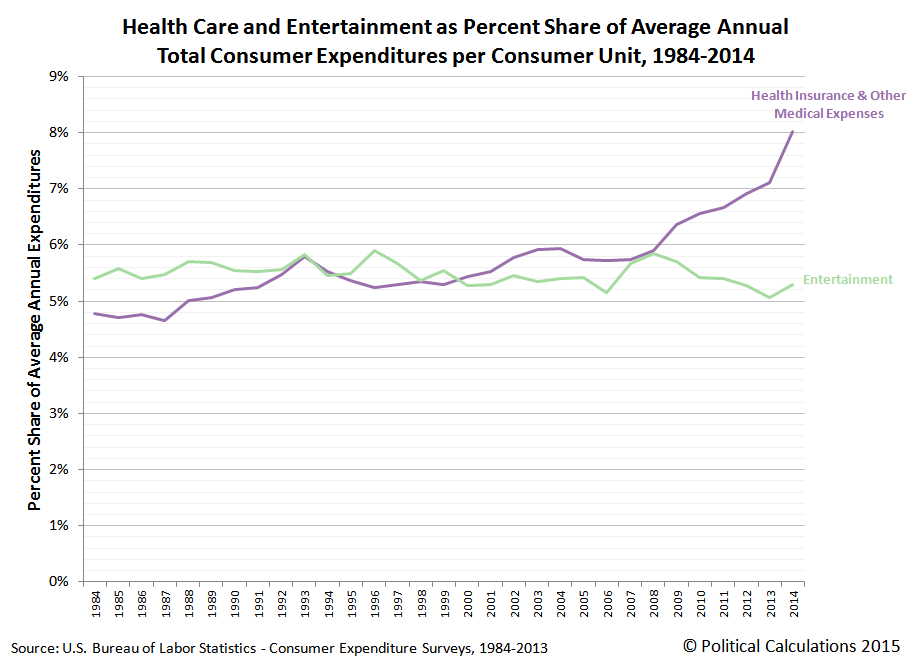
The reason we're comparing these two expenditure categories is because in the years from 1984 through 2008, health care and entertainment represented approximately equal shares of the average annual total expenditures of American households, as both follow roughly the same general trajectory.
But after 2008, things begin to change, which we see when we break down the major categories of health care and entertainment into their subcategories. The chart below shows the dollar value change in each of the subcategories that make up these major expenditure categories with respect to the base year of 2008.

What we first find is that the amount of spending for each subcategory of the health care and entertainment expenditure categories holds fairly steady through 2010, where all the dollar amount spent each year are within $200 of their 2008 level.
What we next observe is that after 2010, the amount of money that Americans spend on the health insurance subcategory of health care expenditures begins to grow exponentially, where all the other kinds of spending, including for actual medical care, medical equipment, and medicine, not to mention all the various entertainment-related spending subcategories, are otherwise little changed - all are within $200 of their 2008 levels.
But American households through 2014 are spending over $1,200 more on health insurance than they were before 2008, as its cost curve has been bent upward.
The reason why is not difficult to determine. The passage of the Affordable Care Act, which is perhaps more popularly better known as "Obamacare", mandated that all Americans either buy costly health insurance or else pay higher income taxes, for which the latter option for most Americans, would represent a more affordable option.
But for those Americans who chose to buy health insurance after it was mandated, who are spending $1,215 more on average in health insurance in 2014 than they were in 2008, we get a sense of just how much more costly that option is.
And when you consider that the average total expenditures of American households in 2014 is $53,495, which is $3,009 higher than it was in the recession year of 2008, we find that the federal government mandated increase in personal health insurance spending accounts has claimed over 40% of the gain in spending money that Americans have otherwise realized as the U.S. economy has slowly recovered.
Which is to say that thanks to Obamacare, through 2014, average Americans are only benefitting from 60% of whatever economic recovery has occurred. The rest of the benefit has gone to the Obama administration's crony coalition of health care firms who were the primary beneficiaries of the Affordable Care Act.
If you don't believe us, just ask their investors, who wouldn't have done anywhere near as well if Americans had not been required by law to buy health insurance instead of whatever else they might otherwise have chosen to buy.
Data Sources
U.S. Bureau of Labor Statistics. Consumer Expenditure Survey. Multiyear Tables. [PDF Documents: 1984-1991, 1992-1999, 2000-2005, 2006-2012, 2013-2014]. Reference URL: http://www.bls.gov/cex/csxmulti.htm. Accessed 18 October 2015.Labels: data visualization, health care, insurance
Welcome to the blogosphere's toolchest! Here, unlike other blogs dedicated to analyzing current events, we create easy-to-use, simple tools to do the math related to them so you can get in on the action too! If you would like to learn more about these tools, or if you would like to contribute ideas to develop for this blog, please e-mail us at:
ironman at politicalcalculations
Thanks in advance!
Closing values for previous trading day.
This site is primarily powered by:

CSS Validation

RSS Site Feed

JavaScript
The tools on this site are built using JavaScript. If you would like to learn more, one of the best free resources on the web is available at W3Schools.com.
Other Cool Resources
Blog Roll


