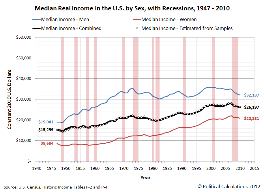
We're revisiting the average and median incomes of men and women in the U.S. today because we've been using that data behind the scenes to prove out whether or not we could successfully determine these values for a combined population using only that data for the component sub-populations that make up the combined population, or vice versa.
As it happens, we could get pretty close to the actual values. The mean (average) income data was fairly easy to do, which we've shown below in our updated chart, where we've also indicated periods of recession (for the sake of not duplicating the chart we had previously posted and for providing additional context):
The trick here for calculating the average income of the combined population was to calculate the weighted average for the sub-populations - our results nearly matched the actual values recorded by the U.S. Census.
Working with the median income data however was a bit more difficult. Here, we took advantage of the fact that the distribution of income in the U.S. follows a log-normal pattern, which means that if you calculate the natural logarithm of income before graphing the distribution, the data will follow the normal, bell-curve shaped distribution that is pretty common in statistics.
Using the math that applies for log-normal distributions, we took the mean and median income data for the sub-populations and calculated their respective population means and standard deviations. We then took the weighted average of their population means, from which we calculated the median income for the combined population in each year, from which we got results that were really close to the actual values, paralleling them from 1947 through 2010.
When we say "really close", each of our calculated values were within about 2% of the actual values recorded by the U.S. Census in its Current Population Survey results. In the chart above, we multiplied our results by a scale factor of nearly 1.02 to shift our calculated values upward to more closely align with the actual values.
This isn't just an academic exercise. The real reason we've gone through this whole procedure is because we're going to be using the same math to extract information from the Census' annual income distribution data that has never really been examined before and we needed a test case to show that it works. And while we won't have the benefit of being able to check our results against actual data, you can reasonably expect that the trends we'll be presenting in that project will directly parallel the actual ones, and will very likely be within about 2% of them as well.
That's the beauty of the math!
Labels: data visualization, income, math
Welcome to the blogosphere's toolchest! Here, unlike other blogs dedicated to analyzing current events, we create easy-to-use, simple tools to do the math related to them so you can get in on the action too! If you would like to learn more about these tools, or if you would like to contribute ideas to develop for this blog, please e-mail us at:
ironman at politicalcalculations
Thanks in advance!
Closing values for previous trading day.
This site is primarily powered by:
CSS Validation
RSS Site Feed
JavaScript
The tools on this site are built using JavaScript. If you would like to learn more, one of the best free resources on the web is available at W3Schools.com.

