According to Snopes, Willie Sutton was famous for two things, one of which wasn't true:
Sutton is famous for two things: His fascinating career as an illegal withdrawals specialist (bank robber, that is) and for a pithy rejoinder supposedly uttered in response to an inverviewer's query about why he robbed banks. While lore would have it that the band robber replied "Because that's where the money is" to that common question, Sutton denied ever having said it. "The credit belongs to some enterprising reporter who apparently felt a need to fill out his copy," wrote Sutton in his autobiography. "I can't even remember where I first read it. It just seemed to appear one day, and then it was everywhere."
So, if you were a modern day illegal withdrawals specialist, seeking to go "where the money is" with respect to the incomes of those who earned it in 2010, where would you go?
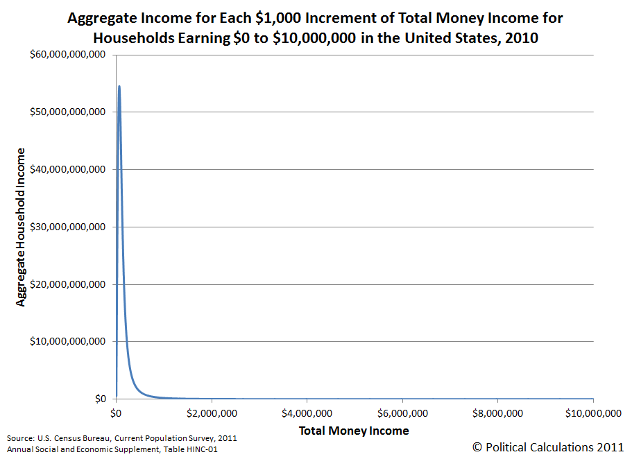
To find out, we estimated the number of households within each $1,000 increment of total money income from $0 to $10,000,000 in the United States, using U.S. Census data. We then calculated the aggregate amount of income within each $1,000 income increment by multiplying our estimated number of households by the value of the midpoint of the income increment.
Our first chart shows what we found:

This chart shows that the aggregate distribution of income in the United States is heavily weighted toward the lower end of the chart, however the horizontal scale makes it difficult to see which incomes correspond to the greatest amount of aggregate income.
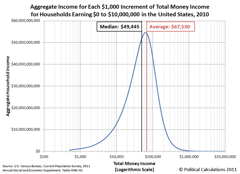
To make those values easier to read, we switched the horizontal axis to be in a logarithmic scale. Our second chart shows the results:

Here, we clearly see that most of the aggregate income earned by U.S. households in 2010 is to be found between the median household income figure of $49,455 and the mean household income figure of $67,530, which would put you in the neighborhood where Americans households collectively earn well over 50 billion dollars per year.
If you'd like to widen your target rant to include those households that collectively rake in more than 20 billion dollars per year, you'll find those households between an annual income of $16,000 and $161,000.
Or, if you just care about the income range where Americans collectively make more than 10 billion dollars per year, you'll find that money earned by households with annual incomes between $8,500 and $221,500.
And now you know where the money really is!
Data Source
U.S. Census. Current Population Survey. Annual Social and Economic (ASEC) Supplement. HINC-01. Selected Characteristics of Households by Total Money Income in 2010. Accessed 13 September 2011.
Labels: income distribution
Welcome to the blogosphere's toolchest! Here, unlike other blogs dedicated to analyzing current events, we create easy-to-use, simple tools to do the math related to them so you can get in on the action too! If you would like to learn more about these tools, or if you would like to contribute ideas to develop for this blog, please e-mail us at:
ironman at politicalcalculations
Thanks in advance!
Closing values for previous trading day.
This site is primarily powered by:
CSS Validation
RSS Site Feed
JavaScript
The tools on this site are built using JavaScript. If you would like to learn more, one of the best free resources on the web is available at W3Schools.com.