Imagine you've just added a packet of dry flavored drink powder to a bottle of water without doing anything else to mix it together. How long will it take to fully dissolve so that you can no longer sense any of the texture of the powder on your tongue whenever you take a drink?
How long that might takes depends on the mechanics of diffusion, which is described as the net movement of particles from an area of higher concentration to an area of lower concentration. It doesn't matter whether those particles are atoms, molecules, aromas, viruses, drink mixes, foraging animals, et cetera, the process of diffusion ensures that eventually, the particles will go from being concentrated to being uniformly spread out in the medium to which they have been added.
The following video starts with an experiment the differences in how drops of colored dye become diffused in liquid water held at different temperatures, before introducing the math of random walks and how they lead to the equations that define the process of diffusion. The presenter also manages to throw in a biblical reference to explain what diffusion is, all in less than 13 minutes.
If you want to graduate to modeling random walks in diffusion, we'll point you to another video that provides both an introduction into two-dimensional random walks without any biblical references, but with its own special kind of goofy fun, before getting into how to program a random walk using Monte Carlo simulations in the Python programming language.
Solving diffusion problems represents a big challenge, because traditionally, their solution through modeling random walks requires lots of computing resources to approximate solutions using iterative numerical analysis. Or did, until this year, when Luca Giuggioli worked out how to more easily frame these kinds of problems for direct solution using mathematical tools originally developed to solve other problems, such as Chebyshev polynomials and the method of images (video).
The diffusion equation models random movement and is one of the fundamental equations of physics. To compare model predictions with empirical observations, the diffusion equation needs to be studied in finite space. When space and time are continuous, the analytic solution of the diffusion equation in finite domains has been known for a long time. But finding an exact solution when space and time are discrete has remained an outstanding problem for over a century—until now. I find the analytic solution of the discrete diffusion equation in confined domains and use it to predict how the probability for various reaction diffusion processes changes over time.
I make joint use of two techniques: special mathematical functions known as Chebyshev polynomials and a technique invented to tackle electrostatic problems, the so-called method of images. This approach allows me to construct hierarchically the solution to the discrete diffusion equation in higher dimensions from the one in lower dimensions.
The exact solution allows me to calculate transport quantities that, until now, could be derived only via time-consuming computer simulations or not at all because of prohibitive computational costs. In the context of random search processes, it is now possible to calculate accurately the probability for a “searcher” to reach a target for the first time, to return to its initial starting position, and to remain trapped at special defective locations.
These findings are directly relevant to a vast number of applications such as molecules moving inside a cell, animals foraging for resources in their home ranges, robots searching in a disaster area, and humans passing information or a disease.
That last bit explains the focus of the press release that accompanied Giuggioli's paper's publication, coming as it did during the global coronavirus pandemic of 2020, but which we think actually diminishes the accomplishment. In crafting a framework that allows direct solution of the equations describing diffusion processes, Giuggioli's approach has the potential to greatly reduce the amount of time and computing resources required to reach useful solutions across a wide range of applications. It's a leading contender to become one of the biggest math stories of the year.
References
Giuggioli, Luca. Exact Spatiotemporal Dynamics of Confined Lattice Random Walks in Arbitrary Dimensions: A Century after Smoluchowski and Pólya. Physical Review X. Vol. 10, Iss. 2 — April - June 2020 – Published 28 May 2020. DOI: 10.1103/PhysRevX.10.021045.
Johnston, Derek. An Introduction to Random Walks. [PDF Document]. 5 August 2011.
Bazant, Martin. 18.366 Random Walks and Diffusion. Fall 2006. Massachusetts Institute of Technology: MIT OpenCourseWare, https://ocw.mit.edu. License: Creative Commons BY-NC-SA. [Course Home | Study Materials]. Fall 2006.
Update 6 January 2021: Bonus video for background, featuring how to use the method of images with fluid flow problems:
Labels: math
If you've been paying attention, you might have noticed the stock market has entered some exciting new territory during the global coronavirus pandemic. To understand how exciting, let's revisit some basic concepts for what defines order, disorder, disruptive events, and bubbles as they apply to stock prices.
Order exists in a market whenever the change in the price of assets in the market are closely coupled with the change in the income that might be realized from owning or holding the assets, within a band of approximately normal variation about a central tendency.
Disorder exists in a market whenever the change in the price of assets in the market is not coupled with the change in the income that might be realized from owning or holding the assets within a band of approximately normal variation about a central tendency that would describe the relationship between the two when order exists in the market.
A disruptive event may be said to be taking place whenever a significant change in the price of assets in the market is not coupled with the change in the income that might be realized from owning or holding the assets over a limited period of time.
And finally, a bubble exists whenever the price of an asset that may be freely exchanged in a well-established market first soars then plummets over a sustained period of time at rates that are decoupled from the rate of growth of the income that might be realized from owning or holding the asset.
Now, let's look at the history of the S&P 500 (Index: SPX), as measured against its underlying dividends per share, or rather, the income that might be realized from owning or holding shares of an S&P 500 index fund or its component firms in your investing portfolio, from December 1991 through the nearly complete month of July 2020, which shows all of these things.

The action corresponding to the coronavirus pandemic is contained in the upper right hand corner of this chart. Following a period of relative order that ran from December 2018 through February 2020, the onset of the coronavirus pandemic in the U.S. in March 2020 represents both a disruptive event, which sent stock prices plunging into a new period of relative disorder.
That plunge reversed when the U.S. Federal Reserve initiated an unprecedented level of intervention to stabilize markets in late March 2020, flooding them with liquidity that succeeded in boosting stock prices in a bid to prevent the greater economic damage that would otherwise have resulted from a collapse in the value of these assets.
But far from stabilizing the situation in the market, by definition, the Fed has effectively blown a new bubble in stock prices, as seen by the rapid ascent of the S&P 500 that is decoupled from the index' underlying trailing year dividends per share, which have begun to fall after having stalled in the second quarter of 2020.
In nominal terms, the size of the bubble that has been inflated in the four months since March 2020 is a little smaller than the inflation phase of the Dot Com Bubble, which took far longer to inflate back in the period from April 1997 through August 2000.
It seems in this exciting new territory for the S&P 500, stock prices are reacting more to changes in the expected rate of growth of the Fed's balance sheet than they are to changes in the expected rate of growth of the S&P 500's underlying dividends per share.
How long that might last is anyone's guess. The only thing we know for certain is that eventually, all periods of relative order, disorder, disruptive events, or bubbles in the stock market come to an end. It's only ever a question of when.
Two weeks ago, the data for cases and hospitalizations in Arizona signaled the state had turned a corner for the progression of coronavirus infections among its residents, but the data for deaths was too incomplete to confirm that milestone had been passed.
Two weeks later, all three major measures of the spread and severity of the SARS-CoV-2 coronavirus confirm the delayed first wave of infections Arizona has experienced has indeed passed through a crest in its coronavirus epidemic, which is now in its rear view mirror. We've continued to refine and update our analysis based on the best estimates of its characteristics, where we've been able to identify significant factors affecting the progression of the coronavirus within the state.
New Hospitalizations Continue Trending Downward
Data for new coronavirus-related hospitalizations in Arizona is especially useful for determining whether particular events affected the rate of exposure to COVID-19 infections within a population.
That's because the date a patient might be admitted to a hospital for health issues associated with a coronavirus infection is independent of any delays in performing COVID tests and the subsequent reporting of their results, which makes it more difficult to use testing-related data for that purpose. The reporting of test results may be affected by shortages of testing supplies and bottlenecks that slow the processing of test results when an unanticipated increase in demand for testing outstrips the capacity of a region's coronavirus testing supply chain to respond.
The CDC reports a median time from exposure to onset of symptoms of 5 to 6 days, with an additional median time of 6 to 7 days before symptoms might become severe enough for an infected person to seek admission to a hospital for treatment. Combined, that gives a stable and narrow median window of 11 to 13 days to use in determining whether a particular event influenced the rate of incidence of exposure to the SARS-CoV-2 coronavirus.
We've used that median window of time in the following chart to indicate when we would expect a change in trend for the rate of new COVID-19 hospitalizations to occur following a significant event (shown as purple or green-shaded vertical bands), or to back calculate when an event would have had to occur to produce an observed change in trend (shown as red-shaded vertical bands).

The downside to using data for new hospitalizations to determine if a given event changed the incidence rate of exposures is that it takes three weeks to get an effectively complete picture of the number of new hospitalizations that occurred on a given date.
We've summarized what we observe in the data in the following table, where the letters correspond to the timing of the significant events indicated on the chart affecting the rate of spread of coronavirus infections in Arizona.
| Timeline of Events Affecting Rate of Spread of COVID-19 Coronavirus in Arizona | |||
|---|---|---|---|
| Event/Date | Description | Observed Change in Trends for Hospitalizations 11-13 Days Later | |
| A 19 Mar 2020 | California imposes statewide lockdown order | Significant change from rising to steady (bounded range) rate of hospitalizations. We think Arizonans effectively implemented practices to minimize their exposure risk to potential coronavirus infections, which then happened to show up as a change in trend immediately after Arizona implemented its own statewide lockdown order. | |
| B 31 Mar 2020 | Arizona imposes statewide lockdown order through April 2020 | Minimal change, new COVID-19 hospitalizations continue within bounded range. We think the main effect of the lockdown order was to standardize how Arizonans minimized their coronavirus exposure risks, which allowed the benefits to extend until the order was lifted, although that came at great economic cost. The lockdown would later be extended to 15 May 2020. | |
| C 15 May 2020 | Arizona lifts statewide lockdown order | Significant change from steady to rising rate of new hospitalizations. | |
| D 28 May 2020 to 15 Jun 2020 | Large scale political protests (Black Lives Matter/George Floyd/Anti-Police) | Change in rate of growth in rate of new hospital admissions as the protests greatly increased the risk and rate of exposure to the coronavirus for younger Arizonans, who are less likely to require hospitalization. Sharp increase in number of cases not requiring hospital admission. | |
| E 19 Jun 2020 | Governor Ducey's executive order allowing counties to require wearing masks in public venues begins to be implemented. | Significant change as new COVID-19 hospital admissions peak and begin to decline. | |
| F30 Jun 2020 | Arizona imposes 'mini-lockdown' order | Minimal change, though data still incomplete for this period. Continued downward trend. | |
One important thing to note for the change in trend associated with the anti-police protests in Arizona's larger cities is that older Arizonans, who are much more likely to require hospitalization and risk death if they become infected by the SARS-CoV-2 coronavirus, appear to have recognized the heightened risk of exposure to the virus from these mass gatherings and have avoided participating in them. Their responsible choices reduced the rate at which hospitalizations for those Age 45 or older were observed to increase during the period where they would be expected to have an effect, while the share of younger Arizonans requiring coronavirus-related hospitalizations increased during this period.
The bigger story however is the peak and reversal in the period associated with Governor Doug Ducey's executive order allowing counties to require residents to wear masks in businesses and other public venues on 18 March 2020 that was quickly implemented in Arizona's four most affected counties on 19 March 2020.
Coming a few days after the anti-police protests petered out, which eliminated a major contributing factor to the spread of coronavirus exposures in Arizona, the governor's mask order appears to have directly contributed to a sharp decline in hospitalizations. It initially appears to be one of the most effective actions taken by any state or local government official during the state's experience with the global coronavirus pandemic.
Before closing this section, we should note that the data for daily new hospital admissions shown in the chart above was obtained on 27 July 2020, prior to a major change in COVID-19 reporting requirements for hospitals in Arizona that revises a large portion of the data. Beginning on 28 July 2020, Arizona's official data began reflecting a new policy where all hospitals in Arizona are now required to report cases to the state, which at this writing, affects data going back to early June 2020. We've presented the pre-revised data because it represents a consistent sample of hospital admissions during the prior reporting periods, without the sudden and incomplete addition of cases counted at those hospitals whose totals are only just now being included in the state's official figures.
Data for Deaths in Arizona Confirm a Corner Has Been Turned
Data for deaths is similar to that for hospitalizations in that there is a relatively stable window of time that can be used to trace a coronavirus-related death back to the time the ultimately fatal exposure occurred. Unlike the data for hospitalizations, it takes much longer to be realized.
For deaths attributed to COVID-19, the CDC indicates the median time death occurs is 12 to 15 days depending on age following the onset of symptoms, which follows the median period of 5 to 6 days from exposure to symptom onset, which gives a combined median window of 17 to 21 days from initial exposure to death for the affected individuals. On top of that, there is typically a seven day lag in reporting deaths.
In the following chart, we've applied that refined time estimate to project the expected changes in trend for the actual timing of coronavirus-related deaths, finding much of the same pattern we identified from the data for COVID-19 hospitalizations in Arizona.

Here, we confirm upturns in the expected periods following when Arizona lifted its statewide lockdown order and in the period associated with the anti-police protests. This latter surge occurs about 11 days into the forecast period. Since the reported deaths for this period are concentrated the Age 65+ demographic, we think it might be attributable to protest participants exposing older relatives after their initial exposure at the mass gatherings in which they participated.
Although it falls within the period for which officially reported data is still incomplete, there is enough data available to indicate Arizona has turned a corner for deaths during its coronavirus epidemic. The approximate timing falls within the period that would be expected following the end of the anti-police protests and the implementation of Governor Ducey's mask order.
The Spread of New Cases Continues Post-Peak Downward Trend
The data for confirmed cases is the most difficult to use in projecting when a change in trend will occur following a significant event that changes the risk of exposure. While potentially offering the shortest time between exposure and confirmed result, the reporting of results is subject to issues related to the available supply of test kits and bottlenecks in processing. For Arizona, that has meant a growing delay between the time when test specimens are collected after being requested and when a positive result is reported because of the increase in demand for testing related to its surge of coronavirus infections.
Assuming the onset of COVID-19 symptoms following exposure some median 5 to 6 days earlier is what prompts an individual to seek confirmation of a coronavirus infection via testing, the amount of time for an Arizonan to receive results has increased from 9 to 15 days after exposure in May 2020 up to a range of 13 to 19 days in June 2020, and then up to as many as 18 to 24 days after exposure in July 2020. These lags are consistent with what Arizona's Maricopa County has indicated applies for its daily case reporting.
The following chart takes these variable lags into account in projecting when a change in trend might be observed following significant events affecting the risk of exposure.

Once again, the reversal of the upward trend coinciding with the period in which the number of cases are projected to be affected by the timing of Governor Ducey's mask order stands out, with the number of newly confirmed cases falling sharply afterward.
Since this data captures the known extent of active coronavirus cases in Arizona however, it provides a means of approximating the number of additional coronavirus cases that resulted from the anti-police protests in Arizona using its seven-day moving averages. Here, we can use the upward trend in cases that was established following the lifting of Arizona's statewide lockdown order on 15 May 2020 to estimate the number of excess cases related to the protests, those above and beyond the state's initial post-lockdown trendline, which would be anticipated to fall between 11 June 2020 and 2 July 2020.
Doing that math, we find that if the number of new cases had simply risen at the rate indicated by its initial post-lockdown trendline, the state would have added 39,442 cases between these dates. Instead, Arizona added 52,474 cases, with nearly a quarter of this total attributable to the mass gatherings associated with the anti-police protests in this raw estimate.
Comparing the Coronavirus Experiences of Arizona and New York
Since mid-May 2020, Arizona has realized an incidence of cases that is very similar to what New York experienced from February through April 2020. The following chart shows just how similar, and also how different, Arizona's experience has been using the metrics of the daily 7-day average of newly confirmed coronavirus cases per 100,000 residents and the daily 7-day average of deaths attributed to COVID-19 per 100,000 residents.

We confirm both New York and Arizona residents have experienced very similar rates of coronavirus infections. At their peaks, hospitals and health care systems within both states operated at or near 100% of their available capacity before the spreads of their respective coronavirus surges subsided.
Meanwhile, at both states' peak in deaths per 100,000 residents, we confirm New York experienced nearly 3.4 times as many deaths as Arizona. We believe this difference in outcomes is directly attributable to extremely poor policy decisions made in managing the coronavirus epidemic in New York as compared to how Arizona's state and public health officials have managed its similarly sized epidemic surge.
Finally, we should also address the role of politically partisan health care professionals in promoting participation in anti-police protests, who undermined their credibility and responsibilities to protect the public's health by doing so. In failing to "condemn these gatherings as risky for COVID-19 transmission" or to recognize that participants either could not or would not practice the precautions they advised to the general public to guard against virus transmission, their reckless and negligent advocacy sent a loud message that they did not take the precautions they advised seriously. That corrupt message greatly amplified the spread of transmissions in other public venues during the time the protests continued, such as bars, gyms, and public pools and water parks, where many young people in particular felt empowered to similarly disregard the precautions they observed protestors disregarding, both endangering themselves and greatly contributing to the spread of the coronavirus.
Arizona's Coronavirus Crest in the Rear View Mirror
The end of the anti-police protests in Arizona and the state government's mask order combined appear to be responsible for Arizona's turning the corner for the spread of coronavirus infections in its delayed first wave.
Arizona is not the only state experiencing a delayed first wave of coronavirus infections, but its experience and somewhat earlier timing can inform others, such as Florida, which are now passing through their own similarly delayed crests as the U.S. enters a "sustained downward trajectory of virus spread."
Previously on Political Calculations
- The Coronavirus Turns a Corner in Arizona
- A Delayed First Wave Crests in the U.S. and a Second COVID-19 Wave Arrives
- The Coronavirus in Arizona
- A Closer Look at COVID-19 Deaths in Arizona
- The New Epicenter of COVID-19 in the U.S.
- How Long Does a Serious COVID Infection Typically Last?
- How Deadly is the COVID-19 Coronavirus?
- Governor Cuomo and the Coronavirus Models
- How Do False Test Outcomes Affect Estimates of the True Incidence of Coronavirus Infections?
- How Fast Could China's Coronavirus Spread?
References
Arizona Department of Health Services. COVID-19 Data Dashboard. [Online Application/Database].
Maricopa County Coronavirus Disease (COVID-19). COVID-19 Data Archive. Maricopa County Daily Data Reports. [PDF Document Directory, Daily Dashboard].
Stephen A. Lauer, Kyra H. Grantz, Qifang Bi, Forrest K. Jones, Qulu Zheng, Hannah R. Meredith, Andrew S. Azman, Nicholas G. Reich, Justin Lessler. The Incubation Period of Coronavirus Disease 2019 (COVID-19) From Publicly Reported Confirmed Cases: Estimation and Application. Annals of Internal Medicine, 5 May 2020. https://doi.org/10.7326/M20-0504.
U.S. Centers for Disease Control and Prevention. COVID-19 Pandemic Planning Scenarios. [PDF Document]. Updated 10 July 2020.
Labels: coronavirus, data visualization, health, risk
The U.S. new home market continued to show surprising resiliency during June 2020.
That resiliency came despite the slowing recovery in the U.S., as several states began reintroducing measures to slow the spread of the SARS-CoV-2 coronavirus as they experienced a delayed first wave of infections.
Perhaps the most remarkable aspect of new home sales is that the number of sales has nearly returned to its pre-coronavirus peak in February 2020. The increase of new home sales back to this level in June 2020 can be easily seen in a chart tracking the trailing twelve month average of annualized new home sales recorded in the U.S. from January 2000 through June 2020.

At the same time, the average sale price of new homes in June 2020 rose to an initial estimate of $384,700, near the final estimate of $386,200 recorded for February 2020. The resulting combination of rising average sale price and rising number of sales produced an increase in the market capitalization of new homes sold in the United States for June 2020, which can be seen in the latest update to our chart following the actual and inflation-adjusted values of that data from January 1976 through June 2020.

The economic recovery data for July 2020 has turned downward with the surge of coronavirus infections in large portions of the U.S. that didn't experience a significant first wave. It will be interesting to see if the positive trend for new home sales continues for another month in the face of that adverse trend.
For the sake of closing on a positive note, Reuters provided the following description of the U.S. new home market in June 2020:
Sales of new U.S. single-family homes raced to a near 13-year high in June as the housing market outperforms the broader economy amid record low interest rates and migration from urban centers to lower-density areas because of the COVID-19 pandemic.
... the fundamentals for housing, which accounts for just over 3% of economy, remain favorable. The 30-year fixed mortgage rate is averaging 3.01%, close to a 49-year low, according to data from mortgage finance agency Freddie Mac. There are more first-time buyers in the market, with the average age 47 years....
In June, new home sales soared 89.7% in the Northeast and jumped 18% in the West. They increased 7.2% in the South, which accounts for the bulk of transactions, and advanced 10.5% in the Midwest. The median new house price increased 5.6% to $329,2000 in June from a year ago. New home sales last month were concentrated in the $200,000 to $400,000 price range.
The housing market looks like it will provide the U.S. economy in 2020 with something of a much needed tailwind.
References
U.S. Census Bureau. New Residential Sales Historical Data. Houses Sold. [Excel Spreadsheet]. Accessed 24 July 2020.
U.S. Census Bureau. New Residential Sales Historical Data. Median and Average Sale Price of Houses Sold. [Excel Spreadsheet]. Accessed 24 July 2020.
Labels: real estate
We wondered if we were going to see any stock market doldrums this summer, and in the last week, they seem to arrived in a week that was short on market moving news, in which the S&P 500 (Index: SPX) closed just 9.1 points below where it did a week earlier.
Uneventful as it was, the week managed to provide enough additional data to allow us to refine our estimates of the value of the amplification factor in the dividend futures-based model we use to anticipate the S&P 500. Based on what we're observing, we think its value shifted to be slightly negative on 14 July 2020, where investors appear to be focused on 2020-Q4 in setting current day stock prices.
 - Snapshot on 24 Jul 2020")
We have also reached a point where the past volatility of the historic stock prices we use in projecting future prices will cause its projections to be less accurate through the next six weeks. In the alternative futures chart, we are showing a redzone forecast range through that upcoming period, in which we assume investors will sustain their forward looking focus on 2020-Q4. Should the trajectory of the S&P 500 move outside that range, it would potentially indicate investors have shifted their forward-looking focus to a different point of time in the future.
That could also happen if the market experiences a significant noise event, which isn't out of the cards. Especially since stock prices these days seem to be more affected by the changes investors expect for how the Federal Reserve might grow its balance sheet (what changes the amplification factor) than they are by changes in the rate at which expect dividends will grow.
There weren't as many market moving headlines as in the past week as in months of weeks that came before, but here are the ones we found in the week's news stream.
- Monday, 20 July 2020
- Daily signs and portents for the U.S. economy:
- Oil steady as virus infections rise but hopes for vaccine lends support
- When the U.S. sneezes, the world catches a cold. What happens when it has severe COVID-19?
- Bigger stimulus developing in Eurozone, Russia:
- EU needs ambitious financial deal more than fast one, Lagarde says
- EU leaders take "last steps" for recovery deal after days of squabbling
- Italy PM says cautiously optimistic of accord at EU summit
- Russia seen cutting rates by at least 25 basis points on Friday: Reuters poll
- Wall Street closes higher, Nasdaq sets record as potential vaccines show promise
- Tuesday, 21 July 2020
- Daily signs and portents for the U.S. economy:
- Bigger trouble, bailouts ahead in the Eurozone; bigger trouble continues in Japan:
- European banks face more than 400 billion euros in COVID loan losses
- ECB's VP warns about impact of new epidemic wave in the U.S.
- Japan's July factory activity extends declines into third quarter as demand sags: PMI
- Bigger stimulus deal reached in Eurozone:
- EU reaches historic deal on pandemic recovery after fractious summit
- Game changer? How the recovery fund will shake up EU bond markets
- Analysts View - 'The money matters': EU stimulus deal lowers region's risk premium
- Stocks, euro rally on EU's massive recovery fund
- Wednesday, 22 July 2020
- Daily signs and portents for the U.S. economy:
- Oil falls as U.S. posts surprise rise in crude inventories
- U.S. home sales rack up record gain; tight supply, COVID-19 seen slowing momentum
- PPP small business aid saved 2.3 million jobs, study estimates
- Bigger trouble developing in Australia, Russia:
- Australia expects latest virus outbreak to cut third quarter GDP growth by 0.75 pct points: source
- Russia's economy contracted 4.2% in first half 2020: Ifax cites economy minister
- Bigger stimulus under negotiation in the U.S.:
- ECB minion faults EU for not enough stimulus, ECB continues Eurobank bailout:
- EU's pandemic fund 'could have been better', ECB's Lagarde says
- ECB to extend capital relief, dividend ban for banks: sources
- Wall Street ends choppy session higher on mixed earnings, U.S. stimulus debate
- Thursday, 23 July 2020
- Daily signs and portents for the U.S. economy:
- Oil falls on coronavirus demand concerns, weak U.S. jobs numbers
- U.S. weekly jobless claims unexpectedly rise as labor market takes step back
- Unemployment's second wave? Stodgy reopening, virus surge may undercut U.S. jobs
- Draft Republican plan for U.S. coronavirus relief has more direct payments: aide
- Fed minions boost monetary stimulus:
- Bigger trouble developing in Asia, China adds more stimulus:
- China's June diesel exports fall to lowest since September 2018
- China state-owned firms' first half profits down 38.8% year-on-year: ministry
- China's ICBC cuts average loan rate to 4.31% to support economy
- Wall Street closes sharply lower on tech selloff
- Friday, 24 July 2020
- Daily signs and portents for the U.S. economy:
- Oil up on strong economic data; U.S.-China tensions cap gains
- U.S. new home sales shine in June; business activity picks up
- Bigger trouble developing in Mexico, Africa:
- Mexican economy shrinks further in May to darken recovery prospects
- Sub-Saharan Africa GDP to contract 3.1% this year: Reuters poll
- Bigger stimulus not developing in China, despite weak growth:
- China will not use property market as short-term stimulus: vice premier
- China's economy seen growing 2.2% in 2020, weak demand, U.S. tensions cloud outlook: Reuters poll
- Wall Street closes lower as Intel dives, earnings and pandemic weigh
Need a bigger picture on the week's events? Barry Ritholtz breaks them down into a succinct summary of positives and negatives over at The Big Picture.
We have a pretty good track record for redzone forecasts, but we don't yet have a lot of confidence in the latest given the exciting new territory the market has entered in the last several months. We'll just have to see how it plays out.

If you rely on your smart phone for, well, everything, you are probably already familiar with that feeling of panic when the device slipped out of your fingers and plummeted to the pavement.
If you were really lucky when that happened, your mobile phone either landed just right, or was protected from damage by a bulky case, or was somehow otherwise cushioned in its impact. If you were a little less lucky, your screen was scratched. If you were a little more unlucky, just the screen was shattered into unusability, but at least it could be replaced for a somewhat reasonable price. If you were really unlucky, you had to replace what you discovered was a really expensive device altogether.
People have a real aversion to losing things. In the case of today's modern mobile devices, that fear goes by the joking name "nomophobia", which has created opportunities for inventors with ideas for how such a loss might be prevented if they are ever dropped.
One of those ideas is to equip the device with airbag-like technology that would deploy if the accelerometers that are commonly equipped in today's mobile devices detect a sudden uncontrolled acceleration. The following illustration appears in U.S. Patent 3,330,305, where the named inventors, Gregory M. Hart and Jeffrey P. Bezos, both of an online shopping service called Amazon.com, described how to use "propulsion elements" (numbered 302 in the figure) to slow the device (numbered 300) with bursts of compressed gas as it travels toward an impact surface (numbered 304), where it might be cushioned from deploying miniature airbags (not shown).

Alas, it is not yet possible to buy such a device from Amazon. And to be sure, news of the patent was greeted with a mix of optimism and skepticism when it was issued in 2012:
Oxford University science lecturer Victor Seidel said: "An airbag might mean the end of cumbersome cases, but it might be impractical to produce. But we are often surprised by what ideas become successful."
And uSwitch.com telecoms chief Ernest Doku added: "Sounds like a lot of hot air.
"The handset would have to be bulky to hide an airbag. What's next, smartphones with built-in parachutes? Or maybe handsets with wings and propellers?"
Flashing forward six years, German engineering student Philip Frenzel developed and patented a different kind of device to protect a mobile phone from damage if its dropped, winning an award from the German Society for Mechatronics. Frenzel's invention deploys spring-loaded retractable legs from a case to actively dampen and absorb the force from impact, protecting the dropped device from damage, as shown in the following video:
Alas, while the ADcase was marketed on Kickstarter in 2019, it did not receive enough interest to proceed forward to become a product you can buy.
The conclusion we can draw from neither Amazon nor ADcase's protective inventions reaching the market is that mobile device owners aren't perhaps as frightened by the prospect of potential damage to or loss of their devices if dropped as the inventors might have believed.
But that doesn't mean these patented inventions are done for. It may just be a matter of identifying a more specialized application where the potential cost of losing a device would be much more costly than a smart phone. Perhaps such as landing probes on the surface of planets or asteroids, where the inventions might be as effective and much less costly than what NASA developed to land the Spirit and Opportunity rovers on the surface of Mars in 2004.
The Spirit and Opportunity Mars rovers cost $800 million each. It would seem that somewhere between the $800 for a smart phone and $800 million for a Mars rover is the magic price point for these inventions.
Image credit: Photo by Ali Abdul Rahman on Unsplash
Labels: technology

The idea behind sin taxes is pretty simple. By imposing a tax on a product or activity that is perceived to be undesirable, it becomes less affordable than it was before, with its higher cost reducing the quantity demanded. The government benefits from having higher tax collections and society benefits from having less of the undesirable thing being taxed.
But what if a government carefully crafted a sin tax to achieve perceived benefits that could have been easily achieved without the tax?
That describes the results of the city of Seattle's soda tax. Here, Seattle's city government set up its soda tax with the intent to reduce the consumption of calorie-laden sugary beverages, which they anticipated would produce health benefits by reducing rates of obesity among the city's residents. When they passed the tax in December 2017, they also funded a study by the University of Washington to measure its impact on the city's lower-income residents, expecting the tax would reduce their consumption of the taxed beverages as it went into effect in January 2018.
That study would seek to answer two main questions:
- How much of the tax, which was set up as a tax on the distribution of sweetened beverages distributed for retail sale, was passed through to consumers?
- Did the tax affect the amount of taxed beverages consumed by lower-income children and their parents who reside in Seattle compared to similar families living outside of the city?
The results of that study through the first year of Seattle's soda tax were published in April 2020. Here's an excerpt describing the answer it found for the first question (boldface emphasis ours):
Our findings suggest that the tax resulted in an increase in the average price of all measured taxed beverage types in Seattle, above and beyond price changes in the comparison area, except for sweetened syrups added to coffee drinks. After accounting for changes in the comparison area (the difference-in-differences) and controlling for price variations by store characteristics (store "fixed effects"), beverage type, and/or beverage size, the overall average price increase was 1.55 per ounce, which presents 89% of the tax....
The tax may be affecting beverage prices in stores near the Seattle border differently than in other stores. Some other cities with beverage taxes (Berkeley and Philadelphia) report that pass-through tends to be lower in stores closer to the city border, presumably due to nearby competition. To explore whether this was the case in Seattle, we examined prices of beverages in 35 stores that were within 1 mile of the southern and northern border of the city, and compared the price changes in these stores to the price changes in the comparison area stores. We found that, indeed, on average, pass-through was lower in the stores close to the border (64% tax price pass-through) than the citywide average.
The following chart illustrates the amount and share of Seattle's soda tax that was passed through to Seattle's consumers:

These results confirm Seattle's soda tax was large enough to have a significant effect on consumer behavior. Assuming a basic price of 2.94 cents per ounce, Seattle's soda tax of 1.75 cents per ounce would add nearly 60% more to the cost of a sugary beverage distributed for sale in the city.
At this point, if you believe the logic of sin taxes, you might reasonably think that sales of sugary soft drinks within Seattle's city limits would plunge, while sales of identical but untaxed drinks in stores outside of Seattle would not be negatively affected.
But that's not what the University of Washington's researchers found when they compared the relative consumption of lower-income Seattle residents with the residents of a comparison area in adjacent communities sharing similar demographics (boldface emphasis ours):
We observed decreases in the consumption of beverages subject to Seattle's Sweetened Beverage Tax among lower-income children and parents living in Seattle from before the tax went into effect to 12 months later. These reductions among Seattle families were similar, however, to reductions seen among lower-income comparison area families over this one-year period. The percentage of children and parents who consume large amounts of sweetened beverages decreased in both Seattle and the comparison area, and in similar amounts. Lower-income children and parents also decreased non-taxed beverage consumption whether residing in Seattle or the comparison area. Thus, the observed reductions in this sample of lower income Seattle resident's reported sugary beverage consumption from the pre-tax period to 12 months post-tax may not be attributable to Seattle's sugary beverage tax.
The following chart summarizes the change in sugary drink consumption observed by lower-income children and their parents in both Seattle, where the soda tax was implemented, and similar residents in the communities that made up the University of Washington researcher's comparison area:

This latter finding wrecks the hypothesis that the decline in consumption of sugary soft drinks in Seattle was due to the imposition of its sweetened beverage tax, a finding with which other analysts who have reviewed the UW study concur:
The inescapable conclusion from the data is that while there was a decrease in consumption of sugared beverages by the low-income Seattle children and parents in the study, none of it can be attributed to the sweetened beverage tax. In almost every single measurement, the comparison group not subject to the SBT saw bigger decreases in consumption.
This outcome means other factors play a more important role in affecting consumer choices where beverage consumption is concerned. As a sin tax meant to influence consumer behavior, Seattle's sweetened beverage tax has clearly failed. In practice, it is just another excise tax that the city's government has imposed to raise revenue to fund the political priorities of elected officials.
We had higher hopes for Seattle's soda tax. Unlike the city of Philadelphia, which imposed its soda tax to fund its mayor's political priorities in a money grab aimed at lower-income residents without any pretense of realizing any health benefits, Seattle's soda tax was intended to influence consumer behavior in a way that proponents could realistically expect to achieve a desirable outcome in the health of Seattle residents, making it an ideal example of what a sin tax might achieve.
Instead, Seattle's soda tax has fallen flat. Based on these findings, like Philadelphia's soda tax, it is simply a regressive tax that does little other than extract revenue from primarily lower-income residents with little-to-no offsetting positive health benefits.
References
Saelens, BE; Rowland, M; Qu, P; Walkinshaw, L; Oddo V; Chan NL; Jones-Smith, JC. 12 Month Report: Store Audits & Child Cohort: The Evaluation of Seattle's Sweetened Beverage Tax. [PDF Document]. March 2020.
Schofield, Kevin. City-commissioned UW research report finds that the soda tax isn’t working. Seattle City Council Insight. [Online Article]. 15 April 2020.
Previously on Political Calculations
While we haven't previously covered Seattle's experience with its soda tax, we have covered Philadelphia's controversial tax in depth. The following posts will take you through much of our analysis of that city's experience.
- Examples of Junk Science: Taxing Treats
- Philadelphia Soda Tax Crushes Soft Drink Sales
- The Tax Incidence and Deadweight Loss of Philadelphia's Soda Tax
- Philadelphia's Soda Tax Collections Are Falling Short
- Philly's Soda Tax Collections Continue to Fall Short of Goals
- Jobs Gained and Lost from Philadelphia's Soda Tax
- Philadelphia Soda Sales Volume Down 34% Since Tax
- Philadelphia Soda Tax to Shrink City's Economy by $20 Million
- Big Miss for Philadelphia's Beverage Tax
- Odds and Ends for Philadelphia's Soda Tax
- Legal Jeopardy for Philadelphia's Soda Tax
- Soda Tax Driving Philadelphians To Drink?
- Philadelphia Soda Tax Collections Start Fiscal Year in Deep Hole
- Philadelphia Soda Tax Collections Continues Falling Flat
- A Natural Experiment for Philadelphia's Soda Tax
- Philadelphia Soda Tax $20 Million Short with One Month to Go in First Year
- Philadelphia Soda Tax Falls 15% Short of Target
- Philadelphia Mayor Scales Back Soda Tax Ambitions
- Philadelphia Soda Tax Boosts City's Alcohol Sales
- Philadelphia Soda Tax Collections Falling Further Short in Year 2
- Philadelphia Soda Tax Underperforming Lowered Expectations
- PA Supreme Court Rules Philly Soda Tax Legal
- Philadelphians Sure Drink a Lot More Alcohol Since the City's Soda Tax Was Imposed
- Philly's Soda Tax Impact on City's Calorie Consumption
- Tax Avoidance and the Philadelphia Soda Tax
- Philadelphia Rebuild Paying Price for Soda Tax Shortfalls
- Philadelphia's Soda Tax Isn't Working
- Hits Keep Piling Up Against Philadelphia Soda Tax
- Especially Perverse Outcomes from Two Years of Philadelphia's Soda Tax
- 62% of Philadelphians Say City's Soda Tax Is A Failure
The U.S. Centers for Disease Control has updated its planning scenarios and best estimates for the COVID-19 coronavirus. Unlike the previous version, this update provides much more information about the median milestones for a SARS-CoV-2 coronavirus infection. That means we now have a very good idea of what the typical experience is for someone who comes down with a serious infection.
By serious infection, we're referring to the 60% of those who become infected by the coronavirus that go on to develop symptoms, which half will be experiencing within 5-6 days of their initial exposure. From there, age plays a significant role in how long it might take to reach the next major milestone for a typical path of treatment for the infection. We've created a chart to visualize what a typical progression for a coronavirus might be based on age and its severity.

In the chart, we've indexed all the milestone events (symptom onset, hospitalization, recovery if not admitted to an intensive care unit, recovery if admitted to an ICU, or death for the most severe case) back to the initial infectious exposure for each demographic age group. Depending on what path one's treatment might take, you can get a sense of how long a serious COVID-19 coronavirus infection lasts.
We've also annotated the chart with additional information provided by the CDC that gives a sense of how common a particular scenario might be, which is really where you'll see major effects related to age.
Finally, we'll also observe that the CDC has now estimated an overall Infection Fatality Rate for the COVID-19 coronavirus to be 0.65% for all ages. This rate includes both symptomatic and asymptomatic cases, where with the CDC's estimate that 40% of all cases involve people who never develop symptoms, would put the overall case fatality ratio at a little under 1.1%. For the youngest, the fatality rate is very low, but increases with age, rising the most rapidly for the oldest, who face the greatest risk of death from a coronavirus infection. The CDC's previous best estimate for the case fatality rate for COVID-19 was 0.4%, which corresponded to an overall infection fatality rate of 0.26%. The CDC's new estimate is consistent with other organizations' estimates.
Previously on Political Calculations
References
U.S. Centers for Disease Control and Prevention. COVID-19 Pandemic Planning Scenarios. [PDF Document]. 10 July 2020.
U.S. Centers for Disease Control and Prevention. COVIDView Cases, Data & Surveillance. [PDF Document]. 17 July 2020.
U.S. Centers for Disease Control and Prevention. COVID-19 Laboratory-Confirmed Hospitalizations, Preliminary data as of July 11, 2020. [Online Database]. Accessed 20 July 2020.
Berezow, Alex. Coronavirus: COVID Deaths in U.S. By Age, Race. American Council on Science and Health. [Online Article]. 23 June 2020.
Labels: coronavirus, data visualization, health
Homebase is a cloud-based application that provides scheduling and time-tracking services for over 100,000 small businesses in the U.S. As such, the firm has a unique window into the impact the coronavirus recession is having upon hourly workers at U.S. small businesses.
They have produced an interactive chart reveals what their national level data has tracked since 4 March 2020, which is complete through the pay periods ending two weeks ago. If you're accessing this article on a site that republishes our RSS news feed, you may want to click through to our site to see the chart in its full-scale, big screen glory.
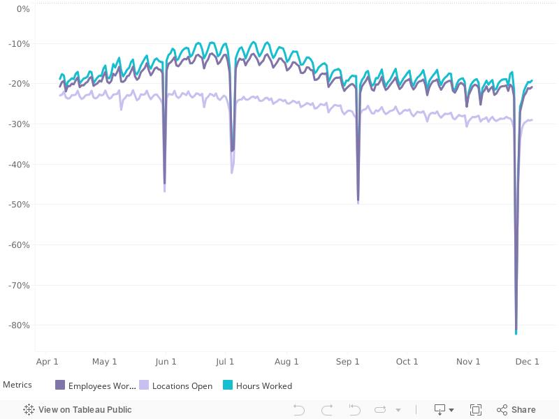
They also visualize their data for major cities, states and various small business types, so you can compare regions and also find out which kinds of small businesses are bouncing back the fastest and which are still well below their pre-coronavirus recession levels.
The national level data indicates the bottom of the coronavirus recession for hourly workers at Homebase's client businesses came on 12 April 2020, with over 50% of locations closed nationwide and over 60% reductions from pre-coronavirus epidemic levels for both number of employees working and number of hours worked. That decline occurred rapidly over a month long period.
Since then, a recovery has been taking place more slowly, with the metrics of hourly employees working, business locations open, and hours worked now about 20% below their pre-coronavirus recession levels through the beginning of July 2020. The trend has been flattening out in recent weeks, coinciding with the increased spread of coronavirus infections in states experiencing a delayed first wave of cases.
HT: Greg Mankiw.
Labels: business, data visualization, recession
Welcome to the blogosphere's toolchest! Here, unlike other blogs dedicated to analyzing current events, we create easy-to-use, simple tools to do the math related to them so you can get in on the action too! If you would like to learn more about these tools, or if you would like to contribute ideas to develop for this blog, please e-mail us at:
ironman at politicalcalculations
Thanks in advance!
Closing values for previous trading day.
This site is primarily powered by:
CSS Validation

RSS Site Feed
JavaScript
The tools on this site are built using JavaScript. If you would like to learn more, one of the best free resources on the web is available at W3Schools.com.
Other Cool Resources
Blog Roll


