Lockdown restrictions played a major role in determining where Americans could eat in 2020 and early 2021. And drink, for that matter!
We have some unique data to illustrate that latter point. The city of Philadelphia imposes a special liquor tax of 10% on the sale price of alcohol-containing beverages within the city. The tax does not apply to sales made by liquor stores and beer distributors, but does apply to the sales of beverages containing alcohol at public venues, such as bars, hotels, restaurants, and clubs.
During the coronavirus pandemic, most of these venues within Philadelphia were closed or forced to operate at severe capacity limits starting in March 2020. After being allowed to reopen or to expand their operations in the following months, many still were prohibited from providing bar service or serving drinks without food until April 2021.
These restrictions mean that Philadelphia's liquor tax collections provide a direct picture of how pandemic lockdown restrictions affected the ability of consumers to buy alcohol while dining away from home. The following chart shows the trailing twelve month total of Philadelphia's liquor tax collections from June 2015 through June 2021, covering the city's last six fiscal years.
Philadelphia's trailing twelve month liquor tax collections plunged by 67.5% from February 2020 through March 2021 due to local coronavirus pandemic lockdown restrictions, from $83,734,909 to $27,150,414. With the city's 10% liquor tax, that $56.6 million decline in tax collections indicates a $566 million reduction in the sale of alcohol containing beverages at Philadelphia's public dining venues.
And that's just one city within the United States. How big do you think that number would get if we had the data for all of them?
Reference
City of Philadelphia Department of Revenue. School District Monthly Revenue Collections, Fiscal Years 2015, 2016, 2017, 2018, 2019, 2020, 2021 [PDF Documents]. Accessed 24 September 2021.
Labels: coronavirus, food, taxes
If you had to pick one aspect of nearly American life that would be most measurably impacted by 2020's coronavirus pandemic, what would you choose?
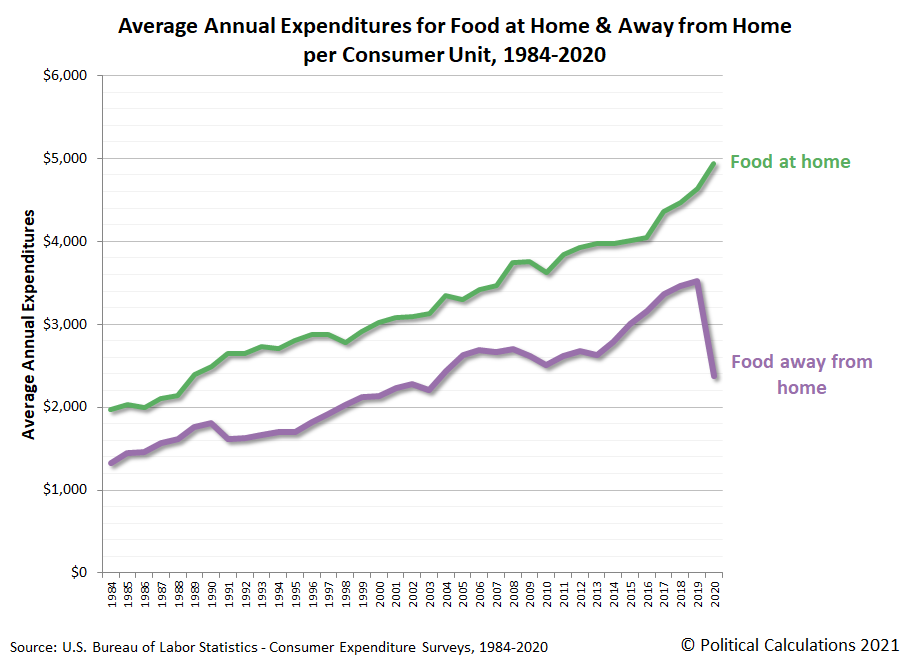
We've been through the 2020 Consumer Expenditure Survey, which gives the answer: food! Specifically, the change in how much Americans spent on food to eat away from home. The various pandemic lockdown measures imposed by various state and local governments forced many restaurants to shut down for prolonged periods. When they were allowed to reopen, many were forced to limit how many customers they were allowed to accommodate.
The following chart shows how those lockdown measures and restrictions impacted the trends for the average amount of money Americans spend on dining out. For reference, the chart also shows the amount Americans spend on average each year to eat at home.
In 2019, Americans spent an average of $4,643 on food to eat at home and $3,526 on food away from home. In 2020, the amount spent on food at home increased $299 (6.4%) to $4,942. But the average amount of money spent to dine out plunged by $1,151, or 32.6%, to $2,375.
Although it represents the biggest average annual dollar decline in a category of spending, in terms of percentage decline, the amount of spending on food away from home represents the third biggest drop recorded from 2019 to 2020. There are two other categories of consumer spending that plunged by larger amounts in percentage terms, but they involve far less average spending per consumer unit "household".
The second biggest percentage decline occurred in the amount of money Americans spent on fees and admissions, such as to sporting or other entertainment events, which dropped by 51.7% from $880 in 2019 to $425 in 2020.
The biggest percentage decline however was recorded for public transportation. Here, the average annual amount spent went from $781 in 2019 to $263 in 2020, a 66.3% reduction. This category of spending includes transportation via bus and light rail systems, which proved to be a major contributor to the spread of coronavirus infections in the epicenter of New York City early in the pandemic. It also includes commercial air transportation, where reduced demand for air travel and restrictions on how many people were allowed to board aircraft greatly reduced the amount of money spent on this class of public transportation.
References
U.S. Bureau of Labor Statistics. Consumer Expenditure Survey. Multiyear Tables. [PDF Documents: 1984-1991, 1992-1999, 2000-2005, 2006-2012, 2013-2020]. Accessed 9 September 2021.
Labels: coronavirus, food, personal finance
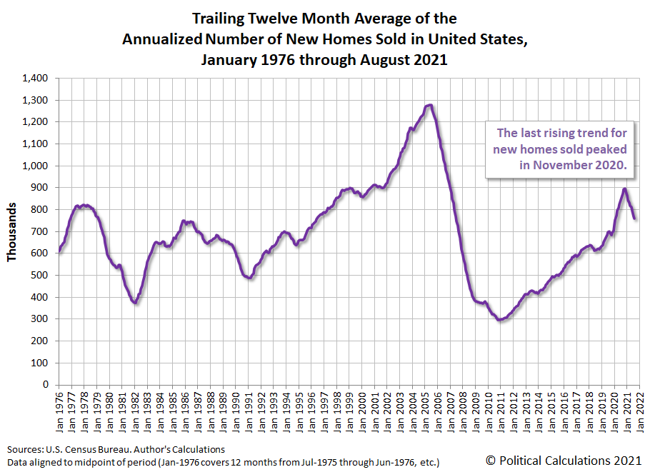
The trend in the number of new homes sold in the U.S. continues to fall. According to the U.S. Census Bureau's data on new home sales, the falling trend began after sales peaked in November 2020.
The market capitalization of U.S. new homes last peaked in December 2020 at $30.12 billion, a figure that has now been finalized with the latest revisions. Since that time, the market capitalization has fallen back from that level, but its overall trend has generally ranged between $28.84 billion and its December 2020 peak.
That outcome for the market cap of new homes is possible because the average sale price of new homes has continued to escalate, even as the number of sales falls.
Within the raw data, the number of new home sales has ticked up during the past two months, but not by enough to affect the general trend at this time.
Labels: market cap, real estate
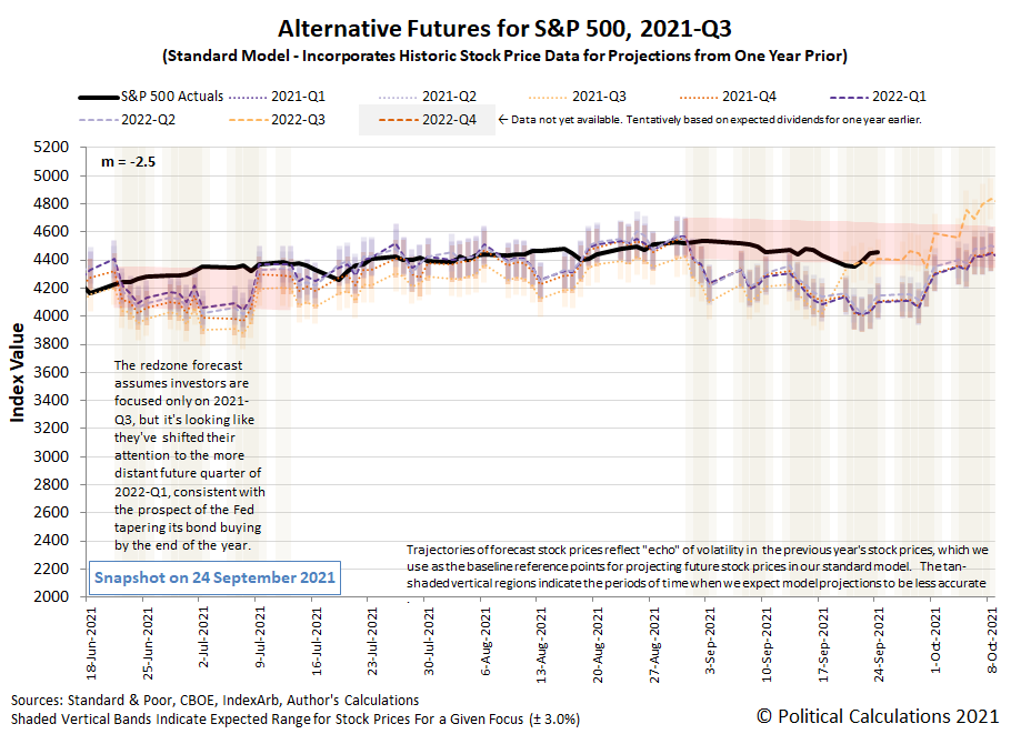
The rollercoaster ride of the S&P 500 (Index: SPX) continued last week. The index even briefly dipped below our redzone forecast range during the week, before rallying to return to its projected trajectory.
Most of the market's action during the week was driven by speculation over when the Federal Reserve would commit to begin slowing down the rate at which it has been buying U.S. government-issued securities to stimulate the economy. When all was said and done after the conclusion of the Federal Open Market Committee's two day meeting on Wednesday, 22 September 2021, the Fed indicated they would follow the plan to taper they've been signaling to investors for months, even though the specific timing has yet to be announced.
With those expectations mostly set, investors have focused on 2021-Q4, which puts the S&P 500 back into the redzone forecast's defined range. The redzone forecast range is based on our assumption investors would mostly focus on 2022-Q1 well into December 2021, which produces a forecast range that is slightly higher than a similar forecast based on investors focusing on 2021-Q4 would be. These two ranges however have considerable overlap because of the small difference in expectations for changes in the year over year growth rate of dividends between these two future quarters. For now, we'll recognize that overlap exists in the form of the actual trajectory of the S&P 500 running mostly in the lower portion of the forecast range shown on the alternative futures chart.
That's not to say investors won't shift their forward-looking attention to some other point of time in the future if prompted by new information. Nor is it to say the expectations for dividends expected at different points of time in the future won't change. As we've seen before, changes for either of these things impact the trajectory of stock prices.
Meanwhile, the market moving headlines for the week that was point to the outized role of the Fed in shaping future expections, although the developing failure of China's Evergrande group and its potential impact on the Chinese economy and what that would mean for the global economy contributed to the dip in stock prices during the week.
- Monday, 20 September 2021
- Signs and portents for the U.S. economy:
- Gas price surge, just one more headwind for world economy
- Another weak U.S. jobs report may be ahead, JPM data suggests
- Fed minions thinking about when to start tapering bond buys:
- Bigger trouble developing in China:
- ECB minions says ECB can stop buying so many bonds:
- Wall Street ends sharply lower in broad sell-off
- Tuesday, 21 September 2021
- Signs and portents for the U.S. economy:
- Bigger stimulus to keep rolling out despite created inflation:
- OECD: Still too early to ease economic support despite inflation spike
- Swiss National Bank to hold rate at record low for years: Reuters poll
- ECB policymakers acknowledge growing inflation risk
- Merkel ally sounds inflation alarm days before election
- UK inflation expectations jump in September - Citi/YouGov
- BOJ to keep stimulus as deflation risks, supply disruption cloud outlook
- Russia to spend $34 billion from rainy-day fund despite inflation worries
- Bigger trouble developing in Japan:
- Wall Street ends near flat on cautious note ahead of Fed
- Wednesday, 22 September 2021
- Signs and portents for the U.S. economy:
- Fed minions tease tapering stimulus bond buys, rate hike seen in 2022:
- Full Federal Reserve policy statement Sept 22, 2021
- Fed's Powell: Bond taper could be done by mid-2022
- Fed policymakers see upward march in interest rates starting next year
- Coronavirus continues shaping national economies:
- ECB minions thinking about making bigger bond buys a permanent feature:
- Wall St ends higher as Fed signals bond-buying taper soon
- Thursday, 23 September 2021
- Signs and portents for the U.S. economy:
- U.S. business activity grows at slowest pace in 12 months - IHS Markit survey
- U.S. weekly jobless claims unexpectedly rise; labor market recovery on track
- "Reasonably good" September jobs starts Fed taper. Is another dud coming?
- U.S. congressional Democrats report deal to pay for Biden spending plans
- Fed minions get parsed, Powell communicates willingness for tougher regulation in bid to keep job:
- How the Fed's policy statement has changed this year
- Fed's Powell opens door to tougher regulations as renomination decision looms
- Bigger trouble developing in Eurozone:
- German economic recovery loses momentum in Sept - flash PMIs
- French business activity weaker than expected in September - flash PMI
- Supply constraints squeeze euro zone business growth
- Central banks acting to clamp down on inflation:
- Investors look ahead to rate hikes with Fed tapering plan all but certain
- Norway raises interest rates, says another hike likely in December
- Brazil raises interest rates, signals third big hike next month
- ECB minions expect inflation to last:
- Indexes close up more than 1% as investors assess Fed news
- Friday, 24 September 2021
- Signs and portents for the U.S. economy:
- U.S. new home sales beat expectations; supply near 13-year high
- Oil hits highest in almost 3 years as supply tightens
- Fed minions getting on board with tapering stimulus bond buys:
- Two Fed policymakers say bar for taper met, nod to next debates
- Analysis-Fed's bond-buying program may be on the way out, but it's not going far
- Bigger trouble developing in China, Japan, Eurozone:
- Alarmed by Evergrande, China's lenders hold back on new credit for property developers
- Nomura cuts China 2021 growth forecast to 7.7% from 8.2%
- Timeline: China Evergrande's snowballing debt crisis
- Explainer-How China Evergrande's debt troubles pose a systemic risk
- Japan factory output seen down again in August on supply chain disruption: Reuters poll
- German business morale falls as 'bottleneck recession' bites
- ECB minion claims inflation is temporary:
- Dow, S&P 500 end with gains up after bumpy week, but Nike drags
Last week, we pointed to the U.S. Treasury's yield curve rates as our ongoing feature pointing to useful investing information sites, but what about other interest rates? For ones that affect personal finance (autos, credit cards, homeowners' equity, etc.), we often turn to Bankrate for its exhaustive listing of currently available loan interest rates. As a bonus, the site also features a lot of useful tools.
When you buy gold jewelry, how much are you paying for the gold in it and how much are you paying for everything else it takes to make and bring it to where you can buy it?
For the sake of simplicity, we're going to call that everything else for the jewelry you're buying the "markup". That makes sense in the event that you ever try to sell the jewelry, where you'll quickly find that the amount of gold in it is what gives it most of the value you can recover from it.
We selected the Nuragold 14k Yellow Gold 3.5mm Solid Miami Cuban Link Chain Pendant Necklace that can be purchased at Amazon to use for our example since it is made from solid 14-karat gold. That means it has much more gold in it than jewelry that has been gold-plated, making its gold content representing a significant portion of its price.
Meanwhile, because pure, or 24-karat gold is a notoriously soft metal, solid gold is often alloyed with alloyed with other, less costly metals such as copper, silver, zinc, and/or nickel to make it stronger. In the case of 14K gold, 58.3% of the content is pure gold.
Meanwhile, if you want to know how much gold is worth today, here is its latest spot price from Kitco, along with a few other precious metals, where the price is given in U.S. dollars per ounce!
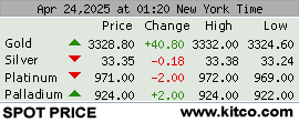
From here, we just need to know the weight of the metal in the jewelry to estimate how much of its value is due to its gold content. For the 20-inch long version of our example necklace, that's 16.6 grams, which on the day we sampled the data, costs $1,003.99. We built the tool below to handle the various weight unit conversions and to calculate the value of gold in it and the resulting markup. If you're reading this article on a site that republishes our RSS news feed, please click through to our site to access a working version of the tool.
For this default example, we find out the jewelry's gold content represents 55.4% of its purchase price, or $556.34. The markup makes up the remaining 44.6%, or $447.64.
If you find yourself in the situation where you're a seller of an article of gold jewelry, you may find the best price you can obtain from a precious metals dealer will be less than the value of the gold content. That's because they have their own markups, which in addition to the transaction costs of doing business, may also include the expense of melting down the jewelry to extract the gold content from it. But that's the subject for a different tool on another day!
Labels: business, personal finance, tool
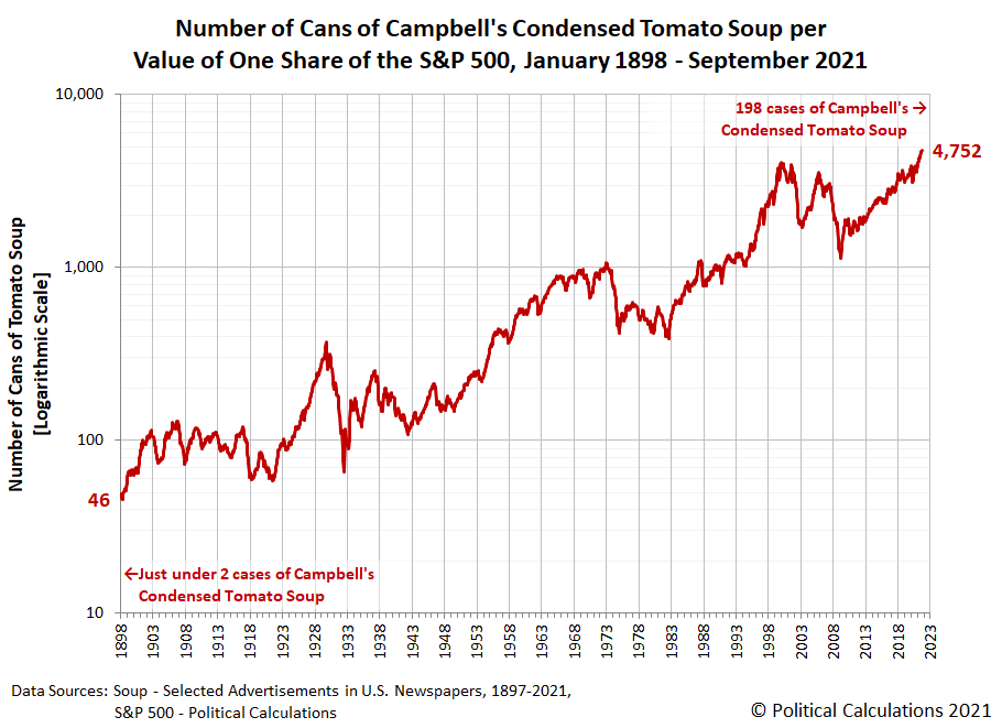
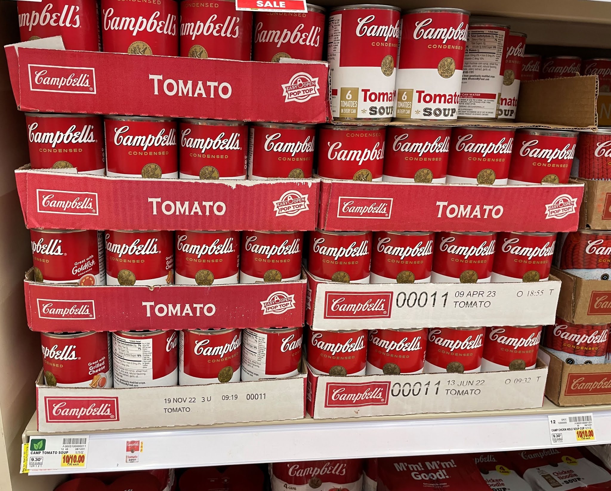
Longtime readers know our two favorite data series are the price histories for an iconic No. 1 can of Campbell's Condensed Tomato Soup and for the S&P 500 stock market index. We're tapping both of them today to answer a burning question we had: How many cans of Campbell's tomato soup could a hypothetical investor in the S&P 500 buy if they cashed in the equivalent of one share of the index.
We're presenting the graphical answer to that question below, where we find that as of the index' all-time record highs in early September 2021, our hypothetical index investor could buy 4,752 cans of tomato soup!
Expressed a little differently, that's the same as 198 cases of 24 cans each.
Compare that quantity to January 1898, when Campbell's condensed tomato soup first began being shipped across the country. We find the equivalent value of a share of the S&P 500 (actually an an index made up of its predecessor individual stock components) would have bought 46 cans, or rather, just under 2 cases worth of soup.
Now, which would you rather have in your investment portfolio or pantry today: one equivalent share of the S&P 500 or 198 cases of Campbell's condensed tomato soup?
Labels: data visualization, food, inflation, investing, soup, SP 500
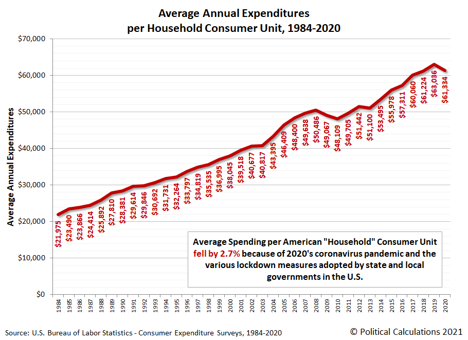
The arrival of the coronavirus pandemic in the United States in March 2020 and, perhaps more significantly, the lockdown measures that state and local governments imposed on Americans as their response had a major impact on how Americans spent money in 2020.
That much is evident from the results of the 2020 Consumer Expenditure Survey, which saw the average annual expenditures of American "consumer units" drop by 2.7% from their 2019 level. "Consumer units" is the affectionate nickname given by the BLS' data jocks to what are predominantly made up of U.S. households. Our first chart featuring data from the 2020 CEX survey shows that measure for each year from 1984 through 2020.
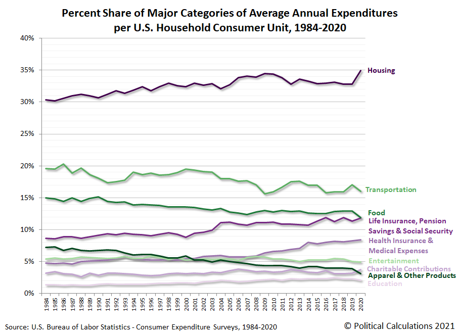
That's the big picture, but the Consumer Expenditure Survey breaks down the average annual expenditures of U.S. household consumer units into major categories of spending. Our second chart show the amount of spending from 1984 through 2020 for housing; transportation; life insurance, pension savings and Social Security; health expenditures and medical expenses; entertainment; charitable contributions; apparel and other products; and finally education, to rank them from largest to smallest.
The major categories of spending that rose in 2020 include housing; life insurance, pension savings and Social Security; and finally charitable contributions. Every other category fell, with the largest declines in expenditures for transportation; food; and apparel and other products.
This outcome confirms the extended negative impact of the various lockdown measures imposed by state and local governments. What's important to recognize here is that they continued in much of the country well beyond the two month-long recession that arrived when large population states first mandated their residents stay at home and shuttered businesses in March 2020 during the first wave of coronavirus infections in the U.S.
Our next chart presents the share of each of the major categories of household spending as a percentage of total annual average expenditures.
The most significant item here is housing, which jumped to represent 35% of the average American consumer unit household's spending, an all-time high for the data series.
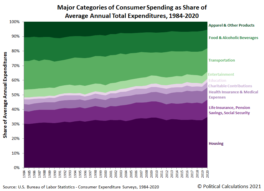
Our final chart stacks all these major categories of household spending together to assemble the full picture of how the spending of American consumer unit households has changed each year from 1984 through 2020.
This last chart is one of our favorites, in part because the colors convey which major categories of spending have generally risen over time (the purple-shaded components) or fallen over time (the green-shaded components).
We'll be exploring the wealth of data contained within the 2020 Consumer Expenditure Survey more over the next several weeks.
References
U.S. Bureau of Labor Statistics. Consumer Expenditure Survey. Multiyear Tables. [PDF Documents: 1984-1991, 1992-1999, 2000-2005, 2006-2012, 2013-2020]. Accessed 9 September 2021.
Labels: coronavirus, data visualization, demographics, personal finance, recession
We now have quarterly dividend futures data for the S&P 500 (Index: SPX) through the end of 2022. Here's what the future looked like as of the close of trading on 20 September 2021:
The past and projected data shown in this chart is from the CME Group's S&P 500 quarterly dividend index futures. The past data reflects the values reported by CME Group on the date the associated dividend futures contract expired, while the projected data reflects the values reported on 20 September 2021. Until the futures contracts for their indicated quarter expire, projected dividends will fluctuate with changing expectations of the future for the index' dividends per share.
Readers should note these projections indicate the amount of dividends per share to be paid out over the period covered by each quarters dividend futures contracts, which start on the day after the preceding quarter's dividend futures contracts expire and end on the third Friday of the month ending the indicated quarter. So for example, as determined by dividend futures contracts, the "current" quarter of 2021-Q4 began on Saturday, 18 September 2021 and will end on Friday, 17 December 2021.
That makes these figures different from the quarterly dividends per share figures reported by Standard and Poor, who reports the amount of dividends per share paid out during regular calendar quarters after the end of each quarter. This term mismatch accounts for the differences in dividends reported by both sources, with the biggest differences between the two typically seen in the first and fourth quarters of each year.
The S&P 500 (Index: SPX) had what Reuters called a 'rollercoaster' week, but when all was said and done, stock prices still fell within the expected range.
Or rather, the range that would be expected if investors were mainly focusing on 2022-Q1 in setting current day stock prices. Or on 2021-Q4, since there's not much difference between the expectations for this quarter and 2022-Q1 at this point of time.
As for the market's rollercoaster week, Friday, 17 September 2021 was a quadruple witching day, with a slew of options and futures contracts expiring. That includes the dividend futures contract for 2021-Q3, which as far as the alternative futures chart is concerned, is over.
If you read the marking moving headlines of the week below carefully, you can see why 2021-Q4 or 2022-Q1 are points of interest for investors looking forward in the story considering the timing of when the Fed will start tapering off its pandemic stimulus bond buying program, which it identifies as likely to happen in either November (2021-Q4) or in December (2022-Q1), where the quarters are defined by dividend futures contract expiration dates.
- Monday, 13 September 2021
- Signs and portents for the U.S. economy:
- From zippers to glass, shortages of basic goods hobble U.S. economy
- U.S. consumers' inflation expectations highest since 2013, NY Fed says
- Oil rises to six-week high as U.S. supply concerns dominate
- U.S. grain exports sink as Gulf terminals struggle to recover from Ida
- Bigger inflation developing all over:
- Japan's wholesale inflation hovers near 13-yr high as material costs rise
- Key gauge of euro zone inflation expectations at highest since mid-2015
- BOJ minions thinking stimulus policies of previous boss were wrong:
- S&P 500 snaps losing streak as tax hikes, inflation data loom
- Tuesday, 14 September 2021
- Signs and portents for the U.S. economy:
- Tamer US August CPI bolsters Fed's transitory inflation case
- Oil settles unchanged as latest storm spares U.S. energy sector
- Louisiana grain terminal reopens after Hurricane Ida as Nicholas rains arrive
- Bigger trouble developing in Japan:
- Bigger inflation developing all over:
- U.S. stocks close lower on worries over recovery, corporate tax hikes
- Wednesday, 15 September 2021
- Signs and portents for the U.S. economy:
- Hurricane Ida, supply constraints slow U.S. factory production
- Record 60 cargo ships wait to unload at busiest U.S. port complex
- Positive signs in Australia, Japan, Eurozone:
- Australian consumers cheered by reopening plans as vaccinations surge
- Japan's machinery orders rebound in sign of capex recovery
- Euro zone production stronger than expected in July
- Bigger trouble developing in China:
- China's house of cards: Evergrande threatens wider real estate market
- China's cooling measures curb new home price growth, property investment
- China's factories, retailers stumble on COVID-19 disruptions
- ECB minions think Delta COVID is overrated and fear inflation hump, inflation hits multi-year high in Canada, UK:
- Markets may be overestimating Delta's impact on growth - ECB's Schnabel
- Analysis: ECB sees a new inflation 'hump' as prices surge
- Canada's annual inflation rate in August hits highest in nearly two decades
- UK inflation posts record jump to hit 9-year peak in August
- S&P 500, Dow gain on factory data, strong oil prices
- Thursday, 16 September 2021
- Signs and portents for the U.S. economy:
- U.S. business inventory accumulation slows in July
- U.S. retail sales surprise to upside in strong boost to economy
- Oil prices steady as U.S. storm threat wanes
- U.S. Gulf crude oil ramps up after hurricane losses -data
- Fed minions have huge ethics problem:
- Bigger trouble developing in Japan:
- Japan cuts economic view on weaker production, spending due to COVID revival
- Japan's hot exports growth cools as COVID-19 hits supply chains
- ECB minions wants to hike interest rates, gradually drop stimulus bond buys:
- ECB's Rehn warns governments to count on higher rates
- ECB's exit from crisis measures will be "very gradual": Rehn
- ECB's Lane reveals in private meeting inflation target may be hit by 2025 - report
- S&P ends modestly lower as rising Treasury yields offset robust retail data
- Friday, 17 September 2021
- Signs and portents for the U.S. economy:
- Fed minions debating when to start tapering off stimulus bond buys:
- ECB minions thinking no rate hikes through 2023, upset at leak of inflation forecasts, then leak more inflation forecasts:
- ECB's De Cos is not foreseeing an interest rate hike in 2023
- ECB faces call to end private meetings after Lane leak
- Some in ECB think inflation forecasts too pessimistic -Makhlouf
- Wall Street Closes Rollercoaster Week Sharply Lower
With expectations for the future of U.S. interest rates often influencing investors, one resource for checking out recent trends you might find useful is the Daily Treasury Yield Curve Rates database from the U.S. Treasury.
In a sign the strange new world of innovation is becoming stranger, U.S. District Judge Leonie Brinkema ruled on 2 September 2021 that an artificial intelligence machines cannot be inventors under the U.S. Patent Act. That ruling contradicts rulings made in favor of AI systems being eligible to be granted patents in Australia and in South Africa and may influence patent applications and appeals currently under consideration in a number of other nations.
The case involves two patent applications filed on 29 July 2019 for a "neural flame" (ASN 16/524,350) and a "fractal beverage container" (ASN 16/524,532) filed by Stephen Thaler, whose DABUS artificial intelligence system is listed as the inventor, with Thaler as the AI system's owner listed as the assignee. In the plaintiff's argument advanced in the court case protesting the U.S. Patent and Trademark Office's earlier rejection of patent awards, Thaler would be the owner of any patent awarded for inventions generated by the artificial intelligence.
But as the judge ruled, because the AI system does not qualify as a person under the U.S. Patent Act, no U.S. patent will be awarded. Consequently, the U.S. patent office's rejection of the two DABUS' patent applications was upheld.
Rather than delve further into the legal considerations, the Inventions in Everything team was curious to see what kind of patentable innovations the DABUS AI system came up with. Here's the basic abstract describing the neural flame, whose purpose is to attract human attention:
The present invention discloses devices and methods for attracting enhanced attention. Devices include: an input signal of a lacunar pulse train having characteristics of a pulse frequency of approximately four Hertz and a pulse-train fractal dimension of approximately one-half; and at least one controllable light source configured to be pulsatingly operated by the input signal; wherein a neural flame emitted from at least one controllable light source as a result of the lacunar pulse train is adapted to serve as a uniquely-identifiable signal beacon over potentially-competing attention sources by selectively triggering human or artificial anomaly-detection filters, thereby attracting enhanced attention.
Here's the abstract for DABUS' fractal container invention:
A container for use, for example, for beverages, has a wall with and external surface and an internal wall of substantially uniform thickness. The wall has a fractal profile which provides a series of fractal elements on the interior and exterior surfaces, forming pits and bulges in the profile of the wall and in which a pit as seen from one of the exterior or interior surfaces forms a bulge on the other of the exterior or interior surfaces. The profile enables multiple containers to be coupled together by inter-engagement of pits and bulges on corresponding ones of the containers. The profile also improves grip, as well as heat transfer into and out of the container.
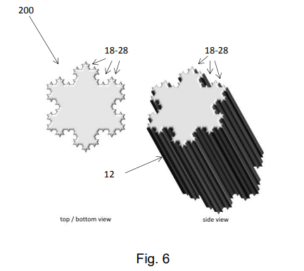
Because it's more visually interesting than DABUS' neural flame invention, here's an illustration of the AI system's fractal container:
Fans of fractal geometry will recognize the profile of the Koch Snowflake. The novel application that would be potentially patentworthy is its application for use as a beverage container, where the combination of an infinite perimeter with a finite cross-sectional area would in fact make it useful for transferring heat through its sides either to or from the beverage or fluid contained within. Here's an video overview of the Koch Snowflake from the Khan Academy:
The invention would have use in applications where its desirable to rapidly transfer heat either into or out of the sides of the container, such as in cooking, where fluted ramekins are often used for that purpose.
From the Inventions in Everything Archives
When IIE the IIE team has previously looked at beverage containing-related inventions, the goal of the inventor has often been to prevent or to minimize the amount of heating or cooling taking place across the walls of a beverage container. Here's where the IIE team has previously paid attention to the heat transfer properties of beverage-containing innovations:
Labels: math, technology
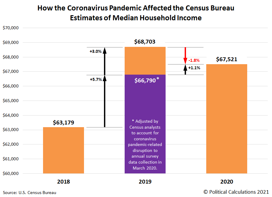
The U.S. Census Bureau released its annual estimate for median household income in the U.S. for the 2020 calendar year on 14 September 2021. It reported median household income for the 2020 calendar year was $67,521.
If you compare that number with the official estimate of median household income of $68,703 reported for the 2019 calendar year, that is a 1.8% decline. But there was a big problem with the 2019 estimate. The Census Bureau was collecting the data that would be used to determine that figure in March 2020, when the coronavirus pandemic reached the U.S. and the lockdowns imposed by state and local governments to "flatten the curve" disrupted the Census Bureau's ability to collect data. It particularly affected the rate of responses for its Current Population Survey's Annual Social and Economic Supplement from lower income households, where many households in this demographic group did not respond.
Census Bureau analysts have estimated that had they been able to collect a more complete data sample, they would have estimated median household income to be $66,790 for the 2019 calendar year, which we first reported in October 2020. And that brings us to the most remarkable aspect of the median household estimate for 2020. If not for the disruptive effect of the pandemic lockdowns, median household income would have risen by 1.1% from the adjusted estimate for 2019 to 2020's official estimate.
The following chart shows the Census Bureau's estimates of median household income from 2018 through 2020, illustrating how different 2019's estimate would be when accounting for the pandemic's disruption.
Only the Census Bureau's official estimate for 2019 was significantly impacted by the coronavirus pandemic. It wasn't a factor at all in March 2019 when data was collected for the 2018 calendar year, and it wasn't a significant factor in March 2021 when data was collected for 2020. The data sources supporting our exclusive analysis are presented below.
References
U.S. Census Bureau: Jessica Semega, Melissa Kollar, John Creamer, and Abinash Mohanty. Report Number P60-266. Income and Poverty in the United States: 2018. [PDF Document]. 15 September 2020.
U.S. Census Bureau: Jessica Semega, Melissa Kollar, Emily A. Shrider, and John Creamer. Report Number P60-270. Income and Poverty in the United States: 2019. [PDF Document]. 15 September 2020.
U.S. Census Bureau: Jonathan Rothbaum and Adam Bee. Coronavirus Infects Surveys, Too: Survey Nonresponse Bias and the Coronavirus Pandemic. [PDF Document]. 3 May 2021.
U.S. Census Bureau: Emily A. Shrider, Melissa Kollar, Frances Chen, and Jessica Semega. Report Number P60-273. Income and Poverty in the United States: 2020. [PDF Document]. 14 September 2021.
Labels: data visualization, median household income
In July and August 2021, the active variants of the SARS-CoV-2 coronavirus spread through China, Japan and several nations in southeast Asia, disrupting global supply chains. How much has that disruption affected the world's economy?
We can estimate that impact by tracking the pace at which carbon dioxide is added to the Earth's atmosphere. The trailing year average of that rate has fallen sharply since June 2021, as shown in the latest update to the chart tracking its history since January 1960.
Since December 2019, a net reduction of 0.57 parts per million of atmospheric carbon dioxide has been recorded in the trailing twelve month average of the year over year rate of change in atmospheric carbon dioxide levels measured at the remote Mauna Loa Observatory. Of that, a net reduction of 0.10 parts per million occurred since June 2021. We can convert both these changes into an estimate of the lost GDP for the global economy using the following tool. If you're accessing this article on a site that republishes our RSS news feed, please click through to our site to access a working version of the tool.
Using the default value of a -0.10 parts per million to account for the change in the rate of growth of atmospheric carbon dioxide since June 2021, we find the equivalent net loss to global GDP attributable to the spread of COVID in southeast Asia and its disruptive effect on the world economy is 3.3 trillion.
Going back to the beginning of the coronavirus pandemic, the reduction of 0.57 part per million in the rate at which carbon dioxide is being added to the Earth's air corresponds to a net loss to global GDP of $18.9 trillion.
We'll conclude by recognizing that not all the decline in the pace at which CO₂ is being added to the Earth's air is related to the disruption to global supply chains from the spread of COVID in southeast Asia. The Chinese government's action to shutter energy-intensive aluminum production to meet environmental goals is also a contributing factor. Since China is the world's largest smelter of aluminum, halts to its production both reduces China's carbon dioxide emissions at the cost of shrinking its economic output.
References
National Oceanographic and Atmospheric Administration. Earth System Research Laboratory. Mauna Loa Observatory CO2 Data. [Text File]. Updated 7 September 2021. Accessed 7 September 2021.
Previously on Political Calculations
Here is our series quantifying the negative impact of the coronavirus pandemic on the Earth's economy, presented in reverse chronological order.
- Global GDP Falls as COVID Hits Southeast Asia
- World GDP Still Shrinking from Coronavirus Pandemic
- Estimated Net Global GDP Lost to Coronavirus Pandemic Exceeds $15.6 Trillion
- Coronavirus Pandemic Sends Global Economy Into Triple Dip Recession
- Double Dip Global Coronavirus Recession Sees Second Bottom
- Net Global GDP Lost to Coronavirus Pandemic Tops $13.6 Trillion
- Global Double Dip Coronavirus Recession Deepens
- Global Economy Enters Double Dip Coronavirus Recession
- Global Economy Teeters on Double Dip Recession
- World GDP Lost Due to Coronavirus Reaches $12 Trillion
- Cumulative World GDP Loss From Coronavirus Pandemic Tops $11 Trillion
- Estimates of World GDP Lost to the Global Coronavirus Recession
- Finding Human Fingerprints in Atmospheric CO2
- The Coronavirus and Atmospheric CO2 in April 2020
- The Coronavirus, Atmospheric CO2, and GDP
Labels: coronavirus, environment, recession, tool
From time to time, our peers in Asia will alert us to developing stories on the state of economic affairs in their home region. On 30 August 2021, they really rang a bell suggesting they were highly concerned about the potential for a developing recession within the region.
Just over two weeks later, we can confirm their fears for the future have largely abated. But that doesn't address the developments that led them to have cause for concern. Here's a sampling of headlines that coincided with their heightened concerns:
- Global supply chain crunch deepens as Delta variant surges
- Southeast Asia roundup: Chip shortage worsens as COVID hits Vietnam, Malaysia
- Factories hit by pandemic-related supply disruptions
- China’s factory activity expands at slower pace in August, services contract
- China’s services activity contracts for the first time since early 2020, official data shows
- "Absolute Shocker": China's Service Economy Unexpectedly Implodes With 2nd Worst Non-Mfg PMI Print On Record
- China’s environmental goals are driving aluminum prices to a 10-year high
All but the last story is significant in demonstrating the extent to which the coronavirus pandemic is still driving national economies. Among the nations of southeast Asia, which had largely escaped the negative impact of COVID in 2020, it's having an especially large impact. One with global dimensions:
Covid's impact on Southeast Asia has disrupted global supply chains, says Joseph Incalcaterra of @HSBC. pic.twitter.com/rDSuJYONhy
— CNBC International (@CNBCi) September 6, 2021
That impact has been building since June 2021. We'll feature an estimate of how disruptive COVID has been to the global economy tomorrow, when we'll also explain why that last headline matters.
Labels: coronavirus, recession, trade
Welcome to the blogosphere's toolchest! Here, unlike other blogs dedicated to analyzing current events, we create easy-to-use, simple tools to do the math related to them so you can get in on the action too! If you would like to learn more about these tools, or if you would like to contribute ideas to develop for this blog, please e-mail us at:
ironman at politicalcalculations
Thanks in advance!
Closing values for previous trading day.
This site is primarily powered by:
CSS Validation
RSS Site Feed
JavaScript
The tools on this site are built using JavaScript. If you would like to learn more, one of the best free resources on the web is available at W3Schools.com.

