We called the failure of Neil Ferguson's Imperial College London (ICL) epidemiological model to reasonably project the severity of the coronavirus pandemic The Biggest Math Story of 2020. Now, armed with a year of actual outcomes to compare with its projections, analysts are able to quantify just how badly off the mark it was.
One year later we may now look back to see how Imperial College’s international projections performed, paying closer attention to the small number of countries that bucked his lockdown recommendations. The results are not pretty for Ferguson, and point to a clear pattern of modeling that systematically exaggerated the projected death tolls of Covid-19 in the absence of lockdowns and related NPIs.
The acronym NPI refers to Non-Pharmaceutical Intervention, which refers to things like the lockdown measures many governments enacted, including ordering businesses to close and residents to stay-at-home for sustained periods of time. It also covers practices such as wearing face masks or practicing social distancing for the purposes of trying to limit the spread of SARS-CoV-2 coronavirus infections.
Ferguson's ICL model was used to make several kinds of projections representing different scenarios at the pandemic's one-year mark.
These projections reflect an assumed replication rate (R0) of 2.4 – the most conservative scenario they considered, meaning Imperial’s upper range of projections anticipated substantially higher death tolls. The countries examined here – Sweden, Taiwan, Japan, and South Korea – are distinctive for either eschewing lockdowns and similar aggressive NPI restrictions entirely or for relying on them in a much more limited scope than Imperial College advised. The United States, where 43 of 50 states adopted lockdowns of some form, is also included for comparison.
At the time the ICL model's projections were generated, the assumed replication rate (R0) for estimating how aggressively the coronavirus might spread had been estimated to fall within a range between 2.2 and 2.7, although a CDC estimate was much higher than that.
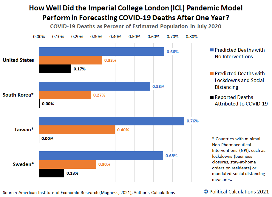
Still, using the same assumption for all these countries provides an apple-to-apples means of comparing the projections of COVID-19 deaths for each. We've visualized that tabulated data in the following chart.
In this second chart, we've recalculated the projected and actual recorded COVID-19 deaths as a percentage of each country's estimated July 2020 population. This modification lets us account for the large differences between each country's population with the others.
The visualized results confirm Neil Ferguson's ICL epidemiological model deviated anywhere from multiples to multiple orders of magnitude from reality. That matters because the ICL model was used to justify restrictive measures that harmed many people's livelihoods and well-being. It will take years to recover from the resulting disruption.
Just over one year ago, the epidemiology modeling of Neil Ferguson and Imperial College played a preeminent role in shutting down most of the world. The exaggerated forecasts of this modeling team are now impossible to downplay or deny, and extend to almost every country on earth. Indeed, they may well constitute one of the greatest scientific failures in modern human history.
That potential is what earned the failure of Neil Ferguson's ICL pandemic model the title of The Biggest Math Story of 2020.
References
Magness, Phillip W. The Failure of Imperial College Modeling Is Far Worse than We Knew. American Institute for Economic Research. [Online Article]. 22 April 2021.
U.S. Central Intelligence Agency. Population Estimates (July 2020). The World Factbook. [Online Data]. Accessed: 6 January 2021.
Welcome to the blogosphere's toolchest! Here, unlike other blogs dedicated to analyzing current events, we create easy-to-use, simple tools to do the math related to them so you can get in on the action too! If you would like to learn more about these tools, or if you would like to contribute ideas to develop for this blog, please e-mail us at:
ironman at politicalcalculations
Thanks in advance!
Closing values for previous trading day.
This site is primarily powered by:
CSS Validation
RSS Site Feed
JavaScript
The tools on this site are built using JavaScript. If you would like to learn more, one of the best free resources on the web is available at W3Schools.com.

