After comparing the remarkable rate of growth of U.S. exports to China in the Bush administration from the low level that defined President Clinton's second term, we felt that this acceleration was remarkable enough to attempt to pinpoint just when that export growth began to surge.
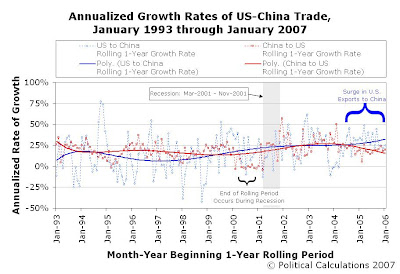
Our following chart presents the annualized growth rate of trade between the U.S. and China taken over each rolling 1-year period from January 1993 through January 2007 (Jan-1993 to Jan-1994, Feb-1993 to Feb-1994, etc.). The chart terminates at January 2006 as this data covers the period from that month through January 2007:

The trendlines largely tell the story: From February 1994 through February 1999, the rate of growth of China's exports to the U.S. (the solid red curve) strongly outperformed the rate of growth the the U.S.' exports to China (the solid blue curve.) This situation reversed from April 1999 through September 2002, although this may have more to do with the lack of growth in China's exports to the U.S. from May 2000 to January 2001, when the growth rate of exports from China to the U.S. essentially "flatlined" around 0%.
This flatlining is primarily due to the U.S. being in recession from March 2001 through November 2001. Since China did not enter into a recession at this time, this allowed the rate of growth of exports from the U.S. to China to exceed China's rate of growth in exports to the U.S. during this period. We can confirm this effect as the rate of growth of China's exports to the U.S. increased as the U.S. came out of recession.
More remarkably, the growth rate of U.S. exports to China has surged substantially since July 2004. This is important because of the effect of these growth rates upon the trade balance between the U.S. and China. In essence, the United States' higher growth rate in its exports to China (as compared to the growth rate of China's exports to the U.S.) indicates that it has begun closing it's trade deficit with China.
Other Insights
The rolling period chart also highlights the major disadvantage the U.S. had in trade with China during the majority of the Clinton administration: extreme volatility. This is consistent with the export from the U.S. of high-dollar, but low-volume goods, such as commercial aircraft. By comparison, exports under the Bush administration have benefitted from reduced volatility, suggesting that what the U.S. is now exporting to China is now more characterized by larger quantities of lower valued goods.
From our perspective, that seems to be a better business model for the United States.
Labels: trade
Welcome to the blogosphere's toolchest! Here, unlike other blogs dedicated to analyzing current events, we create easy-to-use, simple tools to do the math related to them so you can get in on the action too! If you would like to learn more about these tools, or if you would like to contribute ideas to develop for this blog, please e-mail us at:
ironman at politicalcalculations
Thanks in advance!
Closing values for previous trading day.
This site is primarily powered by:
CSS Validation
RSS Site Feed
JavaScript
The tools on this site are built using JavaScript. If you would like to learn more, one of the best free resources on the web is available at W3Schools.com.