Today, we're going to redefine the way you look at health care spending among the nations of the world.
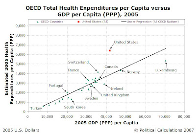
We're going to start by looking at the total Health Expenditures per Capita across the member nations of the Organisation of Economic Co-operation and Development (OECD) against their Gross Domestic Product per Capita, adjusted for Purchasing Power Parity, for 2005:

The chart above presents the data with a linear regression to show the traditional correlation between national economic output and health care spending. In it, we see that the United States appears to spend a disproportionate amount of money upon health care, especially as compared to the other member nations of the OECD.
Since many of the other OECD nations have national health care programs, it is often argued that the lack of such a comprehensive program in the United States accounts for the reason why its health care expenditures are so disproportionate with respect to its economic output per capita compared to those other nations. Advocates for such a program frequently cite this disparity as a reason why a universal health care program should be enacted in the U.S., where presently, such spending is comparatively unconstrained with respect to other nations of the world.
What's Wrong with That?
The problem with this view is that the analysis upon which it is based is flawed. For any comparative analysis to be valid, care must be taken to ensure that the fundamental units behind the analysis are directly comparable. Where a comparison between the United States and the other member nations of the OECD is involved, that means we must consider the size of the economic output of each nation, the total health expenditures for each, and the size of their populations.
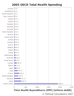
Our following chart shows the total GDP (adjusted for PPP) for the member nations of the OECD for 2005, ranking the nations from low to high according to their 2005 GDP (PPP):

The next chart shows the total public and private Health Expenditures (adjusted for PPP) for the OECD nations. We obtained these figures by multiplying the 2005 Health Expenditures per Capita (from above) by the Population for each nation for that year. Again, the nations are ranked from low to high according to their 2005 GDP (PPP):

The third chart shows the total Population for the member nations of the OECD. As with the other two charts, the nations are ranked according to their 2005 GDP (PPP):

What all three of these charts demonstrate is that the United States' economic output, health expenditures and population all completely dwarf those of the other nations, often by several orders of magnitude. These factors alone make nation-to-nation comparisons dicey at best, and outright misleading at worst. It would be more valid to compare individual states within the United States against many, if not all, of the other OECD member nations.
A Better Comparison
 So, why don't we do that? After all, it has been observed that the economic output of each of the U.S. states is comparable to that of other nations. Comparisons between the populations of individual U.S. states and OECD nations would certainly be more consistent.
It also makes sense in how the government health care programs that the United States does have are administered. Here, while the U.S. does not have a universal health care program covering its entire population, it does have several large-scale national health care programs, such as Medicare for the elderly, Medicaid for the poor, and the State Children's Health Insurance Program (SCHIP) (originally intended for poor children but being expanded to include children whose families can easily afford health care), among others. Many of these programs are administered at the state government level, which helps make a U.S. state to OECD nation comparison of more valid.
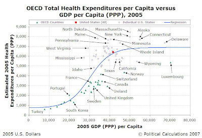
Our next chart takes our first chart showing the 2005 OECD Nations' Health Care Expenditures per Capita vs GDP (PPP) per Capita, and simply adds some fifty data points for the individual U.S. states (see Note 1 for a discussion of how we found these figures for 2005):

We can see from this chart that the linear regression no longer does such a good job in describing the relationship between total health expenditures per capita and GDP (PPP) per capita for the set of data. We next sorted all our individual U.S. state and OECD member nation data from low to high on the basis of their GDP (PPP) per capita and used ZunZun's 2-D function finder to find a better regression model. We selected a sigmoid with offset function as being the best fit for the data, which we've shown in the chart below (we've also identified a number of the individual U.S. states in the chart, as well):

Our tool below takes the formulation we found for our sigmoid regression model and provides the corresponding expected level of health expenditures for a given level of GDP (PPP):
We believe the sigmoid regression model provides a significantly better representation of the relationship between health care expenditures and economic output. While built from empirical data, it has an advantage over the linear regression model in that it better agrees with established economic theory.
The main weakness of the linear regression model is that it assumes that with increasing economic output (or income), increasing health care expenditures will result. The problem with this model however is that it also assumes that there are no diminishing returns to additional health expenditures. The economic "law" of diminishing marginal utility suggests that there is a limit to how much additional benefit an individual or a population may receive from additional spending for health care.
After a certain point, it's not worth spending more for additional health care because you're not getting the same bang for the buck.
These diminishing returns are reflected in the sigmoid regression model we've illustrated above. Instead of health expenditures forever escalating with increasing economic output (or national income), we instead find that amount of expected health expenditures for a given level of GDP (PPP) follows an S-shaped curve, one that rises with growing GDP (PPP) at the low range and transitions to a relatively fixed level at higher ranges of GDP (PPP), corresponding with the diminishing returns one should expect from additional health care spending.
Coming Soon
We'll discuss what this relationship really means for the U.S. and the nations of the world. A quick preview: the United States is, collectively, spending about as much as we should expect on health care with respect to its economic output. Nations with long established universal health care programs are, in effect, achieving their lower expenditures by suppressing the amount of health care their populations may receive below the more natural, unconstrained levels that we see in nations without such established national health care programs.
Notes
[1] Total health expenditures may be found by adding Personal Health Care Expenditures with the expenditures associated with government program administration, public health programs and investments. We were only able to find a projected value of Personal Health Care Expenditures of 1.6778 trillion US dollars for 2005 from Table 125 of the U.S. Census Bureau's 2007 Statistical Abstract of the United States, so we had to estimate this component for each of the states for 2005.
We did this by extracting the Personal Health Care Expenditures by State for 2004, which provided this component of the Total Health Care Expenditures for all 50 states and the U.S. as a whole. We found the percentage of each state's personal health expenditures with respect to that of the entire U.S. We then assumed that these percentages from 2004 would be relatively unchanged in 2005, and multiplied these percentages by the $1.6778 trillion projected national personal health expenditures we found earlier to approximate the state personal health expenditures.
We then divided all these figures by the populations of each state to find the Personal Health Expenditures per Capita for each of the states. We next took the OECD's projected value of U.S. total health expenditures per capita for 2005 of $6,401 and divided it by the U.S. personal health expenditures per capita of $5,660.40 (this figure is obtained by dividing the $,6778 trillion personal health expenditures by the 2005 U.S. population estimate of 296,410,404). This gives us a multiplication factor of 1.131, which represents the portion of total health expenditures associated with government program administration, public health programs and investments.
These costs were distributed among all the states by multiplying this factor by each state's estimated Personal Health Expenditures per Capita for 2005, thereby providing our estimate of the Total Health Expenditures per Capita for each individual state in the U.S.
Labels: health care, tool
Welcome to the blogosphere's toolchest! Here, unlike other blogs dedicated to analyzing current events, we create easy-to-use, simple tools to do the math related to them so you can get in on the action too! If you would like to learn more about these tools, or if you would like to contribute ideas to develop for this blog, please e-mail us at:
ironman at politicalcalculations
Thanks in advance!
Closing values for previous trading day.
This site is primarily powered by:
CSS Validation
RSS Site Feed
JavaScript
The tools on this site are built using JavaScript. If you would like to learn more, one of the best free resources on the web is available at W3Schools.com.