We thought it might be fun to look at the recent trends in the S&P 500 at several different scales. Our first chart shows the current major trend for the S&P 500 index fits in with respect to the average monthly value of stock prices and trailing year dividends per share recorded since December 1991:

Note that at this scale, we're tracking the average monthly index value for the S&P 500, which we find by taking the average of the daily closing values for the S&P 500 index in each calendar month, which allows us to tie into Robert Shiller's and the Cowles Commission's historic data for U.S. stock prices.
Let's focus next upon the current major trend in stock prices, which we've marked on the chart above in the red dashed-line box in the upper right corner. Our second chart shows this data in much greater detail:

Here, we're showing the S&P 500's daily closing prices along with the 20-day moving average for the index' value, which roughly corresponds to the calendar-month based data we presented on our first chart. While this confuses the more dim-witted among Seeking Alpha's commenters, it works fairly well for our purposes because most months contain at least 20 trading days.
This brings up a good question: how do we define a trend? For our purposes, a trend is defined by a power-law relationship between stock prices and trailing year dividends per share. We consider a trend to be orderly when both dividends per share and stock prices are generally increasing in value over time, in such a way that we cannot rule out that the variation in stock prices with respect to the mean trend curve are normally distributed with a statistical hypothesis test. We consider stock prices to be behaving chaotically whenever that basic relationship is not present.
We'll next focus on the most recent microtrend for the S&P 500, which we've indicated in our second chart with the purple dashed-line box in the upper right hand corner. Our third chart focuses on this zone:
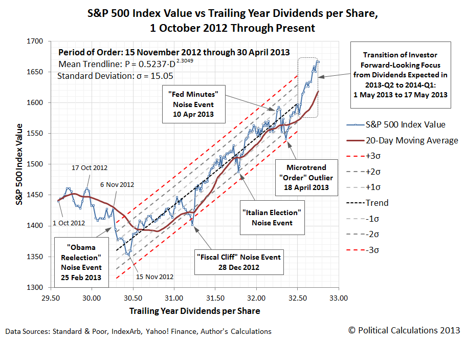
In this final chart, we see the fiscal-cliff tax avoidance rally that began on 15 November 2012, which marked the beginning of the period in which publicly-traded companies raided the funds being set aside to pay out dividends in 2013 to instead pay them out in 2012 for the purpose of avoiding the potential tripling of dividend tax rates in the U.S. for their most influential investors. This portion of the rally ended as these investors sold off stocks just before the end of the year to claim capital gains on them before those tax rates would rise as well.
The next portion of the microtrend rally kicked in with the fiscal cliff tax deal shortly afterward on 3 January 2013, which set the maximum tax rate for both dividends and capital gains at 23.8%. Since the fiscal cliff tax deal also hiked the U.S.' top income tax rates up to a maximum of 43.8%, influential investors once again sought to have publicly-traded companies boost their dividends as a means to avoid the higher federal taxes on the wage and salary income they also earn from the companies they own, taking more of their compensation in the form of dividends instead.
And because that change in the structure of compensation for influential investors would also increase the dividend income earned by regular investors, owning stocks has become relatively more attractive, with stock prices continuing to rise in response.
That portion of the recent microtrend ended in late April 2013 following the major announcements made during 2013-Q2's earnings season. Since then, other fundamental factors have contributed to a shift in the quantum level of stock prices, but then, that sort of thing really confuses the cortically-subilluminated among Seeking Alpha's commenters, so we'll just point you backward in time, again, for that remedial discussion....
You know, it occurs to us that if those commenters would just bother to follow the links we provide, they wouldn't keep embarrassing themselves so badly....
Labels: data visualization, SP 500
Welcome to the blogosphere's toolchest! Here, unlike other blogs dedicated to analyzing current events, we create easy-to-use, simple tools to do the math related to them so you can get in on the action too! If you would like to learn more about these tools, or if you would like to contribute ideas to develop for this blog, please e-mail us at:
ironman at politicalcalculations
Thanks in advance!
Closing values for previous trading day.
This site is primarily powered by:
CSS Validation

RSS Site Feed
JavaScript
The tools on this site are built using JavaScript. If you would like to learn more, one of the best free resources on the web is available at W3Schools.com.
Other Cool Resources
Blog Roll


