U.S. housing prices resumed inflating through the end of 2013, however, they don't appear to have anywhere near the head of steam they did from July 2012 through July 2013.
Let's first update our look at the long term trends for U.S. median new home sale prices with respect to median household income from 1967 through the end of 2013. Here, by tracking the trends of median new home sale prices with respect to median household income, we can more easily identify how relatively affordability of the prices of new homes in the middle of the U.S. sales distribution are changing with respect to the household incomes of people who are in the middle of the U.S. income distribution. This is what allows us to identify when bubbles might be present in the U.S. real estate market:

Here, we see that the first U.S. housing bubble really began to inflate after November 2001, peaking in March 2007, then basically deflating until January 2010. Median new home sale prices then grew slowly and steadily with household incomes until July 2012, which is when we mark the beginning of the second U.S. housing bubble.
Let's next zoom in on the box in the upper right hand corner of our first chart, which shows the detail from 1999 onward:

This chart shows how median new home sale prices stalled out from July through September 2013, coinciding with the period where mortgage rates rose in anticipation of the Federal Reserve beginning to taper off its purchases of U.S. Treasuries and Mortgage-Backed Securities in its Quantitative Easing (QE) programs. Following the Fed's decision to delay any taper in its QE programs until later, the inflation of median new home sale prices reignited in October as mortgage rates fell in response.
Mortgage rates began rising again in December 2013, once again in anticipation that the Fed would follow through on its QE taper plans, which would initially appear to be causing the inflation of the second U.S. housing bubble to slow. Our final chart compares the current data for median new home sale prices from July 2012 to July 2013 against how they have changed since September 2013:
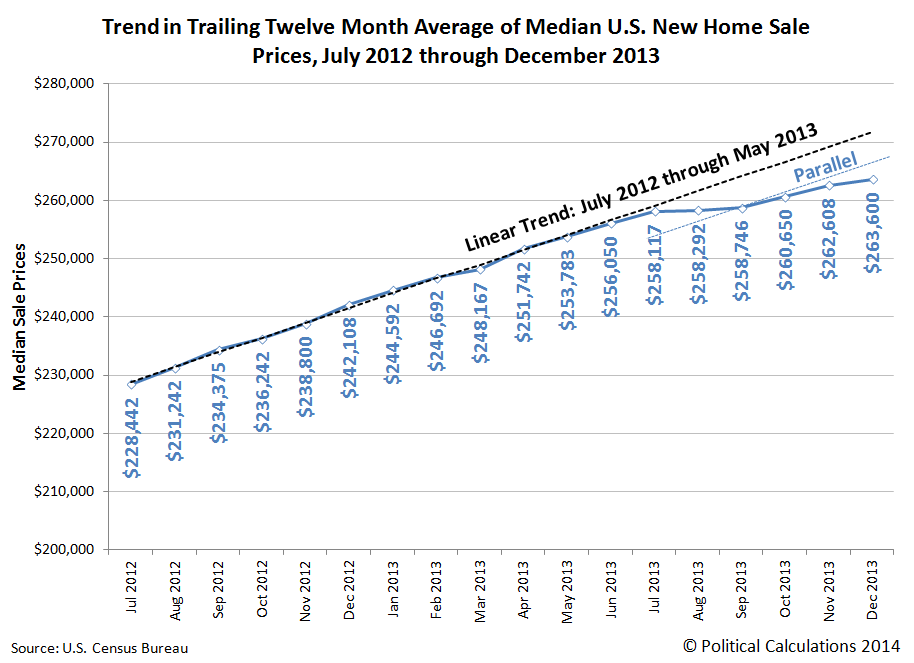
This chart is where we observe that the pace of inflation of median new home sale prices would appear to be slowing. We should caution however that this data is subject to revision as more complete sale data become available, with the greatest revisions occurring in for the most recently published data. Even so, we can see in the older data that the reignited inflation has less "oomph" behind it.
Since December 2013, the Fed has acted to implement its QE taper plans, but mortgage rates are approximately still at the level to which they rose in anticipation of the Fed's action. It will be interesting to see if a new, more stable trajectory for housing prices begins to take hold in the U.S.' real estate markets.
References
Sentier Research. Household Income Trends: December 2013. [PDF Document]. Accessed 23 January 2014. [Note: We have converted all the older inflation-adjusted values presented in this source to be in terms of their original, nominal values (a.k.a. "current U.S. dollars") for use in our charts, which means that we have a true apples-to-apples basis for pairing this data with the median new home sale price data reported by the U.S. Census Bureau.]
U.S. Census Bureau. Median and Average Sales Prices of New Homes Sold in the United States. [Excel Spreadsheet]. Accessed 30 January 2014.
Previously on Political Calculations
We were among the first to declare that a second housing bubble was forming in the U.S. economy, and we were the first to back it up with an objective framework of analysis and data. Our ongoing analysis is chronicled below....
- The U.S. Housing Bubble Is Back - we apply our groundbreaking analytical methods to determine that a new housing bubble has begun to inflate in the U.S. economy.
- Fuel, Oxidizer and a Spark - Part 1 - we revisit the origins of the first U.S. housing bubble and identify the factors that ignited it.
- Fuel, Oxidizer and a Spark - Part 2 - we explain why housing prices rose so much more in just four states than they did elsewhere, and point our finger at the Fed's below-market interest rate policy as the primary source of fuel for the bubble.
- Fuel, Oxidizer and a Spark - Part 3 - we examine the factors that kept the first U.S. housing bubble going, even after the Fed finally acted to stop throwing so much fuel on the fire.
- Confirming the Second U.S. Housing Bubble - using revised data, we confirm that there is no apparent new-year slowdown in the inflation phase of the new U.S. housing bubble.
- As the Housing Bubble Inflates: Month 9 - we use hard data to refute the housing bubble deniers!
- As the Housing Bubble Inflates: Month 10 - we note the fourth consecutive record for median new home sale prices and discuss the spark that set off the second U.S. housing bubble.
- Setting the Baseline for a Better Housing Affordability Index - how affordable is your home when compared with every other American homeowner? We create a new index to answer that question for any household income level.
- As the Second U.S. Housing Bubble Inflates: Rapidly Escalating Prices - each revision of median new home sale prices indicates the second U.S. housing bubble is growing even faster than the first!
- The Sales Mix of the New Housing Bubble - we find that just like in the first U.S. housing bubble, the sales mix of new homes in the second U.S. housing bubble is being distorted in a very similar way.
- The First Anniversary of the Second U.S. Housing Bubble - we mark the first birthday of the second U.S. housing bubble.
- Is the Second U.S. Housing Bubble Beginning to Peak? - We note a deceleration in the upward trajectory of median new home sale prices and identify the primary cause. Along the way, we find that bubbles can only exist if the Fed wants them to exist!
- U.S. New Home Sale Prices Stalling Out
- Breathing New Life Into the Second U.S. Housing Bubble - After stalling out through September 2013, we find that U.S. housing prices began to rise again with lower mortgage rates following the Fed's decision to delay tapering its purchases of U.S. Treasuries and Mortgage-Backed Securities in September 2013.
- Slowing Inflation for the Second U.S. Housing Bubble - looking at the data through December 2013, we find that while the second housing bubble has resumed inflating, it would also seem to be inflating at a decelerating rate.
Labels: real estate
Welcome to the blogosphere's toolchest! Here, unlike other blogs dedicated to analyzing current events, we create easy-to-use, simple tools to do the math related to them so you can get in on the action too! If you would like to learn more about these tools, or if you would like to contribute ideas to develop for this blog, please e-mail us at:
ironman at politicalcalculations
Thanks in advance!
Closing values for previous trading day.
This site is primarily powered by:
CSS Validation

RSS Site Feed
JavaScript
The tools on this site are built using JavaScript. If you would like to learn more, one of the best free resources on the web is available at W3Schools.com.
Other Cool Resources
Blog Roll


